Do you want to make your website more dynamic and keep visitors engaged as they scroll through your content? Using scroll behavior for Thrive Architect elements lets you control how elements appear, move, or react while scrolling, creating a more interactive and visually appealing experience for your audience.
In this article, we’ll show you how you can enable the scroll behavior effect for different Thrive Architect elements on your website.
- What Does the Scroll Behavior Setting Do?
- Accessing the Scroll Behavior Settings
- Static Scroll Behavior
- Sticky Scroll Behavior
- Parallax Scroll Behavior
What Does the Scroll Behavior Setting Do?
The Scroll Behavior option lets you control what happens to certain elements when a user scrolls down the page.
For example, you can use this option to make a button or image stay visible on the screen, even when you scroll. This is called making an element “sticky.”
You can also use the “Parallax” feature to add cool scrolling animations to elements.
The scroll behavior option works directly for buttons, images, Background Sections, Content Boxes, and grouped Columns. If you want to use scroll behavior with other elements, just put them inside a Content Box and set the scroll behavior for the box. The element will follow the same scroll rules as the Content Box.
Accessing the Scroll Behavior Settings
To access the Scroll Behavior options, first add the element you want to apply it to.
Note: Scroll Behavior can be applied to only one of the following elements:
- Button
- Image
- Background Section
- Content Box
- Column
When you’ve added one of these elements on the page, in the Thrive Architect editor, click on the element to open its settings in the left column.
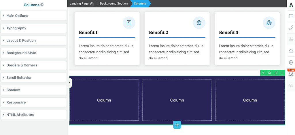
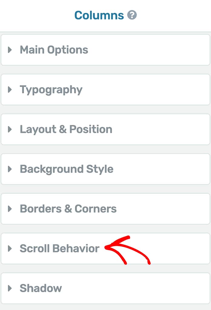
In the left column, click to open the Scroll Behavior settings.
After clicking on Scroll Behavior you’ll see the available options listed below.
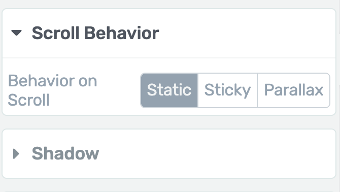
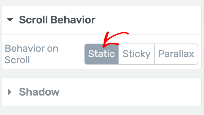
Static Scroll Behavior
By default, the Behavior on Scroll setting is set to “Static.” This means the element will not move as someone scrolls down the page. It will stay right where it is and will not follow the visitor or respond to any scrolling.
So, unless you change this setting, the element will remain fixed in its original spot on the page while people scroll past it.
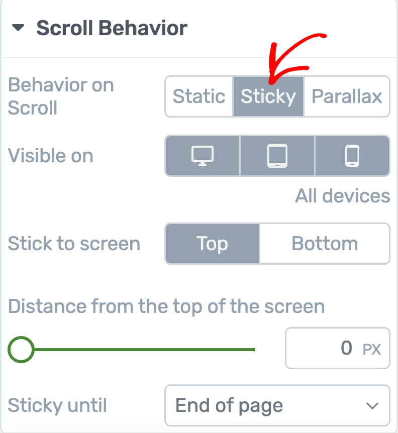
Sticky Scroll Behavior
With the Sticky Scroll Behavior, you can make an element “sticky” so it stays on the screen even when someone scrolls down your website. This means the sticky element won’t move up with the rest of the page – it will always be visible.
Note: If you have two elements that overlap, you need to adjust their z-index values. In the Advanced section under Layout and Position, set the z-index higher for the element you want to show on top.
Also, use padding to make sure your sticky elements don’t overlap each other’s content. Padding adds extra space and keeps everything clear and easy to see.
To mark the element sticky, select Sticky under the Scroll behavior options.
When you enable the Sticky Scroll Behavior, you’ll see a number of settings you can set ahead.
- Select Display Device
- Select Element Position
- Set the Distance from the Top of the Screen
- Elements Sticks Until
Select Display Device
The Visible On setting lets you choose which devices you want the “Scroll Behavior” (sticky state) to work on.
By default, it’s turned on for all devices – desktop, tablet, and mobile.
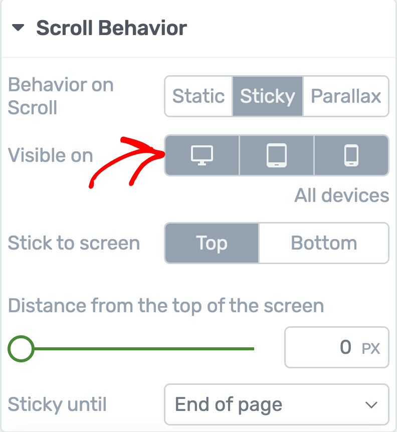
If you don’t want the sticky state on a device, just click its icon to turn it off. This lets you pick if the element should be sticky on just desktop, just mobile, just tablet, or any combination.
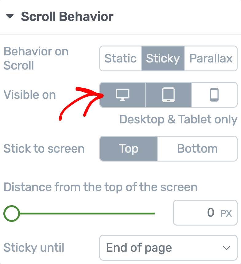
To turn a device back on, click the icon again. Selected devices will have a grey background, while unselected devices will be white. You’ll also see a note below the icons telling you which devices are currently selected.
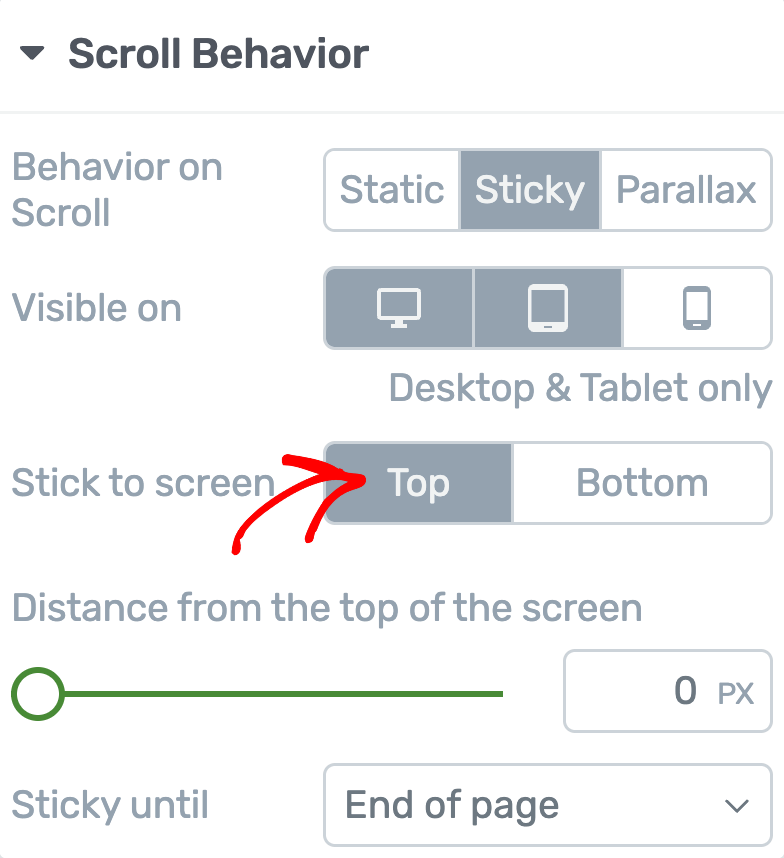
Select Element Position
Next, you can decide where you want the sticky element to stay – top or bottom of the viewport.
To do so, pick your preferred option from the menu. This way, as people scroll, your chosen element will always stay at the top or bottom, just like you set it.
Set the Distance from the Top of the Screen
The Distance from the top of screen setting lets you control how much space there is between the sticky element and the top of the screen when you scroll.
You can change this space in two ways:
- Drag the slider: Move the slider left or right to set the distance.
- Enter a number: Type a number (in pixels) in the box next to the slider if you want a precise distance.
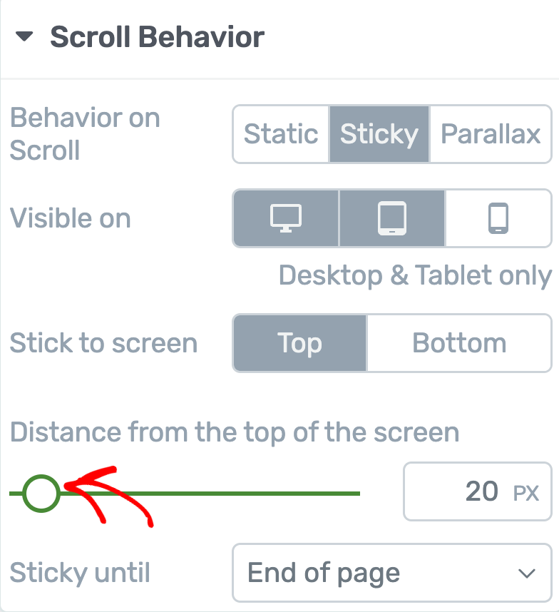
For example, if you set this number to 20, the sticky element will stay 20 pixels below the very top of the screen while users scroll down the page. This is helpful if you don’t want the element to cover your site’s header, menu, or any other items at the very top.
Adjusting this distance makes sure the sticky element looks good and doesn’t block anything important.
Elements Sticks Until
The Sticky Until setting lets you choose how long the element should stay sticky (visible) as someone scrolls down the page.
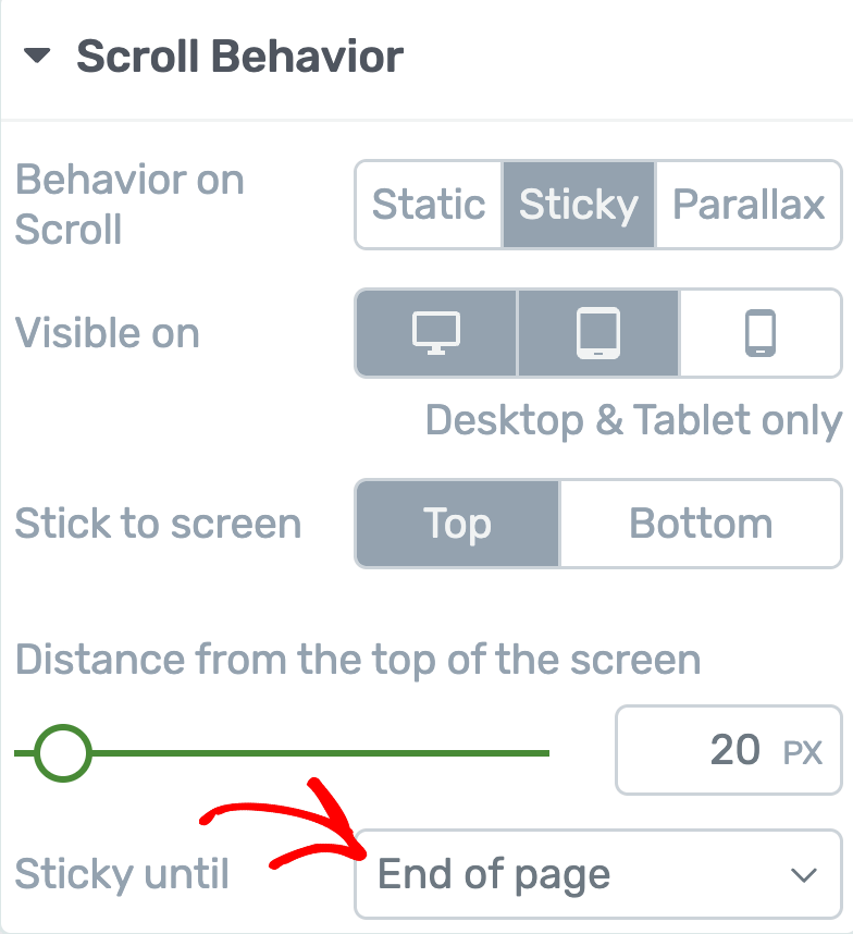
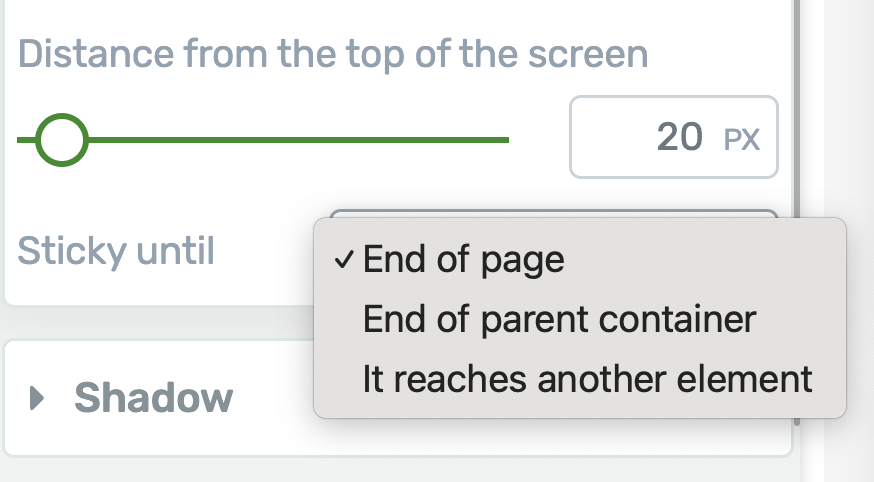
Click on the drop-down menu next to these settings to see the three options.
- End of page (Default): With this option, the element stays sticky and in view until the visitor reaches the very bottom of the page. This is the default setting.
- End of Parent Container: If you pick this, the element will stay sticky only while its parent container (like a Content Box) is still in view. Once you scroll past the parent container and it leaves the screen, the sticky element will also disappear.
- It reaches another Element: With this option, the element will stay sticky until you scroll to another element that you choose. For example, you might want your sticky button to stop showing when someone reaches your footer or another section on the page. Here, you’ll need to pick which element you want it to stop at.
If you choose It reaches another Element, a new field called “Element ID” will appear.
In the given field, type the ID of the element you want the sticky behavior to stop at. To set an ID, go to the “HTML Attributes” section in the left sidebar and enter your chosen ID. Use only one word, or connect words with underscores (like this: header_section).
Note: If you’re editing the header, you’ll also see a “Switch on scroll” option as an additional setting when you choose to enable Sticky Scroll Behavior for the header. To understand how to use the switch on scroll setting for the header, refer to our document here.
Parallax Scroll Behavior
The parallax effects under scroll animations not only make your content more engaging, but also create a smooth, professional feel as elements move, fade, or slide into view while scrolling. This helps capture your visitor’s attention and keeps them interested as they explore your page.
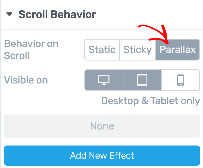
When you enable the Parallax Scroll Behavior, you’ll see a number of settings you can set ahead.
- Select Display Device
- Add New Effect
To understand and use the parallax scroll behavior on your website, we recommend you to read our document here.
Once you’ve set up the “Scroll Behavior” for your element, save your changes. Then, click the “Preview” button at the bottom center of the page to see how the element acts when someone scrolls.
We’ve just seen the different Scroll Behavior options in Thrive Architect and how to use them. You can take a virtual tour of these settings in the video below.
Next, if you want the Table of Contents to stick around the viewport, here’s a document that’ll help you set that up.