The “Block” element comes in handy if you want to quickly combine more types of blocks to create professionally designed content on your blog posts and pages.
This article will explain how to add blocks to your pages or posts, as well as how to use the element’s options.
Add the Element
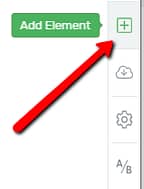
Firstly, to use this element, you will have to add it to your page or post. For that, in the Thrive Architect editor, click on the plus sign, from the right sidebar:
Once the list of elements opens, look for the “Block” element:
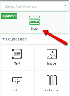
When you find it, grab the element, and drag and drop it on the editor, where you best see fit:
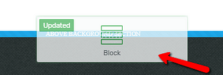
The element will then be added to your page or post.
Important!
Keep in mind that the “Block” element can only be placed on an empty space from your canvas.
It is designed as a top page-level container/section (similar to the “Background Section” element), hence it cannot be placed inside other elements.
Choose a Suitable Block
Once you place the element, a pop-up window will open instantly, where you can select what type of “Block” you want to insert to the page:
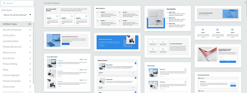
On the left side of the pop-up, you will see two sections: the “Filter Blocks” one, as well as a list of block types.
Filter Blocks
In the first part of this left sidebar, you can choose which blocks to be shown. Click on this section, to open a small drop-down, with the options:

Then, you can choose one of the filtering options from the drop-down, by clicking on it:
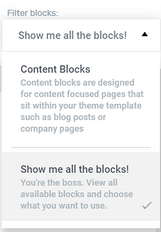
You can choose between three different options here, depending on the situation in which you’re in:
- Editing a simple page
If you are editing a simple Thrive Architect page, then, when you add a “Block” element, you will be able to choose between the “Show me all the blocks!” option, and the “Content Blocks” one, as shown in the image above.
- Editing a Landing Page
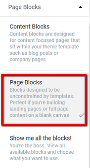
If you add a “Block” element to a Landing Page, you will also have the option to filter the blocks by choosing to only see the “Page Blocks”, besides the”Content Blocks” and “Show me all the blocks” options:
- Editing a page while also using Thrive Theme Builder
When you edit a page that has a Thrive Theme Builder template applied to it, you will also see the “Theme Blocks” option here:
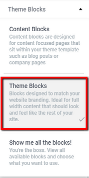
The “Theme Blocks” will inherit the branding of your Thrive Theme Builder theme.
Naturally, choosing to use one of these filters, you will only see the selected types of blocks.
For example, if you click on “Content Blocks”, you will only be able to see those ones in the pop-up.
Block Types
Below the filtering option, you will see a list with all of the block types:
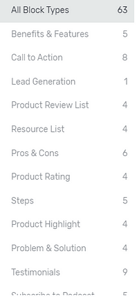
Both sections contain the same blocks. The difference is that in the “Filter Blocks” section, these blocks are categorized according to their purpose on the page too.
The “Block Types” section lists every block, according to the type they belong to (for instance “Pros & Cons”), without categorizing them further.
So for example, if you are looking to add a “Block” that has the purpose of being a “Call to Action”, you can click on the “Call to Action” type/category and you will see the “Blocks” that were created with the goal of being called to action:

Search Bar
Besides the two sections, there is also a search bar, on the left side of the pop-up, that you can use. This comes in handy if you want to look for a certain “Block”.
All you have to do is to start typing the name of the block you want to find and you will see that it appears on the right side of the pop-up:
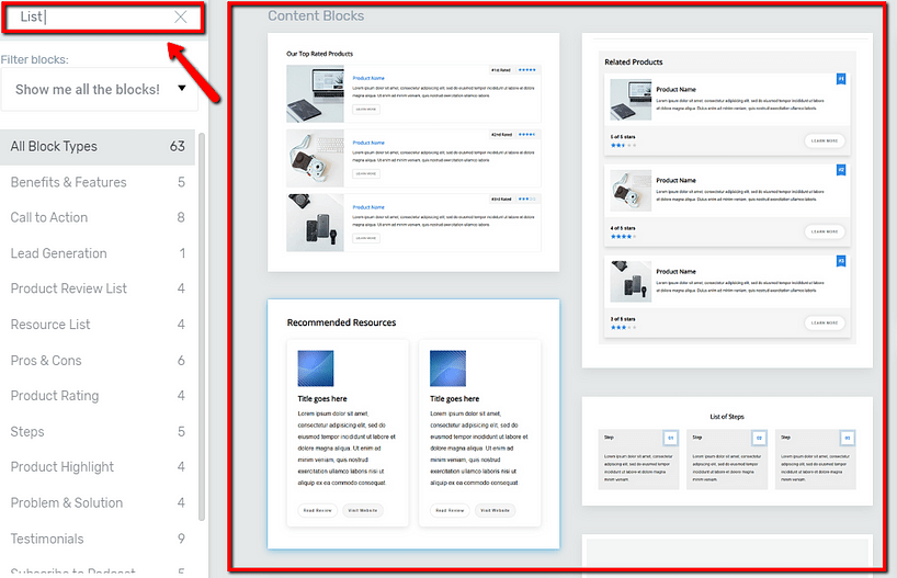
Once you find the block that you want to insert, click on it, to choose it:
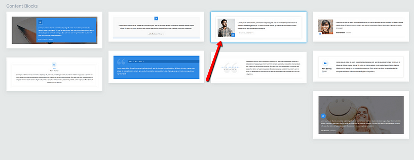
The block will then be inserted.
Note: Keep in mind that, when inserting a block from the “Page Blocks” or “Theme Blocks” bundles, they will inherit the color of the Landing Page or of the theme branding.
For example, if you set the branding color from the Thrive Theme Builder dashboard to dark green, all of the blocks will inherit this color, as well, when you add them to your page.
Use the Main Options
Once you’ve added a block, some options will appear in the left sidebar, that you can use to customize this element:
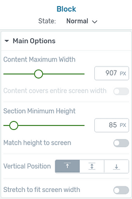
Content Maximum Width
You can modify the width by either dragging the slider under the “Content Maximum Width” option or by entering a value manually in the field next to it:

Content cover entire screen width
Moreover, if you want, you can also make the content of the “Block” cover the entire screen width by clicking on the switch next to the “Content cover entire screen width” option:

Keep in mind that this option will be available only if the “Stretch to fit screen width” option is enabled, as well. If not, you will not be able to make the content cover the entire screen width.
Important!
If you are editing a Landing Page, the first option to appear under the “Main Options” section will be the “Inherit Width from Landing Page” one, which will be enabled by default:

If you click on the switch, to disable it, these two options will become available:
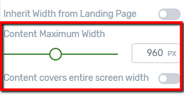
Both of these options can be used as described above.
Section Minimum Height
This option allows you to adjust the height of the “Block”. In order to do that, either drag the slider under the “Section Minimum Height” option or enter a value manually in the field next to it:

Match height to screen
With this option, you can make the height of the “Block” element match the screen. If this is what you want, just click on the switch next to this option:

Vertical Position
Just as its name says, the “Vertical Position” option can be used to adjust the vertical position of the content inside the “Block” element.
You can choose to place the content at the top, at the center, or at the bottom of the “Block”. Simply click on the position you want to use and the content will be placed accordingly on the page, inside the “Block”:

Stretch to fit screen width
The last option here is the “Stretch to fit screen width” one. Naturally, enabling this one will stretch the entire “Block” element to fit the width of your screen.
If you want that, click on the switch next to the option:

Customize the Content of the “Block” Element
After adding and customizing the way the “Block” looks like, it is also very important to customize its content. When you insert the “Block” element to your page it contains default content like the ‘lorem ipsum’ texts or general images.
These must be changed in order to make the “Block” element unique and specific to your page. Therefore, make sure to change all such default content by replacing them with your own texts, images, button texts, etc.
You can do this very easily. First, click on the respective element from the “Block” element. This will make the options of the respective element appear in the left sidebar. Use the options of the particular elements to customize their content.
For instance, if you have selected a text, you can delete it directly from the editor and replace it with your own text. If it is an image that you have selected, then use the “Replace Image” option from the sidebar to change it with your picture, etc.
Keep in mind that it is essential to personalize the various items of the “Block” element this way so that they represent your own business/services.
Repeat
After you have finished setting up your first “Block”, you can continue with adding as many different types of “Block” elements as you need, repeating the same steps, in order to create the page that you want.
Note: To add a second “Block” element, you can either drag and drop it from the element list, as shown at the beginning of this article, or you can hover over the top/bottom side of a “Block” element that you have already placed in your editor, and click on “+Block”:

Using “Blocks” will make your job a lot easier, and it will give you the possibility to create the page you want in at least half the usual time it would normally take to create it.
Use the Rest of the General Options
Just like in the case of all the Thrive Architect elements, the more general options are also available for the “Block” element. These can be found under the “Main Options” in the left sidebar when the “Block” element is selected:
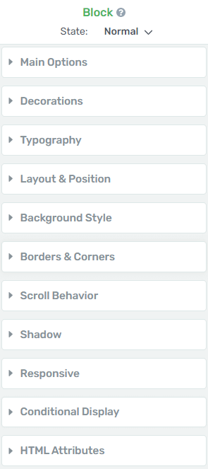
The ‘Conditional Display’ option
This feature allows you to take a block of content from any page, and create alternate versions for it:
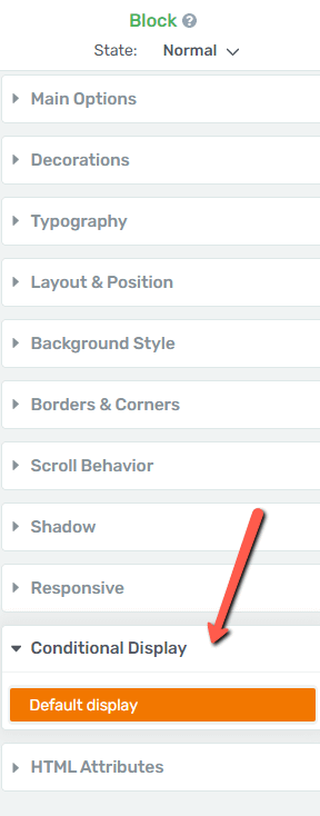
You can then assign different display rules to each version, and decide what each visitor to that page will see, depending on what kind of permissions that person has:

We have a separate article in our knowledge base that explains in depth how to use this feature:
If you need detailed information on how to use the rest of the general options, check out our knowledge base, as we have created separate tutorials on each of them.
This concludes the article about how to add and customize a “Block” element. If you need more information on how various Thrive Architect elements work, please check out our page with tutorials.