In Thrive Architect, you are now able to add a “Course List” element, that will allow you to display a summary of your published courses from your site, created in Thrive Apprentice.
You will be able to add this element to any post or page from your website, wherever you want to display a preview of some/all of your courses.
This element is pretty similar to our “Post List” element, so if you’re familiar with that one, setting this element up shouldn’t be too much of a hustle.
Continue reading this article, to find out how to add this element to a post/page, and how to use all of its options.
Add the Element to the Post/Page
First of all, to be able to use the element, you will have to add it to one of your posts/pages.
For that, open the post or page you want to add the element to, and launch the Thrive Architect editor.
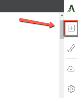
Once you’re in the editor, click on the plus sign from the right sidebar:
This will open the list of elements. You can either scroll down, to look for the “Course List” element, or start typing its name in the search bar:
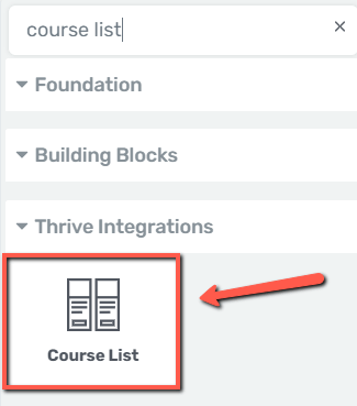
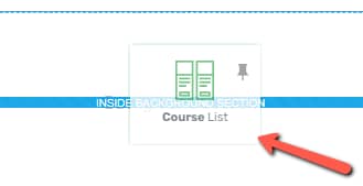
All you have to do is grab the element and drag and drop it where you want it placed, on the page or post:
Right away, a pop-up will open, from where you can choose the template of the element:
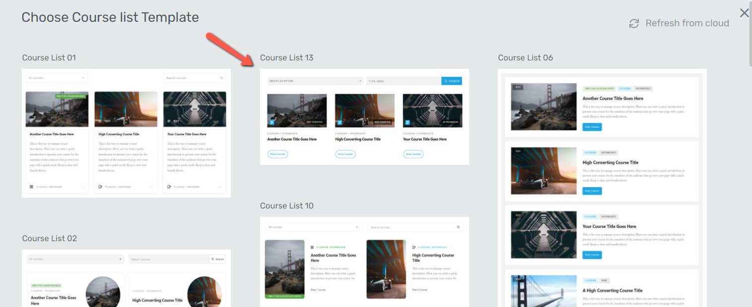
Choose the one you prefer, by clicking on it. The template will immediately be applied, and the element will be added to the page/post.
Once added, the options of the “Course List” element will appear in the left sidebar:

Here is how to use all of these:
Choose the Template
The first section of the left sidebar will let you replace the template of the “Course List” element, if you later decide that you want to change it:
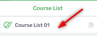
Note: Please remember to replace the template before bringing any modifications to it. If you replace the template after customizing the element, the modifications will be lost.
If you click on this section, the same pop-up will open, which also opened when first adding the element. If you want to change the template, all you have to do is click on another one, from the pop-up, and click on “Replace Template”:
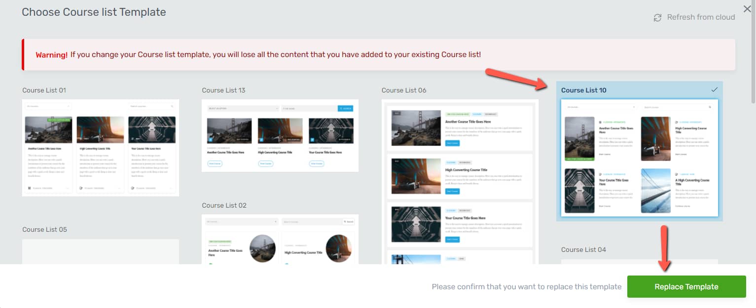
Besides changing the template, you can also use the rest of the sections from the left sidebar, to further customize the element.
Use the Course List Options
The “Course List Options” section is where the options that are specific to this element can be found:
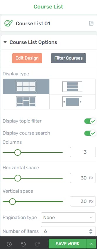
We’ll go through each of these options, one by one.
Edit Design
The “Edit Design” option can be used to customize the design of the “Course List” element.
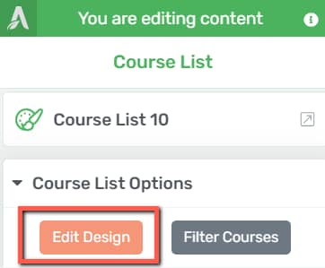
When clicking the “Edit Design” button, the editing interface changes a bit, allowing you to go more in-depth and make changes to the actual elements inside the “Course List” element.
You can choose to remove a certain element from there or modify its structure.
|
Important: Please keep in mind that group editing is enabled at all times when you edit the design of this element, in order to keep its consistency. This means that, for example, if you remove or modify an element from it, the corresponding elements from the other course previews will also be affected: 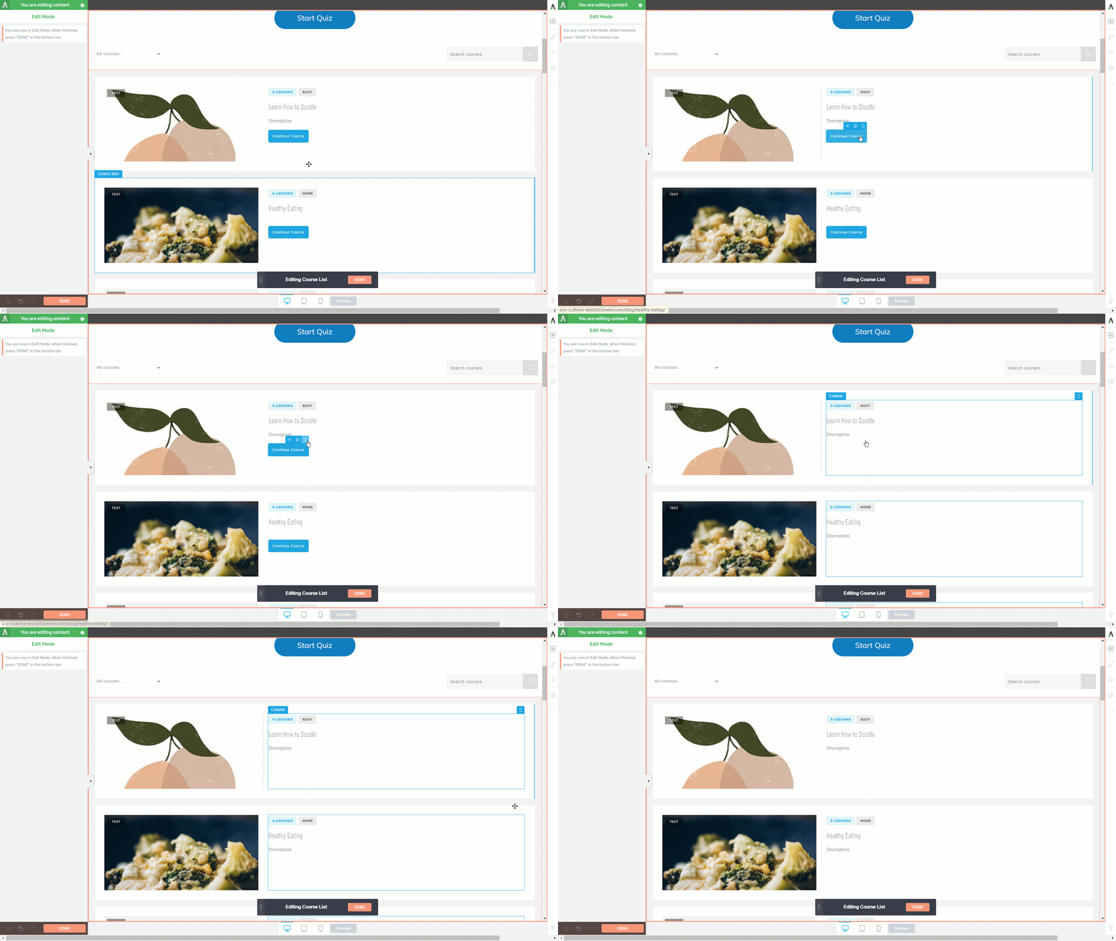 You can check out this article for more information about the “Group Styling” feature. |
Another thing that you can do while you’re in the “Edit Mode”, is to add new elements from the right sidebar, some of which are only available for the “Course List” element.
To add more elements, click on the plus sign from the right sidebar, and you will notice all of the elements that can be added. The ones that are specific to the “Course List” element will be found under the “Course List Elements” section of the element list:

Depending on the template that you’ve chosen for the element, some of these items might already be added to your “Course List” element. However, in case you remove them, you can always open the element list and add them back on.
These are the elements that have been designed to be used with the “Course List” element, for which we have a separate article linked here:
- Action Button
- Author Image
- Cover Image
- Course Description
- Difficulty Level
- Course Label
- Number of Lessons
- Course Name
- Progress
- Topic Icon
- Topic Title
- Course type icon
- Course Type
You can also customize each of these elements how you see fit, using all of the customization options available in Thrive Architect. One additional resource that you might find useful here is this article, which explains in-depth how and when to use the “Action Button” element.
Filter Courses
The “Filter Courses” option will let you choose the courses you want to display in the “Course List” element, by using different criteria to filter the content. To do this, click on the “Filter Courses” button:
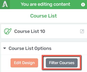
When you click on the button, a pop up will show up on the screen, containing various options regarding what courses you would like to display in the element:
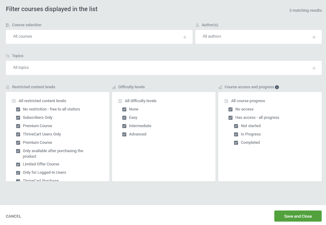
- Course Selection
You can select the exact courses to be shown, manually:
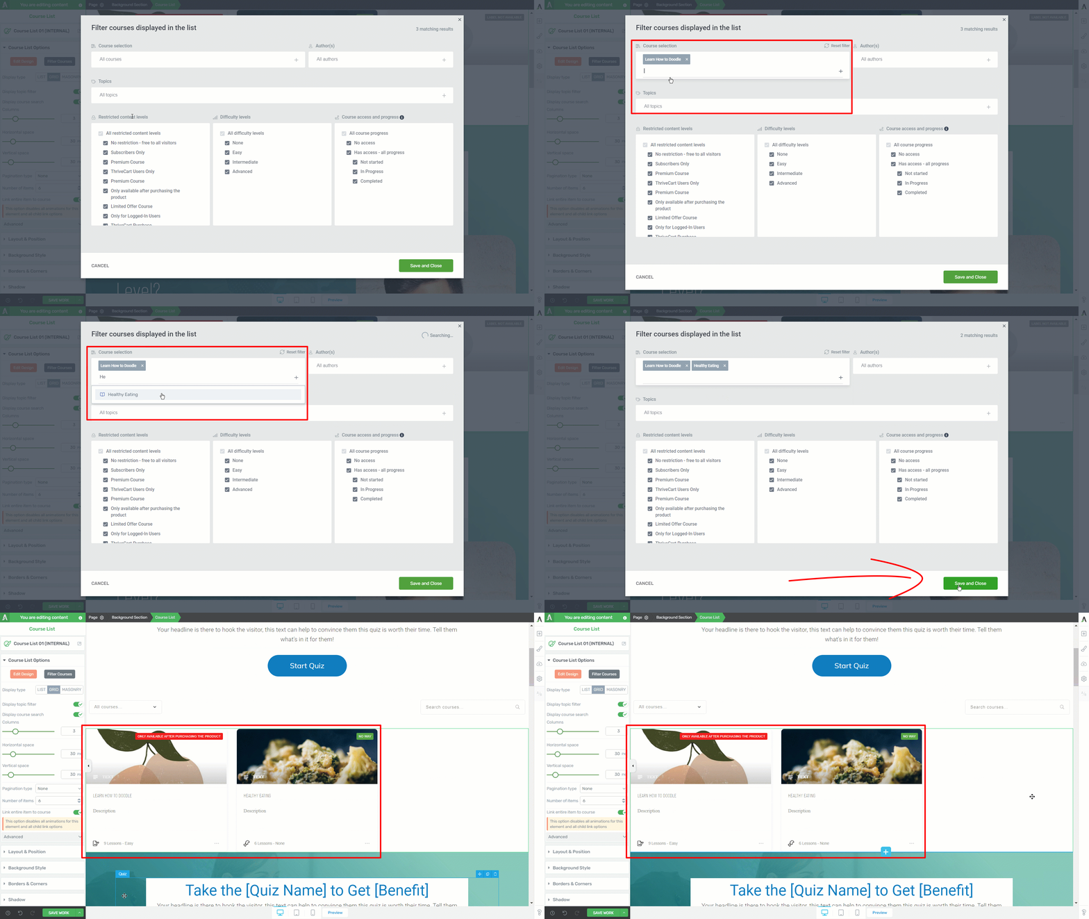
- Authors
You can opt to show only the courses created by a certain author. If you want to filter the courses using this method, use the “Authors” section, and choose the author whose courses you want to display:

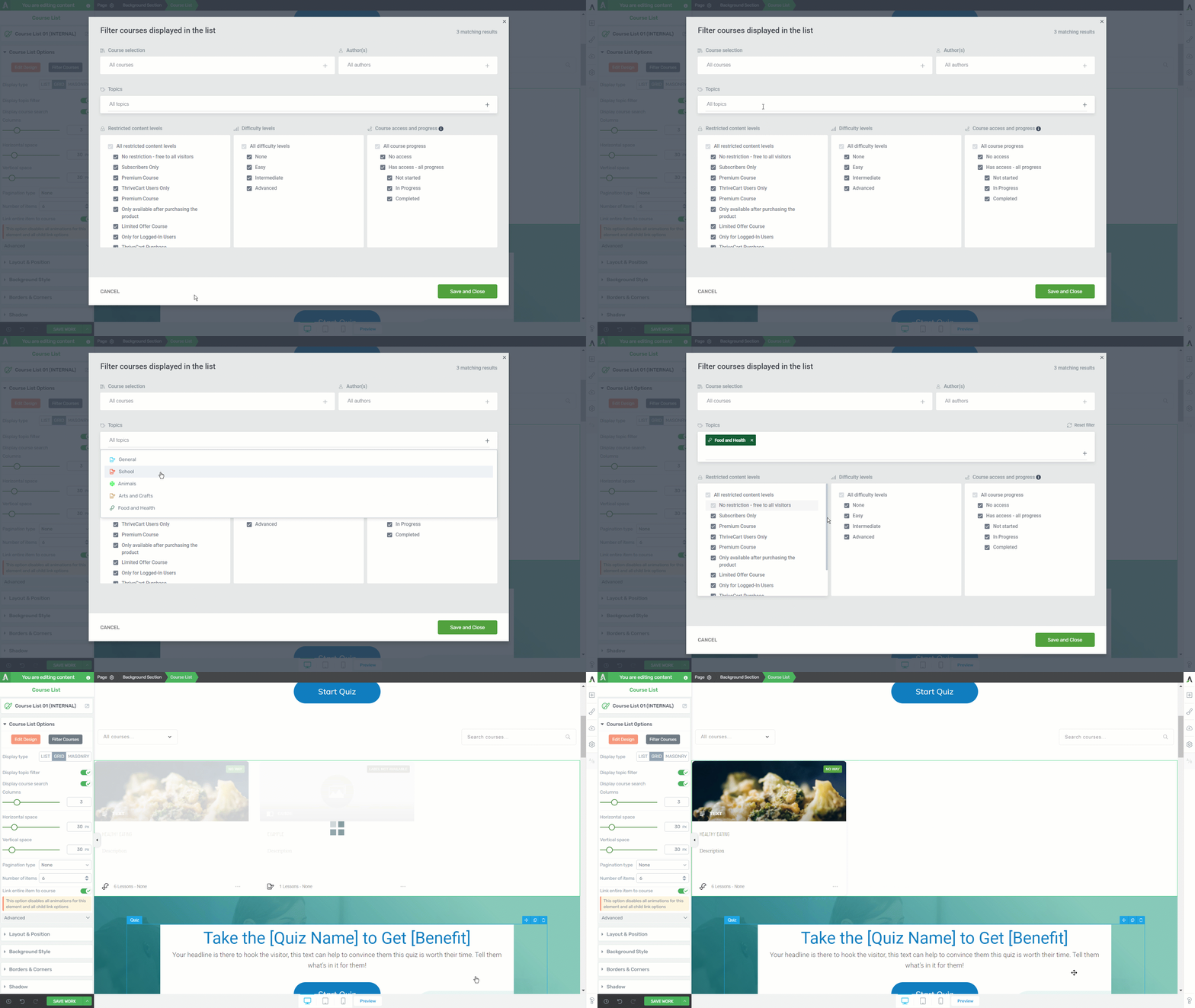
- Topics
The courses from the “Course List” element can also be filtered by their topic. This way, you can display only the courses that have a certain topic assigned to them:
In the next section, you can filter the courses by their restriction rules, the difficulty levels, as well as the course access and progress:
- Restricted Content Levels, Difficulty Levels, Course access and progress
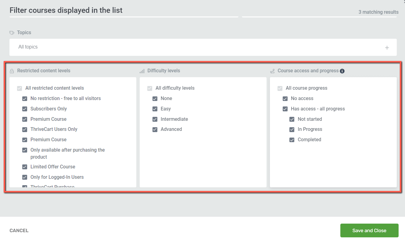
Simply check/uncheck the boxes in front of the elements you want to filter the courses by.
|
Important! Please remember that all of this information (authors, topics, access restrictions, difficulty levels, etc) is set from within the Thrive Apprentice dashboard. If you’re not familiar with the processes of setting these up, please take a look at the Thrive Apprentice section of our knowledge base, as you will find numerous tutorials and articles that will help you get started. Learn more about what elements can be customized/set from Thrive Apprentice here. |
After choosing the proper course filtering rules, click on “Save and Close”, to return to the main options of the “Course List” element:

Display Type
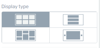
There are three options in which the courses can be displayed inside the “Course List” element:
- List: each course will be sown in a list format, one after another;
- Grid: the courses will be displayed in a series of columns side by side, and each column will have a fixed height and spacing between them, to form a perfect grid;
- Masonry: This is similar to the “Grid” display type, in the sense that this will also display the courses in columns. The difference is that there are no fixed heights for the columns (irregular layout, best visible when having 2 or more rows).
- Carousel: this will allow you to display a summary of your published courses from your site, created in Thrive Apprentice.
We have a separate article that goes into more detail about how to use the options for the “Carousel” display type, and where to find them:
In order to select one of these settings, simply click on the preferred setting from the “Display Type” section:
Display Topic Filter
When this option is enabled, a dropdown will appear on the top side of the “Course List” element, which will let the users filter the courses by topic/access restriction rule:
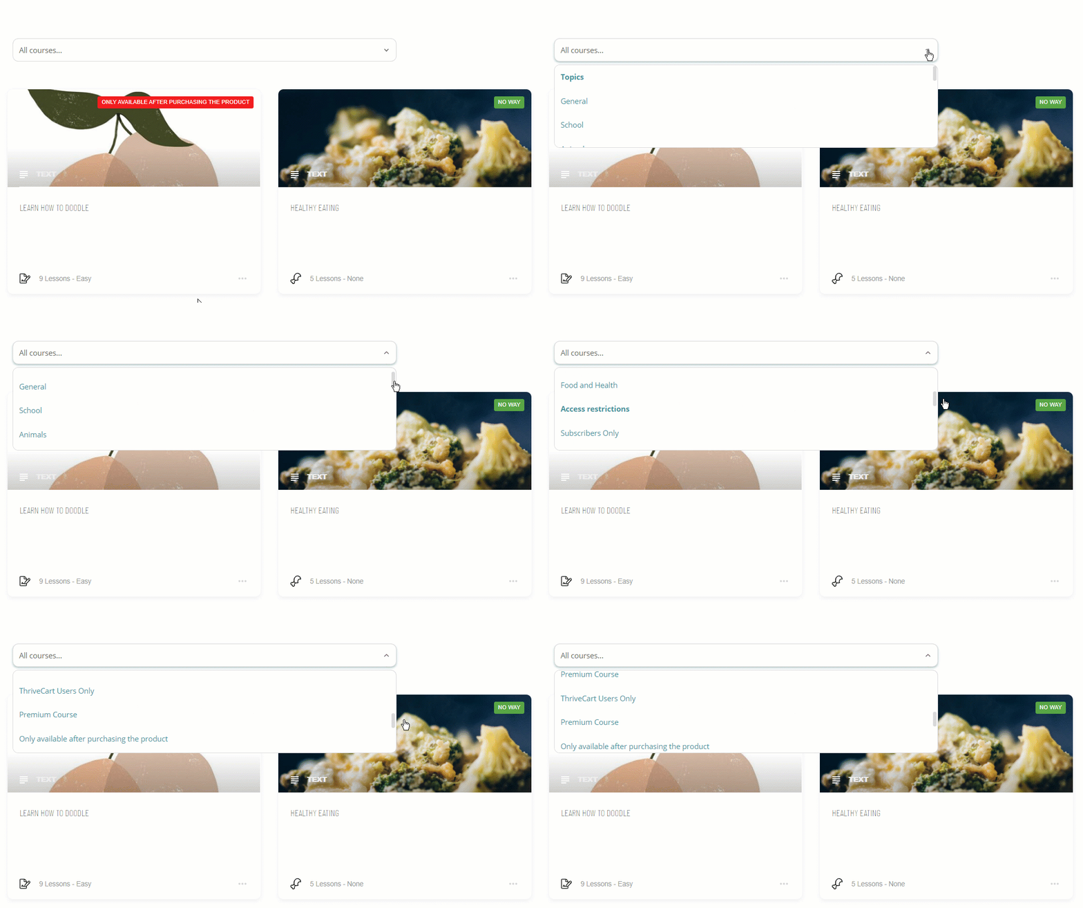
This filter is a “dropdown” field and, if you want to customize it, you can do so by clicking on it, and its options will appear in the left sidebar:
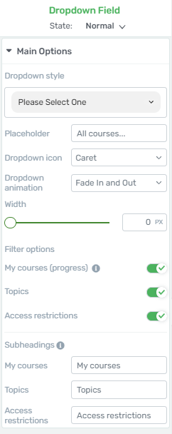
Some of the options of the “Dropdown” field are described in more detail in this article, so please check it out, if you want to learn more about customizing this field.
Besides the ones described in the above-mentioned article, there are a few extra options that can be used here:
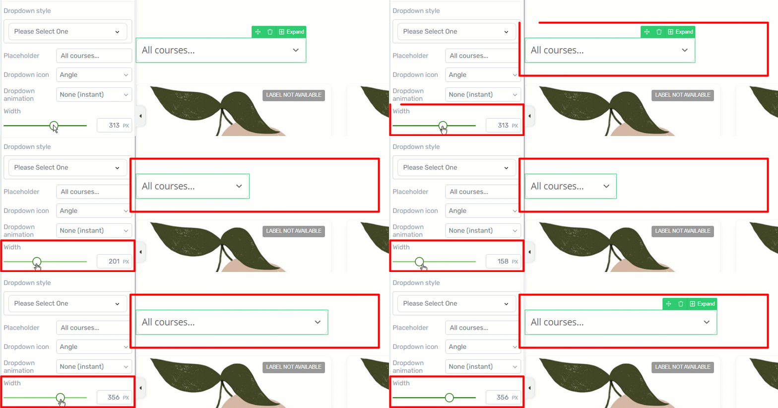
- Width
The width of the entire dropdown field can be modified, by dragging this slider from side to side, or by entering a value in the field next to the slider:
- Filter Options
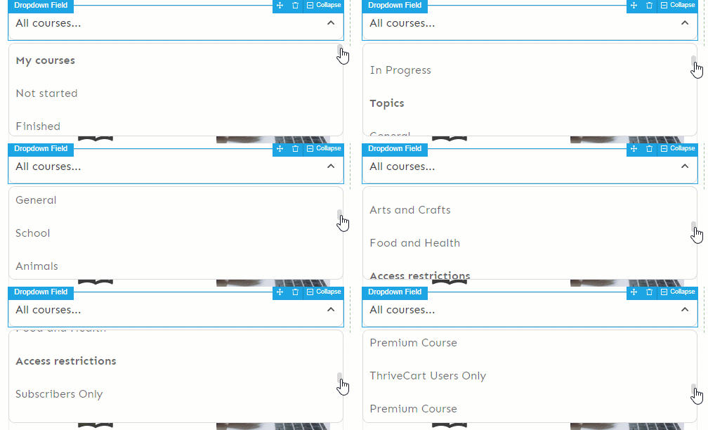
Inside the dropdown you can let the visitors filter the courses to be shown by their courses, topics, or access restrictions:
You can choose which of these filters should be listed or not from the next set of toggles available in the left sidebar:
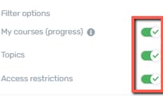
The first toggle, “My courses” is only available for the users who are logged in, as it naturally shows the courses to which the users have access. The following two can be used by the visitor to filter the courses based on topic or access restrictions.
Right under the filter option section, you can find the “Subheadings” section, which you can edit as you best see fit, for each of the above-mentioned filters:
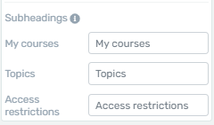
Simply delete the currently existing text, and replace it with a new one.
For example, if you want to only filter the “Topics”, and would also like to change the title for the “Topics” subheading, this is how it would look like:
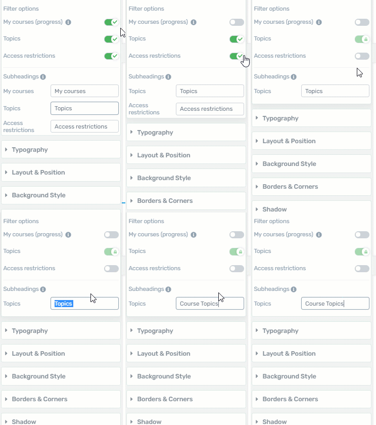
Note: If you do not want the subheading titles to be shown, simply leave the fields empty.
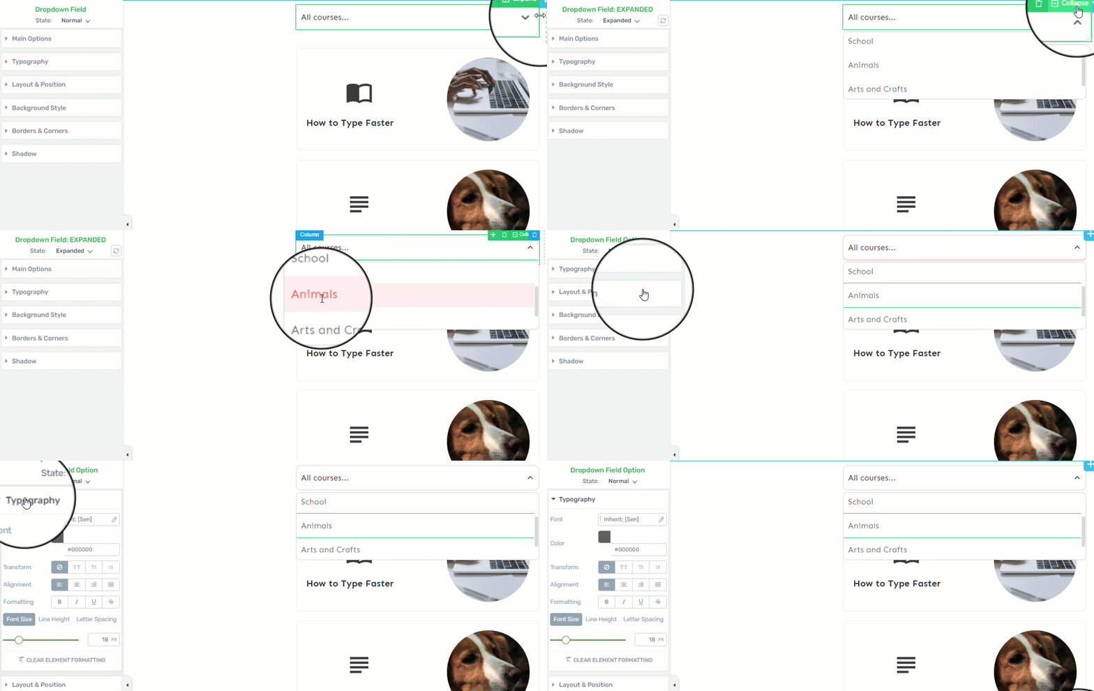
For a more customized dropdown field, you can edit the way it looks like in both “Expanded” and “Collapsed” views:
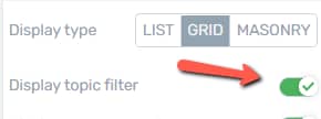
If you do not want the users to be able to filter the courses in this way, all you have to do is disable this option, by clicking on the switch next to it:
Display Course Search
Similar to the option above, this one will add a search bar to your “Course List” element:
This one, too, can be customized by clicking on it, in the editor. Its options will show in the left sidebar:
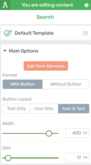
Should you need more information about customizing the “Search” element in Thrive Architect, please check out this tutorial.
If you want to hide the search bar for this element, simply disable this option:

Columns
Next, you can select how many columns should the “Course List” element display the courses in.
In order to change the number of columns, simply drag the slider from the “Columns” section, or enter a value manually in the box next to it:

Horizontal Space & Vertical Space
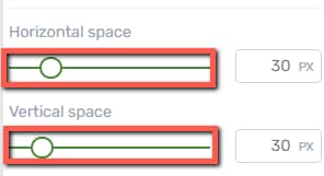
With the help of these two options, you can adjust the horizontal space (the space between the columns – if you choose the “Grid” or “Masonry” display type) and the vertical space (the space between the rows).
Modify the spacing by dragging the slider, or enter a value manually in the box next to the slider for the space you want to modify:
Pagination Type
The “Pagination Type” option allows you to add pagination below course previews. This comes in handy if you have many courses that you display on more pages of the “Course List” element.
By default, there is no pagination added to the element. In order to use this option, click on the field from the “Pagination Type” section. This will open a small drop-down with the three options you can choose from. Click on the one you want to use:
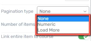
- None is the default state and it means that there is no pagination added to the element.
- Numeric: if you choose this option, a “Numeric” “Pagination” element will be added, below your “Course List” element.
- Load More: if you choose this option a “Pagination” in the form of a “Load More” button will be added, below your “Course List element”.
Should you want to find out how to further customize the “Pagination” that is added when you use the “Numeric” or the “Load More” “Pagination Type” options, take a look at this step-by-step guide. This article talks about the “Pagination” feature for a “Post List” element, but the same options apply to the “Course List” element.
Number of Items
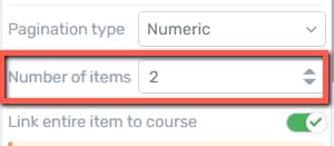
Another option that you can use here is to set the number of courses that will be displayed within the selected “Course List” element. If you want to do that, enter a numerical value in this field, or use the up/down arrows next to the field:
Link entire item to course
With this option, you can choose to link entire items from the “Course List” element to the course they represent.
If you enable this option, when someone sees the “Course List” element, they will not have to click on a specific title, button, or on the featured image from one of its items, to be redirected to the course.
They will be able to simply click anywhere on the respective “Course List” item and they will be redirected to the full page/post/content of that item.
If you want to use this option, all you have to do is to click on the switch next to it:
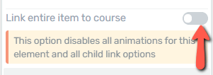
Note: If you activate the “Link entire item to content” option, all the other links from the “Course List” (for example, the links applied to buttons or images of an item, with the “Animation and Action” option) will be disabled.
Advanced Settings
The last option available in the “Course List Options” section of the left sidebar is the “Advanced” one. Click on the down arrow, to expand it:
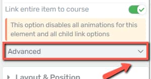
With the help of this one, you can set up the “No results message”, so the message that your users will see, if no results apply to their search/filters.
As soon as you expand this section, a field will appear, from where you can change the default message:
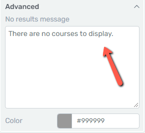
Moreover, you can change the font color of the message. Click on this color box, to change it:

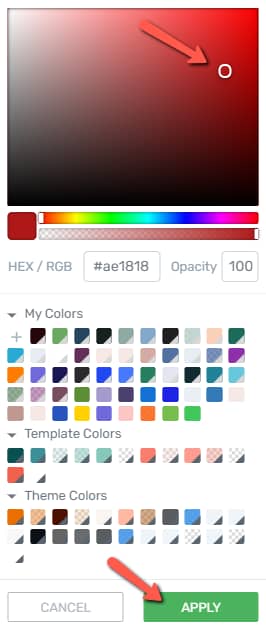
The color picker pop-up will appear, and you can choose the desired font color, and click on “Apply” when finished:
These were the main sidebar options of the “Course List” element.
However, the more general options (such as the “Layout & Position” or the “Borders & Corners” options) are also available for this element. Since these are general options, we have separate tutorials on using them. You can find these tutorials here.
If you need help with other Thrive Architect features or elements, you can also check out our knowledge base.
You might also be interested in this article, about our “Apprentice Lesson List” element, which can be used to add your Thrive Apprentice lessons inside a post or page created using Thrive Architect.