Are you looking to enhance your website’s visual appeal while also boosting user engagement? Using the divider and star rating elements in Thrive Architect can help you create attractive, organized, and interactive content with ease.
In this article, we’ll show you how you can add and customize dividers and star ratings on your website using Thrive Architect.
- Adding a Divider on a Page
- Using the Main Options of the Divider Element
- Using Other Settings of the Divider Element
- Adding a Start Rating Element on Page
- Changing the State of a Star Rating Element
- Using the Main Options of the Star Rating Element
- Using Other Settings of the Star Rating Element
Adding a Divider on a Page
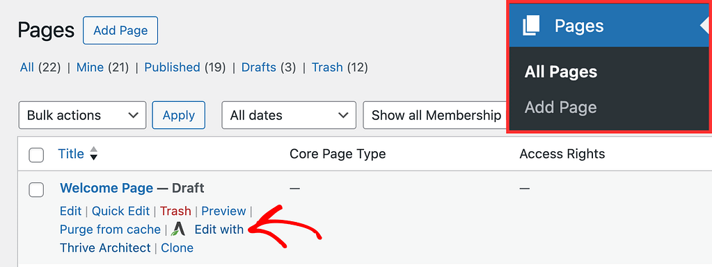
To add the Divider element to a page, begin by opening the page in the Thrive Architect editor. To do so, open your WordPress admin area, Pages >> All Pages, hover on the page you want to edit and click Edit with Thrive Architect.
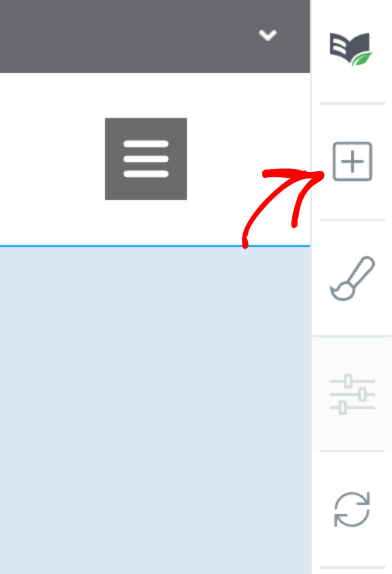
When the page is opened in the Thrive Architect editor, go to the right panel and click the plus (+) icon.
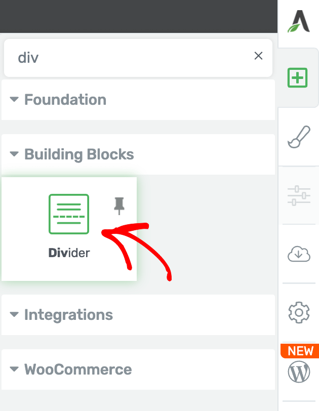
Clicking on the plus icon will open up the list of Thrive Architect elements to choose from. From this list, drag and drop the Divider element on the page.
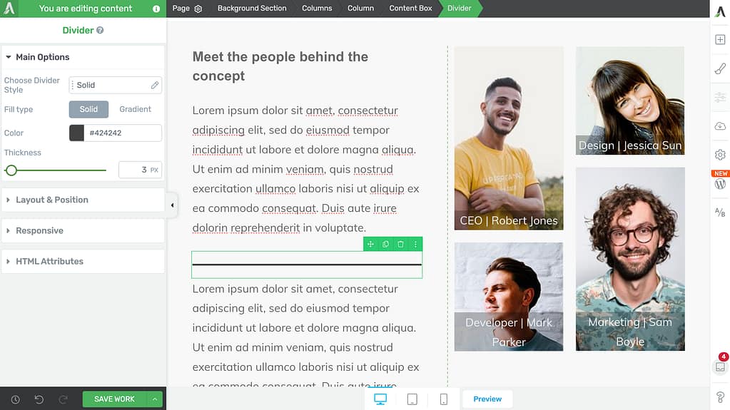
Once you drag and drop the element in your desired location you’ll see the Divider element on the page.
When on the page, click the divider so you can customize it using the settings you see in the left column.
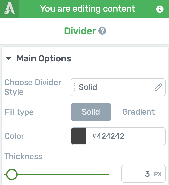
Using the Main Options of the Divider Element
The Main Options of the Divider element allow you to customize the main look of it. They enable you to do the following.
- Choosing the Divider Style
- Selecting a Fill Type
- Selecting a Color for the Divider
- Setting Up a Gradient for the Divider
- Setting the Thickness of the Divider
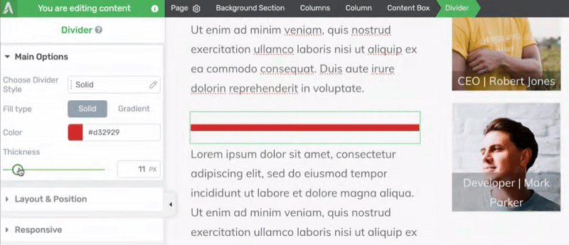
Choosing the Divider Style
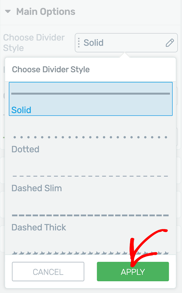
To change the divider style, first click on the field beside Choose Divider Style.
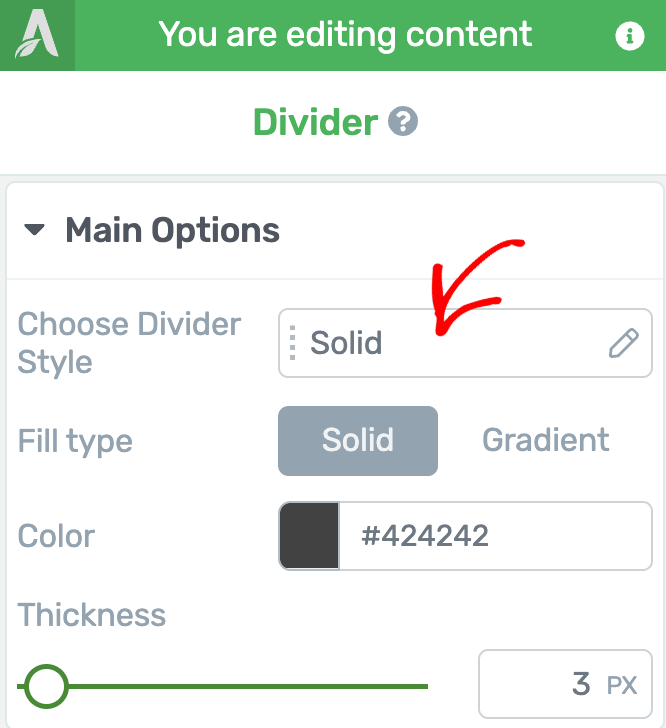
When you click on the field, you’ll see a dropdown where you select the style you want to use for the divider and click the Apply button.
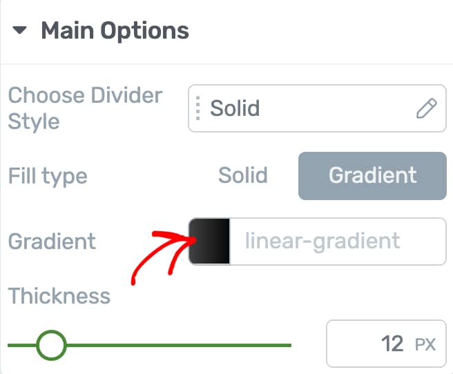
Selecting a Fill Type
The Fill Type setting can be set only when you’ve selected the solid style for the divider. This setting remains hidden for the other styles.
Fill Type is the type of filling you want to add in the divider. Here, you can choose to add a Solid or Gradient fill type for a Solid styled divider.
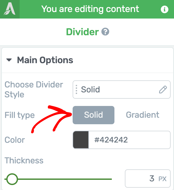
The next setting to choose a color or gradient depends on the choice you make here in case of a Solid styled divider. With the other styles you’ll see the Color setting only.
Selecting a Color for the Divider
The color setting lets you select a color for the divider. This setting is available for all divider styles except when you select the Gradient fill type for a Solid divider style.
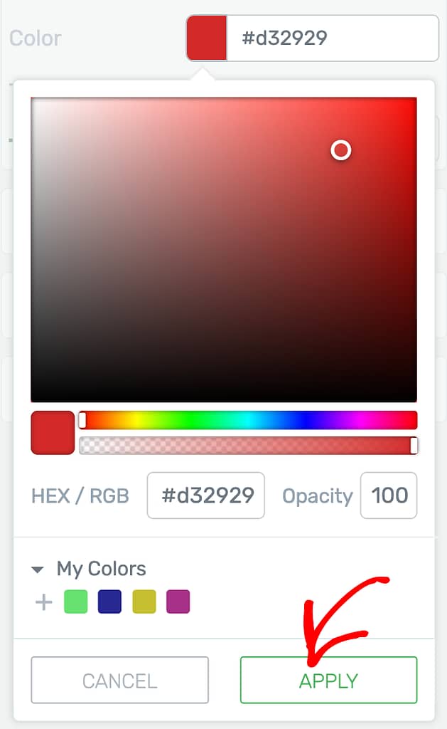
To set the divider color, click on the color block beside the color setting or enter a hex code in the given field.
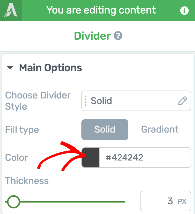
When you click on the color block, select the color from the color picker and click the Apply button.
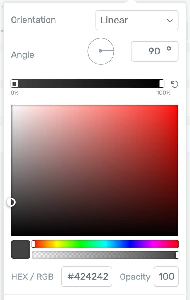
Setting Up a Gradient for the Divider
The Gradient option is only seen when you select a Solid divider style and apply the Gradient fill type for it.
To set up a gradient, first click on the block beside the Gradient setting.
When you click on the Gradient option, set the Gradient orientation, the angle, select a color and click the Apply button to save changes to the divider gradient.
Setting the Thickness of the Divider
The Thickness setting lets you set the thickness of the divider on the page.
To set the divider thickness, simply drag the control over the slider or enter a number in the given field.
Using Other Settings of the Divider Element
Just like the other Thrive Architect elements, the Divider element comes with additional options where you can manage the layout and positioning, responsiveness, and add HTML Attributes.
To learn more about these options, read the documents listed below.
- Using Layout and Position Options in Thrive Architect
- Using the Responsive Option in Thrive Architect
- Using HTML Attributes in Thrive Architect
Adding a Start Rating Element on Page
To add the Star Rating element to a page, begin by opening the page in the Thrive Architect editor. To do so, open your WordPress admin area, Pages >> All Pages, hover on the page you want to edit and click Edit with Thrive Architect.
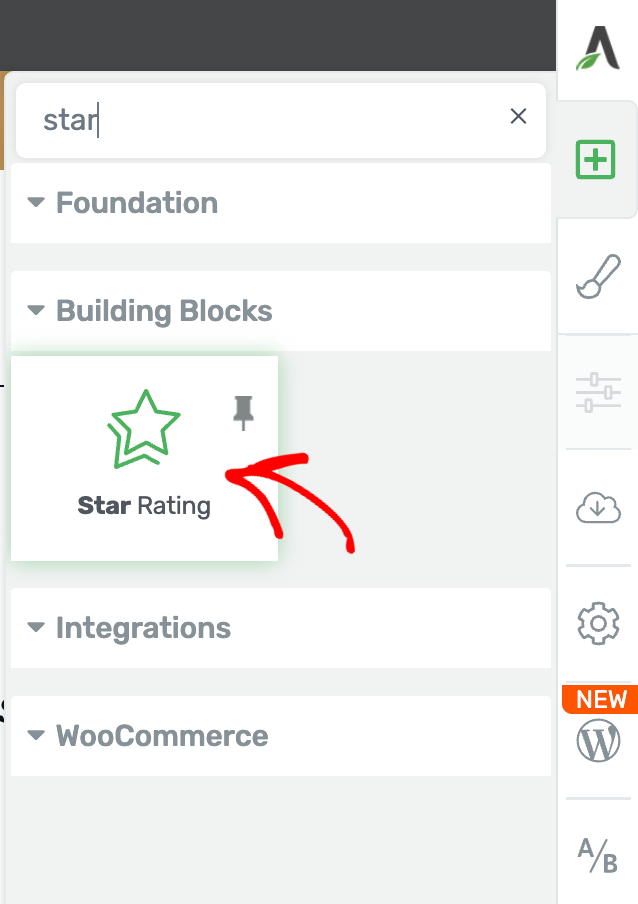
When the page is opened in the Thrive Architect editor, go to the right panel and click the plus (+) icon.
Clicking on the plus icon will open up the list of Thrive Architect elements to choose from. From this list, drag and drop the Star Rating element on the page.
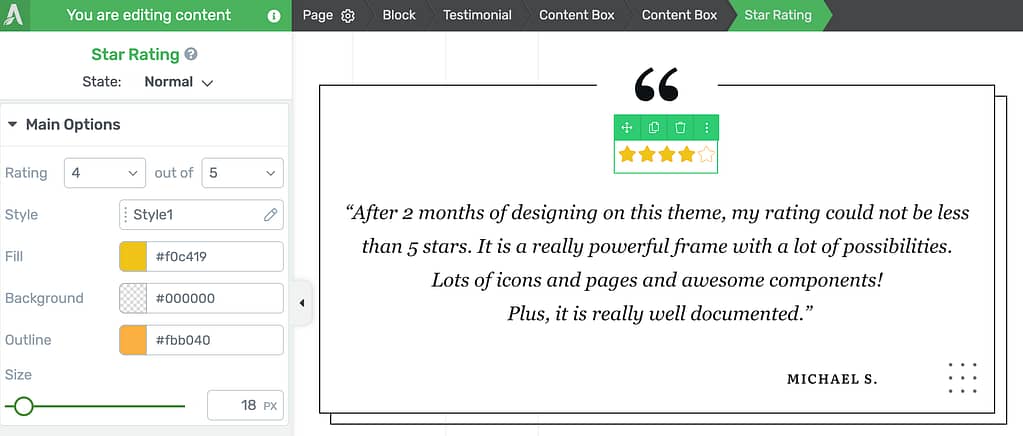
Once you drag and drop the element in your desired location you’ll see the Star Rating element on the page.
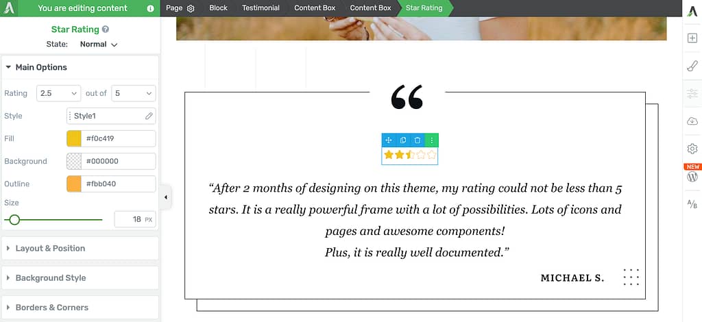
When on the page, click the star rating so you can customize it using the settings you see in the left column.
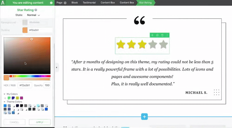
Changing the State of a Star Rating Element
Like many other Thrive Architect elements, the Star Rating element comes with two states – Normal, for when it is seen on the page, and Hover, for when a user hovers over it.
You can customize to change the look of the star rating in both these states.
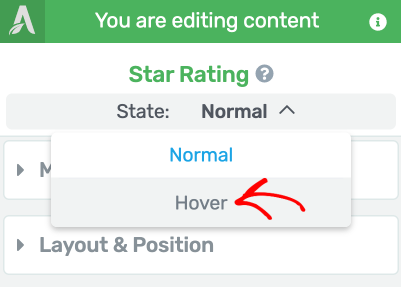
To change the state, click on the Star Rating to open its editing options in the left column.
In the left column, change the State of the Star Rating by clicking the down arrow besides Normal.
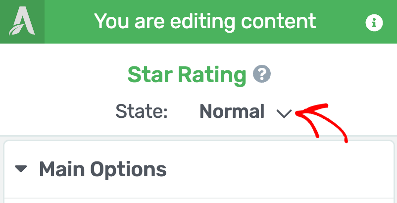
When you click to change the state, you’ll see two states that you can select from and edit the star rating accordingly.
To edit the star rating styling that’ll show up when the user hovers on it, select the Hover state here.
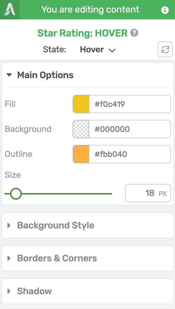
When you select the Hover state of the Star Rating, you’ll see the available settings for this
state in the left column.
In the Hover state, you can edit the Fill, Background, and Outline colors of the Star Rating element along with the size. All these options are also available for the Normal state of the Star Rating element that we’ll be seeing further in this document.
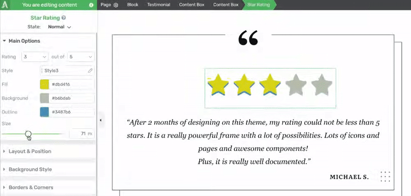
Using the Main Options of the Star Rating Element
The Main Options of the Star Rating element allow you to customize the main look of it. They enable you to do the following.
- Setting the Rating for the Element
- Selecting a Style for the Star Rating Element
- Selecting a Fill Color for the Star Rating Element
- Selecting a Background Color for the Star Rating Element
- Selecting an Outline Color for the Star Rating Element
- Setting Up the Size of the Star Rating Element
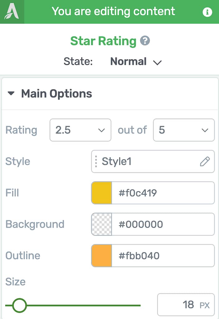
Setting the Rating for the Element
When you’ve added the Star Rating element on the page, you’ll have to select the rating you want it to show. To do so, use the fields beside the Rating setting under Main Options.
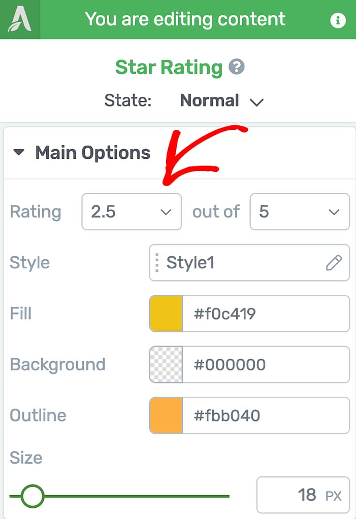
The Rating setting allows you to select the total value and the rating you want to display.
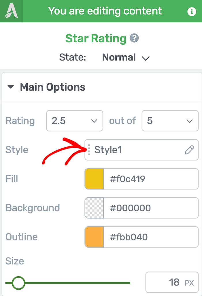
Selecting a Style for the Star Rating Element
Once on the page, you can edit the style of the star rating element.
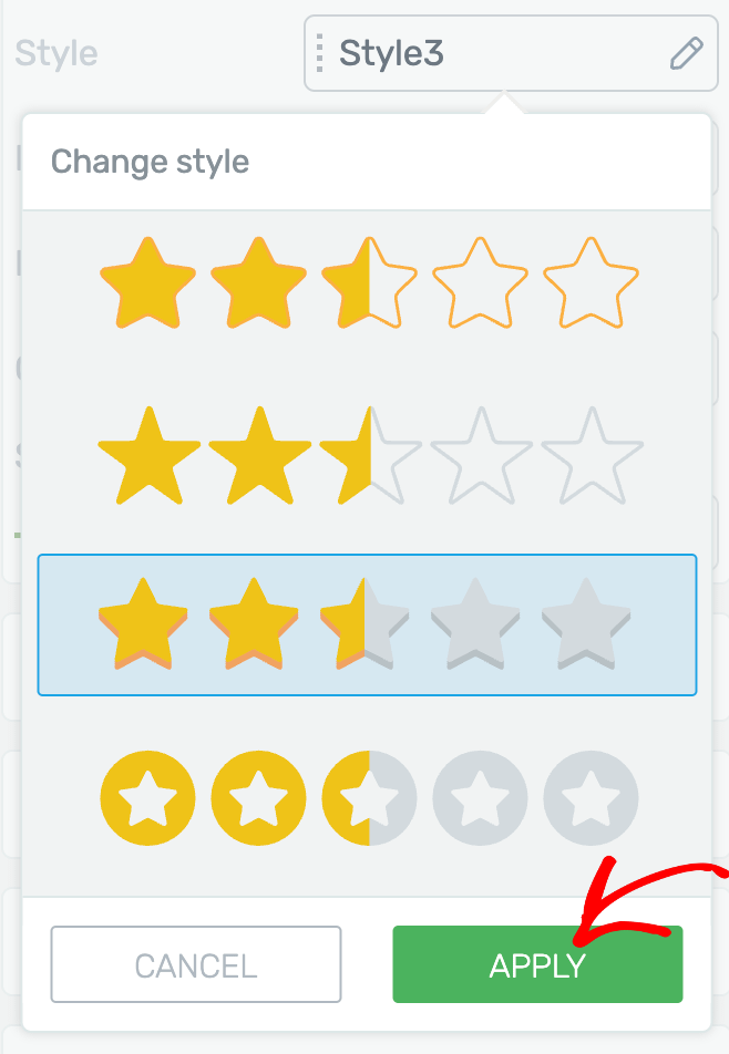
To edit the style, first click on the field beside Style.
Clicking to edit the style, you’ll see a dropdown with available styles for this element.
In this dropdown, select the Star Rating style you want to use and click the Apply button.
Selecting a Fill color for the Star Rating Element
The Fill setting will let you set a color that the stars in the Star Rating element will be filled with.
To select change the color, start by clicking on the color block or enter the hex color of the color you want to apply.
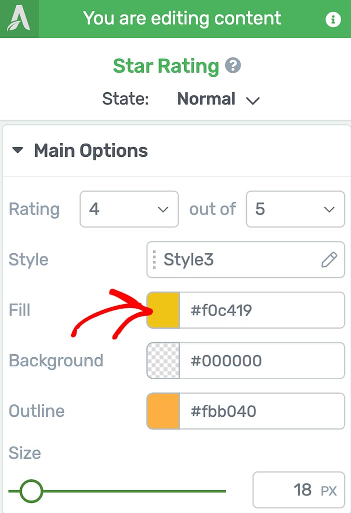
When you click on the color block, select the color, the opacity, etc. that you want to use and click the Apply button.
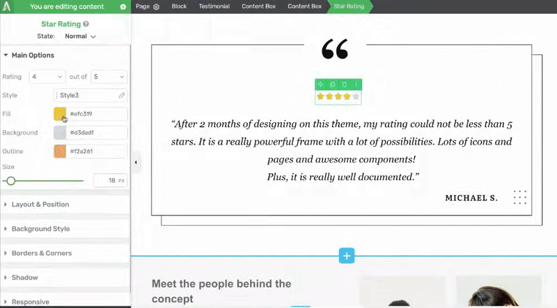
Selecting a Background Color for the Star Rating Element
The Background setting will let you set a color for the stars that aren’t filled with the fill color.
The fill color fills the stars matching the ratings and the empty stars are filled with the background color.
To select change the color, start by clicking on the color block or enter the hex color of the color you want to apply.
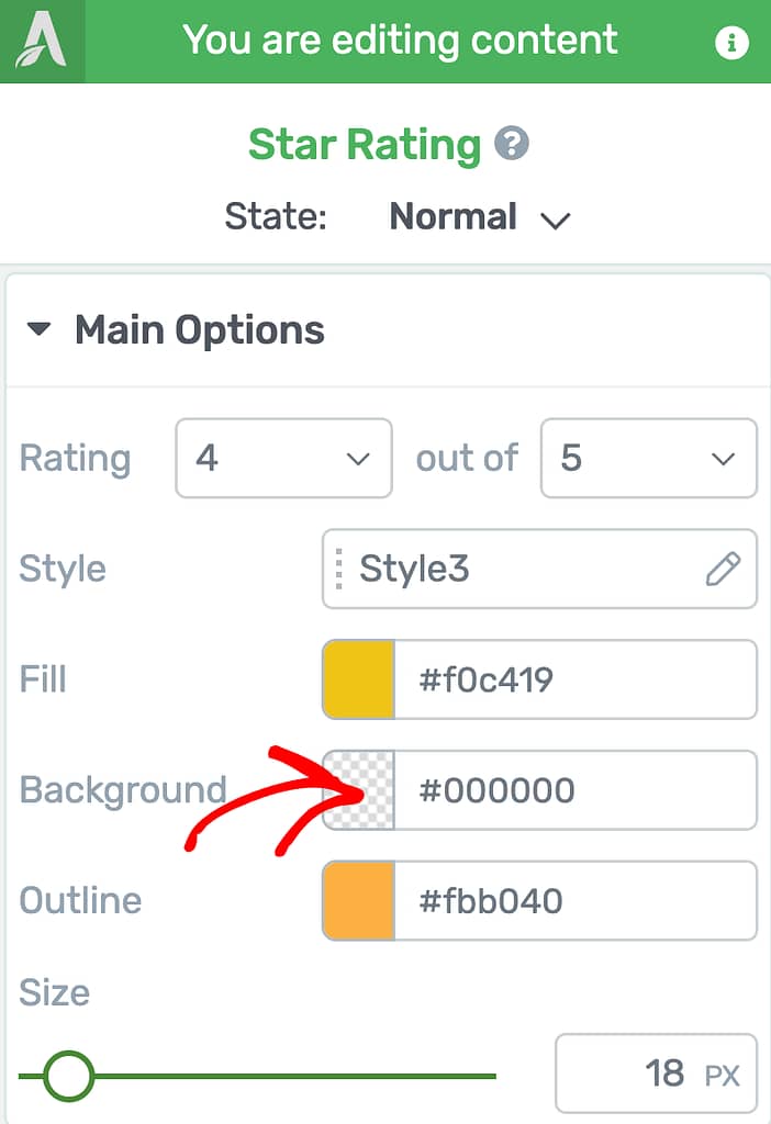
When you click on the color block, select the color, the opacity, etc. that you want to use and click the Apply button.
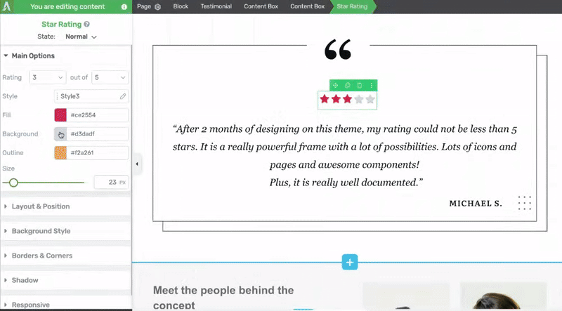
Selecting an Outline color for the Star Rating Element
The Outline setting will let you set an outline color for the stars in the Star Rating element.
To select change the color, start by clicking on the color block or enter the hex color of the color you want to apply.
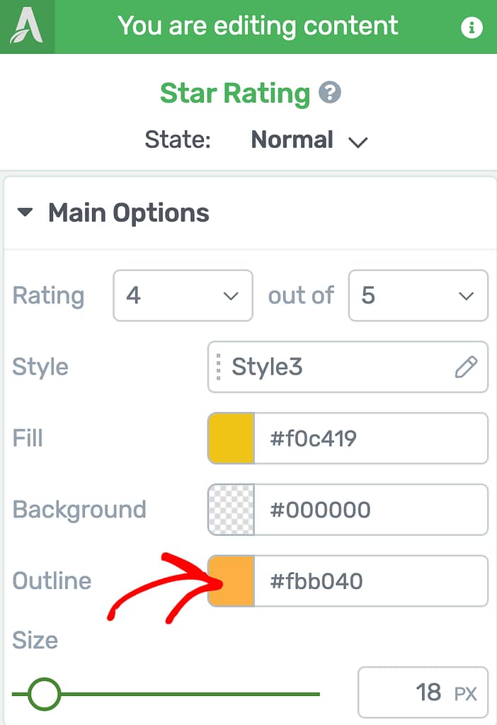
When you click on the color block, select the color, the opacity, etc. that you want to use and click the Apply button.
Setting Up the Size of the Star Rating Element
The Size setting under the Main Options of the Star Rating element lets you set the size of the element on the page.
To set the size, use the slider beside the setting.
Using Other Settings of the Star Rating Element
Just like the other Thrive Architect elements, the Star Rating element comes with additional options where you can manage the layout and positioning, background style, borders and corners, etc.
To learn more about these options, read the documents listed below.
- Using Layout and Position Options in Thrive Architect
- Using the Background Style Option in Thrive Architect
- Using Borders and Corners Settings in Thrive Architect
- Adding Shadows to Thrive Architect Elements
- Using the Responsive Option in Thrive Architect
While all these are available while editing the Normal state of the Star Rating element, only the ones listed below are available when you are editing the Star Rating element in the Hover state.
- Using the Background Style Option in Thrive Architect
- Using Borders and Corners Settings in Thrive Architect
- Adding Shadows to Thrive Architect Elements
We’ve just seen how you can add a Divider and a Star Rating on a page using Thrive Architect and customize it further. You can take a visual tour of this in the video below.
Next, do you want to add testimonials on your page to pair it up with the Star Rating element? The Testimonial element in Thrive Architect can be used to do that.