Are you looking to display engaging data or progress percentages on your website to capture your audience’s attention?
The Fill counter element from Thrive Architect makes it easy to showcase data, such as percentages, on your site – helping you communicate results and achievements visually and effectively.
In this article, we’ll show you how you can display percentages on your website using the Fill counter element and customize its look and feel.
- Adding the Fill Counter Element on a Page
- Using the Main Options of the Fill Counter Element
- Other Options of the Fill Counter Element
Adding the Fill Counter Element on a Page
To add a Fill Counter element on a page, please ensure you’ve created a page using Thrive Architect.
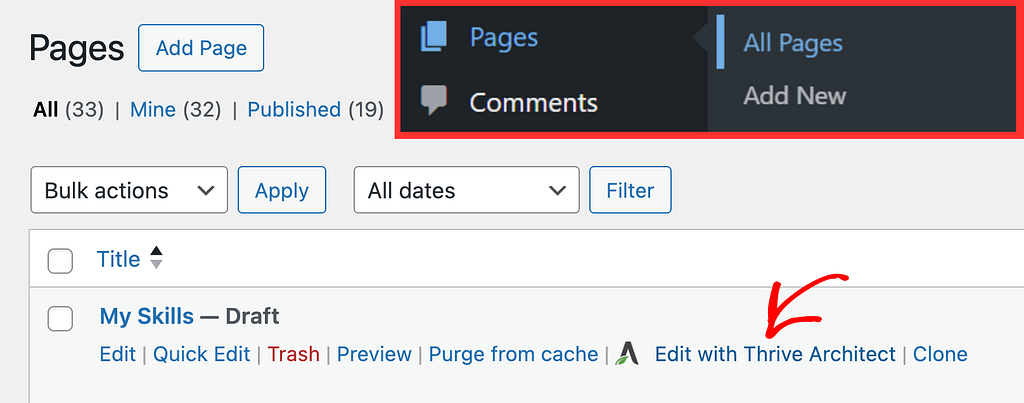
To begin, open your WordPress admin area, navigate to Pages >> All Pages, hover on the page and click Edit with Thrive Architect.
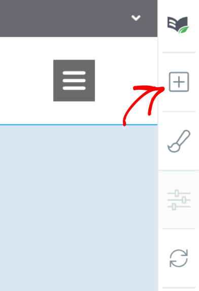
In the Thrive Architect editor, in the right panel click on the plus (+) icon.
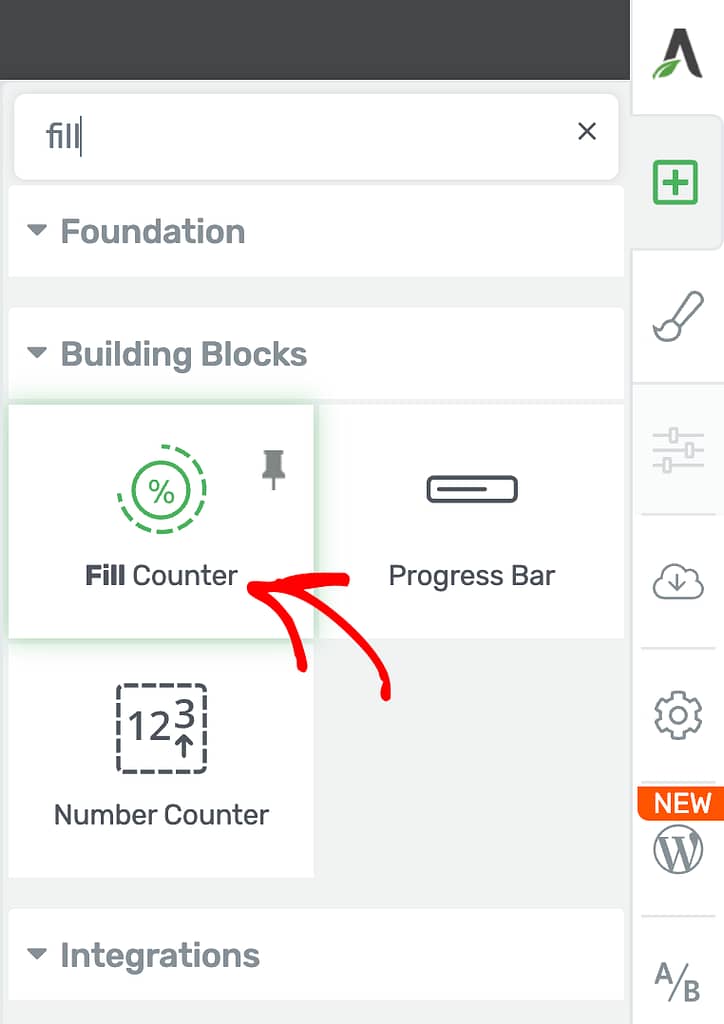
When you click the plus icon, you’ll see the list of Thrive Architect elements you can use on the page. In this list, search, drag and drop the Fill Counter element on the page.
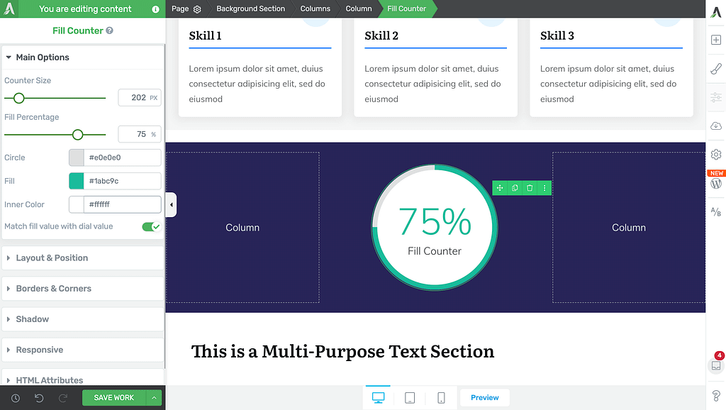
When you drag and drop the element on the page, you’ll see it added in the section you dropped it in and its Main Options open in the left column.
Using the Main Options of the Fill Counter Element
Like the other Thrive Architect elements, the Fill Counter element comes with Main Options that you can use in the left column.
To open the element’s Main Options, click on the Fill Counter element on the page and see the Main Options open in the left column.

Under the Fill Counter element’s Main Options enables you to:
- Setting the Counter Size
- Setting the Fill Percentage
- Selecting the Outer Circle Color
- Selecting the Filled Circle Color
- Selecting the Inner Circle Color
- Matching the Fill Value to the Dial Value
Setting the Counter Size
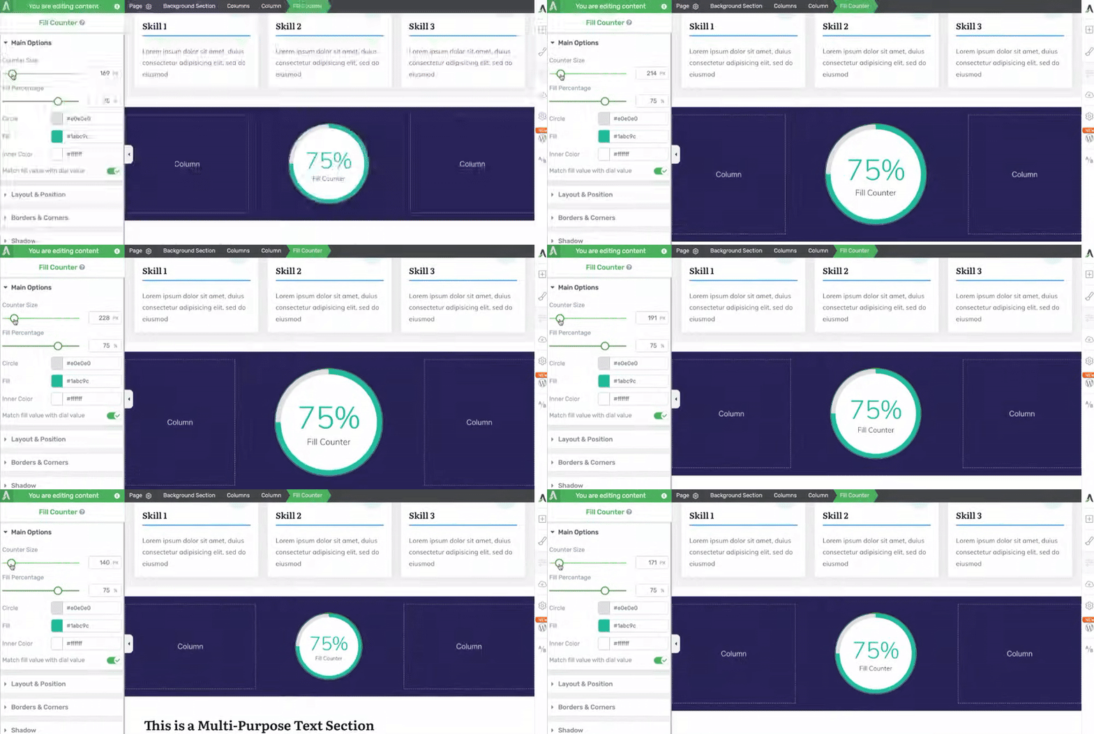
The Counter Size setting allows you to set the size of the counter displayed on the page.
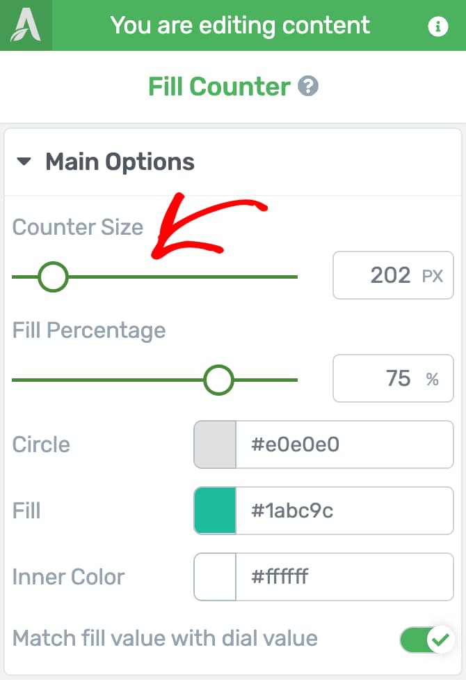
To set the counter size, use the slider beside the option.
Setting the Fill Percentage
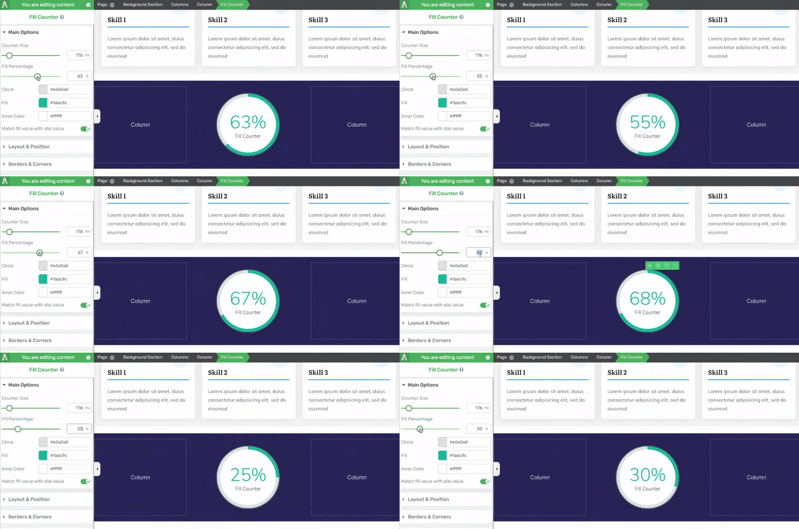
Fill Percentage is the main setting that this element is made for. This setting will display the specified number inside the circle and fill the circle background as per the value set here.
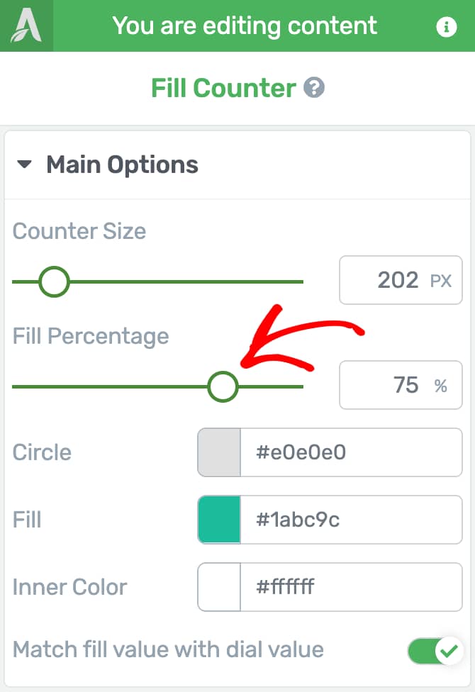
To set the value here, use the slider beside the option or enter a number in the given box.
Selecting the Outer Circle Color
The Circle color in the Main Options represents the circle background color you see on the Fill Counter element.
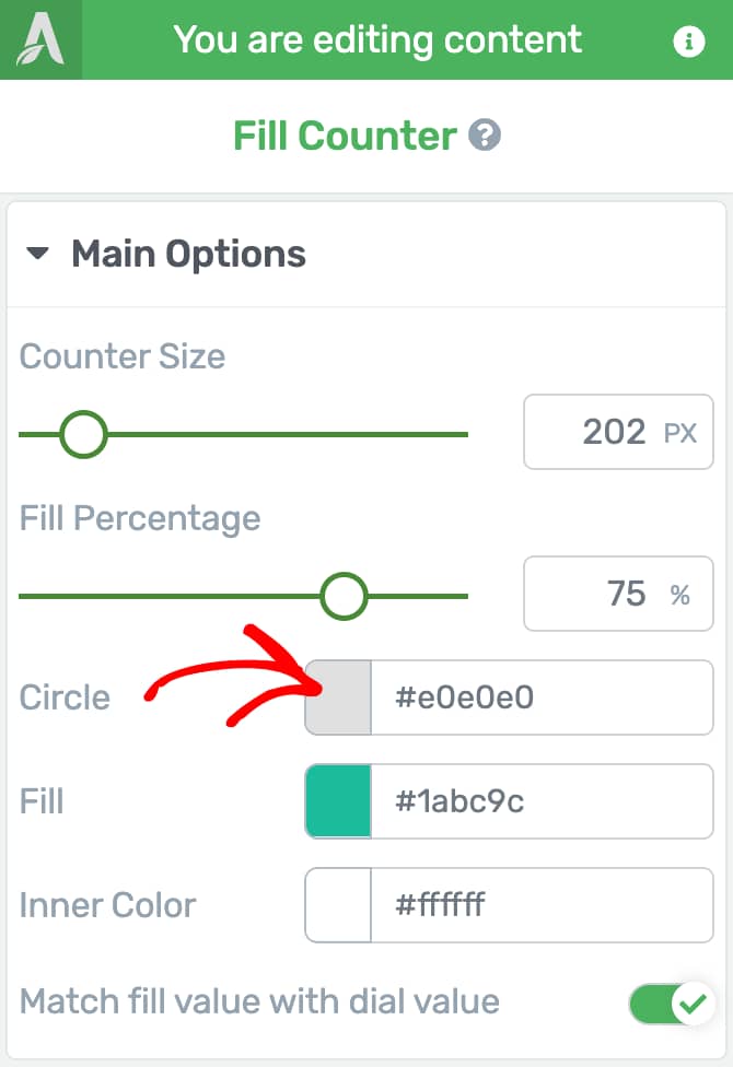
To set the outer circle color of the element, click on the Fill Counter element on the page, under the Main Options, click on the color beside Circle, and use the color picker to select a color and click Apply.
You can also use the color hex code if you have it ready.

Selecting the Filled Circle Color
The Fill setting allows you to select the color of the circle being filled. This will change the color of the part of the outer circle that gets filled based on the fill percentage you enter.
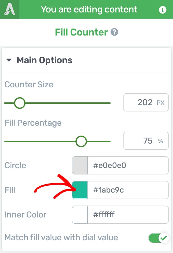
To set the Fill color, click on the color beside the Fill setting, select the color from the color-picker and click the Apply button.
You can also use the color hex code if you have it ready.
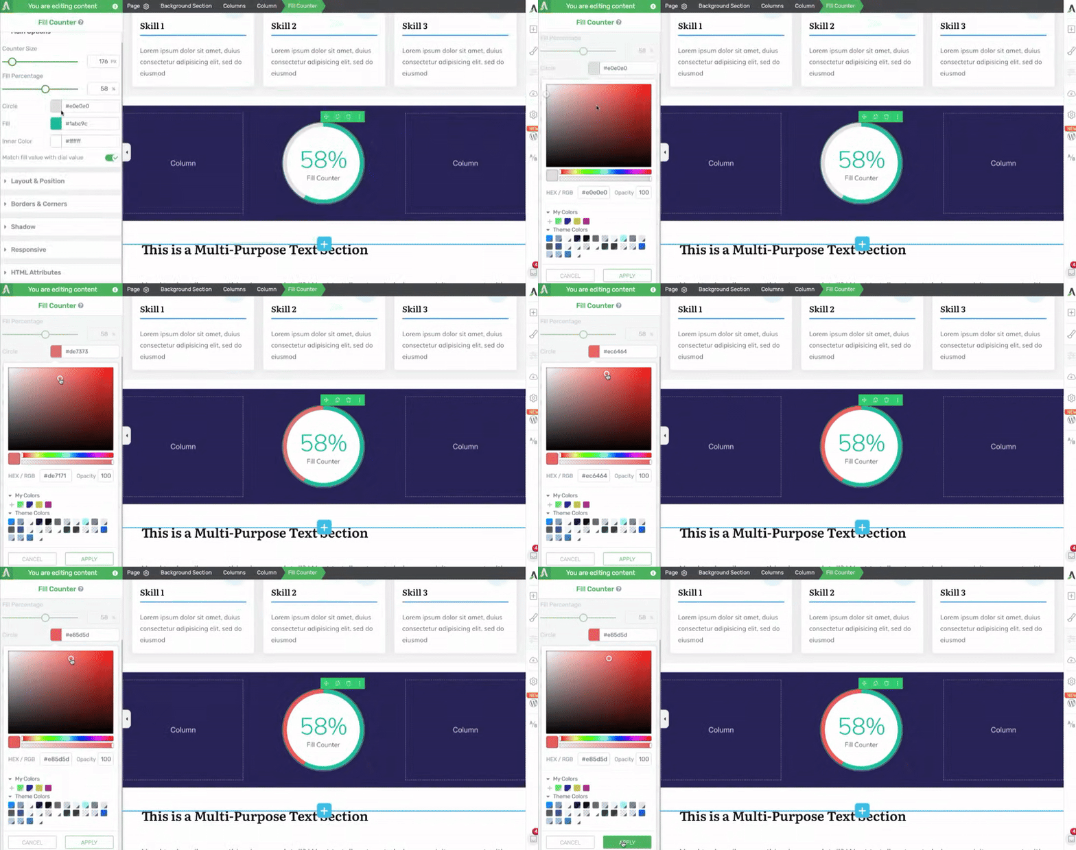
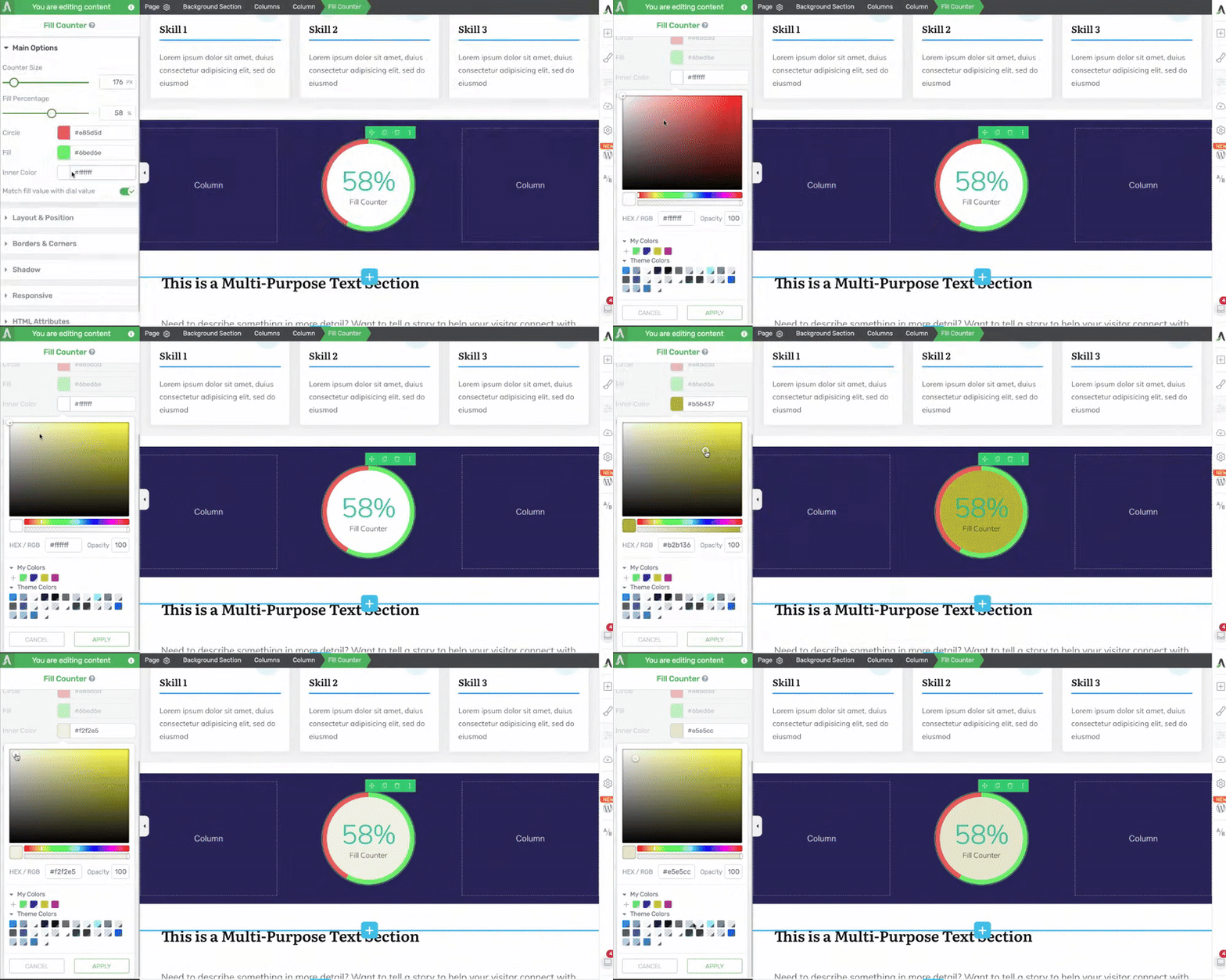
Selecting the Inner Circle Color
The Inner Color setting lets you set the color that’ll be reflected in the inner circle of the Fill counter element.
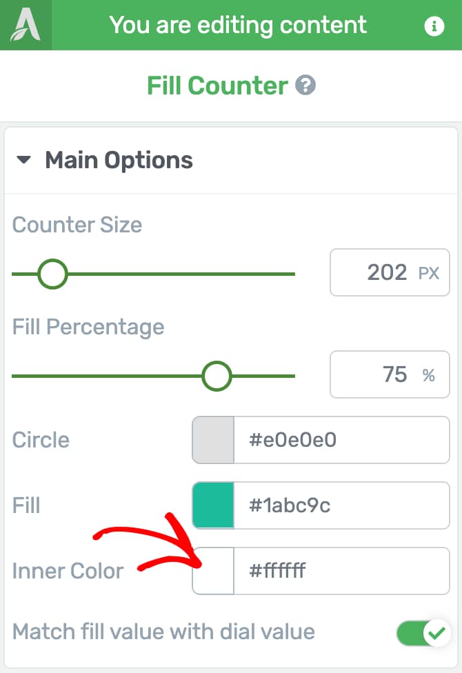
To change the inner circle color, click on the color, select the color from the color-picker, and click on the Apply button.
Matching the Fill Value to the Dial Value
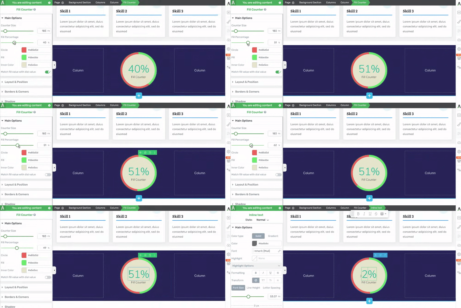
This setting when enabled will keep the percentage numerical and the fill percentage in the circle connected.
The Match fill value to dial value is enabled by default. This means that when you edit the Fill percentage value in the settings, the outer circle is filled matching that percentage.

When you disable this setting, the percentage numerical inside the circle can be edited by clicking on it. This value won’t reflect in the outer circle fill percentage.
Other Options of the Fill Counter Element
Just like the other Thrive Architect elements, the Fill Counter element comes with additional options where you can manage the layout and positioning, borders and corners, shadows, etc.
To learn more about these options, read the documents listed below.
- Using Layout and Position Options in Thrive Architect
- Using Borders and Corners Settings in Thrive Architect
- Adding Shadows to Thrive Architect Elements
- Using the Responsive Option in Thrive Architect
- Using HTML Attributes in Thrive Architect
We’ve just seen how you can add and customize a Fill Counter element on a page using Thrive Architect. You can take a virtual tour of this element in the video below.
Next, do you want to add a number counter on your website? The Number Counter element in Thrive Architect will let you display an animated counter to display numbers on your website.