A hover effect is the alteration of the appearance of an element once you move the cursor around and it reaches a certain element, even if it has not been selected:

You can use this feature to:
-
emphasize different elements;
-
provide more information about a certain piece of content (adding tooltips on hover, for example);
-
attract users to a specific part of the page that changes its appearance when someone hovers over it;
-
make it more obvious for the users that they can interact with a certain element;
-
show the user the element they are about to click on;
|
Important! The hover state is not available for mobile/tablet devices. |
In Thrive Architect, you can modify and customize the way elements look upon someone hovering their mouse over them.
This article is a short guide showing you where to find the option and how to use it.
First of all, let’s see where the setting can be found.
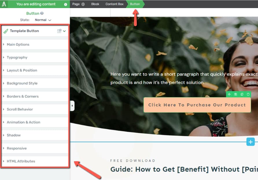
When editing elements such as the “Text”/”Image”/”Button” elements and others, while the element is selected, its options will appear in the left sidebar:
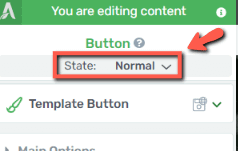
On the top side of the left sidebar, right below the name of the element, you’ll find the “State: Normal” section:
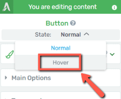
If you click on it, a dropdown opens, and you can select the “Hover” state:
As you do this,
-
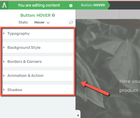
the left sidebar will be left with fewer options, just the ones that can be applied to the hover state of that specific element:
-
the element will be highlighted in the editor so that you can more easily visualize the changes you make to the hover state:

You can customize the appearance of the element in its hover state, as well as add animations if you see fit. This will really emphasize the element when someone moves their cursor over it.
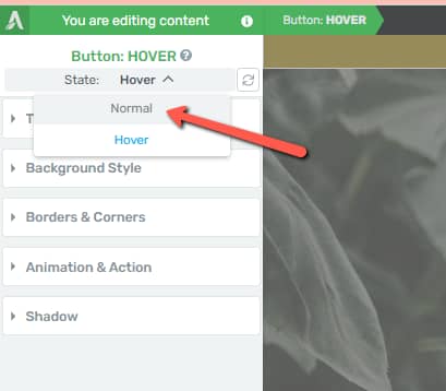
Once you’ve customized the hover state of the element, you can go back to the “Normal” state and continue setting it up:
Reset the Hover State
If you do not like the customization you have applied to the button in the “Hover” state, you can use the “Reset State” option to reset the “Hover” state of the button to match the “Normal” state:

In order to do that, simply click on the “Reset State” option and then, confirm that resetting the state is indeed what you want to do:

Here are some other resources related to customizing the “Hover” state of different Thrive Architect elements:
-
Create a Hover Effect Animation on a Button Element from Thrive Architect
-
How to Add a CSS Hover Animation to Your Opt-in Form Elements
I hope this article was useful. Don’t forget to check out our knowledge base for more information about Thrive Suite features!