When you are creating a hyperlink in Thrive Architect, there are various ways in which you can customize it.
These articles from our knowledge base go into more detail about how to apply links to various Thrive Architect elements, as well as how to use the hyperlink settings:
So after you’ve created your hyperlink, you will notice that there’s a new set of options available in the left sidebar:

These can be used to customize the way the hyperlink text looks when you hover over it. Besides the common options, such as color, formatting, size, font and so on, you also have some effects that bring a dynamic feel to your text.
Let’s have a look at each of the available options:
Main Options
Color
The color of the highlighted text can either be inherited from the page theme / template colors (and this is the option selected by default):

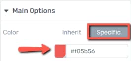
Or it can be chosen by you, if you click on “Specific”, and then use the color field to pick a different color:
Note: If you want to use the inherited colors, you can always access them from the Central Style Panel of the right sidebar:
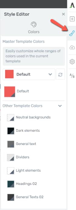
Here are some articles about the Central Style Panel found in our Smart Landing Pages and Thrive Theme Builder, and how you can use it:
- How to Use the Central Style Panel in the Thrive Theme Builder Editor
- What are Smart Landing Pages and How to Use Them
Highlight
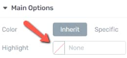
From here, you can pick a highlight color for your text:
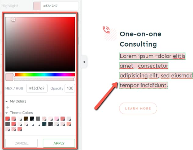
Choose the desired color from the color field, and you will notice how the highlight is automatically added to your selected text:
Font
Next come the font options:

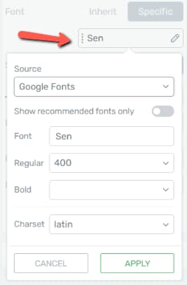
Here as well, you can choose to inherit the theme / template font, or pick a different one from the available list of fonts:
Size
The sizing can also be inherited or manually adjusted by you, in the next section of the sidebar:

Formatting
The “Formatting” options work just as in the case of any other text – you have the “Bold”, “Italic”, “Underline” and “Strikethrough” options to choose from:

Effect
Here’s where you can apply an effect to your underlined text:
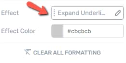
If you open the first field, you will get this list of available effects:
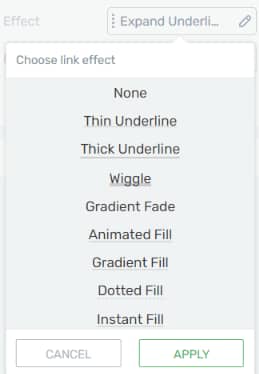
To see how the effect works while you are still in the editor, you first have to select it and save your changes:
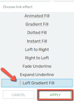
Then simply hover over the text to see how it would look like on the front-end:
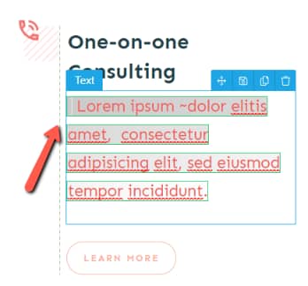
In the above example, I have a “Left Gradient Fill”, and the color of the gradient is a light grey. This can be changed from the following section of the left sidebar.
Effect Color
Open the color field available here, if you want to change the color of the effect that will be applied to your hyperlink:
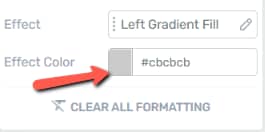
Clear All Formatting
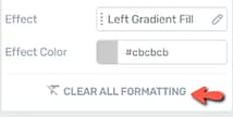
If you want, you can click on the “Clear All Formatting” button and that will reset the hyperlink to what it looked like right out of the box:
Shadow
This is another tab of the left sidebar, that can be used if you want to further customize your text:
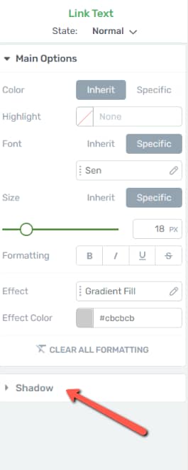
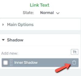
Depending on the effect you’ve chosen earlier, you might already have a shadow added to your text. You can simply remove it from the trash icon, if you want:
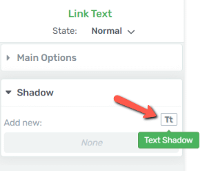
Then, click on the “Text Shadow” to add a new one:
This will open a pop-up with the following options:
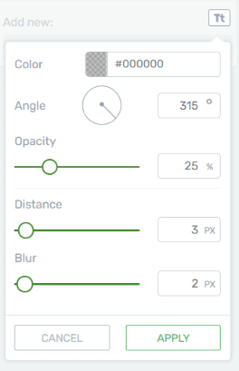
All these options are explained in a separate article from our knowledge base:
These are the ways in which you can use the left sidebar options to customize the look of any hyperlink you create on your website.