Do you want to display an image gallery on your website in the carousel style? This is possible when you use the Image Gallery element in Thrive Architect.
In this article, we’ll show you how you can enable the Carousel style for an Image Gallery on the page and customize it further.
Enabling the Carousel Style for an Image Gallery
When you add an Image gallery to a page, click on it to open its settings in the left column.
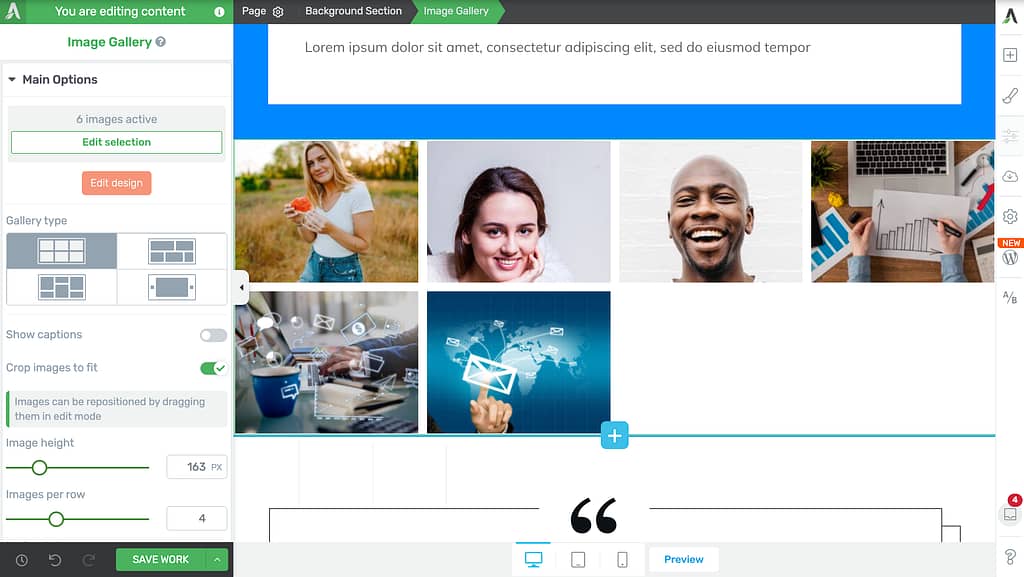
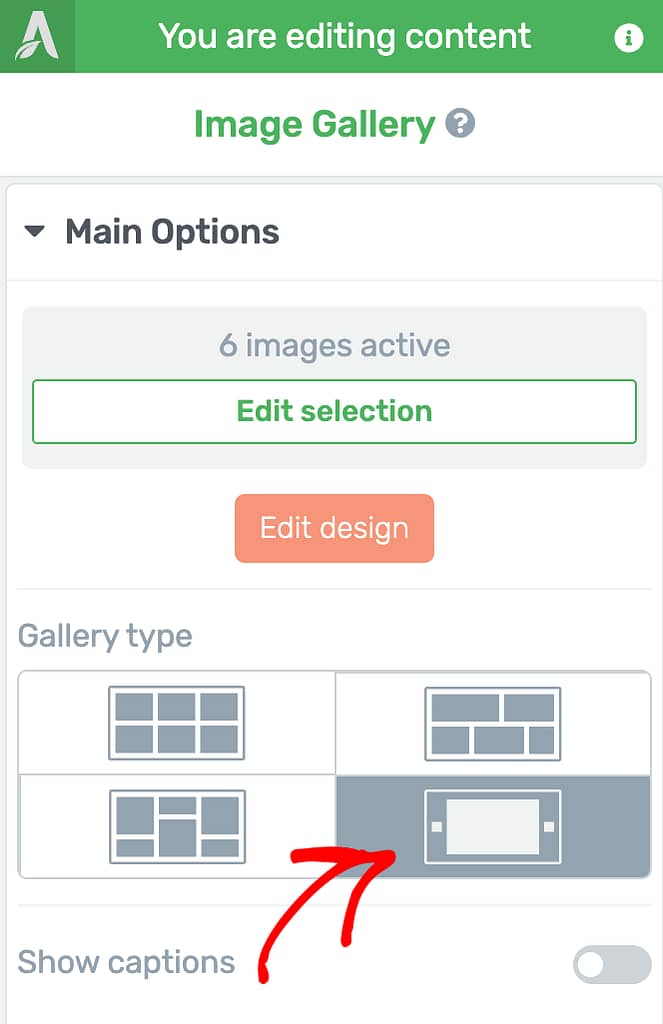
In the left column, under Main Options, go to Gallery type and click on the Carousel layout.
As soon as you select to set the image gallery type as Carousel, you’ll see that reflected on the page in the editor.

Customizing the Image Gallery Carousal
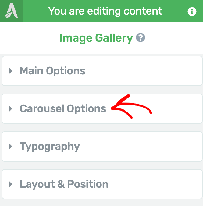
When you set the Image Gallery type to Carousel, you’ll see a new setting option called the Carousel Option in the left column.
To open the settings for the image gallery carousel click to open the Carousel Options.
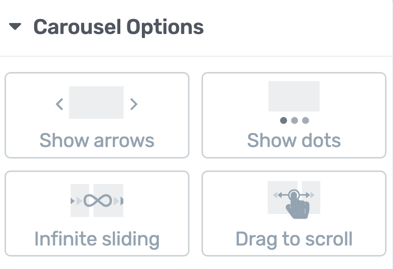
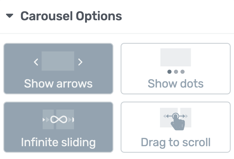
The Image Gallery Carousel Options have settings that ease the following.
- Selecting a Carousel Navigation Style
- Selecting the Number of Slides to Scroll
- Selecting the Number of Columns
- Autoplaying the Carousel
- Overlapping End Items
- Enabling Adaptive Carousel Height
- Enabling Uniform Slides Height
- Managing the Vertical Positioning
- Enabling Single Slide Fader
Selecting a Carousel Navigation Style
The first setting under the Carousel Options lets you select the carousel navigation style for your image gallery. In this section you can set to apply one or multiple styles to your gallery.
The available carousel navigation styles for an image gallery are as follows.
Show arrows
When you select to show arrows, you’ll see arrows added on the right and left of the carousel. These arrows will make it easier to navigate through the image gallery items.
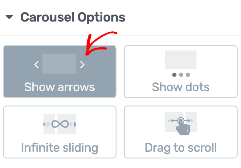
When you select to show arrows in the carousel you’ll see them added to the left and right of the carousel.

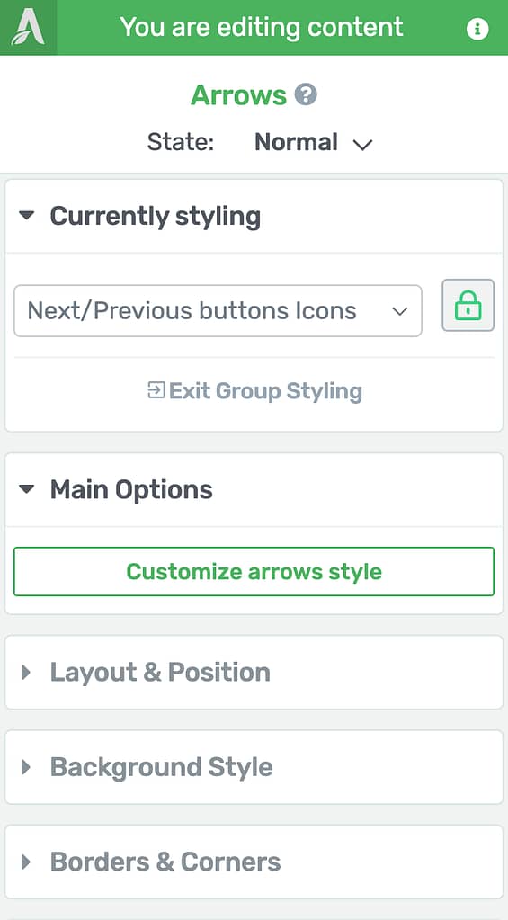
To edit the arrow icon, color, etc. click on the arrow to open the settings in the left column.
In the left column, edit Arrow options just like any other Thrive Architect element.
Show dots
When you click to show dots on the carousel, you’ll see the dots added under the image gallery carousel. This makes it easier to navigate through the carousel by clicking on the dots.
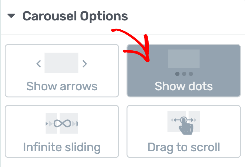
When you choose to show dots, you’ll see them added under the carousel helping you to navigate through the gallery.

To edit the dots’, color, etc. click on the dots to open the settings in the left column.
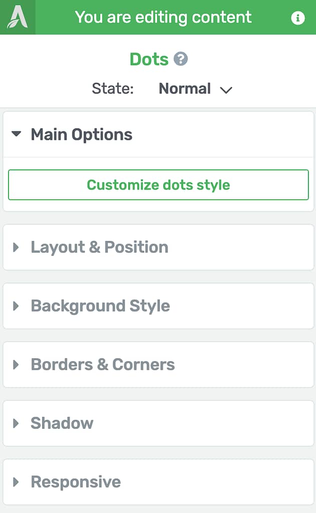
In the left column, edit Dots options just like any other Thrive Architect element.
Infinite sliding
The infinite sliding option allows you to enable infinite sliding for the image gallery carousel. When you enable this option, the carousel will continue showing images, i.e. the image series will restart after the last image in the queue.
After you enable the infinite scroll option, users can navigate through the carousel without an end. This means the first image in the gallery will queue up after the last and go on.

Drag to scroll
Enabling the drag to scroll option will let users drag the images to scroll through the gallery in the left or right direction.
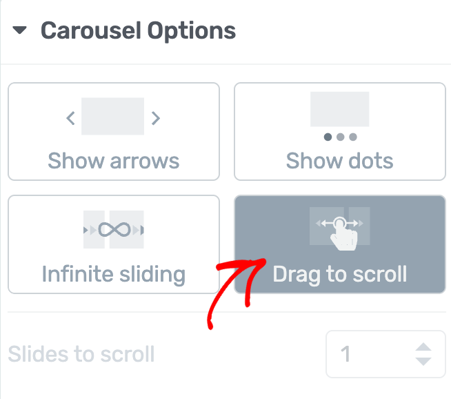
When you select drag to scroll, users can scroll through the image gallery by dragging images in the direction they want to go.

Selecting the Number of Slides to Scroll
This setting will allow you to select the number of images or slides that should be scrolled through on one click. You can use this setting when you choose to show arrows or dots on the image gallery carousel.
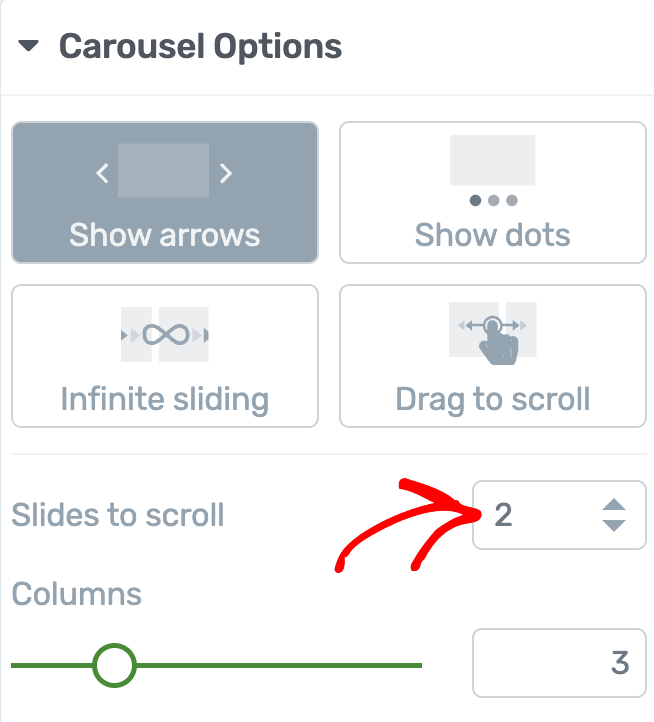
In the Slides to scroll field enter a value between 1 to 3 that’ll determine the number of images or slides that will pass when you click to scroll.

Selecting the Number of Columns
When you set up an Image Gallery Carousel you can select the number of images or slides you want to display in one view by setting the number of columns.

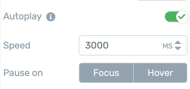
Autoplaying the Carousel
Autoplaying the carousal is only available when you are previewing the page. This is just a setting that’ll help you run through the image gallery before you hit publish.
To enable autoplay, click on the toggle button beside the setting.
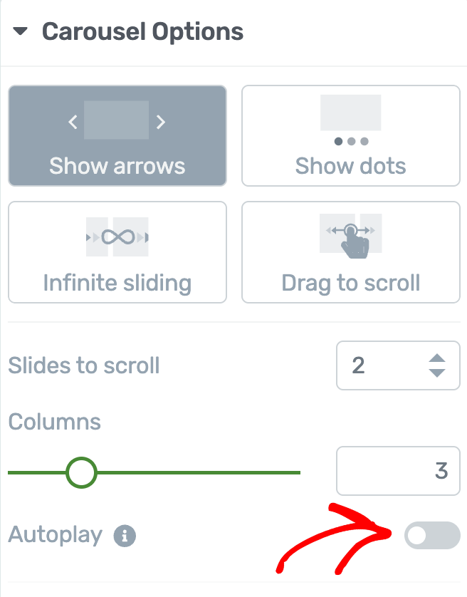
When you enable Autoplay, you can set the autoplay speed and when you want it to stop (on focus or hover) in the next settings.
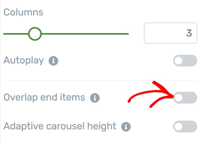
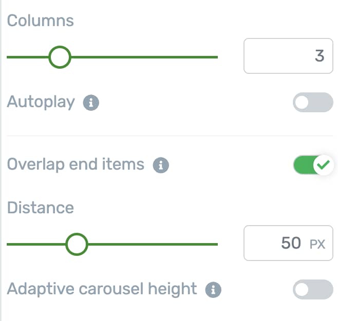
Overlapping End Items
The Overlapping end items settings lets you show a part of your previous and next slides on the carousel. This option is available only when Infinite sliding is active.
To overlap the end items click on the toggle button beside the Overlapping End Items setting.
When enabled, select the distance of the item that should be overlapped at the ends.
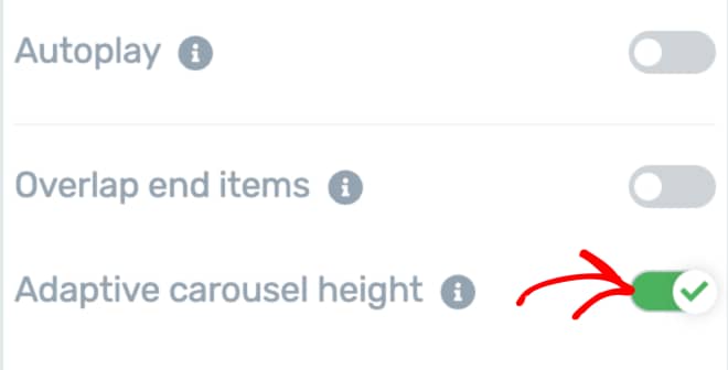
Enabling Adaptive Carousel Height
This option will change the number of columns to 1 and will adjust the height of the carousel based on the available content.
To enable this feature click on the toggle button beside the Adaptive carousel height.
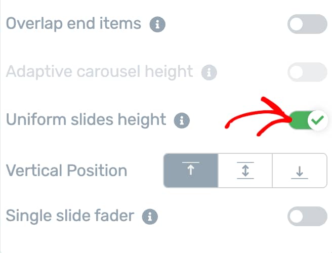
Enabling Uniform Slides Height
This option will ensure that your carousel slides are vertically consistent.
To enable this click on the toggle button beside the Uniform slides height.
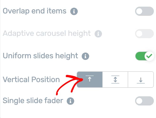
Managing the Vertical Positioning
The Vertical Position setting lets you decide the vertical alignment of images or slides within a carousel.
To set the vertical positioning of the carousel, use the alignment options beside this setting.
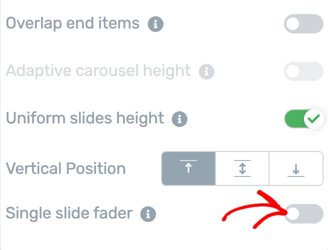
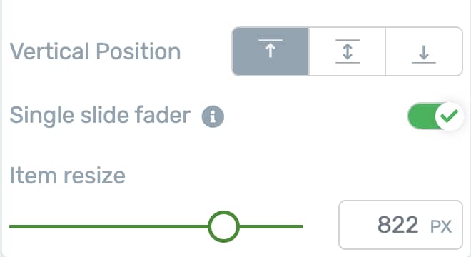
Enabling Single Slide Fader
This option will display a single image per slide with a fading transition
To enable a single slide fader, click on the toggle button beside this setting.
When you enable this setting, use the Item resize option to resize the image or slide as you want.
After you finish setting all of these as you want, scroll down and click the Save Work button to save changes on the page.
We’ve just seen how you can add and use the Carousel Options for an Image Gallery in Thrive Architect.
Next, do you want to add color changing effects to images in an Image Gallery Carousel? Here’s our document that’ll help you do that.