The “Lesson List” element allows you to display your Thrive Apprentice lessons, courses, or modules anywhere on your posts or pages.
This article will explain how to add the element to your website and how to use its options in order to customize it as you best see fit.
Add the Element to the Post/Page
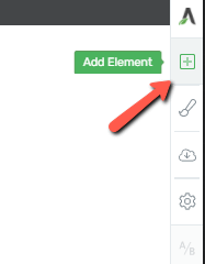
In order to start using the element, you first have to open a page or post with Thrive Architect, and then look for the plus sign in the right sidebar:
Look for the element within the list, or simply type its name in the search field:
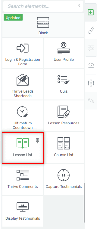
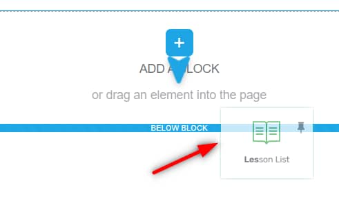
Once found, drag and drop it anywhere on your page:
As soon as you do that, a drop-down list will appear from where you will be able to select the Thrive Apprentice course you want to display:
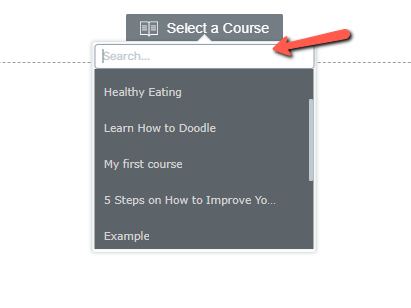
Select the desired course, and it will load automatically on screen:
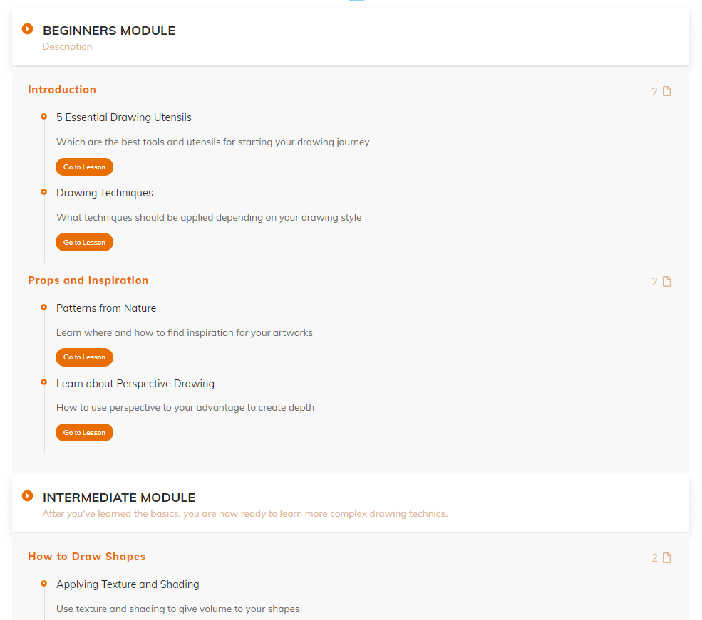
Note: if you are selecting an unpublished course, you will see this notification instead, letting you know that you have to publish it first:
Choose the Template
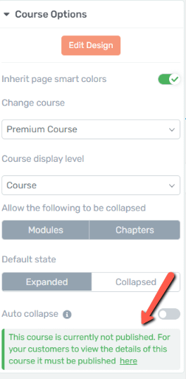
The first section of the left sidebar allows you to change the template of the course:
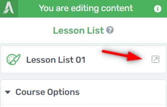
A lightbox will open with the list of available templates you can choose from. Select the desired one, and then click on “Replace Template”:
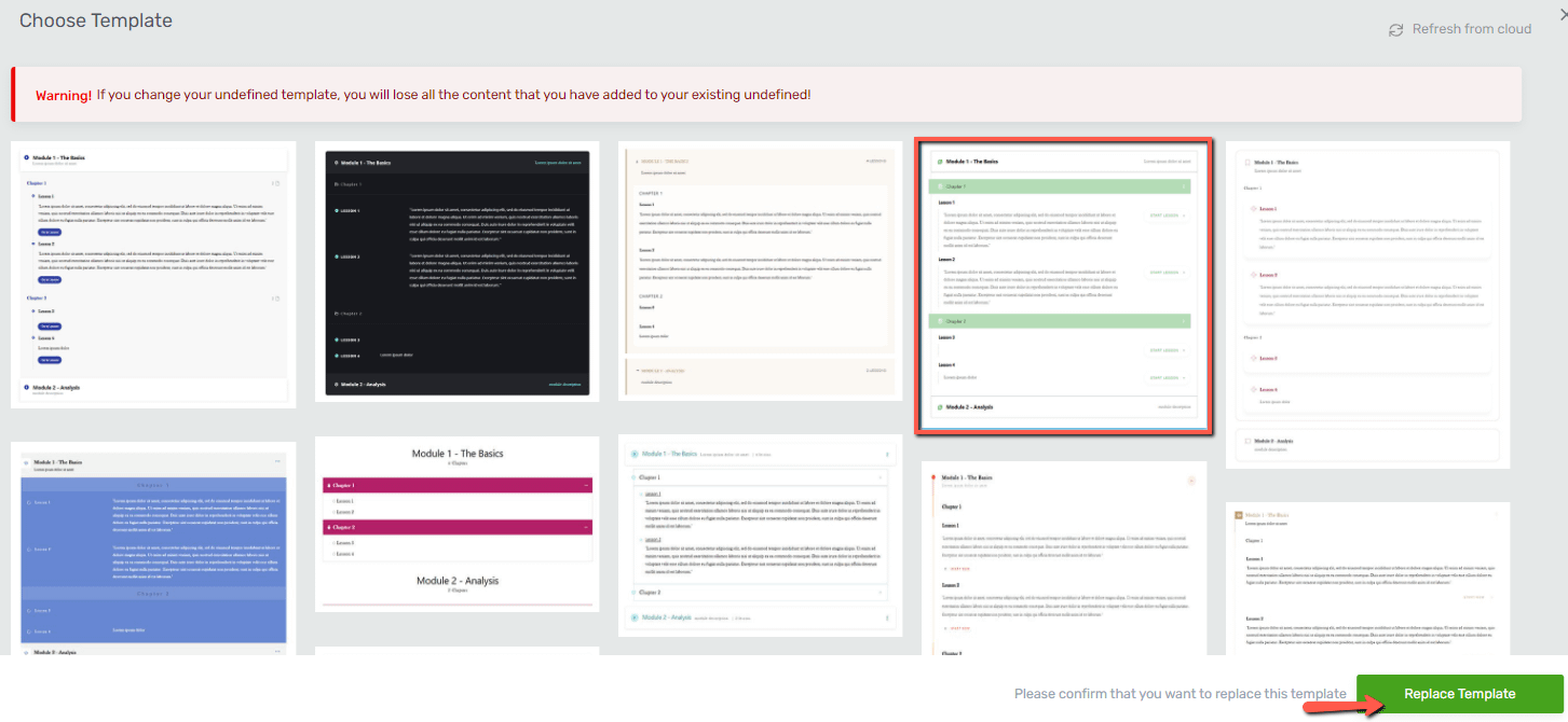
As simple as that your previous template has been replaced with the new one:
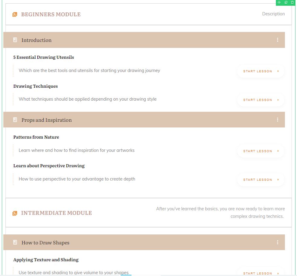
Use the Course Options
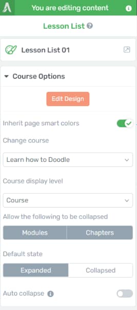
If you want to customize various aspects and items of the element, you can use the “Course Options” from the next section of the sidebar:
Edit Design
Click on the “Edit Design” button to enter the edit mode:

As soon as you do that, you will notice that all items of the course have become clickable and you can customize each one individually:
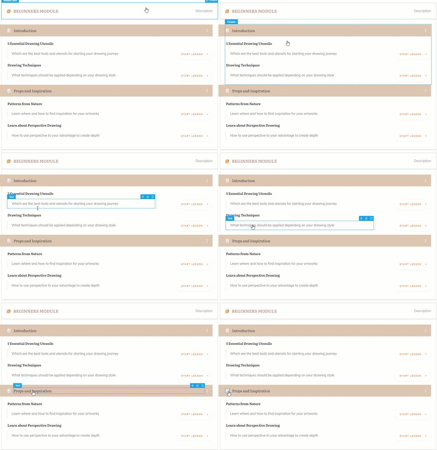
Hover over different items of the course structure, and click on the one you want to edit (in this example, I will edit a “Module Item”):
Main Options
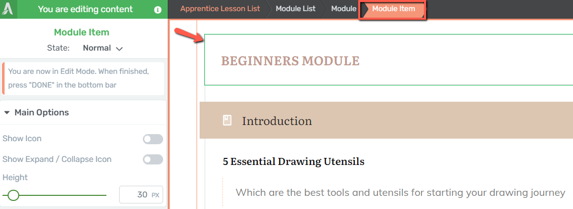
The corresponding options of the selected “Module Item” have appeared in the left sidebar:
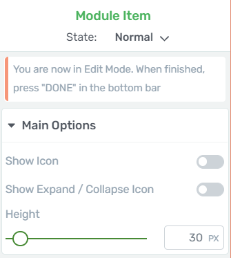
Any change brought to the item will be also visible on all items of the same type, so on all “Module Items” in this case.
- Show Icon
If you want to display in your “Module Items”, then activate the toggle next to the “Show Icon” text:
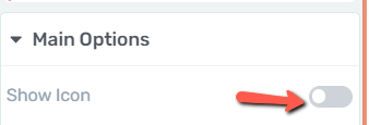
Once the toggle is active, the icon will appear in front of the module title:

You can go on even further here, and customize the icon itself if you want:
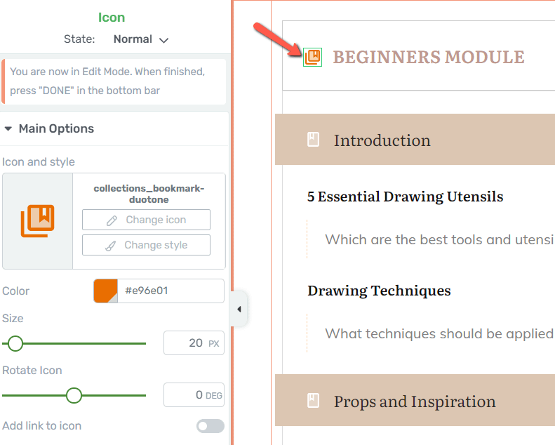
We have a separate article which you can read if you want to learn more about icons and how to use them.
- Show Expand / Collapse Icon
The next available option for customizing the “Module Item” allows you to display the expand / collapse icon:

After you activate the toggle you will be able to view the icon in your course structure:

This icon is customizable as well, so you can follow the same guidelines as in the case of all other “Icon” elements.
Now, whenever someone wants to view the full list of chapters and lessons available within the selected module, they can do so with the help of this icon:
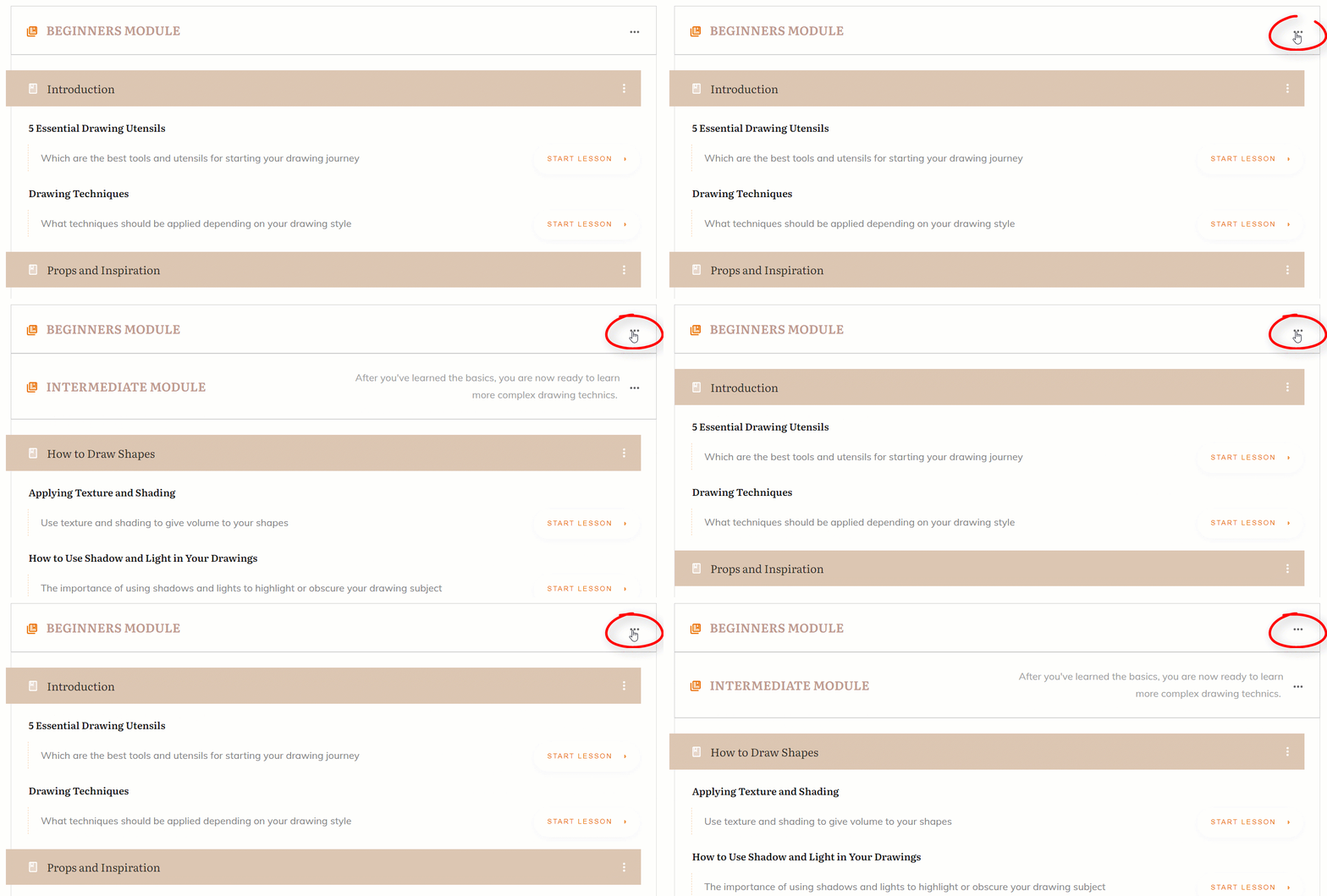
Use the breadcrumbs to go back to the “Module Item” options:

- Vertical position
If one or both icon toggles are active, then the “Vertical Position” option will appear on the left sidebar:
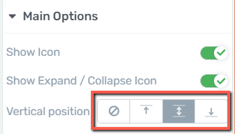
You can use one of the available buttons to decide what kind of placement you would like for each one of them, or for both at once:

- Height
Lastly, you can adjust the height of the “Module Item”, by dragging the slider from left to right or by inserting a numerical value in the field next to the slider:

These options are applicable in the case of editing a “Module Item” but the same guidelines apply if you are trying to edit a “Chapter Item” or a “Lesson Item”.
|
Important! Keep in mind that if you customize an item from the “Lesson List” element template, that change will be applied to all items of the same type: If, for instance, an item is deleted by mistake, it will be deleted from all places where that item appeared but can be easily re-added from the right sidebar: 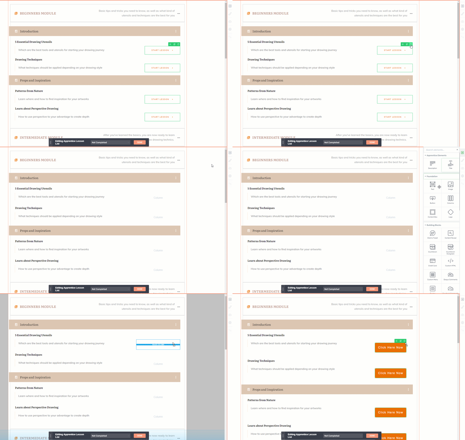 You can check out this article for more information about the “Group Styling” feature. |
You can also customize other items of the template as well, such as “Text” elements or “Button” elements. If you want to customize a button from the template, such as the one showcased above, the following options will become available in the left sidebar:
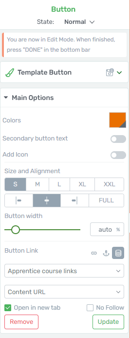
You can change the color of the button, add icons and secondary button texts, change its alignment and width as you best see fit. All options and how to use them are detailed in this article from our knowledge base.
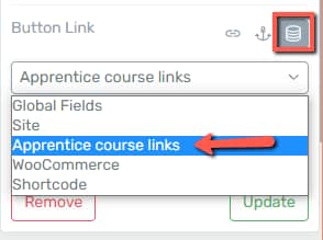
An important feature worth mentioning here is the “Button Link” one:
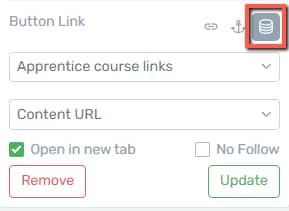
This feature allows you to apply a dynamic link to your button, and thus redirecting the user to the desired content ( in this case the “Apprentice course links”):
Important!
If the “Button” element is removed from the template and re-added from the right sidebar, it will not be linked automatically to the “Apprentice course links”. It will have to be linked again, using the steps detailed in this dedicated article.
States
Furthermore, you will notice on the bottom side of the editor a state management bar, from where you are able to switch between states as it follows:

You can thus customize the design of the course in each of the available states:
- The “Not Completed” state is what someone would see if that person has not yet started the course:

- The “No Access” state is what someone would see if they are not logged in or if they have not purchased the course:

- Naturally, the “Completed” state would allow the user to revisit the lesson if needed:

- For the “In Progress” state you can customize the way the lesson list looks when the student is already in the learning process, and has started the course:

- Lastly, for the “Locked” state the buttons will be greyed out, to inform the student that the lessons are currently locked with a “Drip” campaign and are not available yet:

Apprentice Elements
Besides the already existing elements you might already be familiar with, you will notice two additional ones, in the “Apprentice Elements” section – “Description” and “Title”:
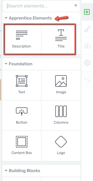
Note: these are only available while you are in the “Edit Design” mode of the “Lesson List” element, and they are also thoroughly explained in this article.
They come in handy if the description or title of your course has been removed from the template, or if the selected template does not have one of these two elements by default.
This way, you are not required to go back to your Thrive Apprentice course to copy the title or description of each course, but instead, you can simply drag and drop the desired element to your template, and content relevant to each of them will be displayed automatically.
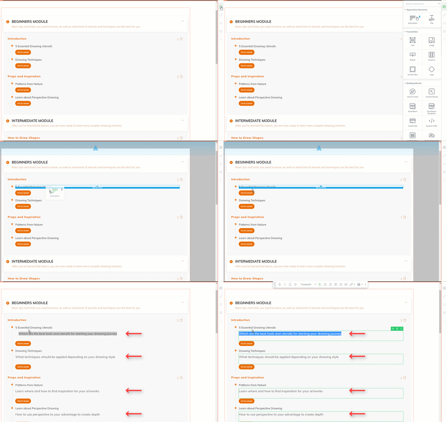
- Description
This element will display the description relevant to each lesson, chapter, or module, as you have set it in your Thrive Apprentice course:
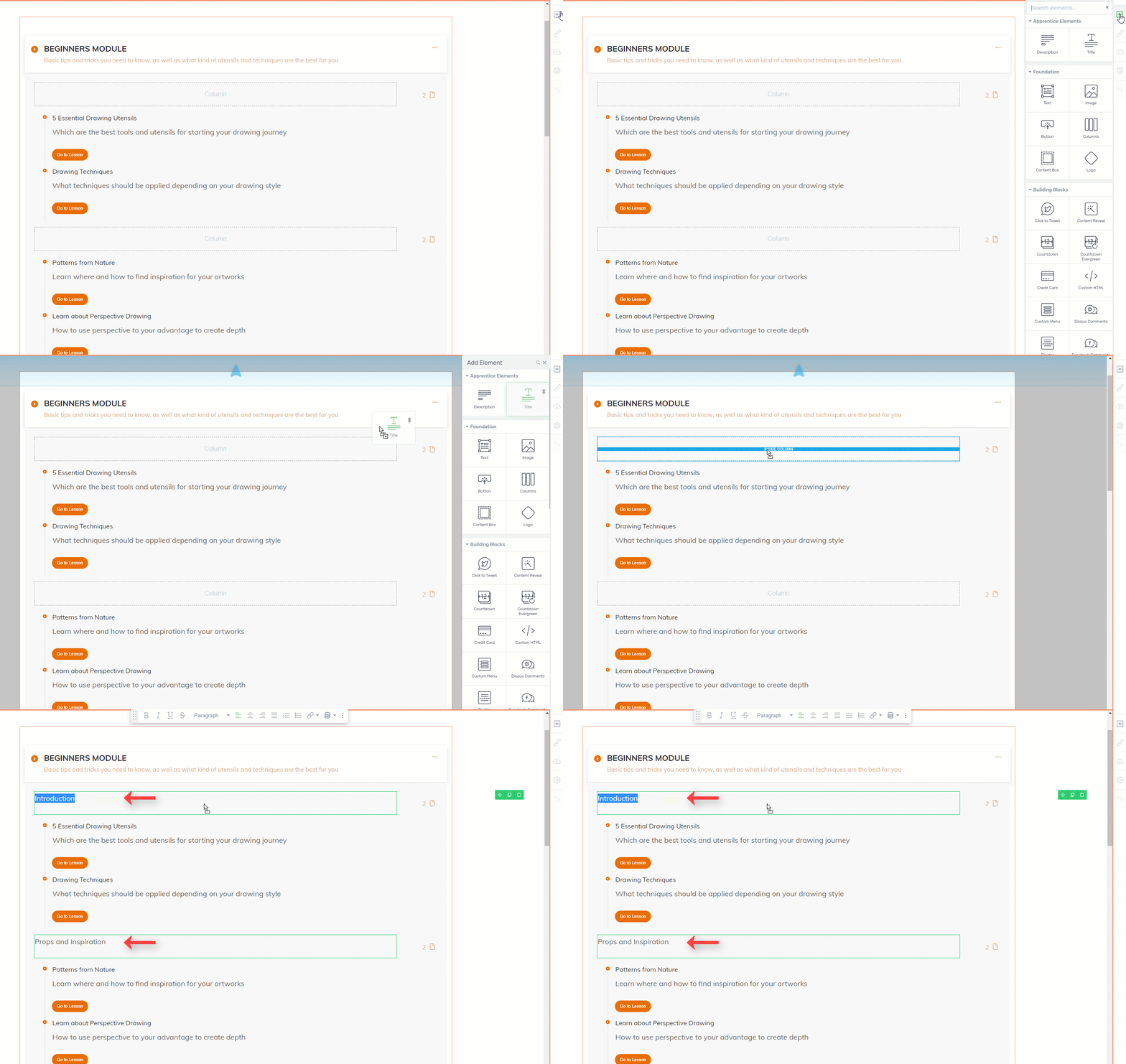
- Title
This element works exactly as the previously explained one, and it pulls the title of a module, chapter, or lesson from Thrive Apprentice, without having to manually copy it from your Thrive Apprentice course dashboard:
The text pertaining to each of these elements, as well as to other text items from the template, can be customized even further in terms of color, format, font, etc. This article explains how to use the options when editing a “Text” element.
|
Note: This is how you can use the “Edit Design” options when customizing a “Module” item from your element. The same principle applies when you are customizing a “Lesson” item or a “Chapter” one. If you are customizing a “Lesson” item, there’s a separate set of options you can use here:  You can, for example, enable the lesson type icon, which basically lets the student know whether the selected lesson is a video, text, audio one, and so on: 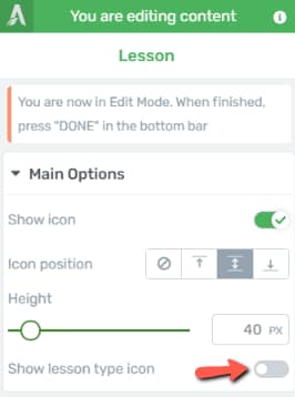 We have a separate article in our knowledge base that goes into more detail about how to enable and use this option, which you can find linked here. |
When you have finished with editing the element and want to exit the “Edit Design” mode, click on one of the two “Done” buttons located in the bottom part of the page:

This will automatically save your work and take you back to the “Course Options” sidebar of the “Lesson List” element:
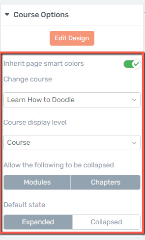
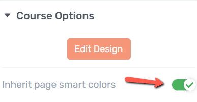
Inherit page smart colors
If the toggle next to this option is active, then the colors of the element will be inherited from the Thrive Theme Builder theme or Landing Page on which the element is placed:
Disabling the toggle will trigger a color field to appear in the left sidebar:
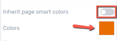
Click on it and use the color picker or a HEX / RGB code to change the color to the desired one:
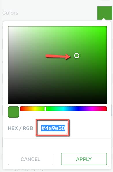
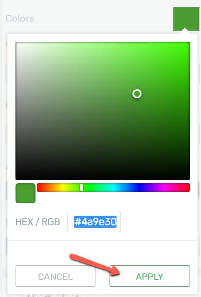
In order to save your changes and return to the “Course Options” sidebar click on “Apply”:
Change course
The following option allows you to change the course that is currently displayed on your page or post:
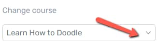
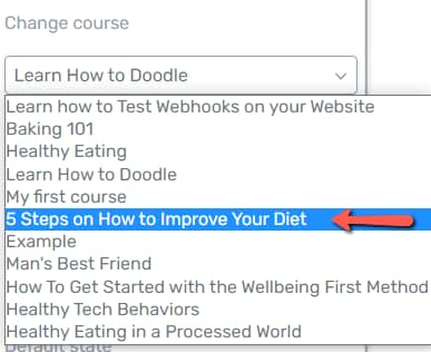
Open the drop-down to view the full list of available courses set up in Thrive Apprentice and simply select the one you want from there:
Course display level
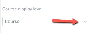
If you want to change the display settings of the course, click on the dropdown field under “Course display level”:
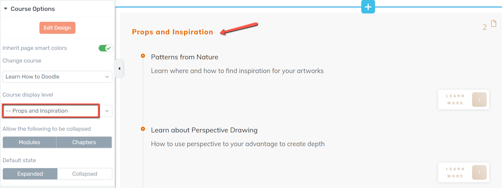
This feature will let you define which “top-level” item of the course structure will be displayed on your page or post:
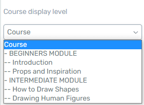
You can choose to display just the module, the chapter, or a lesson:
Allow the following to be collapsed
This option will define which items from the course structure will support being collapsed:
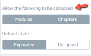
If both “Modules” and “Chapters” are disabled, then the “Default state” option, located right underneath, will not be available.
Default state
Just as mentioned above, with the help of this feature you can set the default state in which the “Module” and “Chapter” items will be displayed on your website:
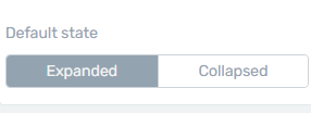
This is how the course would appear on your website if you opt for a “Collapsed” state for both “Modules” and “Chapters”:

And this is how it would be displayed if you choose the “Expanded” state:

Auto collapse
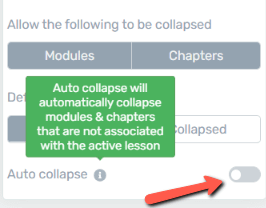
The “Auto collapse” option allows you to automatically collapse the modules and chapters that are not associated with the active lesson.
In order for this option to work, you have to make sure that you are using the “Lesson List” element in the content of one of your Thrive Apprentice courses.
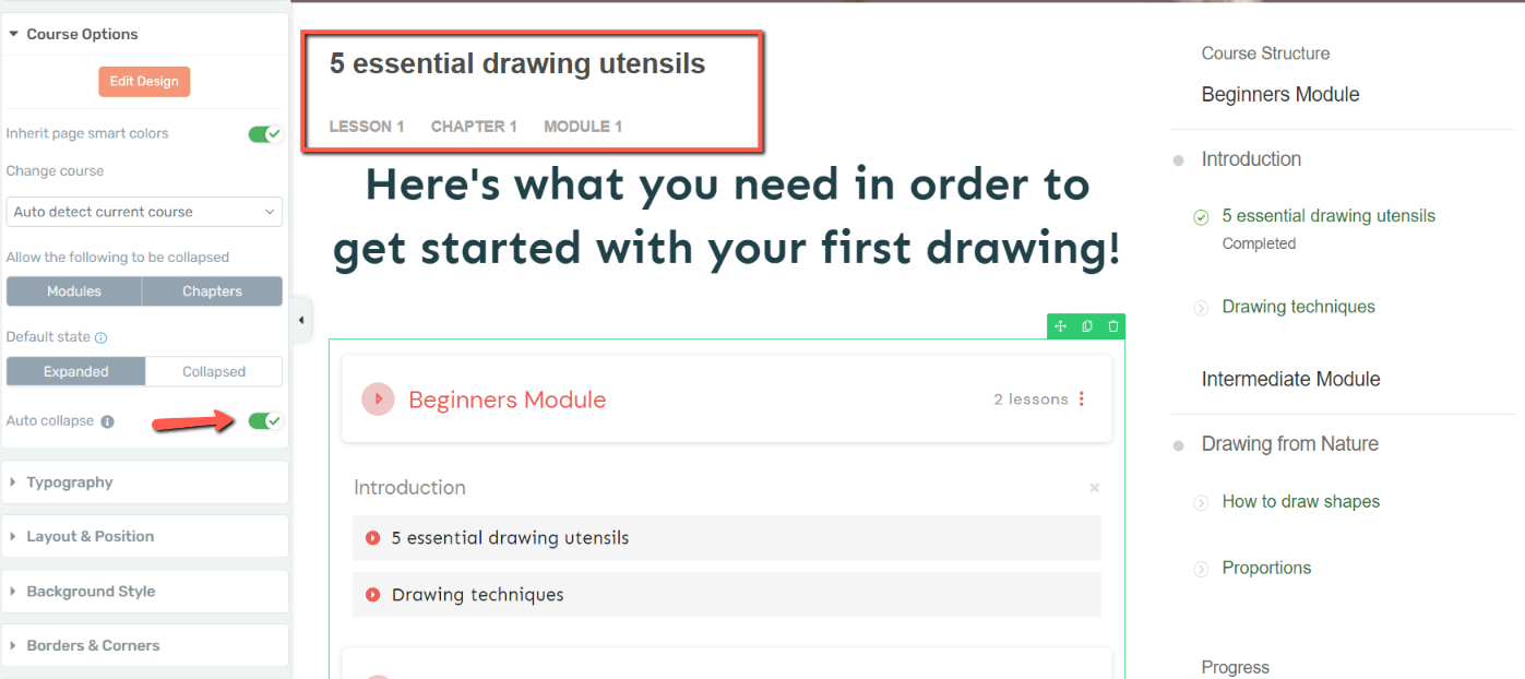
This way, the element will automatically detect the course and lesson in which it was placed, and thus, auto collapse the chapters and modules that are not active:
Here’s an example of an “Lesson List” element placed inside the first lesson of my Thrive Apprentice course:
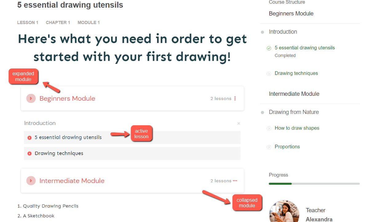
Now, with this toggle active, the students will only see the module containing the active lesson, whilst the remaining ones will be auto collapsed:
Use the Rest of the Options
The more general options are available for the “Lesson List” element as well, and these can be used to customize the element even further:
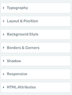
If you want to find out how to use these options, please check out the separate tutorials about each of these on our tutorials page, or in our knowledge base.
You might also be interested in this article, about our “Course List” element, which can be used to add a list of your Thrive Apprentice courses inside a post or page created using Thrive Architect.
Hopefully, this article about how to use and customize the “Lesson List” element was useful for you.