This article will explain how to use and customize the “Login & Registration Form” element from Thrive Architect.
This element is useful in situations where you want to offer the users the possibility to register and login to your website.
Add the Element to the Post/Page
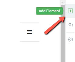
Firstly, you need to add the element to the page, in the Thrive Architect editor. For that, click on the plus sign from the right sidebar:
Then, in the list of elements that opens, look for the “Login & Registration Form” element, or type its name in the search bar:
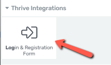
After you find the element, drag and drop it on your post or page, in the editor, where you best see fit:

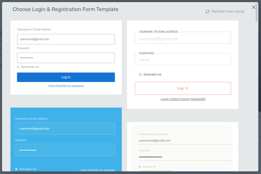
As soon as you add the element to your page, a new pop-up will open from where you have to choose the template for your “Login & Registration Form”:
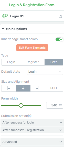
Once you do that, you can start using the options of the element (from the left sidebar) to customize it in the manner that fits your website:
Choose the Template
If you take a look at the options from the left sidebar, you can see that the first section is the “Template Options” one. You can use this option if you want to pick another template from the library. Click on the field next to the option:

This will open the same pop-up from where you initially selected the template. Decide on the one that you like the most, and once selected, click on “Replace Template”:
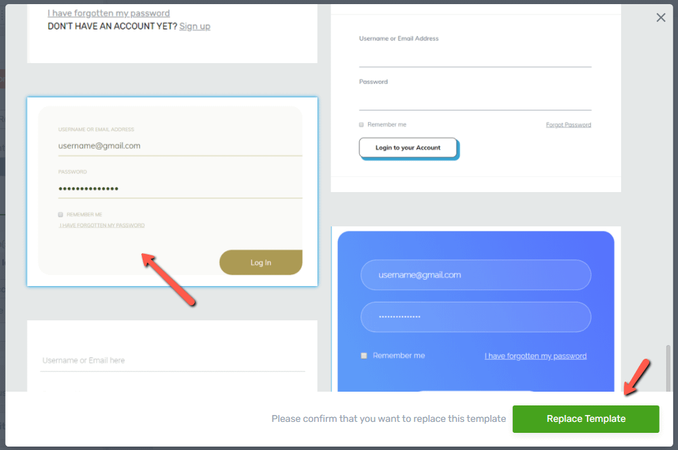
Note: If you want to replace the template, make sure you do this before adding any content or customize the existing content of the “Login Form” element. This is because, when changing the template, all the initial content and modifications will be lost.
Choose the Color
After choosing the template, you can proceed with changing the color of your element:
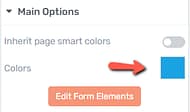
Note: In case you’re using Smart Landing Pages or Thrive Theme Builder, you will have an extra option here: “Inherit smart colors”. If activated, the color of the element will match the smart color, set for the Landing Page/Thrive Theme Builder Template.
If the color toggle next to “Inherit page smart colors” is switched off, just as in the example above, then the “color field” box will become available in the sidebar.
Click on the “color field” and, from the color picker choose the desired shade of color or insert a HEX/RGB code. Once done, click on “Apply” to save your changes:
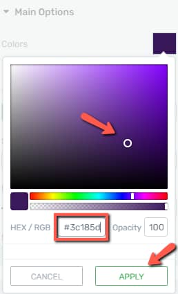
Note: the “Colors” option is only available for certain templates, so if you want to use this option, make sure to choose a template from the library that comes with this feature.
The next button available in the “Main Options” sidebar is the “Edit Form Elements”. From here, you can edit various states of the form. For example, you can edit the way the form looks like in the normal state, in the “Password Recovery” state, or in the situation where someone is already logged in.
However, before proceeding with explaining the “Edit Form Elements” button, we should look into the form “Type” and what it implies.
Type
The form “Type” is located in the same sidebar, right under the “Edit Form Elements” button:
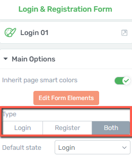
There are three different options you can choose from here, and they represent the type of form you would like to have displayed on your website, for your visitors. Depending on what you choose here, they can either see a “Login” type of form, or a “Register” type of form, each of them having different proprietis.
You can also choose to display both, and this option covers the features available for the “Login” and “Register” types.
Use the Edit Form Elements Option
The options available when clicking on “Edit Form Elements” will be different depending on what type of form you have selected: “Login”, “Register” or “Both”.
Login Form Type
The “Login” form type is how the form looks on the page when the user already has an account and just wants to log in.
Make sure this form type is selected and then go ahead and click on the “Edit Form Elements” option:
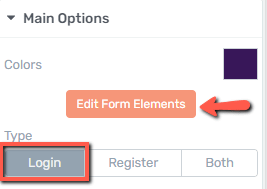
When you do that, you will be taken into the “Edit Mode” of this element. You can edit various states of the form.
By default, when entering the “Edit Mode”, you will be customizing the “Login Form” state. If you want to change the state that you are editing, click on this field, from the bottom side of the editor:

When you click on that, a list will open, with all of the available states that you can customize. Select the one that you want to edit, by clicking on it:

Here are the options from each state:
- Login Form State
When selecting the “Login Form” state, the following options will become available in the left sidebar:
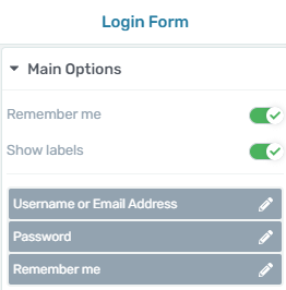
- Remember me
The “Remember me” feature let’s you decide whether you want this text to appear in the form or not:
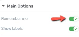
If the toggle is enabled, then the option will appear on the form as well:
2. Show labels
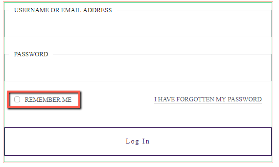
The same applies to the “Show labels” toggle:
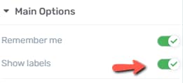
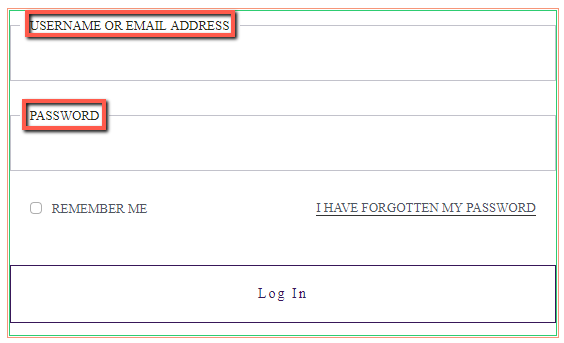
If the toggle is activated, then the username/email and password labels will be shown in the form:
3. Edit the form fields
Going forward, you can choose whether you want to edit the actual form fields. Click on the pencil icon next to the element you want to edit:
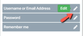
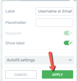
This will open a small pop-up, where you can change the placeholder and label text, as well as some other settings. Here is how to use all of the options from this pop-up:
Pop-up Options
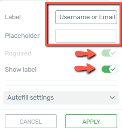
You will notice that the “Required” toggle is not clickable – this is because certain labels, such as the ones containing the “email address/username” and the “password” are mandatory by default when logging into an account.
The last available option here is the “Autofill settings” one:

If you open the drop-down, you will be able to choose the dynamic data which should be filled automatically:
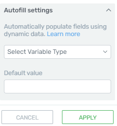
If you want to learn more about how to set it up and use it, you can read this dedicated article from our knowledge base.
When you finish customizing all of the options from this pop-up, click on “Apply” to save everything:
4. Edit each field individually
Lastly, on top of the already explained option, you should keep in mind that each item from the form is also editable and customizable.
You just have to select that individual element and customize it as you would do with any other Thrive Architect element.
If we take the “Remember Me” checkbox as an example and select it:

You will notice in the left sidebar that you can change the color, the default style from a list of templates and the size of it, editing the checkbox as an individual element:
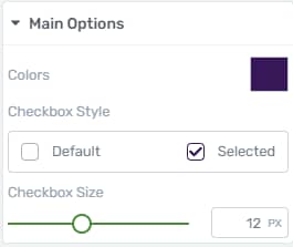
Check out this article if you need help editing the “Checkbox” type of custom field.
5. Use the Dynamic Links feature
Another feature you can use here is the “Dynamic Links” for all “Text” elements.
You can select a text link such as the “Sign Up” one:

On the edit panel located on the upper side of the screen, select the “Link” option and then the “Dynamic” feature:
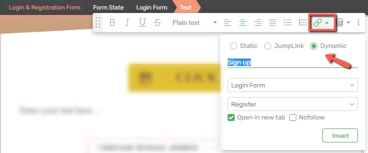
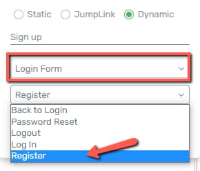
Now, from the drop-down field, you can insert the action that should be linked to the selected text (and which corresponds to the “Login Form”, in this example):
You can learn more about how “Dynamic Links” work here.
Important!
The “Dynamic Link” feature cannot be used for the “Button” elements located within the forms.
- Password Recovery State
The next state is the “Password Recovery” one. You can customize the form that the users have to fill in when they want to recover their password:

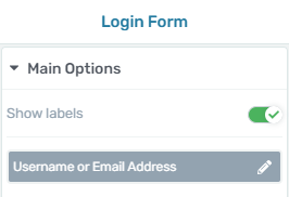
You can edit the form fields from the left sidebar. The options are fewer but identical to the ones described above for the “Login Form” state:
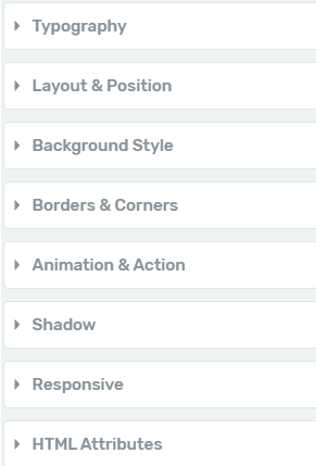
Feel free to also use the rest of the general options from the left sidebar, for even further customization:
- Password Recovery Confirmation State
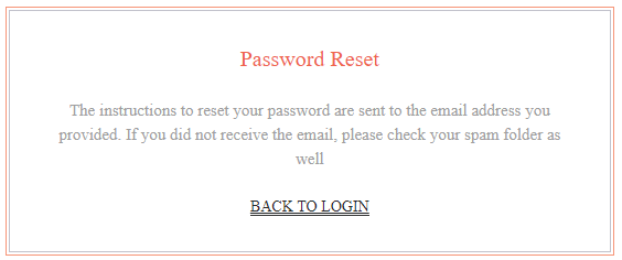
The third state from the list is the one where the users are informed about the instructions for recovering the password.

This state does not have any particular options in the left sidebar, but you can select each element of the form directly from the editor, and customize it as you prefer:
- Already Logged In State
Lastly, you can customize the form that appears in the situation of someone already being logged in on the website:

Again, every aspect of the form is visually editable, so you can easily modify the aspect of this form:

After you finish customizing each state, you can click on the orange “Done” button to go back to the element options:

Register Form Type
Going back to the “Main Options” sidebar, we will proceed with seeing what options are available for editing for the “Register” form type:
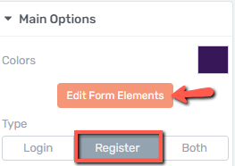
Entering the “Edit Mode” will allow you to customize the form states. If you want to change the state that you are editing, click on this field, from the bottom side of the editor:
By default, the “Registration Form” one is selected:

- Registration Form State
When selecting the “Registration Form” state, the following options will become available in the left sidebar:
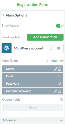
1. Show labels
This feature will allow you to hide or show the labels of the fields:

2. Add one or multiple connections
After this, you have the connection settings, from where you can add multiple connections to the already existing one:
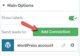
The WordPress account is added by default and cannot be removed (it’s mandatory for registration forms because this connection is required for the account creation).
If you want to add a new connection, click on the blue “Add Connection” button and proceed just like you would do for a “Lead Generation” element (all steps are detailed in the “API Connection” in the article linked here):
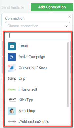
Note: this comes in handy if you want to automatically add the newly registered users to a mailing list. This way you can send emails just to the ones that are registered on the site.
From the next section available in the left sidebar, you can add, edit (pencil icon) or remove (trash icon) form fields:
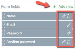
You will notice that some fields, such as the “Email” and “Password” ones cannot be deleted, as they are mandatory fields.
However, you can remove others or add new ones (depending on what kind of information you would like to capture during registration).
We do have a separate article in which we’ve explained how to add and customize each type of custom field, and you can find it here.
After you’re done setting up the fields, you can proceed with setting up the “Hidden Fields” option:

It can be added to the registration form and will behave as per the existing “Lead Generation” form. You can find out more about how to set up hidden fields in this article.
Lastly, the “Advanced” settings of the form consist of the following options: “Enable asset delivery”, “Form identifier” and “Captcha spam prevention”:
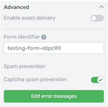
Here are some resources to help you understand how to use these options:
The “Form identifier” allows you to easily and quickly search for this form in Thrive Ultimatum, simply by pasting this code in the form field.
All of these work as per the “Lead Generation” element set up in the “Add Connection” section.
Edit Error Messages
After clicking on this option you will see a pop-up window open with various types of error messages that you can customize.
You can replace the default messages by typing in the messages that you want your users to see if they do not fill out the respective fields correctly:

You also have the option of adding an additional error message called “Signup failed”. If you activate this option you will be able to set one more error message for the rare cases when the sign-up will fail.
Just type in the message you want to show in these cases in the field that appeared with the default “Error” text:

After you have finished setting up the error messages, click on the “Save” button to change them and apply them to the element.
- Already Logged In
The second state of this form is the “Already Logged In” state, from where you customize the form for someone who is already logged in on the website:

Once more, after you’ve set up all the states for the “Registration” form, click on “Done and exit to the initial “Main Options” sidebar:

Both Form Types
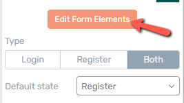
The last type of form that you can set in the “Main Options” sidebar is the “Both” type of forms to be displayed:
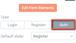
Furthermore, you will notice a “Default state” drop-down appeared right underneath the “Type” field, from where you can select the default state that appears first when entering the “Edit Form Elements” mode:
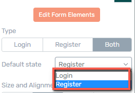
Now, to enter the “Edit Mode” for the “Both” type, click on “Edit Form Elements”:
In the editor, you will be able to set up the same states that have already been detailed above, only this time, they are all together in the same drop-down:

The options from the left sidebar will correspond to the state you select here. So, as the “Registration Form” was set as the default one, the left sidebar will have the corresponding options:
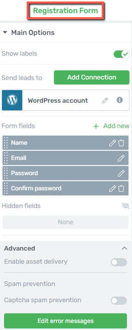
All five states are already described above, so don’t hesitate to go through them again if you need additional information.
Use the Group Styling Feature
There’s one more thing you can edit here, before going back to the initial “Main Options” sidebar. If you click on “Form State” in the breadcrumbs when an item of the form is selected, you will be taken to some more options for this form:

“Group Styling” is applied in the case of the “Login Form” element. This feature will help you modify parts of the “Login Form” element in a fast and easy manner.
In order to do this, click on the field below the “Currently Styling” section of the left sidebar:
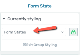
This opens a list, with all of the available options:
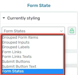
If you select “Grouped Labels” for example, you will get all these extra options in the sidebar from which you can customize the labels:
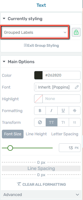
If you don’t want to edit the labels as a group, click on the “lock” icon next to the field:
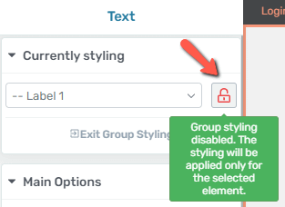
This will disable group styling, and allow you to only edit the label which you select within the form.
Once you’re done with the customization, exit the “Group Styling” by clicking on this button:
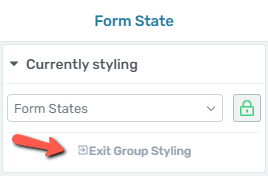
You can learn more about the “Group Styling” feature here.
Use the Rest of the Main Options
Besides the “Edit Form Elements” option, this “Main Options” section contains some more options, which you can use as described below:
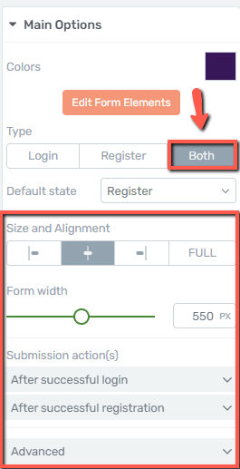
Important!
We will enable the “Both” type of forms, in order to see the options available for both the “Login” and the “Registration” forms in one place as they appear in the sidebar. However, the sidebar might look slightly different depending on what type of form you have selected. Regardless of which form is selected, you will find below all options described.
Size and Alignment
Set up the size and the alignment of the form, by using the available options:

Note: if you select the “Full” option for the size, the “Form width” option (which we describe below) will become not available.
Form width
Use this option to change the width of the form, by using the slider, and dragging it from slide to slide, or by entering a numerical value in the field next to it:

Submission action(s)
- After Successful Login
You can choose what happens after someone successfully logs into the website. Click on this field to open a small pop-up and see the options for this field:

Now go ahead and click on the pencil icon to see all the available actions:
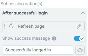
If you click on the first field here, a pop-up will open up, with all of the available options that can be performed after someone successfully logs in:
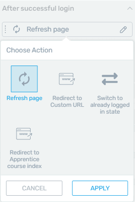
→Refresh page: select this option and click on apply if you want to perform this action once the login was successful.
→Redirect to custom URL: if you want the users to be redirected to another page, you can choose the first option from the pop-up.
You will be taken back to the “Main Options” sidebar, where you can add the redirect URL as shown below:
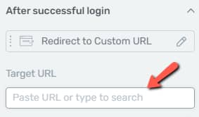
→Switch to already logged in state: this option comes in handy if you don’t want to have any kind of action performed after the user has logged in.
→Redirect to Apprentice course index: the last available option will redirect the user to the “Apprentice” course index (use this option if you have a Thrive Apprentice course set up).
These were the available actions for a successful login.
After choosing one, you have the option of displaying a “success message” for the user, by activating this option:
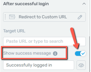
The message can be set using this field:
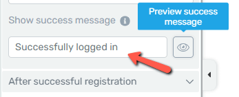
The “eye” icon lets you preview the message as you are editing it.
- After Successful Registration
Now let’s look into the actions available for when a registration is successfully done. Click on the field to open the sub-menu:

Now click on the pencil icon to display the full list of actions:
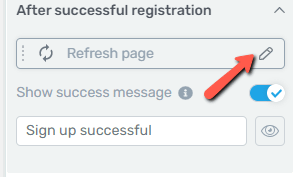
You will notice that the actions available here are very similar to the ones already described above:
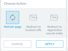
The “Refresh page” option will simply refresh the page.
However, if you select the “Redirect to Custom URL”, besides the URL redirect field, you’ll also notice an additional option in the sidebar – “Send form values to thank you page”:
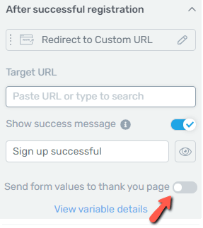
If you enable the toggle, you will send variables such as “name” and “email” to your thank you page.
The same option can be enabled for the “Redirect to Apprentice course index” action:
You can check out the “Send form values to thank you page” section of this article, should you need more information about this feature.
Advanced
The last section of the “Main Options” sidebar is the “Advanced” one. From where you can decide whether you want to hide the form when the user is logged in:

Use the Rest of the Options
Just like in the case of other elements, besides the “Main Options”, you can use some other general options, as well (such as Layout&Position, Borders&Corners, etc.):
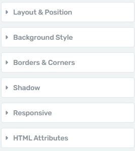
If you want to know how to use the rest of the options from the left sidebar, make sure to take a look at the articles and tutorials from our Knowledge Base
These were the ways in which you can use the above-mentioned sections to add and customize a “Login & Registration Form” element in Thrive Architect.
I hope this article was helpful to you.