If you use the “Lead Generation” element and you connect your form to a service, you can add various types of custom fields to that form. The “Radio” type is one of them.
This article will explain how to set up a “Radio” type of custom field, and how to customize it, as well.
Set up a Radio Field
First of all, you have to connect your “Lead Generation” element to your desired services.
Click on the “Lead Generation” element, to select it, and go to the left sidebar menu to click on “Add Connection”:

Should you need help with this step, check out this list and click on any of the services that we support to see a tutorial on how you can establish an API connection. Then, after setting up a connection, you will have to add a new form field.
As an example for this article, I have connected my “Lead Generation” element to Mailchimp.
In order to add a new field, in the “Form Fields” section of the left sidebar, click on “Add New”:
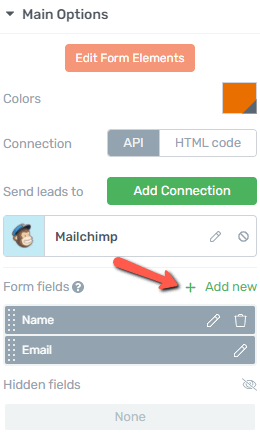
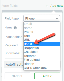
This will open a pop-up, where you will have to set up the new field from. Firstly, click on the “Field Type” section, to open the list with all of the available fields:

From the list that will open, click on “Radio”:
Then, continue setting up the field. You can choose a name for it, but this is optional, and the name will not be visible for the users:
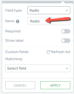
This option is just going to help you identify the “Radio” fields, if you have used multiple ones.
Then, you will have to set whether this should be required or not, as well as if you want to show the label or not:
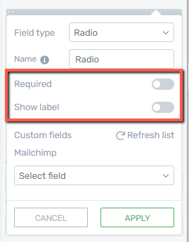
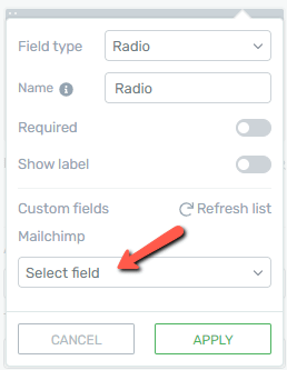
Moreover, you should set up the field mapping. Since I’m using Mailchimp as an example, I will have to click on the “Select field” section, to choose a field where the information should be sent to, in my Mailchimp account:
When you’re done setting up this field, click on “Apply”:
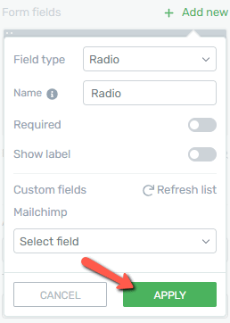
Now, the “Radio” field has been added to your “Lead Generation” element.
Edit the Radio Field
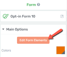
After setting this field up, you can go ahead and use its options in order to customize it. For that, in the left sidebar, click on “Edit Form Elements”:
This will access the “Edit Mode” of the “Lead Generation” element. Then, click on the “Radio” field, and its options will appear in the left sidebar:
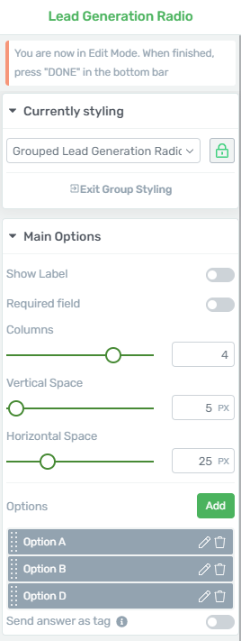
Here is how you can use the options from the left sidebar:
Grouped Styling
The “Grouped Styling” option and the ways you can use it are explained in more detail here.
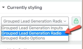
If you want to edit multiple “Radio” fields at a time, what you have to do is select the “Grouped Lead Generation Radio” option from the “Currently Styling” dropdown:
Main Options
Besides using the “Grouped Styling” feature, you can use the “Main Options” section to further customize the element.
Show Label
The first option is the “Show Label” one, which you can also use when you first set up this field. If you want to activate this option and show the label, click on the switch next to the option:

Required Field
Next, you can choose if you want the field to be required or not, by activating/deactivating this option:

Columns
With the use of the “Columns” option, you can set the number of columns in which the options of the field should be displayed. To change the number of columns, either use the slider and drag it from side to side, or enter the number of desired columns in the field next to the slider:

Vertical Space
This option allows you to set the distance in between the options of the “Radio” field. Keep in mind that you should use this option if you have displayed the options in a vertical manner.
If you have displayed the options in a single row, there is no point in using this option.
To modify the vertical space in between the vertically displayed options, drag the slider from side to side, or enter the desired value in the field next to the slider:

Horizontal Space
Similar to the previous option, this one allows you to modify the horizontal distance in between the options, if, of course, they are horizontally displayed. Again, in order to modify the distance, either use the slider or write the value in the field next to it:

Handle the Radio Options
When you add a “Radio” custom field to a “Lead Generation” element, this means that you can give the users the experience of choosing between one or more options.
The next section of the “Radio” field options is the one where you can establish the options of this type of custom field.
Firstly, you can add a new option, by clicking on the blue “Add” button:
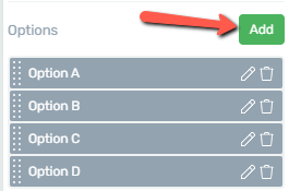
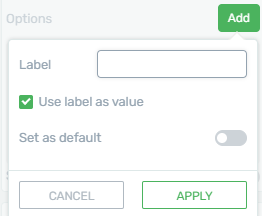
When you click on that, a small pop-up will appear:
-
Label
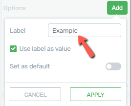
You will first have to assign a label to the new option, by writing it in the dedicated field, like so:
-
Use Label as a Value
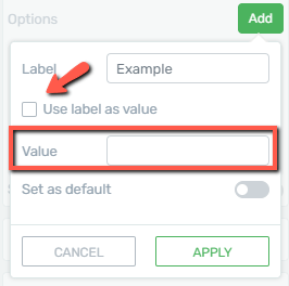
Then, you can choose whether the label should be used as a value, or not. If you do not want that to be the case, uncheck this option, and a “Value” field will appear. Enter the desired value in that field:
-
Set as default
You can also set one of the options as a default. This means that the option will be already selected when the page loads.
Important!
-
You cannot have more than one default option set in a radio box group.
-
You can see which one of the options is set as default, directly from the options list, as the default one has a checkmark next to it, like so:
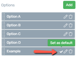
To set an option as default, click on this switch, when setting it up:
After you finish setting up the new option, click on “Apply”:
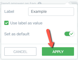
This is how you can add and set up a new option for the “Radio” custom field type.
Besides adding a new option, you can also edit or delete the already existing ones. Here is how you can do that.
To edit one of the existing options, click on the pencil icon next to it, from the list of all the options:
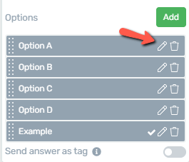
This will open the same pop-up like the one appearing when you add a new option, and you can use the options just as described there.
Should you want to remove one of the options, you can just click on the trash icon next to it:
This will immediately delete the option.
Send answer as tag
The last option here is the “Send answer as tag” one. Click on the switch next to it, to activate the option:

You can find out more details about this option, and how to set it up, in this article.
Edit the Radio Field Options
The options described above were the ones that you can use to customize the “Radio” field. However, this field is constructed out of more “Radio Field Options”.
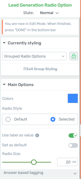
The way to add/edit and remove these options were presented above. However, if you click on each one, individually, more settings will show in the left sidebar:
Grouped Styling
The “Grouped Styling” feature is applied here, as well, in case you want to modify all of these options, at the same time.
You can choose whether you want to customize all of the options at once, or just one selected option.
By default, the “Currently Styling” setting is set to allow you to customize all of the items at once, but you can click on this icon, and select the option that you want to separately edit:
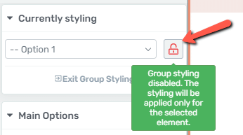
This way, the modifications you make will only be applied to the selected option.
To exit the “Group Styling” feature, you can click on “Exit Group Styling”:
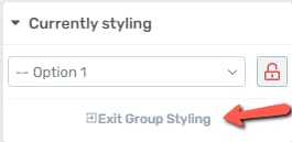
Another way to do that is to go back one step, in the breadcrumbs, meaning that you can click on “Lead Generation Radio”:

Main Options
Besides using the “Group Styling” feature, you have some more options that really let you customize the options of this field as you wish. They can be found under the “Main Options” section.
Colors
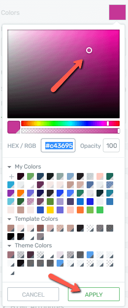
Firstly, you can choose the colors of the options. If you want to change the color, click on the color box next to the option:
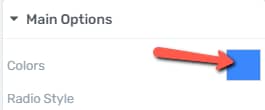
The color pop-up will open. Choose the preferred color, and click on “Apply”:
Radio Style
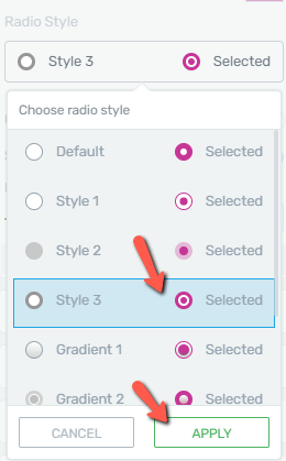
Next, you can choose the style of these options. Click on the field below this option to open the drop down with all the available “Radio Styles”:

Scroll down to see all of the pre-designed styles, click on the one you like, and click on “Apply” to use it:
Use Label as Value
This option can be used exactly like the one that appeared when first setting up the field.
Set as Default
Activating this field means that the option will be selected by default when the page loads.
Radio Size
This is where you can set the size of the options from. You can modify their size by using the slider, or by entering a value in the field next to the slider:

Answer based tagging
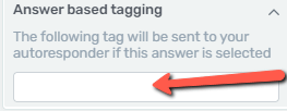
Lastly, you can add a tag, to be sent to the autoresponder if the answer is selected:
State
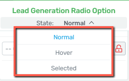
While editing the options, you can also choose which state you are currently editing: “Normal”, “Hover”, or “Selected”. Click on “State: Normal” if you want to open the drop-down that allows you to select which of the states you want to customize:
All of these states can be customized as you wish, using the options from the left sidebar. When you’re done, you can go back to the “Lead Generation” options by clicking on the orange “Done” button:

Remove the field
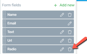
If you want to delete this “Radio” field, all you have to do is go back to the “Lead Generation” element options, and, in the form fields list, click on the trash can icon next to the field you want to eliminate:
Besides the “Currently Styling” and “Main Options” sections, feel free to use all of the other general options for even more in-depth customization of this field. For all of the other options, you will be able to find articles in our knowledge base.
Make sure you also check out this article, to see what other types of custom fields can be added to this element.
I really hope this article was useful for you. If that’s the case, don’t forget to rate it with a smile below 🙂