In the Thrive Theme Builder editor, you can add and customize various elements, in order to build the perfect design for your template.
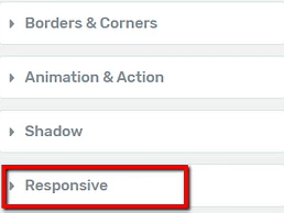
When you select an element or a section in the editor, its options will appear in the left sidebar, grouped in some sections. One of these sections is the “Responsive” one:
The responsive option allows you to hide elements or entire sections on three different platforms.
This means that, for example, if you decide not to display an element or section from your site on mobile, you can do that with the use of the “Responsive” option.
In order to access the “Responsive Options”, click on the section, to expand it:
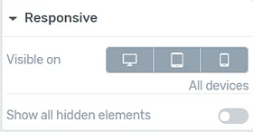
The section contains two options. Here is how to use them:
Visible On (Desktop/ Tablet/ Mobile)
The first option is the “Visible On” one, and it allows you to choose the platform/devices on which the element or section should appear. You can choose to display the elements on desktop, tablet, or mobile, or any combination between these three.
I will use a “Video” element as an example but remember that the option works the same in the case of any other element or section of the template.
When an element is visible on one of these platforms, the respective icon will have a dark grey background:
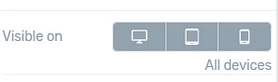
You will also be able to see where the element is visible, as it will be written below the option:
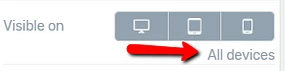
By default, the element will be visible on all of the platforms. If you want to hide it from one of the platforms, click on the icon with the respective device. For example, if I want to hide the “Video” element on mobile, I will click on the last icon:
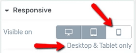
The icon of the disabled device has turned to a white background color.
You can always preview your templates so that you can see how the template looks like when using the “Responsive” options.
Remember that you can also choose a certain platform for previewing the template, by clicking on one from this section, on the bottom side of the editor:
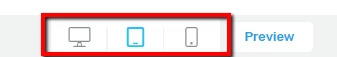
This way, if you hide an element in Mobile View, for example, you can preview the template in the Mobile View, as well, and check if everything looks right.
Show all hidden elements
Besides choosing the device on which the element or section should be visible, you can also choose to show all of the hidden elements.
When you edit templates with Thrive Theme Builder, you can use the “Visibility Settings” to hide or show some of the elements and sections.
We have explained how you can do that in this article, so make sure to read it if you want to get more familiar with this feature.
If you want to show all of the hidden elements, you can activate this option, by clicking on the switch next to it:
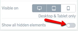
Once you activate it, the hidden elements will be shown on the template.
These were the ways in which you can use the “Responsive” options when customizing Thrive Theme Builder templates. Make sure to also watch this video, that goes into more in-depth details about mobile responsive editing:
For more information about various Thrive Theme Builder features, you can check out our knowledge base.
I hope this article was useful to you. If so, please make sure to leave a smile below 🙂