The greatest benefit of adding social share buttons to your page is that this can increase its online presence.
Here is how you can do that using the “Social Share” element in Thrive Architect.
Add the Element
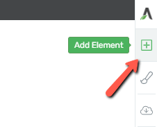
First, you will have to add the element to the page. Click on the plus sign from the right sidebar of the editor to open the list of elements:
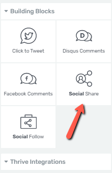
Look for the “Social Share” element and when you found it, drag & drop it to your page:
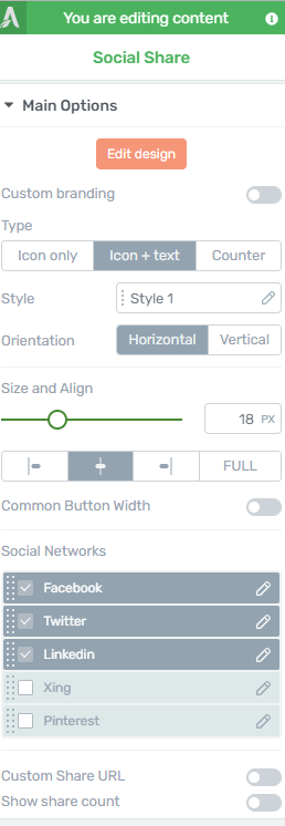
Then, personalize it using its “Main Options” from the left sidebar:
Use the Main Options of the Element
There are various aspects you can customize with the help of the “Main Options”, and the first one is customizing the design.
Edit Design
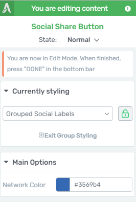
When you click on the “Edit Design” button, you will be taken to another set of options in the sidebar:
Group Styling
The “Grouped Social Buttons” feature will allow you to edit the design of the labels and icons as a group so that any applied change will be visible on all the items pertaining to that group:
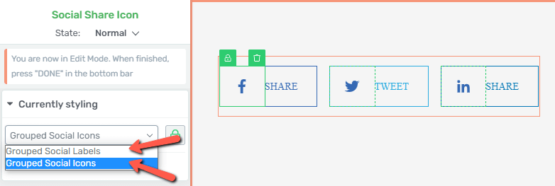
After you select one of the fields available in the drop-down, the corresponding options will appear in the main sidebar:
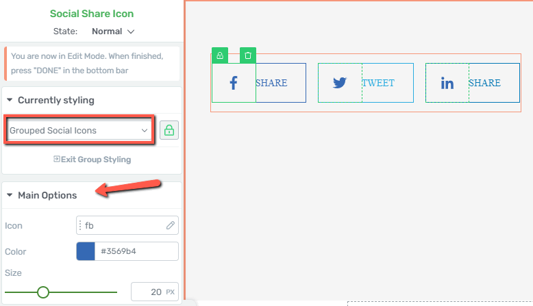
- Icon
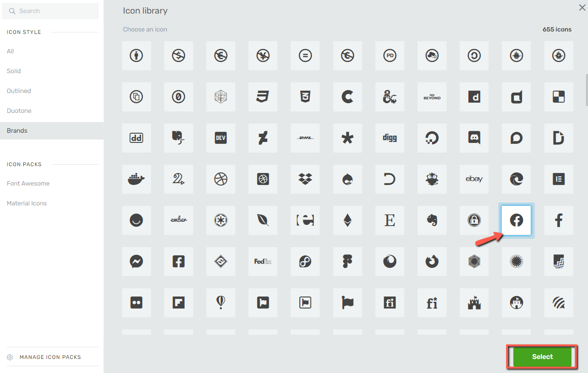
If you click on the “Icon” field you will be able to change the current one with another one from the icon library. Once you have decided on the icon, click on “Select”:
- Color
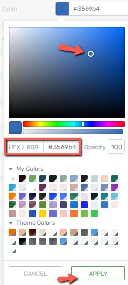
Next comes the color of the icon, which is automatically showing the default network color. Click on the color box in order to change it:
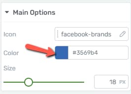
Use the color picker, a HEX/RGB code, or one of the saved colors to set the new color, and save your changes by clicking on “Apply”:
- Size
Change the size of the icon from the next available option. You can either drag the slider from left to right or insert a numerical value in the corresponding field:

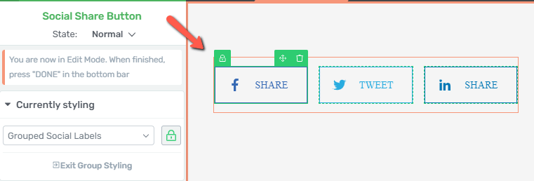
You can also choose to edit each item individually, and in order to do that you have to click on the green lock icon next to the item you want to edit:
Once clicked, the lock will turn to a red color, meaning that it’s unlocked from the group and that it can be customized as a standalone item:
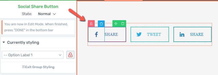
This means that all the above options that could be used for editing the icons and labels as a group, can also be used on individual items only.
Furthermore, if you click on one of the social share icons, you will notice three options that you can use: you can lock/unlock the item (1), move it around (2), or delete it (3):

When you are done with all the changes, simply click on one of the “Done” buttons located in the lower part of the screen, or on the “Exit Group Styling” option form the left sidebar:
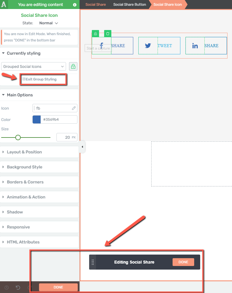
This will automatically save your work and take you back to the “Main Options” sidebar of the “Social Share” element.
You can also learn more about the “Group Styling” feature here.
Custom branding
By default, the “Custom branding” option is disabled:
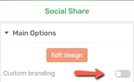
However, if you activate the toggle, you will be able to change the color of the icons from the “Color” box that appears in the sidebar:

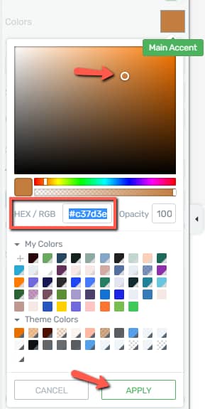
The color will be inherited from the Landing Page template main accent, but you can change it at any time by clicking on the color box from this section, which will trigger the color field pop-up.
You can then use the color picker, a HEX/RGB code, or one of the predefined colors to set your new color, and once everything is done, click on “Apply”:
Type
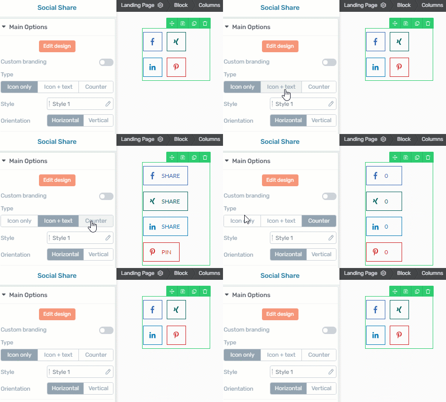
Next, you can select the “Type” of icons you want to have displayed in your “Social Share” element.
The first one is “Icon only”, which means only the icons will be displayed, without any additional information.
The second one, “Icon+text” will also show the share text next to the icons; while the third one, the “Counter”, will display the icons and a counter next to them, showing how many times has the website been shared on those specific platforms:
Style
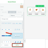
Should you want to change the “Style” of the icons, you can do so from the following option:
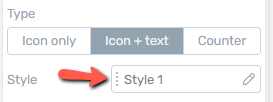
Click on the field next to “Style” and you will be able to pick another style for your icons from the pop-up window:
Orientation
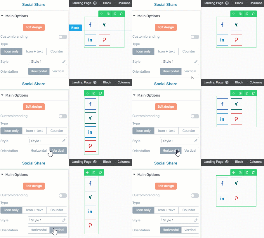
The “Orientation” of the items is the next feature you can set up, and you can choose between a “Horizontal” and a “Vertical” orientation:
Size and Align
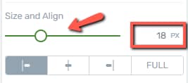
The size and alignment of the items can also be changed, from the following option. For changing the size you can drag the slider or insert a numerical value in the corresponding field:
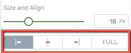
You can also choose a left, center, right of full alignment from these buttons:
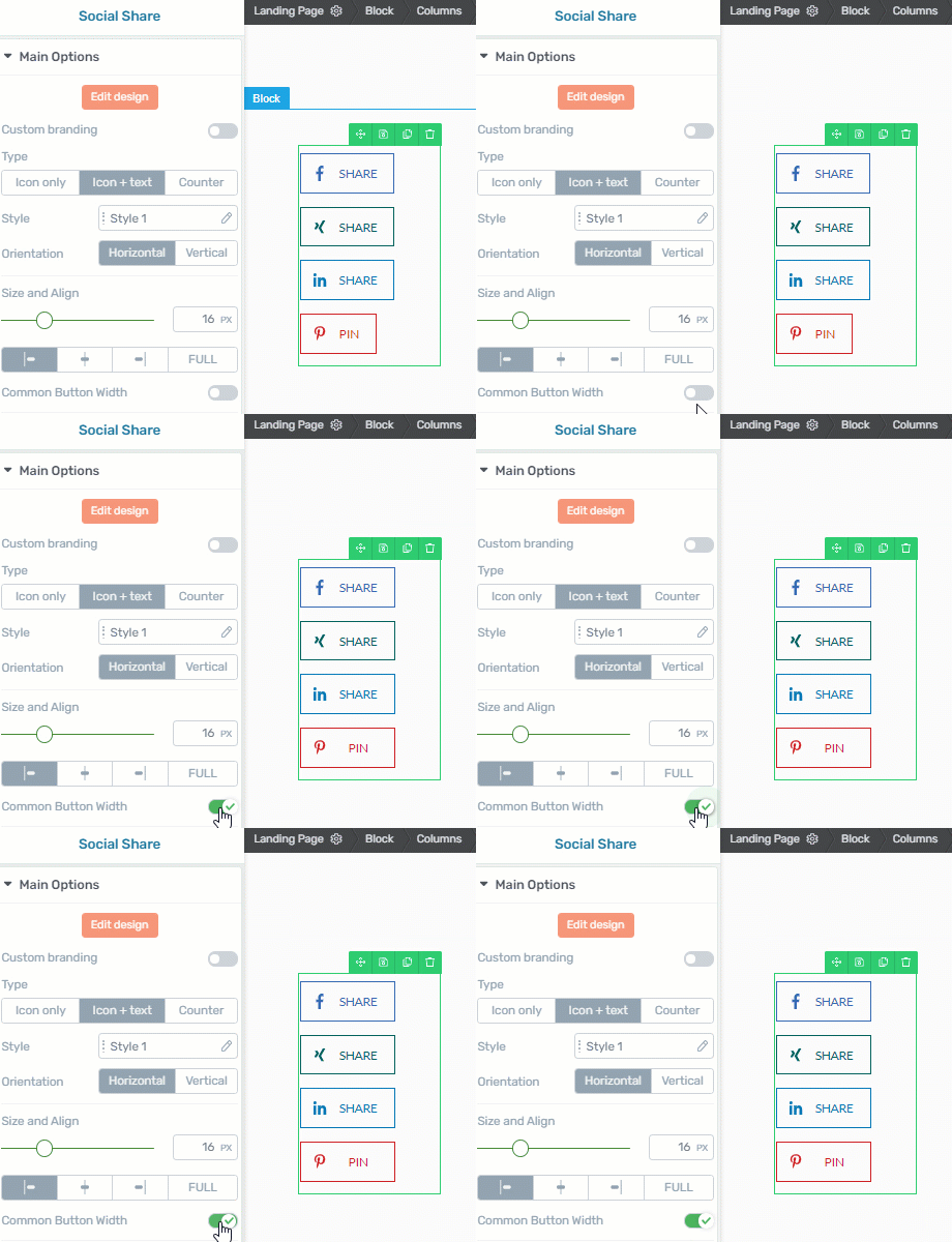
Common Button Width
This option can be used to make sure the buttons are set to the same width, irrespective of the text in the label:
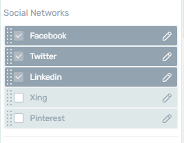
Social Networks
The “Social Networks” is a list with the available social media networks, and you can choose which are the ones you want to have displayed on your page:
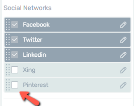
Click on the checkbox next to the social network you want to display, and it will be automatically added to your “Social Share” element:
You can also edit them:
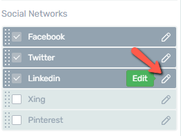
Depending on the social network you want to edit, the options available here will be different.
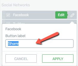
With each of the networks, you will have the option to change the label of the button.
The below example is displayed if you click on “Facebook”. Just delete the current text label, replace it with the label you want on the button for the respective network and then, click on “Apply”:
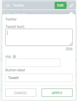
However, if you click on another network, for instance on “Twitter”, you can also use the specific settings this has. For example, you will be able to add a text that will be tweeted when your page is shared on Twitter:
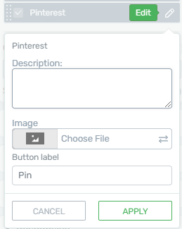
And lastly, for the “Pinterest” social share icon, you can include a picture accompanied by a short text:
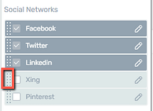
Moreover, you can rearrange the buttons by hovering your mouse over the dotted lines to the left of their name and then, drag & drop them to the desired position:
Custom Share URL
The “Custom Share URL” option is useful in case you want your users to share another URL (a different page or a different website), instead of the page that the social share buttons are displayed on. In order to do this, after activating the option, complete the field that appears with the URL of your choice:

Show share count
If you activate the “Show share count” option, two additional fields appear in the left sidebar:
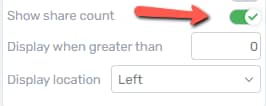
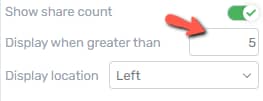
The “Display when greater than” option, means that the count next to the icons will only be shown if your content has been shared at least as many times as the number you set here:
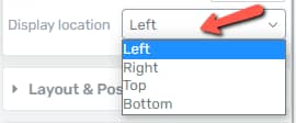
From the “Display location”, you can choose for a left, right, top, or bottom alignment of the share count:
Note: One thing to keep in mind here is that this option works only for Facebook and Pinterest shares.
Additionally, in the case of the Facebook social share button, the “Share Count” option will only work properly, if you also have a Facebook API connection set up on your website. This connection between your Facebook and your Thrive account is needed for the share count to display the correct number of shares.
After you are done using these options, there are a few other more general options also available that you can use to further customize the social share buttons.
If you need additional information about the general options, or about how other Thrive elements work, please follow this link.
Hopefully, this article was useful to you. If so, please give us a smile below 🙂