Do you want to keep your web pages clean and organized while still providing detailed information to your visitors? The Toggle element in Thrive Architect lets you create expandable content tabs that reveal more information when clicked, making it easy to manage space and improve the user experience.
In this article, we’ll show you how you can add and customize a Toggle element on your website using Thrive Architect.
- Adding a Toggle Element to a Page
- Changing the Template of the Toggle Element
- Using the Main Options of the Toggle Element
- Using the Other Settings of the Toggle Element
Adding a Toggle Element to a Page
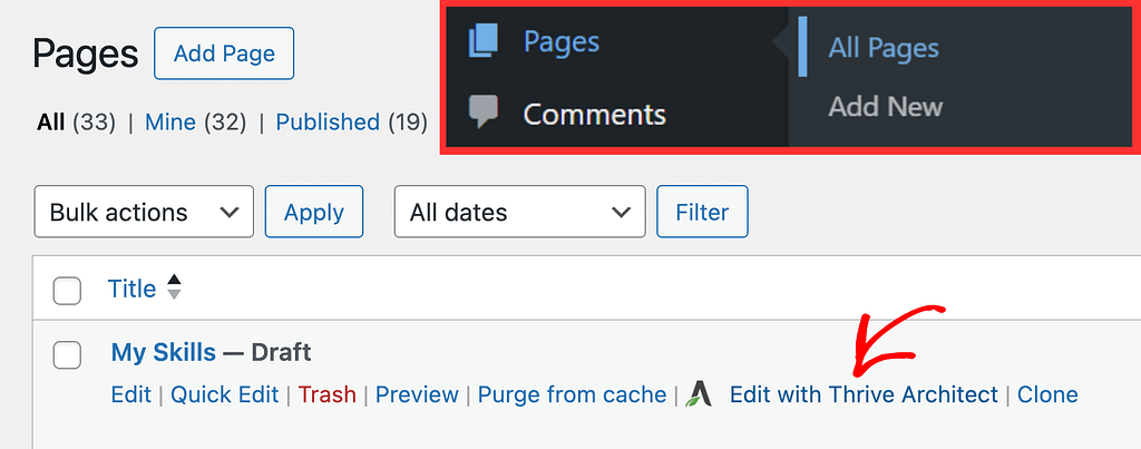
To add the Toggle element to a page, begin by opening the page in the Thrive Architect editor. To do so, open your WordPress admin area, Pages >> All Pages, hover on the page you want to edit and click Edit with Thrive Architect.
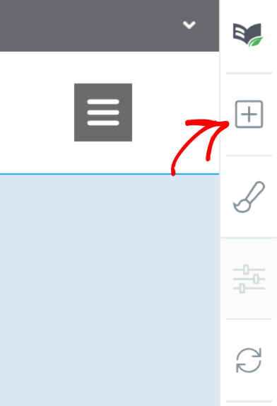
When the page is opened in the Thrive Architect editor, go to the right panel and click the plus (+) icon.
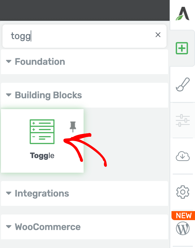
Clicking on the plus icon will open up the list of Thrive Architect elements to choose from. From this list, drag and drop the Toggle element on the page.
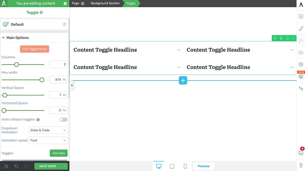
When you drag and drop the Toggle element, you’ll see it added to the page and its settings open in the left column.
Changing the Template of the Toggle Element
Sometimes you may want to change the template of the Toggle element after it is added to the page. This can be done using the template setting in the left column.
To do so, first click on the Toggle element to open its settings in the left column.
In the left column, click on the Toggle template name that is currently active.
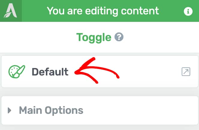
When you click on the template name, you’ll see a popup with available Toggle element templates that you can choose from.
Note: If you change the Toggle element template, you will lose all the content that you have added to your existing Toggle!
On this popup, click on the template you want to apply to the Toggle and click the Replace Template button.
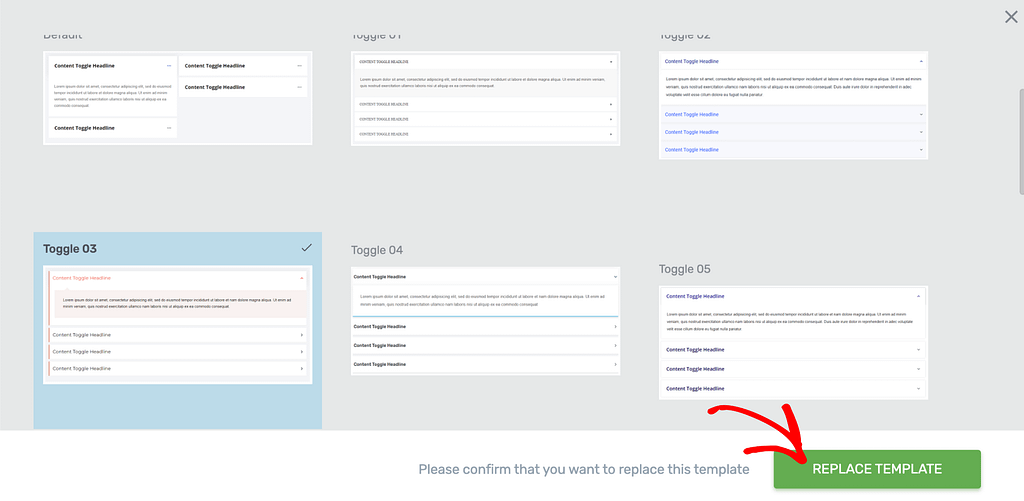
When you click to replace the template, the popup will close and you’ll see the new template applied to the toggle on the page.
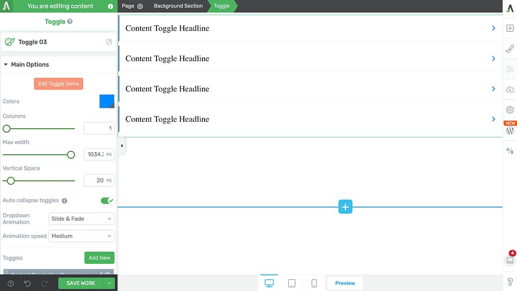
Using the Main Options of the Toggle Element
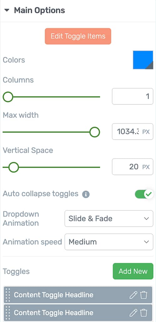
The Main Options of the Toggle element allow you to customize the main look and feel of it. They enable you to do the following.
- Editing the Toggle Items
- Selecting the Colors for the Toggle Element
- Selecting Number of Columns in the Toggle Element
- Setting the Maximum Width of the Toggle Element
- Setting the Vertical Spacing of the Toggle Element
- Auto-closing Toggles
- Selecting a Dropdown Animation
- Selecting the Dropdown Animation Speed
- Adding, Editing and Deleting Toggles
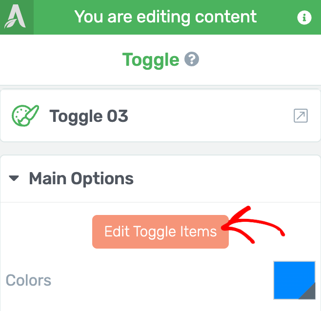
Editing the Toggle Items
To edit the items inside a Toggle element, in the left column, under the Main Options, click the Edit Toggle Items button.
When you click to edit toggle items, you’ll see the Toggle element in the Edit Mode.
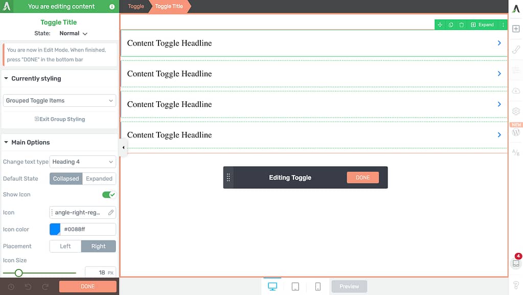
Apart from the Main Options and other settings that you can manage for the Toggle Items, the Edit Mode also gives you the following settings.
- Group Styling
- Managing Toggle Item States
Group Styling
The Toggle element Edit Mode enables group styling so you can style all the buttons uniformly.
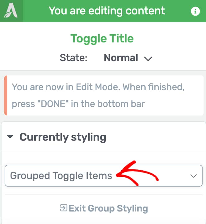
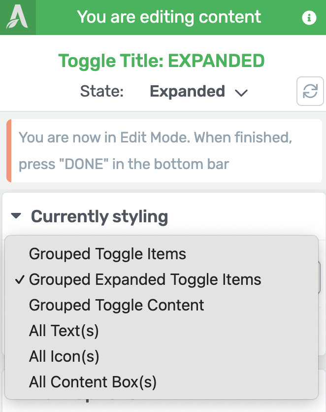
This can be seen in the left column within the Currently styling section.
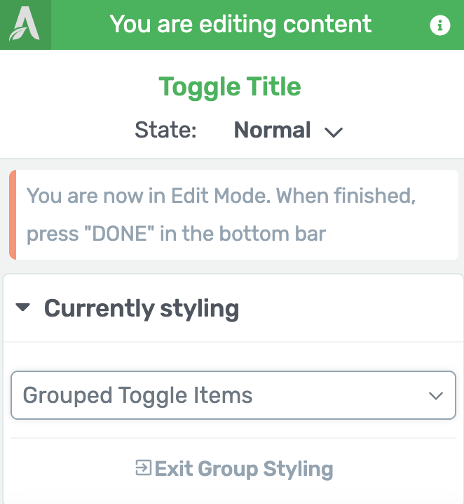
The Currently styling section shows a dropdown where you can select the element group you want to edit. In this case, it’ll only be the Grouped Toggle Items which means anything you change in the Main Options or the other settings will be applied to all the toggle items in the element.
Note: Unlike other elements, the Toggle element is a group of toggles and all of them should look uniform. Therefore, you don’t see an option to unlink a specific toggle item for styling.
Managing Toggle Item States
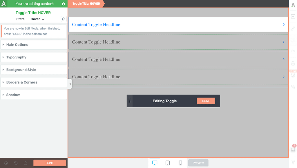
Like many other Thrive Architect elements, the Toggle element comes states – You can choose among 3 states – Normal, for when it is seen on the page, Hover, for when a user hovers over it, Expanded, for when a toggle is expanded with content within.
You can customize to change the look and feel of the Toggle element in these states.
To change the state, in the Edit Mode, click on the Toggle Item to open its editing options in the left column.

In the left column, change the State of the Toggle Item (in this case the Toggle Title) by clicking the down arrow besides Normal.
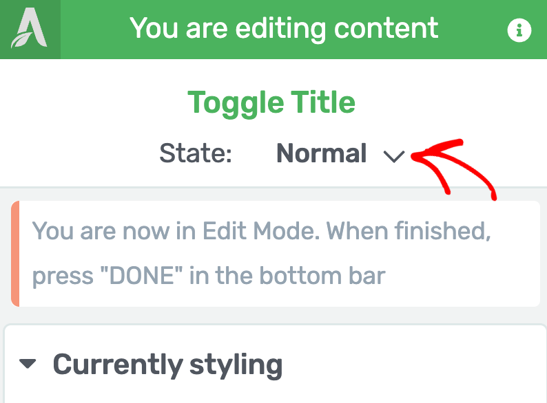
When you click to change the state, you’ll see three states that you can select from and edit the toggle items accordingly.
To edit the styling that’ll show up when the user hovers on it, select the Hover state.
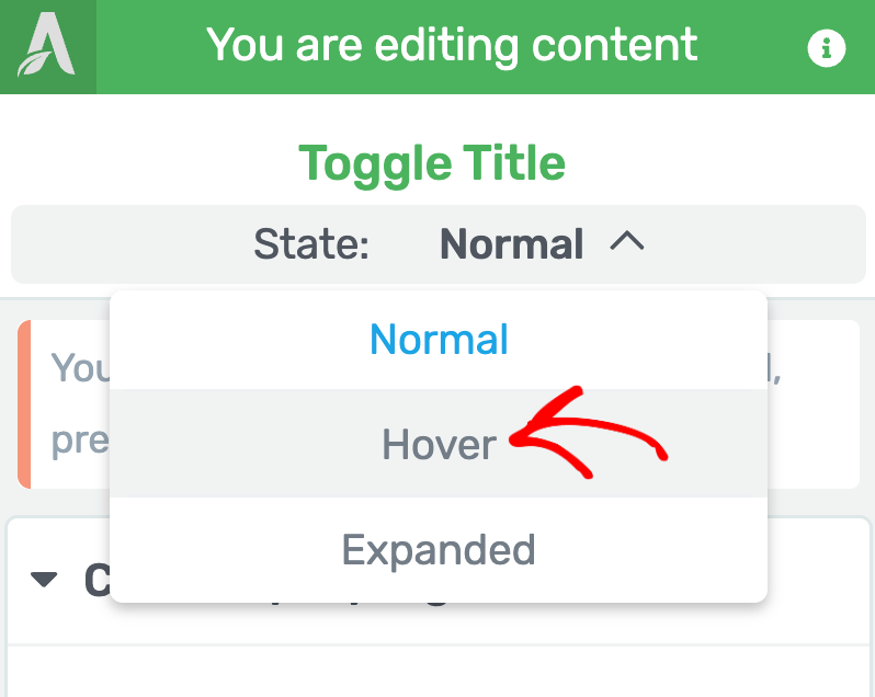
When you select the Hover state of the Toggle item, you’ll see the available settings for state in the left column. These settings will be applicable to only the selected Toggle title within the Toggle element.
To understand hover state effects in Thrive Architect, refer to our document here.
To edit the Toggle title’s styling that’ll show up when the toggle is expanded, select the Expanded state.
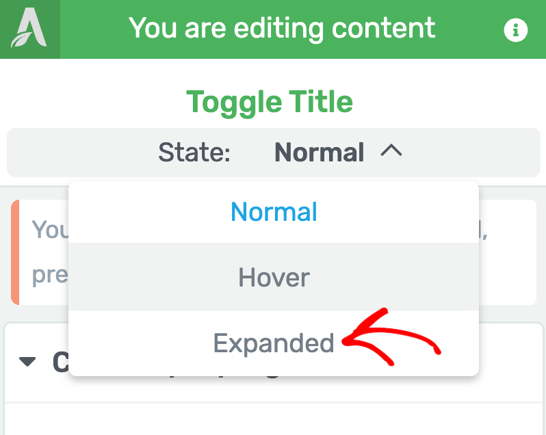
When you select the Expanded state of the Toggle item, you’ll see the available settings for state in the left column.
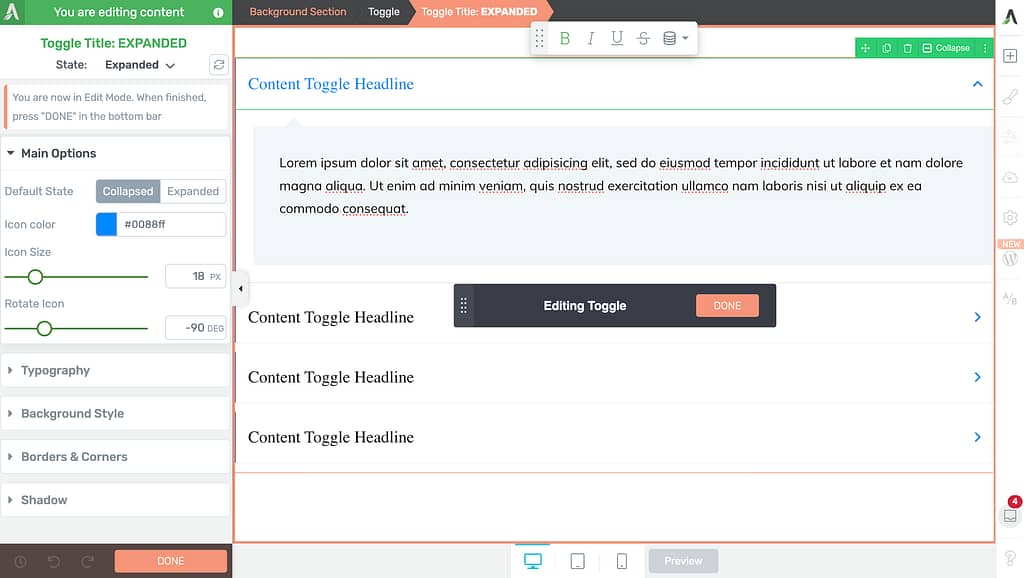
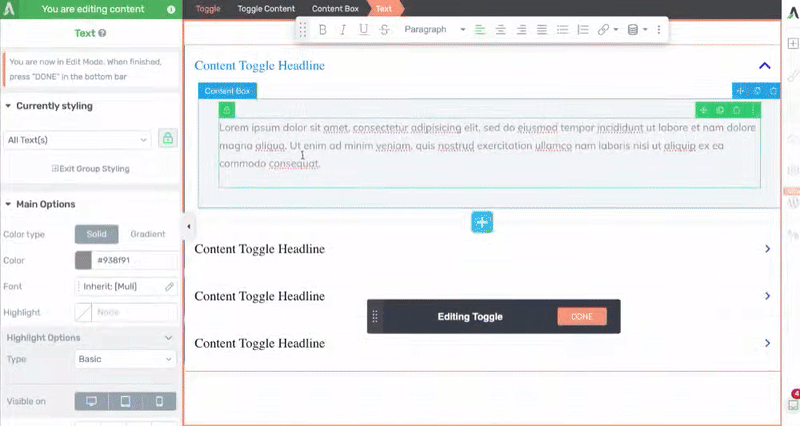
To edit the toggle title in the expanded state, use the settings in the left column. You can also click on the expanded text and other elements to manage their settings in this state.
In the expanded state of the Toggle items, you can select the group of items you want to edit. To do so, click on the dropdown within the Currently styling section to see all the available groups you can select from.
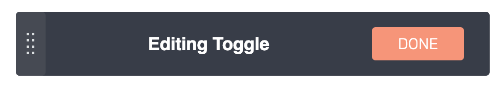
After you finish editing the Toggle items, click the Done button to save and exit the Edit Mode.
Selecting the Colors for the Toggle Element
The Colors setting of the Toggle element lets you select a color you want to use.

When you click on the color block, you may have to unlink the color from the theme and then pick a color and apply it to the Toggle element.

Selecting Number of Columns in the Toggle Element
The Columns setting will help you decide the number of columns your toggle items will be displayed in.
To set this value, use the slider or the field beside it.
The number of columns you can set depends on the number of content headlines added. For example, if you have 4 headlines, the maximum number of columns you can add is 2, 5 headlines – 3 columns, so on and so forth.
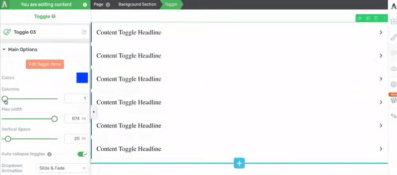
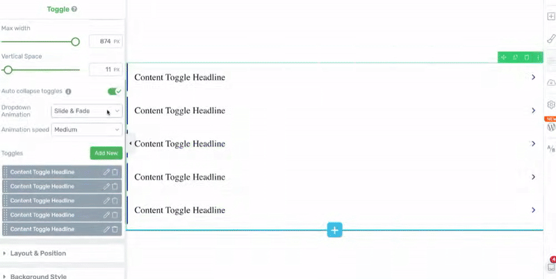
Setting the Maximum Width of the Toggle Element
The Max width setting lets you set the maximum width of the Toggle element. Here too use the slider or the field beside the setting.
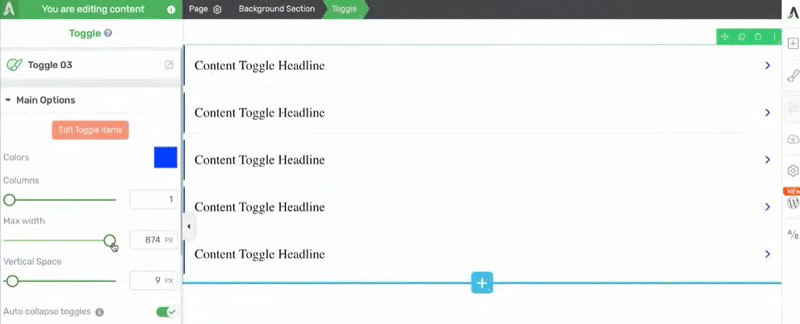
Setting the Vertical Spacing of the Toggle Element
The vertical spacing setting lets you manage the spacing between the toggle headlines in the Toggle element.
To manage the spacing, use the slider or the field beside the setting.
Note: Just like vertical spacing, you’ll be able to manage the horizontal spacing between headlines when you add 2 or more columns.
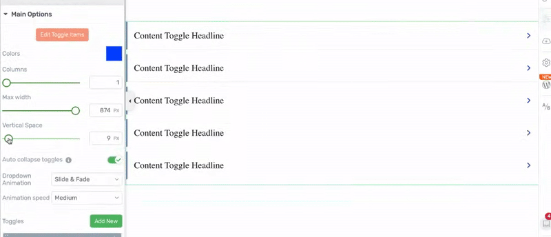
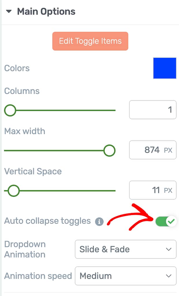
Auto-closing Toggles
If you turn on the Auto collapse toggle option, visitors can only open one toggle at a time. Opening a new toggle will automatically close any others that are open.
To use this feature, just click the on/off switch next to it.
Note: This option is turned on by default.
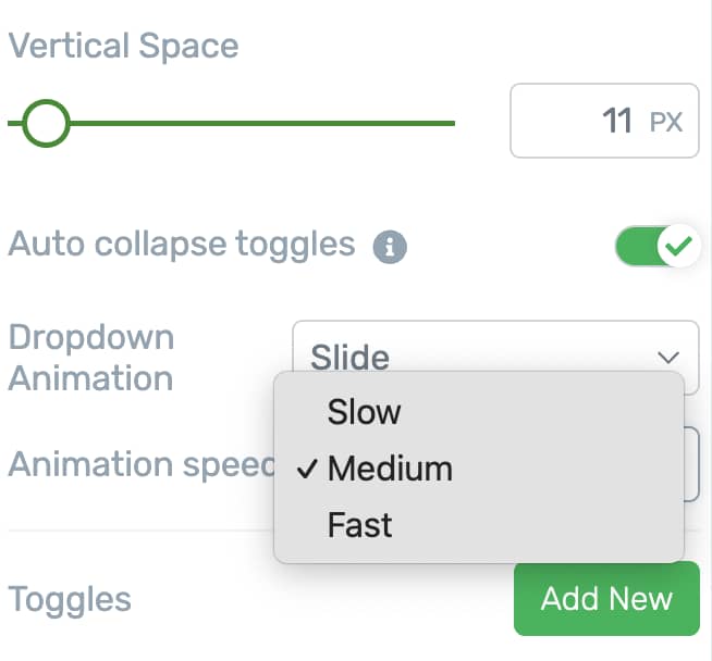
Selecting a Dropdown Animation
The dropdown beside the Dropdown Animation setting allows you to decide the animation effect you want to add when a toggle item expands.
To select a dropdown animation, click on the dropdown beside it and decide whether you want to add the Slide, Fade, or Slide and Fade animation.
Selecting the Dropdown Animation Speed
The Dropdown Animation Speed setting allows you to set the speed of the animation you select. Clicking on the dropdown allows you to select a slow, medium or fast speed.
Note: This option is only available when you select a dropdown animation in the previous option.
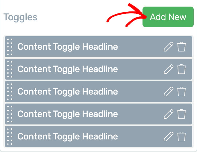
Adding, Editing and Deleting Toggles
The Toggles section under Main Options lets you add, edit or delete the toggles in a Toggle element.
- Adding a Toggle
- Editing a Toggle
- Deleting a Toggle
Adding a Toggle
To add a toggle, click on the Add New button beside Toggles.
Editing a Toggle
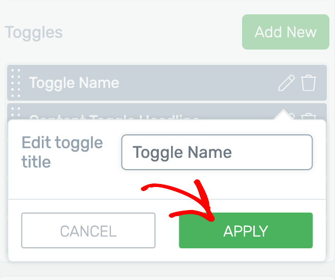
Editing a Toggle here will let you rename it. So, to rename a toggle, first click on the pencil icon beside it.
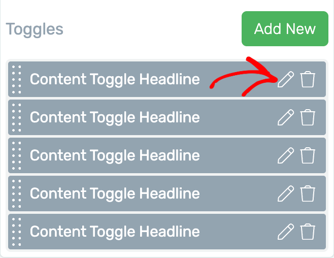
After clicking the pencil icon, you’ll see a dropdown where you rename the toggle in the given field and click the Apply button.
Deleting a Toggle
To delete a toggle from the element, click on the trash can icon.
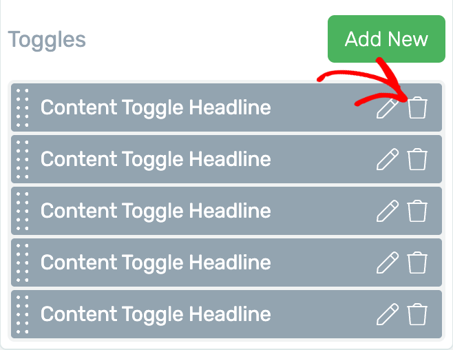
Clicking the trash can icon will remove the toggle instantly.
Using the Other Settings of the Toggle Element
Just like the other Thrive Architect elements, the Toggle element comes with additional options where you can manage the layout and positioning, borders and corners, background styling, shadows, etc.
To learn more about these options, read the documents listed below.
- Using Layout and Position Options in Thrive Architect
- Using the Background Style Option in Thrive Architect
- Using Borders and Corners Settings in Thrive Architect
- Adding Shadows to Thrive Architect Elements
- Using the Responsive Option in Thrive Architect
- Using HTML Attributes in Thrive Architect
We’ve just seen how you can add and customize a Toggle element on a page using Thrive Architect. You can take a visual tour of it by watching the video below.
Next, just like a Toggle lets you stack content blocks horizontally, the Tabs element lets you add vertical content blocks that users can switch between. You can read our document to learn more about the Tab element in Thrive Architect.