With the help of the “Mega Menu” feature of the Custom Menu element, you can create Mega Menus, where all the second and third level menu items will be displayed on your page at once, in a Mega Menu dropdown.
This is very useful if you want to give the visitors of your website an easy way to browse through complex navigation menu structures. If you build a “Mega Menu” they will be able to access lots of different menu items right away, without having to look through the entire website.
Here is how you can do that:
Add the Element to the Post/Page
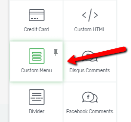
The first step is to add a “Custom Menu” element to your page. To do that, click on the plus sign from the right sidebar. This will open the list with elements.
Look for the “Custom Menu” element and when you have found it, drag & drop it to the desired position on the page:
Note: Please be advised that if you place a Mega Menu into a container (e.g. a Content Box, Columns, etc.) that is not full width, the menu and its drop-down will only be as wide as the container. Since the container is not full width, the menu will not be full width either (it will only be able to take the max-width of that container).
This might lead to the drop-down not being displayed correctly. Thus, for a good user-experience, we do not recommend placing Mega Menus in containers.
In case you need to have a menu in a container type of element (which is not full width), then we recommend using a Standard Custom Menu instead of the Mega Menu because that one does not have the large drop-down that the Mega Menu does.
Menu Type
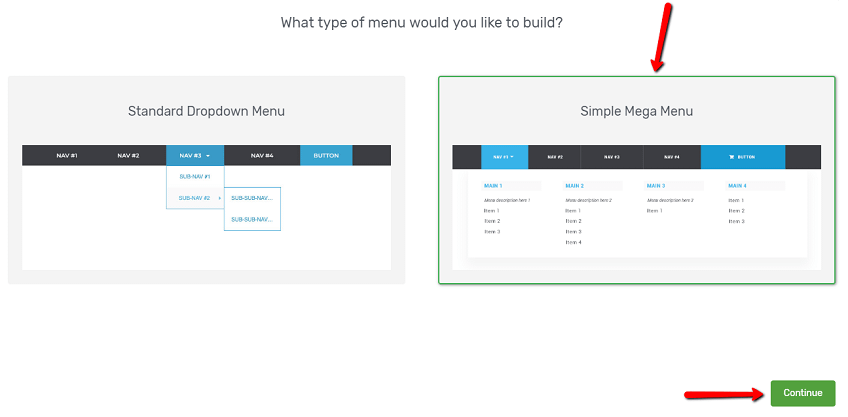
After you have added the element to the page, you will have to select what type of menu you would like to build. Select the “Simple Mega Menu” and then click on the “Continue” button to go on:
Menu Source
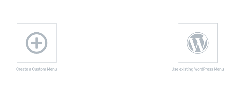
The next step is to select the source of the menu you want to add. You can choose between creating a Custom Menu from scratch or using an already existing WordPress Menu from your website:
Create a Custom Menu
If you want to create a custom menu, then choose this option. Once you have clicked on it, the “Select Template” button will appear on the bottom right corner of the window. Click on it to go to the next step:
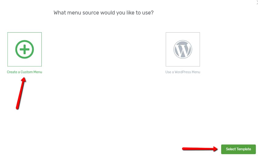
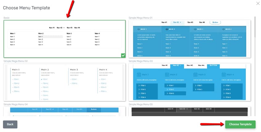
The list with the available templates will open. Select the template you like from this list and then, click on the “Choose Template” button:
Use existing WordPress Menu
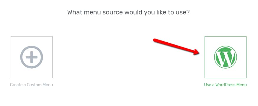
If you want to use one of the menus you have already set up in your WordPress dashboard, then, click on the “Use a WordPress Menu” option when you are selecting the source for your menu:
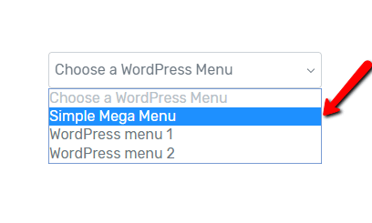
After you choose this, another section will appear where you can select the exact menu from. In order to do this, click on the down arrow from this section and then, select the WordPress menu you want to use from the drop-down that appears:
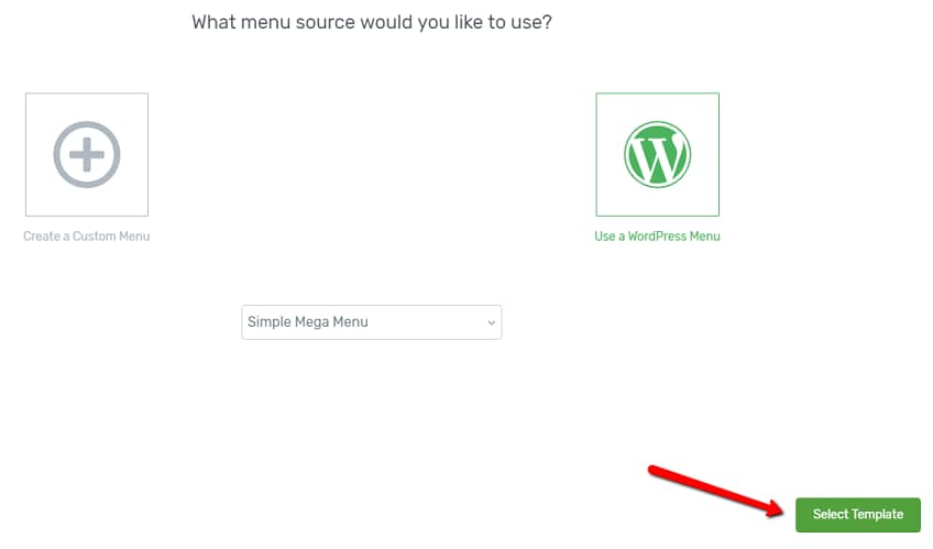
Then, the same “Select Template” button will appear as in the case of the “Create a Custom Menu” option mentioned above. Click on it:
This will take you to the list of available templates. Select the one that best suits your needs and click on the “Choose Template” button:

Choose the Template
From the first section of the sidebar, you are able to browse and change the template of the menu. To do that, click on the “Template” field, and simply change the current template with another one from the library:

You can choose between multiple templates, with a horizontal or vertical orientation, to find the one that best suits your website.
Note: If you want to replace the template, make sure you do this before adding any content or customize the existing content of the “Custom Menu” element. This is because, when changing the template, all the initial content and modifications will be lost.
Use the Main Options
After inserting the menu to your page, you will be able to customize it, using the “Main Options” of the “Custom Menu” element. You can do this, exactly the same way as you do when you build/insert a “Standard Dropdown Menu” to your page.
Therefore, to see detailed information on how to customize the “Simple Mega Menu” you have just inserted, please read this article.
Since the more general options are also available for the “Custom Menu” element, you can also use these to customize the “Simple Mega Menu” further. If you need to know how to use these options, please check out the separate tutorials about each of these on our tutorials page, or in our knowledge base.
Style Simple Mega Menu Items
Besides customizing the menu, you also have the option of changing the style of its items, based on what level they are.
In order to customize a menu item, click on it directly. This will open the options of the “Menu Item” in the right sidebar. You can also select which menu items to customize by opening the drop-down from the “Currently styling” section and selecting the group of items you want to modify:
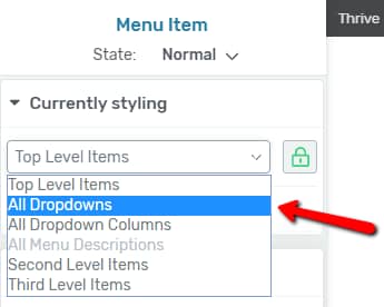
Then, you can use the “Main Options” of the Top-, Second- and Third Level items (such as the “Hover Effect“, the “Item style” or the “Show Icon” option) to proceed with styling them.
All of these options are described in detail here with three exceptions that are available only for Mega Menus.
All Dropdowns
If you want to style the drop-downs of your “Simple Mega Menu” and you select “All dropdowns” from the “Currently Styling” section, you will see a new set of “Main Options” appear:
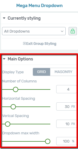
- Display Type
First, you can choose the way in which the items of the drop-down are displayed. Either click on the “Grid” or the “Masonry” type and what you select will automatically be applied to the drop-down of your Mega Menu:

In case you have more second-level items (with various numbers of third-level items) than the number of columns set for the drop-down, then, you will see the differences according to the “Display Type” that you have selected:
- If you have selected “Grid”, the drop-down items will be displayed as a fixed grid with the same heights per row.
- If you have selected “Masonry”, each item of the drop-down will be displayed with its own height, so that they are displayed nicely one below the other.
- Number of Columns
Here you can choose in how many columns will the menu items be shown in the drop-down. In order to change the current number of columns, either drag the slider under this option or enter a value manually in the box next to it:

- Horizontal & Vertical Spacing
Both of these options work the same way. With the help of the “Horizontal Spacing” you can adjust the horizontal spacing of the elements in the drop-down; and with the help of the “Vertical Spacing”, you can change the vertical spacing of the elements in the dropdown.
All you need to do is either drag the slider under these options, or enter a value manually in the box next to them, and the spacing in the drop-down will be changed:


- Dropdown max width
With the help of this option, you can change the width of the drop-down container. By default, this is set to 100%, but if you want the drop-down to be smaller (occupy less space), in terms of its width, all you have to do is to either drag the slider from the “Dropdown max width” option or enter a value manually in the box next to it:

All Dropdown Columns
If you have selected the “All Dropdown Columns” from the “Currently Styling” section, then, you will see one Main Option: the “Show menu description” option.

- Show menu description
This option is also only available for Mega Menus. In order to use it, you first have to activate it by clicking on the switch next to it, shown in the image above.
This will automatically add the “Click to edit menu description” sample inline text to the first column of your drop-down.
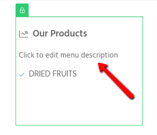
Simply select the inline text that has been added and either start typing or paste the text you want as the description for this menu.
If you want to add a “Menu Description” to another drop-down column, you just have to click on the respective column and then, activate the “Menu Description” option for it.
These descriptions work similar to Text elements, so you can change their color, font type/size, etc. You can style the “Menu Descriptions” if you access them: either by clicking directly on them, or selecting them from the “Currently Styling” section; and then, use their “Main Options” from the left sidebar.
However, please keep in mind that Menu Descriptions cannot be styled separately. This means that if you style or change something on one of them, then, those changes will be applied to every “Menu Description” that you have for your drop-down (including the ones you add in the future).
Second Level Items
Furthermore, when it comes to styling the “Second Level Items” of a Mega Menu you will also have the option of displaying an image for them. With the help of this option, you can have more graphical second-level items.
- Show Section Image
In order to do this, click on one of the second-level menu items to access its options, or select “Second Level Items” from the “Currently Styling” section of the Mega Menu. Then you will see the “Show Section Image” option in the “Main Options”:
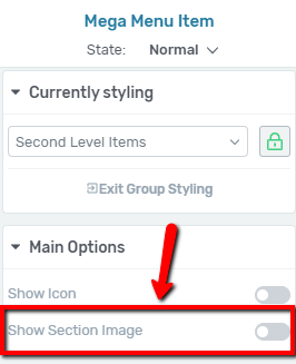
Click on the switch next to this option to activate it.
- Position the images
Below the “Show Section Image” option four different positioning options will appear:

These represent which part of the second level menu item should the image appear. By default, the left position is selected, but you can easily change this if you click on one of the other positions available: the right, the top, or the bottom position.
- Select & add the images
After activating the “Show Section Image” option and selecting where the image should be placed, you can go on and choose the image you want to be displayed.
For that, look for the second-level menu items on the page, in the editor, and click on one of the image icons that has been added to them:

This will open the Media Library where you can add the image from. If you have previously uploaded here the image you want to use, simply click on it to select it and then click on the “Insert into post” button.
If you have not uploaded the image yet, then first you will have to use the “Upload Files” tab to upload the image, then select it and insert it with the “Insert into post” button.
After you add the image, it will be displayed instead of the image icon in the second level item that you have selected.
Repeat this process to add an image for each of the second-level menu items you want.
All Menu Images
After you have added the images to the second level items, you can style them in the same manner as you can style menu items. Either click on one of the images from the menu to select it or choose “All Menu Images” from the “Currently Styling” section:
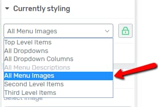
Then you will see the “Main options” related to the menu images appear in the sidebar. If you want to change the image added to one of the items, click on the “Replace Image” option from:
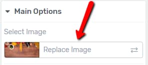
This will open the Media Library and you can select (or upload and select) the image you want to replace the current one with.
Furthermore, you can also adjust the size of the images from the drop-down menu by either dragging the slider under the “Size (height)” option or entering a value manually in the box next to it:

Note: When adjusting the size of the images, you will see that the size of every image will change at the same time. This is because of group styling.
If you want to change the size of only one of the images, then, you will have to deactivate group styling for that specific image, by clicking on the “Lock-Unlock” button that appears in its upper left corner, or on the one that is in the “Currently Styling” box.
Mobile Menu
After you have customized and styled your Mega Menu in desktop view, you can also make sure it looks good on mobile devices as well. You can do this by customizing/adjusting it in mobile view, just as presented here.
However, please keep in mind, that the main idea behind Mega Menus is to have a large drop-down, in which second and third level menu items will be displayed on your page at once. Therefore, this feature was created with the desktop view in mind.
Nevertheless, as mentioned above, you do have the possibility to customize Mega Menus to be mobile-friendly as well, just keep in mind the following:
- In mobile view, the top-level menu items will inherit their style from the desktop view, just like in the case of a “Standard Dropdown Menu”.
- However, the second and the third level menu items do not inherit their desktop style. This means that although you style the second and the third level menu items in desktop view, they will not look the same way in mobile view.
Here, you will have to style them again to make sure, they are suitable for mobile devices. The only thing that second and third-level items inherit from the desktop view is icons. So if you have added an icon to them in desktop view, that will also be visible in mobile view.
Also, when you want to style the second and third level menu items in mobile view, you will see that you can only style them together, not separately. Thus, the second, as well as the third level menu items will look the same way on a mobile device and the changes that you bring to one of them will be applied to the other ones as well.
After you have customized the “Simple Mega Menu” in mobile view as well, you can save the page and preview it, to see how the newly added menu will look like for the visitors of your website.
Use the Rest of the Options
Just like in the case of other elements, besides the “Main Options”, you can use some other general options, as well (such as Layout&Position, Borders&Corners, etc.):
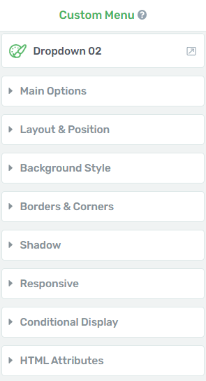
The ‘Conditional Display’ option
This feature allows you to take a block of content from any page, and create alternate versions for it:
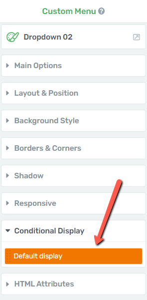
You can then assign different display rules to each version, and decide what each visitor to that page will see, depending on what kind of permissions that person has:
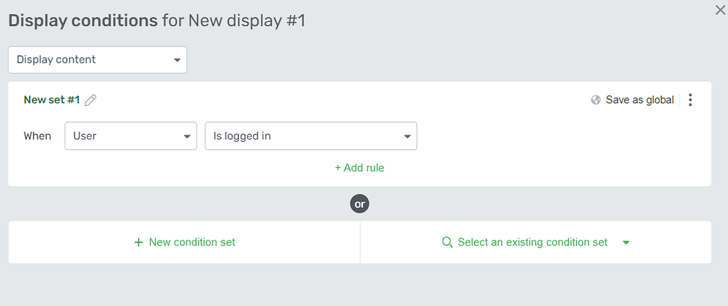
We have a separate article in our knowledge base that explains in depth how to use this feature:
If you want to know how to use the rest of the options from the left sidebar, make sure to take a look at the articles and tutorials from our knowledge base.
Also, if you want to find out even more details about the Mega Menu feature, check out this blog post.
Hopefully, this article was useful for you. If so, please give us a smile below 🙂