Thrive Theme Builder comes with a feature called “Reading progress indicator”, that shows your site’s visitors how much time is left until they reach the end of the page or post they are currently reading.
Using this feature on your Thrive Theme Builder templates can help you keep your audience engaged and scrolling until the end of the page.
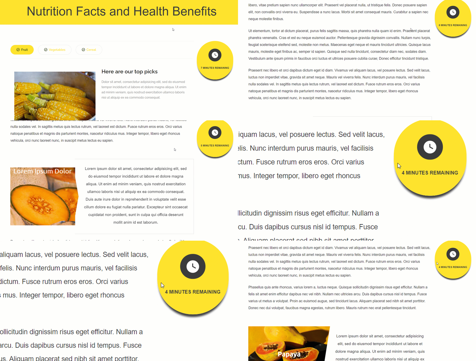
You can be creative and use it in interesting layouts, such as the one that I will be showing you in this article, in which I will create a sticky reading progress indicator that remains in viewport until the end of the page:
If you don’t know where to find the feature and how to enable it in Thrive Theme Builder, make sure to check out this article first:
Now let’s move on to the actual process of creating this layout.
Access a Thrive Theme Builder Template
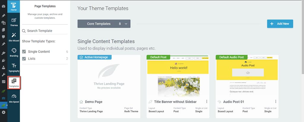
First, head over to the “Templates” section of your Thrive Theme Builder:
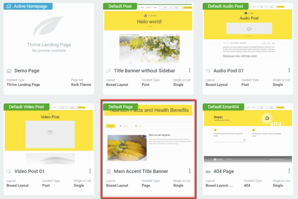
Access the template on which you plan to enable this feature. I will be working on the “Default Page” template:
Add the ‘Content Box’ Element
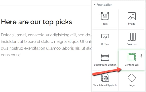
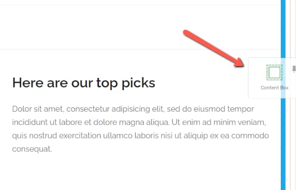
Here, the first thing we need to do is open the right sidebar list of elements and look for the “Content Box” element:
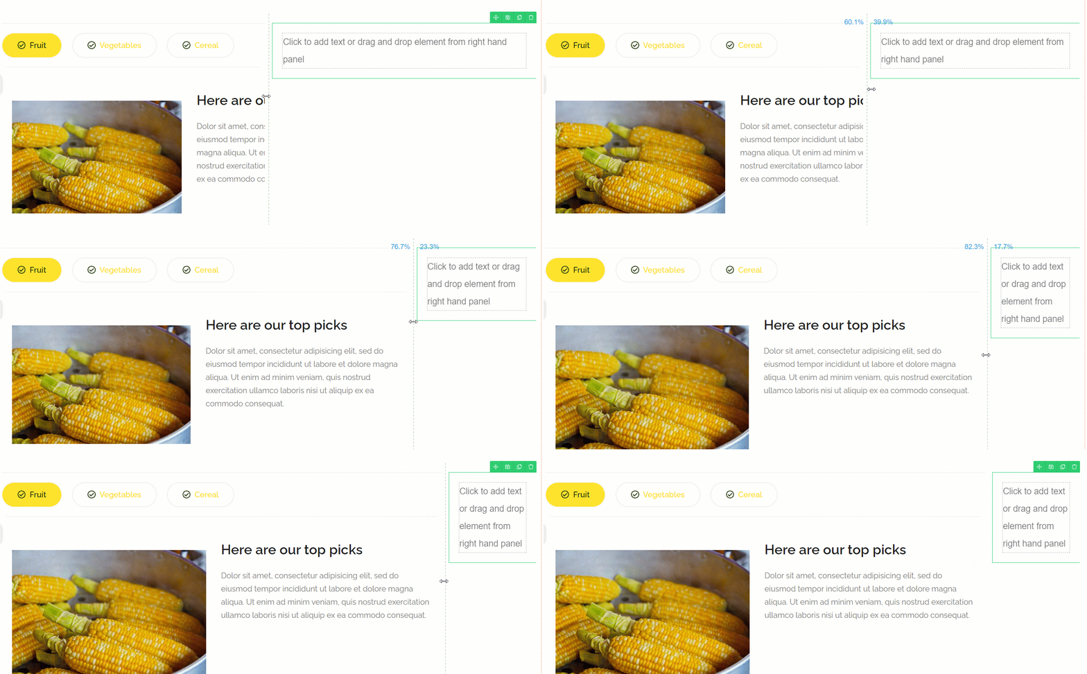
Place it on your template where you best see fit. For this example, I’ve added it to the right hand-side of the template:
Once the element has been added, feel free to adjust the layout proportions:
Add a Solid Color
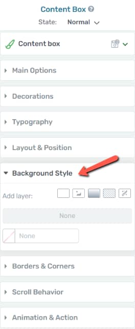
Next, let’s add a solid color to the content box. To do that, click on the “Background Style”:
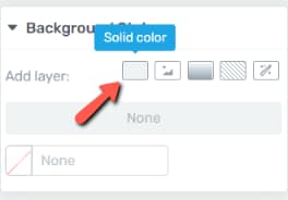
Add a “Solid Color” layer:
And pick a color using the color field or from the list of saved colors:
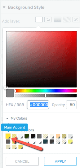
Adjust the Corners
After this is done, expand the “Borders & Corners” section of the same sidebar:
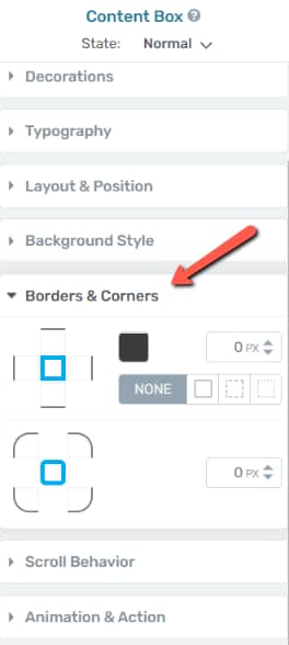
Here, tweak the corner values until they look as round as you would like them to be:
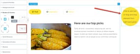
These values might need to be adjusted later, after we add content to the actual content box. But for now, I’ve just created and customized the container a bit, so that I’d have an idea of how the final layout would look like.
Add the ‘Text’ Element
Next, let’s move on to adding a “Text” element to this content box, from the same right sidebar list of elements:
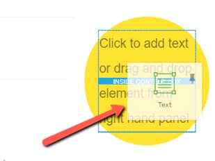
Use a Dynamic Source
Select the text, and look for the dynamic text option of the inline formatting panel:
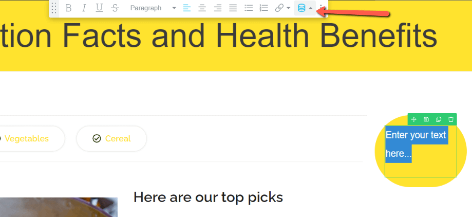
After you click on it, select the “Content” field from the first drop-down list:
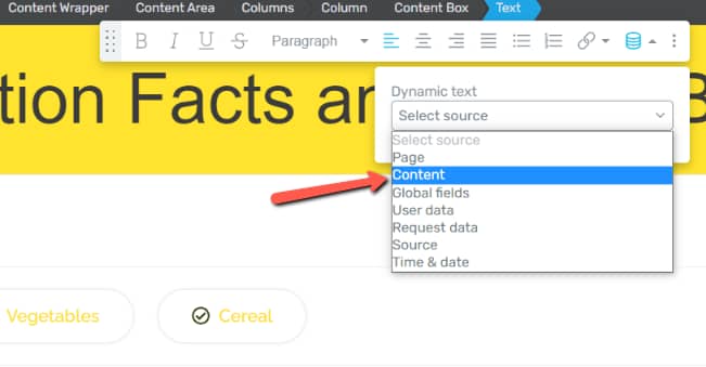
In the second drop-down list that appears, select “Reading time remaining (in minutes)”:
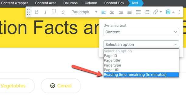
Lastly, click on “Insert”:
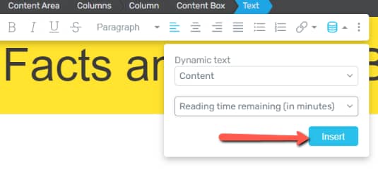
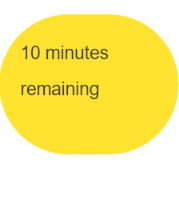
The selected text should automatically turn into a dynamic one, that shows the actual number of remaining reading minutes:
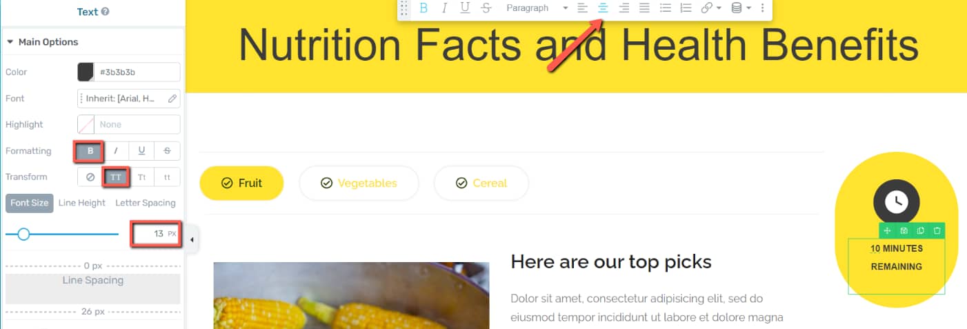
With the text selected, use the left sidebar options to customize it to your liking. I’ve made it bold, all caps, and center aligned, and also decreased its size a bit:
Add the ‘Icon’ Element
Next, add an “Icon” element to your content box:
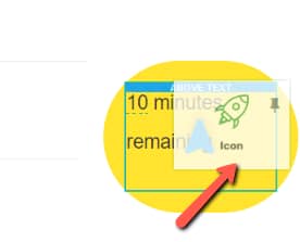
Choose a template from the library:
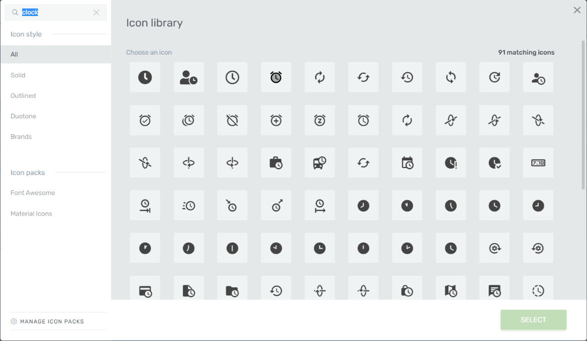
And once added to the container, feel free to use the left sidebar options to further customize it. You can change the style if you want:
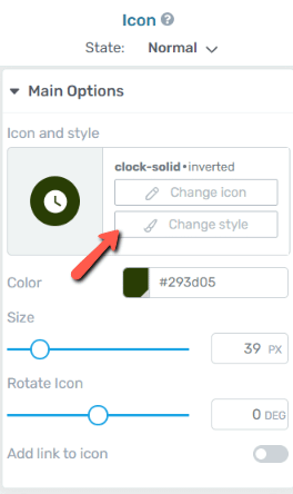
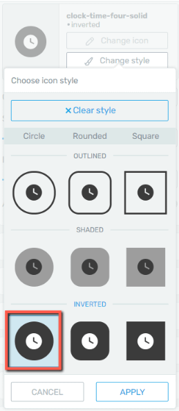
And pick a different one from the available list of icon styles:
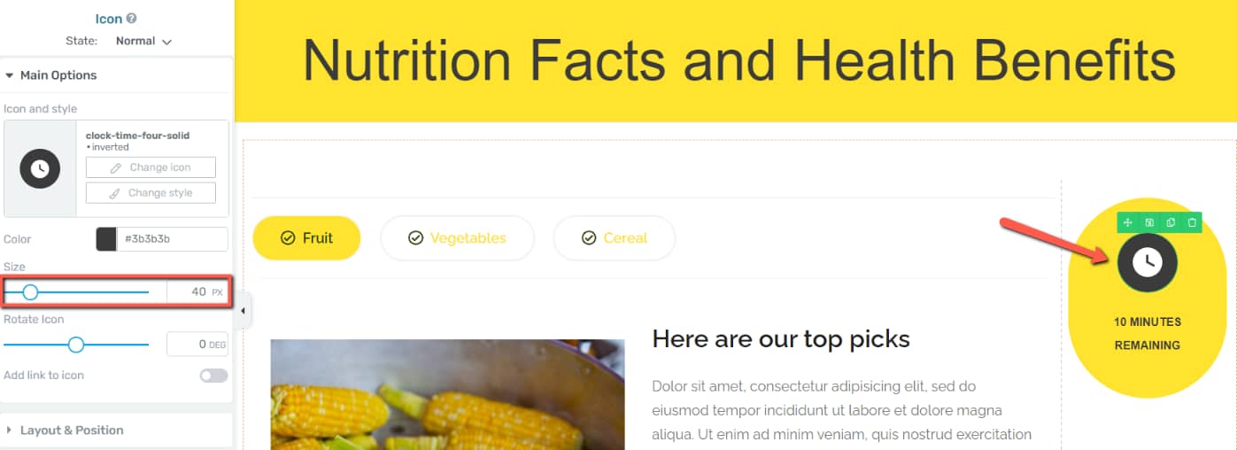
And of course, you can also adjust the sizing in order to make it fit nicely in the parent container:
If you are satisfied with how the content box looks like up to this point, then the only thing left to do it to make sure you apply a sticky behavior to it. This means that the element will remain in viewport on scroll, until the end of the page (or until it reaches another element set by you).
Apply the Sticky Behavior
To do that, make sure your “Content Box” is selected and expand the “Scroll Behavior” section of the left sidebar:
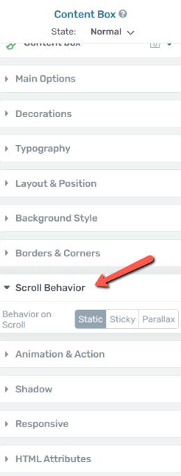
Here, select the “Sticky” option:
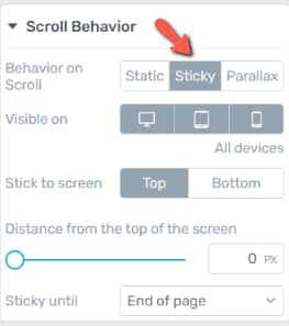
The remaining settings can be left as they are. If you do that, then the element will be in viewport until the visitor scrolls to the end of the page, like so:
If you want to keep the sticky behavior until a certain point of the page, you can do that as well, by selecting this option from the “Sticky until” drop-down list:
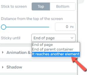
There’s a separate tutorial in our knowledge base about how to do just that, that I have linked below:
If you want to recreate the exact same look from the demo version, then keep on reading this article, as there are two more steps that need to be done.
Add a ‘Drop Shadow’
With your “Content Box” still selected, expand the “Shadow” section of the left sidebar:

Here, apply a “Drop shadow”:
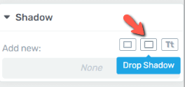
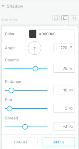
And tweak the values as needed be. These are the ones I’ve used for the demo version:
Add a ‘CSS Animation’ on Hover
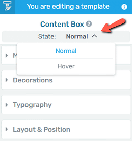
Lastly, let’s apply an animation to the content box on hover. For that, access the state panel of the element and access the “Hover” state:
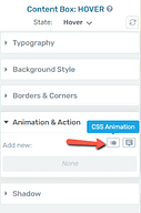
Expand the “Animation & Action” section and click on the “CSS Animation” option:
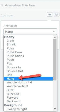
Select the “Hang” animation type and then apply and save your changes:
As simple as that you’ve managed to animate your content box, so that it will move anytime someone hovers over it. With all this ready and set up, you can return to the normal state of the element, and save and preview your work.
Your final reading progress indicator should be sticky until the end of the page and should also animate whenever someone hovers over it:

And that’s about it. This is how you can add a reading progress indicator to your Thrive Theme Builder, in this cool animated layout.
I hope you found this tutorial interesting. As always, don’t hesitate to check out other tutorials of this type available in our knowledge base.