Do you want to add animations that grab attention and keep users engaged on your webpage? The Animation and Actions settings in Thrive Architect lets you add such visual effects to different elements on a page.
In this article, we’ll show you an example of how you can create a page section with animated elements on it. The techniques used here can be mixed and matched with the elements on yor website to create your own custom animations.
For this document, we’ll be recreating a page block that contains animated images.
- Adding Images to the Block
- Working on the Layout
- Adding Animations to the Images
- Making the Animation Mobile Responsive
Adding Images to the Block
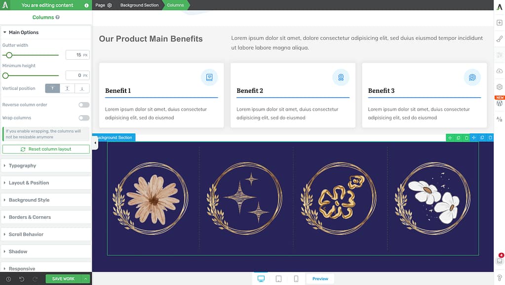
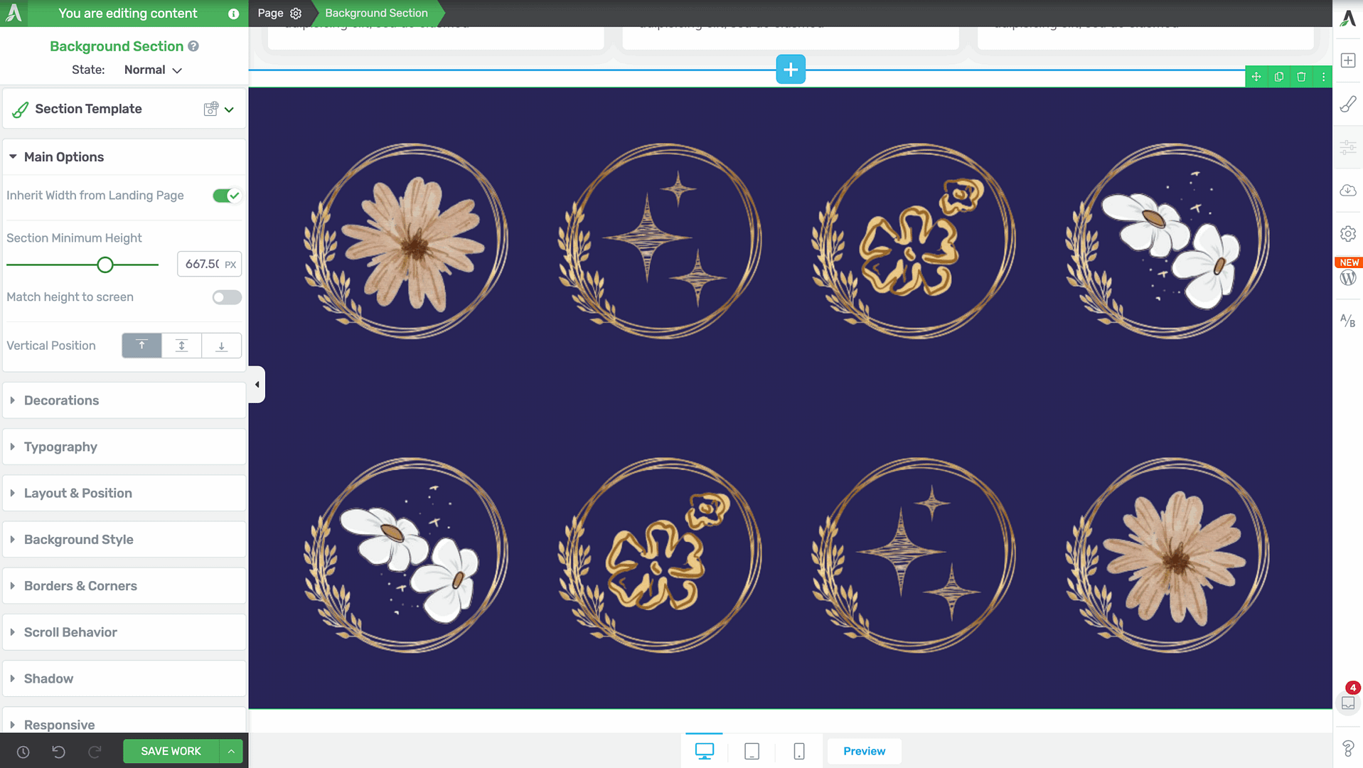
In the example for this article, we’ll add a background section on the page, that includes 4 columns and each column has an image.
To do so, drag and drop the Background Section element on the page. Then, drag and drop the Column element and select a 4 column layout inside the Background section element.
After you’ve added the 4 column layout, drag and drop the Image element inside each column and upload the image you want to use inside it.
To ensure we have enough images to show the animation in the demo, we duplicated the column element. To do so, hover on the column element and click the duplicate icon.
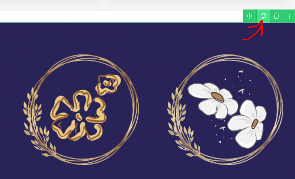
After duplicating the Columns element, you can replace the images with the ones you want.
Working on the Layout
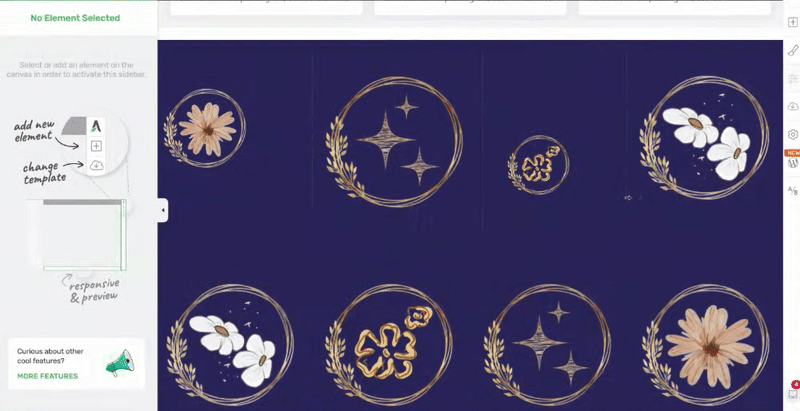
The next step in the process is arranging the images in a way that conceals the fact that they are staked into columns on top of each other. This will help achieve a more natural look.
There are different ways you can manage the sizing and layout of images in this case.
- Resizing the Image
- Adjusting the Image Layout and Positioning
- Using the Column Layout and Position Option
Resizing the Image
To resize the image in a column, click on the image to open its options in the left column.
In the left column options, open Main Options and use the slider to adjust the image size.
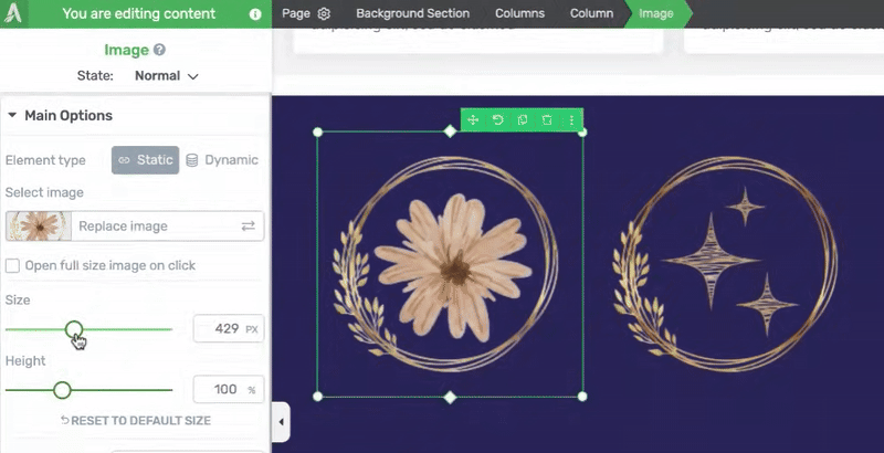
This can be done individually for all the images you’ve added in the columns.
When you try resizing the image, you’ll see that you cannot increase an image size after a certain point. This is because the column layout does not allow it to.
Adjusting the Image Layout and Positioning
Just like resizing an image, you can adjust the layout and positioning of images in each column.
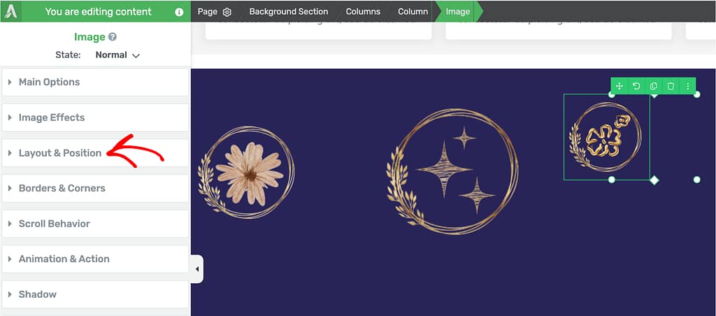
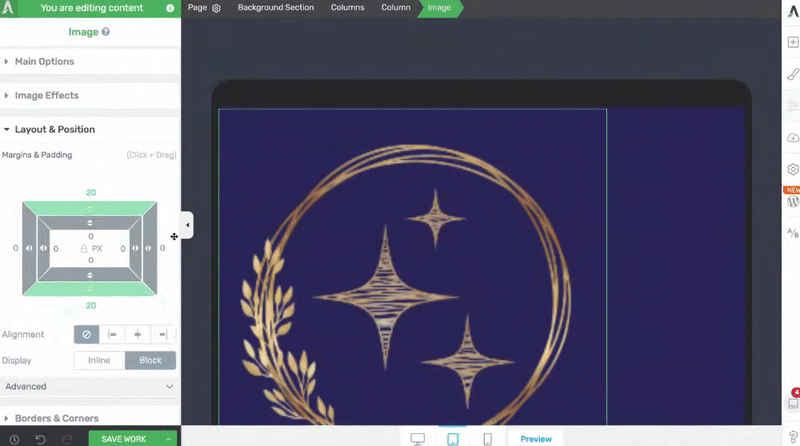
To adjust the Image layout and positioning, click on the Image to open the left column and click to open the Layout & Position options.
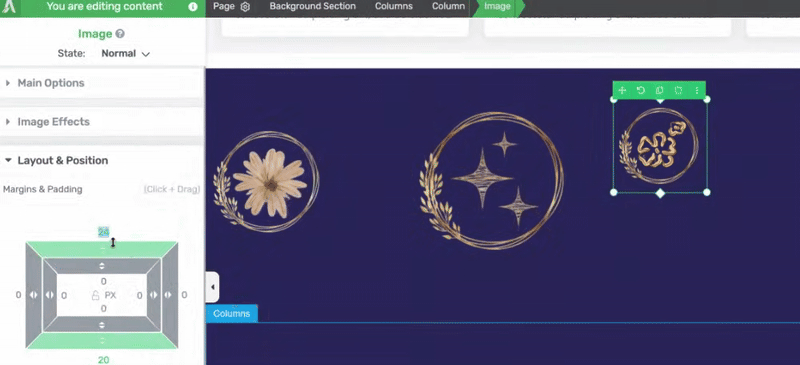
Under the Layout & Position options, drag and drop to adjust the margins and paddings for the image.
Note: The margins and paddings should be used for minor spacing adjustments. Adding huge margins and padding values will affect how the layout looks on smaller devices, such as mobile phones and tablets.
If you want to move an image from one side of the screen to the other side of the screen then try using the alignment options and advanced layout and position options.
To apply similar settings to the other images, repeat the Layout & Position settings for each image in the columns until you find a look that matches with what you have in mind.
Using the Column Layout and Position Option
Along with the image size and layout and positioning, you can alter the layout position of the columns by hovering over it and dragging the dotted lines.
Doing this will also help you increase the image sizes when you want.
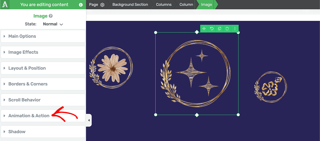
Adding Animations to the Images
When you finish adding the images, resizing them and setting up the layout and positioning, the next step is to add an animation to each of these elements (images in this example).
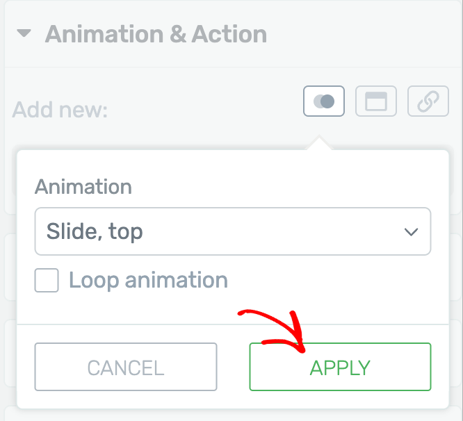
To add an animation, click on an image to open the left column options and click to open the Animation and Action settings.
Under Animation and Action, click to add CSS Animation to the image.
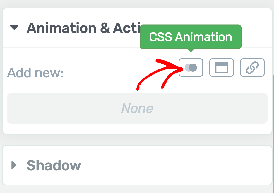
When you click to add a CSS Animation, you’ll see a box where you click the dropdown to select the animation for the image.
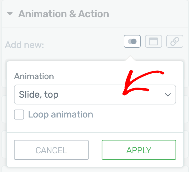
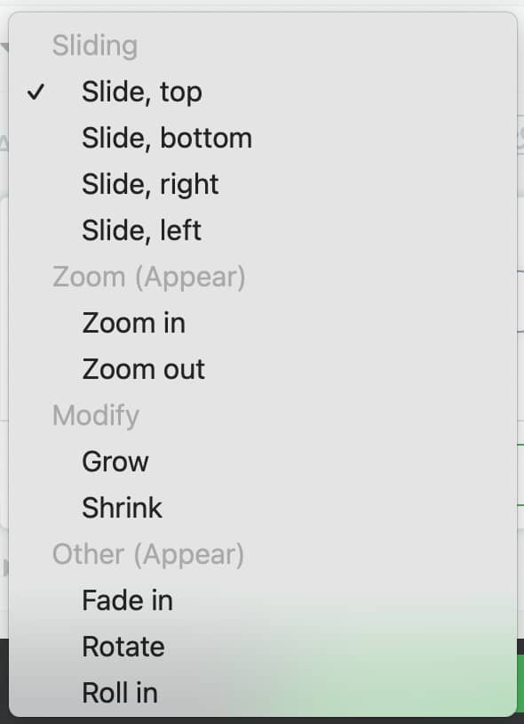
Once you click on the dropdown select the animation you want to apply.
After selecting the animation click the Apply button.
Similarly, you can apply animations to all the images added inside the columns.
Once done, click the Save Work button in the bottom left.
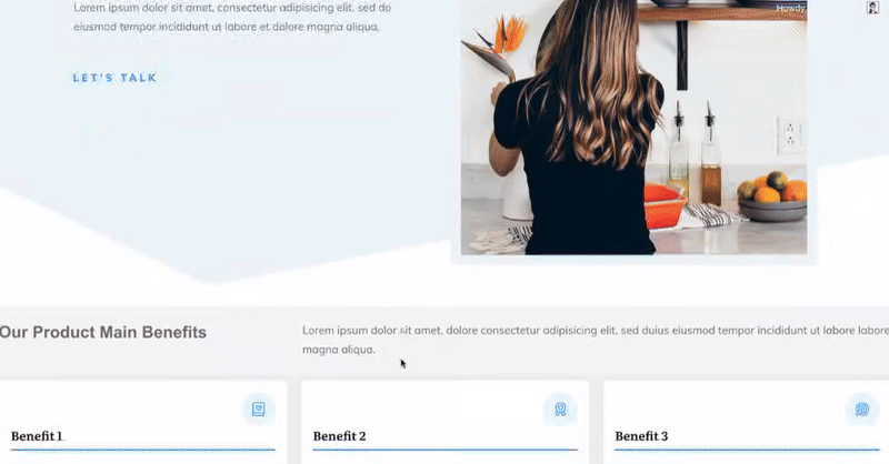
This will add a visual effect to all the images in that section that’ll be seen when a user scrolls down the page.
Making the Animation Responsive
When designing your website, it’s important to make sure that your posts and pages look good on smaller devices, such as tablets and mobile phones.
The page that we’ve just created looks best when opened on a desktop, but we can make sure that we get the same effect when opened on a tablet or mobile.
To do so, select the device from the panel located at the bottom of the page.
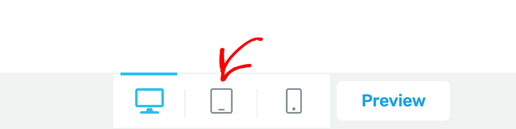
When you select the device from the panel, make the same type of adjustments as done for the desktop mode.
In this example, we’ve done that for the section in tablet view. You can do the same in tablet and mobile view individually.
We’ve just seen an example of how you can add visual effects in a page using Thrive Apprentice. Just like the Image element used in this article, you can use any other Thrive Architect element and add an animation you want to use on the page.
Next, do you want to add hover animation to images? Such animations will work when a user hovers on the image. To learn more refer to our document here.