While setting up a “Custom Menu” on your page/post with the Thrive Architect editor, you have the possibility to split the menu with your logo. This can be done in just a few steps and with it, your logo will be placed in the middle of your menu.
Activate the option
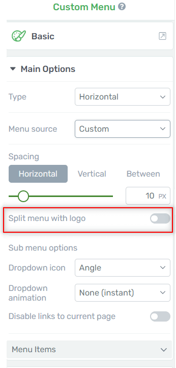
In order to achieve this, you will have to use the “Split menu with logo” option. When the “Custom Menu” element is selected, you can see its option in the left sidebar.
Look for the “Split menu with logo” option, from the “Main Options”:

Note: Please keep in mind that the “Split menu with logo” option is only available for “Standard Dropdown Menus”, so in case your custom menu is a “Simple Mega Menu”, then, you will not find the option/you will not be able to split the menu with your logo.
When you have found the option, click on the switch next to it, in order to activate it:

After you do this, the switch will turn green, signaling that the option is activated:

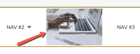
Thus, your logo will appear in the middle of your custom menu in a matter of seconds, like this:

If you have already set a logo for your website using the “Logo” element, or if you have a Thrive Theme Builder Theme, and you have displayed a logo using the theme’s options, then, the logo displayed here when splitting the menu, will be the same one you set with the “Logo” element/within the theme.
In case you have not set a logo for your website yet, then the logo displayed in the menu will be the default logo included in Thrive Architect (in the “Logo” element).
Customize the logo within the menu
If you want, you can even customize the logo that is displayed in your menu now. To do this, first, click on the logo from the middle of the menu:

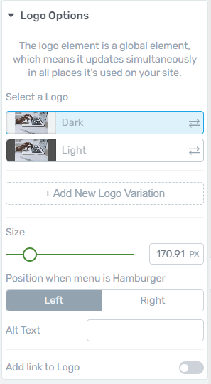
Then, you will see the logo’s options appear in the left sidebar:

You can use these options to customize the logo. This “Logo” element is identical to the “Logo” element from Thrive Architect. Therefore, you can customize it the same way.
If you need details on how to do this, check out this tutorial, for step-by-step instructions.
Position when menu is Hamburger
The only additional option you have for the element, in this case, is the “Position when menu is Hamburger” option.
Just as its name says, this option allows you to set where the logo should appear, when the menu is transformed to a Hamburger menu, which is when the page/post is viewed from a mobile device.
For such cases, you can choose to place the logo on the left of the menu, or on the right. To choose one of these, all you have to do is to click on the preferred setting from the “Position when menu is Hamburger” option:

You can preview how the logo will look on the left or on the right, by using the “Mobile Phone” or the “Tablet” view options, from the bottom-center part of the editor:

When you click on either of these view options, you will see how the menu is transformed to a hamburger menu and the logo placed on its left/right, in accordance with how you set this up:

After you finish customizing the logo within the custom menu, don’t forget to use the “Save Work” button, from the bottom-left part of the editor, in order to save your changes:

That’s how easily you can split your menu with your logo.
For more tutorials about Thrive Architect elements and options, check out our knowledge base here.