When building your website, it is very important that you take care of the aspect of your pages and posts and the way they look on every device.
I will link some useful resources below, so please check them out, as they are directly related to the mobile responsiveness topic:
-
How to Create Mobile Responsive Templates in Thrive Theme Builder
-
Why Doesn’t My Page Look Exactly Like the Preview on My Mobile Device?
-
How to Save and Preview Your Page (On a Desktop, Tablet and Mobile Interface)
-
How to Use the Responsive Option in the Thrive Theme Builder Editor
A common question we get is how you can make sure that your website’s menu looks perfect on all devices, not just on desktops.
When you customize the Custom Menu Element, it is, of course, very important to consider how it looks on different devices. This article will include some tips for that.
Customization Aspects
Customizing this element in desktop mode should not be a difficult task, but you should always keep in mind the following aspects when customizing the tablet and mobile views:
-
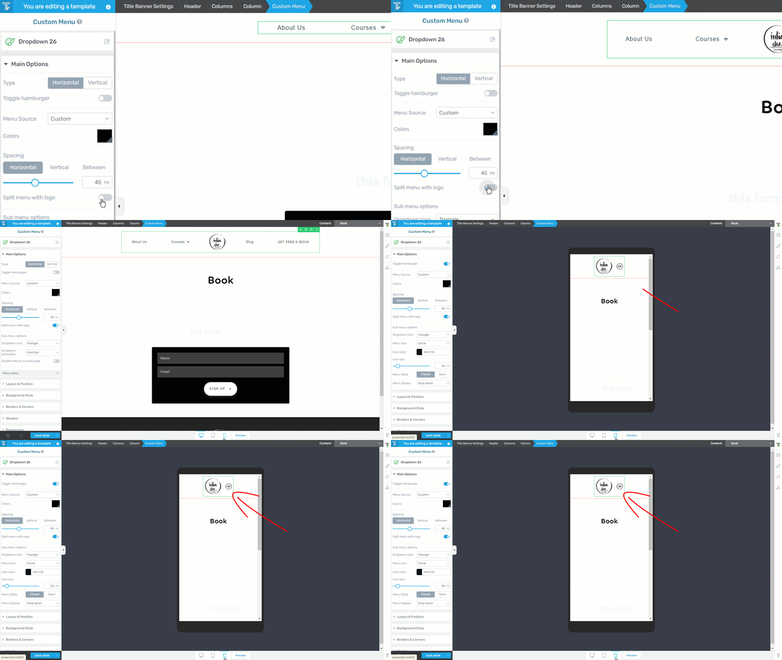
The “Split menu will logo” option will push the hamburger menu from tablet and mobile views, instead of leaving it in its default middle side of the page positioning.

-
Some modifications you make in Desktop Mode will not be inherited by the other two (Tablet & Mobile), so be sure to always go back and double-check if things are looking as you want them to.
-
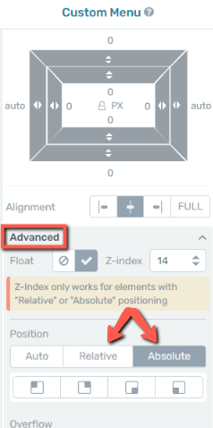
Try using relative/absolute positioning and alignment instead of an exact number of pixels.

This way, you’re working with proportions instead of fixed numbers, which will be very handy when setting margins and paddings, for example. Please see this video for more tips and tricks related to working with relative positioning.
-
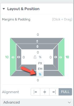
On the same note, when managing fixed widths, it is easier if you use percentages instead of pixels as the unit of measurement, and this applies to all Thrive elements.

This way, the size of the element you’re setting the fixed width for will be proportional to the screen size the user is viewing it on.
-
In case you’re adding more elements next to the menu, try to group them, so that they don’t modify their position one from another.
You can use the “Content Box” element to group them and make sure the position of the elements inside the “Content Box” will keep their placement on all devices.

-
Use the “Group Styling” feature to customize elements and items of the same level. Please check out this article for more in-depth information about how to best use this feature.
The Cascading Rule
When using Thrive editors, please remember that, for the three different views that you can edit (“Desktop” / “Tablet” / “Mobile”), we use a cascading rule.
This means that:
-
the modifications made on “Desktop” view will have an impact on both “Tablet” and “Mobile” view;
-
the modifications made on “Tablet” view will only affect the “Mobile” view;
-
the modifications made on “Mobile” view will not reflect on any other view.
Having this in mind, remember that it is always easier to start the
If you need more information about Thrive products and features, be sure to check out our entire knowledge base, found here.
Hopefully, this article was useful to you. If that’s the case, don’t forget to leave a smile below 😄
|
If you want to stay up to date with the latest articles added to our knowledge base each month, go ahead and sign up for our tutorial newsletter! |