If you use the “Lead Generation” element and you connect your form to multiple email services, you can also display a “GDPR Checkbox”, asking your visitors for consent to use their email address in more than one place.
This option comes after the General Data Protection Regulations (GDPR) have been implemented.
If you’re not familiar with this aspect, don’t forget to check out this blog post: How Thrive Themes Products Will Help You With GDPR Compliance.
How to Set this Up?
First of all, you have to connect your form to your desired services.
To do this, click on the “Lead Generation” element, go on the sidebar menu and click on “Add Connection”:

If you’re not familiar with this step, check out this list and click on any of the services that we support to see a tutorial on how you can establish an API connection.
As an example: We will set up two connections on the form: the WordPress account one and MailChimp.
In this way, the desired outcome is to create a WordPress user account for the visitor, while also adding them to our MailChimp mailing list, but only if the user accepts to receive our newsletter.
In order to be GDPR compliant, you can add a “GDPR checkbox” field to your form, through which your visitors can give their consent to add their data to your mailing list (in our case to MailChimp).
The label text for the checkbox can be something like “Subscribe to the Newsletter”, or anything that will let them know that their data will be used for some other purpose than to create the WordPress subscriber, as well.
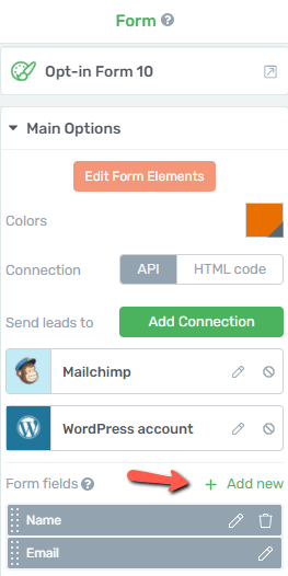
To add the “GDPR Checkbox”, you will have to add a new form field. For that, click on the “Add New” option:
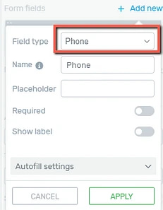
When you do this, a pop-up will open, where you can set up the new GDPR form field. Click on the “Field Type”, to open a list with all of the available types of custom fields:
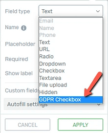
From this list, click on “GDPR Checkbox”:
After this, in the pop-up, you will be able to set up the field. You can choose a suitable name, but keep in mind that this will not be visible in the actual form, nor will affect the data submission:
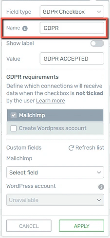
However, naming the fields can help you identify what the field is for. This can be useful if you have multiple fields and you’re sending the collected data via email, for example.
Then, using the switch next to the “Show label” option, you can decide whether you want the field’s label to be visible or not:
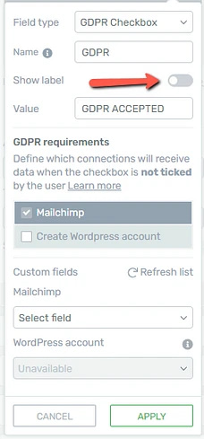
The label text can be modified using the “Edit form elements” option.
You can also change the default value for the field if you want:
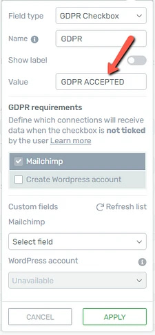
After that, you will have to check the GDPR requirements:
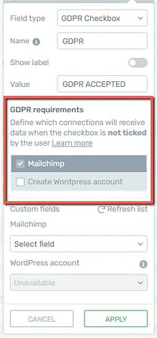
You will see all of the available connections here. This means that you can define what connections should or should not receive the data when the user doesn’t check the GDPR consent checkbox.
For example, if you want the WordPress account to be created, but the information to not be sent to Mailchimp, you can configure this as such:
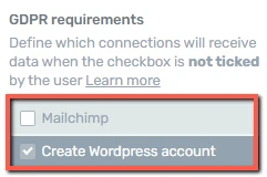
This way, the account will be created, but Mailchimp will not receive any of the user’s information.
If no box is checked here, then the GDPR checkbox will require confirmation to submit the form. The users will not be able to submit the form if they do not check the consent checkbox:
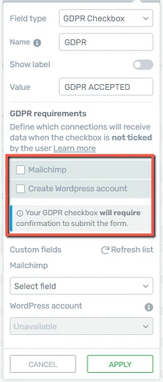
Thus, if the users will check the consent checkbox, the form will be submitted and all of the connections will receive the information of the user.
Once you have done that, you will have the option to select which custom fields from MailChimp (the chosen autoresponder) should the information field be added to:
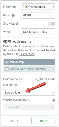
To do that, click on the “Select field” section and choose the field from the drop-down that appears on the screen.
When you’re done setting up the field, click on “Apply”:
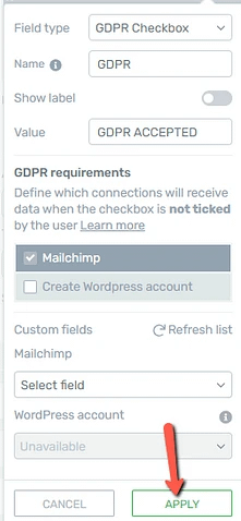
Now the GDPR field is set up. You can also customize and edit it if you want.
How to Edit the GDPR Field
The next thing we will do is modify elements, such as the text label associated with the checkbox, the size or style of the checkbox, etc.
To do this, select the form and, in the main options, click on “Edit Form Elements”:
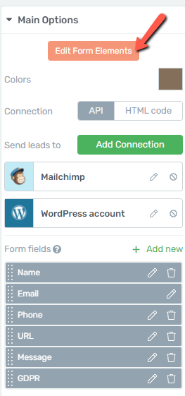
Then, select the newly added field, by clicking on it, in the editor:
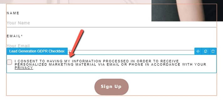
The options of this field will appear in the left sidebar:
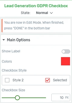
Feel free to use all of these options to customize this element.
States
Firstly, you are able to edit three different states of the GDPR checkbox: normal, hover, or selected.
For that, you can click on the “State: Normal” section from the top side of the left sidebar, to open the list with all of the available states:
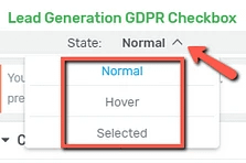
-
State: Normal
This is the state that you have been customizing so far. This is how the GDPR checkbox field will look like in its natural state.
-
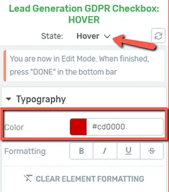
State: Hover
This is how the checkbox will look like when someone hovers their mouse over it:
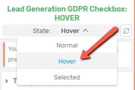
For example, you can change the typography of the checkbox, so that it stands out more when someone hovers over it. I will change the text color to red, in the hover state:
-
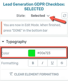
State: Selected
The last state is the “Selected” one, and you can choose the way this checkbox looks like after someone ticked it. As an example, let’s change the color of the “Selected” state to green:
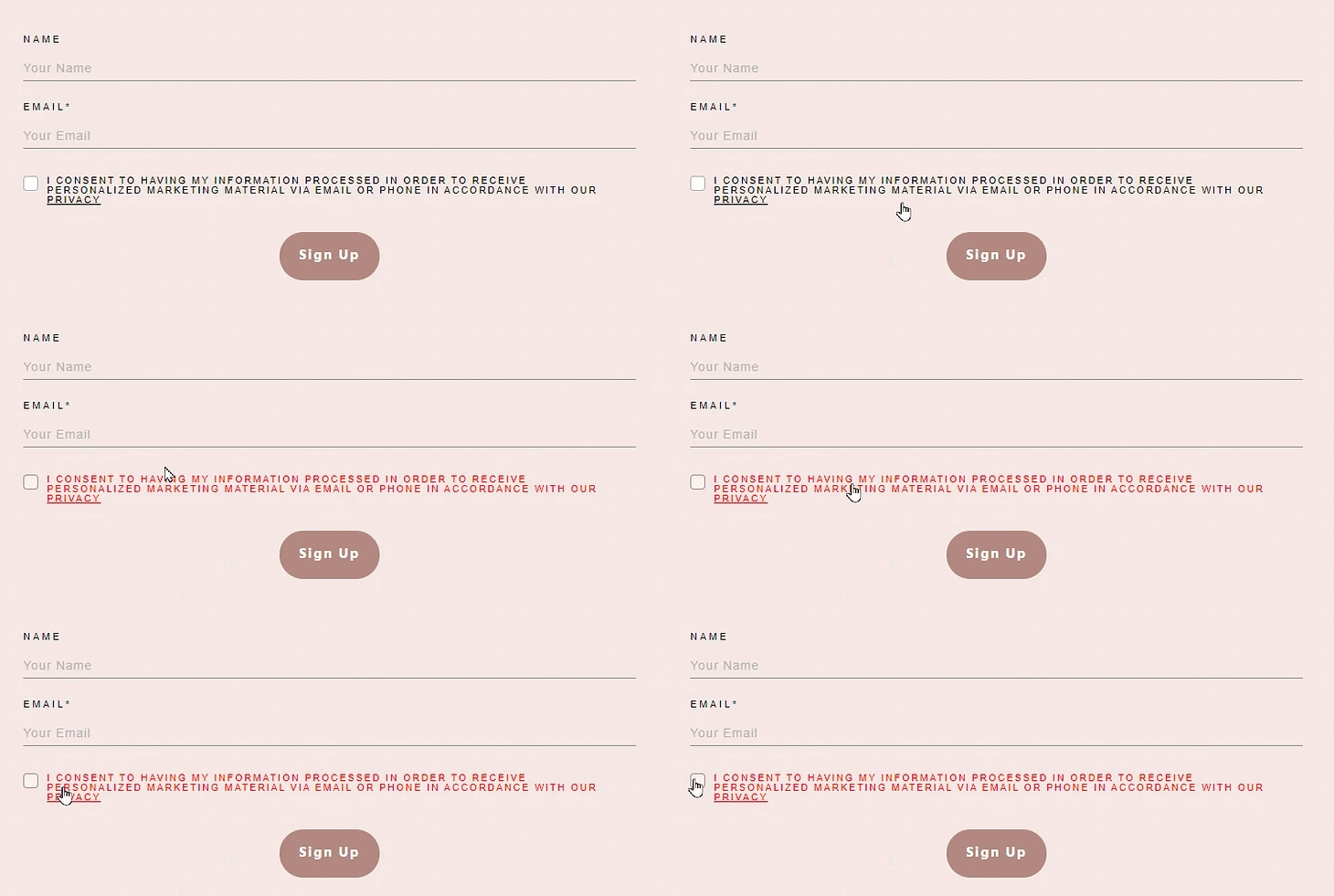
So, in this scenario, here is how the GDPR checkbox will look like for the users:
Main Options
Besides using the Group Styling feature, you also have some options under the “Main Options” section of the left sidebar, that you can use to further customize this checkbox. Here is how to use them:
Show Label
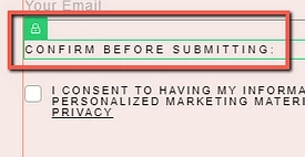
You can decide whether you want to hide or show the label of this form field. The label can be customized if needed. To show the field label, click on the switch next to this option:

If you activate it, you will be able to change the “Please Confirm” default label, by simply clicking on it and removing the default text, to type in your own:
Colors
Then, you can change the color of the tick icon, from the “Colors” section. Click on the color box and choose the preferred color:
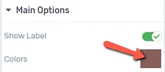
A color picker pop-up will open, and you can manually change the color, or enter a HEX/RGB color code.
Checkbox Style
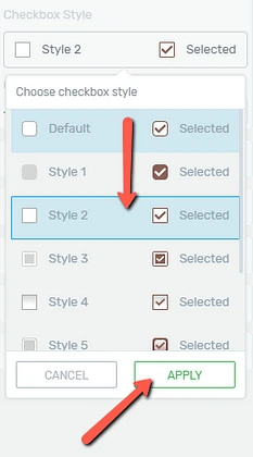
You can also choose from various styles for this element. Click on the field below this option to open the drow down with all the available “Checkbox Styles”:

In the pop-up that opens, scroll down to see all of the pre-designed styles, click on the one you like, and click on “Apply” to use it:
Checkbox Size
Lastly, choose a suitable size for the checkbox, by using this slider, or by entering a value in this field:

These were the ways to set up the “GDPR Checkbox” form field, using the options from the left sidebar.
Of course, besides the “Currently Styling” and “Main Options” sections, feel free to use all of the other general options for even more in-depth customization of this field. For all of the other options, you will be able to find articles in our knowledge base.
I really hope this article was useful for you. If that’s the case, don’t forget to rate it with a smile below 🙂