When working with images in Thrive products, whether we’re talking about a Thrive Theme Builder theme or a Thrive Architect constructed page, there are some key points you should keep in mind regarding how images should be handled:
-
Most WordPress themes provide image size guides because the images are fixed. However, we don’t have these guidelines as our themes don’t have standard image sizes.
-
As a Thrive Suite user, you will have full control over adjusting the images and resizing them as you wish:

-
When it comes to “Image” elements, we automatically load the optimized version.
-
When it comes to dynamic background images, if you add an element to a page and go to the “Background Style” section, the width of the element is automatically set to an appropriate size:
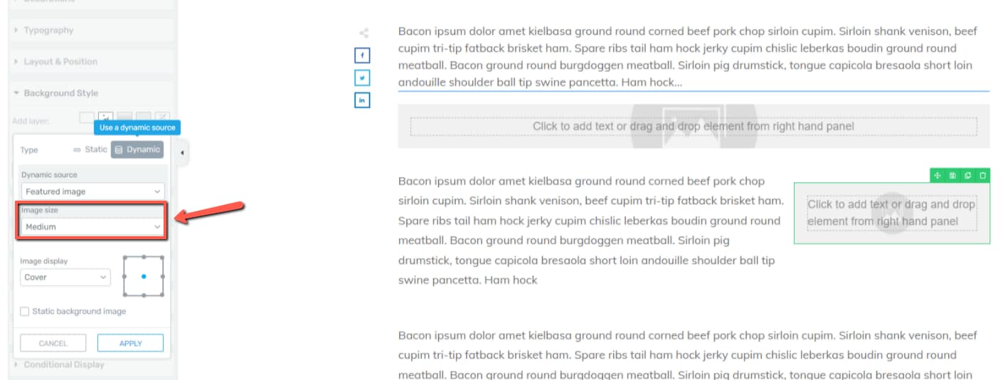
As you can see, the “Content Box” on the bottom right has a medium image size, while the one above has the background image automatically set to large.
-
The official recommendation from Google says that you should always include width and height size attributes on your images and video elements.
By default, whenever an image is inserted using Thrive Architect, the dimensions of the image are specified automatically. For this reason, you don’t need to do anything else to make this happen.
-
Thrive Architect automatically has SRCset technology enabled. When uploading an image into the Media Library, WordPress will automatically save multiple sizes of the same image.
When using an image in Thrive Architect, all the available image dimensions will automatically be listed in the code. -
In the front end, the browser (Chrome, Firefox or Internet Explorer for example) will automatically display the smallest image size that’s big enough to cover the display dimensions.
-
If you are looking for a way to always load the exact image dimensions in the front end, there are two methods in which it can be done:
-
Manually – by saving the image in the right dimensions
This method relies on you saving images in an image editing exactly in the right display dimensions.
This can be quite tricky if you don’t specifically know the dimensions that you want in advance.
It can often involve going back and forth between Thrive Architect and the image editing tool, so this method is more practical for advanced users that understand image dimensions and exactly what they’re looking for – not very practical for beginner or intermediate users. -
Automatically- by activating adaptive images
Adaptive image technology ensures that the browser will always load the exact image size for the end-user, regardless of the dimensions that the image was saved at.
This is the recommended solution for most users because it’s a set it and forget it approach that ensures images across the whole site are always served at the right dimensions.
Our recommended solution is Optimole; it works with all Thrive Themes products and delivers images at exactly the right dimensions over a CDN.
-
Even as a general rule, we always recommend using an image optimization plugin such as Optimole.
Useful references:
-
What Non-Thrive Plugins You Should Use for Your WordPress Website
-
How to Use the Site Speed Section of the Thrive Theme Builder Dashboard
-
Popular Third Party Plugins Used Alongside Thrive Theme Builder
-
Interpreting the Site Speed Score from PageSpeed Insights (Image Suggestions)
These are a few key ideas on using images with Thrive Suite plugins. I really hope this article came in handy. Leave a smile below on your way out 😸