Do you want to use the Content Box element effectively with all the available styling and functional options in Thrive Architect? Like every other element, the Content Box element too comes with features and settings that will help you add text or any other element within it.
In this article, we’ll show you how you can add the Content Box element to a page, and customize it to your needs.
- Adding the Content Box Element to a Page
- Editing the Status of a Content Box
- Using the Content Box Element’s Main Options
- Other Options of the Content Box Element
Adding the Content Box Element to a Page
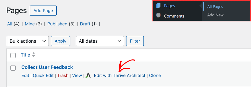
To add the Content Box element to a page, begin by opening the page in the Thrive Architect editor. To do so, open your WordPress admin area, Pages >> All Pages, hover on the page you want to edit and click Edit with Thrive Architect.
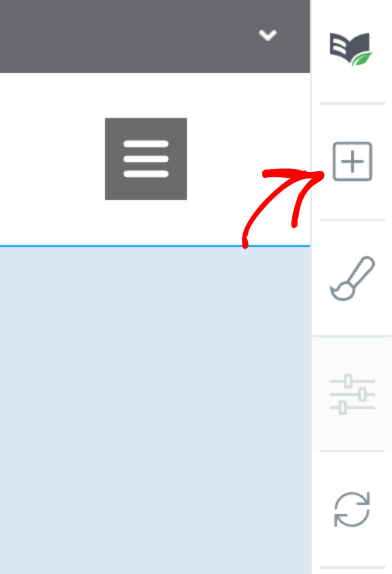
When the page is opened in the Thrive Architect editor, go to the right panel and click the plus (+) icon.
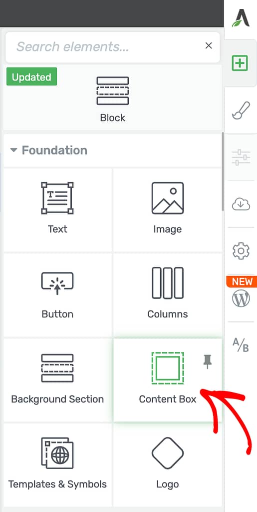
Clicking on the plus icon will open up the list of Thrive Architect elements to choose from. From this list, drag and drop the Content Box element on the page.
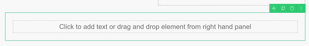
Once you drag and drop the element in your desired location you’ll see the Content Box element on the page with a placeholder text in it.
Depending on what your goal is, you can add various elements inside the Content box.
By default, a Text element is already added to the Content Box. You can simply click inside the box and start typing or paste the text you want to display in your content box.
Tip: If you don’t want the default Text element, you can easily delete it using the little trash icon that appears when you click on the element.
Furthermore, you can add other types of elements (such as buttons, images, etc.) by simply dragging and dropping them into the Content Box. This way you can create the content that is the most suitable for your page.
Editing the Status of a Content Box
Like the other Thrive Architect elements, the Content Box has settings that’ll appear in the left column.
To open the Content Box settings, click on the Content Box on the page in the Thrive Architect editor.
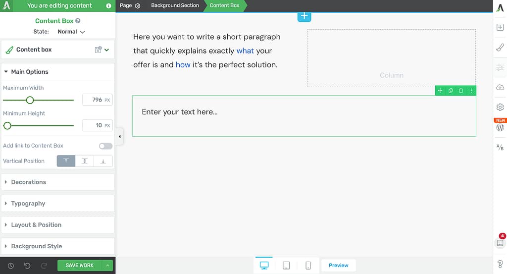
In the left column, the first thing you can do is select a state of the Content Box you want to edit. To select a state, click on the currently selected state – as for this example it is Normal.
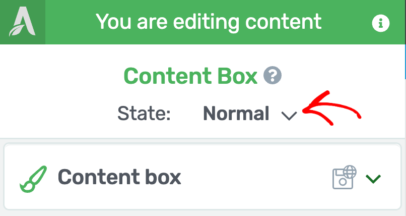
After clicking Normal, you’ll see the available states that you can select from. The available states for a Content Box element are Normal and Hover.
- Normal: This lets you edit the Content Box element in its original state.
- Hover: This lets you edit the on-hover state of the Content Box.
Using the Content Box Element’s Main Options
After you select the state you want to edit, you can move to the Main Options of the Content Box.
Note: The Main Options can be edited only for the Normal state of the Content Box element.
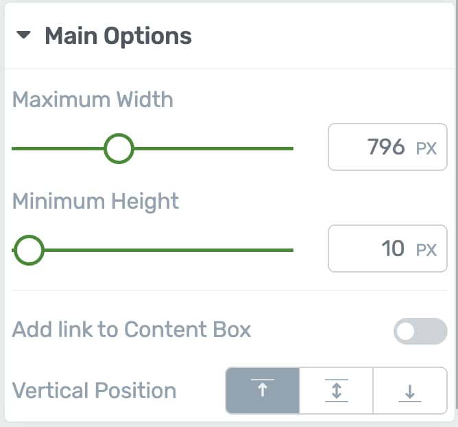
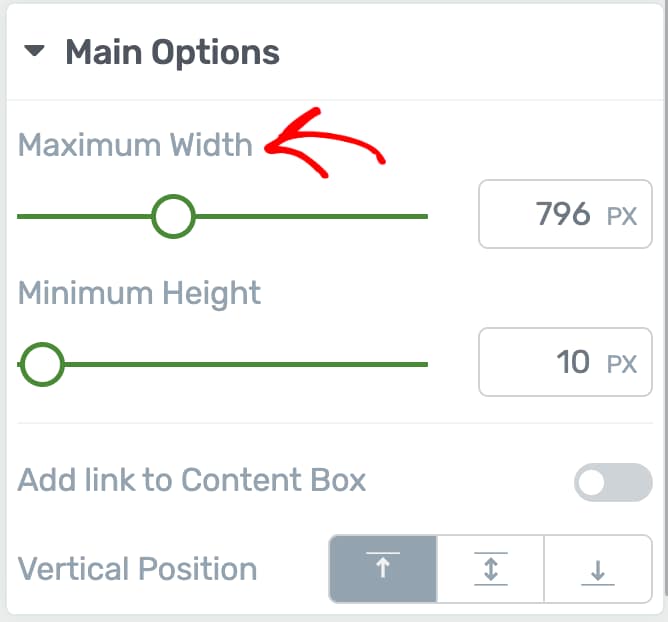
Maximum Width of the Content Box
You can use this setting to modify the width of the Content Box. All you have to do is drag the slider under this option, or enter a value manually in the field next to the slider.
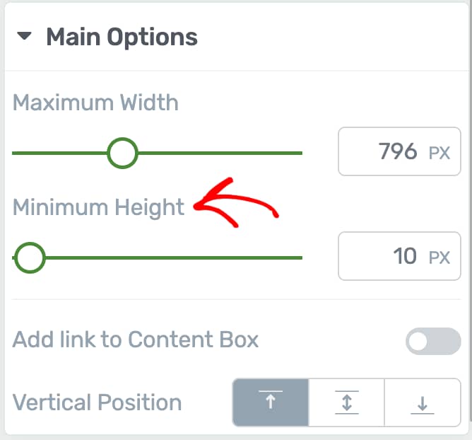
Maximum Height of the Content Box
You can use this setting to modify the height of the Content Box. Use the slider or the field beside it if you want to modify the minimum height of the Content Box.
Adding a Link to the Content Box
This setting can be used to add a link to the Content Box.
To add a link, first enable this option by clicking on the toggle button beside it.
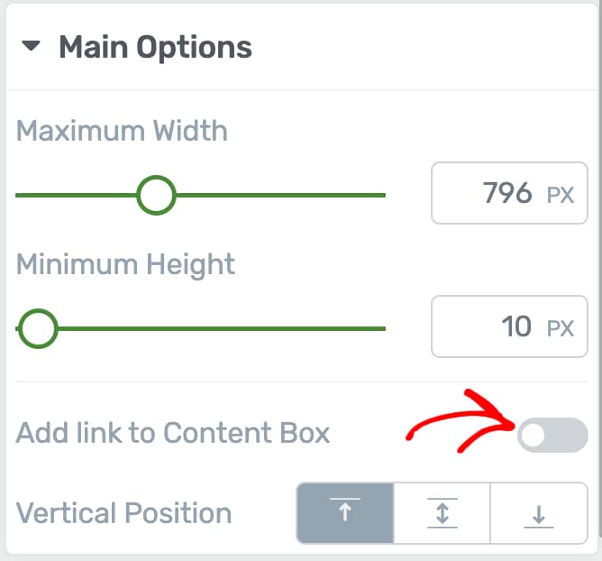
After enabling, you can select the type of link you want to add to the Content box.
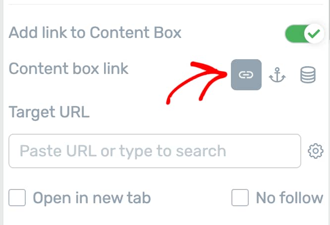
These link types allow you to
- Link the Content box to one of your website pages.
- Add a jump link to the Content box.
- Add a dynamic link to the Content box
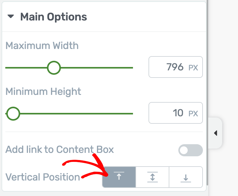
Vertical Position of the Content Box
This option allows you to choose the vertical positioning of the content, meaning the elements that are/will be in the Content Box.
To set the vertical positioning, click on one of the desired vertical positionings from this section.
Other Options of the Content Box Element
Along with the settings under Main Options you can manage the background styling, typography, layout & position, scroll behavior, etc.
Adding Decorations to a Content Box
The decorations option is used when you want to customize the sides of the elements or you want to use the decoration to divide certain parts of your page.
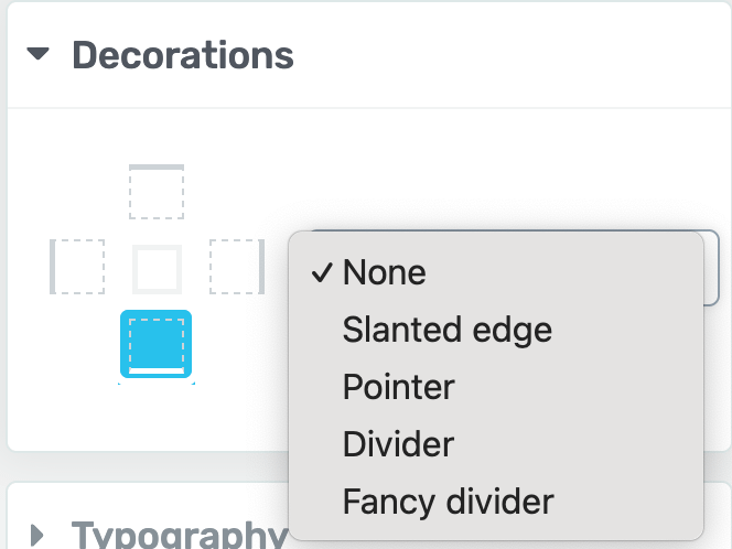
You can read our document here to understand how you can manage decorations for a Content box.
Managing Typography in a Content Box
The typography tab lets you select the paragraph style, font style, colors, alignment etc. of the text you add inside a Content box.
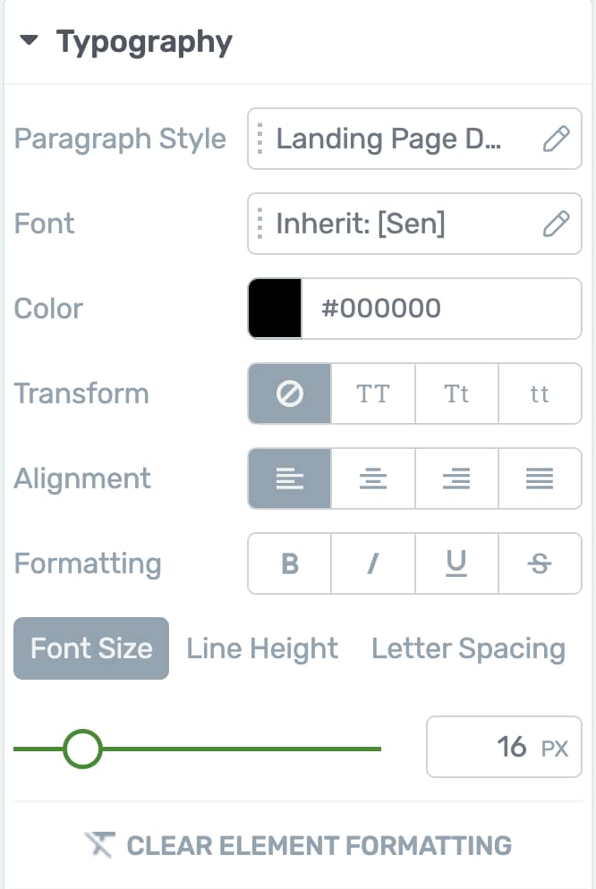
You can read more about Typography in Thrive Architect here.
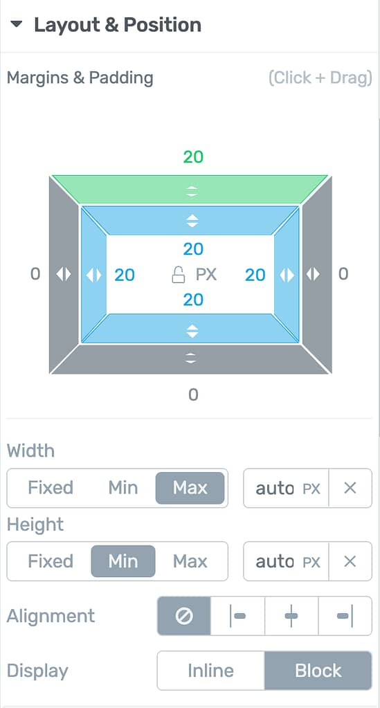
Managing the Layout & Position of a Content Box
This option lets you manage the layout and position of the Content box. You can read more about Layout and Position in Thrive Architect here.
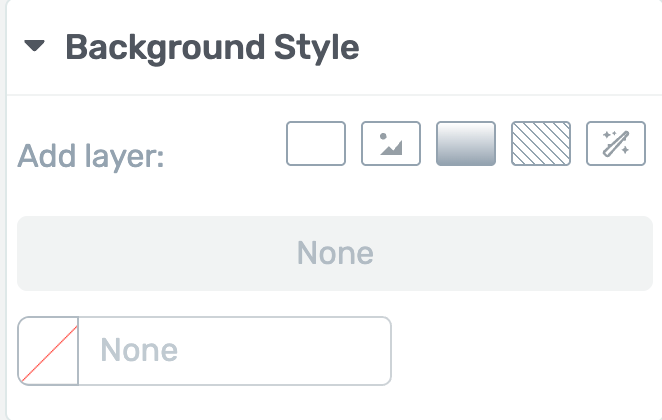
Managing Background Style of a Content Box
This option lets you set and manage the background styling for the Content box as a whole. You can read more about the background style option here.
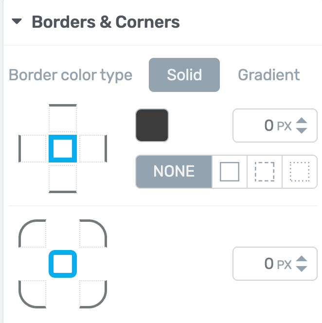
Managing Borders and Corners of the Content Box
The Borders and Corders option of the Content box allows you to manage the borders and corners you want to apply to the box. You can read more about it here.
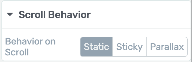
Using the Scroll Behavior of the Content Box
The Scroll Behavior option lets you decide how the Content box behaves when the page they are on is being scrolled down. You can read more about this option here.
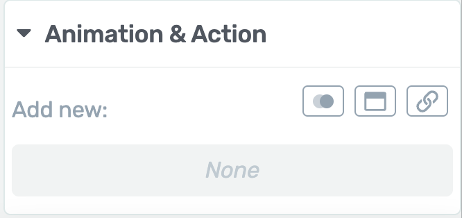
Using Animations and Actions in the Content Box
The Animations and Actions are a set of features, created with the purpose of controlling what happens when someone clicks, scrolls, or hovers on the Content box. You can read more about it here.
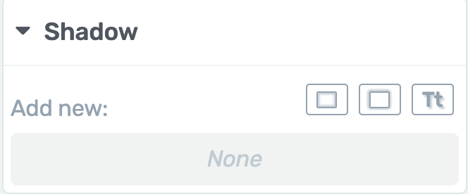
Adding Shadows to the Content Box
The Shadow option allows you to add a shadow to the Content box element. You can read more about it here.
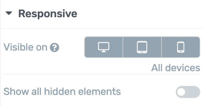
Managing the Responsiveness of the Content Box
The Responsive option allows you to manage the display of the Content box on the Desktop, Tablet, or Mobile interfaces. You can read more about it here.
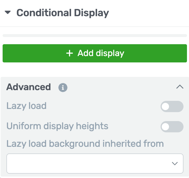
Applying Conditional Display Settings to the Content Box
The Conditional Display option will help you display the Content box based on the condition you set. You can read more about it here.
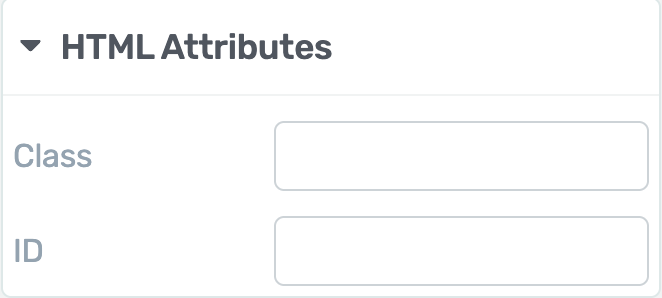
Adding HTML Attributes to the Content Box
The HTML Attributes option lets you easily add custom CSS and labels. You can read more about this in our document here.
After making all the changes to the Content box and other elements on the page, click the Save Work button on the bottom left.
We’ve just seen how you can add and customize a Content Box on a page. You can take a look at the virtual representation of this in the video below.
Next, do you want to use the Global style feature on a Content box element? We recommend you to read our document to learn more.