Adding icons to a page is an important part of building a website. This can be done in a few steps by using the “Icon” element in Thrive Architect.
1. Add the element to the page
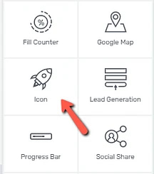
Drag & drop the “Icon” element to the part of the page where you want the icon displayed. A pop-up window will open with many icons that you can choose from:

Scroll down to see them all.
You can use the tabs from the left side of the pop-up if you want to search for specific icons, or to access some icon packs. Also, you can filter which icons to be displayed, using the “Icon Style” section:
Moreover, click on the “Manage Icon Packs” section, if you want to add a Font Awesome Pro pack, for example:
Check out this article if you want to find out how to add Font Awesome Pro Icons in Thrive Architect.
Then, simply choose the icon that is the most suitable for your purposes, by clicking on it, and click on “Select”:
In case you are looking for a specific icon, you can use the search bar from the upper right part of the pop-up window to find it by typing in the related search-term.
2. Customize the icon
There are a few specific icon options with the help of which you can customize your icon:

Icon and style
You can change the icon anytime by clicking on the “Change icon” button:

The pop-up window with the icon library will open again and you can select another icon instead of the current one.
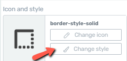
After deciding on the icon that you want to use, you can choose its style. For that, click on “Change Style”:

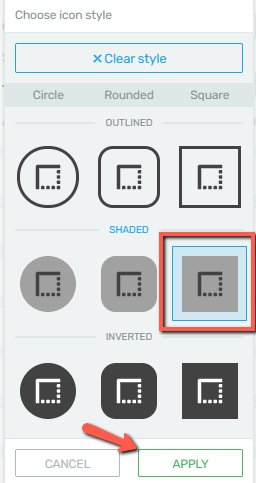
This opens a pop-up, with a few styles of the icon:
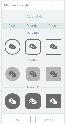
You can choose the one you like, by clicking on it, and then click on “Apply”:

Icon color
In order to make sure your icon is in accordance with the rest of the design of your page, you can change its color anytime. Click on the color box next to the “Icon color” option, select the desired color with the help of the color picker or a HEX/RGB code:
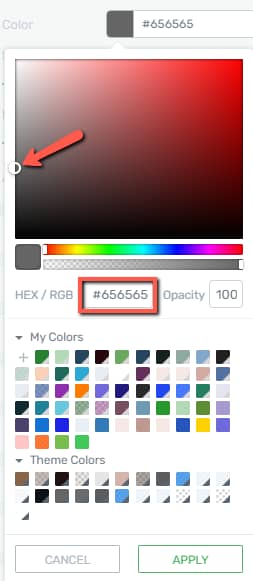
You can also choose one of the already existing colors from the “My Colors” and “Theme Colors” sections.
After you are done, don’t forget to click on the “Apply” button to make sure all your changes have been saved.
Icon size
Changing the size of your icon is simple. You just have to drag the slider under this option or enter a value manually in the box next to it:

Add link to icon
You can also add a link, to open when someone clicks on the icon. If you want to do that, enable this option:

When you enable it, some options will appear. You can create a static link, a jumplink, or a dynamic link. If you want to apply a static link, simply insert the URL in the field that appears:
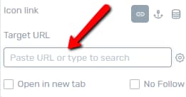
For more information about how to apply links, please see this article.
State feature
This feature can be found right above the “Icon Options”. With its help, you can customize the icon in two different states: “Default” and “Hover”.
The “Default” state is the general one, while the “Hover” state refers to how your icon looks like when visitors hover their mouse over it.
If you click on the “State” section and choose “Hover”, you will see a few options available, that you can use to make your icon different (for e.g. it can have another color) in this state.
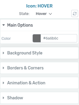
When you are done customizing the icon in the “Hover” state, you can click on “State: Hover”, to switch the states again:
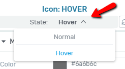
Then, save the page and preview it, in order to see how the visitors will see it in the two different states.
The more general options (available for most of the Thrive Architect elements) are also available for the “Icon” element. Thus, you can use them to further customize the icon; for instance, to change its position with the “Layout & Position” options.
And that is not all – you can create stunning layouts with icons in Thrive Architect. Check out this tutorial for guidance.
If you wish to find out more about how various Thrive Architect elements work, please follow this link.
Hopefully, this article was useful for you. If so, please give us a smile below 🙂