Do you need a simple way to present data or compare features clearly on your website? The Table element in Thrive Architect makes it easy to organize and display information in a structured, user-friendly format.
In this article, we’ll show you how you can add and customize a Table element to your page using Thrive Architect.
- Adding a Table Element on the Page
- Changing the Template of the Table Element
- Using the Main Options of the Table Element
- Using the Other Settings of the Table Element
Adding a Table Element on the Page
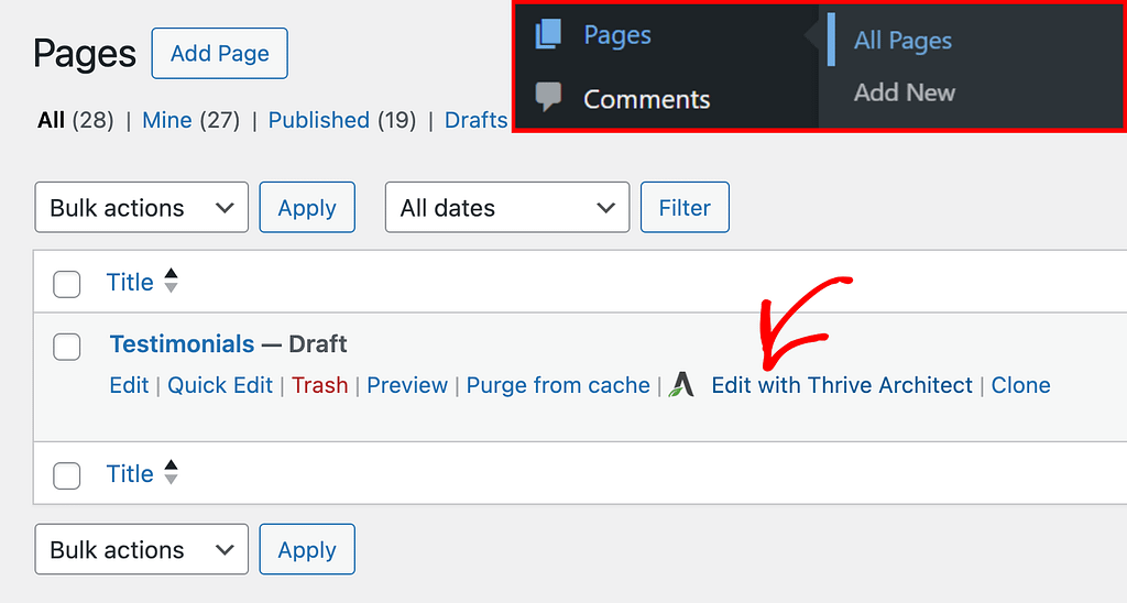
To add the Table element to a page, begin by opening the page in the Thrive Architect editor. To do so, open your WordPress admin area, Pages >> All Pages, hover on the page you want to edit and click Edit with Thrive Architect.
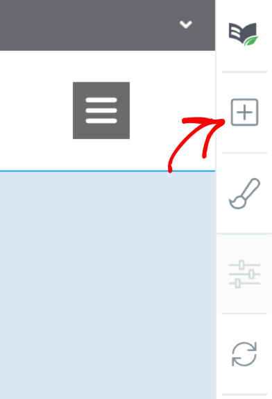
When the page is opened in the Thrive Architect editor, go to the right panel and click the plus (+) icon.
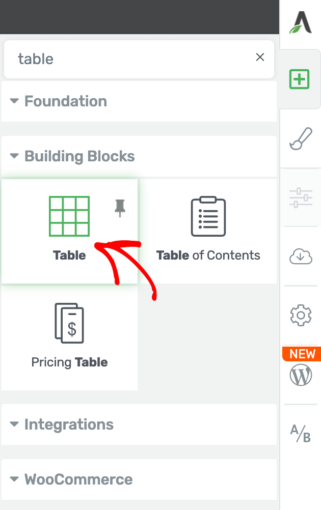
Clicking on the plus icon will open up the list of Thrive Architect elements to choose from. From this list, drag and drop the Table element on the page.
When you drag and drop the Table element on the page, you’ll see a popup that lets you select the table template you want to use.
On this popup, you can choose to start from a blank or a styled template.
- Blank template: A plain tabular structure to add the content and edit style like colors, etc.
- Styled template: A styled tabular structure that has some sample text and style added already.
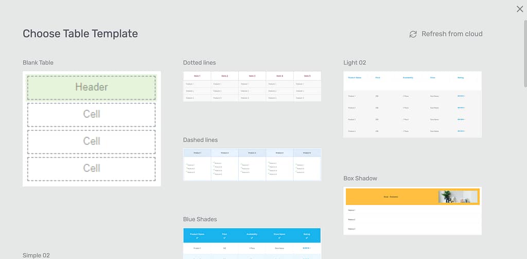
When you click on the template you want to use, the popup will close and you’ll see the table template added to the page.
Changing the Template of the Table Element
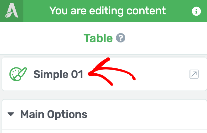
If you want to change the template of the table after it is added to the page. This can be done using the template setting in the left column.
To do so, first click on the table to open its settings in the left column.
In the left column, click on the Table template name that is currently active.
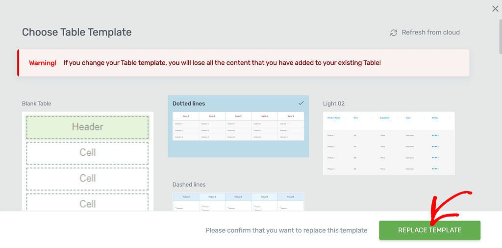
When you click on the template name, you’ll see a popup with available Table templates that you can choose from.
Note: If you change the Table template, you will lose all the content that you have added to your existing Table!
On this popup, click on the template you want to apply to the Table and click the Replace Template button.
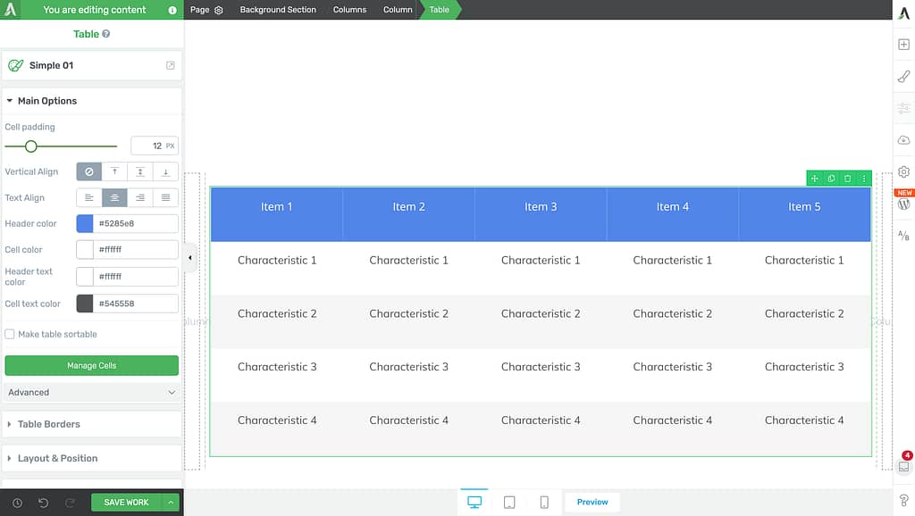
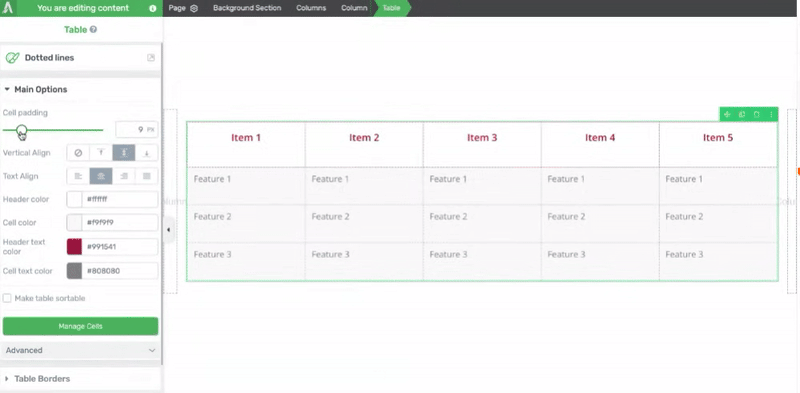
Using the Main Options of the Table Element
The Main Options of the Table element allow you to customize the main look and feel of it. They enable you to do the following.
- Managing the Cell Padding
- Managing the Vertical Alignment
- Managing the Text Alignment
- Changing the Header Color
- Changing the Cell Color
- Changing the Header Text Color
- Changing the Cell Text Color
- Making the Table Sortable
- Managing Table Cells
- Adding Alternating Colors to Table Rows
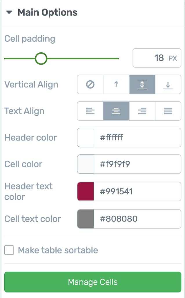
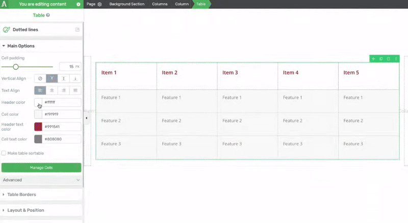
Managing the Cell Padding
The Cell Padding setting allows you to manage the spacing within the cells in the table.
To use this setting, use the slider of the field beside it.
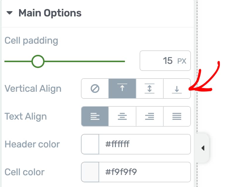
Managing the Vertical Alignment
The vertical alignment option lets you choose where your content appears inside the cells – at the top, middle, or bottom. Just click on the position you want, and the content will move there.
To set the vertical alignment, click on the position you want to enable.
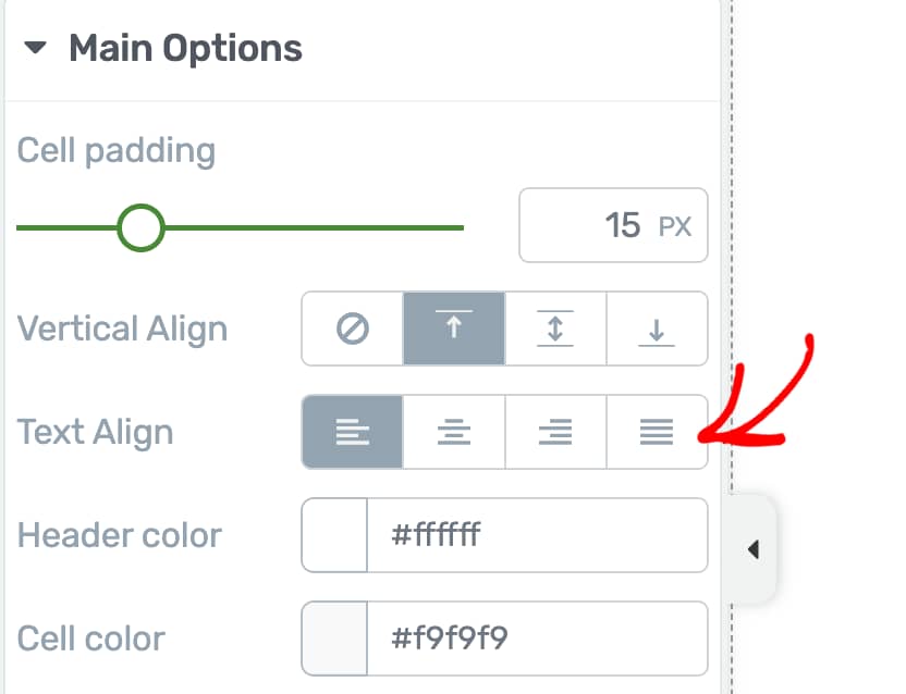
Managing the Text Alignment
The text alignment option lets you line up the text in your table the way you want. For example, you can make the text appear on the left, in the center, or on the right side of each cell.
To set the text alignment, click your preferred option to see the change.
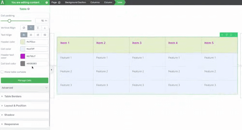
Changing the Header Color
The Header Color setting lets you select a color you want to fill the header cells of the table with.
To set a header color, click on the color block to open a color picker where you select the color and click Apply or directly enter the color hex code in the given field.
Changing the Cell Color
The Cell Color setting lets you select a color you want to fill the cells of the table with.
To set a cell color, click on the color block to open a color picker where you select the color and click Apply or directly enter the color hex code in the given field.
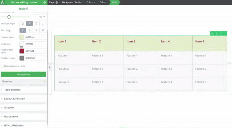
Changing the Header Text Color
The Header Text Color setting lets you select a color for the text inside the header cells of the table with.
To set a header text color, click on the color block to open a color picker where you select the color and click Apply or directly enter the color hex code in the given field.
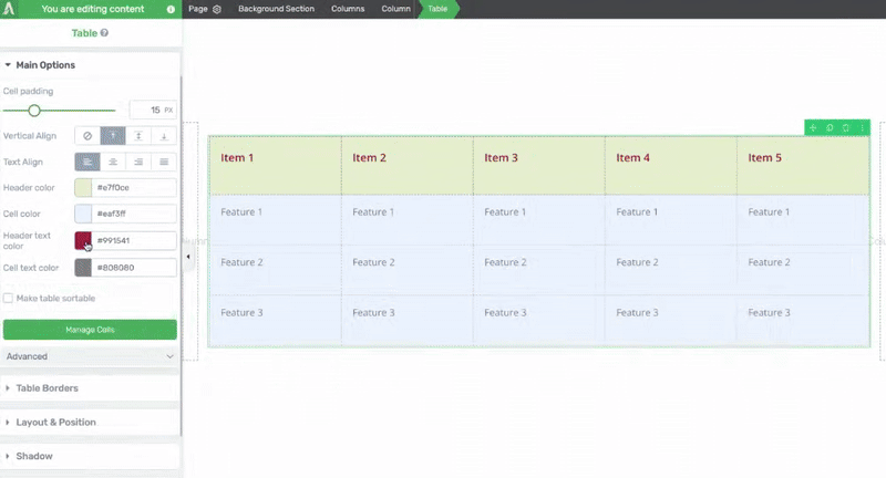
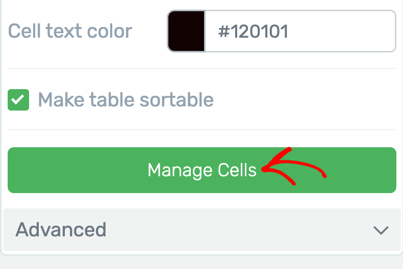
Changing the Cell Text Color
The Cell Text Color setting lets you select a color for the text inside the cells of the table with.
To set a cell text color, click on the color block to open a color picker where you select the color and click Apply or directly enter the color hex code in the given field.
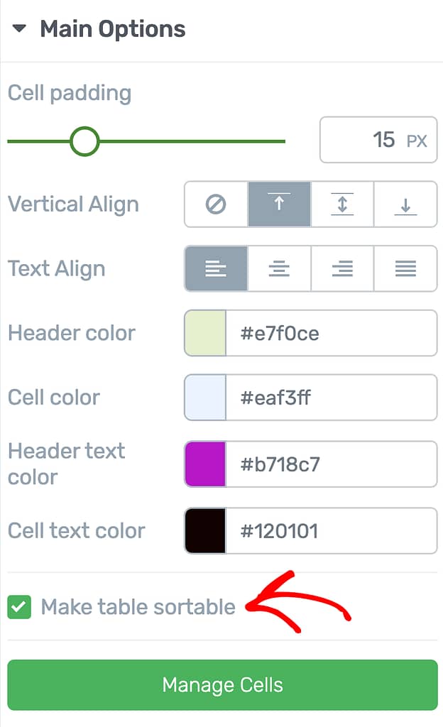
Making the Table Sortable
This option lets visitors sort the table. For example, if your table lists names, people can click to sort them from A to Z. If your table has numbers, it can be sorted from smallest to largest.
To turn this on, just check the box next to this option.
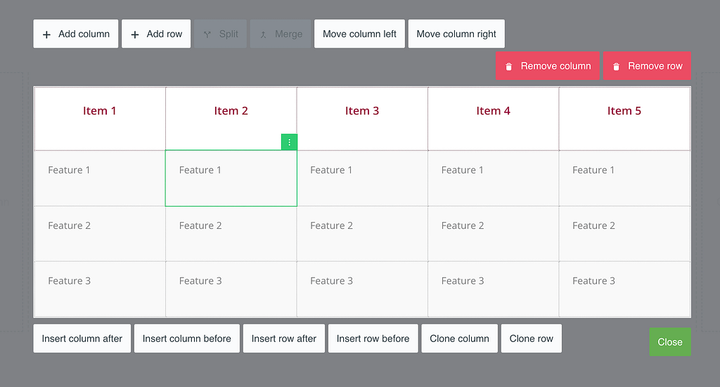
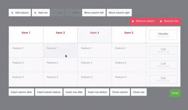
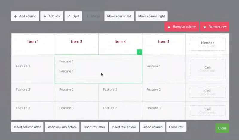
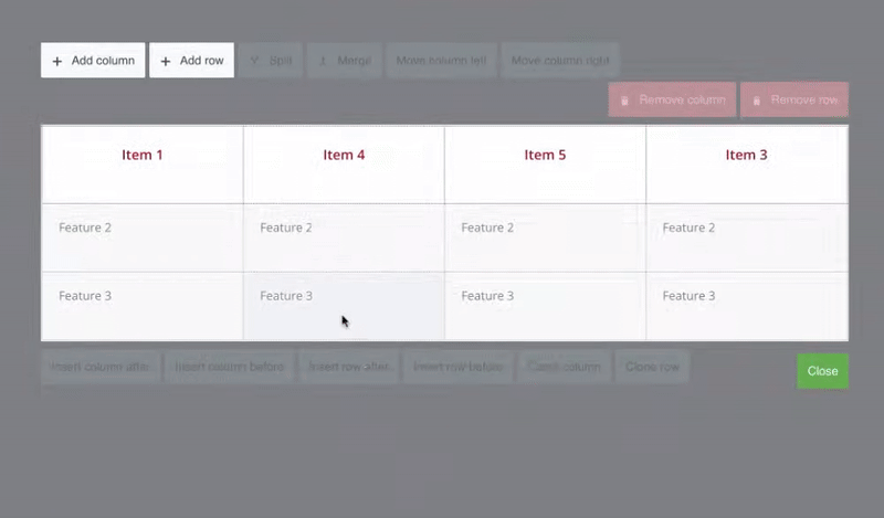
Managing Table Cells
The Manage Cells option lets you add or remove rows and columns, merge or split cells, move rows and columns, etc.
To open all the options, click the Manage Cells button.
After clicking the Manage Cells button, you’ll see buttons with different options around the table on the page. These options will let you:
- Add or remove a row or column
- Merge cells in the table
- Split cells in the table
- Move columns to left or right
- Insert column before or after
- Insert row before or after
- Clone a column or row
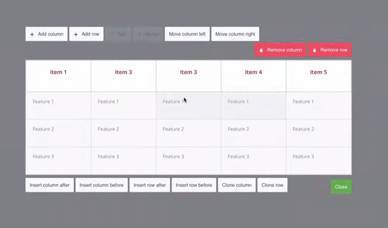
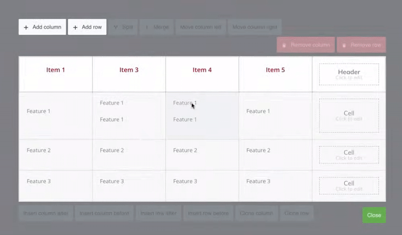
Add or remove a row or column
You can use the Add column and Add row options to add a new column or a row to the table. Similarly, the Remove column and Remove row options will let you remove a column and a row respectively.
Note: The column and row will be added after the last column and row in the table. While the Remove column and row options will remove the column or the row in which you’ve selected a cell.
Merge cells in the table
This option can be used when you want to merge multiple cells in the table.
To do so, select all the cells you want to merge and click the Merge button.
Split cells in the table
The Split button is enabled only when you select a merged cell in the table. This option can be used to split already merged cells in a table.
To do so, select the merged cell and click Split.
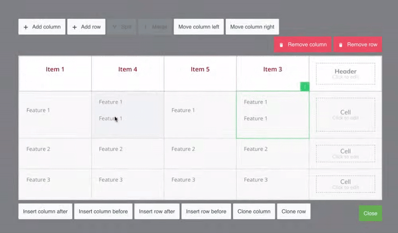
Move columns to left or right
The Move column left and Move column right buttons are enabled when you select a cell in the table. These options let you move the column of the selected cell to the left or right.
Insert column before or after
The Insert column after and Insert column before buttons are enabled when you select a cell in the table. These options let you insert a column after or before the column of the selected cell.
Insert row before or after
The Insert row after and Insert row before buttons are enabled when you select a cell in the table. These options let you insert a row after or before the row of the selected cell.
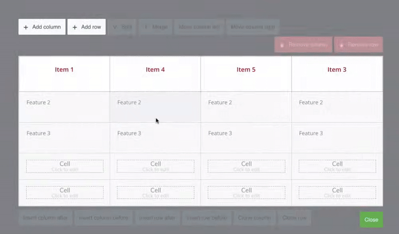
Clone a column or row
The Clone Column and Clone row options let you clone selected columns or rows in the table.
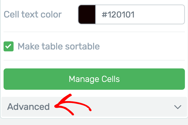
Advanced Main Options
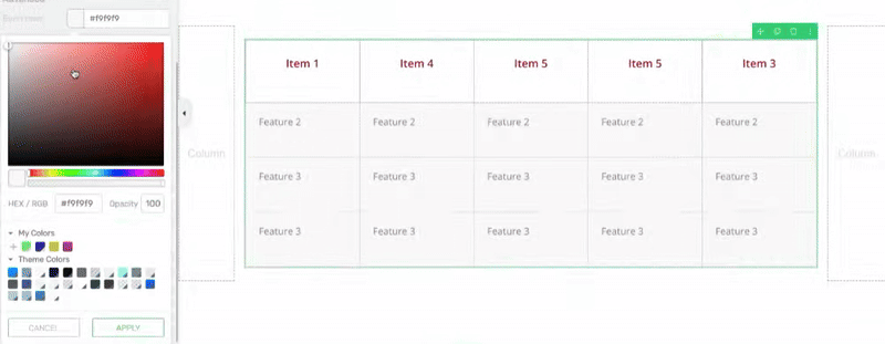
The Advanced Main Options of the Table element lets you add alternate colors to the table rows and reset the width and height.
If you want to add alternate colors to the rows in your table, this setting under the Advanced section will help you with it.
To access this setting, click on Advanced under the Main Options.
When you click the Advanced tab, you’ll see two options where you can select the colors you want to apply to the even rows and the odd rows in the table.
To add alternate colors, click on each color block and select the colors from the color picker.
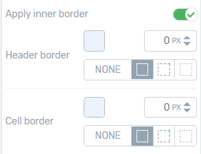
Exterior border
You can add an exterior border to the table by clicking on the little up arrow from the “Table Borders” section, or entering a value manually. The number you enter here will define the thickness of the border that is applied.
You can also change the color of the border by clicking on the box with the color in it and you can choose one out of the three patterns that are available for the border. You just have to click on the pattern you want to use:
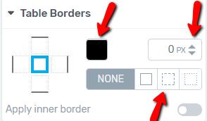
Interior border
If you wish to add an interior border to the table as well, then, activate the “Apply inner border” option from the “Table Borders” section.
This will open the “Header border” and the “Cell border” options as well, and you can use them in the same way that you used the exterior borders options. Add the borders to the headers/cells by selecting their thickness, choose a color and then, a pattern for them:
The more general options, like the “Typography”, or the “Layout & Position” options, are also available for the “Table” element, but since these are available for almost every Thrive Architect element, you will find separate tutorials on them in our knowledge base.
Mobile view
After you have customized your table in desktop view, you can also check it in mobile view to make sure it looks mobile-friendly. In order to do this, click on the “Mobile View” option from the bottom-center part of the editor (next to the “Preview” option):

If the table you have created is not selected, then access it either by clicking on it directly or by selecting it from the breadcrumbs.
You will see that besides the options of the “Table” element that are available in desktop view, there is an additional option here, in “Mobile View”.
This is the “Create mobile-responsive table” option in the “Main Options” section from the left sidebar:
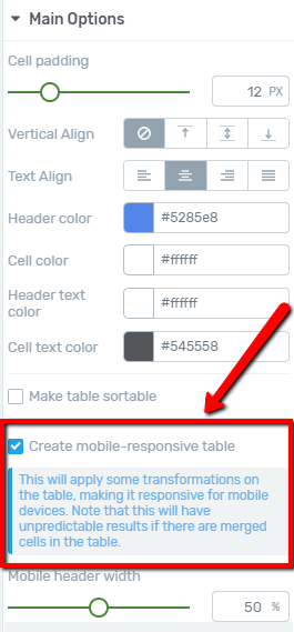
Make sure that this option is checked because, just as its name says, this will make the table you have created mobile-responsive:
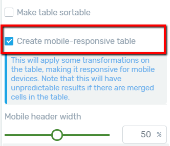
Checking this option will turn the headers of the table into a column and will place all the other cells in a vertical layout, instead of a horizontal one, in mobile view. This way your table will be a lot easier to view on a mobile phone:
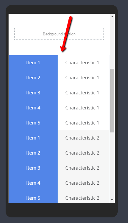
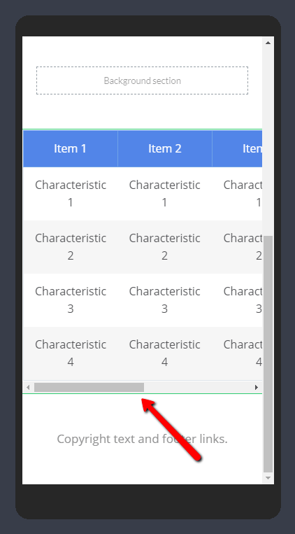
If you leave the “Create mobile-responsive table” option unchecked, then, the table will not be mobile-responsive. This means, that although your table will look good on a desktop, it will be difficult to view it on a mobile phone.
If people will want to see the information from every cell of the table on a mobile phone, they will have to scroll all the way through to see them. The table will look like this on mobile:
Note: The “Create mobile-responsive table” option is only available in the “Mobile View” of the “Table” element. Thus, it will not be present in the “Desktop” or in the “Tablet” view.
After you made sure the table is mobile-responsive too, you can save your work using the “Save Work” option from the bottom-left part of the editor and then, preview the page to see how the table you have created will look like for the visitors of your website.
Using the Other Settings of the Table Element
Just like the other Thrive Architect elements, the Table element comes with additional options where you can manage the layout and positioning, shadows, etc.
To learn more about these options, read the documents listed below.
- Using Layout and Position Options in Thrive Architect
- Adding Shadows to Thrive Architect Elements
- Using the Responsive Option in Thrive Architect
- Using HTML Attributes in Thrive Architect
We’ve just seen how you can add and customize a Table element on a page using Thrive Architect. You can take a visual tour by watching the video below.
Next, do you want to make it easier for users to scroll through the topics in a long post or page? The Table of Contents element will help you create a post index quickly.