In this article, you’ll learn how to use the Styled Box element in Thrive Architect. This element lets you insert professionally designed, pre-built content sections from the cloud template library directly into your page.
The Styled Box element is a template-based building block. Rather than configuring individual design options, you browse a library of ready-made layouts—such as feature boxes, info cards, pricing highlights, and callout sections—and insert one onto your page. Once inserted, you can edit the text, images, and other elements inside the Styled Box using standard Thrive Architect controls.
What Is the Styled Box Element?
The Styled Box element works differently from most other Thrive Architect elements. Instead of starting with a blank element and building it up with options, you start by selecting a complete design template from the cloud library. The element appears as an Insert Styled Box placeholder until you choose a template.
Key characteristics of the Styled Box element:
- It is a cloud template element, meaning its designs are hosted in the Thrive Themes template library
- It has no hardcoded main options of its own—all controls come from the individual elements within the selected template
- After inserting a template, the Styled Box becomes a container of standard elements (text, images, icons, buttons, and more) that you can edit individually
- It supports group editing, allowing you to style multiple similar items within the Styled Box at once
Tip: Think of the Styled Box as a shortcut. Instead of manually arranging columns, icons, text, and backgrounds, you pick a pre-designed layout and customize it to fit your content.
Adding the Styled Box Element to a Page
Follow these steps to add a Styled Box to your page:
- Open your page or post in the Thrive Architect editor.
- Click the green plus (+) icon in the right sidebar to open the element panel.
- Type Styled Box in the search field at the top of the panel.
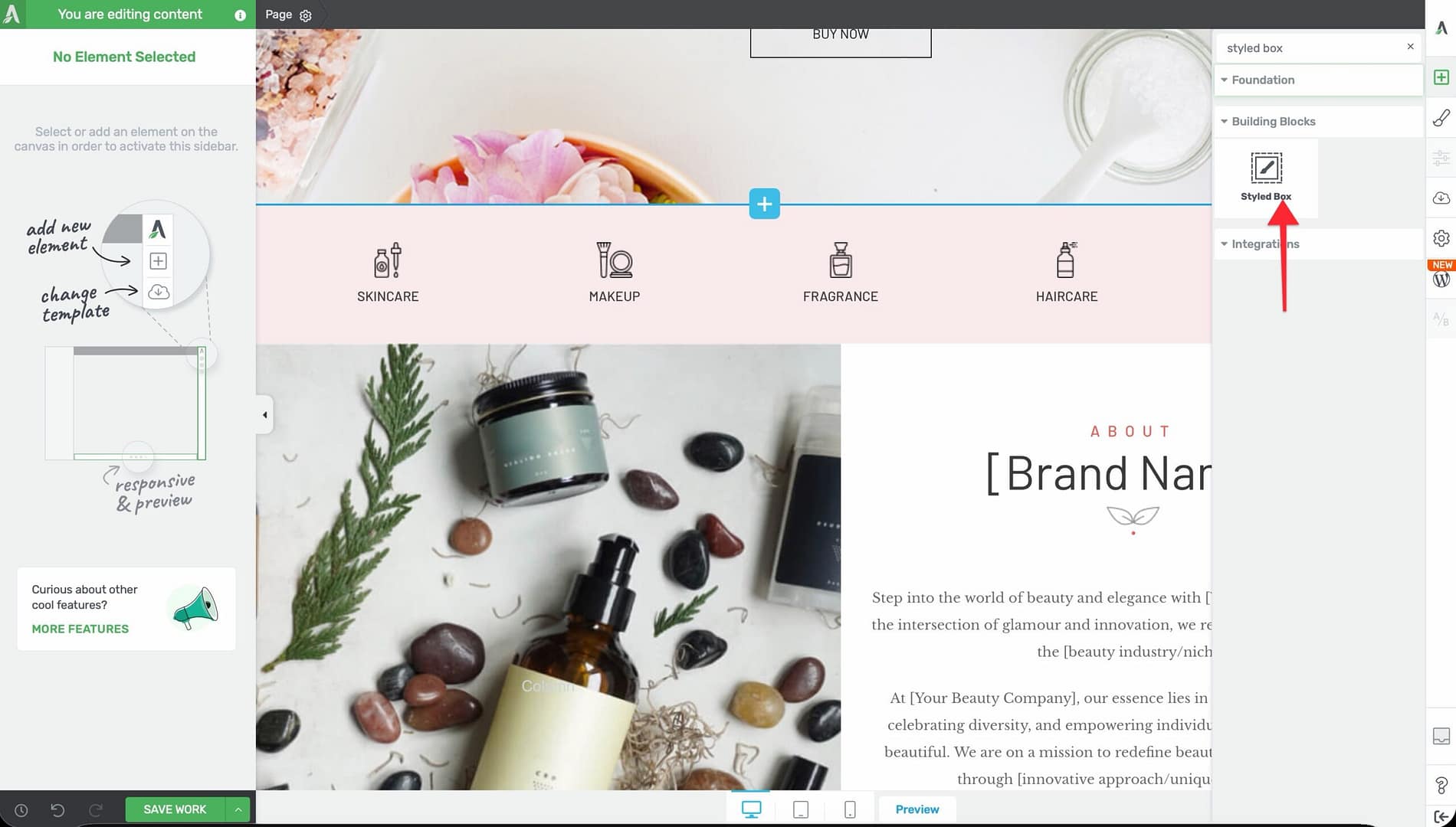
- Alternatively, scroll down to the Building Blocks section in the element list to find the Styled Box element.
- Drag the element from the panel and drop it onto your page canvas.
An Insert Styled Box placeholder will appear on the canvas. This placeholder indicates that you need to select a template before the element displays any content.
Selecting a Styled Box Template
After adding the placeholder to your page, you need to choose a template:
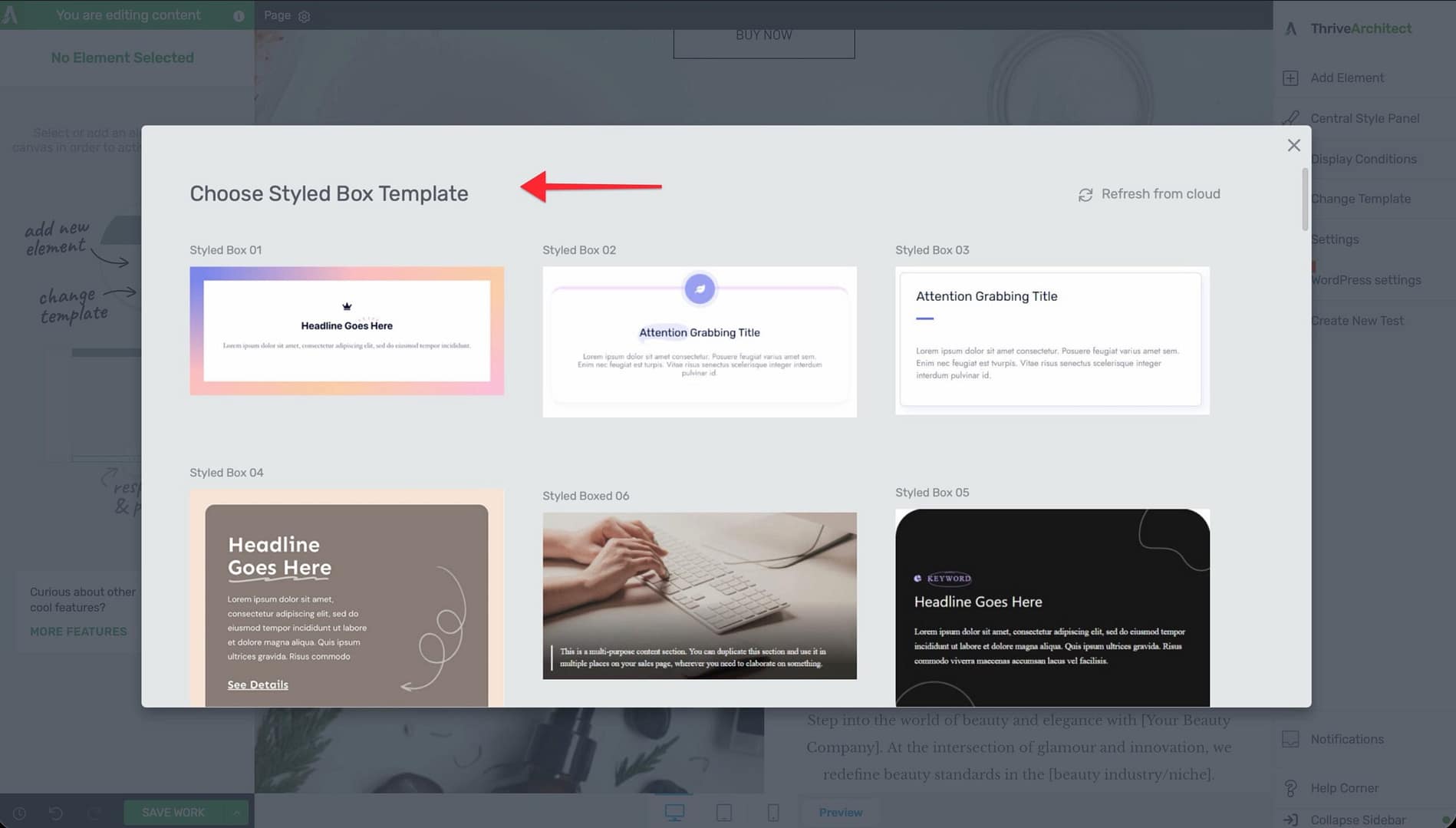
- Click on the Insert Styled Box placeholder on the canvas.
- The cloud template library will open, displaying a gallery of available Styled Box designs.
- Browse through the templates or use the search and category filters to narrow down your options.
- Click on a template to preview it.
- Click Insert (or double-click the template) to add it to your page.
The selected template will replace the placeholder on your canvas, and you’ll see the fully designed Styled Box with all its elements in place.
Editing the Contents of a Styled Box
Once you’ve inserted a Styled Box template, you can customize every element inside it using standard Thrive Architect controls:
Editing Text
- Click on any text element within the Styled Box.
- The text formatting toolbar will appear, allowing you to change fonts, sizes, colors, and alignment.
- Type directly to replace the placeholder text with your own content.
Replacing Images
- Click on an image element within the Styled Box.
- In the left sidebar, click Replace Image or use the image options to upload a new image or select one from your media library.
- Adjust the image size, alignment, and alt text as needed.
Modifying Icons and Buttons
- Click on any icon or button element within the Styled Box.
- Use the left sidebar options to change the icon style, button text, link destination, colors, and sizing.
Adjusting the Layout
- Click on the background section or column structure within the Styled Box.
- Use the standard layout controls to adjust padding, margins, column widths, and background settings.
Using Group Editing with Styled Boxes
The Styled Box element supports group editing, which lets you apply styling changes to multiple similar items at the same time. This is particularly useful when your Styled Box contains repeating elements like feature cards or icon boxes.
To use group editing:
- Select one of the repeating elements inside the Styled Box (for example, one of several icon-text pairs).
- Look for the Group Editing option in the left sidebar.
- Enable group editing to apply your changes across all similar elements in the group simultaneously.
This saves significant time when you need consistent styling across all items in a Styled Box.
Common Use Cases
Feature Highlights
Use Styled Boxes to showcase product features, service offerings, or key benefits. Many templates include icon-text combinations arranged in columns, making them ideal for feature sections.
Callout Sections
Insert a Styled Box with a bold background and prominent text to create attention-grabbing callout sections for important messages, announcements, or special offers.
Info Cards
Styled Boxes with card-style templates work well for team member profiles, testimonial layouts, or categorized information displays.
Content Dividers
Use a visually distinct Styled Box between sections of your page to break up content and guide the reader’s eye through your layout.
Frequently Asked Questions
Can I Change the Template After Inserting a Styled Box?
No. Once you insert a Styled Box template, it becomes a collection of standard Thrive Architect elements on your canvas. To use a different template, delete the current Styled Box and add a new one.
What Happens if I Delete an Element Inside a Styled Box?
You can freely delete, add, or rearrange elements inside a Styled Box after insertion. The Styled Box template is just a starting point—once inserted, you have full control over its contents.
Are Styled Box Templates Responsive?
Yes. Styled Box templates from the cloud library are designed to be responsive. They will adapt to different screen sizes automatically. You can further fine-tune the responsive behavior using Thrive Architect’s device-specific editing controls.
Can I Save a Modified Styled Box as a Template?
Yes. After customizing a Styled Box, you can save it as a content template for reuse. Right-click the Styled Box container element, select Save as Template, and give it a name. It will then be available in your saved templates for future use.
Related Resources
- Columns: How to Use the Columns Element — Arrange content side by side inside your Styled Box
- Content Box: How to Use the Content Box Element — Another container element for grouping content
- Block Element: How to Use the Block Element — Pre-designed page sections from the template library
- Getting Started: Getting Started with Thrive Architect — Overview of the editor and element panel
That’s it! You’ve successfully learned how to use the Styled Box element in Thrive Architect. By selecting a pre-designed template from the cloud library, you can quickly add polished content sections to your pages without building layouts from scratch.