From the Thrive Dashboard, you can very easily customize notifications and adjust how the “success”, “warning” and “error” notifications are displayed.
In this article, we will have a look at where you can find these notifications and how you can change their aspect in order to match your website theme.
Access the Notification Toasts
The “Notification Toasts” are part of the Global Elements card, that can be quickly accessed from your Thrive Dashboard:
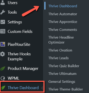
Here, scroll down to the bottom of the page and look for the Global Elements card:
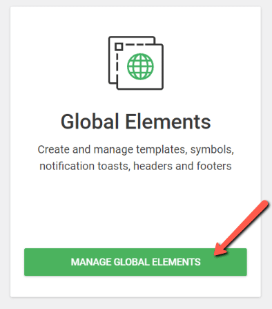
This is where you can manage and customize global elements, such as content templates, symbols, blocks, and so on. The changes you make here will be applied to all elements of the same category, wherever they appear on your website.
The notifications are located under the “Notification Toasts” tab:
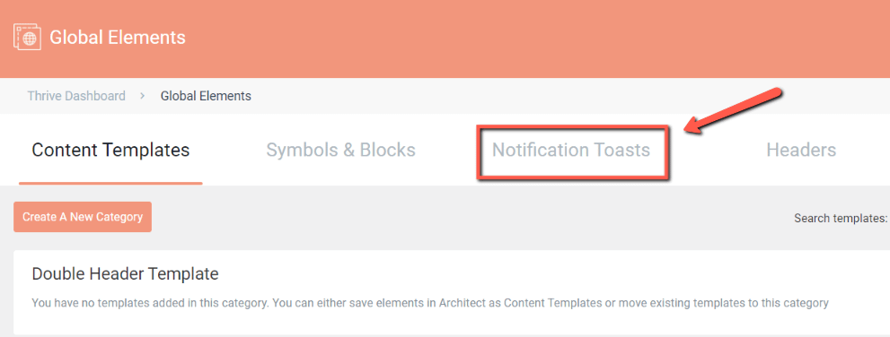
Here, you will be able to access two sets of notifications: the default and custom ones:
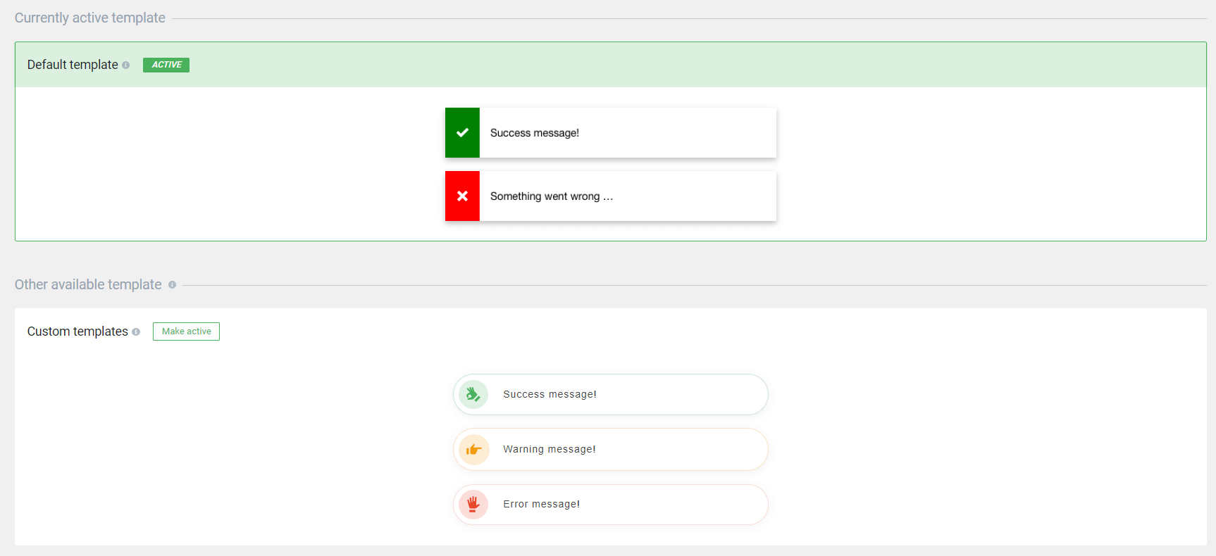
- Default templates
The default templates cannot be modified:
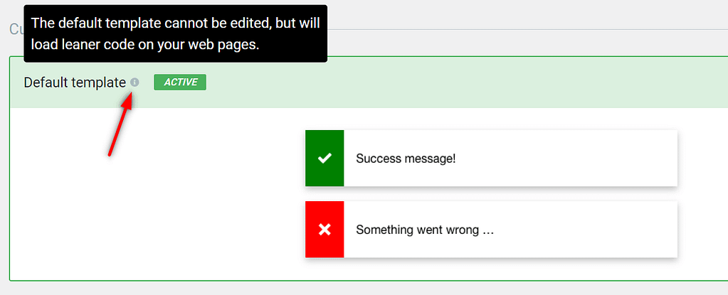
However, you can still pick a different design for your notifications. For that, you can use the custom templates.
- Custom templates
The custom templates are located right under the currently active set of templates. Click on the “Make active” button to activate them:

Next, hover over the notification cards and click on the “Edit template” button that appears:

Editing the Custom Template
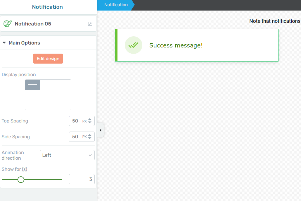
This will trigger the Thrive Architect editor. By default, you will start customizing the “Success message!” notification:

Simply click on the notification to access the left sidebar list of options:
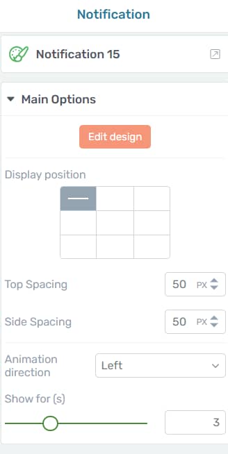
Template
If you click on the first section of the left sidebar, you will be able to pick a different template for your notifications:
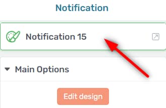
Simply choose the one that you like and then click on the “Replace Template” button:
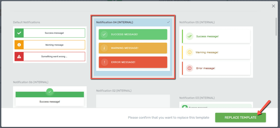
Next, you can proceed with the remaining options of the left sidebar:
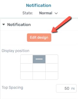
Edit Design
You will be able to switch between states and choose which one to edit simply by clicking on the “Edit design” button of the left sidebar:
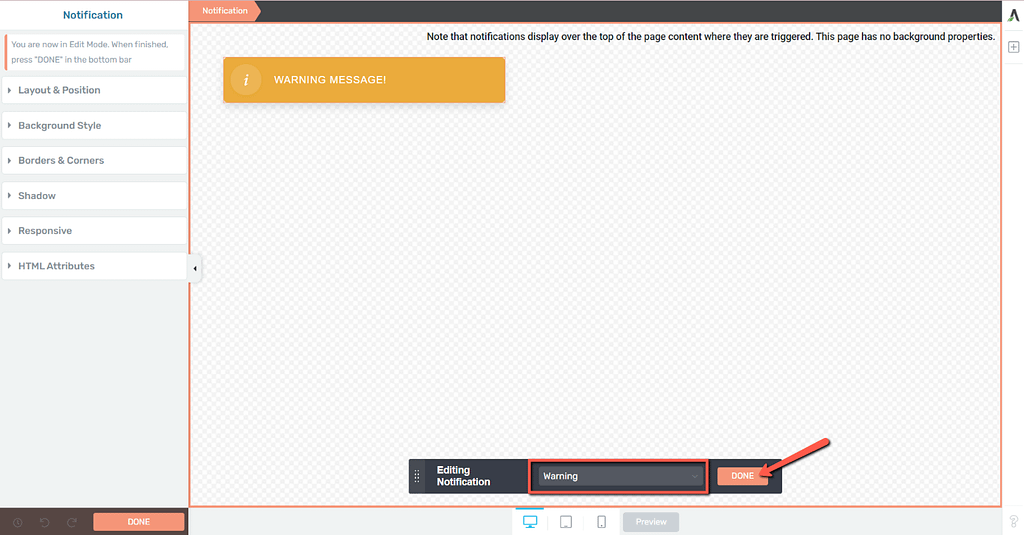
Then, from the state panel that appears on the lower side of the screen, simply select the notification type you would like to edit:

After you do that, you can go ahead and use the options available in the left sidebar if you want to adjust the layout, position, background, borders, and corners, etc.
However, if you want to return to the “Main Options” and use the options available there, then you first have to click on “Done”:
Using the Main Options
Let’s have a look now at the remaining features from the “Main Options” tab:
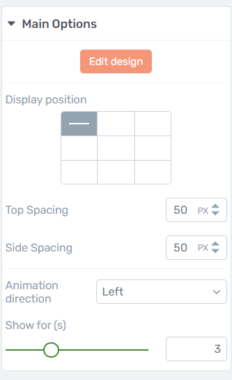
In this example, I will be customizing the “warning” notification, but keep in mind that the same options apply to all notification types.
Display position
Use the available table cells to decide where to position the notification:
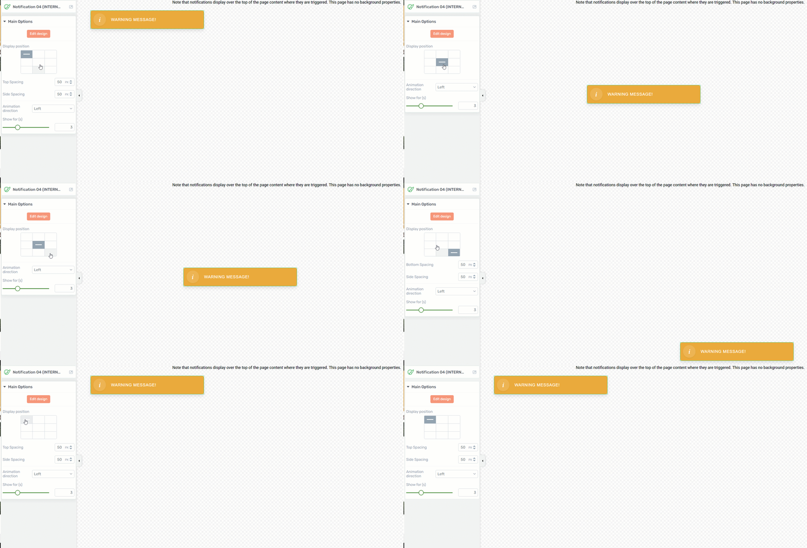
You will notice that depending on the selection you make here, you might have access to several additional settings right under the main table:
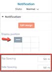
If the notification is displayed in the top corners of the page, then you will be able to adjust the top and side spacing; if the notification will be displayed in the lower part of the page, then you will be able to adjust the bottom and side spacing.
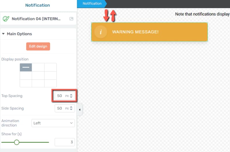
Top Spacing
Use the numerical field available here to adjust the top spacing for the notification:
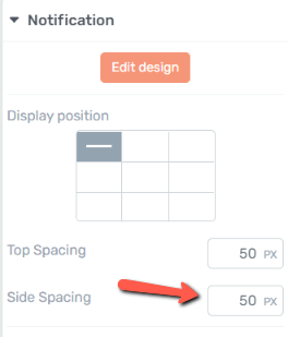
Similarly to the top spacing, you can adjust the space to the side by inserting a number of pixels in the next available field:
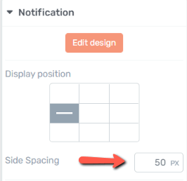
If the notification is placed somewhere in the center of the page, then you will only have the option of adjusting the side spacing:
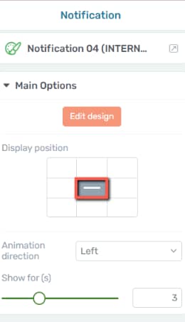
And lastly, if the notification is perfectly centered, then no other adjustments can be made in terms of spacing:
Animation direction
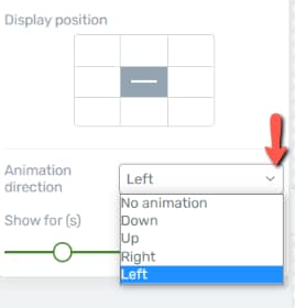
Open the drop-down list from here to decide the direction of the animation:
Show for (ms)
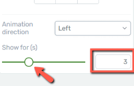
Use the next available tools (either the slider or the numerical field next to it) to decide how much time should the notification be visible on screen:
Use the Rest of the Options
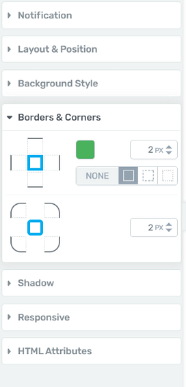
Naturally, besides the options available in the first section of the left sidebar, you can still go ahead and use the remaining ones. You just have to click on the desired section to expand it:
This is how easily you can access and customize the notifications for your website.
I really hope you found this tutorial useful. You can also check out other tutorials of this type, available in our knowledge base if you want to learn more about Thrive Themes.