In this article, you’ll learn how to use the Button element in Thrive Architect. This element lets you add clickable buttons to your pages with full control over design, sizing, links, icons, and hover effects.
The Button element is a cloud template element, meaning you start by selecting a pre-designed button style from the template library. Once inserted, you can customize every aspect of the button—from colors and typography to special link types like WhatsApp messages, email links, phone calls, and file downloads.
Adding the Button Element to a Page
Follow these steps to add a Button to your page:
- Open your page or post in the Thrive Architect editor.
- Click the green plus (+) icon in the right sidebar to open the element panel.
- Type Button in the search field at the top of the panel.
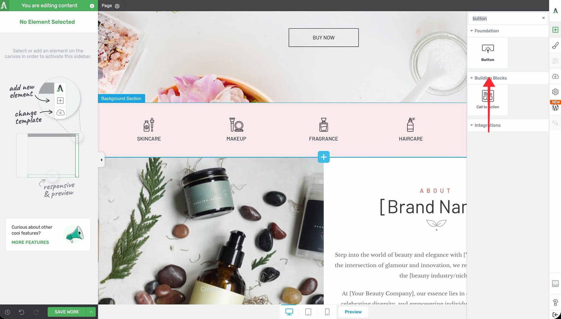
- Alternatively, scroll down to the Foundation section in the element list to find the Button element.
- Drag the element from the panel and drop it onto your page canvas.
Click on ‘Template button’ in the left sidebar to open the cloud template library, to display a gallery of available button designs. Browse or search the templates, then click on a design to insert it onto your page.
Configuring the Main Button Options
After inserting a button, select it on the canvas to reveal the main options in the left sidebar. The Button element provides the following controls:
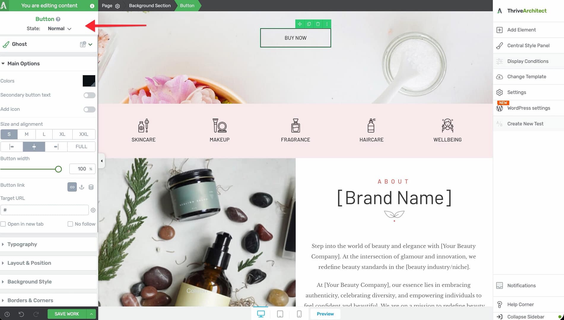
Color Palettes
Click the Color Palettes option to choose from a set of pre-configured color combinations for your button. Each palette adjusts the button’s background, text, borders, and shadow colors as a coordinated set.
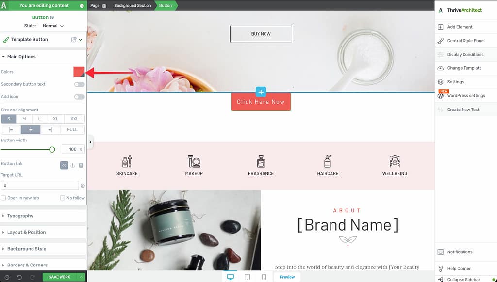
Master Color
Use the Master Color picker to set a single base color that influences the button’s background, shadow, and borders simultaneously. This is useful for quickly matching your button to a brand color without adjusting each property individually.
Secondary Button Text
Toggle the Secondary button text switch to add a second line of text beneath the main button label. This is commonly used to display a subtitle, a brief description, or a supporting message (for example, “Buy Now” as the main text and “30-Day Money-Back Guarantee” as the secondary text).
Add Icon
Toggle the Add icon switch to display an icon alongside the button text. Once enabled, you can:
- Click the icon to open the icon picker and choose a different icon
- Use the Icon side option to position the icon on the Left or Right of the button text
Size and Alignment
Use the Size and alignment controls to set the button’s overall size and position:
- S — Small (18px font)
- M — Medium (24px font)
- L — Large (32px font)
- XL — Extra Large (38px font)
- XXL — Extra Extra Large (52px font)
Set the alignment to Left, Center, Right, or Full Width to control where the button appears within its container.
Button Width
Use the Button width slider to set a specific maximum width for the button, measured in pixels or percentages. The range is 10 to 1080.
Button Styles
Click the Button Styles option to open the cloud template style picker, where you can switch to a different button design without deleting and re-adding the element.
Button Link
Click on the button text area or use the link option to set the button’s destination URL. You can configure:
- The URL the button links to
- Whether the link opens in a new tab
Creating Special Button Link Types
The Button element supports several special link types beyond standard URLs. These let you turn buttons into tools for communication, sharing, and file delivery.
WhatsApp Button
To create a button that opens a WhatsApp conversation:
- Select the button on the canvas and open the link settings.
- Enter a WhatsApp link in the URL field using the format:
https://wa.me/YOURNUMBER(replaceYOURNUMBERwith the full international phone number, without spaces or dashes). - Optionally append a pre-filled message:
https://wa.me/YOURNUMBER?text=Your%20message%20here
When visitors click the button, their device will open WhatsApp with a conversation to the specified number.
Email Link Button
To create a button that opens the visitor’s email client:
- Select the button and open the link settings.
- Enter a mailto link in the URL field:
mailto:[email protected] - Optionally add a subject and body:
mailto:[email protected]?subject=Hello&body=I%20have%20a%20question
Phone Link Button
To create a button that initiates a phone call on mobile devices:
- Select the button and open the link settings.
- Enter a tel link in the URL field:
tel:+1234567890(use the full international format).
On mobile devices, tapping the button will prompt the visitor to call the specified number.
Download Button
To create a button that triggers a file download:
- Upload the file to your WordPress Media Library and copy its direct URL.
- Select the button and open the link settings.
- Paste the file URL as the button’s link destination.
- Ensure the URL points directly to the file (for example,
https://yoursite.com/wp-content/uploads/ebook.pdf).
When visitors click the button, their browser will download the file or open it depending on the file type and browser settings.
For files that open in the browser instead of downloading (like PDFs), you can force the download by adding a download attribute to the button’s HTML. To do this, go to Settings (gear icon) > Advanced Settings > View Page Source (HTML), find the button’s anchor tag, and add download to it.
Customizing Button Design
Beyond the main options, the Button element provides several additional design panels in the left sidebar:
Hover State
The Button element supports a hover state, allowing you to define a different appearance when visitors move their mouse over the button. To configure the hover state:
- Select the button on the canvas.
- Click the State dropdown at the top of the left sidebar.
- Select Hover to switch to hover state editing.
- Adjust colors, backgrounds, borders, shadows, and typography for the hover appearance.
- Switch back to Normal state when finished.
Animation
Add entrance or scroll-triggered animations to your button using the Animation panel. This can help draw attention to important calls to action.
Background
Configure the button’s background color, gradient, or image through the Background panel. This applies to the clickable button link area.
Borders
Use the Borders panel to add or modify border width, style, color, and corner radius on the button.
Typography
Control the button text appearance with the Typography panel:
- Font Color — Color of the button text
- Font Size — Size of the text (overrides the size preset if set)
- Text Style — Bold, italic, underline, and strikethrough options
- Line Height — Spacing between lines of text
- Font Face — Font family selection
- Text Transform — Uppercase, lowercase, capitalize, or none
- Letter Spacing — Spacing between individual characters
Shadow
Add a box shadow to the button using the Shadow panel to create depth and visual emphasis.
Layout
Use the Layout panel to adjust margins, padding, and height for the button.
Scroll Behavior
Configure scroll-based behaviors in the Scroll panel, such as sticky positioning or parallax effects.
Using Shared and Global Styles
The Button element supports shared styles, which let you define a button style once and apply it across multiple buttons on your site. When you update a shared style, all buttons using that style update automatically.
To apply a shared style:
- Select the button on the canvas.
- Look for the Shared Styles option in the left sidebar.
- Choose an existing shared style from the dropdown, or create a new one based on the current button’s design.
Frequently Asked Questions
Can I Change the Button Template After Inserting It?
Yes. Select the button and click the Button Styles option in the left sidebar to browse and apply a different template style without deleting the element.
How Do I Make a Button Open a Link in a New Tab?
In the link settings for the button, enable the option to open the link in a new tab. This adds a target="_blank" attribute to the link.
Can I Add Multiple Icons to a Button?
No. The Button element supports a single icon, which you can position on the left or right side of the text. If you need multiple icons, consider using a Content Box with separate icon and text elements.
What Is the Difference Between Master Color and Color Palettes?
Color Palettes apply a coordinated set of colors across the entire button (background, text, borders, and shadow). Master Color sets a single base color that influences the background, shadow, and borders, giving you quick one-click control over the button’s dominant color.
Related Resources
- Getting Started: Getting Started with Thrive Architect — Overview of the editor and element panel
- Icons: How to Use the Icon Element — Working with icons in Thrive Architect
- Call to Action: How to Use the Call to Action Element — Pre-designed CTA sections that include buttons
- Lead Generation: How to Use the Lead Generation Element — Form elements with submit buttons
That’s it! You’ve successfully learned how to use the Button element in Thrive Architect. From standard page links to WhatsApp messages, email links, phone calls, and file downloads, the Button element gives you a versatile, fully customizable way to drive visitor action on your pages.