Do you want to make your website more visually engaging and capture your audience’s attention? The Image element in Thrive Architect allows you to easily add and customize images, helping you create stunning and effective web pages.
In this article, we’ll show you how to add an image element on page and customize it further.
- Adding the Image Element to a Page
- Editing the State of an Image Element
- Using the Main Options of the Image Element
- Adding Image Effects
- Other Options for the Image Element
Adding the Image Element to a Page
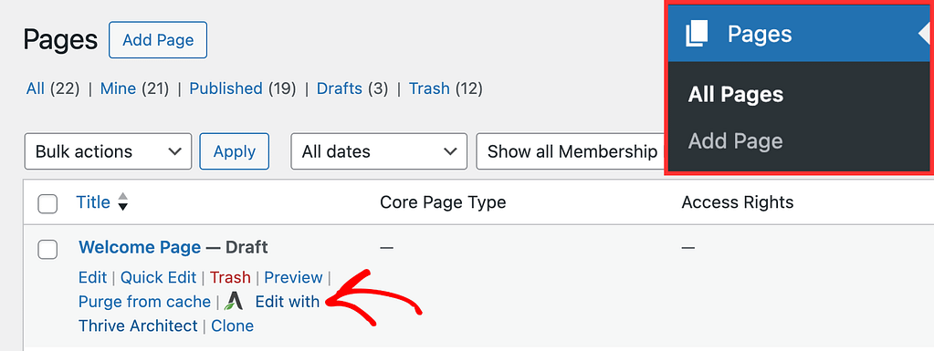
To add the Image element to a page, begin by opening the page in the Thrive Architect editor. To do so, open your WordPress admin area, Pages >> All Pages, hover on the page you want to edit and click Edit with Thrive Architect.
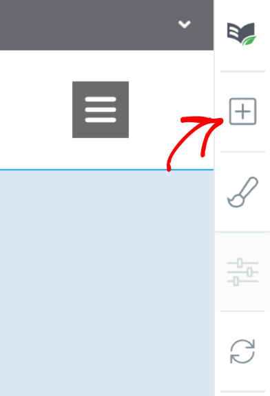
When the page is opened in the Thrive Architect editor, go to the right panel and click the plus (+) icon.
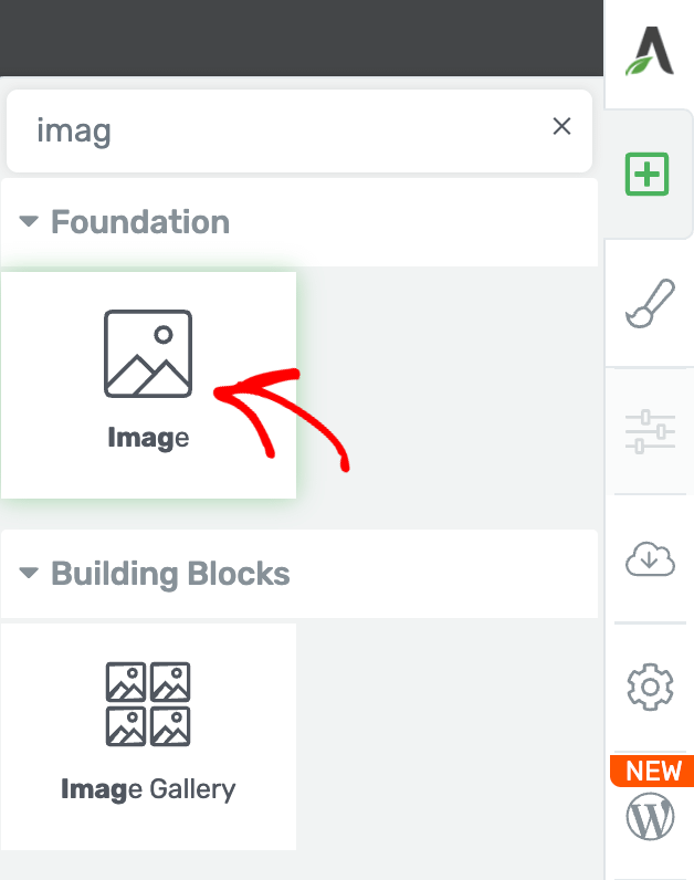
Clicking on the plus icon will open up the list of Thrive Architect elements to choose from. From this list, drag and drop the Image element on the page.
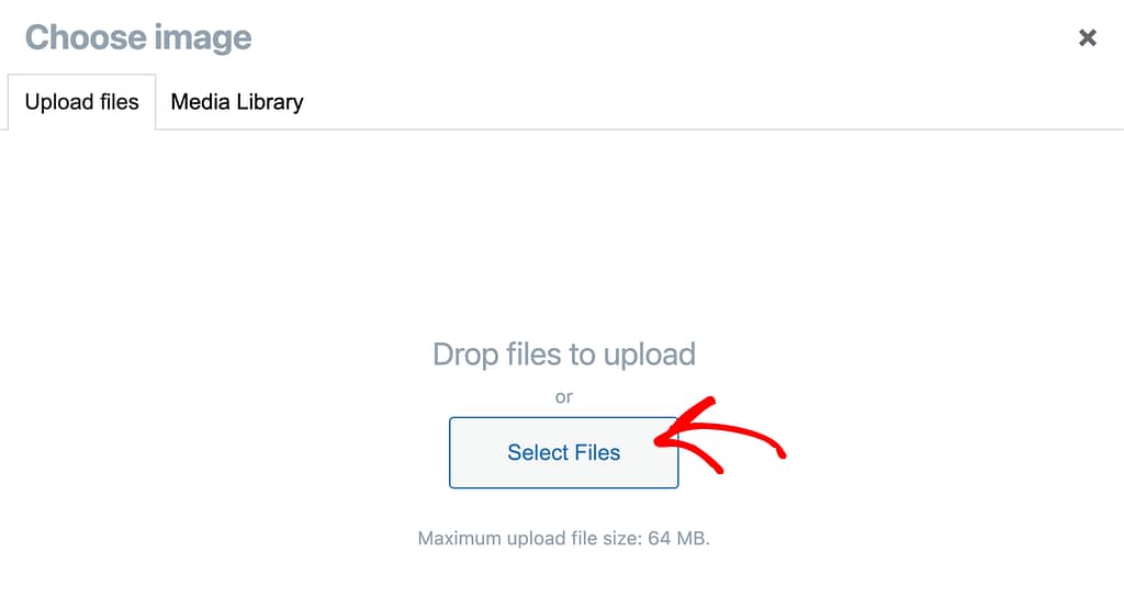
After you drag and drop the element on the page, you’ll see a popup where you can choose an image. To pick an image, you can choose to upload one using the Upload files tab or choose one from the Media Library.
To upload a new image, open the Upload files tab and drag and drop the image file or click on the Select Files button to upload the file from your computer.
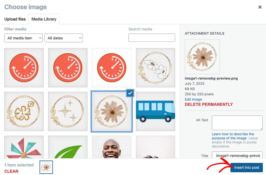
To use an image that is already uploaded and added to your website’s media library, open the Media Library tab, select the image you want to use, and click the Insert into post button.
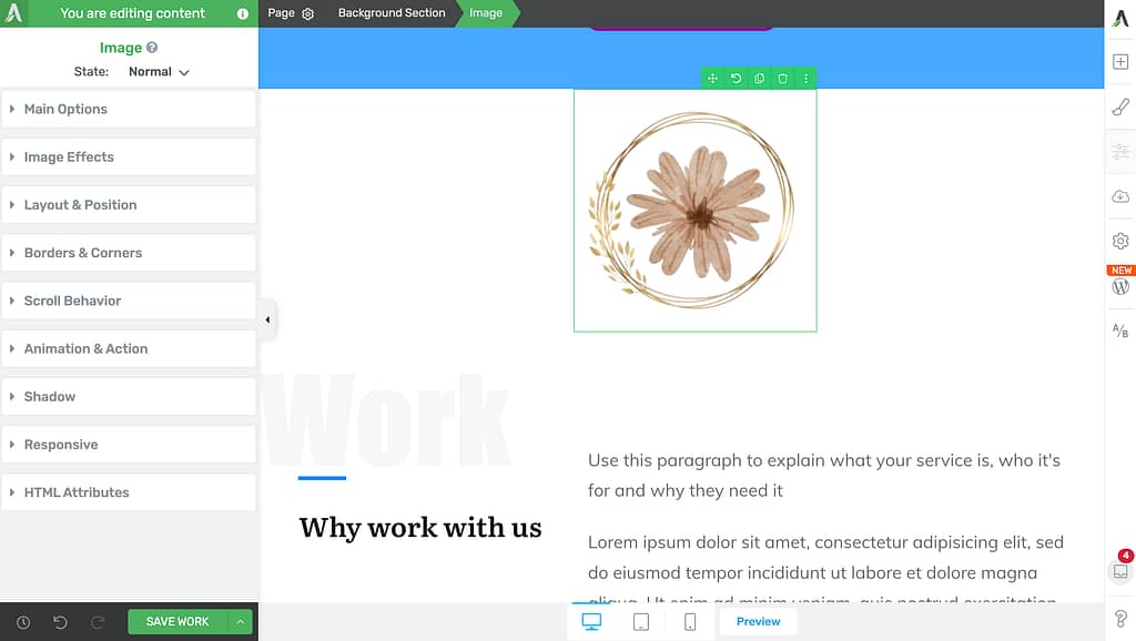
When you click to insert the image, you’ll see it added to the page and its settings open in the left column.
Editing the State of an Image Element
Like many other Thrive Architect elements, the Image element comes with two states – Normal, for when it is seen on the page, and Hover, for when a user hovers over it.
You can customize to change the look of the Image in both these states.
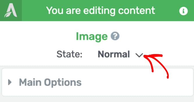
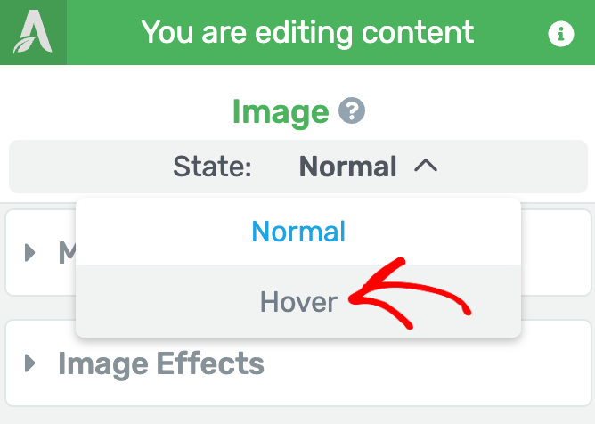
To change the state, click on the Image to open its editing options in the left column.
In the left column, beside State click on the down arrow to select the image state you want to edit.
When you click on the down arrow, click on Hover to switch to the settings of the Image’s hover state.
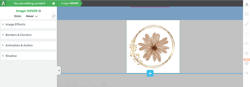
When you click Hover, you’ll see the Image hover settings open in the left column.
To understand hover state effects in Thrive Architect, refer to our document here.
Using the Main Options of the Image Element
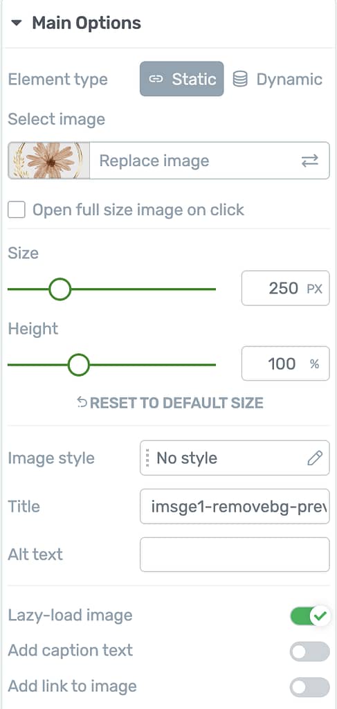
The Main Options of the Image element allow you to customize the main look and feel of the button. They enable you to do the following.
- Selecting the Element Type
- Opening Full Size Image on Click
- Setting the Image Size
- Setting the Image Height
- Selecting an Image Style
- Adding the Image Title
- Adding an Alternate Text for the Image
- Lazy Loading the Image
- Adding Caption Text to the Image
- Adding a Link to the Image
Selecting the Element Type
The Element type setting lets you decide whether you want to add a static or a dynamic image on the page.
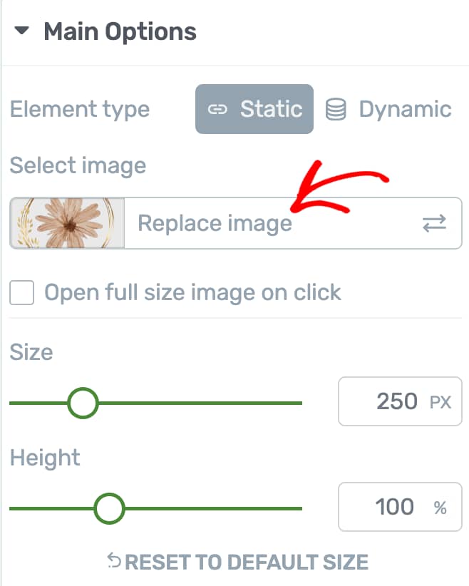
Adding a Static Image on Page
To add a static or fixed image on a page, click on Static beside the Element type setting.
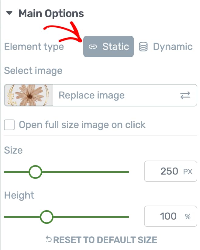
When you choose to add a static image on the page, the next setting allows you to select an image on the page. If you’ve already added an image, click Replace image.
Adding a Dynamic Image on Page
To add a dynamic image on a page, click on Dynamic beside the Element type setting.
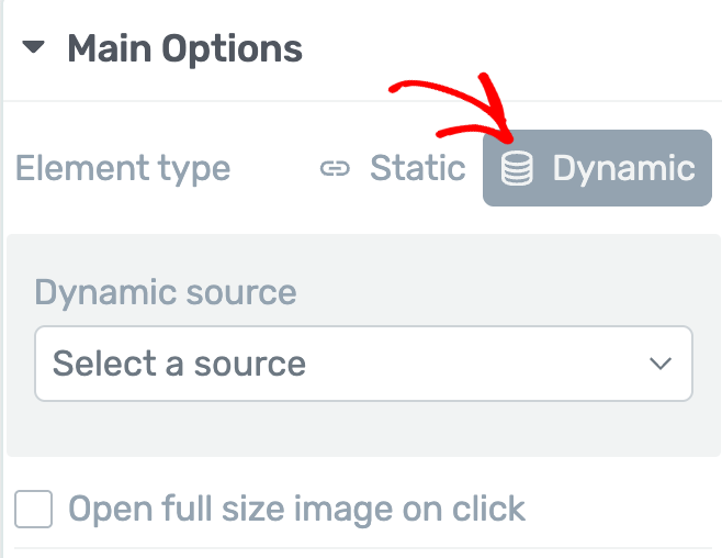
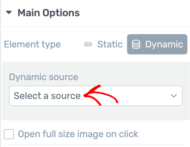
When you choose to add a dynamic image on the page, the next setting allows you to select the source of the dynamic image. To select an image source, click on the dropdown that says Select a source.
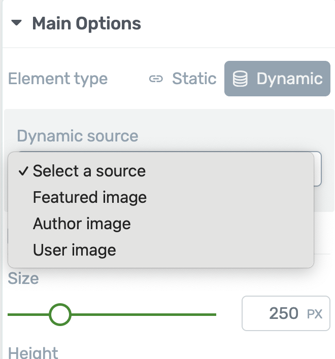
After you click to select a source, you’ll see options that you can select as your image source.
- Featured Image: This will fetch the featured image you add to the current page or post through the post editor.
- Author Image: This will fetch the profile image of the author of the page or post.
- User Image: This will fetch the image set as a user profile image in the WordPress backend.
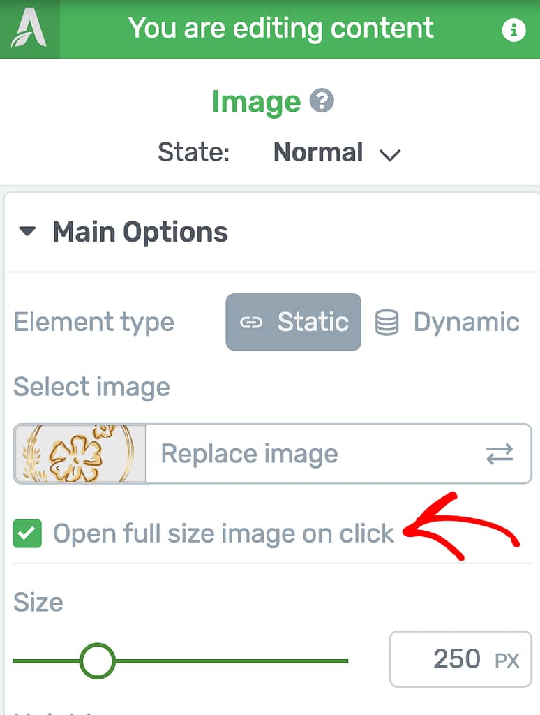
Opening Full Size Image on Click
The Open full image on click setting will ensure the image is opened in full size when a user clicks on it.
To enable this feature, click on the checkbox beside it.
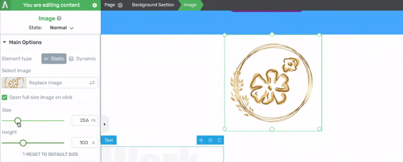
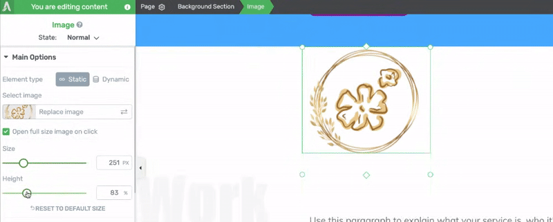
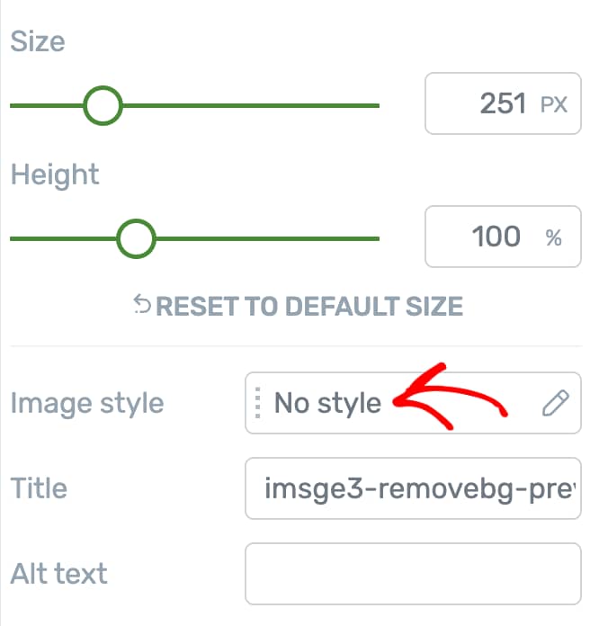
Setting the Image Size
To change the size of the image, use the slider or the field under the Size setting.
If you want to reset the image size, click on Reset to Default Size. Clicking this will reset the size and the height of the image.
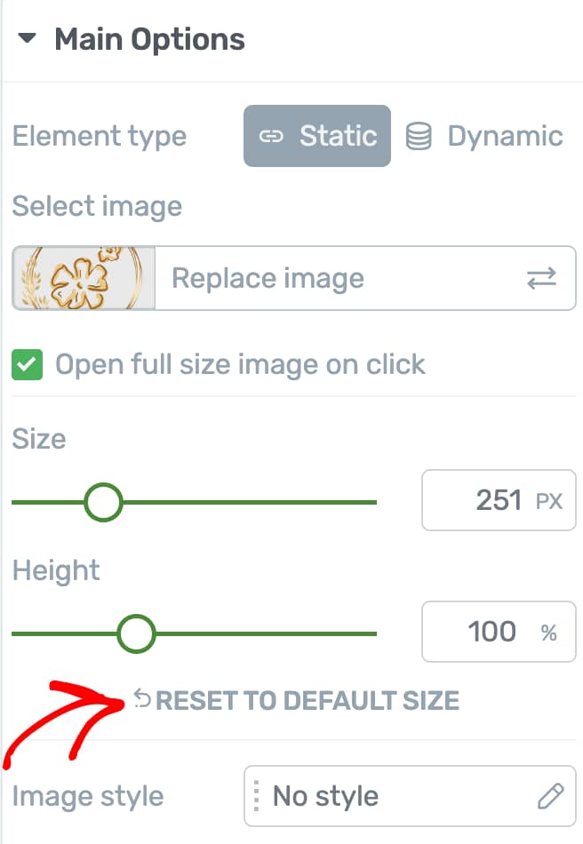
Setting the Image Height
To change the height of the image, use the slider or the field under the Height setting.
If you want to reset the image size, click on Reset to Default Size. Clicking this will reset the size and the height of the image.
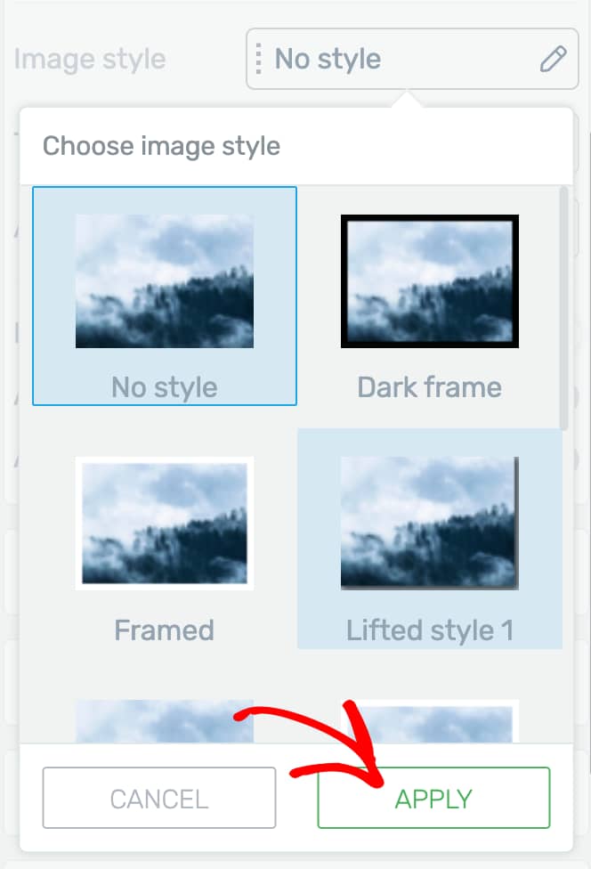
Selecting an Image Style
The Image Style setting lets you select a style you want to apply to the selected image. To set the image style, click on the field beside this option.
When you click to change the image style, you’ll see a list of available styles like Dark frame, Framed, Lifted Styles, etc.
Once you select an Image Style, click the Apply button.
Adding the Image Title
If you want to add an image title that shows up when a user hovers over the image on the page, use the Title setting to add an Image Title.
It is recommended that you add a meaningful image title since these titles provide additional context to users and search engines, helping improve page relevance and user experience.
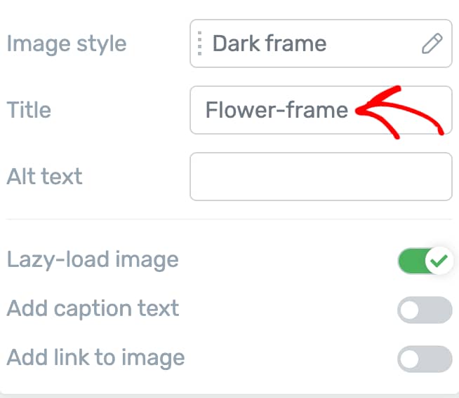
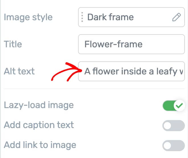
Adding an Alternate Text for the Image
If you want to add an image alternate text that shows up when an image does not load on the page, use the Alt text setting to add it.
It is recommended that you add a meaningful Alt text for the image since the Alt text describes images for search engines and assistive technologies, boosting accessibility and image search rankings.
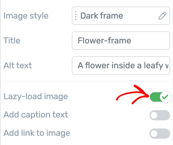
Lazy Loading the Image
Lazy loading is a technique that delays loading images on a webpage until the user actually scrolls down to them. This means instead of loading all images at once when the page first opens, only the images visible to the user are loaded right away.
Lazy loading helps your website load faster, saves bandwidth, and improves user experience, especially for visitors on slower connections or mobile devices. By only loading images when needed, it can also help boost your site’s SEO.
Lazy Loading is enabled by default for images added using Thrive Architect.
To manage this setting, use the toggle button beside the Lazy Load setting.
Adding Caption Text to the Image
A caption text is a text that accompanies the image and adds more information about it.
To add a caption text to an image, click the toggle button beside the Add caption text option.
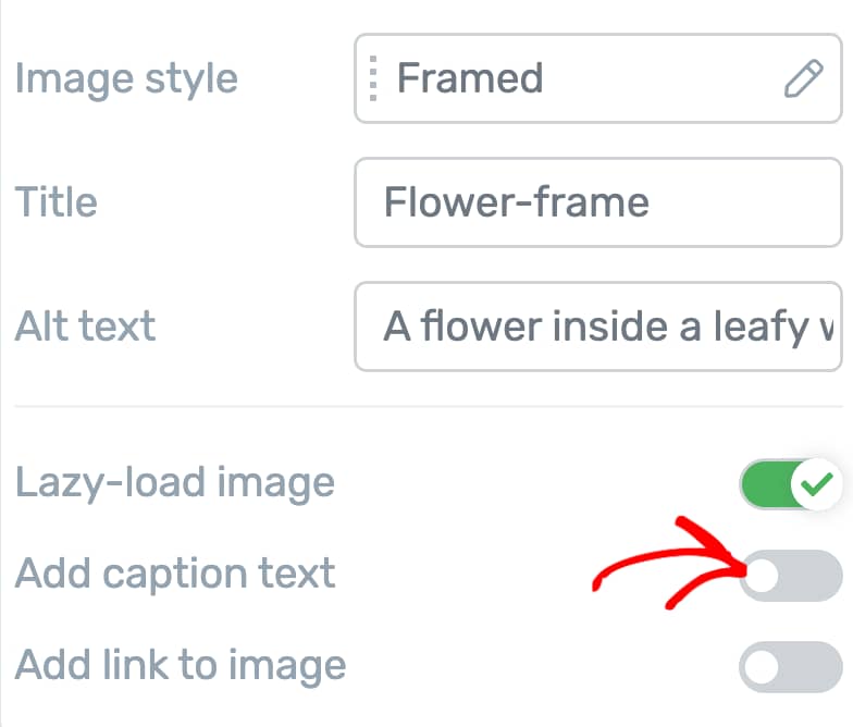
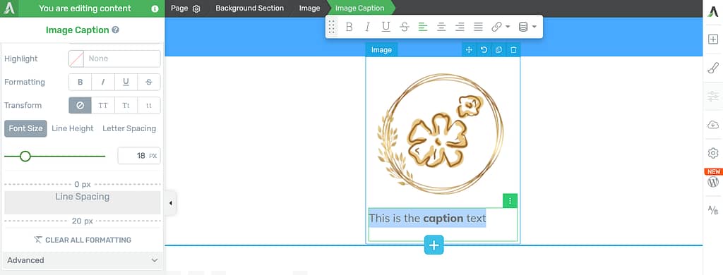
When you enable the caption text for the image, you’ll see that added under the image. To edit the caption text and use its settings to customize it further, click on the caption text under the image.
Adding a Link to the Image
Sometimes you’d want to add links to an image redirecting users to where you want them to be.
The Image link section lets you add a static link, a jump link, or a dynamic link to the image.
To enable an Image link, first click on the toggle button beside the Add Link to Image setting.
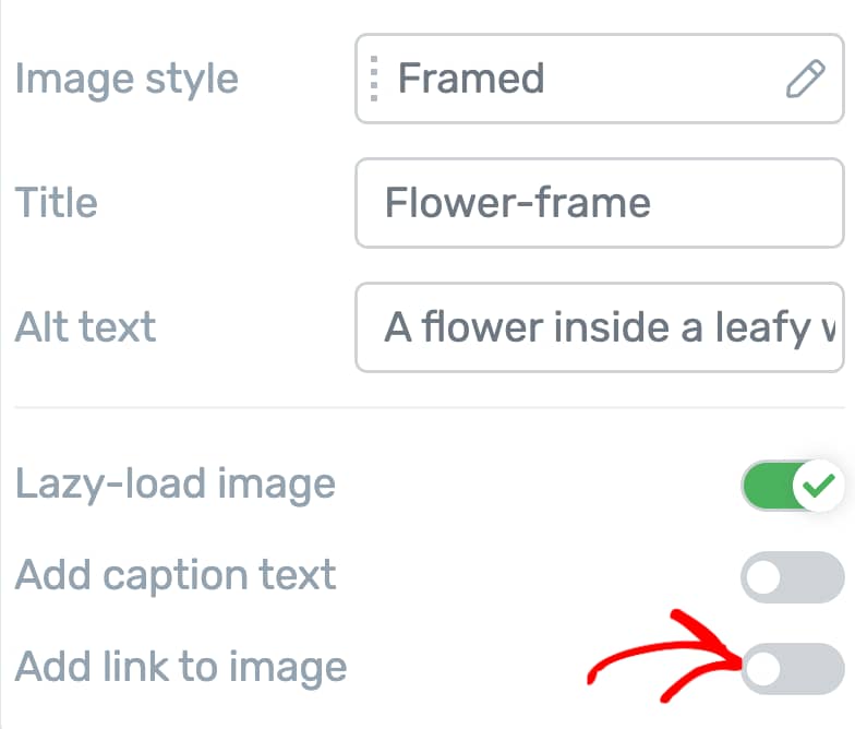
When you enable an image link, the next step is to select the type of link you want to insert into the image.
You can refer to the following articles that will help you with detailed explanations about the type of links.
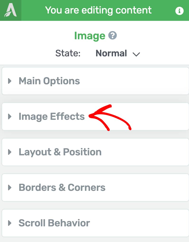
Adding Image Effects
Thrive Architect allows you to add effects to an image added using the Image element.
To add an image effect, click on the Image on the page to open the settings in the left column.
In the left column, click to open Image Effects.
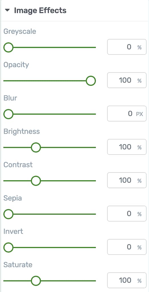
Under the Image Effects settings, you can decide the percentage of Grayscale, Blurr, Opacity, etc. that you want to add to the image.
Other Options for the Image Element
Just like the other Thrive Architect elements, the Image element comes with additional options where you can manage the layout and positioning, borders and corners, background styling, shadows, etc.
To learn more about these options, read the documents listed below.
- Using Layout and Position Options in Thrive Architect
- Using Borders and Corners Settings in Thrive Architect
- Using Scroll Behavior Options in Thrive Architect
- Using Animations and Actions in Thrive Architect
- Adding Shadows to Thrive Architect Elements
- Using the Responsive Option in Thrive Architect
- Using HTML Attributes in Thrive Architect
The above options are available for the Normal state of the Image element. The options available in the Hover state of the Image are as follows.
- Using Borders and Corners Settings in Thrive Architect
- Using Animations and Actions in Thrive Architect
- Adding Shadows to Thrive Architect Elements
We’ve just seen how you can add and customize an Image element on a page using Thrive Architect. You can take a visual tour of these steps in the video below.
Next, do you want to add hover animations to an image using Thrive Architect? Here’s our document that’ll help.