If you add a background section on your website, using Thrive Architect, and you also add a background image, it may look one way on your desktop, but on a mobile interface the content will be resized and chances are that it will look different.
The reason this is happening is because the item that is resized for the mobile interface is the content that is added to the page section, not the background image. Therefore, you need to be aware of the fact that if you add more and more content on the page section, the priority is to resize the content you have added.
In order to get the best display of your page section’s background on a mobile interface, make sure you follow these recommendations:
Carefully Choose your Background Image
Make sure you choose carefully the background image you want to display, as on the mobile interface it will be cropped to better fit your content.
Example of How NOT to Display Your Background Image
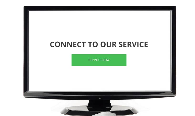
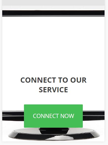
Adding a background image with a specific focus area is something you should avoid. If you are adding content on your page section and you center it, while the focus area is somewhere on the side, the outcome will not be the desired one.
This is an example of how such a background section would look like on your desktop:

However, on a mobile device, the focus area will not be displayed on the screen, and the page section would look like this:

Example of How to Properly Display Your Background Image
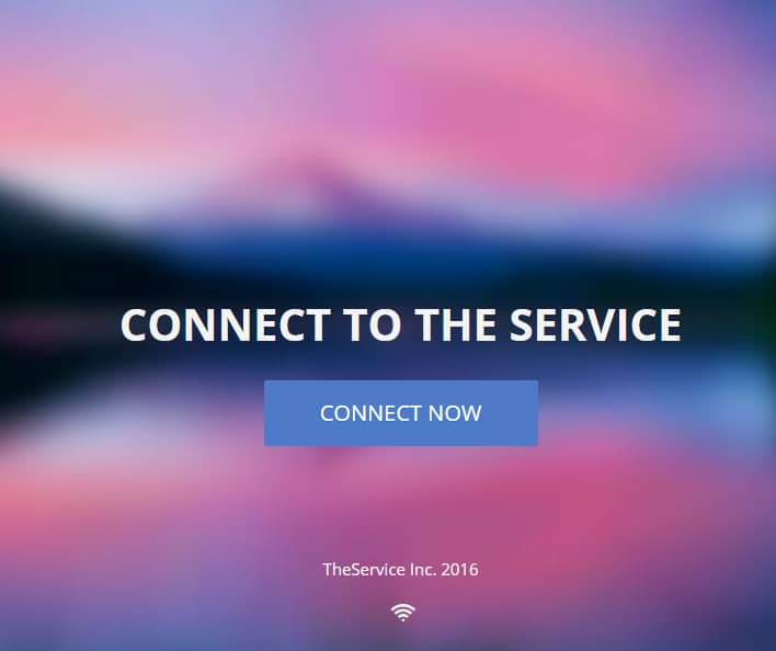
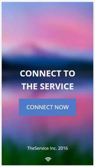
Considering the aspects presented above, you should display an image that doesn’t have a focus area. These images could be abstract images, nature images, blurred images, and so on.
Below you will see how a blurred background image would look on your desktop:

And, on a mobile device, the image will also be displayed in a proper manner:

The “Margins and Paddings” Implications
You should be extra cautious when bringing additional changes to the “Margins & Paddings” item of your page section since it can affect the responsiveness of the mobile device.
Make sure to also check out this video, with more in-depth details about creating mobile-responsive content:
For more information on how to make your website fully mobile friendly, please check out the following blog post, and if you need any further assistance, you can open a support conversation.