We've released a new feature for our Thrive Architect plugin for WordPress that makes it easier than ever before to create professionally designed content quickly.
It's a new Thrive editor element called the Content Block and provides you with predesigned template blocks that are 100% customizable to meet your website's unique needs.
We created this new element to help you build better looking content faster with far fewer editing steps.
Watch the video above and read the post below to learn exactly how the new Content Block element will help you create professionally designed landing pages and higher quality blog posts in waaay less time.
More...
What are Content Blocks?
The new Content Block element gives you the flexibility to fully customize predesigned content quickly without having to repeat the same editing steps over and over again.
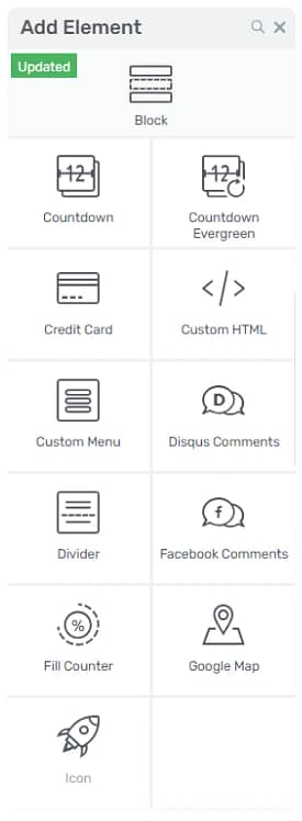
Once you update to the latest version of Thrive Architect, you'll notice a new element in your Thrive editor right sidebar... the Content Block:
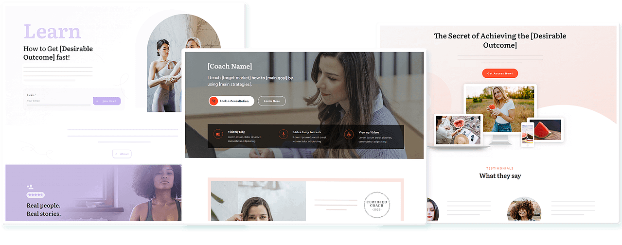
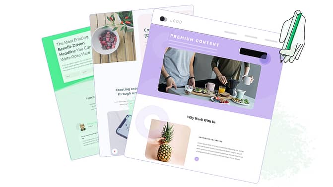
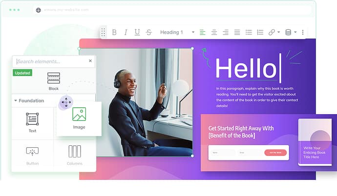
When you drag and drop the Content Block element into your Thrive editor window, a gallery of several predesigned Content Blocks will appear from which you can choose what you need for your blog posts and landing pages:
To help you find what you're looking for faster, the Content Block gallery can also be filtered based on Categories (My Favorites, Product Review, Blog Post, Company, Content Pattern, and Podcast) as well as by Block Types.
For example, if you're trying to write a product review article for your blog, you can simply click the "Product Review" category to filter for all the available product review designs.
You can then preview any Content Block design you're interested in using (within the gallery window) by clicking on it:
Then, you just click the green "Insert Into Content" button to make it appear within your editor window.
To learn more about how to use the Content Block element across the posts and pages of your website, watch the video above and check out our Thrive Knowledge Base article on the new element here.
We Need Your Help
So now that you've seen Shane's video about the new Content Blocks element, what kinds of Content Blocks would you like to use to build better content faster on your website?
Help us make the perfect Content Blocks for you in our future Thrive Architect releases by telling us what use cases and types of content would be most beneficial for your online business by leaving a comment below!
Love it! Great how you provide useful pre-designed templates with such a feature. You’re making it easier and easier for us to look good. So very impressed with how you continue to add useful features to Architect. Your stock continues to rise with me and I am sure many, many others. Keep it up.
Thank you very much, Allen!
What would be REALLY cool is if you guys built in a way to upload your own designs and then let the community vote on them, add tags, etc. This would be an AWESOME feature and push Thrive Architect to the forefront of all page builders. It would also be great if I could publish my elements/blocks privately to the cloud so I can use them across my 80 WordPress sites.
That’s a really interesting idea! Thanks for your suggestion, Marshall!
I absolutely LOVE this new feature… and I’d love to see an option for us to create and save “Content Blocks” to our own gallery.
That’s just the start though. A selection of content blocks designed for Squeeze pages, one of high-conversion elements for landing pages, etc. This new feature truly opens up a whole world of possibilities.
Love you guys… and thank you so much for this!
Thank you for your suggestion, Miguel! We’ll definitely be releasing more content blocks for things like landing pages and other purposes.
And we’ll see if we can do the thing with saving your own blocks as well.
here’s a little workaround that made this “feature” work for me:
1. put a content box on your webpage
2. drag and drop the content BLOCK into the content BOX
3. adjust
4. save
Content Blocks of Top 10 Lists, Detailed Multi Section Product Reviews and Blog Post Templates, will be great!
Thanks for your ideas, Roger!
Absolutely amazing new feature. This will help to produce great looking blog posts so much faster.
Thanks for your comment, Barbara!
Another excellent addition. Thanks.
Thank you, Martin!
I do product reviews and informative articles. I also like to do a product comparison.
Thank you for your suggestion, Billy!
GREAT Addition!!!
I’ve liked the transparent feel you get from a section with in the website. I wish I knew what to call it to help me explain to you what I mean. Let me just say, various “styles” could be added to help build a site quicker and easier.
We’re working on that kind of thing. 😉
This is great. Thanks, Shane. I would love to see a “Benefits” (product features and benefits) content block.
One other feature not related to this is calculation forms (product pricing calculator). This would be a great addition.
Would love FAQ blocks too (for different headers and sub-headers of FAQs)
Thanks for your feedback, Felix!
Fabulous enhancement.
Thank you.
Primary use cases for me will be:
– online courses
– book descriptions (but I suspect I’ll be able to adapt review blocks)
– information tables – especially as Google loves these. Can you attach metadata to them?
Also hoping (and expecting) when I do my plugin updates at the weekend that I’ll find we can save our content block customizations and access them easily, as for other elements.
Thanks for your feedback, Mike! You can’t create or save your own content blocks yet (it’s a bit more involved than saving templates or symbols), but we’ll see what we can do.
This is awesome.
Here are what I would like to see.
Content blocks that encorporate ads and adsesne.
You see, the challenge is that; just putting ads over in the right side bar doesn’t get many clicks.
But, having the ability to put them in a content box that has an image, or text side by side or wrapping it that follows the adsense guidelines so that the ads are in context and not an afterthought would be amazing!
Content blocks that allow us to insert mini squeeze pages and lead generation would be fantastic.
Thanks, Patrick
Interesting idea regarding AdSense blocks. We hadn’t thought of that. Thanks for sharing, Patrick!
Can I save a content block as my own and reuse it on another post(s) after I edited one of yours?
Not yet, but that’s a feature we’ll be working on.
This is awesome…especially since I have been trying to stylize blog posts for a while now and it take a chunk of time to create all the boxes and such to make them look great…thank you! I’m really happy I selected you as my core theme going forward.
One thought and maybe I can already do this is around video snippets. I do a lot of speaking and so I am going to edit down my speeches and take a bunch of clips and insert into blog posts along the way as well as pages on my site. If there is a way to have some styles available for easy drop in of video with some stylized text around it that would be awesome. Thanks again…
Thanks for your suggestion, Blaine!
Online courses! Content blocks could make an onlline course look appealing to people with limited internet skills (and also to all the others, of course!)!
Thanks for your idea, Ingela!
I’d love some multi column “footer” & “header” blocks that are optimised for smaller devices – tablets / mobiles. Maybe with a phone icon and click to call number / custom menu / logo etc
I find it extremely time consuming getting these elements to work well on all devices – particularly landscape view on tablets where the contents spills over several lines because the width is a tad too wide for responsive view
Thanks for your suggestion, Mark! New header and footer templates are coming soon.
Fantastic feature! Can’t wait to be able to use Thrive Theme (out of beta testing) with Architect. This pair will rock. Having CTA for books and giveaways with transparent background would be cool too.
Thanks for your feedback, Mark!
Wow, this is going to save many of us SO much time guys – what a great addition. Thank you.
Happy to hear that, Ryan.
So f***ing NICE. JUDT PURE AWESOMEBESS HERE GUYS! LOVE YOU AND YOUR NEW UPDATES. Big hugs from Sweden!!!
Thank you very much, Alexander. Great to see you’re so enthusiastic about this feature. 🙂
Ah that is awesome, great stuff! I was just thinking of designing my own podcast content box, but now I see that won’t be necessary and I can use the predesigned podcast content block, thanks!
Good to see that we released this just in time. 🙂
Excellent feature – thank you! Will definitely make writing content much easier.
Would like to have content blocks specifically for Sales Landing Page elements.
Thanks
Thanks for your comment, Sue! We will get to work on landing page and sales page related content blocks soon. 🙂
awesome!
Im not sure if your content blocks for blog
cover what i need, but i basically want to have a nice basic blog post design in terms of margins etc, and for text block sections and headlines/subheadlines, so i can just drag and drop and overall it looks all good together, like all your blog posts.
I dont want to have to tinker with headlines, text blocks and overall blog post design so it workswell together.
Lastly:do you think the next gen theme could be released within 2-3 months?
thanks!
Thanks for your input, Oli! We will add the blog layout idea to our list.
We don’t have a release date for the theme yet, but we will publish it as soon as we have a release date.
Matt, you’re right. I DO love these new features! Almost makes me want to blog more frequently 🙂
I haven’t taken a peek at the Content Blocks that are available, but off the top of my head, the ones that would be most useful to me would be: testimonials; pull-out quotes; product recommendation; and why not a video playlist or gallery?
Great stuff! Thank you for sharing your ideas!
Cool. Now how can I replace the blog header/nav to a custom nav/header? Makes no sense compared to my other pages built in architect.
Do you mean replacing your theme’s header? We don’t have a feature for that yet, I’m afraid.
The flexibility that comes with creating custom headers only makes sense to be applied to the main theme, especially since the old themes will be replaced by the new Theme Builder soon. [Hopefully? 🙂 ]
The content blocks feature is absolutely amazing and such a time-saver! But, like Christopher said, if it gets injected into the main theme (without back-end coding involved), any blog post you create just looks terrible and totally off-brand.
Hi just watched, and updated the site plugins. I’m looking around so it might be there, I want a page that organizes the tags. So if the reader only wants to read about one type of content, then they click on the block titled that content topic. I can do it now in a way but it’s not clean.
Hi Chels,
Do you mean this as something to filter content within a single blog post, or across many blog posts on your whole site?
Game changer!! Thanks, guys.
Thanks for your comment, Andy. Glad you like it!
You’re amazing. Thanks
Thank you, Dave!
Would love product photo galleries(woocommerce) & ability to add woocommerce variation blocks if possible
Thanks for the suggestion, Darren!
Please woocommerce product blocks/ category blocks etc…
also table of contents block
Thanks for your feedback!
Great feature! I would love to see a table with individual cells where the content can be hidden or revealed with a click. I currently use the toggle inside a table cell for this purpose but the design options are very limited. It would be great if this can be done with the content block feature and saved and reused. Thanks for listening!
Thanks for your input, Bhavesh!
Awesome. How about a slider content box? We can then just change the images and the slider would work.
I’m afraid we have a policy against sliders around here… https://thrivethemes.com/why-sliders-suck/
However, there are tons of slider plugins already available to use for WordPress.
Excited to use this feature to create fast blog posts for my interviews and media appearances. I’ve been frustrated that WP doesn’t allow duplicating pages. I have the format, just need to change the details. This is going to save me so much time. Now I can create all those posts that have been waiting for me to find the time. Bam! Thanks team you’re the best!
Glad to hear you’ll find this useful, Debbra!
Hello. This looks great. I realize this is likely not possible, but it would be awesome if you could add an audio player for podcast episodes where we just have to drop the link to the MP3 file. Thanks for all you do.
Hi Molly, spoiler alert… if you updated Thrive Architect to the latest version, search for audio element 😉
This is awesome. I’ll take them for a spin and will report back on ideas should that be necessary. Thanks, Thrive!
Thank you, Zane!
Awesome feature!
I would like to see blocks to create:
– home pages
– product/service/sales pages
– about me/us pages
– contact pages
– online course pages
Blocks that come in mind are:
– page headers: full width background section with background color/image and title + sub title
– features/benefits
– products/services: I always spend a lot of time styling mostly 3 columns with products or services
– call to actions: I build a lot of funnels with an e-book followed by a free strategy session; I always spend a lot of time styling 2 columns with in the 1st column a CTA for the e-book (button -> popup with optin) and in the 2nd column a CTA for the free strategy session (button -> page)
– why us
– portfolio/image gallery
– case studies
– customer logo’s / as seen on … (trust factors)
– course content (for sales page)
– video lessons
– course downloads/resources
I think that is enough to keep you busy… 😉
Great stuff! Thank you for your feedback, Wouter. 🙂
Amazing. Thrive just keeps on getting better and better.
Thank you, Jonathan. 🙂
Just awesome as usual. I won’t even say what I want because everything you ever put out I didn’t know I wanted till you put it out. It’s the Henry Ford effect.
Haha, that’s good to hear. 🙂
I would love a content block to market all our products on a page — our products are mostly books — so the content block would be an image of the book — a brief description with link to a sales page — and then buttons for buying print version, digital version, and Kindle version.
This is an awesome new feature!! Thanks!!
Thanks for your comment, Cher! Take a look at the “resources” blocks we’ve already released. There are some there that I think fit the bill for what you describe very closely.
How do you drop a content block into a blog post? My understanding is that you can’t edit blog posts in Thrive Architect, apart from just opening up the blog content and changing text. Has something changed? I’d love to be able to create and design my blog posts in Thrive Architect.
Hi Peter,
You can edit blog posts with Thrive Architect. You just can’t load landing pages on a blog post. But everything else in Thrive Architect works on blog posts just as on pages.
Fantastic. Thanks a lot, Shane & Co.
Thank you, Bjarne. 🙂
Nice new feature , hope you add more templates for portfolio presentation especially logo design presentation .
you know some times it includes a lot of things like Inspirations ,Logo variations , Colors,Fonts ,
and sometimes it be more options with different ideas ,option 1 , option 2 ,, ect and each of options might includes those sections Inspirations ,Logo variations ,, ect
Its takes long time ! i designed the same thing for my website last year its fine but i’m not satisfied enough about it !
for sure waiting more templates in different genres .
by the way I feel the new thrive theme builder is going to come pretty soon.
Thanks for your feedback, Momen!
An RSVP block for signing up for events.
Thanks for your suggestion!
LOVE THIS!!!!
Was tired of having to save everything as a template, plus my design skills are not nearly this good, so again I LOVE THIS FEATURE!
Thank you Thrive team!
Thank you, Albert! Happy to know that you like what we’ve created here. 🙂
I have my content by video show, not podcast, so a content block special for video, and show notes would be awesome
Thank you for your suggestion, Alina!
Sweet, I like that feature, very nice, thanks. My suggestion for more content blocks, I think we can all agree with website necessity – having extra content blocks that are tailored for a home page, about page, service page, catalog page, contact page, and the sale page would make sense to have for the basic need for website development when you think about it. Hope that help.
Thank you for your suggestion, Luis!
Sure thing Shane, thanks for adding this feature, pretty cool. I just thought that having this content block feature – it would be nice to have some designed content blocks for each necessity section that goes for each necessity pages which would cover the whole thing really.
Hey Shane, I was thinking about this further and I would like to add more suggestion so that I can be more specific. It would be great to add content blocks for all the necessary pages that I mentioned before. But, it would also be great to add content blocks that target each section.
For example, it would be great to have content blocks that target Intro, header, menus, the above the fold section, slide blocks, optins, step by step, diagrams, text grid, benefits, portfolios, testimonies, team, video or video optin, counter, scarcity clock, storyboard/section, a catalog list section, and so on.
I know that it will take time to create on your end, but it would be great to add these kinds of content blocks. I think everyone would agree – that would be nice. Thanks for listening.
Good news because I’m about to re-launch my blog section and I need something appealing, modern and easy to use. We need to aim to the final user who would enjoy great content within a great design!
Thanks,
Carlos
I think you’ll really like the content blocks, then. 🙂
Wow! I just can’t keep up with all you’re upgrades. Thanks so much for working to make this easier for all of us!
Thank you, Michelle! Glad you like this new feature.
Amazing feature , I would like to see content blocks for customer support content…
Thanks for your suggestion, Vincent.
The best content/page builder in the business just keeps getting better— I absolutely love the new addition! Kudos to everyone at Thrive Themes! Would love to see content builder elements for ecommerce (i.e. WooCommerce). Thanks guys!
Thank you, David!
This is an awesome new feature, Matt & Shane – thanks! The main types of content blocks I would love to see would be for landing pages (e.g. webinar registration pages) and short-form sales pages. I know you have some excellent templates for those already, but I’d love to also be able to use content blocks because right now I often find that I’m saving bits of landing page templates as content templates. If there were a selection of content blocks to do this, it would be easier and faster (and no doubt provide a lot more variety). Thanks and best wishes.
Thanks for your feedback, Matthew!
This is a great idea! I would love to see some example pages using different content block styles. It would help me conceptualize what I would like a page/post to look like.
Thanks for your comment, Mark! We’ll be publishing some more tutorials and examples for how to use content blocks, yes. 🙂
PLEASE never stop being AMAZING!!!! 😀
Thank you, Clark. 🙂
I would love to see a content block that pulls in posts from an RSS feed. For example, I want to build a webpage for my personal brand. On the home page, it would be great to feature the latest content from my business blog. They’re separate domains but, if there was a content block that read and allowed me to organize posts from a different domain’s RSS feed, I can accomplish this.
I could also create a page that curates blog posts from my favorite sites. For example, I could have a page that’s called “Favorite Blogs” for example and, on that page, I can link to the latest post on each of my favorite blogs and it will dynamically change whenever those blogs post new content.
I can think of probably 20+ use cases for this.
Very interesting idea! Not sure how much info we could bring in from an RSS feed, but I see how this could be pretty useful.
That looks great thanks! I’d love to see some gallery and folio content blocks please. For example a variety of gallery thumbnail blocks with mouseover effects and titles and then individual project blocks with short comments to show off great project images on individual pages. Cheers Darren
Thanks for your feedback, Darren!
Thank You very much. I love being a member of thrive themes.
Thank you, Rosemarie. That’s nice to hear. 🙂
These seem similar to the Style Boxes which I also like. When I have time, I like to use magazine style layouts in my blog posts, such as the Steps, and the Pros and Cons blocks. I once tried creating a Steps layout on a page, but it wasn’t clean as the Steps block you created for TA. So thank you for that.
Ideas for other blocks:
1. More Step style blocks with different types of step icons.
2. A product review block with icon image element on the upper left side of the block positioned at the start of the paragraph.
3. A Question and Answer block
4. A question to reveal the answer block.
5. A three column steps block that allows for image at the top of each step and text, including the step number below each image.
I can send screenshots of the types of blocks I’m describing if you want.
Thank you for your suggestions, Bakari!
LOVE this new feature… can see me using the blog and podcast content blocks very soon!!
I think a case study content block would work really well!
Glad to hear you can make use of these right away. 🙂
Brilliant edition, thanks for making life easier, one thing I would like to see is the ability to create a blank post page, like landing pages, so you are not beholden to the theme
Interesting idea! Thanks for sharing, Ashley!
I using Thrive Architect to build a lot of portfolio pages, although it wasn‘t made intentionally for this. But i just love Thrive Themes, so i use it anyway.
There is just this one main thing missing, a PORTFOLIO GRID and some kind of GALLERY view where you can click to the next (portfolio)picture.
How I did it until now: insert images one by one in columns, and by clicking they open separately, but you can not easily click to next picture. You have to close one picture and click the next one to pop up/view enlarged.
So this would be a really great change for me and make things easier to have a PORTFOLIO GRID and VIEWER.
..
Bonus: what would be super cool to be able to organize the portfolio grid based on categories. If i could define categories, lets say Aquarell/Outline-Drawing/Animations/…
The category names should then be shown, and because i define each image i use in this portfolio grid also as belonging to one of the defined category you can then click on of the categories, and the other categories vanish. (With this i could really use big portfolio grids that are nonetheless practical to use)
Thank you for your suggestion, Jonas!
just awesome 😀
Thanks! 🙂
In my opinion, a useful set of content blocks, would be about affiliation marketing (products display and features, reviews, etc). You already have some (very good), but I would improve this category. Great new feature by the way 🙂
Thanks for your feedback, Filippo!
Thinking the concept a bit further:
What I noticed when creating landing pages is, that I allways change the same element: Change button colour and style to our brandsdefault, change background style & colour to brands defaults. Basically Make the brand design suit to templates (when using templates).
You have nowadays global fonts, colours etc.
Why don’t you build templates – both landingpages and content templates where…
————-
When I predefined my default colours, button design, font style & sizes etc.
The templates automatically get converted to my default brand design.
————-
So I don’t need to change the same things over and over again on a template. But just can see if brand design looks good with the templates and just adjust, when it doesn’t look good.
This would really speed up the process of creating websites!
That would be very cool, I agree. We are working towards this kind of thing with the features we’ve been building. There’s only one major downside: the more styles are changed automatically, the more likely it is that the end result won’t look nice. So, we might spend a lot of time designing a nice looking page, but once you load it, it looks bad because it just doesn’t go well with your brand colors, fonts, buttons etc. That’s difficult for us to predict, with so many variations possible.
But some way to quickly preview a page with all your custom stuff and then decide if you want to load the original or the “branded” page would be great.
These are awesome. My big challenge / time consuming part of blog posting is creating a list of links to the content/sections or text anchors to the sub-headings. I noticed Neil Patel’s posts for example has a floating content list for easier navigation of long form posts and hub and spoke content.
Anything that would help with this would be awesome.
Interesting idea! I don’t know how well this would work if it’s done in the post editor, rather than on theme level. But we’ll look into it.
This is very cool 🙂
Maybe you can add order bumps and webinar landing pages, broadcasting pages. Contest pages would also be something unique and nice to have. Well done. Keep it up! Cheers
A feature where we can share pages or posts with other Thrieve Users or in different sites that belong to the same user, as a template would also be very cool. I think both InstaPages and ClickFunnels have this feature of sharing templates or funnels with other people, who even don’t have to be Thrieve Themes members yet, which will encourage them to become members to use the templates.
Nice Feature i love it
but id like to see the ability to add woocommerce produkts with just a wc-produkt id
regards
Amazing… Great update to Thrive Architect.
– Product Features or Benefits Block
– Course Outline / Course Features / Benefits Block
I actually read all about content blocks last week and tried to create a few myself with saved templates, so this sounds like a huge time-saver. Thanks for the update, will certainly start using this.
You continue to amaze me with high quality content and updates!
This is absolutely fantastic!!!
The answer to your question: the blocks I would need the most aren’t landing pages focused. A recent blog post of yours highlighted how we are moving to landing pages providing great content to convert highly engaged people. Additionally, landing pages are the best tool when addressing different audiences, without the need for different websites. Specifically, I’m thinking about blocks with pros and cons in parallel columns, highlightened sections, highly converting and seamlessly integrated opt-in blocks for workshops, webinars or digital downloads. Thanks for an amazing feature, I’ll be using it right away!
Fantastic new feature! I’d love to see content blocks with design element. For example the green header section with the 3 pictures in a fancy divider style which is shown here at minute 1:00 https://www.youtube.com/watch?v=pfYgA4utP1w&t=536s
A great new option, thanks. You don’t provide number icons, so could we have numbered content?
I love the look of new content blocks feature. The logic you’ve used for global and local edits will be a big time saver. The templates shown in the video look fantastic. I would primarily use this for image and product galleries and affiliate product/service lists. I use Shopify rather than Woo, so a product gallery for me would be an image gallery with a “buy now” or “read more” button, and it looks like that is already catered for. Quote blocks and testimonial blocks would also be useful. An author box too please.
Absolutely amazing new feature !
One word: awesome!
The Thrive Themes team does it again, with a lovely surprise for all of us Thrive Architect users.
I agree with many of the suggestions already posted here and have one request to go alongside them:
I use an offline blogging tool to write all my text (Ulysses) and publish directly to my WordPress site from there.
This helps enormously with my writing workflow, but here’s the catch:
When I publish to WordPress from the offline tool, it has the usual WP 5 editor blocks, but once I click Edit with Thrive Architect, your editor puts it all into one “WordPress content” block.
I then have to cut and paste paragraphs individually into Thrive Architect elements, in order to make it look pretty.
Would it be possible to split the WordPress text automatically into the appropriate Thrive Architect elements, such as heading and body text, bulleted and numbered lists?
I’m sure I’m not the only blogger with this kind of workflow, so an update like this would save loads of time for all of us.
This looks really nice. I can’t wait to see when Thrive Architect gets integrated with Toolset Types and other custom post type plugins, so we can have dynamic blocks where the content is queried instead of being static.
Shane, I remember Hanne share a video on How To Create An Affiliate Review Block that had the Brief Introduction, Pros, Cons, Summary as well as rating inside it. Maybe you can create a template for the same. It looked awesome.
Great feature! Thank you!…
hi Shane, this is great again, was waiting for it. however, it is not yet showing in my site?
also would like to see something related to coupons.
Make sure to update to the latest version of Thrive Architect and to clear cache (CRTL+F5 on a PC)
Thanks, Hanne, Tried but nothing I will try to install it again
great addition, so many possibilities, how about “video” targeted blocks? Thanks, Shane, Matt
How do you suggest I use those content blocks for blog posts? As far as I know I can only add a block above the WP Content block or below – but not inline with the content.
Do you suggest writing blog posts directly in TA, instead of using the WP backend editor?
Thanks
Michael
Yes we do 🙂 We create all blog post in Architect directly so that we can take advantage of the nice layout options.
Would love to see content blocks for “post Grids”. The default ones are decent but something with more pizzazz would be a welcome upgrade.
Also, a real estate content block outlining house features would be a godsend.
we need content blogs for woocommerce shopping cart to use with woocommerce shortcodes
I’d love to see customizable, high-quality audio players with playlists and categories. I wasn’t very happy with all the plugins I’ve tried and this would be a great audiovisual addition to blogs.
Great stuff!
I would love to see some content block for diplaying deals (or coupons).
Each deal block would basically need:
– a title (deal name)
– a description field (could be under a toggle box)
– a date field (“use before 10/15/19” for example)
– a book now button
– an image (optional)
Thanks!
Awesome feature! Congrats!
As long as I use Thrive Apprentice I really need some content blocks or templates in order to show my online courses that I am creating on Thrive Apprentice.
If not possible doing dynamically yet, at least allow us to change the Index page design generated by Thrive Apprentice. The original and fixed design is not so beautiful… sorry… 🙂
Thank you!
I feel like a kid in a candy store! Thanks for these amazing templates. I still haven’t delved into everything and wonder if there is a template that I could use for my Services page. I offer 4 different services and it would be amazing if I could just add an image, change colours and voila! Done and dusted. Thanks Thrive, you ROCK!
This is a great addition to Thrive Architect. I would love to see this for dynamic content.
Content blocks for COURSE CREATION. Thanks!!! Love ThriveThemes!!!
Also: Content Blocks for MMPS landing pages. (I repeat: Love ThriveThemes!)
A “Today You’ll Learn” box like at the beginning of this blog post:
https://imobsession.com/clickworthy-headlines/
which is a skyscraper list post with a lead magnet designed to lead people to a Andre Cheperon style Soap Opera Sequence to get them to buy Thrive Headline Optimizer
I’m not a designer but I’d like to have a more sophisticated looking version of this box.
Thanks 🙂
Hi Shane,
I am not sure if this suggestion has been made yet (read only a few), how about a top menue content block?
I am having a serious headache with the top navigation. I want a logo (left), log in and try free. Below the various tabs. This is a real mess when I get down to smaller screen sizes including tablet and mobile. The log in and try free, become strange becouse they are not part of the string due to too many tabs.
I’d like to see some recipe templates with SEO optimization features added as well.
Great job with these blog templates!!! Excited!
Shane
Do you have a content block for a sidebar. I am currently using a theme that offers this, (still waiting for the new theme from you) which allows you to add a sidebar after you have haded a couple od posts, or anywhere within the page.
Love this feature. It’s awesome. I would love it if there was a Masonry grid feature for blog posts where maybe the photo might be different aspect ratios or titles might be longer than other titles.
Would like Content Blocks that help set up the Front Page. Especially anything that includes the header and stuff at the top of any website such as a menu
Being able to save elements from one site to use on another would really be helpful to me. I love this though and I’m looking forward to saving my self hours of work.
Hey Matt,
Just thought of a Content Block I’d love to see: a styled FAQ (or several styles! 😉 LoL!)
I was thinking of using Architect’s “Content Reveal” but your designers are so much more adept than I am!
Oops! Matt, I meant “Content Toggle” not”…Reveal” :-/ Sorry!
I find these tools really great!
One thing I do not understand is how to make sure that the blog post created in Thrive Architect is displayed correctly in my theme (Rise). Because I can not edit my blog page with Thrive Architect.
Can you help me please?
Love the feature but I am missing the the save option for the edited content blocks so I can insert ti to another page using the same styles, colors…etc. Currently if I add the same content block from the list I will need to edit it again to look the same as on my other page
Great work, I am going to buy a membership to test all this out. I would like to see, 2 different content blocks, one for restaurant food menus with prices and 2 columns, and magazine layouts
If I use Thrive Theme Builder then should I use Thrive plugin?
You certainly can use them together, but they can work independently too!
Theme Builder is a full WP theme & if you use it, it will replace your current theme.
Plugins & themes each control different and very specific parts of your content, as explained in this post: https://thrivethemes.com/theme-builders-vs-page-builders/
Thrive plugins don’t require the use of Theme Builder — but they make a great, cohesive toolset that is designed to work together 😉 — and Theme Builder doesn’t require the use of Thrive plugins. Although I can’t imagine NOT using Thrive Architect for building everything on my website! It’s awesome! 😀
Hope this helps! 🙂
…a 4 Columns review block again
Great stuff. I must find an easy way to take traditional blog posts and convert them to thrive architect.
Hi Johan,
In my experience it’s probably not efficient to “convert” existing posts to Architect since you’d have to completely recreate them in Architect…
Architect treats existing WordPress content “separately” so it only permits you to enter new tA content above or below existing WP content…
What I would do is just use TA for your future blog posts…
And if you’re using Theme Builder, you can create custom post templates! 🙂
True. Was hoping for a magic solution. ????????
Hehe! Yeah, I think Page Blocks — which have since been upgraded to BLOCKS (see this latest UPDATE post, if you haven’t read it: https://thrivethemes.com/early-july-2020/) are the closet to a “magic solution” you’re going to find! 😉 LoL
It’s primarily about WooCommerce integration, but if you check out the TOC, look for the new BLOCKS element. They’ve been improved so now you can use them in pages & posts… 😀
Really a huge time-saver!
Cool. ???? Thanks. Appreciated.
Great new Feature, thank you! I often need to add colums with 3 images in a row and a button under each (or text) and make an overview what materials I need – and link them to Amazon. Having something like this would be great!