This article will go through some things that you should consider when building a mobile responsive template using Thrive Theme Builder.
Creating templates is a very important part of using Thrive Theme Builder. You can create templates for different types of content, and then apply those templates to your pages or posts. It is important to know how to optimize those templates and what to do in order for them to be mobile responsive.
There are some things you can do for that, but mainly, keep in mind that you should always check the way your template looks, before applying it to a live page or post.
1. Use the Mobile Preview Mode
Once you customize the template and it looks just the way you want it to, make sure you first preview it using the two other preview modes, to see what the template looks like in tablet and mobile view.
For that, you can use the options from the lower side of the editor:

This will help you see if there are any elements from the template that might look weird on a more narrow surface, and you can customize them or even hide them, using the “Responsive” option.
Please check out this article if you want to find out how to preview a template. Also, this one explains the “Responsive” options and how to use them.
2. Be Aware of the Elements You’re Using
When you customize your template, you should always keep in mind that, some of the elements might look different on mobile, than they do on a desktop. This is, of course, because of the width difference between the two different screens.
Here are some examples to showcase what I mean:
-
Background Images
If you want to add a background image to a template, you can use a “Background Section” element, along with an “Image” element, and you will easily achieve that.
However, make sure that you choose a suitable background image, so that when you preview the template in the mobile view, it will still look fine.
For more information about this, we have written this article, about background images not being mobile responsive in Thrive Architect, but the information also applies when it comes to building Thrive Theme Builder templates.
-
Pricing Tables/Columns
The “Columns” element, as well as the “Pricing Tables” one, are elements that might look a bit off when navigating from a mobile device.
This is because the container size is too narrow on mobile, so the columns will be stacked one below another, rather than displaying a very small version of the element.
We have a few examples of these elements and how to make them mobile responsive in this blog post, so feel free to check it out, as well.
-
Tables
When adding a “Table” element in your template, there is one option that you can use in order to make this element mobile responsive.
After you choose a template for the table and customize it using the options from the left sidebar, you can click on the “Mobile” preview mode:

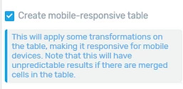
Then, in the left sidebar, you will find an option, that you can only see when using the mobile view:

The option is called “Create mobile-responsive table”, and you can check the checkbox in front of it, in order to make the “Table” element mobile responsive.
You can also find more details about the “Table” element mobile responsive option in this blog post.
These were some examples of elements and how to make them mobile responsive.
3. The Margins and Paddings Option
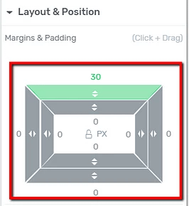
Another important aspect of customizing templates is that you should be extra cautious when bringing additional changes to the “Layout & Position” section from the left sidebar since it can affect the responsiveness on the mobile device:

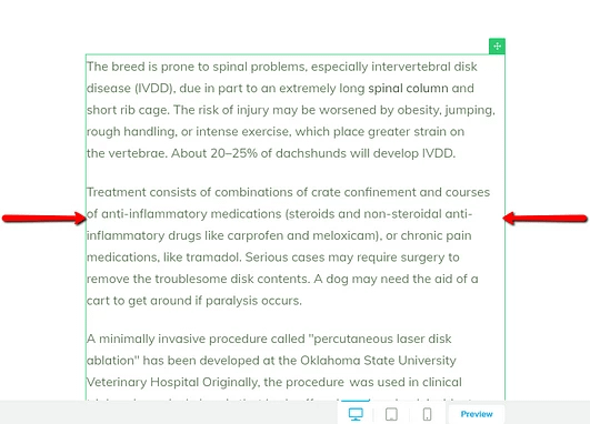
For example, if I select the “Post Content” element and add spacing to the left and right margins, the desktop view will not show much of a difference:

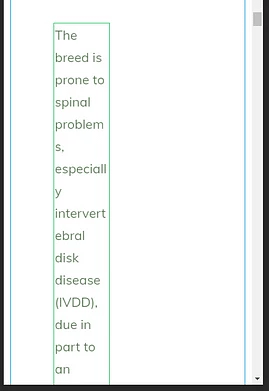
However, when I switch to the mobile view, it is clear that the content does not look right:

This is why it’s better to always check the template and the way it looks in all three views (desktop, tablet, and mobile).
Also, you should be aware that a 10px margin, for example, will have more impact on the mobile view than it will on the desktop view.
On the same note, you might also find this article useful, explaining some technical reasons why the mobile preview looks a bit different than the desktop one.
Moreover, this video goes over even more in-depth details about editing mobile responsive content:
All these considered, your templates should be mobile responsive, and you can apply these templates to the pages and posts of your choice.
Remember that, if you need more information about Thrive Theme Builder and all its features, you can find it in this section of our knowledge base.
I hope this article was helpful to you. If so, please make sure to rate it with a smile below 🙂