TL;DR – How to Make Your WordPress Site Mobile-Friendly
Want the short version? To genuinely make your WordPress site mobile-friendly, you need to think beyond just a responsive theme. We’re talking about a mobile-first design that prioritizes speed, readability, and usability on every device.
Here’s the rundown:
- Start with the right tools: Choose a fast, responsive WordPress theme and page builder (like our Thrive Theme Builder and Thrive Architect, which I’ll talk more about later).
- Prioritize speed and stability: Optimize your site’s Core Web Vitals—especially how fast your main content loads, how quickly it responds to interaction, and how stable the layout is.
- Design for thumbs: Use mobile-friendly layouts, readable fonts, and buttons that are easy to tap.
- Keep it simple: Avoid intrusive popups, overly long forms, and cluttered menus.
- Test, test, test: Always check your pages on real mobile devices, not just emulators.
- Use WordPress features: Take advantage of options like “stack on mobile,” responsive font units (em/rem), and lazy loading for images.
These strategies will help you deliver a fast, user-friendly experience on every screen, and yes, they’ll improve your mobile SEO in the process.
I've spent a lot of time thinking about how people actually use the internet. And if I had to guess where you're reading this right now, I'd put my money on your phone. It’s not just a hunch; it’s a reflection of how we live and work these days. Mobile isn't some niche trend anymore; it is the internet for most people.
According to my research:
- Over 58% of all website visits now come from mobile devices.
- More than 63% of Google searches happen on phones.
- By 2029, we're expecting 6.2 billion smartphone users globally.
If your WordPress site isn't genuinely optimized for these mobile users, you're not just missing an opportunity; you're actively losing traffic, leads, and conversions. It’s happening whether you realize it or not. And no, simply installing a "responsive" theme isn't enough to cut it anymore.
This guide goes beyond the basics. I’m going to show you how to truly make your WordPress site mobile-friendly, focusing on what really matters: fast load times, intuitive layouts, and a design that feels right across every screen size. My goal is to help you build a site your visitors can actually navigate with one thumb, without any rage-tapping.
Here’s what we’ll cover:
- What responsive design actually means for your WordPress site.
- How to quickly check your site’s mobile-friendliness.
- The mobile-first principles that drive modern site design.
- How to optimize for Google’s critical Core Web Vitals.
- Which WordPress tools give you the control you need over mobile layouts.
- How to sidestep common mistakes that frustrate mobile users.
What is Responsive Design and Why it's Essential for WordPress
Before we dive into the "how," let's clear up what we mean by "responsive design." It’s a term thrown around a lot, but its meaning is crucial, especially for WordPress sites.
At its core, responsive design means your website's layout and content respond and adapt to the size of the screen it's being viewed on. It’s not about creating a separate mobile version of your site; it’s about building one site that fluidly adjusts. This involves:
- Fluid grids: Your content blocks don't have fixed widths; they scale proportionally.
- Flexible images: Images resize automatically to fit their containers.
- Media queries: These are CSS rules that apply different styles based on screen characteristics (like width). For example, your navigation might turn into a hamburger menu on smaller screens.
Why is this so important for your WordPress site? Because WordPress powers a huge chunk of the internet, and its flexibility means you can build almost anything. But with that power comes the responsibility to ensure what you build actually works for everyone. Responsive design is the standard because it offers a consistent, optimal experience across devices, which is exactly what Google and your visitors expect. It’s about future-proofing your site and making sure your message gets through, no matter the device.
How to Check if Your WordPress Site is Mobile-Friendly
Before you start making changes, you need to know where you stand. I find that many people think their site is mobile-friendly because it "looks okay" on their phone, but there's a difference between "looks okay" and "is optimized."
Here are a few ways I recommend checking your WordPress site's mobile-friendliness:
1. Google's Mobile-Friendly Test
This is my go-to. Google provides a free tool that quickly analyzes your page and tells you if it's considered mobile-friendly by their standards. It's not just a pass/fail; it also highlights specific issues like text being too small or viewport not being set.
- How to use it: Just type "Google Mobile-Friendly Test" into search, click the link, and paste your URL. It's straightforward.
2. Browser Developer Tools (Responsive Design Mode)
Most modern browsers (Chrome, Firefox, Edge, Safari) have built-in developer tools that include a "responsive design mode." This lets you simulate different screen sizes and device types right in your browser.
- How to use it: On your site, right-click anywhere and select "Inspect" (or "Inspect Element"). Look for an icon that looks like a phone and tablet (often in the top-left of the developer tools panel). Click it, and you can then choose various device presets or drag the screen edges to resize.
3. Test on Actual Physical Devices
While emulators are great for a quick check, there’s no substitute for testing on real phones and tablets. Different devices, operating systems, and browsers can render things slightly differently.
- How to use it: Grab your own phone, a friend's, or a colleague's. Check your site on iOS and Android, on different screen sizes. Pay attention to tap targets, text readability, and how easily you can navigate. Do things feel "cramped"? Are buttons easy to hit?
4. WordPress Theme/Builder Preview Options
If you're using a quality WordPress theme or page builder (like Thrive Theme Builder or Thrive Architect), you'll often have built-in preview options that let you see how your design looks on desktop, tablet, and mobile within the editor. This is incredibly useful for making adjustments on the fly.
- How to use it: In your theme customizer or page builder, look for icons representing different devices. Clicking these will switch your preview to that screen size, allowing you to make device-specific edits.
By combining these methods, you'll get a comprehensive picture of your site's mobile performance and identify exactly where you need to focus your efforts.
Having a mobile-friendly website isn't just a nice-to-have anymore; it's a fundamental requirement. I see it as a non-negotiable aspect of any successful online presence.
With over half of all global website traffic coming from mobile phones, there's a very high probability that a potential customer's first interaction with your brand will be on a small screen. A well-optimized site ensures they can access your content without frustration—no pinching, no zooming, no squinting. Just a smooth, intuitive experience.
Beyond user satisfaction, a mobile-friendly site is a huge win for your search engine rankings. Google explicitly favors mobile-friendly sites, putting them higher in search results for mobile queries. This means more eyeballs on your content, more potential leads, and a better chance of achieving your business goals.
Ultimately, a responsive WordPress site sends a clear message: you're committed to providing a seamless, enjoyable experience for your audience, no matter how or where they choose to engage with you. That builds trust, and trust, as we know, is the foundation of any successful conversion.
9 Essential Tips to Make Your WordPress Site Mobile-Friendly
Now that we’ve covered the "why" and "how to check," let’s get into the actionable steps. These are the strategies I use and recommend to ensure your WordPress site performs beautifully on every device.
1. Choose the Right WordPress Theme and Tools
Your website’s layout and design are foundational to a good user experience for mobile users.
The goal should be to achieve a visually pleasing responsive design, combined with a clear, straightforward layout, that makes your website engaging and easy to use.
Your site layout and design should feature:
- A consistent color scheme
- High-quality images & videos (avoid large images)
- Readable fonts
- Clear call-to-action sections
- Whitespace usage
- Consistent branding elements (logos, motifs, etc.)
Now, if you’re not well-versed in web design, you’ll struggle to build a website like this from scratch.
But with the right WordPress plugins you won’t even have to.
Thrive Theme Builder + Thrive Architect are the no-code, website-building duo you need to build a clean, conversion-focused website for all screen sizes.
With these tools, you get access to responsive theme options and page templates to create a memorable, user-friendly website.
Thrive Theme Builder helps you create a great-looking, custom mobile-friendly theme, along with the necessary core page templates (homepage, blog page layout, default blog post design, 404 page, etc.)
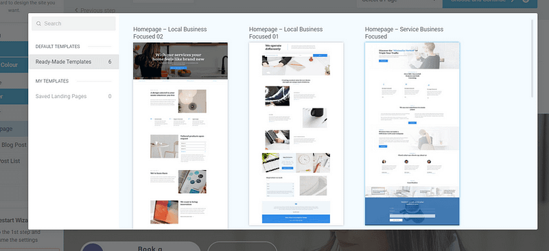
Example of page templates from Thrive Theme Builder
The Thrive Visual Editor found in this plugin lets you tailor how your site looks on mobile devices without affecting the desktop layout.
You get to control font sizes, element visibility, and layout adjustments specifically for mobile users, ensuring your site remains accessible and easy to navigate, no matter the device.
Once you’ve set up your theme, you’ll use Thrive Architect’s user-friendly drag-and-drop visual editor to customize your page templates to your exact liking. No need to use HTML or CSS.
Choose from hundreds of landing page templates to add to your site and use our library of design elements to make them unique to your business.
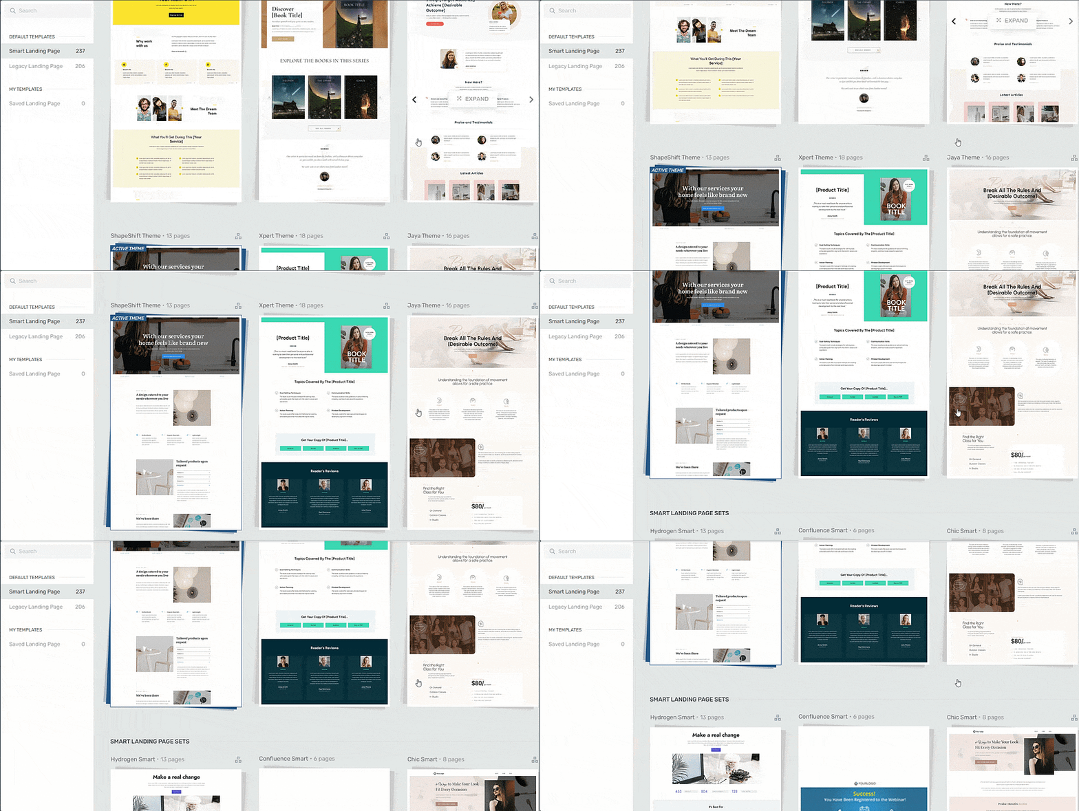
Landing page template sets in Thrive Architect
Both tools are designed with responsiveness in mind. Thrive Architect automatically applies mobile-friendly adjustments to your content, so you don't have to worry about manually configuring these settings yourself!
You can also use Thrive Architect's advanced mobile editing features to hide or customize specific elements that might not work well on mobile.
This flexibility ensures that your mobile site isn’t just a scaled-down version of your desktop site but a thoughtfully designed interface that caters your mobile users' needs and preferences.
💡 WordPress Design Tips for a Better Mobile Experience
Once you’ve chosen a responsive WordPress theme and page builder, the next step is fine-tuning your design for mobile usability. Here are a few quick but powerful tweaks:
Use
emorremunits for font sizing instead of fixed pixels — this makes your text scale better across screen sizesAvoid embedding text directly into images — use the Cover or Media & Text blocks in the WordPress editor to overlay text responsively
Enable “stack on mobile” for columns, grids, and media layouts so your content reflows vertically on small screens
Use a mobile-friendly navigation menu, like a hamburger or off-canvas layout — Thrive Theme Builder and Responsive Menu plugins make this easy
Simplify your layout for mobile with Thrive Architect’s Hide on Mobile option — great for removing decorative or non-essential elements on small screens
These small changes go a long way toward creating a responsive, mobile-first WordPress site that looks and feels great for every visitor — no matter what device they’re using.
2. Keep Your Site’s Navigation Simple and Straightforward
Straightforward, seamless navigation is essential for a mobile-friendly website.
With a well-structured navigation system, your visitors can easily browse your website and find what they’re looking for without any issues.
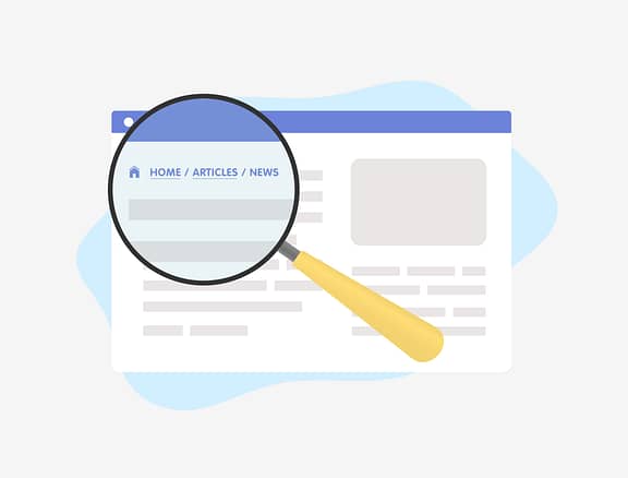
When I'm thinking about navigation for mobile, I focus on:
- A clear, consistent main navigation menu, typically a hamburger or dropdown, that guides users.
- Logical, well-thought-out page organization that creates an intuitive flow.
- An easily accessible search bar, often in the header or footer.
- Content that’s organized so it can be scanned and navigated intuitively.
One thing I always recommend avoiding on mobile is a cluttered sidebar or too many widgets. While these can work on desktop, they often push critical content below the fold or create visual noise on smaller screens. Simplicity is key here.
3. Optimize Your Website for Speed
Mobile users are often on the go, and they expect things to load fast. A slow site isn't just annoying; it leads to frustration, high bounce rates, and ultimately, lower satisfaction. And yes, it absolutely impacts your SEO rankings.
To keep your WordPress site loading quickly and ensure mobile-friendliness, I suggest:
- Optimizing your images and videos. Tools like TinyPNG or EZGif are great for this. Don't upload massive files.
- Keeping your plugins updated and lean. Outdated or poorly coded plugins can be a major drag on performance.
- Using a theme built with clean code. A well-coded theme, like those from Thrive, is designed for speed from the ground up.
- Installing a site speed plugin. There are many reputable options, or you can use tools found in Google Search Console for diagnostics.
Thrive Theme Builder actually includes a Website Speed Optimization tool that works automatically. It's designed to ensure your website loads fast without you needing to fuss with extra settings or plugins. My goal is always to make performance optimization as simple and straightforward as possible.
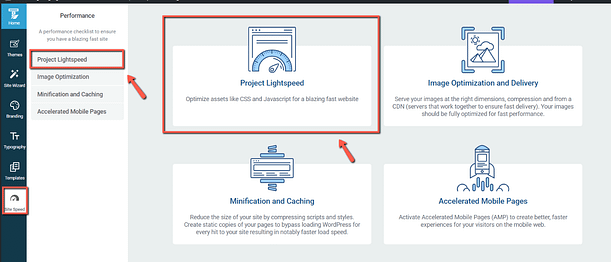
What Does AMP do?
AMP plays an important role in boosting page speed.
It speeds up web pages on mobile by simplifying the code. It limits the use of JavaScript to its own library for faster loading and requires CSS to be inline and under a certain size, cutting down on what can slow pages down.
This feature is automatically activated on your website, so you don't need to do anything here.
Our site performance optimization tools are simple to understand and straightforward to use, so you can complete this setup in less than a few minutes.
🎯 A Quick Word on Core Web Vitals
Google doesn’t just check if your website loads — it measures how real users experience it, especially on mobile.
The three key metrics that matter most for mobile SEO are called Core Web Vitals:
Largest Contentful Paint (LCP): How fast your main content loads (ideal: under 2.5s)
Interaction to Next Paint (INP): How quickly your site responds when someone taps or clicks (ideal: under 200ms)
Cumulative Layout Shift (CLS): How stable your page layout is while loading (no random shifting)
If you’ve ever tapped a button and had it move right before your finger lands — that’s bad CLS.
To improve your scores and boost both performance and rankings:
✅ Compress images and serve them in next-gen formats like WebP
✅ Use fixed-size containers for media, text, and embeds
✅ Defer unnecessary scripts and minimize JavaScript and CSS
✅ Enable lazy loading for images and videos below the fold
Bonus: Thrive Theme Builder includes built-in performance features that help optimize for speed — without extra plugins or technical fuss.
When your Core Web Vitals are healthy, Google sees your site as fast, stable, and user-friendly — and so do your visitors.
And if you need deeper guidance on optimizing your WordPress website for speed, take a look at this detailed guide.
4. Use Clear, Readable Fonts
This might seem obvious, but it’s often overlooked. You need to use easy-to-read fonts and ensure the text size is suitable for reading on small screens without forcing users to zoom. I always recommend increasing the base font size specifically for small screens.
In terms of font choice, I lean towards standard, highly legible fonts like Open Sans, Droid Sans, or Roboto. They work well across all types of websites and maintain their readability on smaller screens. Avoid anything too decorative or thin; clarity is king on mobile.
5. Avoid Using Popups (Especially Intrusive Ones)
Popups can be effective on desktops for capturing leads or announcing offers. But on mobile? They're often a nightmare. They're hard to close, can cover the entire screen, and disrupt the user's flow, quickly discouraging them from interacting with your website.
My advice: save popups for larger screens, and even then, use them sparingly and thoughtfully. For mobile, consider less intrusive alternatives like inline forms or slide-ins that don't block the entire view.
6. Keep Your Forms Short & Simple
On mobile devices, screen real estate is precious. Lengthy forms are cumbersome and intimidating. Short, simple forms reduce clutter and make it much easier for visitors to input their information, leading to a smoother, more enjoyable experience.
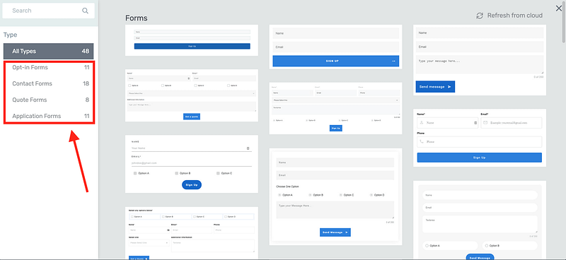
Forms in Thrive Architect
Your visitors are more likely to complete forms that are perceived as easy and quick to fill out.
By minimizing the number of fields, you reduce the effort required to fill them out, increasing the likelihood of form submission. This is particularly important for e-commerce checkouts, lead generation forms, and sign-ups.
7. Space Out Links and Buttons
On mobile devices, people rely on their fingers to navigate.
Fingers, especially thumbs, are less precise than mouse cursors used on desktop computers and can result in incorrect clicking.
Make sure links and buttons are easy to tap without accidentally hitting the wrong one by giving them ample space and making them large enough to be finger-friendly.
You should also place call-to-action buttons within easy reach for thumb navigation, because most visitors are scrolling with one hand.
8. Streamline Content and Layout
Simplify your website's design and content layout so your mobile visitors can easily access key information.
The easiest way to do this, especially if web design isn’t your strength, is through using templates that have created a clear visual hierarchy for you. That way you’ll know where to put your content without a worry.
Our professional page templates are designed with usability principles baked in.
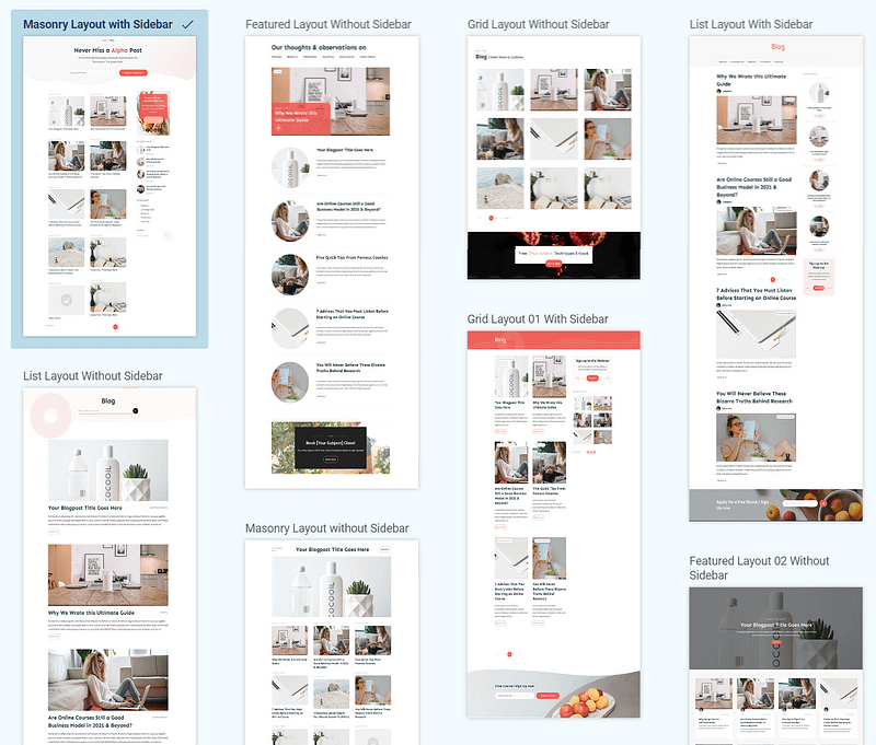
Page templates in Thrive Architect
9. Test on Different Devices (Again!)
I can't stress this enough: don't forget to look at your site’s mobile view on a variety of devices. While browser developer tools are helpful, they are simulations.
I recommend using platforms like BrowserStack or even just borrowing a few different phones from friends to test your website on a variety of real mobile devices and browsers. This confirms compatibility and performance in the real world. You'll often catch subtle issues that emulators miss.
❓ FAQ: Mobile-Friendly WordPress Sites
1. What does it mean to make a WordPress site mobile-friendly?
Making a WordPress site mobile-friendly means designing and optimizing your site so it works smoothly on smartphones and tablets. This includes using responsive layouts, fast load times, readable fonts, touch-friendly buttons, and simplified navigation for smaller screens.
2. How can I test if my WordPress site is mobile-friendly?
You can test your site using tools like Google’s Mobile-Friendly Test, BrowserStack, or by manually checking your pages on different real devices. Also, preview your site using Thrive Architect’s mobile view toggle to see exactly how it performs on smaller screens.
3. What tools can I use to improve mobile responsiveness in WordPress?
Thrive Theme Builder and Thrive Architect are excellent tools for mobile-friendly design. They let you customize layouts by screen size, hide or adjust elements for mobile, and ensure your content stacks and displays correctly on any device — no coding required.
4. Why is mobile optimization important for WordPress SEO?
Google uses mobile-first indexing, which means it ranks your site based on how it performs on mobile. A slow or clunky mobile experience can hurt your SEO, increase bounce rates, and lower conversions. Optimizing for Core Web Vitals, speed, and usability helps your WordPress site rank higher and perform better.
Next Steps: Audit Your Website
Now you know how to create a mobile web design, it’s time to review your current web pages and identify the areas that need to be improved.
Here are four additional tutorials to help optimize your site’s design, SEO, and marketing:
Make Your WordPress Site Mobile-Friendly: Get Started Today
Mobile optimization isn’t just about shrinking your content to fit a smaller screen. It’s about creating a faster, cleaner, more intuitive experience — one that respects how people actually browse the web today.
From Core Web Vitals and responsive layouts to mobile-specific design tweaks in WordPress, the small changes you make now can lead to big gains in usability, SEO, and conversions.
The tools are all within your reach — especially if you’re using Thrive Theme Builder and Thrive Architect. Together, they give you complete control over your mobile design without code, helping you create lightning-fast pages that look and perform beautifully across all devices.
💡 Final Thought
Your mobile visitors aren’t just passing through — they’re deciding whether to stick around, sign up, or buy.
Design for that moment.
✅ Ready to optimize your WordPress site for mobile?
Start building a fast, mobile-first website today with Thrive Suite, and turn more clicks into conversions — no matter what screen your visitors are using.

