Do you want to learn how to create a user-friendly website your audience will love?
We’ve got you.
Picture driving traffic to your website through your digital marketing and social media strategies...
Only for your audience to leave without taking action.
We don’t want that to happen to you and that’s why we’ve created this guide.
Keep reading to learn how to create a user-friendly website and turn your audience into leads and customers.
What Makes a Website User-Friendly?
If you want your target audience to stay on your website and engage with your content, you need to make sure your website has clear navigation, looks good, and loads fast.
In an age where internet users have unlimited websites to consider, a user-friendly website is your key to standing out.
User-friendliness directly impacts your website’s performance and conversion rates.
Here are the important elements of a user-friendly website:
- Simplicity: Every element on your web pages should serve a specific purpose.
- Navigation: Your visitors should be able to find their way around your site easily.
- Responsiveness: Your website should look good and function well on any screen size – tablets, smartphones, and desktops.
- Fast Loads: Slow load times are frustrating. Your website must load as quickly as possible, to improve SEO and avoid high bounce rates.
- Consistency: Your site’s layout – look and feel – should be the same across all pages, making the user experience smooth and predictable.
- Search Functionality: Include a search element to allow your website visitors to find specific posts and pages
- Accessibility: Your website should be usable by everyone, including people with disabilities. This means good color contrast, readable fonts, and alt text for images.
How to Create a User-friendly Website with the Right Tools
For beginners, creating a user-friendly website might sound challenging.
Where do you start? What tools do you use? How do you keep your user’s attention?
This section breaks down seven key steps you should follow to achieve this and create a better user experience:
1. Download & Install Thrive Suite
Your site needs to look great, load fast, and provide your website visitors with a smooth, stress-free user experience.
As we mentioned earlier, part of a user-friendly site experience includes a website that’s easy to navigate, clearly communicates value and offers engaging content to encourage your visitors to stay for longer – and eventually convert.
To build a user-friendly website, you’ll need the right tools.
We recommend using Thrive Suite, the best plugin bundle for WordPress.
Thrive Suite is the all-in-one website building solution you need to build a thriving online business.
All of our plugins are compatible with one another and are designed to make web development easy.
With our tools, you can comfortably create an enjoyable experience for your site visitors.
No janky features. No need to worry about plugin compatibility. No coding required.
You can use Thrive Suite to:
- Build a stunning, professional-looking websites with our library of customizable templates and intuitive theme and website builder
- Create attention-grabbing sales and landing pages that convert
- Grow your email list with our library of 400+ opt-in forms
- Design interactive quizzes to generate leads & segment your audience
- Build an impressive membership site, online course platform – or both
- Collect, manage, and showcase customer testimonials from one place
- Moderate comments, boost reader engagement & build a community right on your blog posts
- Create smart automations to connect your website with your favorite tools
- … and so much more.
If you want to build an impressive website (blog, membership site, eCommerce site, etc.) to impress your audience and convert them into leads and customers…Thrive Suite is your best bet.
And you’ll see that in the rest of this tutorial.
2. Create Clear Website Navigation: Plan Your Site Structure
Site navigation is a core part of a user-friendly website.
When your site visitors land on your site, they should be able to easily find their way around.
So, start by planning your site structure first. This is more than just about your site’s appearance. Make sure your website has a logical flow and then build your navigation menus accordingly.
If you followed step 1, you can now use Thrive Theme Builder, our theme-building plugin, to create your website’s structure.
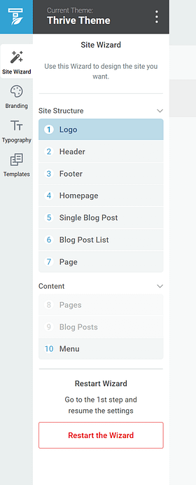
Thrive Theme Builder’s Setup Wizard is designed to make web design easy and help you create your site’s structure quickly.
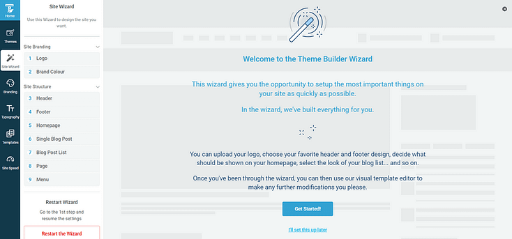
By the end of the Setup Wizard, you'll have created a clean web and UX design that you can now go in and customize using Thrive Architect, our drag-and-drop page builder.
3. Maintain a Consistent Website Layout
You can also use Thrive Theme Builder to ensure your color scheme, typography, and page templates are consistent throughout your website.
Color Scheme
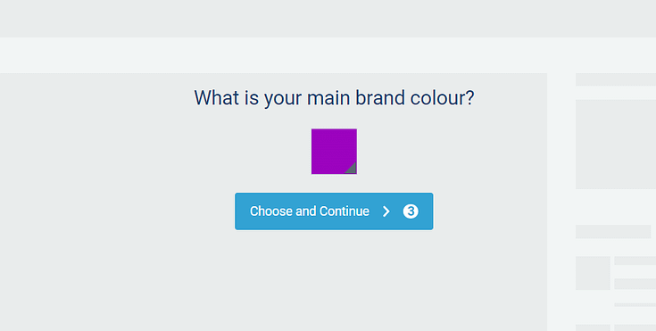
We’ve implemented Smart Color Technology in Thrive Theme Builder (and some of our other plugins), to automatically create a professional color palette for your website.
So, when you select a main color for your website, this will be applied to all your pages, posts, headers, and footers.
Typography
In terms of typography, you can select global fonts for all headings, body text, and hyperlinks from one spot:
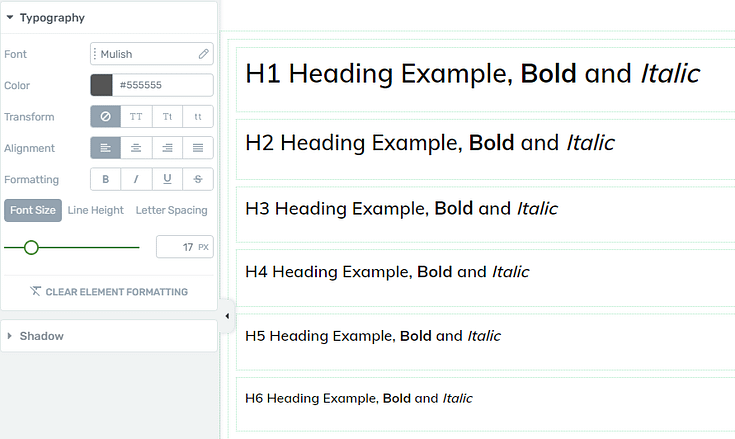
These settings are automatically applied to the text in any templates you choose to load.
But if you want to change a heading’s font for a specific page, you can use Thrive Architect to do this.
Focus on choosing fonts that prioritize readability. Avoid cursive and fancy fonts, and stick to clear fonts you can easily read on desktops and mobile devices.
Templates
Every theme in Thrive Theme Builder comes with a set of high quality page templates for different parts of your website.
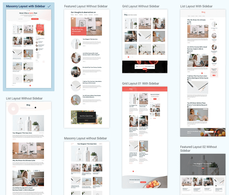
Selection of blog post list templates from one of Thrive Theme Builder's themes
The templates share the same color scheme as your theme.
If you choose to change your theme’s color, your templates will adopt the new color immediately.
The beauty of these templates? You don’t need to spend time looking up design trends and learning complicated terms like “margins”, “padding”, and “white space” to build a stunning website.
4. Responsive Design: Optimize Your Posts & Pages
A responsive design ensures that your website can be viewed easily on desktops and mobile devices (smartphones, tablets, etc.)
This makes it user-friendly by meeting desktop and mobile users where they are, regardless of the device they're using.
If you’re using Thrive Architect, you can optimize your pages and create a mobile version of your website in seconds. Here’s how:
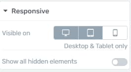
The "Responsive" option lets you manage the display of certain elements on the Desktop, Tablet, or Mobile interfaces.
To use the "Responsive" option, you need to add an element on your page - If you already have one on the page, select it, and look for the "Responsive" option in the left sidebar:
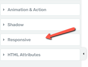
Responsive element in Thrive Architect
Click on it, to expand the option, and you will find 3 icons, equivalent to the 3 devices: Desktop, Tablet, and Mobile:
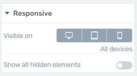
By default, the three icons will be 'active', meaning that the respective elements will be visible on all three devices.
If you want the element not to be displayed on one of the devices, all you have to do is select/click on the icon representing that device. This way you will "deactivate" the display of the element on that device.
Thus, the users who will access your website through that device will not see the element.
For example, if you select the Mobile icon, the element will now only be visible on Desktop and Tablet:
The same works if you select “Desktop” or “Tablet”.
And if you want to learn more key tips to build a responsive website, watch this tutorial from Tony:
5. Keep It Simple
Focus on keeping your site’s design simple and straightforward.
A cluttered website, with unnecessary elements and distracting animations, can quickly overwhelm visitors, preventing them from engaging with your site.
Keeping the design simple doesn't mean stripping it of personality, or making a “bland” website.
It's about making sure every element serves a purpose and enhances the user experience.
Thrive Theme Builder’s theme templates are designed to be simple, yet stunning, so you can impress your visitors and get them to take action.
And in Thrive Architect, you can use our selection of professionally designed block templates to enhance your pages without compromising your site visitor’s experience.
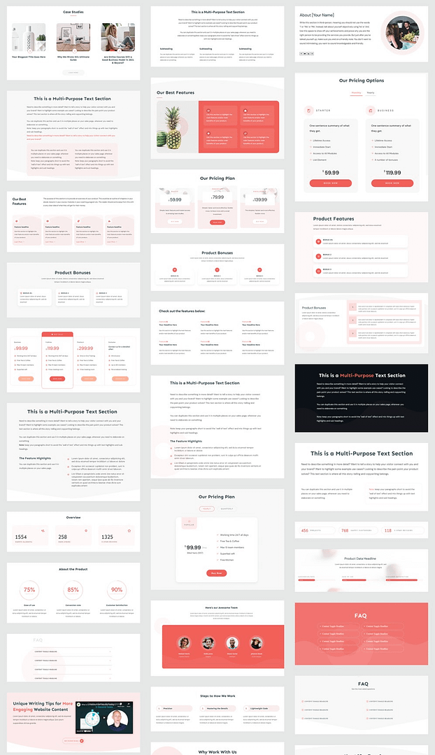
A selection of block templates from Thrive Architect
Don't Overdo the CTAs
While your goal is to get your visitors to take action and opt in or buy, you need to be wary of including too many calls to action (CTAs) on your web pages.
Users don’t want to feel like they’re being forced to do something. So, stick to 2 - 3 clear calls to actions per page – depending on the page’s length, too.
6. Add Search Functionality
Adding a search bar to your website makes it easier for your visitors to find what they’re looking for.
Think of it as a mini search engine for your site. Your own “Google”.
Instead of scrolling through multiple pages, they can type their query in the search bar and access the posts or pages they want to view in seconds.
If you have Thrive Suite, adding a search bar to your website is super simple and will take you a few minutes.
1. Select a Header with a Built-In Search Bar in Thrive Theme Builder
When you select your pre-built header template in Thrive Theme Builder, you have the option to select from several options that include a search bar.
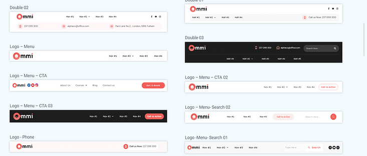
Simply scroll through your list of options and pick the template that fits best with your design needs.
2. Use the “Search” Element in Thrive Architect
Your next option is to use the “Search” element in Thrive Architect.
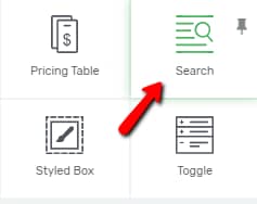
With this element, you can add a search bar right onto one of your web pages, or you can add it to your navigation bar.
Just drag and drop the element onto the desired space and voila, your search bar is ready to be displayed and used.
If you want to learn several tips on how to customize your search bar on your WordPress website, watch this quick tutorial from Tony:
7. Optimize for Speed
Thrive Theme Builder also includes a Website Speed Optimization tool to ensure your website loads fast.
Simply put, this tool focuses on putting out clean, lean code.
Leaner code = less to load = faster website response times.
This feature is automatically activated on your website, so you don't need to do anything here.
Our site performance optimization tools are simple to understand and straightforward to use, so you can complete this setup in less than a few minutes.
Thrive Theme Builder also includes in-built tools to optimize your images so they don’t affect your page speed.
We also recommend using an image optimizer like Kraken or TinyPNG for compressing your images.
Next Steps: Set Up Your Website with Thrive Theme Builder (In 15 Minutes)
Now that you know the most important parts of creating a user-friendly website, it’s time to start building.
If you followed step 1 of this tutorial and purchased Thrive Suite, you can work on building your site’s structure with the Thrive Theme Builder Setup Wizard.
Creating a clean website design couldn’t be any easier…
Key steps in the Setup Wizard include:
,
Selecting your main brand color to create your color scheme
Upload a dark and light version of your logo
Choose a header
Choose a homepage template
Select a template for your blog post list
…and so much more
Creating a functional, user-friendly website doesn’t have to be hard or time-consuming.
Here are 4 more tutorials you can use to create an impressive WordPress website for your business:
Create Your User-Friendly Website Today
And there you have it!
With this tutorial, you can easily build a great website your users will love.
No need to spend time learning to code, trying to figure out complex tools, or spending thousands of dollars to make this happen.
Thrive Suite is the affordable solution you need to create a stunning single-page business website and promote your products and services
What are you waiting for?

