Do you want to know what the biggest conversion killers are — and how to avoid them?
Generating traffic through your digital marketing strategy means little if your visitors aren't converting into customers or leads. Often, there are subtle yet significant factors on your website that can deter potential conversions.
These barriers, or 'conversion killers', can range from unclear messaging to poor user experience. Ignoring these issues can be costly, leading to lost revenue and missed opportunities.
But there's good news - each of these challenges has a solution.
In this post, we're diving into the 10 biggest conversion killers that might be hindering your website's performance, and more importantly, how to fix them.
Keep reading to unlock the secrets to transforming your website into a powerful conversion engine.
Is Your Current Website Helping or Hurting Your Conversion Rates?
Sometimes, the answer to our problems are staring right at us. This is the same case for your website and online business.
Conversion rate optimization (CRO) can be as simple as analyzing all aspects of your business and identifying the roadblocks responsible for causing your visitors to drop off.
Take, for instance, a lead-generation page that attracts substantial traffic from search engines, social media, and other channels, but struggles with low sign-up rates. In such cases, the culprits might be your forms, calls to action, or even the landing page copy.
Or, consider when customers visit a specific product page, but leave without purchasing. The problem could be your product description, pricing, or checkout process.
Sometimes, the problem isn’t with your page content at all. Overlooking mobile responsiveness can alienate a big portion of your audience who then find your site difficult to navigate on their phones.
As experienced marketers, we know how to identify these problems in minutes. But it might not be as easy for you, and that’s why we’ve created this guide.
Let’s Breakdown the Most Common Conversion Killers on a Website:
Most of the conversion killers in this list can be boiled down to simple design or marketing errors — which means they’re easy to solve.
Read through this guide to learn how to avoid (or fix) these common mistakes and increase conversions today.
1. Poor Website Design and User Experience
Your website’s design is the first impression a site visitor gets of your brand. If your website is poorly designed, it can negatively affect your credibility.
Confusing, overcrowded menus and a lack of a search bar in your header will frustrate your website visitors, causing them to drop off without interacting with your site content.
That means higher bounce rates, fewer sign-ups and even fewer sales.
Solution: Use the right tools to build your website
Your site’s design depends on the theme and page-building tools you use to create it. We recommend using a theme builder to design your website’s structure and customize it with a page-building plugin.
Look for tools that provide customizable templates so you don’t get bogged down in trying to design your website from scratch.
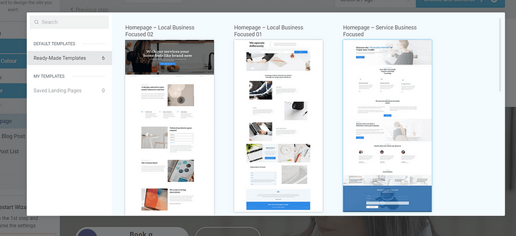
Example of page templates from Thrive Theme Builder
If you’re looking for design tools to build your website, or revamp your current one, we recommend using Thrive Theme Builder and Thrive Architect, the ultimate web design duo.
These powerful tools can complement each other, helping you create a visually appealing website that makes your business stand out.
No need to code. No need to purchase expensive add-ons. You get everything you need to build a stunning WordPress site.
You can purchase Thrive Theme Builder and Thrive Architect as a bundle or as part of Thrive Suite, where you get access to eight additional premium plugins.
2. Slow Loading Times
A slow-loading website is the fastest way to lose potential customers.
If people have to wait more than 3 to 5 seconds for your landing pages (or other web pages) to load, they’ll leave your site without interacting.

Solution: Optimize your website for speed
To avoid a slow loading speeds, you should:
- Optimize your images and videos
- Ensure none of your plugins are outdated
- Use a theme that is built with clean code and is updated regularly
- Install a site speed plugin for additional assistance
3. Lack of Mobile Optimization
If your website isn’t optimized for mobile, you’re leaving a lot of money on the table.
54.4% of global website traffic comes from mobile phones, which means there’s a high chance your potential customers’ first encounter with your website will be on a mobile device.
If a visitor accesses your website and can’t navigate it smoothly on their phones or tablets, they’ll leave without reading your content or converting.

Solution: Create mobile-friendly web pages
Make sure your website and landing pages look great on all devices, not just on a desktop.
The easiest way to do this is to use a page builder that comes with built-in mobile optimization features.

Mobile optimization in Thrive Architect
If you struggle with tech and design, however, these features might not be as easy to use.
So, here’s a super useful tutorial on how to create mobile responsive pages for your WordPress website:
4. No Clear Call to Action (CTAs)
You need to direct your audience to take a specific action, otherwise, they’ll read through your content and leave without converting.
Solution: Add CTA sections in strategic spots on your pages
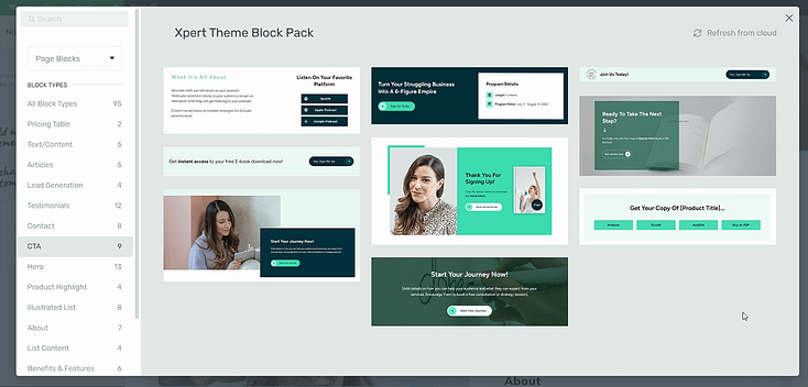
Example of CTA sections available in Thrive Architect
The following places are ideal for CTA sections:
Your hero section
After the features & benefits section
After a testimonial section
At the bottom of your page
Your headers and footers are also great places to add call-to-action buttons – like a Click to Call button.

We recommend adding 2 to 3 CTA sections to your pages, depending on their length.
5. Complicated Checkout Processes
For eCommerce stores, if your checkout process involves lengthy forms or too many steps, you’ll lose customers.
Purchasing a product through your site should be straightforward and user-friendly.
Solution: Use a reliable payment platform to create a good customer experience

The best way to avoid checkout problems and enhance the customer experience is to use a reliable eCommerce platform or checkout tool like WooCommerce, WP Simple Pay, or WPForms.
These tools provide the infrastructure to create a seamless checkout experience, including pre-designed templates to help you build payment pages and forms that look great and function well.
Alternatively, if you don’t need a checkout page, a simple plugin like PayPal Button for WordPress works just as well.
6. Lack of Trust Signals
Trust signals, like security badges, customer testimonials, and clear return policies, help build trust. Without them, visitors may feel uneasy about completing a transaction.
You wouldn’t buy from a faceless company that has no reviews on its products or services, would you?
Neither will your potential customers.
Solution: Add social proof to your most important landing pages
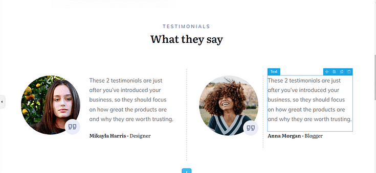
Social proof section in Thrive Architect
Including social proof on your homepage, sales pages, and other important landing pages can significantly boost your conversion rates.
This social proof can be:
Compelling testimonials from previous customers or subscribers who have used your lead magnet
Subscriber counts to show how many people have opted in for your offer
Endorsements from well-known brands
Case studies or success stories on how your content helped someone achieve their goal
Social proof works because it shows your audience that other people have tried your free offer and benefited from it, convincing hesitant subscribers to convert.
Tip: If you’re struggling to find the courage to ask for testimonials, read this guide to learn 5 effortless ways to add testimonials to your WordPress website and sales pages.
7. Unfocused Copy
“Unfocused copy” looks like:
Lack of structure and organization
Inconsistent tone and style
Overuse of complex terms
Repeating the same points throughout the text
Failing to address your audience’s pain points
No clear call to action
Solution: Use copywriting best practices to craft concise, compelling copy

You don’t need to be an expert marketer to create conversion-focused copy.
Think of copywriting as a process:
Understand your audience and their challenges
Highlight how your value proposition solves each challenge or problem
Address your readers directly
Break your paragraphs with supporting visuals to make them easier to read
Use calls to action to direct your audience to take action
For more copywriting tips, check out these free resources:
8. Limited Payment Options
If your potential customers are restricted to limited payment methods, this could make it hard for them to complete a purchase.

Solution: Use a payment gateway plugin that supports multiple payment methods
We recommend connecting your website to a WordPress payment gateway plugin like WP Simple Pay, Easy Digital Downloads, or WooPayments.
These tools provide the infrastructure to create a seamless checkout experience, as well as multiple ways to accept payments from your customers.
9. Intrusive Popups and Ads
Being inundated with ads and multiple popups, while trying to scroll through a page, is the last thing your site visitors want.

Solution: Learn to use pop-ups the right way
Popups, when used correctly, can be the needful push your audience needs to convert.
Here's how to make them work for you:
- Get the timing right
- Avoid using multiple popups on the same page
- Include a clear exit option
With the right popup tool, you can create and configure pop-ups that will help your conversions, and not hurt them. Our top 2 recommendations are Thrive Leads and OptinMonster.
10. Poor SEO/Site Visibility
If your website isn’t ranking on search engine results pages, you’re missing out on a big chunk of conversions.
Your audience should be able to find your business organically.
Solution: Use an SEO plugin to optimize your website
The easiest way to optimize your website for search engines is to use a reliable SEO plugin.
Most business owners don’t have time to learn the intricacies of search engine optimization, and that’s why tools like this exist.
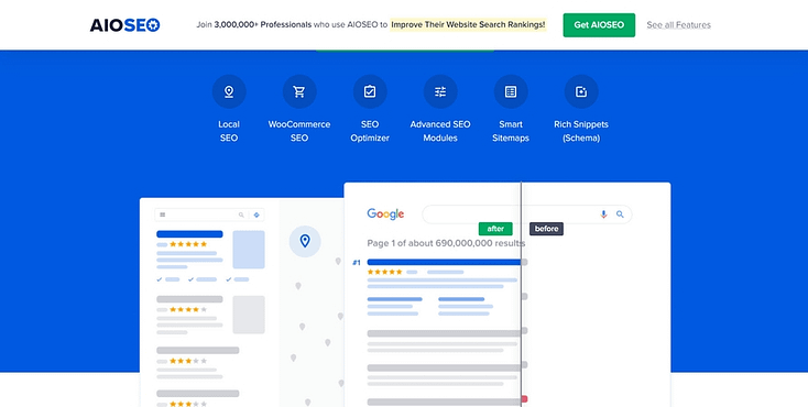
Our top recommendation for WordPress websites: All in One SEO
AIOSEO handles all the technical aspects of optimizing your website and provides key tips on how to make your content SEO-friendly.
This plugin is easy to install, even easier to use, and will help you get your target audience in front of the right eyes, so you can convert them into leads and customers.
Next Steps: Create a Streamlined Landing Page for Your Next Offer
Now that you know what could be hurting your website conversion rates (and how to fix them) let’s work on creating pages that convert.
Landing pages are key for promoting your offers and getting your audience to take action.
So, here are 4 free tutorials to help you get started:
Biggest Conversion Killers: Is It Time to Revamp Your Website?
Now you're aware of the biggest conversion killers that could prevent you from achieving your business goals, it's time to look at your website.
If you're struggling to reach your conversion goals, your analysis should beyond looking for quick fixes. It may be time to review your website's design as whole.
Reflect on the points we've covered: Are your website's design and user experience intuitive and engaging? Are your calls to action clear and compelling? Is your checkout process streamlined and user-friendly? These are just a few of the critical areas that can make or break your site's effectiveness.
If you know that your website is due for an overhaul, it could be time to use a different set of tools.
To build a conversion focused website that offers a seamless user experience, we recommend using Thrive Theme Builder and Thrive Architect.
Thrive Theme Builder helps you build and customize every aspect of your website design without typing a single line of code.
Once you’ve created your website’s structure, you’ll hop in and customize your web pages with Thrive Architect.
Seamless building without needing to learn a line of code.
As we mentioned earlier, you can purchase Thrive Theme Builder and Thrive Architect as a bundle or as part of Thrive Suite, where you get access to eight additional premium plugins to create a powerful online business.


