Build Leads Faster with the Best WordPress Lead Generation Plugin: Thrive Leads
“
WOW, a 238% increase in conversions when I switched to Thrive Leads. This is the most powerful list building plugin I’ve used and the team behind it is ON FIRE!
Absolutely gets a recommendation from me.

JOHN LEE DUMAS Entrepreneur on Fire
More than Just Building Your List
Thrive Leads is a lead generation plugin for WordPress. That sentence is not wrong, but it barely scratches the surface of what this plugin is about.
First and foremost, Thrive Leads is the list building solution that's created by a team of people who are obsessed with conversion optimization.
Using Thrive Leads is like having your very own list-building and conversion expert - baked right into a powerful piece of software.
This is not your old-school list building plugin. We've taken the most cutting edge conversion tactics used by smart businesses and growth hackers and for the first time ever, those tactics are easy as pie for you to use on your own site. You can finally experience explosive lead growth and the amazing business benefits that come with it.
What Makes Thrive Leads the Top Lead Capture Plugin for WordPress?
Here Are 4 Big Benefits:

Design & Deploy
Thrive Leads combines every type of opt-in form you need in one single plugin and gives you a simple drag-and-drop editor to create the perfect design every time.

Advanced Targeting Lead Forms
Get a massive conversion boost by showing relevant, highly targeted offers to your visitors based on posts, categories, tags and more. Build hyper-targeted and profitable lists.

A/B Testing for Opt-In forms
Thrive Leads comes with a highly advanced but very easy to use A/B testing feature. Easily increase your conversions and use the plugin to automatically increase your conversion rate.

Actionable Reporting & Insights
Thrive Leads gives you a simple overview over the most important metrics. See exactly how your opt-in forms are performing over time and where your most valuable traffic comes from.
Build Every Type of Opt-in Form to Maximize your Conversions
Using Thrive Leads, you no longer have to rely on just one way to generate leads and you no longer need multiple plugins (that probably conflict with each other). Instead, you get an opt-in form builder, popup plugin, and lead generation plugin all wrapped up in one supercharged lead generation solution.
ThriveBox (PopUp Lightbox)
An unblockable overlay (a.k.a. popup) that is displayed above your content and is very attention-grabbing.

"Sticky" Ribbon
Add a ribbon type form which shows at the top of the screen and remains "sticky" as the visitor scrolls down the page.

In-Line Forms
Automatically insert an opt-in form at the bottom of your posts or insert them anywhere using a simple short code.

2-Step Opt-In Form
Create a 2-step signup process by adding buttons or links that open a lightbox on click.

Slide-In
Less intrusive than a popup, but almost equally attention grabbing, this form slides into view from the corner.

Opt-In Widget
Add an opt-in form to your sidebar or any other widget area on your site, with just a few clicks.

Screen Filler Overlay
The "unignorable" opt-in form and the perfect way to make sure you get your visitor's full attention on your offer.

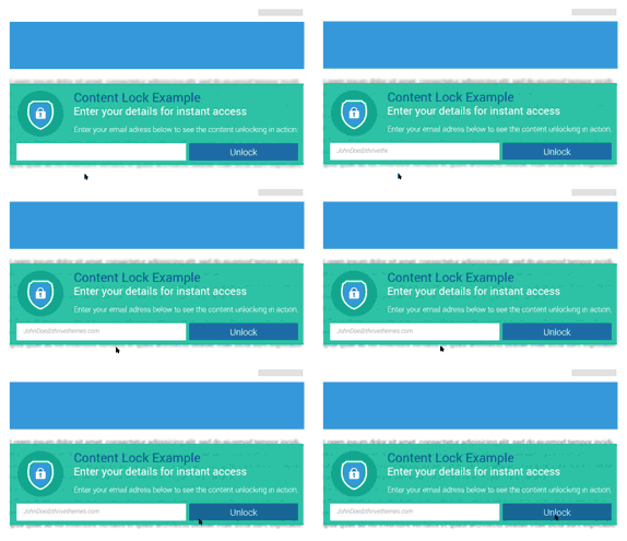
Content Lock
A great way to add an opt-in incentive right inside your content. Reveal it once the visitor signs up!
Scroll Mat
A unique type of screen-filling offer that appears from the top of the page and pushes the content down.

Yes/No & Multiple Choice Forms
Engage your visitors and boost conversion rates by offering multiple choices!

114,117

Enthusiastic Users Can't Be Wrong...
Already, 114,117 customers have discovered the benefits of using conversion-boosting WordPress tools provided by Thrive Themes.
We guarantee luxury-quality software and real life results. And our software delivers, over and over again.
Meet the Power-Packed
Thrive Leads Feature Set

Every Opt-In Form Type at Your Fingertips
In line forms, 2-step opt-ins, screen-filling overlays, content upgrades, scroll mats, floating ribbons...we’ve got them all!

Grow Your List Faster with Advanced A/B Testing
Thrive Leads features A/B for opt-in form to ensure you can always find the best possible design and persuasive messaging.

Boost Conversions with SmartLinks & SmartExit
Hide forms or show different offers to your existing subscribers and take your conversion rates to the next level with Smart features.

Beautifully Pre-Designed Templates
Choose from dozens of templates to create eye-catching, effective list building forms & display them anywhere on your site.

Target Your Opt-In Forms with Surgical Precision
Determine exactly on where on your site which forms are shown. Set them triggers, scroll triggers, on-click forms and more.

Discover Detailed Stats & Reports
Find out exactly which opt-in forms are performing best, which pages and posts your leads are coming from & more...
See The Best WordPress Lead Generation Plugin in Action
As you can see, Thrive Leads comes with any type of opt-in form you'd ever want on your site, hundreds of templates and a full-blown A/B testing engine. And of course you can customize every form to look good on mobile too. These are just some of the reasons we're known and loved as the best WordPress lead generation plugin.
Build Conversion Boosting Forms - No Design Skills Required!
Creating beautifully designed, eye-catching and conversion optimized forms is a breeze with Thrive Leads, thanks to an extensive library of professionally designed templates you can use:
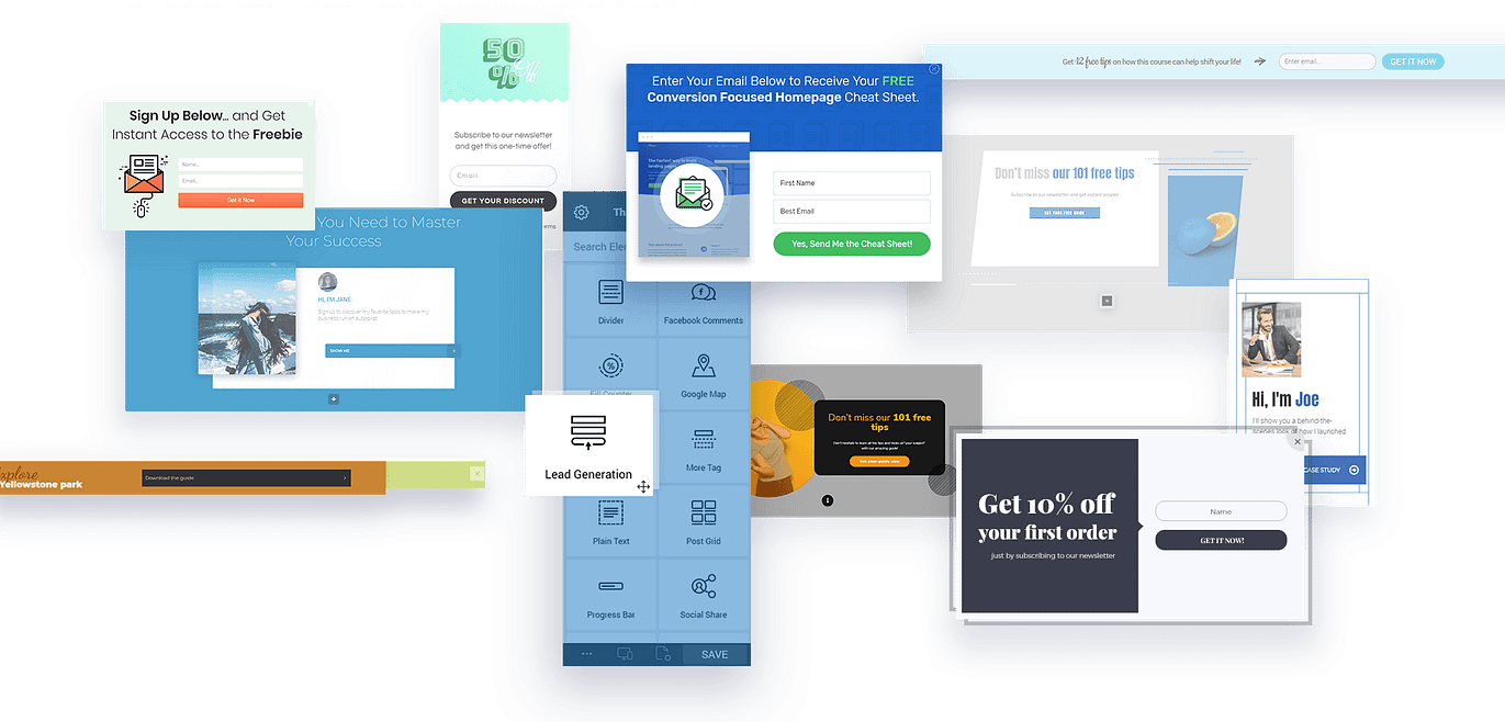
Make a few tweaks to a form or completely customize your own design. With our intuitive drag-and-drop editor, you can create any design you can think of - all without touching a single line of code!
The Web is Not Just Desktop Anymore...
Create Mobile-Specific Opt-in Forms
Time spent browsing the web from a mobile device such as a tablet or a smartphone has officially surpassed time spent browsing on desktop. That's why Thrive Leads gives you full control over what you show your mobile visitors.
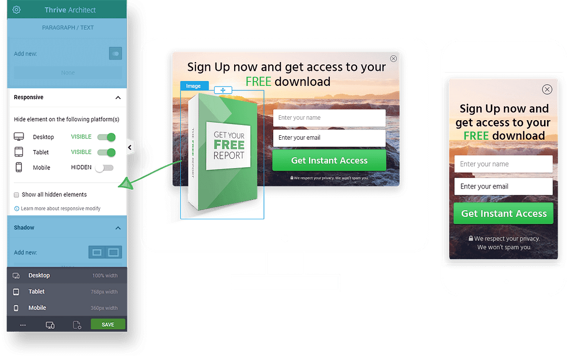
Not only are all of the templates mobile responsive, on top of that, in Thrive Leads, you get 3 levels of customization:
1
Show or hide certain opt-in form types
This allows you to show an attention grabbing full screen opt-in form to desktop visitors and a more optimized form type such as a ribbon to your mobile audience.
2
Show or hide certain elements on the opt-in form
Imagine you have an opt-in form with the image of an ebook, but on mobile you want to hide this image. This is done with one simple toggle in Thrive Leads.
3
Tweak any detail with mobile responsive editing
This allows you to change font size, margins, button size and more specifically and only for desktop, tablet or mobile. This way, any form type will look perfect on any screen size.
Use Thrive Leads Forms to Cover All the Bases
Okay, So You Got Features... Now What?
As you can see, Thrive Leads is absolutely packed with features and we've built it to be as easy to use as possible. But what's the point, really?
If you're like most website owners, you need more features and more plugins like you need another hole in your head... what you really need are results.
And the big question is: does Thrive Leads warrant your time and attention? Will it actually make a difference to your business or will it be yet another waste of time?
Our Iron-Clad 30 Day Guarantee
We offer a simple guarantee: If you're not happy with your Thrive Suite or Thrive Leads standalone subscription within the first 30 days for ANY reason, our refund process is simple, painless and easy. Just reach out to our friendly support team and we'll get you taken care of right away.
“
Your stuff is beautifully designed, fast and has great options for marketers that you just don’t see with other themes. Great, great job!
Absolutely love Thrive!

David Coleman
Seamlessly Integrate With Your Autoresponder or Email Marketing Service
Thrive Leads has direct API integrations for the most popular email services. In addition, you can use it with any system that creates an HTML signup form, opening Thrive Leads up to hundreds of possible integrations. You can also use different lists and different services for different forms you create, so you're never tied to just one system.


Campaign Monitor




Our Pricing Plans

Thrive Suite
Get full access to our entire suite of integrated plugins (including Thrive Leads) at one great price. Build and grow your dream online business with a complete set of conversion-focused tools.
$ 599/yr
$
299/yr
Save $300!*

Thrive Leads
Get the standalone WordPress plugin. Best for those with existing websites that want to add opt-in forms to their website to grow an engaged mailing list.
$ 199/yr
$
99/yr
Save $100!*
30-Day Money Back guarantee
*All pricing is in USD. All renewals are at full price. You can change plans or cancel your account at any time.
Full Feature List
Thrive Suite
Thrive Leads
Licenses
5 Sites
1 Site
WordPress Plugins
9
1
Thrive Leads ⓘ
Thrive Apprentice ⓘ ⓘ
Thrive Theme Builder ⓘ ⓘ
Thrive Architect ⓘ
Thrive Quiz Builder ⓘ
Thrive Ultimatum ⓘ
Thrive Comments ⓘ
Thrive Ovation ⓘ
Thrive Optimize ⓘ
WordPress Themes
Thrive Theme Builder
Shapeshift ⓘ
Ommi ⓘ
Kwik ⓘ
Bookwise ⓘ
Jaya ⓘ
Xpert ⓘ
Templates
For Everything (1000+)
For Your Opt-in Forms
Lead form templates
Landing page templates
220+
Smart page block templates
1270+
Lesson, module, course overview and school templates for online courses
Quiz templates
Scarcity campaign templates
Testimonial Templates
A/B Testing
Landing pages
Opt-in Forms
Quizzes and Surveys
Scarcity Campaigns
Support & Updates
5 Sites
1 Site
Updates
Unlimited
Unlimited
Support Access
24 hour Weekday Support Unlimited requests
24 hour Weekday Support Unlimited requests
Education & Community
Exclusive Access
Free Access
Access to Thrive University
Access to exclusive Thrive Suite only courses
Thrive Suite exclusive webinars
Access to the Facebook Group
Guarantee
30 Days
30 Days

Thrive Suite
Get full access to our entire suite of integrated plugins (including Thrive Leads) at one great price. Build and grow your dream online business with a complete set of conversion-focused tools.
$ 599/yr
$
299/yr
Save $300!*
*All pricing is in USD. All renewals are at full price. You can change plans or cancel your account at any time.

Thrive Leads
Get the standalone WordPress plugin. Best for those with existing websites that want to add
opt-in forms to their website to grow an engaged mailing list.
$ 199/yr
$
99/yr
Save $100!*
*All pricing is in USD. All renewals are at full price. You can change plans or cancel your account at any time.
Our Customer Satisfaction Agreement

30 Day Money-Back Guarantee
If you're not happy with your results within the first 30 days for ANY reason, our refund process is simple, painless and easy.

Friendly Customer Support
If you run into any technical issues, our friendly support team is here to help you out. We'll do everything within our power to help you succeed

Unlimited Updates
Thrive Suite and Thrive Leads come with unlimited updates while your subscription is active. This means that you don't have to worry about outdated software causing your site to be vulnerable for hackers.

State of the Art List Building
We'll teach you the hottest and newest list building techniques and update Thrive Leads to allow you to use these on your website.
F.A.Q.
Yes, Thrive Leads is a WordPress plugin. As with most WordPress plugins, it's optimized for self-hosted of WordPress.org website, but WordPress.com users can use it with "Business" or "eCommerce" plans.
Unlike other tools, there's absolutely no limit to the number of leads you can collect with Thrive Leads. As soon as you install the plugin, you can create as many opt-in forms as you want, and collect as many leads as you can!
The main difference lies in a focus on functionality vs. a focus on performance.
Other list building plugins are designed with a focus on some type of functionality. E.g. they enable the user to create and add popups to their site.
In Thrive Leads, this kind of functionality is just the basis of the plugin. It's what we take as a given and we've made sure that Thrive Leads has better and more extensive functionality than all competing plugins combined. But the real emphasis with Thrive Leads is on conversion optimization. It's not just about helping you build your mailing list. It's about helping you build your mailing list as fast as possible.
We have a relentless conversion focus that influences everything we do and every feature we build.
Your existing website and Thrive Leads opt-in forms (as well as any landing pages, quizzes, etc. that you built with Thrive Suite) will stay intact and working. The only difference is that getting support, updates and using our premium templates requires an active license.
As many as your heart desires! We do not put a limit on the number of opt-in form you can put on your site.
Yes. Free unlimited support is included with your purchase of Thrive Suite or the standalone Thrive Leads plugin so long as your subscription is in good standing.
Yes. If you don't need Thrive Theme Builder and all of our conversion focused plugins packaged in Thrive Suite, you can get a single, standalone license of Thrive Leads if all you need to add on your site is opt-in forms.
Yes. You can install the Thrive Leads plugin on your WordPress website and it will work with any WordPress theme of your choosing!
Depends. If you're just looking to add visually editable opt-in forms to a single WordPress website to grow your mailing list, then getting Thrive Leads by itself makes sense. But if you need to build multiple websites, and want to layer additional functionality onto those sites (such as the ability to fully customize your WordPress theme, create conversion focused opt-in forms, build and sell online courses or memberships, incorporate engaging quizzes into your content, use scarcity countdown timers for your product launches, etc.) — Thrive Suite is the online business building toolkit you've been looking for.
Get Thrive Leads When You Purchase Thrive Suite or a Standalone License & Start Growing Your List!
Remember, there's a good reason why every marketer ever always goes on about how "the money is in the list". Get instant access to Thrive Leads when you either become a Thrive Suite member or purchase the standalone plugin. Start seeing your email list grow today!

