Meet

Shapeshift is a Sleek, Professional WordPress Theme For Thrive Theme Builder
With Shapeshift + Thrive Theme Builder, anyone can build beautiful websites on WordPress - with zero coding
What is
?
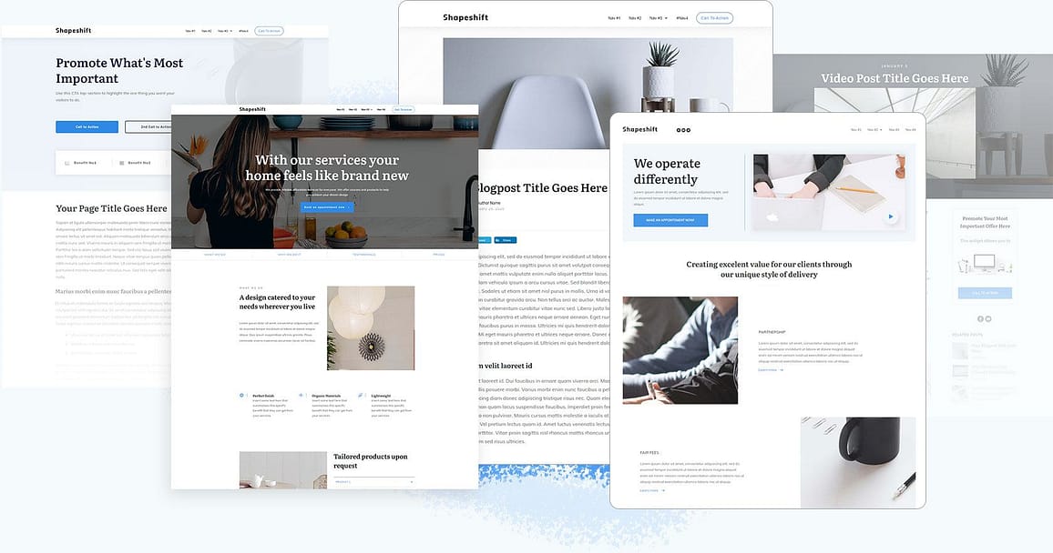
The first companion theme developed for Thrive Theme Builder, Shapeshift gives you a sleek, polished starting point for building the custom WordPress site of your dreams with zero coding required.
With Shapeshift - included when you purchase Thrive Suite - you can rapid-fire build a professional looking website with all the basics in place in 15 minutes or less, then customize to your heart's content to match your brand and needs.

Sleek, Professional Designs To Power Your Business
Shapeshift captures the modern, sleek approach to design favored by forward-thinking brands today. With a flat, professional design language, and sharp bold angles, Shapeshift is perfect for building a brand that demands to be noticed.

Everything You Need To Build Your Brand On WordPress With Zero Coding
No matter your experience level with WordPress and website building, we’ve made it easy to build a beautiful website when you purchase Thrive Suite and select Shapeshift as your Thrive Theme Builder theme. You’ll find everything you need one click away in the visual editor so you can rapidly assemble the site of your dreams with zero coding.
5 Pre-Designed
Homepage Templates
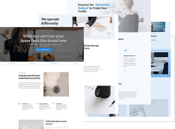
With Shapeshift, we’ve thought of everything when it comes to building your site, and that includes pre-designed homepage templates. With Shapeshift, you get 5 homepage templates and hundreds of Blocks – ready to customize for any kind of website or business. Pick the template for you and customize with a few clicks to fit your brand, or start with a blank canvas and build a custom homepage from scratch.
7 Silo Page Templates
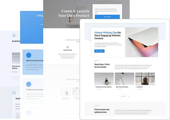
With WordPress themes it can be frustrating to customize your category pages, and usually requires a 3rd party plugin. Not so with Shapeshift and Thrive Theme Builder. We’ve included 7 Silo page templates to turn your category pages into elegant, content-rich experiences for your audience.
Pick a silo page template, convert your category page with one-click, and customize away to your heart's content using the same visual editing capabilities found throughout Thrive Suite.
152 Theme Blocks To Build Anything
Theme Blocks make it easy for you to quickly assemble beautifully designed sections and pages. Want a conversion focused hero area, but don’t know how to design it from scratch? Need a pricing section or FAQ section but unsure which elements to add?
With Shapeshift, you don’t have to. We’ve designed 152+ Theme Blocks for any use case you can think of. Find the Block you need, drop it onto the editing canvas, and customize to fit your brand.

Lead Generation Forms, Call-to-Action Buttons, Contact Forms, ... They're All Included
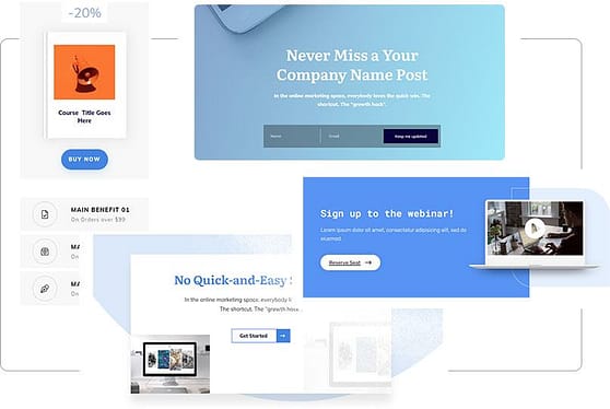
If you want to turn your visitors into subscribers, sales, and customers, you’ll need an easy way to call attention to your offers. With Shapeshift you don’t need to shop around for a 3rd party plugin to build your opt-in forms, promotional content boxes, call-to-action buttons, or contact forms - you get dozens of pre-built conversion-focused designs available in the editor to drop anywhere on your site.
352 Pre-Designed
Landing Pages
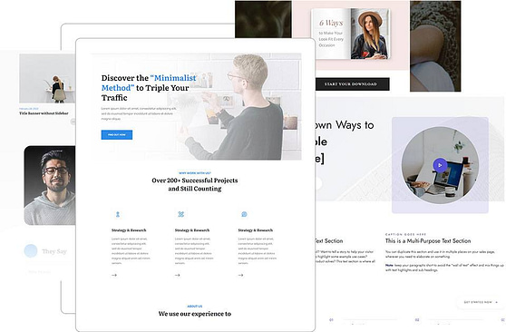
Want to create a lead magnet page to grow your list, a sales page to get new clients, or even a webinar page to get new webinar attendees? With Thrive Suite and Shapeshift, you get access to 352 landing pages for any use case to sell your products, grow your email list, and grow your business. No matter what sales objective you have, Thrive Suite has you covered with pre-designed landing pages so you can quickly turn your marketing ideas into a reality.
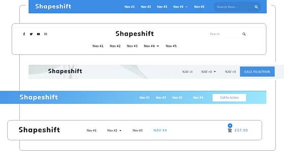
34 Customizable Headers
With Shapeshift you don’t have to worry about customizing your header or installing a 3rd party plugin to build the header you want. Thrive Theme Builder makes it possible for you to visually edit any aspect of your header, and Shapeshift comes equipped with 34 header templates out of the box. Find the header style that you love, customize every detail to fit your brand, or build something truly unique from scratch.
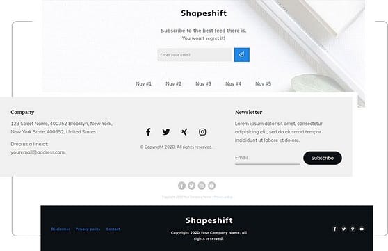
32 Customizable Footers
Similar to headers, it can be a headache to build a custom footer. You’re often stuck with the default footers packaged with your theme and only able to customize via the widget area. With Thrive Theme Builder and Shapeshift, you can visually build any kind of footer you can imagine and you get 32 footer templates to use as a starting point. Choose a design you like, drop it onto the editing canvas, and update it for your brand.
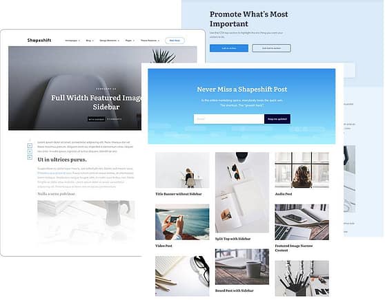
Templates For All Your Theme Pages
Have you ever tried to customize your WordPress theme page templates like your archive pages (search, category pages,...), page templates, or single blog post templates? Most themes only let you customize your theme pages on a limited basis forcing you to edit the code to get your desired result. Not so with Thrive Theme Builder and Shapeshift. Every theme page is customizable via the visual editor and we’ve included a variety of sleek pre-designed templates so you can build your perfect theme pages fast.
183 Pre-Designed
Page Section Templates
With Shapeshift you get dozens of Page Section templates. With page section templates, you can easily add a predesigned section to a page template with one click and rapidly assemble any kind of page you want -- and, thanks to smart technology, they’ll automatically adapt to your brand colors and fonts. With Shapeshift you get elegantly designed top sections, bottom sections, sidebar sections and more


12 WooCommerce Store Templates
Shapeshift + Thrive Theme Builder makes designing your eCommerce store easy. Shapeshift comes equipped with dozens of WooCommerce-ready store templates, from product pages to checkout pages, ecommerce homepages, and more. Shapeshift gives you everything you need to design a sleek, professional eCommerce store on WordPress no matter what your experience level.
When You Purchase Thrive Suite Today, You’re Getting Shapeshift + Thrive Theme Builder
(And All of Our Conversion-Focused WordPress Tools)
Shapeshift is the sleek, professional front-end that powers the look and feel of your website, Thrive Theme Builder is the revolutionary back-end technology and theme building powerhouse that gives you total design freedom over your entire WordPress website. Included with Thrive Suite, Shapeshift + Thrive Theme Builder is easy to install, easy to customize, and will help you get your site up-and-running in minutes.

Native WooCommerce integration gets your WooCom site
up and running fast

Visually customize Everything on your site with
Drag and drop ease

Mobile responsive
out of the box

Integrates seamlessly with all your favorite marketing tools
Get Up And Running With Shapeshift in 15 Minutes
We’ve taken all the guesswork out of moving from zero to customized website fast with our walkthrough setup wizard.
With the walkthrough wizard, as soon as you install Thrive Theme Builder + Shapeshift, you’ll be guided through a setup process to get all the major components of your site built and ready to launch.
In just a few minutes and a few clicks, you’ll add your logo, choose your header and footer designs, customize your site colors and fonts, choose your page templates, optimize your site for speed using one-click cache settings, and build the entire foundation for your site.
Update Shapeshift Everywhere In Seconds With Smart Colors & Smart Site Technology
Thrive Theme Builder makes it easy to manage and update your Shapeshift website everywhere from one central location using dynamic global color settings, centralized font management, and effortless control over your logos.
Quickly change brand colors and fonts everywhere with one-click. Or customize every pixel to your exact needs.
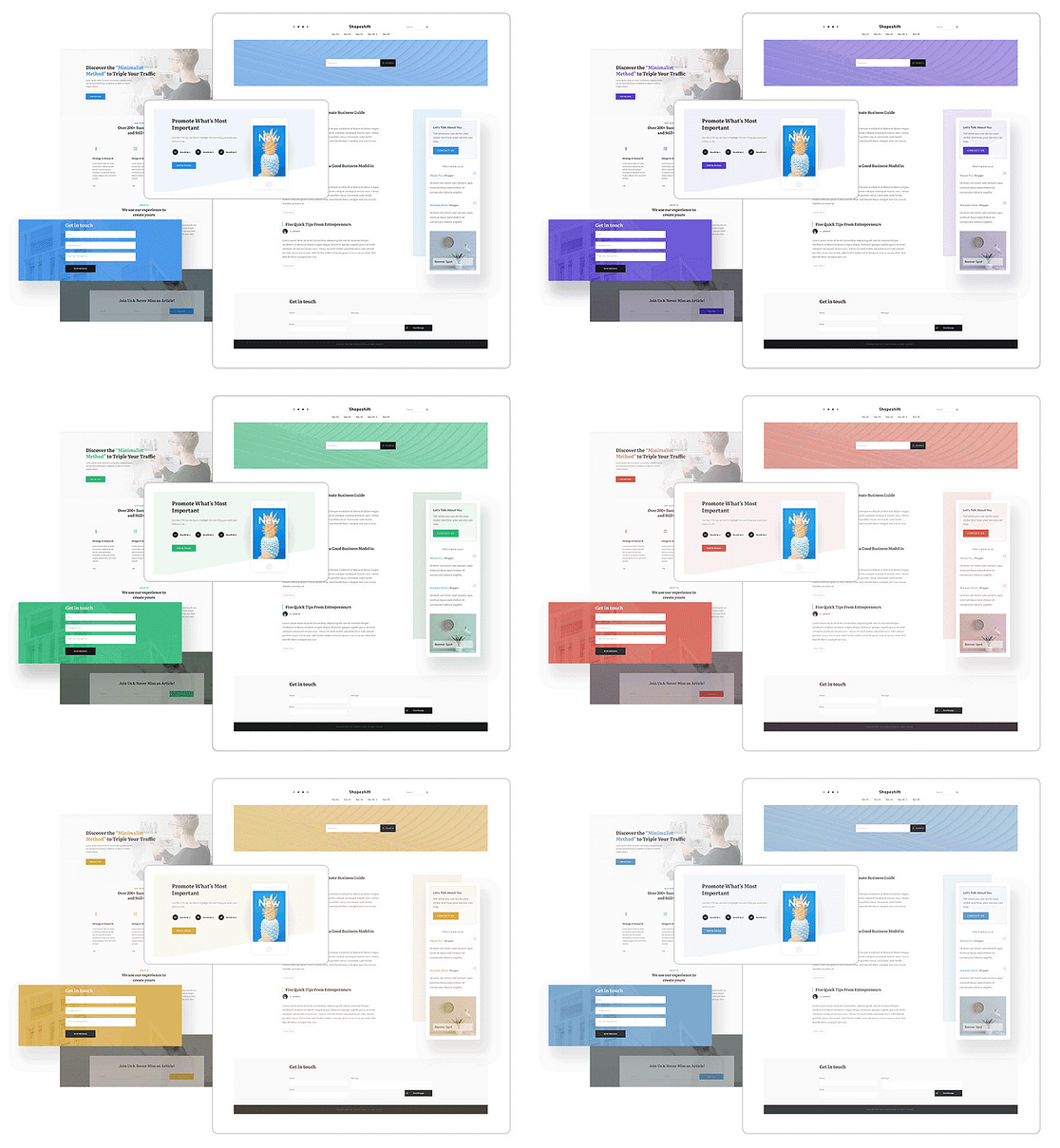

Update site colors everywhere With one click

Change fonts site-wide with one click

Easily update brand info everywhere

Easy logo & favicon management
How To Get Started With Shapeshift & Thrive Theme Builder
Unlike traditional WordPress themes which are typically installed as stand-alone products, Shapeshift requires that you first install and activate Thrive Theme Builder. Don’t worry, they’re both included with Thrive Suite at no additional cost! From there, you’ll select the companion theme of your choice (either Shapeshift or Ommi, with additional companion themes to come in the future!).
1
2
3
72225
Installs
WordPress site owners are already using Thrive Theme Builder
Learn more about Thrive Theme Builder here
Thrive Suite is Your All-in-One WordPress Toolbox For Creating
Websites That Convert
When you purchase Thrive Suite today, you’re not just getting Shapeshift and Thrive Theme Builder. You’re getting an entire business-building toolkit for WordPress.

Conversion Focused Templates
Thrive Architect - Get 352 landing page templates to grow your business with conversion-focused sales funnels. Visually edit your pages and blog posts at drag & drop speed
Companion Themes
Thrive Theme Builder + Shapeshift & Ommi - Get the only WordPress site builder you’ll ever need, with two ready-to-go companion themes
Leads
Thrive Leads - Convert more visitors into leads and customers with the most advanced lead generation plugin for WordPress

Online Courses
Thrive Apprentice - Create and sell stunning online courses

Quizzes
Thrive Quiz Builder - Engage, segment, and convert more visitors with quizzes

Marketing Tools
Plus... Get all of our Conversion-Focused Site Building Tools!
Eliminate Plugin Bloat, Improve Your Site
Free and premium third party plugins can cost you a bundle, fill your theme with bloated code, slow down your site, and mean constant maintenance and site-security vigilance. Do you really know who’s behind that plugin and if they’re actually keeping it up-to-date? Thrive Theme Builder + Shapeshift makes many common WordPress plugins obsolete with its native code.
With Thrive Theme Builder You Will No Longer Need:
CSS Styling Plugins
Custom Sidebar Plugins
Contact Form Plugins
Related Post Plugins
Category Redirect Plugins
Page & Post Cloning Plugins
Author Box Plugins
Custom 404 Page Plugins
Get Instant Access To Thrive University, The Thrive Knowledge Base, And Our Team of WordPress Customer Support Experts



When you join the Thrive Themes family, you’re getting so much more than themes and plugins.
We’re passionate about helping you grow your online business faster and easier than ever before. We provide our customers with some of the best marketing training in the industry via Thrive University and our support team is ready to help you whenever needed.
Thrive Theme Builder and Thrive Suite Are Backed By a World Class WordPress Development Team.
7+ Years Experience Shipping The Best WordPress Software On The Market
When you buy Thrive Suite, you’re not just getting Shapeshift and Thrive Theme Builder plus all of our conversion-focused plugins, you’re also getting peace of mind that your website is being supported by a world class development team.
Our developers have been on the forefront of visual editing technology since the beginning. We're obsessive about improving our products, which means Thrive Theme Builder will only get better and better.

Nataliya
Dude. YAS! Can't wait to check it out!
Pssstt! You guys are doing amazing work! I moved all my clients to Thrive, including big companies.♥ ♥ ♥
Can't wait to see what's coming next.

Justin R.
To put it in a word...Brilliant! But the first word that came to mind is BadAss... I'm not a fan of plugin bloat insanity. My take on Thrive Theme Builder > You good people just hit a bases-loaded walk-off Homerun...For me and every other Thrive Theme tribe member.

aamirah b
this is really good insight, as i’ve used a few plugins as mentioned. so tired of buying themes then adding plugins, loving the new theme builder!! my daughter laughs at me every time i say thrive themes is all i use for wordpress. awesome job.

joanna
I just want to say WOW – the new Thrive Theme Builder is amazing!!! I am so impressed. It’s literally solving all the problems I had before.

Volker H
As a former AVADA user I recommend to get rid of this….theme. It takes a bit of effort but you save more than this amount of effort in the future and you get an excellent support.
Most of the migration effort will be the deletion of the avada syntax.
Due to the ability to use templates and symbols in Thrive Architect you can migrate very efficiently.

David C.
OK, that’s just amazing! I love how Thrive continues to not only improve the best theme builder around, but also makes the components within that theme builder the very best available, anywhere. Great job!
Get Instant Access to Shapeshift

Start taking your online business to the next level
Get access to Thrive Theme Builder plus all of our companion themes!

Our 100% Satisfaction Guarantee
If, for any reason, you don't like Thrive Suite, you can get a full refund anytime within 30 days after your first purchase. If you have any issues, just get in touch with our friendly support team and they'll either help you out until you get the results you need or give you a swift refund.
Frequently Asked Questions
Shapeshift and Ommi are companion themes that can be installed on your Thrive Theme Builder website to control the look and feel of the website. Thrive Theme Builder is the technology that powers your site. From visual editing, to design elements, Thrive Theme Builder puts you in control over your entire WordPress website.
Yes. In order to access Shapeshift you need to purchase and maintain an active subscription for Thrive Suite which gives you access to all of our conversion-focused tools.
Yes! With native WooCommerce integration, you can connect to WooCommerce painlessly. Plus, we include hundreds of content and page templates specifically designed for your eCommerce shop.
Yes! It’s easy to replicate the look and feel of the demo site if that’s what you want, or, we’ve made it easy to customize your site and build something 100% unique for your brand.
Absolutely! Shapeshift and Thrive Theme Builder work seamlessly with all our other Thrive Suite plugins.
To get Shapeshift set up on your site you’ll need to install the Thrive Product Manager, then install Thrive Theme Builder before activating Shapeshift.
How Much Is Total WordPress Site-building & Design Freedom Worth To You?
When you purchase Thrive Suite today and get access to Thrive Theme Builder, you’re not only getting the best visual “no code” front-end WordPress site builder on the market so you can build your perfect website... You’re also getting instant access to all of our conversion-focused site building tools.

