It's feature update week! Again.
...which means we roll out a bunch of new features and improvements to our website building software and you get access to all of them as soon as you update.
Pandemic or not, you'll see we're still hard at work helping you build better websites.
Read on to see the 10 new features we've just rolled out to Thrive Themes.
More...
To access these new features, update to Thrive Architect 2.5.8 and Thrive Theme Builder 1.6.0.
1. New User Interface Colors
The first change you'll notice when you fire up Thrive Architect or Thrive Theme Builder will be a new color scheme and label across the top of the editor, green when you are editing content and blue when editing a template.
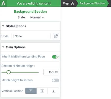
Green = static content on this page only.
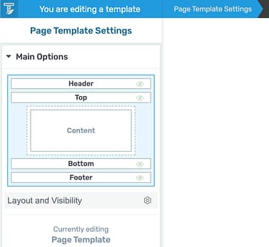
Blue = template content updated website wide.
The purpose of this is to make it abundantly clear what you are editing.
When it's green, you'll see the label "You are editing content". This means your changes only affect the page you see infront of you (though headers and symbols can be exceptions).
This is what you'll use for landing pages, your homepage and blog posts.
When it's blue, you'll see the label "You are editing a template". Template changes made in Thrive Theme Builder are reflected in multiple places across your website. This is for editing headers, footers, sidebars and more.
2. Header Transitions
Ever seen that pretty effect on a website where a header is transparent on load and then fades into color as your scroll down? Like this?

Notice the transparent header that becomes white? That's a header transition.
Now that effect couldn't be easier to achieve! We've added an 'on scroll' state to your headers.
When editing a header, look under 'Scroll Behavior' for a new toggle that says Switch on scroll.
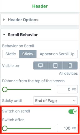
This toggle enables header transitions
When you enable this toggle, you'll be able to set the pixel distance from the top of the screen to change header states.
This respects your device type too, so you can set a different distance on mobile than desktop or disable the sticky effect entirely if you prefer.
Once enabled, you'll see a state dropdown in the editing bar.
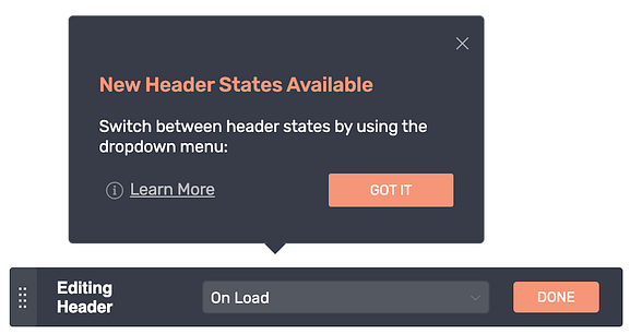
Look for the new header state selector
Swap to 'On Scroll' and you can make as many changes as you want to the appearance of your header. Your visitors will see a smooth fade animation to the second state when they reach the scroll distance.
For the effect I made above, I set the 'On Load' state to have 0% background opacity (invisible) with white text and then 100% opacity with black text on scroll.
But here's what's really impressive: These aren't just style changes... they're content changes.
That means you can have a different menu or call-to-action buttons in your header for the two different states.
3. File Upload Element
Adding a visually editable file upload area to a lead gen form that is truly safe and poses no security risks was no small achievement.
But I think you're going to love the results.
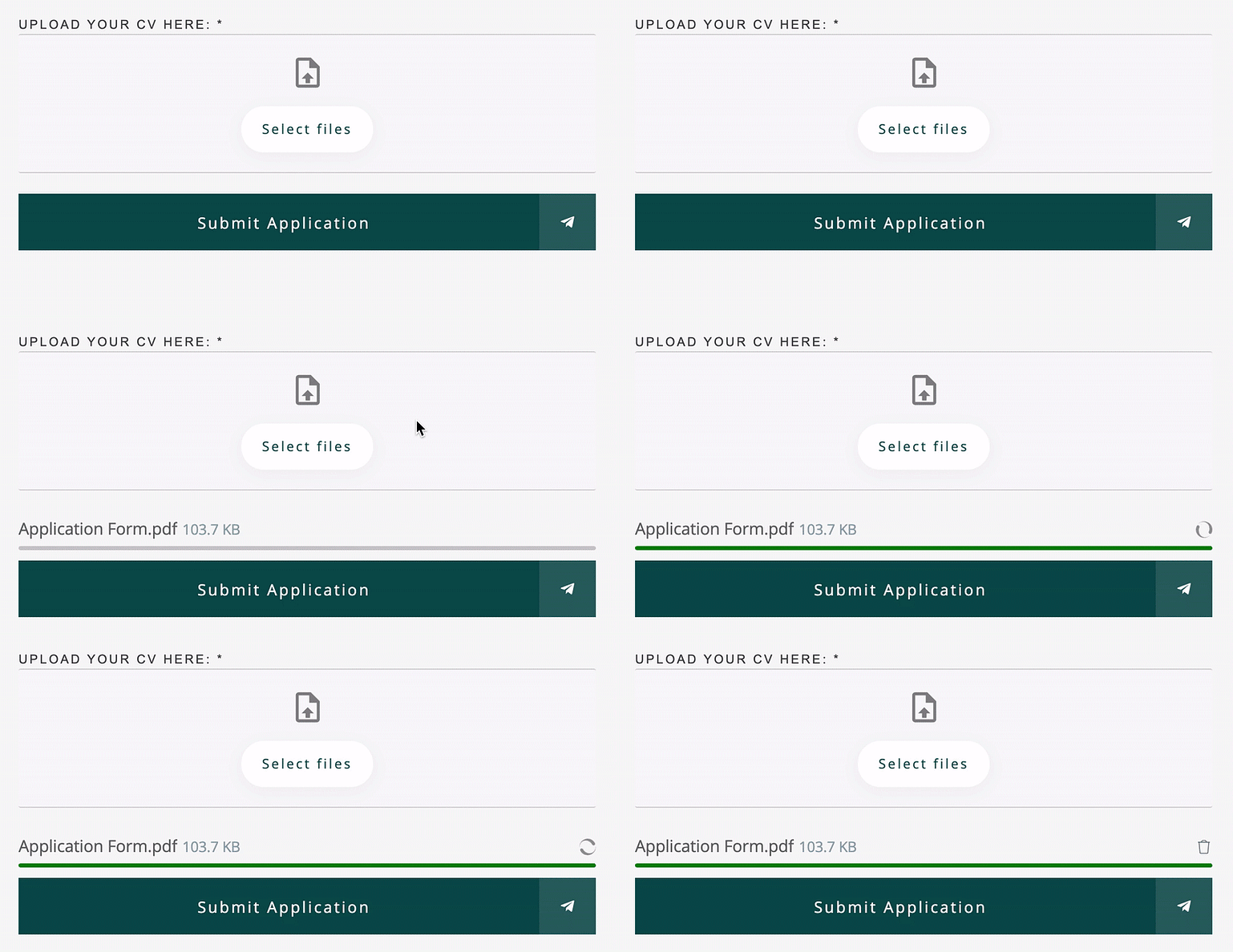
Easy drag-and-drop file upload feature built entirely in Thrive Architect
This is a new field type that you can add to Lead Generation forms or Contact Forms.
Your visitors can either drag-drop their files right into the upload zone or click 'select files' to open a file picker.
You can create big, colorful drop zones like this:
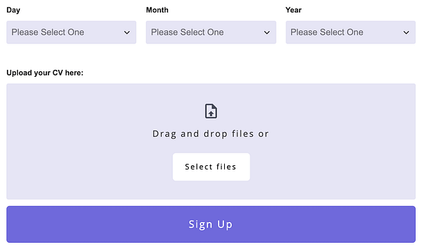
That drag-drop zone is fully editable
Or simple outlined zones like this:

Outlined designs? Easy
Or style it to be a simple button that your visitors should click to load the file picker:

Simple 'select files' button? No problem.
You can even style how the file upload drop zone will look when visitors drag a file over it!
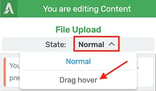
Style the drag hover state from here.
How the File Upload works:
A poorly executed file upload feature can introduce security threats to your WordPress website. We're not letting you take any risks so our file upload element uses an integration with either Google Drive or DropBox.
This way, the file will never touch your WordPress website.
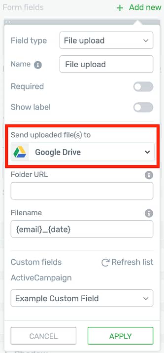
File Upload API connection settings.
You'll need to set up an API connection in the dashboard for your chosen file hosting. It's a little bit of a process but it only has to be set up once per website.
Check out our setup tutorials here:
You can use shortcodes to automatically name each file that gets uploaded, including the date, time, visitor's email and the original file name, making it easy for you to see which files came from who.
When you're in the form edit mode, clicking on the File Upload element will show options for configuring permitted files:
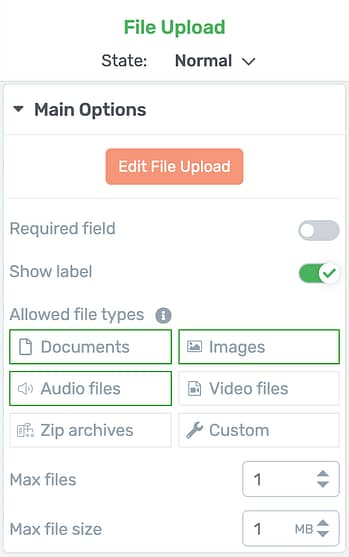
Choose what files your form will accept
You can easily set what file types, the max number of files and max file size. Each file type allows a group of accepted file formats to be sent. You can see the file format list here.
Once a visitor completes the form, their files will be safely uploaded to your Google Drive or DropBox account where they cannot be accessed by 3rd parties so long as you keep your permissions set to private.
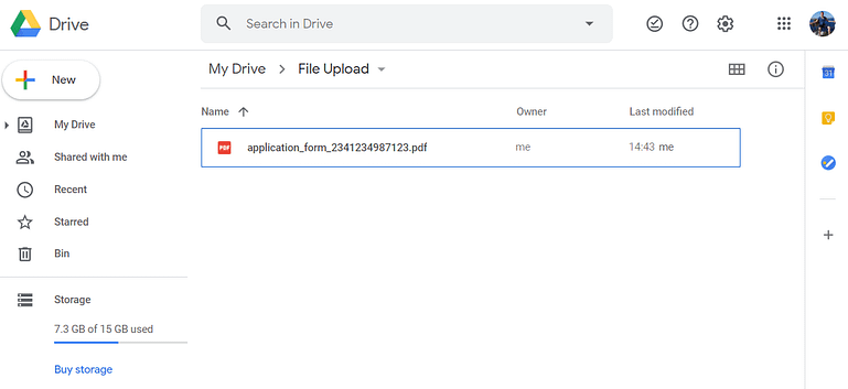
Uploaded files will appear in your Google Drive just like this
If you set up an email to be sent from your WordPress site with the form data, then you can notify yourself and include the file upload links. Clicking these links will open the files directly in your private Google Drive or Dropbox account.
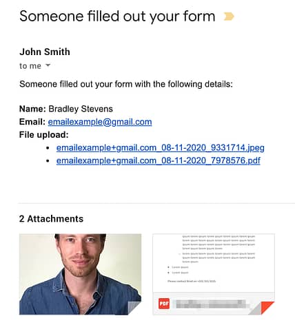
How a file upload email looks in your gmail inbox
You can also pass the direct file URLs into a custom field in your autoresponder or CRM. If it's more than one file then the URLs will be comma separated when they are added to your custom field.
As you can see, we've carefully thought through how you should use this for your website and have been extra cautious to steer clear of any security risks.
We're pretty proud of the end result.
And for the icing on the cake?
There's a new form template category called 'Application Forms' made with pre-styled File Upload fields.
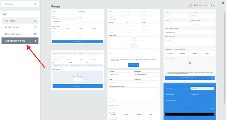
Pre-built application forms made by our designers
4. WooCommerce Mini Cart Element
WooCommerce users: there is a new element you'll find in the elements panel:
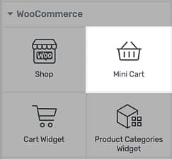
Look for the Mini Cart element
Yes, it's a mini cart!
What is a Mini Cart? I'm sure you've seen an ecommerce cart icon in a header before that, when clicked, opens a small tray displaying cart items like this:
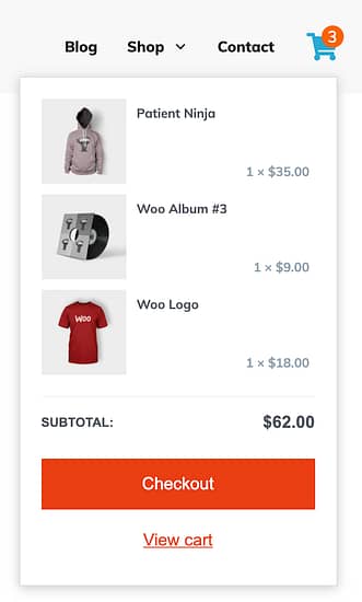
When the mini-cart icon is clicked, this is the tray that will show
That example above was built in Thrive Theme Builder with the new mini-cart element.
You can now add these mini-carts wherever you want and they have plenty of visual-editing controls:
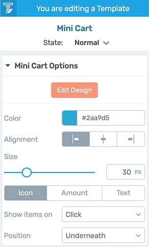
The mini-cart settings panel
You can show an icon, include a label or show the price, change the color, size, or position and choose if the cart should show on click or on hover.
Enter edit mode and you'll find even more options. Use the edit bar to switch between cart states, including styling the 'empty cart' view.
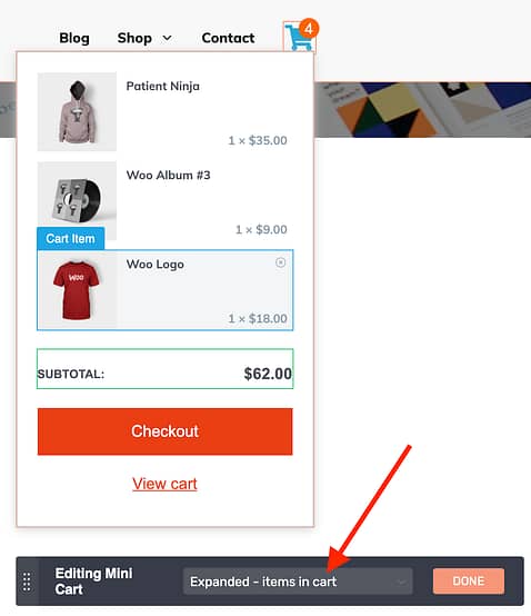
Edit your mini-cart states in the Thrive editor.
It's important to note that we have given you as much visual editing capacity as possible without interfering with core WooCommerce functionality.
That means that if you are using any WooCommerce extensions that add extra cart options, they should all still work with this feature.
5. Table Of Contents Gets Even Better
In June, we updated our Table of Contents element... and it was a hit.
We added full visual editing, templates, indented levels, automatic numbering, renaming headings, hiding headings, highlight states for floating navigation... this list goes on! Check out this article here that shows you why it was so impressive:
The Only Table of Contents Solution You'll Ever Need for WordPress
But we weren't finished.
Take a look at what is now possible with the newest improvements to the Table of Contents:

That's a beautiful table of contents!
Collapsible Table of Contents
The first thing you'll notice in the animation above is that it can be clicked to collapse, just like our toggle element.
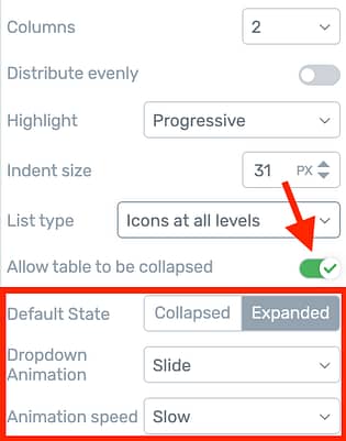
Enable this toggle for a collapsible TOC
Once enabled, enter edit mode and you can set an icon next to the title, choose left or right, icon rotation when opened, and set the default state to either expanded or collapsed.
Icons as a List Type
A new option lets you set a list type to 'icons at all levels' or 'icons at top level'.

List Type is an option for the Table of Contents
This will structure your Table of Contents like a styled list, with editable icons infront of each option.
If you choose 'all levels', you can even set different icons per level like this:
Enter Edit Mode and click the icons you want to change
Customizable Numbering
If you'd prefer, you can choose 'numbered at top level' or 'numbered at all levels' for list type. This will automatically generate numbers before each heading.
However, you now have the option to style that number independently of the text.

Numbers can not be independently styled
With the number selected, you can even add a suffix, whether that's a dot, bracket, dash... whatever you like.

Suffix characters will be added right after each number
Editable Divider and Columns
Lastly, the Table of Contents is customizable per screen size allowing you to set 1 column on mobile view and more columns on other views if you prefer.
When set to 2 or more columns, a vertical divider will be visible. Previously this was a simple grey divider but now you can customize its color, thickness, size and pattern.
Try out the new Table of Contents and you'll see that with this level of visual editing, there is almost nothing you can't build.
6. New Scroll Behavior: Stick to Bottom
Under 'Scroll Behavior', you've already been able to set an element to Sticky.
A sticky element will pin itself to the top of your visitor's browser when they scroll past it and will be released from its stickiness at a point you select on the page.
This week we've offered a second sticky setting: Stick to Bottom.

Notice the 'Enroll Now' banner sticking to the bottom?
Sticky to bottom means that as it enters the viewport, it will pin to the very bottom of the screen. Once the viewport arrives at an end point you have set, rather than being released from stickiness, it will simply fade out.
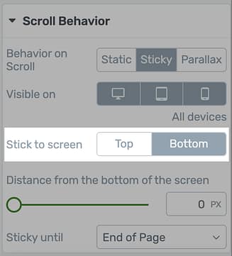
Set your screen position here
So... why would you want this?
- 1Mobile users can reach a call-to-action at the bottom of the screen with their thumb more easily than when it's at the top
- 2Sticking to the bottom won't interfere with any sticky website headers
- 3Return to top and Social Share buttons are often pinned at the bottom of blog post templates
7. Multiple Post Types in Post List
Our Post List element is arguably the best you'll ever find for WordPress. That's a bold statement... but the flexibility of this element combined with full visual editing is just mind-boggling.
However, it was restricted to displaying only one post type at a time.
We've now expanded the filter settings to allow multiple post types in the one post list.
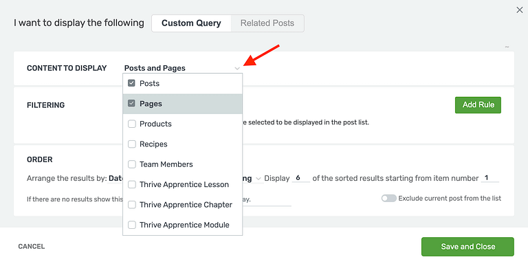
Mix post types in the one post list
This means you can display both Posts and Pages, or any number of custom post types, such as WooCommerce products alongside specific blog posts.
Perhaps you want to create a Podcast and would prefer to use a custom post type rather than just a blog post category. With this improvement, you won't be backing yourself into a corner.
The Rules Of Mixing Rules
There is one caveat to mixing post types in the post list: You can only add filter rules that apply to all included post types. This is a limitation of WordPress.
This means you can easily filter posts and pages by author, since the author taxonomy exists for both. However you cannot filter by category since WordPress pages do not have categories, only blog posts do. If you try, an alert will show.
An easy solution is to find any free 3rd party plugin in the WordPress repository that can add taxonomies to any post types. Once you add categories or tags to WordPress pages, then you'll be able to filter with those rules across multiple post types.
8. New Material Community Icons
Icons. More icons.
In the last 2 releases, we've been adding open source Material Design icons made by the Google design team to our icon element.
In this update we've brought in Material community icons, which adds nearly 3500 more.
That's 6268 free Material Icons
As the name suggests, Material community icons are made by the community to match Google's open-source design standards.
If you want to see the full list of community icons you now have available, click this link. It's impressive!
Why the fuss over icons?
We figure they are important because you'll use them in: styled lists, table of contents, custom menus, buttons, call-to-actions, tabs, toggles, video thumbnails, pricing tables, search elements, our templates and any part of your own landing page designs.
9. Naming Fields in Lead Gen Forms
Since you can now add so many new field types to your forms, we've made a small usability improvement by adding a 'Name' option to your field types.
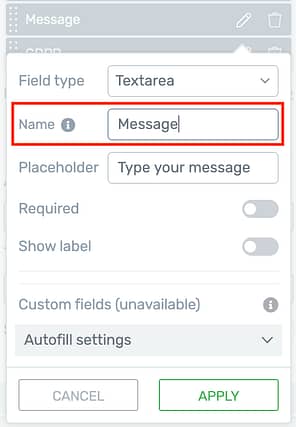
Like to stay organized? Name your fields.
The name you choose is for your own reference and will help you make sense of your forms more easily.
This name will also form part of the query string if you forward form results to a thank you page, and it will be used as a field label in contact form email sent from your website like this:
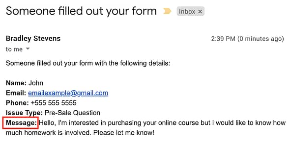
Field names will be used as the bolded label in contact emails.
It's a small improvement but helps with managing complex forms.
10. Global Color Unlinking Buttons
Have you ever opened the color picker to see that it was greyed out and you couldn't change it?
That's because you were viewing a global color, and changing it would affect any other elements that use the same color.
When you're in that situation again, you'll see your options clearly overlayed on the color picker:
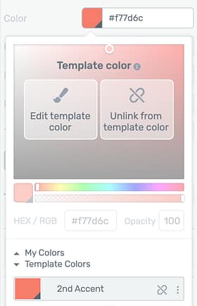
New overlay buttons will show you your global color options.
From here you can either edit the color, which will update all other elements referencing the same color, or you can unlink the color which means you change it without affecting anything else.
There are 3 types of locked colors:
- Global Colors: a central color you wish to use in multiple places on your site
- Template Colors: colors that are used throughout your current landing page template.
- Theme Colors: branding colors that are used website wide.
In each instance, if you want to change the locked color rather than unlinking from it, we'll show a tooltip that explains where that color is inherited from.
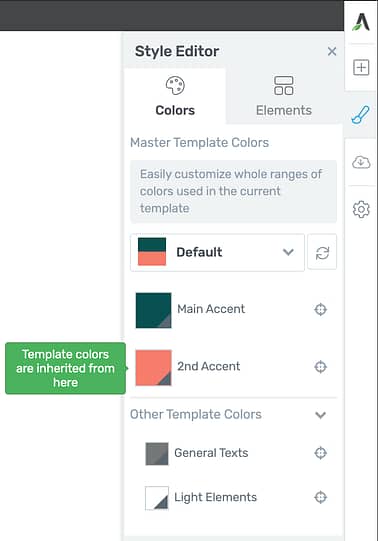
A tooltip will direct you where to change template colors.
Leave a comment below!
You know we live for your feedback, ideas and suggestions. Try out the new features above and let us know what you think.
What else is holding you back from achieving your business goals? We want to know how our software can help.


OK, now this is epic
Right?!
These look great. I’m excited about the file upload option, and I think the dual user interface colours is a smart addition. Great work, team!
Thanks Daniel! We’re pretty proud of the file upload feature. A lot of development hours went into that
Integration with woocommerce would be amazing!
Yes, indeed there must have been loads of work to get it to where it’s at! Well done everyone involved.
Wow a awesome update this time.
I will definitely use upload to Dropbox form and a few other of them right away????
Happy to hear, Jens!
Awesome updates! My absolutely most wished for feature request is for an automated standalone plugin with many kinds of templates to quickly configure all kinds of funnels.
Is something like this already in the works? Thrive Themes is already awesome, but this added funnels functionality would really put it over the top in value!!!
Hi Nick,
In Thrive Architect we have what we call sets of landing pages. These sets contain anything from a lead generation page, confirmation page, thank you page and often more pages like sales pages etc. This means you can create a funnel super quickly using the same set to build your pages.
Atm we’re not working on a standalone funnel builder.
Can the product upload feature be used on the Woo-commerce product page?
Hi Sandra,
The file upload feature doesn’t integrate with WooCommerce products. If you want to allow users to upload files on product pages, it’s best to use a dedicated extension created for WooCommerce.
For example the Product Add-Ons extension has a file upload option, just tested it and seems to be working smoothly with Thrive Theme Builder.
Following!
If you want visitors to create products I’ve found the Fluent Forms Plugin does a nice job. I’m looking forward to looking at TT Forms & the file upload once I renew my TTMembership.
Absolutely love all of these new features. Thanks to the team again for this.
Love the file upload features that upload without touching the server.
Looking forward to try it on mobile.
Thanks Denis – we love your Thrivemate site and excellent tutorial videos by the way. Great job
Thanks. You have done a great job yourself building a great technical team to build great products.
Are you guys releasing visual quiz editor soon? Heard it was being worked on…
Hi Kris, we are indeed working on bringing some more customizing options to the quiz question templates in Thrive Quiz Builder. We had some setbacks in the implementation and will release it as soon as we have the right balance between usability and customizability.
I am currently using Gravity Forms with Lastform. [This gives the advanced features of Gravity Forms a styling look like TypeForm.]
I would love to use Thrive-only forms and quizzes. Please consider adding advanced features, conditional logic and visuals like this in the future.
Thanks!
May I ask why you want to avoid Gravity forms? And also, what conditional logic would you use?
Hi Bradley, Gravity Forms is awesome! Nothing to avoid as such. It’s just that I would love if they are available in the Thrive Universe.
Here’s why.
The Lastform support has ended. They no longer update the addon. There are bugs and functionality suffers. I suspect more and more problems will start occurring as time passes and WordPress updates.
Typeform is getting more formidable and awesome! That’s good! But there is a considerable monthly charge.
So, it would make sense to explore the possibility of having Typeform and Videoask functionality in WordPress itself.
Secondly, there are some troubles one has to go through to set up Gravity Forms integrations. Such as Google Sheets integrations.
Looking at the massive updates you guys are sharing, one wonders if you can add anything related to forms in the future.
Thanks!
Regarding the conditional logic,
1. Form entries get sent to Trello, Google Sheets and Hubspot as per the options chosen.
Like, if the field is this, it should go here with this static text.
2. Dynamic confirmation. Like, if this field is selected, then the confirmation page is this.
This is necessary for hiring. They see the confirmation page based on their selected role.
Global color is not working, there is a very bad interface as we can’t choose any color
Hi Ajay,
Could you please open a support ticket if you believe that this is a bug on your site? Our support team will gladly have a look and help you out!
Awesome – I’ll make use of the file upload and woocommerce mini cart upgrades straight away – thanks
Thanks Matt. We’re open to feedback if you find anything that is unintuitive too
The ability to upload a file using a thrive themes default form is big news to me. I am so proud to be a premium Thrive Themes Member!
Thanks Alex – I also really like the file upload integration. There are so many excellent business use cases with that.
Another great update and some cool new features here. The one I am most happy about is the way I can now edit global colours! I kept coming up agains that one and getting stuck – so, thank you!
Yeah, we’re cracking down on usability. We’re at a point where the software is so powerful that the challenge is to make these features easy to find when you need them. I hope this helps!
Hi
Thanks for all those improvements.
I see, you add some new features to table of content but all the links in the table have no optimized anchor.
Actualy the link is something with a t-156826455 anchor instead of the name of the title we jump to.
this is effective in SEO for the jump to link in search results and i’m very surprised you’d never add this before.
This is the only reason i don’t use your table of content tool.
Hope it will come soon.
Have a nice day
Hey Eric, thanks for your question! I don’t consider myself an SEO expert but I believe this is incorrect. We checked this before we built the TOC.
An on-page jumplink uses an identifier after a #. Everything after the # in a URL is an instruction for the browser only, telling it to jump down the page to that location. Because this is an instruction for the browser and does not affect the content of the page at all, Google’s bots will ignore everything after the # and it has no bearing on SEO. If the link were pointing to a different page then yes it would matter, but in the case of a Table of Contents, it doesn’t.
However, the anchor text does matter and will be used for Google’s sitelinks. That is the hyperlinked text shown in the TOC and in Thrive Architect we have made that text uniquely editable so that you can customize it for SEO. You are safe to use our TOC and the auto-generated #ID won’t affect rankings.
If you’re still unsure, here’s a screenshot of John Mueller’s answer to this question (John is a Senior Webmaster Trends Analyst at Google and one of the few authorities who can answer this question with confidence).
Brad’s response leaves no room for doubt. Anytime John Mueller confirms something, then you know it’s true.
That said, if you did have any smidgen of further doubt, here is a screenshot of the Google results with sitelinks that have been picked up from our table of contents element.
This shows that Google has indexed links included in the ToC element and promoted them to their search results listings.
In summary: there’s no need to worry about how the ToC element has been built – it’s perfectly compatible with sitelinks and is in line with SEO best practices.
Thanks for those informations guys.
it’s clear for me now.
I will use it in my next articles.
Cheers
one of the things I miss in woocommerce is the posibility to edit by separate all the elements in woocomerce to customize much more woocomerce. I could be nice add “a product cart button widget”, and the posibility to add en element like “a long description product ”
I will make a video for the team explaining better since i have a woocomerce made with elementor and I cannot do exactly the same things with thrive theme builder and I thing we are not talking about about difficult improvements for the developer team.
Hello Juan,
While we are not aiming for a full visual WooCommerce builder, we are working on more customization options. If you can share a video with what you’d like to accomplish it would help us a lot to understand the requirements more precisely.
I can’t make promises about it, but we are gathering feedback to see what our customers would like to see in our theme builder and hopefully deliver those requests 🙂
yess that would really be great Loran. I second that
Non stop implementation by Team Thrive! These features are wonderful and a major help!
Glad you like them, James
Awesome updates. Thrive continues to be a game changer. Best software for web dev EVER.
Thanks Toby!
Thank you for the constant updates.
When will Thrive team be able to construct a feature which excludes certain email accounts or addresses from accessing the lead generating offer?? Lets say restrict gmail and allow only professional email accounts?
Hi Jerry, thank you for your suggestion. For the moment that is not something we have on the roadmap but we’ll see what the demand is for this feature.
BOOM ????
😀
No comment other than WELDONE THRIVE THEMES!!!Thank you for all the updates
Thanks Michael!
Love the updates. I’m especially excited about the new header sticky option and the ability to change content on scroll.
One thing stopping me from using it yet is the inability to adjust layout and positioning on the scroll state. Is this by design or a bug?
Hi Stephen,
What layout changes are you trying to make?
My current header is logo>menu w/CTA button. I’m basically replacing the menu with a short 1-line testimonial and leaving the logo and CTA button.
Setting that up is easy enough but I’m having to add an extra column, text, and a button (the CTA in the original is part of the menu). It’s creating a lot of padding underneath and I’m unable to adjust as layout and position is grayed out when editing the scroll state
Hey Stephen, we saw that layout/position settings in the second state could interfere with the fade animation between headers so we’ve temporarily greyed out those settings as a precaution. We’ll add them in the next release (3 weeks) once we are confident it won’t affect the animation.
Thanks for the update Brad. That makes sense and I don’t mind waiting 3 more week for things to be perfect.
Hey Stephen, just dropping you a comment to let you know: We’ve just released an update that now makes it possible to have different paddings, margins and sizes between your header states. Try it out and let us know how it works out!
Just wondering… In Thrive Apprentice is there occasion to use the table of contents or is that sort of navigation completely covered by modules, chapters, lessons? I’m a little puzzled as I have yet to build my first course. –Thanks, Roy
Thrive Apprentice will generate a list of your lessons/chapters/modules on a per-course basis that can be accessed from any lesson. It makes it really easy for your students to navigate to the lessons they want, and it’s all created automatically. Hope that helps, Roy.
Thanks, Brad. So informative and, for me :)), so easy to understand.
Thanks, team for all the new wonderful features. Very much appreciated at this end.
You’re welcome, thanks for the comment Alex!
Hi Brad, thanks for your great info & updates. Especially timely as I am installing some Thrive contact forms today.
But question: the image you show above for update #3 “File Upload Element … Application Forms” shows you have available 43 total form templates: 19 Optin, 18 Contact forms & 6 Application forms.
However when I installed the Thrive updates you describe just now, I have just 25 total forms: 10 Optin, 9 Contact forms & 6 Application forms.
Am I missing something here? Seems you have almost 2x as many forms available on the same Thrive screen. Would you kindly advise, thanks. David
Hi David,
You have the right amount of templates 😉 Brad is working on a website that includes templates that are not publicly released. This ususally means that our designers made a bunch of them but not all made the cut or that we have new templates in the pipeline that still need to be tested.
Could you add webhooks to send file uploads through a service like Zapier or Integromat to whatever other destination we choose?
File uploads aren’t really sent; they get uploaded to your Google Drive or Dropbox. However what you can do is send a direct link to the file, which is just a URL, to any destination you choose. As long as the recipient is given permissions to access the file (based on Google Drive or DropBox permissions), it’s just one click to access the file.
That means you can send the link through Zapier to any 3rd party tool, even adding it to Google sheets, to a field in your autoresponder, emailing it to a team member, etc. Hope that helps!
That’s great!! One thing that bugs me is I have over 100 templates saved and deleting the old ones one by one takes forever. Any chance of a multi-select function to delete them quickly?
I agree that template and symbol management in the backend needs a bit of an overhaul. Thanks for the request!
Great additions as usual. The mini-cart is awesome!
the new Multiple Post Types in Post List type ❤️ ❤️ ❤️ ❤️ ❤️ ❤️
Glad to hear you’ll use it! Let us know how you go and what you end up making
GREAT update! Exciting times to be a Thrive member.
Since you asked….what is holding me back from achieving my business goals? Apprentice. Apprentice! APPRENTICE!! Right now, Apprentice is the old briney barnacle clinging on to the beautiful Thrive Themes ship!
We have been hard at work preparing and scheduling some big changes to Apprentice, the first of which will start showing up a few releases from now. But I’m fairly confident to say that by the end of this year, Apprentice will feel like a whole different experience… and I think you’ll love it!
That’s great. You guys delivered big time on Thrive Theme Builder and WooCommerce. I’m sure Apprentice will be no exception. Keep up the amazing work!
Agreed, thrive + woo is huge. If apprentice ties in to woo/S2 then Thrive will be the undisputed kings. I’m so happy to be a thrive member right now. Theme builder is a dream and all the templates make web design work a breeze !!!!
Hi Bradley, nice work again!! Congratulations!!
I totally agree with Andy, and I would like to leave my suggestion for a simple step that would give us a lot of result in the first place, just integrate Apprentice with Woocommerce!
This new Thrive Themes approach to software delivery is much better then it was in the past (Theme Builder). Consider Woocommerce integration with Thrive Themes as an example of a well-done delivery where you add new features in steps instead of waiting a whole year to deliver a finished product.
People can start to benefit from the small step evolution and you will learn from it too.
Please, do the same thing with Apprentice and start delivering in small batches.
Thank you!
Thanks Alexandre! Woo with Apprentice is going to happen, but some other priorities need to be released first. We aim to update incrementally and take feedback as we go, but occasionally some overhaul features need to be done in a batch. Apprentice may be a bit of both.
That sounds great!
Is there any update on an integration with the payment provider Digistore24?
That would be a true gamechanger as well!
No update on that front, Thomas. But we have the votes tallied up for it
yeahhhhh
:-OOOOOOO exciting
That’s an amazing answer 😉
Hi Brad, when are y’all going to give me the ability to run banner ad tests the same way I can run lead generation tests? I’ve been asking for this for *years* but so far no dice. I’d like the ability to track my own banner ads to see which ones generate the most click through rates and retire the ones that perform poorly. I’m currently using thrive leads to randomly serve banner ads, but the click through rates aren’t tracked so I don’t know which ones are converting the best.
That’s an interesting use of Thrive Leads. So just to clarify: you want outbound link/ button clicks to count as conversion events instead of lead gen sign ups? The adverts take visitors to another site, right? I’m not convinced Thrive Leads is the ideal solution for that, but I have a few more questions: Which form type are you using in TL – is it the shortcode type? Do you also use TL for lead generation? Are you using lead groups to change the banner ads depending on where visitors are on your site?
Thanks in advance. This will help me understand the bigger picture.
Yes, that’s exactly what I want. My website makes money by driving traffic to my affiliate partners websites rather than by me selling my own products, so I want to track the banner ads that generate the highest click through rates. I agree that Thrive Leads is not the ideal solution for this, which is why I’m asking for a better one 🙂
Here’s what I’m doing:
I create several “in content” TL opt-in form types that consist of nothing but an image (banner ad) with an outbound link. I then create Lead shortcodes with several banner variations running as a ‘test’ that I never end. I use the shortcodes to place the banners as widget and interstitial ads on every page and post. The TL shortcodes serve up different banner ads for each unique visitor, just as if it was a lead generation ad.
You can see an example for yourself on the homepage of my website, a banner for one of my affiliate partners will be served up after the fold: fitnesstestlab.com
I can see the impressions for each banner ad but not the click throughs, so I don’t know which ones are performing the best.
I would very much like to be able to run these type of ads and track click throughs, and keep the ads that convert the best while removing ones that don’t, similar to how TL can be used to track the highest converting lead generators.
I would also like to be able to add new banners into the mix without having to stop/start a new test each time, basically have a never-ending rotation that I can add to as needed and have the ads that don’t meet a certain threshold of clicks be removed from the rotation.
Does that make sense? Is this possible?
It makes sense yes, but we currently only track sign ups and internal page visits for split testing. But thank you for the detailed explanation, this is helpful feedback for us. We’ll discuss it with the team.
Is it possible to add a form. Hide unwanted fields and redirect submit button to your link. That way you can track blank sign-ups.
You can use something like Prettylinks plugin to get the ctr for your ads. You can create the same link multiple times for different banner placements.
Thanks! Great post. I’m very happy with Thrive products and the on-going improvements and innovation.
Thank you Sahar!
Brad, I’m already addicted to your 3-week Thursday’s update blog posts 🙂 Seeing the new options is always entertaining – and so inspiring. Thanks, Thrive Team!
And thank you, Stef! It’s so awesome to hear that our updates are something you look forward to
What an awesome update! Two quick questions:
– Can you please integrate with Microsoft’s OneDrive for the file upload?
– What’s the maximum file size allowed for upload?
Best wishes
Philip
Hey Philip, we’ll add your vote for OneDrive. Maximum file size is set by the limits of the file hosting API, so for Google Drive that’s 5120GB. I have a feeling that’s more than enough
Awesome, thanks Brad!
Love these updates. Thank you Thrive, team. I feel very lucky to be a member and make sure to tell everyone how good you are.
We’re very happy to hear that, Jane!
Wow! The Thrive team has done it again. 10 valuable features. I especially like the file upload feature. My monthly subscription for Thrive gives me so much more value by far, than my other monthly subscriptions. Keep em coming!
That’s great to hear, thank you John
You are the best!!!!! I get excited every time. Your work is amazing. I am a very happy customer 🙂
You’re welcome, Andrea. It’s exciting to share too
I would love to see a Shop page that displays only product category images. Click on the image and it takes you to a page of products under that category.
Hello Sheila,
We are working on something that will allow that. It might still be a few releases away, but it’s work in progress 🙂
Thanks, I look forward to the update. Loving the Thrive Theme Builder!!
I’ve wanted this feature for a long time too. One thing I hope the designer/developer can implement is to pick a product in a category to be the “cover” image. I sell one of a kind products. It is very frustrating to the shopper if the catalog cover image is not something that is *really* for sale in the category. An alternative strategy would be randomly select a cover image from the products in a category.
Hi Sheila,
So you would like to have category pages in the list?
I’ll pass on your suggestion.
Yes, thank you for passing my suggestion on!
Thank you so much TT, been praying that we could have something like the header transition!! Can’t wait to use it! 🙂
Massive update! This is educational. Thanks, guys.
I had a query. Can we split test (revenue-wise) woo-commerce products and combinations of up-sells and down-sells using Thrive split testing feature?
Thanks! Not at the moment but I’ll add it as a feature request.
I would love for there to be a way to do a most popular posts (according to pageviews/social shares) in the post list option rather than just a widget.
Thanks for the suggestion Keegan,
This is not something we currently have on our roadmap, for the moment I would suggest using the option to set specific posts in the post list. This will allow you to attract more views to the posts that you believe are your best content.
hi buddy, the upload file is a very good update and the one I have been waiting for.
There’s one other thing I’d like to have on Thrive, which is user reviews. Where visitors can write a review on one of the product posts. And if this could be integrated into Woo it would be great too.
I’ve looked at other alternatives to user review plugins, but none of them match wtih my website design, except maybe I hired someone to do them. But, I would have it integrated with TA or TTB. I would look forward to it if Thrive could consider it.
Hello Willya,
WooCommerce has a built-in feature to allow reviews on product pages, that works with theme builder as well. Or you’d need some functionality that goes beyond the core review option of Woo?
Hi Lorant,
Yes, you are right. But, what if for a non-woocommerce product page, like I have a service or I write a review about a product then I want people to also write reviews like G2.com did.
Awesome update as always!
I have one suggestion and a question:
Suggestion: for icons, it would be great if they could be tagged somehow internally (perhaps by the community) so that it’s easy to find the kind of icon I’m looking for.
I appreciate how you’ve split them up into groups but there are so many that it’s hard to find the one you want because the name of the icon may not bear any relation to it.
For example, if I want an icon of a telephone, I’d like to be able to search for “telephone” or “phone”, regardless of whether those words are part of the icon name or not.
Hope that makes sense!
Question: I can see a lot of people excited for the Woo Commerce integration and it’s making me wonder whether it’s a good fit with Thrive Apprentice to replace SendOwl or not.
In what scenarios would you recommend one over the other for accepting payments and tracking sales, customers, etc?
e.g. is one better for physical products and the other better for online courses? How do they compare for costs? And so on.
Perhaps Shane can give us an update on this, similar to the ones he did when you first brought out the SendOwl integration?
Yesss icon tagging would be great!! One time I was looking for a diamond for half an hour until I found it by the name “gem” XD
Definitively, some internal tagging like that would be great for these situations.
We did look into tagging, only to find that it would be surprisingly difficult to implement. But we haven’t given up. We’ll see what we can do.
WooCommerce is much more suitable for a shop with lots of different products where customers add to a cart and buy them all at once. The main attraction of WooCommerce is that it’s free, but it’s not very user friendly, requires extensions for what can feel like core functionality, and is mainly made for physical products. SendOwl is still recommended for simple sales funnels of online courses and digital products. If our recommendation changes, we’ll make some noise about it.
Thanks for the clarification re woocommerce, that does help clear things up for me.
Re the icons: I guess it doesn’t necessarily have to be tagging, it’s really about anything that could help locate the icon we want when we don’t know how it is named.
Tagging would be an obvious answer but I’m sure the boffins at Thrive Themes can find a solution, whatever it is!
Once again amazing additions which make being a member so much more valuable. Some very useful features introduced here to make life easier.
Just one improvement I would like to see, is more attention to the impact on legacy themes, not just TTB. Beautiful Ovation testimonials are now black text on a dark maroon background. They look correct when editing in TA. Just because TTB has been released does not mean everyone can change over.
With a similar feature failure being told by support that it’s because I’m using an ‘old’ theme is not helpful. I for one need time to transition various sites.
Great updates once again!
Is there a roadmap somewhere we can check for upcoming features and updates?
I would love if apprentice had the option for people to manually click a lesson as “done” before they can go to the next one like other LMS’s. Now it gets checked as done once someone just opens it.
Or the option to hide certain courses based on a role. e.g. we have member only courses that are part of an online coaching program, but also sell separate memberships, it’s confusing for people to see the courses for members when they are orienting before buying and think they get those as well, even though it’s in the description.
Thanks Richard. We use a private roadmap for a number of reasons I won’t go into. But both of your requests have popped up before and already have a bunch of votes. We’ll add your votes to them
Great work! Just loving it!
Q:Is there some where down the line a posibility for calculated customer fields? Or custom made database connections? Or do I over look it?
Keep up the great work!
Cheers Christiaan
There are many terms for colors – Global Colors, Template Colors, Theme Colors and My Colors. I am still confused how to use them.
What is the difference between Global Colors and Theme Colors if first are used “in multiple places on your site” and the last are used “website wide”? How all of them relate to each other?
Where exactly can I change “My Colors”, or “Global Colors” or Template Colors? How to do it? Are they overlapping?
It would be nice if you create an exhaustive, structured post about colors.
Hi Alexander,
Thanks for the suggestion. We’ll see if we can create a comprehensive article about this.
For now, let me try to explain it in a bit more detail:
Theme color: This is the color you pick when using Thrive Theme Builder, it IS a global color (so it will change everywhere you used it when you change it) and it is used by our smart technology to pick up automatically. Let’s say orange is your theme color, when you now drop a block on a page, it will automatically detect this color and use the orange. This makes it EXTREMELY fast to change your website colors.
Global color: This is independent from your theme and can be used even if you only have Thrive Architect (and not Thrive Theme Builder) Let’s say you have an accent color that you use for buttons on your sales pages. If you assign a global color to the buttons then you’ll be able to change it 1 time and it will change everywhere you used it. When you use pre-designed templates such as blocks, the global color is not automatically assigned, but you can assign it and from then on it is linked.
Template colors: This applies to standalone landingpages in Thrive Architect. When you choose one of our smart landing pages, our designers picked a color palette that works for those landing pages. When you drop a block on the landing page, the colors will adapt to these template colors but anything you change will ONLY AFFECT THAT LANDING PAGE. So if you pick for example the Bright Smart landing page. Out of the box, the accent color is red. But you can very quickly change it to blue. Now the whole landing page is blue and any block you add will be blue too.
My colors: These are colors you like and that you save to have them handy. They are not linked. If you use one of my colors on 5 different buttons, you will have to go in and change every button if you change your mind about the color.
Hope that helps!
Such great features. I’m so happy I found out about Thrive all that time ago. I do have a feature request though. Integrate Thrive Leads or Thrive Architect with Paypal/Stripe and you might just have one of the best form builders on the market.
Hey Mark, tell me more: What are you trying to achieve? What are you selling? Are you looking for a whole checkout tool or just a way to integrate via API and accept a form submit only once payment is confirmed?
Will it be posible to use the widgets from the old themes.. I am still waiting to switch to the new theme but without the old widgets it will take forever to rebuild the widget areas on my websites.
Hi Martin,
No you won’t be able to use the widgets from the old themes. But Thrive Theme Builder and Shapeshift have everything you need.
I don’t believe it will take you that long because TTB comes with pre-designed sidebar sections. What widgets were you using from the old theme.
I am using the thrive Tabs widget. I have setup different widgets for different categories and pages with the widget display options and the custom category option. Maybe it is just me being confused but it is such an easy way to use.. Is there some tutorial on how to make a new tabs widget?
Seems like you might have been using Clever Widgets for those display options? You can still use that with TTB.
For the tabs widget, you’d select a tab element, drag it in the sidebar and then add a list element to the tab element (the list element has pre-made designs that are made to be shown in small areas such as the sidebar)
Oooor it might be a good opportunity to try something new 😉
Just…. so… amazing! Thank you so much. I love the ability to collapse the table of content and customize the titles. I’ve used it already: https://ysamphy.com/how-to-rest/
They make me want to write more and more! Thank you very much for all the hard work you put in to make all this possible for me. ????
I really like your site Samphy – it’s a great example of how you to combine parts of the Thrive Themes suite to create an attractive site. You also have great information there, too. How long has it taken you to get your site to where it is today?
Thanks, Paul. With ThriveThemes, I can design another one like it in less than day!!
TT really got me to get back to blogging. I quit for a long time and resumed just about two years ago. However, I didn’t take TT seriously till early this year. That’s largely how I fell back in love with writing and blogging again.
thank you for linking to the icon list, I’ve wanted to know the names of the symbols when trying to find the right one. it is so frustrating when you don’t know what they are called.
Fantastic feature update, Thrive keeps getting better and better.
On feature ideas is to add a country field element to the form? I have some forms that I would like to capture country data however I don’t want to create a custom drop down list adding all the different countries. Having an element prepopulated with all the countries would rock.
Hey Scott, you’re in luck! We have a feature we’re releasing quite soon which will make this very easy to achieve.
It takes more than 24 hours to reply to tickets! It would be great if you could invest more on customer support. Most of the agents don’t read the tickets properly and provide wrong solutions
Hi Alex,
I’m sorry to hear you had a bad experience with our support. Our average reponse time is 6h and we invest heavily in customer support. We’re currently also in the process of switching over the forum to a better solution which will hopefully help improve the overall quality.
Great updates!!! Thank you!!!
After I finish this comment I’m renewing my Thrive Themes Membership because of this page. Then I’ll go read some of the other monthly update pages. These monthly updates are concise and with just the right amount of information and screen captures. Bradley I appreciate your word crafting talents and efforts to create these posts. Thanks also to Hanne, Lorant, and Paul McCarthy for adding additional comments.
Bradley, I do have one thought for you. I understand why TT doesn’t publish a product roadmap, but if you could provide a little background or identify problems these enhancements are targeted to fix it would help me as a reader to identify why or how I could use it. For example, I’ve always needed the ability for visitors to upload images because an image is worth a thousand words. That one is easy for me, but Header Transitions for the life of me I can’t imagine a benefit or what issue it is trying to address. It might be an issue I have but didn’t know.
If you decide to continue “as is”; I’m still looking forward to the next post from you.
Thank you for your kind words, John!
I see your point. If I shared the driving purpose behind each feature, these posts would probably be 3-5 times as long. My goal is to announce what is new, while the rest of the marketing team create content and tutorials around ‘why’. You can see an example of that in David’s post about using the Table of Contents feature. It’s a whole article around just that one element.
Perhaps I can be more specific around use cases, though, so I’ll take that feedback. As for your example of header scroll, really that’s just a design feature that has been requested. It doesn’t solve a problem so much as allow for interesting new designs.
I am using the sticky scroll for a banner with a button. The color of the element matches my theme color in the editor but in the preview it changes. Is there a way to fix this?
Hey George, hmm. That doesn’t seem right. Without taking a direct look I can’t be sure what’s happening. If you open a support ticket, our team will take a look and fix it for you.
Hi George,
Make sure to empty your cache. If the problem persists, please ask your support team so they can have a look and help you out.
Hi,
Is Thrive themes team planning to integrate WooCommerce with Thrive Apprentice? Because payment gateways only support WooCommerce in my country.
Thank you.
Yes eventually we will. But we have some other improvements to make to Apprentice first.
Hi Hanna,
Thank you for replying.
May I ask do you have ETA of the integration?
We do not at this time
Thank you.