

TL;DR: What Are the Best Coaching Landing Page Examples Doing Right?
There are a lot of coaches out there, and even more opinions on what your website should look like. If you’re not sure whether your landing page is working (or you haven’t built one yet) this guide clears things up fast. Here’s what you’ll learn (and what actually works):
- What makes a coaching landing page effective?
A single, focused offer (like a free call, quiz, or training) backed by a benefit-driven headline, real proof, and a clear CTA. The best pages focus on guiding readers. - What should I put on my landing page?
Start with a promise (what result you help people achieve), then add social proof, testimonials, credibility markers, and a strong reason to act now. Repeat your CTA at least 2-3 times. - Should I offer a freebie, quiz, or discovery call as my coaching offer?
Depends on your business model; most high-ticket coaches lead with a call. If you’re growing your list, try a quiz or lead magnet. You’ll see real examples of all three inside. - Can I build good landing pages without a designer?
Yes. Every page in this guide was made with simple tools, and there are a lot of options that offer drag-and-drop templates made for coaches, no coding needed. - How do I know if my landing page is working?
Track conversions. If people are clicking but not signing up, your copy or offer might need a tweak. Thrive Suite includes tools to test variations and improve results.
This guide breaks down 7 real coaching landing pages, so you can easily learn how to build a page that looks good, feels aligned, and drives action.
If you’re a coach, your landing page is either working for you… or against you.
It’s the page people land on when they’re most curious and most uncertain. And in a few scrolls, they’ll either trust you enough to take action… or they’ll bounce.
The problem, however, is the fact that most coaching website landing pages don’t convert. They aren’t even designed to.
They ramble. They try to do too much. Or they feel more like an online résumé instead of a conversion-focused landing page.
Meanwhile, the coaching industry is exploding:
- The global coaching market is now worth $6.25 billion
- It’s projected to hit $7.3 billion by 2025
- Active coaches worldwide? Over 145,500 today, with 167,000+ expected next year
- Annual revenue has jumped 60% since 2019
That means more opportunity... but also more noise.
If your life coach landing page, health coaching funnel, or business coaching lead magnet isn’t clear, focused, and built to get those clicks… someone else’s will be.
And you might be thinking “Maybe I need a new coaching template…”
You don’t. In fact, I’m 99.9% confident that your current page is fine. It just needs a few simple tweaks to turn it into a high-converting landing page.
That’s what this post is about.
You’ll see 7 real-world effective coaching landing page examples that do extremely well, with breakdowns of why they work and how to adapt the ideas to your own offers.
And if you want to build yours fast? You’ll get the tool recommendations and page types I recommend and have used over the years – built for coaches who want results, not just a pretty page.
Let’s dive in.
What’s Holding Most Coaching Pages Back?
Vague, feel-good headlines with no value hook
Visitors land on your page hoping to hear: “Here’s how this helps me.” But instead, they get vague lines like “Step Into Your Power” or “Unlock Your Potential.” These don’t clarify what you offer or why it matters, by the way. They just float past the reader. That's why I say: clarity beats inspiration every time.
Multiple CTAs that compete for attention
“Book a call,” “Join my newsletter,” “Download the checklist,” “Follow on Instagram” can't all be on one page.
If they are, you'll just end up killing your conversions. A high-performing landing page has one job and one next step. Anything more introduces friction and decision fatigue.
Weak or buried testimonials
Your visitors need proof that your coaching delivers. If your testimonials are generic (“She changed my life!”), hidden at the bottom, or missing entirely, you’re asking people to trust without evidence. Real testimonials with specific outcomes build trust fast.
Layouts that look like homepages
A homepage says “here’s everything I do.” A landing page says “here’s what to do next.” If your page has a nav bar, random sections, or sidebars full of distractions, you’ll lose your visitors.
No urgency or clear next step
Even if someone’s interested, they won’t act unless you give them a reason to act now. That could be a limited-time offer, a next-available booking slot, or even a well-placed CTA button that says exactly what happens next. Without urgency or clarity, momentum dies.
Big Breakdown: 7 Top Coaching Landing Page Examples That Nail It
So what does a high-converting coaching landing page actually look like in 2026?
It’s one thing to talk about headlines, CTAs, and page flow, but it’s another to see how real coaches are putting those principles into practice.
In this section, I’ll break down 7 coaching landing pages that are doing it right. Each one is different – from freebie opt-ins to premium call funnels – but they all follow a clear logic: focus the message, guide the action, and earn the click.
Use these examples as inspiration, swipe files, or even a mirror for your own page. The goal here is for you to see what’s possible when strategy meets clarity.
Example 1: Susie Moore – The Self Coaching Society Landing Page
🧭 Type: Premium Coaching Program
🎯 Offer: The Self Coaching Society – A Path to Emotional Resilience & Confidence
TL;DR: What Susie Moore’s Coaching Page Gets Right
Susie’s page leads with clarity and emotional resonance. From the first headline, it speaks directly to the reader’s inner world. No vague “live your best life” language, just grounded, uplifting copy.
A few standout moves:
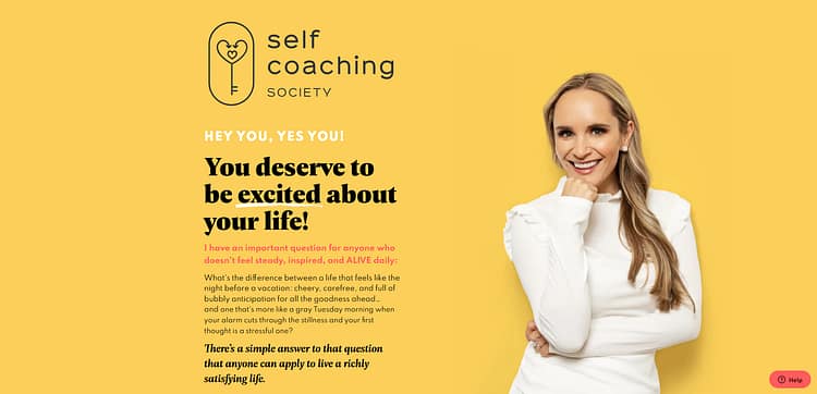
- The headline sets the tone – simple, personal, and instantly relevant: “You deserve to be excited about your life.”
- Her face is front and center, building trust before the reader even scans a testimonial. This is especially effective for coaching where the relationship matters.
- The “What I’m Not” section filters with kindness, helping visitors self-select without feeling excluded. It’s smart positioning that also builds relief and respect.
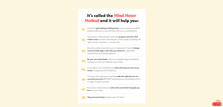
- Her coaching method is clearly explained – not buried in rambling sentences with no value, but laid out so the reader believes in the process before ever clicking the CTA.
- She includes the price confidently and without friction, which signals transparency and avoids sticker shock later.
- Testimonials are woven throughout, each one echoing real transformations. Each one reinforces the page’s promise at key decision points.
Overall, this is a great example of a premium coaching page that builds belief in the offer. And it does so with structure, warmth, and total clarity.
Susie Moore’s landing page for The Self Coaching Society is a masterclass in building warmth and authority at the same time. From the moment you land on it, there’s no question who it’s for or how it’s meant to feel. This isn’t a generic coaching template. It’s a carefully constructed, emotionally intelligent page that speaks directly to the reader’s inner life.
The hero section makes an immediate impression, both visually and emotionally. The headline (“You deserve to be excited about your life.”) doesn’t hide behind jargon or vague transformation promises. It’s simple, direct, and emotionally charged. That tone carries through the rest of the page. Every line of copy is crafted to nudge the reader toward hope and curiosity. And I love that.
What I think really works is how personal the page feels.
Susie’s face is prominent, not tucked away in a small corner; and for coaches, this is so important. The buyer needs to trust the person behind the offer, especially when the product is deeply personal like life coaching. Her presence builds connection before any credentials are even mentioned.
From there, the page unfolds in layers (with social proof, philosophy, and clarity all working in tandem). She includes major media logos, which add credibility. But the storytelling doesn’t rely on status. Instead, Susie shares her personal story, her outlook on coaching, and what you can expect from the program in an approachable, no-fluff voice. That balance (between aspirational and relatable) is hard to pull off, and she nails it.
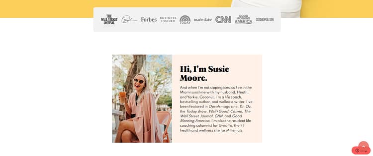
One of the most effective parts of the page is her “What I’m Not” section. Instead of only trying to sell the dream, she makes it crystal clear who this isn’t for. That, to me, is brilliant positioning.
It makes the reader feel safe. Coaches often forget that a big part of conversion is relief. Relief that they’ve finally found someone who gets them. Relief that they won’t waste time or money on something that’s not aligned. Susie offers that.

The page also does an excellent job of breaking down her actual method: the unique philosophy behind The Self Coaching Society. It’s not buried. It’s front and center. She doesn’t just say “transformation happens.” She shows how it happens. That builds belief in the process before the CTA even appears.
Speaking of CTAs, she doesn’t hide the price. That alone puts her ahead of many high-ticket coaching pages. She’s direct about cost, value, and what you get. There’s a level of transparency here that builds trust instantly.

Throughout the page, testimonials are scattered in smart, intentional ways. Instead of dumping them all at the bottom, she weaves them into the flow of the offer. These aren’t generic “Susie’s great” statements. They’re outcome-driven, emotionally resonant pieces of social proof. They reflect the results she promises — more confidence, more self-trust, more emotional clarity.

This is a high-conversion coaching page because it doesn’t just inform, it connects. The structure is intentional, but the copy still feels warm. It’s aspirational, but grounded in proof. If you’re a coach creating a premium offer, there’s a lot to learn from how this one is done.
🔑 Key Takeaways from Susie’s Self Coaching Society Page
- Lead with transformation, not tactics. The headline hits straight to the emotional core of the offer.
- Use your face early and prominently. Trust starts with visibility.
- Don’t fear honesty. Her “What I’m Not” section builds more trust than fake hype ever could.
- Name and explain your framework. The breakdown of her process adds credibility and clarity.
- Repeat testimonials with purpose. Don’t just stack praise. You should highlight outcomes that align with your promise.
- Be transparent with pricing. Especially at higher tiers, clarity converts more than mystery.
- Warmth + structure = trust. The page flows naturally, but every section has a clear role in the conversion path.
Example 2: Marie Forleo – Free Productivity Masterclass
🧭 Type: Free Productivity Masterclass
🎯 Offer: “3 Sneaky Mistakes That Kill Productivity & Tank Profits” – Instant Access Training by Marie Forleo
TL;DR: Why Marie Forleo’s Masterclass Page Works
This is a short landing page that punches way above its word count. If you’re offering a free masterclass, lead magnet, or webinar, this is the kind of page you should study.
- It opens strong with a clear, benefits-focused headline:“3 Sneaky Mistakes That Kill Productivity & Tank Profits.” Her page addresses a specific problem and a reason to keep reading.
- The CTA promises immediate value: “Watch INSTANTLY” replaces vague language like “Sign up now.” That single word, “instantly”, lowers friction and raises trust.
- Her photo builds connection, and the content block next to it breaks down the value with zero overwhelm:
- What you’ll learn
- Why it matters
- How it fits into her Time Genius method
- Trust signals follow immediately, using major media logos (Oprah, NYT, Forbes, Goop) to signal authority. If you don’t have this level of PR yet, this is where solid testimonials or recognizable client brands can do the job.
- There are just two CTA buttons, placed exactly where momentum peaks. One above the fold, and one after the proof.
This page doesn’t try to do everything. It just makes it ridiculously easy to say yes.
Let’s keep this one short because that’s the entire point of Marie Forleo’s landing page.
Unlike high-ticket coaching program pages that go deep with testimonials, storytelling, and objection handling, Marie’s page is just one clear, focused scroll. It’s a masterclass in restraint. And if you’re offering something free (like a webinar, challenge, or lead magnet) take notes.
The hero headline hits hard:
“3 Sneaky Mistakes That Kill Productivity & Tank Profits.”
It’s specific, punchy, and immediately relevant to business owners who feel like they’re spinning their wheels.

Then, right beneath it:
👉 A bold CTA: “Watch INSTANTLY”
This does a couple of smart things. First, it removes friction. There’s no “register now” or “join the list.” It promises value immediately, which builds trust and encourages clicks.
Next to Marie’s smiling photo is a single value box:
It’s well-spaced, easy to skim, and has just enough depth to feel worth opting into.
And right after that? Social proof. Which isn't testimonials this time, mind you, but logos: Oprah, Forbes, Goop, NYT. If you haven’t been featured like this (yet), this is where testimonials from real people with results can step in.

What I really want you to take from this is:
Not every coaching page needs to be long.
If you’re giving away something free, let the simplicity do the work. A few smart copy lines, visual cues, and trust signals are more than enough to convert curious visitors into subscribers.
Also: Marie includes two CTA buttons, one in the hero and one after the proof section. Even on short pages, placement matters.
🧠 Key Takeaways: What You Can Learn from This Page
- Match the page length to the offer. Free = low commitment, so keep it concise.
- Use instant access language. “Watch instantly” feels modern, friction-free, and satisfying.
- One value box > bloated paragraphs. Get to the point fast, then invite action.
- Don’t overdesign. This page is minimal but effective because it stays out of its own way.
- Use whatever social proof you do have. If you haven’t been on Oprah, real testimonials work beautifully.
And if you need guidance on how to collect and display testimonials on your website, check out this detailed guide.
Example 3: Ali Abdaal – LifeOS Coaching Program Landing Page
🧭 Type: Premium Productivity Coaching Offer + Curriculum-Based Course
🎯 Offer: LifeOS – A Complete System for Personal & Professional Growth
TL;DR: Why Ali Abdaal’s LifeOS Page Converts with Confidence
Ali’s LifeOS page feels less like a funnel and more like a thoughtful walkthrough. It's built for readers who want clarity, not coaxing.
- The headline leads with truth, not tricks:“LifeOS: A complete system to help you live a happier, healthier, more productive life.”It sets the tone. It offers a direct promise that resonates.
- The opening insight section does the heavy lifting: Before he ever talks about features, Ali unpacks the why behind productivity struggles. That tiny shift (teaching first) makes his offer feel like the answer, not just another product.
- His curriculum layout is a masterclass in visual clarity: Icons, short benefit-led descriptions, and modular blocks make it scannable but persuasive. It’s the kind of section that makes people think, “Yes, I need this.”
- FAQs are robust and realistic :From tech questions to emotional hesitations, he tackles real objections before they become dealbreakers.
- The final CTA is understated but effective: No countdown timers, no pushy language. Just an invitation backed by value and it works.
If you’re building a high-value coaching or digital product page, this one is worth studying from top to bottom.
Let me just say, Ali Abdaal’s LifeOS landing page is an excellent case study in high-conversion design that still feels human and clean. You can tell from the first scroll that everything is strategic (and still sounds like Ali).
The first thing that stands out? The headline and intro section. I appreciate that it says exactly what it is:
“LifeOS: A complete system to help you live a happier, healthier, more productive life.”
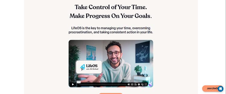
Then, instead of rushing into features, Ali offers a mini philosophy lesson. He unpacks the psychology behind why productivity systems fail; which subtly positions LifeOS as the smarter solution *before* he even pitches it. That’s a powerful tactic for coaches selling premium programs: lead with insight, not offers.
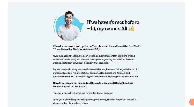
Next, the breakdown of what you get is clean, benefit-led, and deeply visual. Every part of the curriculum (from energy tracking to intentionality and workflow) is laid out with icons and copy that makes it easy to skim but hard to ignore. If you’ve ever struggled to structure your coaching curriculum page, just look at how this one simplifies a complex offer.
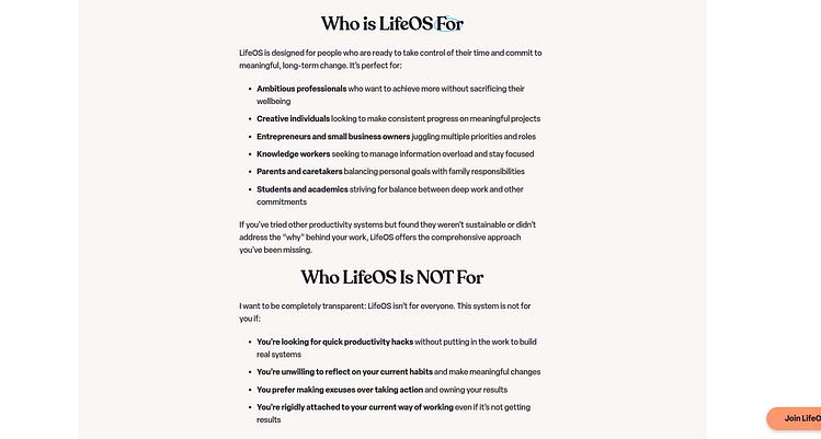
I also love how he includes a full section on “Who This Is For” and “Who It’s Not For”. Coaches, please don’t skip this. Not only does it help filter out the wrong audience (which saves you time), it actually builds *more* trust with the right ones. Transparency converts.
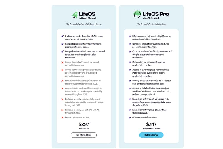
Then there’s pricing, which is clearly displayed. I love that there's no hiding it behind a sales call. The “one payment or three” model is simple, and the copy underneath it directly tackles objections (e.g. “you can go through the entire program and still get a refund if it’s not for you”). This matters. High-ticket doesn’t mean high-pressure.
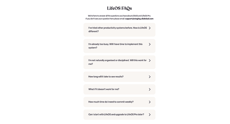
The FAQs section is another strength. It’s long, detailed, and covers both logistical and emotional questions. Things like “Will this work if I’ve already tried other productivity tools?” show he knows exactly what doubts the buyer has and he’s not afraid to address them.
The page closes with a clean call to action and subtle urgency. Nothing overhyped. No false scarcity. Just a confident, clear offer.
🔑 Key Takeaways from Ali’s LifeOS Landing Page
- Name your framework. LifeOS positions itself as a system. A named, proprietary system that builds perceived value instantly.
- Teach before you pitch. The “psychology of productivity” section educates and primes the reader to believe in the solution.
- Use visual structure. Icons, short blurbs, and white space make this a joy to scroll.
- Be upfront about pricing. No one wants to dig for the cost. Transparency builds trust.
- Handle objections in advance. The FAQs are smart, specific, and well-worded.
Example 4: Chris Do – Brand Messaging Kit Landing Page
🧭 Type: Digital Product (Downloadable Kit)
🎯 Offer: Brand Messaging Kit – A Framework for Sharpening Your Brand Voice
TL;DR: Why Chris Do’s Brand Messaging Kit Page Works So Well
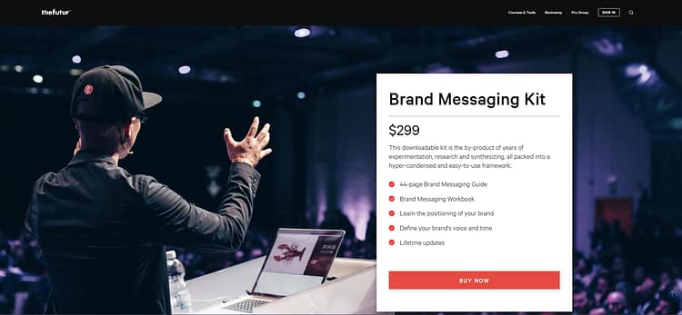
- Right up top, you get everything you need: the product name, a shot of Chris on stage (great trust-builder), the price, and exactly what’s inside the kit. No fluff. No build-up. Just clear value, front and center.
- Instead of a long personal story, Chris keeps things tight: he explains the importance of messaging with a quick nod to brand psychology, not hard-sell tactics. It positions the offer as thoughtful and strategic without feeling forced.
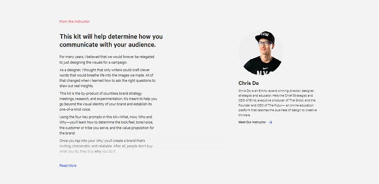
- There’s a short “From the Instructor” section that adds just enough personal touch to build credibility. You get a glimpse into Chris’s mindset shift (why messaging clicked for him) and it makes the product feel more grounded in real-world experience.
- The visuals do most of the heavy lifting: workbook mockups, tidy layout, and zero clutter. It’s skimmable, scrollable, and easy to say yes to; especially for buyers who already know they need help with their brand voice.
This page doesn’t shout. It doesn’t oversell. It trusts the offer to land and that confidence makes it convert.
This is one of the most straightforward product pages I’ve reviewed; and I actually mean that as a compliment. Chris Do (founder of The Futur) knows exactly what this offer is, and he doesn’t dress it up in unnecessary copy. The landing page for the Brand Messaging Kit does a great job of staying focused, clear, and conversion-minded (especially for a lower-ticket, high-value resource).
The top section hits fast:
A large hero image of Chris on stage (great move, always show yourself in your element), a prominent product title, the price, and a crystal-clear list of what’s included. No distractions. No build-up. Just: “Here’s the product. Here’s the value. Here’s how to get it.” This kind of delivery works well for digital kits where the buyer already has a pain point and wants a solution *now.*
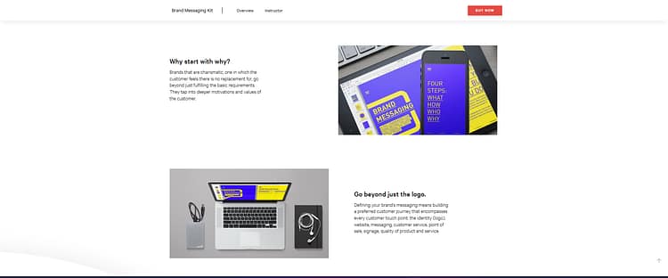
Then we move into some visual context. I appreciate how they didn’t default to a long emotional story. Instead, they show the actual workbook and explain *why* messaging matters. The “Why start with why?” section is short but grounded in brand psychology, which helps give this offer more credibility. It's subtle positioning, not hard-selling.
The next content block is one I always recommend creators include: “From the Instructor.” Chris writes personally and openly about how he used to believe visuals alone were enough, and how asking the right questions changed the way he approached brand messaging. Even though it’s short, it adds a layer of trust and it reinforces that the kit is the product of actual lived experience.
The visuals continue to do a lot of heavy lifting. Mockups of the materials, clear headers, and generous white space keep the page readable.
It’s minimal. It’s confident. It works.
🔑 Key Takeaways from Chris Do’s Brand Messaging Kit Page:
- Lead with clarity. The page opens with everything a potential buyer needs to make a decision. No fluff.
- Visual credibility matters. Real photos, mockups, and a speaking shot establish trust and authority fast.
- Instructor voice builds connection. Even a short personal note can go a long way in making your product feel real.
- No need for drama. Not every product needs a sweeping sales page. When the offer is practical, the copy should be too.
- Price transparency converts. $299 is front and center. No hiding, no bait-and-switch, and no pressure tactics.
Example 5: Chillpreneur – Creator Archetype Quiz Funnel
🧭 Type: Quiz Funnel → Coaching Program
🎯 Offer: Influential AF Academy – A Self-Expression Coaching Program for Creators
TL;DR: Why Chillpreneur’s Quiz Funnel Pulls Its Weight
This one breaks the mold and that’s exactly why it works.
- It starts with you, not them: Instead of pitching an offer upfront, Chillpreneur leads with a quiz: “Discover Your Creator Archetype.” It’s engaging, introspective, and sneaks in value before asking for anything in return. The opt-in ends up feeling like the next logical step.
- Personalization powers the pitch: Your quiz result unlocks a tailored profile (mine was “The Conversationalist”) that actually feels useful. And because the language reflects your style, the offer that follows doesn’t feel random. It feels aligned.
- Skip the scroll and go straight to action: There’s no long sales page. The call to action sends you directly to the checkout. A bold move, but one that works when the pre-sell is baked into the experience. It’s trust-by-design.
If you’re a coach or creator working with identity, content, or self-expression, this is a funnel worth studying.
Chillpreneur does their thing differently. *Way* differently. From the second you land on their site, it’s loud, layered, and a little chaotic. For some people, that might feel like too much. But for creatives? That contrast is magnetic. It’s personality-forward, and that’s kind of the whole point.
Instead of leading with a traditional landing page, they let *you* do the talking, via a quiz.
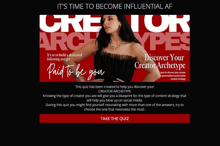
The “Discover Your Creator Archetype” quiz is their gateway to everything. It's designed to help you figure out your personal content style and how to lean into it on social media. The questions are fun, but not shallow. They actually make you think. And once you're done, you’re asked for your email in exchange for the results. That’s the opt-in moment, cleverly disguised as curiosity.
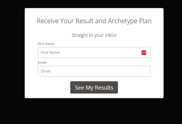
Once you hit submit, you get a surprisingly detailed profile delivered via email. My result? The Conversationalist. The report comes with a tone-of-voice breakdown, content creation tips, and examples — plus a CTA to join the Influential AF Academy.

But here’s the twist: that CTA doesn’t send you to a longform sales page. It goes straight to a checkout page. Pricing, offer summary, and a payment form. No fluff. No scroll. Just: here’s what it costs, are you in?
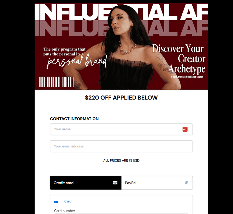
That’s a bold move. But in context, it works. If someone’s gone through the quiz and felt seen by the results, they’re already sold on some level. And for everyone else? Chillpreneur now has their email and their archetype. Meaning every follow-up email can speak to that person’s specific style, doubts, and desires.
It's lean, it’s gutsy, and it’s creative funnel building. Not for the faint of heart, but definitely worth experimenting with if you’re targeting personality-driven creators.
🔑 Key Takeaways from Chillpreneur’s Funnel
- Turn personality into a lead magnet. The quiz works *because* it’s rooted in identity. People love learning about themselves and then seeing what to do with that insight.
- Ditch the traditional funnel (if it makes sense). No landing page, no long-scroll pitch. It’s quiz → results → buy. High risk, high payoff. Test before going all in.
- The visuals are bold by design. They’re trying to attract the right kind of client. If you’re serving a creative audience, don’t be afraid to color outside the lines.
- Use email follow-up intentionally. Once someone’s taken the quiz, you’ve got personalized data. Use that to segment, tailor your messaging, and deepen the relationship over time.
- Even chaos needs structure. Behind the quirk and contrast is a very clear funnel with a purpose: convert cold traffic into warm leads, then into bold buyers.
Want to learn how to create an engaging quiz funnel? Check out this step-by-step guide right here.
Example 6: Listings Lab – Application Page Funnel
🧭 Type: Premium Coaching Program (Call-Based Offer)
🎯 Offer: A Framework for Scaling a Real Estate Business to Multi-Six or Seven Figures
TL;DR: Why The Listings Lab Application Funnel Works So Well
This page isn’t trying to sell to everyone and that’s the whole point.
- It’s not a checkout, it’s a filter. The Listings Lab isn’t selling a quick fix. It’s offering a premium coaching experience and they make you *apply* to join. That alone reframes the offer as high-value. You’re not just buying into a program. You’re asking to be considered.
- The funnel respects the buyer’s effort. Booking a call is a bigger ask than downloading a freebie. This funnel meets that ask with proof, presence (video!), and real talk.
- Positioning happens through process. From the detailed form to the strategic copy, every part of this page signals: “We work with a specific kind of person.” If you’re the right fit, the funnel makes you feel seen. If you’re not, you self-select out.
If you’re offering a high-touch, transformation-based coaching program, and you’re tired of the usual sales page grind, this kind of call-first funnel is worth considering, especially when your value is in the conversation, not just the content.
The Listings Lab does things a little differently and it works.
Their core offer isn’t a course or a freebie; it’s a call. You get on the phone, talk it through, and see if the program’s a fit. Which makes sense. Not every business should be sold through a checkout button. Sometimes, the offer itself needs to be filtered and that’s exactly what this funnel is designed to do.
It starts on the homepage with a strong hero:
“Build a sustainable multi-six or seven figure real estate business, without burning out or relying on outdated marketing tactics.”
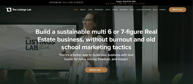
Clear promise. Clear CTA. When you click the “Book a Call” button, it leads you to a landing page and that choice is intentional.
Instead of dropping you on a form, they take you through a proper sales experience. That matters because this is a high-effort offer.
When the action you’re asking someone to take requires more from them (a call, a big investment, or a time commitment), you need to earn it. That means building trust, showing proof, and giving people enough detail to feel safe opting in.
The landing page kicks off with another hero, this time reframing the promise as “the most effective framework in real estate marketing to grow and scale your business.” It’s direct, ambitious, and sets the tone for what follows.
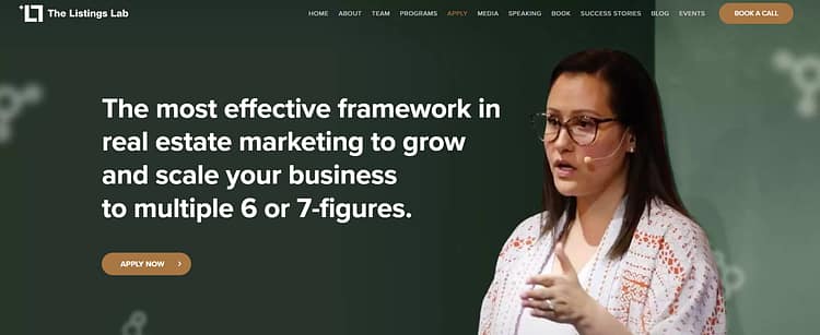
Next, they speak straight to the pain points:
Are you worried about where your next client is coming from?
Are you tired of working hard without seeing consistent results?
This follows the classic problem–agitation–solution model, but it doesn’t feel templated. It feels honest — and that matters in a market where every other funnel sounds the same.
Then there’s a short video. And here’s where I always recommend putting in the extra work:
If your offer requires more effort from the user (like booking a call, making a big payment, or committing to a serious transformation) you should include a video.
People want to see who they’re working with. They want to hear your voice. They want to know there’s a real person on the other side. The Listings Lab gets that.

Further down, you get a clear summary of the program: what it is, what it includes, and how long it runs. In this case, it’s designed to help you dominate your marketplace in 90 days, which is another smart move.
Timeframes ground transformation in something tangible.
They help people imagine what could be possible by a specific point in time, which makes commitment feel easier.
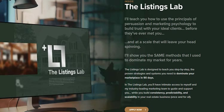
The testimonials here are strong. Some are written, others are on video. The video ones do a lot of heavy lifting. A real person speaking about their transformation creates trust faster than any long paragraph ever could.
And then we get to the form; where the filtering starts.
This isn’t your typical first name–last name–email setup. It’s an application form.

You’re asked about:
It might seem like they’re just trying to get to know you. but this also works as a strategic filter. The Listings Lab clearly works with a specific kind of client. This form helps them spot whether or not you’re that person.
And beyond that, having a form like this adds prestige. It says: this isn’t for everyone. You don’t just buy, you apply.
🔑 Key Takeaways from the Listings Lab Funnel
- Not all offers need a “buy now” CTA: booking a call can be more strategic (especially for high-ticket or selective programs)
- Use full landing pages before application forms: let people understand what they’re saying yes to
- For high-effort actions (calls, bigger price points, serious commitments), include a video and let people see you
- Speak clearly to the real pain points: don’t just “paint the dream,” show that you understand the struggle
- Anchor your program in a clear timeframe to build confidence (e.g. 90 days)
- Use video testimonials where possible: they convert better than blocks of text
- Application forms should act as filters, not just intake forms: they help you qualify leads and elevate your brand
Example 7: Natalie Ellis – Webinar Funnel
🧭 Type: Webinar → Email Nurture → Paid Offer
🎯 Offer: A 5-Step Playbook to Start or Scale a Freedom-Based Business™
TL;DR: Why Natalie Ellis’s Webinar Funnel Works Without the Hype
This funnel doesn’t rush. It guides.
- It starts with one clear action: The homepage isn’t trying to do everything. It does one thing well; which pointing people to the masterclass. That clarity instantly builds trust and makes navigation frictionless.
- The messaging speaks directly to desire: “Create more time, make more money.” It’s a promise wrapped in simplicity. Paired with a clean design and CTA, the visitor knows what they’re getting and why it matters.
- The rest of the funnel is invisible by design: There’s no long sales page or aggressive pitch. You register for the webinar, and the nurture begins in the background. Emails are personalized, the tone stays helpful, and the actual offer only shows up once you’re ready to hear it.
If you’ve ever felt like your sales page was doing too much too soon, this is a great example of pacing. Natalie’s funnel builds interest, not pressure. In today’s trust-driven market, that’s what works.
Natalie Ellis does things simply, but intentionally. And it starts with the homepage, which serves as a pointer.
The homepage exists to drive traffic to one clear destination: the free masterclass.
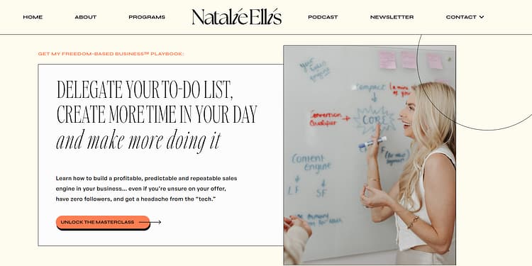
That’s a smart move, especially if your business has multiple offers behind the scenes.
Instead of overwhelming the visitor, you guide them toward the best starting point. Using a webinar designed to nurture trust and capture leads. If you’re trying to warm people up to a paid program, this is how you do it.
The homepage headline is strong: “Delegate your to-do list, create more time in your day, and make more doing it.” That messaging taps directly into the freedom and income desires of the target audience. Paired with a clean “Unlock the Masterclass” CTA, the funnel starts with clarity and minimal friction.
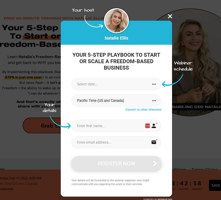
Once you click through, you land on the webinar registration page. The headline hits: “Your 5-Step Playbook to Start or Scale a Freedom-Based Business™.” It promises structure, not fluff.
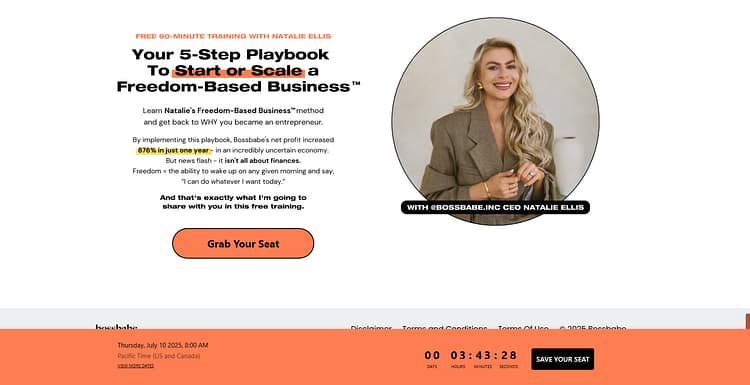
There’s a quick intro to Natalie as the BossBabe co-founder, and a standout stat: an 876% profit increase. That caught my attention immediately (and it'll probably do the same for interested visitors).
Then comes the countdown timer (a soft urgency tactic). You’re shown the next available webinar slot, creating forward motion without being pushy. The registration form is short: name, email, and session time. But this is where the real funnel begins.
Behind that simple opt-in is a well-oiled lead gen machine. You enter your details, attend the masterclass, and start receiving emails, tailored to your interest and behavior.
There’s no “Buy Now” page, no long sales letter upfront. Because for this funnel, the selling happens later. The webinar does the warming. The emails do the nudging. And eventually, you’re invited into the paid BossBabe ecosystem... likely a course, membership, or group coaching offer.
It’s simple. It’s user-friendly. And it’s built on trust-first marketing.
🔑 Key Takeaways from the Natalie Ellis Funnel
- Use your homepage to point to one primary offer: it reduces overwhelm and increases action
- Webinars are still powerful when paired with strong positioning and lead capture
- Short landing pages can convert: especially when paired with stats and clean design
- A single outcome-based stat can replace lengthy testimonials
- Countdown timers create soft urgency that nudges action without pressure
- Lead gen is the real goal: the webinar warms them up, the emails do the selling
- Simple structure + strong funnel = effective conversion without complexity
How to Build Your Own Coaching Landing Page (The Blueprint Behind All 7)
Notice anything? Every page above is different (different niche, different vibe, wildly different design) but underneath, they're all running the same play. Strip away the branding and you're left with the same handful of building blocks, stacked in roughly the same order.
Here's that blueprint. Steal it.
Quick gut-check: open your current page and count how many of these seven you actually hit. Most coaching pages land two or three — and then wonder why the traffic never converts.
Selling high-ticket coaching? You'll usually swap the direct "enroll" button for an application or booking page; same blueprint, but the last step becomes "apply" or "book a call" instead of "buy now."
Build it without hiring a designer (or touching a line of code)
Good news: you don't need a $5,000 designer or a developer on call to put this together. Every page in this post could be built in an afternoon inside Thrive Architect, our drag-and-drop landing page builder for WordPress.
Instead of staring at a blank screen, you start from conversion-focused templates built on exactly the blueprint above — hero, proof, offer and CTA blocks already in place. Drop in your words and photos, rearrange what you like, hit publish. No code. No agency invoice. No waiting two weeks for a mockup.
→ Build your coaching landing page with Thrive Architect
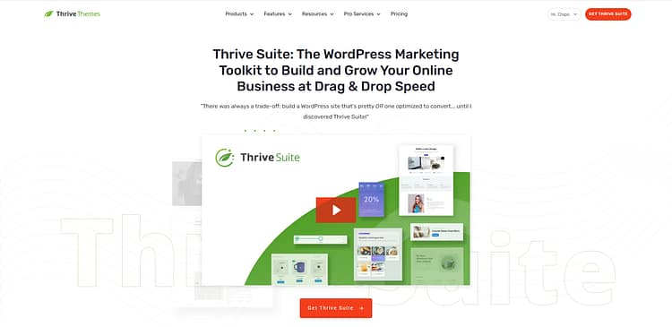
Already on WordPress? Thrive Architect plugs straight in. Want the full conversion kit too — opt-in forms, A/B testing, the lot, it's all in Thrive Suite.
If you’ve been sitting on an offer because the tech feels overwhelming, this removes the roadblock. I’ve launched full funnels in a weekend using Thrive. Once it’s set up, it’s yours to tweak, test, and scale however you want.
It’s hands-down one of the best investments I’ve made in my business.
Most Common Questions About Coaching Landing Pages
Real questions people ask when trying to create an effective coaching funnel.
What is a coaching landing page?
A coaching landing page is a standalone page with one job: turning a visitor into a lead or client through a single action, like booking a call, joining a training, or downloading a resource. Unlike your homepage, which introduces everything you do, a landing page strips away every competing option. That focus is why it converts.
What should a coaching landing page include?
Seven blocks, in roughly this order: a headline that sells the outcome, an "I see you" problem statement, the offer made obvious, proof (testimonials with real names and faces), a short why-you section, a how-it-works breakdown, and one repeated call to action. That's the exact blueprint every example above follows.
What is an application page in coaching, and when should I use one?
An application page asks visitors to apply for your program instead of buying it outright: a form with qualifying questions (experience, goals, biggest obstacle), usually followed by a call. Use one for high-ticket or high-touch coaching where fit matters more than volume. It filters out mismatched leads and adds prestige: you don't just buy, you apply. The Listings Lab example above shows a full application funnel in action.
How long should a coaching landing page be?
Match length to commitment. A free masterclass or lead magnet needs one focused scroll, like Marie Forleo's page above. A premium program with a four-figure price needs room for story, proof, method, and objections, like Susie Moore's or Ali Abdaal's. The bigger the ask, the more trust the page has to build before the button.
Should I show my coaching prices on the landing page?
For lower-ticket offers and digital products, yes: upfront pricing reduces friction, and the strongest examples above (Susie, Ali, Chris Do) all show their price confidently. For high-ticket, call-based programs, many coaches hold pricing for the call, and that's legitimate when the offer genuinely needs a conversation. Either way, lead with value before numbers.
Do I need a designer to build a coaching landing page?
No. Every structure in this guide can be built with a drag-and-drop tool like Thrive Architect, starting from conversion-focused templates with the hero, proof, and CTA blocks already in place. You swap in your words and photos and publish. Design skills help; they're not the price of entry.
Final Thoughts: Building a Coaching Landing Page That Actually Converts
Great coaching landing pages focus on doing one thing: they guide visitors toward one clear step. Whether that’s booking a call, signing up for a training, or downloading a freebie, clarity is what drives conversions.
Once you know your goal, structure the page around it. Use a proven layout, write copy that speaks to outcomes (not just motivation), and show real social proof. Repeat your CTA at least three times, and make sure it’s impossible to miss.
If you're using Thrive Suite, you already have everything you need. You can start with a coaching-specific template, edit it easily, connect it to your email list, and even run A/B tests with Thrive Optimize to improve performance over time.
The tech doesn’t need to hold you back. If your offer is strong, Thrive gives you the tools to match.


