TL;DR The Truth About Exit-Intent Popups
Exit-intent popups work—but only when they’re used with purpose.
The biggest levers are Value × Relevance × Timing, plus a mobile setup that respects the user experience.
In this guide, I’ll walk you through:
If you’re serious about recovering abandoning visitors without turning them off, this is the playbook you’ll want to keep open.
How many of your visitors are you losing forever?
I still catch myself wincing when I look at the numbers.
In 2025, the average bounce rate for eCommerce sites is 47% (SaleHoo). Almost half the people who land on your site slip away without giving you a second thought.
BUT here’s what makes me lean in. Exit-intent popups can recover up to 21% of abandoned carts (OptinMonster). Nearly one in five “lost” visitors pulled back from the edge. That is the difference between silent exits and meaningful wins.
I never build popups for the sake of adding noise, and neither should you. The goal is to step in at the right moment with something that feels helpful: free shipping, a resource that matters, or even a quick way for someone to tell you why they were leaving.
By the end of this guide, you’ll know how to turn exit moments into opportunities—launching a popup that feels like a timely nudge rather than an interruption, then scaling it with advanced strategies like cart rescue, micro-surveys, and dynamic offers.
When half your traffic walks away, you can’t afford to treat it as the end of the story. Every exit is an opening to re-engage, recover revenue, and build trust at the exact moment most businesses give up.
Do Exit-Intent Popups Really Work? Yes. When You Use Them Right
Short answer: absolutely.
Exit-intent popups are one of the highest-ROI safety nets you can add to your site. The real difference between a forgettable popup and one that makes you smile at your analytics usually comes down to Value × Relevance × Timing—and yes, that matters even more on mobile.
Here’s what the numbers look like when you use them well:
- General campaigns: On average, popups convert at around 4.65% in 2025 (Wisepops). That’s four or five people out of every hundred you were about to lose forever.
- Top performers: When the offer is spot-on and the targeting sharp, conversion rates can climb to 15–20%+, with some best-in-class campaigns reaching over 40% (OptiMonk).
- Cart rescue: Exit-intent shines here. Discounts, free shipping, or a small incentive often convert at 15–17% (OptiMonk).
- Micro-surveys: Even simple “tell us why you’re leaving” popups can pull in 12%+ response rates, giving you priceless insight into pricing objections, missing features, or friction points.
Translation: the format alone doesn’t win. The magic happens when the offer matches the moment. That’s why the same technology that annoys people in one context can feel like a helpful lifeline in another. A sloppy, generic popup will get you eye-rolls and exits. A well-timed, relevant one can save a cart, capture a lead, or give you the exact insight you need to fix your funnel.
Think about it this way: every visitor leaving your site is a story that ends too soon. Exit-intent gives you a chance to flip the ending—whether that’s a discount that tips someone into buying, a resource that keeps them learning, or a feedback box that tells you what to fix next. The numbers prove it works, but the real win comes from designing popups that feel like part of the journey rather than a distraction from it.
By the way: If you’re thinking bigger than popups and want to connect every touchpoint in your funnel, our guide on advanced lead generation tactics shows how to blend exit-intent with other dynamic triggers like scroll-based slide-ins and conversational polls.
Why Some Popups Flop (and How to Flip Them)
We’ve all seen popups that make us want to slam the back button. The good news? Most of those failures come from predictable mistakes you can avoid. Here’s where campaigns usually fall apart — and how to turn them around:
Common Popup Flops and Fixes
The Mistake | The Fix |
|---|---|
Generic offers shown to everyone | Segment by page intent, visitor type (new vs. returning), cart status, or traffic source. A discount that feels generous to a first-time shopper feels insulting to a loyal customer. |
Bad timing (too early or too late) | Lean on exit-intent as your default trigger. For long reads or content-heavy pages, layer in a secondary trigger (like scroll depth or time on page) so the popup lands when attention is at its peak. |
Mobile misery (full-screen, hard to close) | Respect the small screen. Use slide-ins or sticky bars, keep tap targets large, and make the close button obvious. If people have to pinch-zoom just to exit, you’ve already lost them. |
Form friction (asking for too much) | Every extra field bleeds conversions. Start with email-only or use a two-step opt-in so the commitment feels lighter. You can always gather more detail later. (Not sure how to design that popup form itself? Our tutorial on creating opt-in forms that convert walks you through layouts, copy tweaks, and UX fixes that double sign-ups.) |
Repeat fatigue (same offer after conversion) | Nothing says “we don’t know you” like serving the same popup to someone who already signed up. Add frequency caps and suppression rules so once they’ve converted, they’re never asked again. |
Bottom line: popups flop when they interrupt the journey instead of supporting it. Flip the script and they’ll feel less like a nuisance and more like a timely nudge.
To dive deeper into what makes popups feel natural instead of annoying, check out our roundup of popup best practices — it’s full of real examples you can copy straight into your design flow.
Focus On Making Exit-Intent Popups Mobile-Friendly
On desktop, exit-intent is fairly straightforward: the popup appears when the mouse drifts toward the top of the screen.
Mobile doesn’t work that way. There’s no cursor to track, so the technology looks for other signals — like a user tapping the back button, scrolling up quickly toward the browser bar, going inactive for a while, or switching to another tab or app.
That means two things:
Mobile Exit-Intent Challenges
- Mobile exit-intent is less precise. A fast upward scroll might mean someone’s leaving… or maybe they just wanted to re-read the headline.
- The experience has to be much gentler. A full-screen popup that blocks the page is a recipe for frustration on a small screen.
Mobile UX Rules
To keep both users and Google happy, follow these rules:
- Respect Google’s page-experience guidelines. Stick to non-intrusive formats, make the dismiss button obvious, and let users access the content underneath. Google has made it clear: intrusive page elements can hurt your search rankings.
- Design for thumbs. Big tap targets, short and clear copy, and one unmistakable call-to-action button. If someone has to zoom in or hunt for the “X,” the popup is already failing.
Mobile visitors are often the majority of your traffic. If the experience is clunky or annoying, you’re not just losing conversions — you’re sending a message that you don’t care about the customer experience.
Great UX starts with fast pages. Learn how to optimize your website for speed and UX so your popups appear smoothly and never interrupt the browsing flow.
Mini Sanity Check (Before You Build)
Before you switch a popup live, take 60 seconds to walk through this checklist:
- Is the offer a real win right now? Don’t dangle something vague like “Join our list.” Make it concrete: free shipping, a checklist, a discount, a resource that answers their exact question.
- Is it tailored to this page or visitor? A pricing page is high-intent — the offer might be “Book a demo” or “Get 10% off today.” A blog post is top-of-funnel — the offer could be a free guide or template related to that topic.
- Will they see it once, not forever? Set frequency caps (like once per session or every few days). Nothing kills goodwill faster than seeing the same popup every time you visit.
- Does mobile get its own design? Don’t just shrink a desktop popup down. Build a version that fits the mobile screen and interaction style (slide-ins or sticky bars are usually best).
- Do you know how you’ll measure success? Don’t just track sign-ups. Look at conversion rate by page and segment, plus downstream results like open rates, click-throughs, and even lifetime value.
If you can tick all five boxes, you’re on the right track. If one feels shaky, fix it before you publish.
One-Minute Example (What “Used Correctly” Looks Like)
Let’s bring it all together with a real-world scenario:
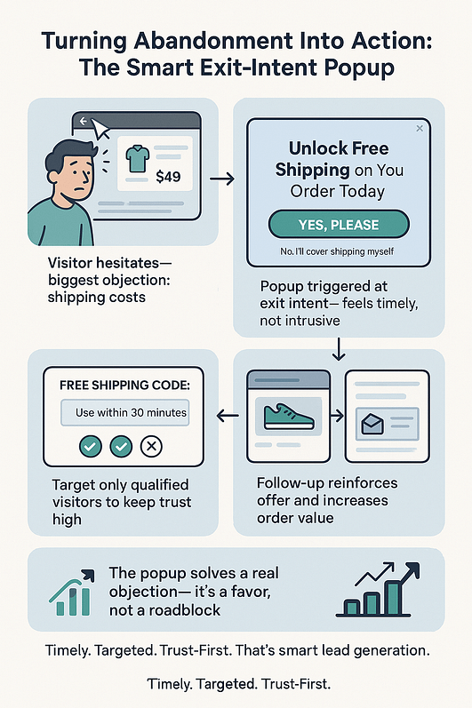
How to Build Your Exit-Intent Popup (Hands-On Tutorial)
We’ve covered the why and the what — now let’s move into the how. This is the part where strategy turns into something tangible on your site. Step by step, you’ll build a real exit-intent popup you can publish today, then fine-tune it with testing and targeting once it’s live.
Think of this as your safety net in action: simple to start, powerful once optimized.
How to Set Up an Exit-Intent Popup on Your WordPress Site
You don’t need to be a developer to build something powerful here. I’ll walk you through the exact steps I use to set up an exit-intent popup — from blank canvas to live, working form.
1. Install Thrive Leads
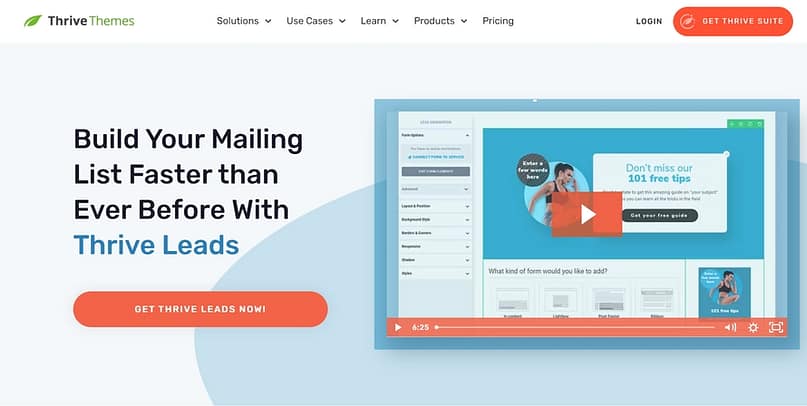
This is the plugin I trust for popups because it’s built for conversions, not just “looking nice.” Once you’ve installed Thrive Leads on your WordPress site, you’ll have access to drag-and-drop design (no HTML/CSS headaches), plus over 450 conversion-focused templates.
The real magic is targeting: you can decide exactly who sees which popup based on behavior, source, or interests. That way, you’re not interrupting people with random offers — you’re showing them something that matters.
👉 Bonus: It integrates smoothly with most email service providers, so new leads slide right into your system.
Choosing Your Popup Plugin
If you’re still exploring your options, check out our roundup of the best popup plugins for WordPress, where we compare Thrive Leads against other top tools for speed, flexibility, and targeting. But I’m telling you, Thrive Leads is the one you need.
2. Create a ThriveBox
Inside Thrive Leads, scroll down to ThriveBoxes. Click Add New, give your popup a name, and hit save. This is your “container” — the space where your form will live.
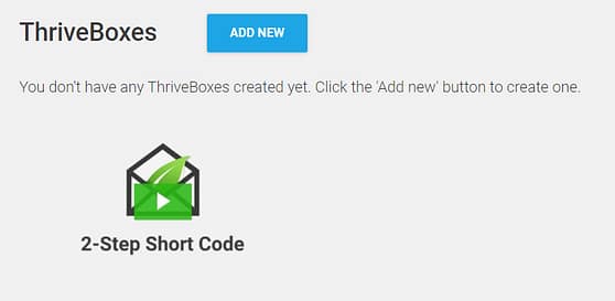
3. Add a Form to Your ThriveBox
Click Edit next to your new ThriveBox, then hit Create Form. Give the form a name and confirm. You’ll see it appear in your dashboard, ready for design.
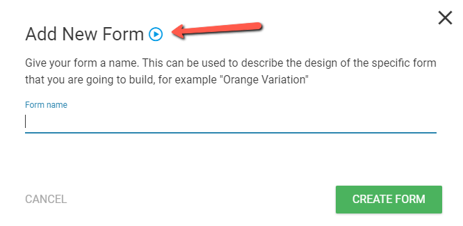
4. Choose Your Popup Animation
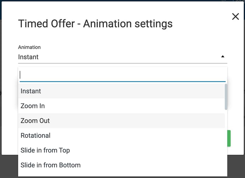
Animations are what bring your popup to life. Under Animation, you’ll see “Instant” as the default. Click that to choose from other styles — fade-in, slide-up, bounce, etc.
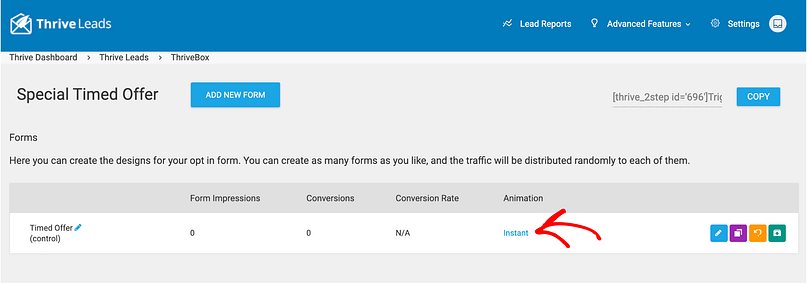
Pick one that fits your brand tone (I usually go subtle — no need to scream at your visitors).
5. Pick a Template & Customize the Design
Now the fun part. Thrive Leads gives you a huge library of professionally designed templates. Scroll until you find one that feels right for your offer, then open it in the visual editor.
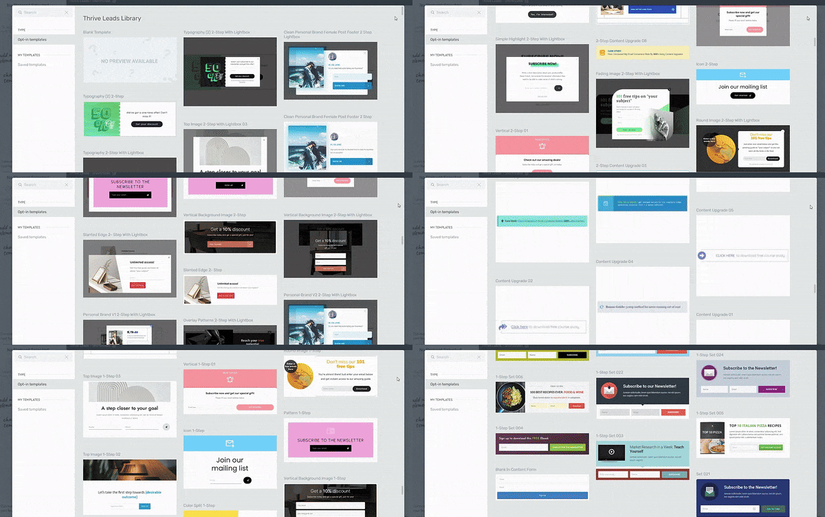
Form Templates in Thrive Leads
From there, you can tweak:
The goal? Clarity. Keep text short, make the CTA button impossible to miss, and always tie it back to the value you’re offering. When you’re done, save your design.
6. Add the Popup to Your Page
Head to the page you want the popup to appear on (I use Thrive Architect for this, but any page works). Click the Cog icon in the right sidebar, then head into Advanced Settings → Page Events.
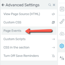
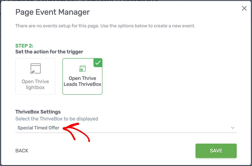
Hit Apply, preview it, and make sure it looks sharp across desktop and mobile.
And that’s it — your exit-intent popup is live. You’ve just built a conversion safety net that can catch abandoning visitors and turn them into subscribers or customers.
Want to see how popups fit into a complete conversion system? Check out our guide on how to create a lead generation website that turns traffic into steady subscribers.
And if you need a deeper walkthrough? Visit the Thrive Leads tutorials hub for more hands-on guides, integrations, and design tips.
Make Your Popup Convert: Copy, Design & UX That Stop the Scroll
An exit-intent popup is only as strong as what it says and how it feels. If it looks spammy or sounds robotic, people won’t give it a second thought. Here’s how to make yours stop the scroll (and actually win conversions).
Design Headlines That Interrupt Patterns
Your headline has to snap people out of autopilot in the split second before they leave. Short, bold, and human always wins:
Keep a swipe file of ideas you can adapt. The goal isn’t to trick — it’s to reframe the moment as an opportunity.
The same persuasion triggers that power great popups also apply to your pages. Learn how to craft a high-converting landing page structure that keeps attention and drives clicks.
CTA Best Practices
Your button copy should be more than “Submit.” Pair action with benefit so people feel the payoff instantly:
Clarity beats cleverness. When in doubt, ask: Would I click this myself?
Visuals That Earn Attention
Images do the heavy lifting. Choose visuals that feel natural and relevant:
Need inspiration? Browse these high-converting popup templates to see proven layouts that grab attention without breaking your user experience.
Respect UX (and Google’s Guidelines)
A popup should feel like a nudge, not a block. To keep it user-friendly (and SEO-safe):
When your popup feels helpful, clear, and respectful, it doesn’t just convert more — it builds trust in the process.
Advanced Targeting & Personalization (The 80/20 of Performance)
Generic popups are why so many people think “popups don’t work.” The truth? Most of the performance lift comes from simple targeting rules that take a few minutes to set up. Do these right and you’ll be in the top 20% of performers.
Audience Splits
Behavioral Rules
Dynamic Content
Make the popup feel like it’s written just for them:
Looking for another engaging way to capture intent? Try building quiz lead magnets that combine interactivity with segmentation power.
Quick Decision Tree Example
The beauty of targeting is that it shifts the popup from “one-size-fits-all nag” to “timely, relevant nudge.” That’s the real 80/20 lever.
If you’re serious about personalization, learn how advanced lead segmentation turns raw data into tailored messaging that converts faster.
Measure What Matters (and Improve Weekly)
Popups aren’t “set it and forget it.” You’ll get your best results by treating them like living campaigns you tweak week by week.
Core KPIs
Tracking conversions only matters if you understand what drives them. Review the core conversion optimization principles that help you interpret popup data and test with confidence.
A/B Test Plan (First 30 Days)
Keep tests simple and focused. Early wins come from:
Even small tweaks can unlock double-digit lifts. The key is to test systematically — one variable at a time — and keep the winners rolling forward.
Want to go even deeper with testing? This step-by-step guide on A/B testing opt-in forms shows how to pinpoint which tweaks actually lift conversions.
And once you’ve nailed tracking and optimization, the next step is seeing how these metrics play out inside a complete lead generation funnel — from first click to final conversion.
Post-Conversion: Don’t Stop at the Popup
The popup is just the spark. What happens right after is what turns a quick win into a real relationship.
On-Page Confirmation
When someone opts in, don’t just say “Thanks.” Reinforce the value they’ve unlocked, set clear expectations, and give them one obvious next step. Example: “Your discount code is ready — check your inbox. While you’re here, explore our best-sellers.”
Don’t stop at the opt-in — your thank-you page can build momentum too. Here’s how to create a thank-you page your audience will love and keep new leads engaged right after they sign up.
Welcome Email Tailored to the Offer
Once you’ve captured the lead, the next step is delivering real value. Browse these lead magnet ideas that convert to find inspiration for your follow-up sequence or exit-offer freebie.
CRM/ESP Tagging
Don’t waste the data. Tag leads by offer, page, segment, and device. That way your nurturing emails feel intentional: “Saw you were exploring [product category] — here’s a buyer’s guide you’ll love.”
Once you capture a subscriber, connect Thrive Leads to your email service so new contacts are tagged automatically for personalized follow-ups.
After someone opts in, the real magic happens in your inbox. Use our email nurture sequence guide to build trust and move new subscribers toward that first purchase.
The “Crazy-Scientist” Playbook (Outside-the-Box, But Practical)
Popups don’t have to be boring. With a little creativity, they can feel like personalized experiments that delight instead of annoy:
These ideas aren’t gimmicks — they’re ways to respect intent while testing creative angles that can quietly lift conversions.
Once your popups are working, it’s time to maximize the payoff. Use our funnel maximization guide to add smart upsells and downsells without breaking your user flow.
Common Mistakes (and the Fix)
Even with the best intentions, popups flop when these slip through:
Get these right, and your popups won’t feel like interruptions — they’ll feel like natural, useful parts of the journey.
Exit-Intent Popup FAQs
Still have questions? You’re not the only one. Exit-intent popups spark a mix of curiosity and skepticism — some marketers swear by them, others worry they’ll annoy users or hurt SEO. The truth is, the results depend on how you set them up. These quick answers cover the most common concerns, so you can build smarter, high-converting campaigns without second-guessing yourself.
It’s a popup that appears when your behavior signals you’re about to leave a site. On desktop, the system tracks your cursor moving toward the browser bar or tab close button. On mobile, it relies on other signals — like hitting the back button, scrolling up fast, or going inactive.
Yes, but they need a different approach. Since there’s no cursor, use subtle formats like slide-ins or sticky bars. Keep the copy short, the buttons easy to tap, and always give a quick way to close.
Not if you respect Google’s guidelines. Intrusive, full-screen popups on mobile can hurt rankings, but non-intrusive formats that are easy to dismiss are fine. Think helpful nudge, not content blockade.
Baseline campaigns convert around 3–5%. Well-optimized popups (strong offer + targeting) hit 15–20%+. Cart recovery popups often land in the mid-teens, and micro-surveys can pull double-digit response rates.
- E-commerce: discounts, free shipping, low-stock alerts, or cart reminders.
- Blogs/content sites: lead magnets (checklists, templates, guides) or newsletter subscriptions tied to the topic they’re reading.
Show it once per session, maybe again after a few days — but never on every single visit. Add suppression rules so subscribers and recent converters don’t see offers they’ve already taken.
Segment. If someone’s already signed up, exclude them from the same popup. Instead, show them something useful — like a new resource or an exclusive loyalty perk.
Start simple. Test one element at a time: offer (discount vs. free shipping), headline (direct vs. question), CTA copy (“Get my code” vs. “Send my code”), or trigger (exit-intent vs. exit + 10s delay). Small changes can add up fast.
Tag leads by the popup they converted on inside your CRM or email platform. That lets you track not just initial conversions, but downstream quality — open rates, purchase behavior, and long-term value compared to other channels.
- Two-step (Yes/No): First button click = micro-commitment. It lowers friction and often boosts conversions, especially when paired with clever “No thanks” copy.
- Single-step form: Faster for users who are ready to act, but less engaging.
If you’re starting fresh, test a two-step popup — it usually pulls higher engagement.
Conclusion: You’ve Built a Last-Chance Safety Net — Now Optimize It
At this point, you’ve gone from understanding the “why” behind exit-intent popups to actually building one yourself. The essentials are simple but powerful: keep the offer relevant, respect the user experience, design mobile-first, apply smart targeting rules, and never stop testing.
Think of this as your safety net — the moment where most visitors slip away, you now have a chance to re-engage, recover value, and start building trust.
👉 Build your first exit-intent popup in Thrive Leads today and put that last-chance safety net to work.
And if you’re ready to put your new popup to work? Start by building your lead funnel and turn those sign-ups into long-term customers.


