Last week, we released 4 new features and improvements to your Thrive Themes plugins including Thrive Theme Builder.
Read on the discover what's new in Thrive Architect version 2.5.0 and where you can find these new features in our software.
More...
1. Floating Video
If you already know what Floating Video is, then you're probably fist-pumping the air when you read that title.
If you don't, here's an example. Watch what happens to the video below when the viewer scrolls past it:
See how the video automatically floats into the top left of the screen?
Floating video allows you to neatly push your video to one of the corners of the screen so that it's present while visitors view the rest of your page.
There are paid floating video plugins costing half the price of Thrive Architect dedicated to this one feature... but we've just given it to you at no extra cost, built right into our tools.
Does it help with conversions?
Yes.
If a visitor lands on a sales page and begins to watch a sales video at the top, what happens when they want to scroll down to find out more about the product?
Your sales video disappears.
With floating video, it neatly floats to the side, allowing the video to still do the heavy lifting while your viewer consumes the rest of the content on the page.
How does Floating Video Work?
Under your video settings, you'll find a new toggle that says 'Sticky Float on Scroll'.
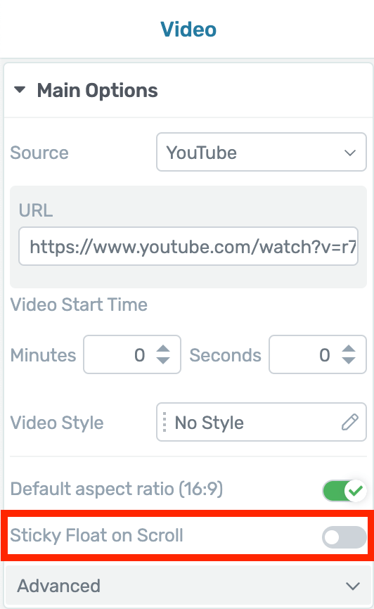
Look for this new toggle
When you toggle this on, a new set of options will appear. Take a look:
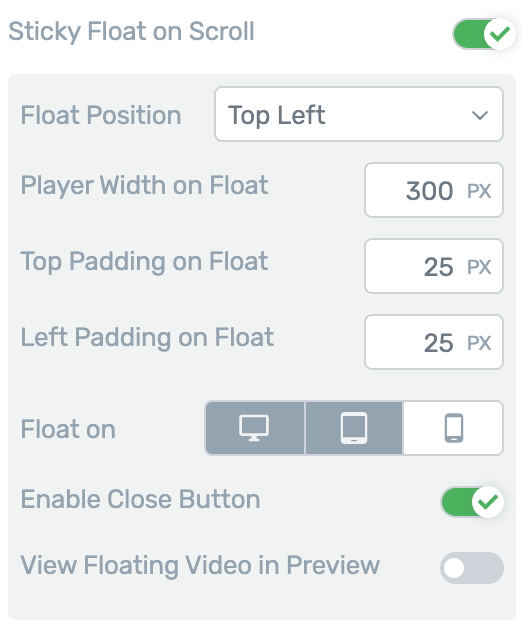
Configure your floating video behavior
You can choose which of the four corners you want your video to float, or you can choose 'keep position'.
Keep Position will orient the video with the top left corner of it's original placement on the page.
You can set the player width in pixels or percentage of viewport, and adjust padding on the two sides closest to your chosen corner.
'Enable Close Button' adds a small cross in the corner of the video so your visitors can close the floating video. Leaving this setting switched off forces floating video at all times.
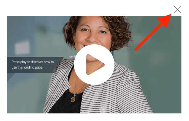
By default, we've disabled floating video on mobile where screen real estate is sparse, but you can enable it if you please.
Video size and padding options work on cascading responsive views too. That means changes you make to the floating video on tablet view will apply to smaller sizes (mobile) but not larger (desktop).
This means it's super easy to get floating video just right on all device sizes.
2. New Buttons with Smart Colors and Templates
We've released a subtle technical improvement to buttons... that also comes with 34 new button styles.
Now when you drop a button onto the canvas, it's going to look different out of the box. When you click the style selector, you'll see something new:
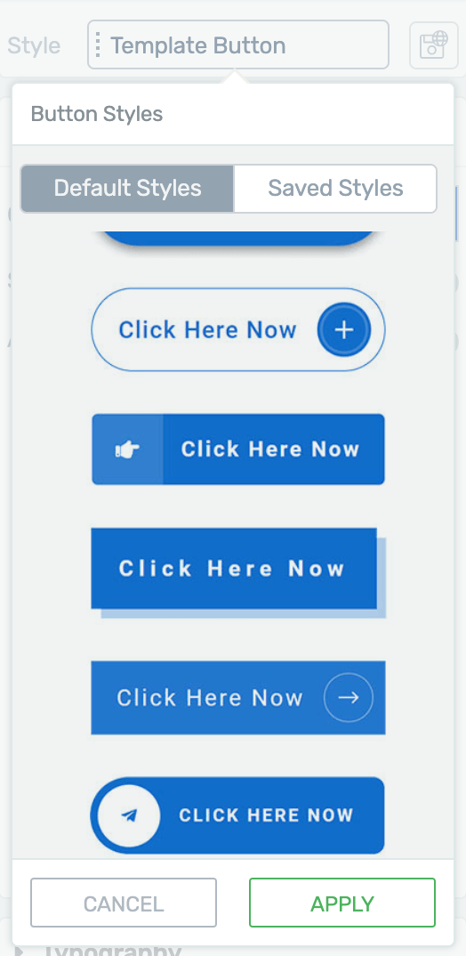
The new button style selector
From here, it's easy to see which button styles you have saved, and which ones are defaults.
The defaults come in two categories:
- 1Template Styles: these are the button styles pre-made for the landing page template or theme template that you are actively editing.
- 2Thrive Styles: these are 34 new button styles that work on any page.
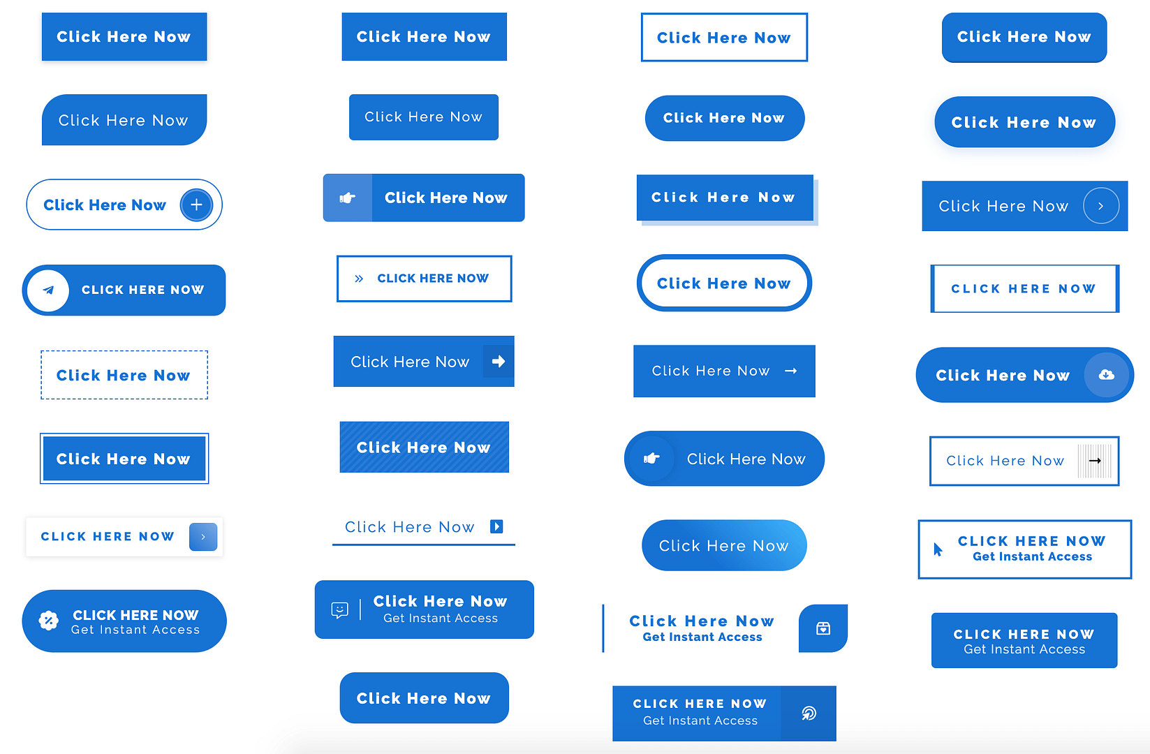
Click the screenshot above to see the Thrive Styles in more detail
What you won't notice at first is what's changed behind the scenes.
New Buttons are now Smart Color enabled. That means that with one click you can set a key color and the button will intelligently adapt.
That means any gradients, borders, hover colors, icon colors, backgrounds and font colors will match your selection.
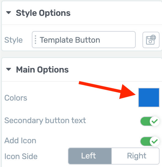
Set the Smart Color here
What's impressive about Smart Color technology is that it intelligently sets shades and tones related to the main color you've chosen.
If you choose a dark orange, you may see a lighter or less saturated orange used subtly on a border, or an even darker shade on a font. But you won't need to manually set those yourself. The Smart Color algorithm figures it out for you based on your accent color of choice.
Changing Style... Not Content
Once you drop a new button on the page, you can change the content of the button (text, icon and hyperlinks) and your choices will remain the same while you try out new styles.
Why is this helpful?
It means you can drop a default button on the page, change the text to say "Get Started" or "Reserve Your Seat" or whatever suits your business, and then cycle through new button styles to see how that same text will look.
Smart Color vs Master Color
If you've built your own buttons from scratch in the past, you may see they are using something called Master Color, which we have decided to move away from. Master Color lacked the versatility of Smart Color technology.
Master Color buttons will still work without any issue, but if you'd like to use the new Smart Color technology, you simply need to load a compatible style. Fortunately, that's just 2 clicks. Nothing will change if you leave your buttons as they are.
3. Page Blocks for Shapeshift, Our Thrive Theme Builder Theme
For those using the new Thrive Theme Builder, this is huge.
Shapeshift, our first fully-editable Thrive Theme now gets Page Blocks.
You might be familiar with our Page Block technology from our Smart Landing Page Sets.
Not sure what a Page Block is? Here's a video Shane made when we first announced Page Blocks in December 2019.
So, what does this mean for Thrive Theme Builder?
You might remember that Shapeshift already comes with 5 beautiful homepage designs.
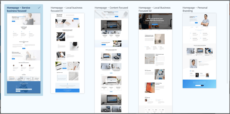
Fully editable Homepage templates in Shapeshift
But what if you want to quickly restructure your home page?
What if you want to use the hero section from one template, the testimonial design from another, and the opt-in form from a third template?
Page Blocks make it ridiculously easy to drop entire blocks of pre-built page templates onto the page and change their order.
To access it, open up any landing page template from the Shapeshift set and you'll find this new blue Plus button:
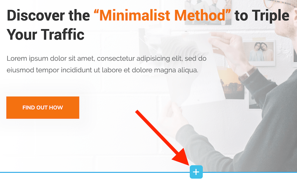
Click this button to add a new Page Block
When you click on this [+], a pop-up will open that lets you choose any page block from the entire Shapeshift set.
That's 125 beautiful page blocks. Click the toggle to match to your landing page colors and voila!
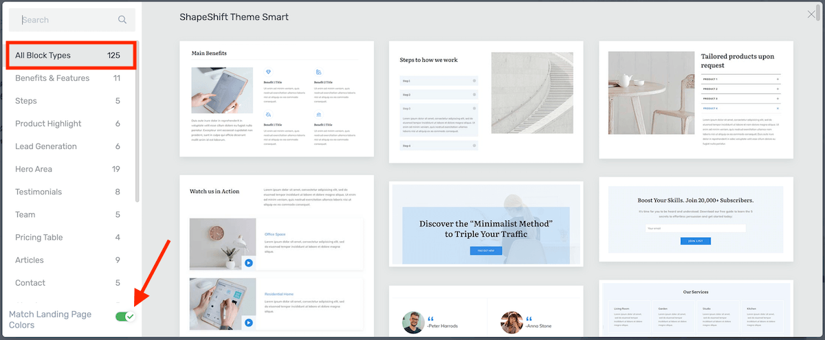
Choose from 125 page blocks for Shapeshift
This means you can mix and match blocks from one Shapeshift template to another, and piece together your dream homepage...
...Or About page... or Contact page... whatever you want!
If you're using Shapeshift with Thrive Theme Builder, look for the 3 green blocks above the landing page set. Any templates with those blocks are Page Block enabled.
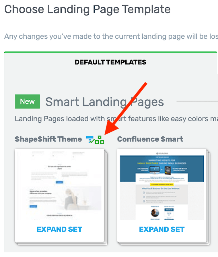
The 3 squares shows that a template is page block enabled.
If you'd like to build your own page from scratch, you'll find a Blank Page Template inside of the Shapeshift Set that is Page Block enabled.
You can see the blocks in action at 42.57 min into the tutorial "How to Build a Coaching Website from Scratch".
And see the blocks used to build a fully customized homepage here:
In order to see the page blocks, make sure to update Thrive Theme Builder, for this go into Appearances >> Themes >> Thrive Theme Builder
4. New Guarantee Box Designs
Are you offering a 30-day Money Back Guarantee on your product?
If not, you should be.
Generous refund policies and guarantees are known to boost your conversion rates by putting your money where your mouth is.
By reducing the risk of dissatisfaction, your customers are far more likely to convert, knowing that if your product isn't a fit for them they can get their money back.
To make it easier for you to flaunt your guarantee on a sales page, we've released 21 new guarantee box designs. Take a look:
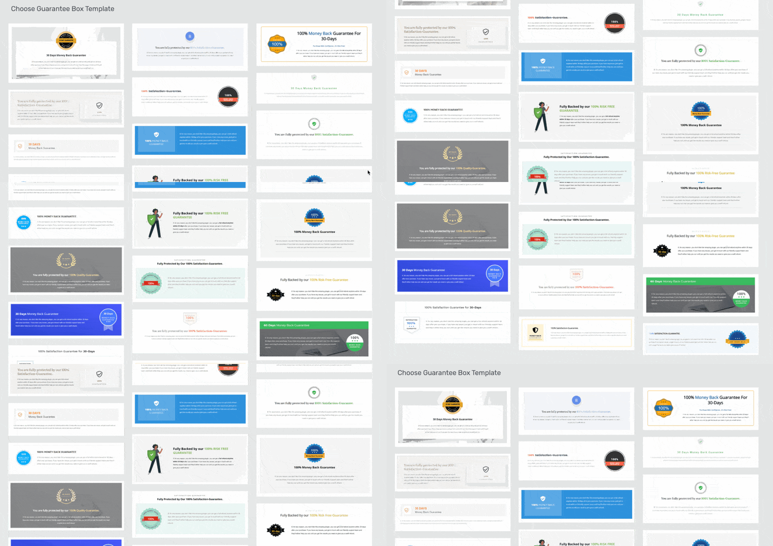
Look at these beautiful Guarantee Box templates
Of course, these new designs are editable and our designers have created some eye-catching new seals and ribbon designs too.
The key text areas on these seals are text elements, meaning you can easily change the wording of your guarantee to suit your product.
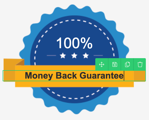
Guarantee Seals include editable ribbon text
With one click, you can drop a Guarantee Box right on your sales page.
Not sure where to put them?
Guarantee Boxes are an excellent way to relieve purchase anxiety, so we recommend placing them at the point on the page where your visitors are likely to feel unsure about buying. Usually that means placing them right after your pricing table or the first time you share your product's price.
Here's an example of one of the templates loaded right into this blog post:
You are fully protected by our 100% Satisfaction-Guarantee.
If, for any reason, you don't like this amazing plugin, you can get a full refund anytime within 30 days after your purchase. If you have any issues, just get in touch with our friendly support team and they'll either help you out until you get the results you need or give you a swift refund.
Guarantee Boxes are stylized content boxes, and can be found in your Thrive Architect elements panel. Just look for this icon:

Let us know what you think!
What do you think of Floating Video? Think you'll use the new Button Styles?
We love hearing your feedback on our features and your suggestions for new improvements, so please drop a comment below.


Thrive just keeps getting better and better…thanks guys ????????????
That’s the plan! Thanks Nick
Head and shoulders above other page builders. Continues to get better and add much requested features for sales pages
Is there any development on Thrivecart link with Apprentice?
Thanks Andrew. I know you’re one of our power users and it sounds like you’re working with Architect daily. If you see areas for improvement or features you’d like, let us know.
Yes, quite a lot of development with the Thrive Cart integration. We had to change our approach to the integration (the end result will be better for it) and prioritize Thrive Theme Builder, but we’ve now been working closely with the Thrive Cart team over the last month to speed up this development.
Hi Brad,
Thrivecart doesn’t include restricted membership levels in its current format.
Will that be changing so that it is a complete alternative to SendOwl?
The reason I ask is we are revamping our member area nad I’ve owned ThriveCart for a while and decided to set it up using SendOwl based on your integration with SO.
But I’d really prefer to use ThriveCart given we have had TC for 2-3 years so far and like the way its developing.
The Thrive Themes team could really add value to them as well with their editor upgrade 😉
We’re ironing out the finer details right now, so I won’t say too much incase things change. But our SendOwl integration never used membership levels either. Membership levels may sound good in theory, but they’re tedious and frustrating to manage when you add more courses and have to assign each one to it’s own membership. Our SO integration simplified that to: pay for a course (or a bundle), get access. Simple.
But if you have decided that membership tiers are best for your business, I’d suggest you look at Wishlist Member. It integrates easily with ThriveCart and with Thrive Apprentice and will let you group course access by membership level.
I second Brad’s response Graeme… WishList Member works well with Thrive Apprentice and ThriveCart. Powerful teammates and WishList Member has all the functionality you’ll need without the bloated bells and whistles of MemberMouse.
Man, I like it when you talk like that Brad… It will be a mucho welcome integration.
Love it
Have you set a date for when Thrive Theme Builder will be available as an individual plugin purchase? Rather than just for use by Thrive Themes Members.
We’re getting close to announcing a date, but we have some other features we’d like to add first. As soon as we know, we’ll email out about it. Our mailing list is the best place to get official answers first.
Great stuff, Brad! 😀
IMO, the addition of the Page Blocks in TTB is a game changer, making the already-awesome Theme Builder even more versatile! WooHoo! 😉
Thanks! <3
Oh yeah, that feature alone massively increases what you can do with Shapeshifter
Floating video?? Wow.
‘Wow’ is what we were going for
I’ve said it again and again but you rock Brad!! Thanks to you and the team for these updates.
You’re welcome, Denis
When I add a video to a page or post I use html code not youtube or the like where I get a link. Is there a way to incorporate the floating video that way, or must you use a url?
Hi Tony,
No this will only work with the “video element”. Where are your videos hosted? Because we have a lot of options for the video element (not just Youtube).
Absolutey brilliant.
Thanks Quentin!
I have already build two Websites with the Architect and I´m loving it. These add ons rock 🙂 Thanks and keep up your great work!
Glad to hear you’ve loving it, Michael
Any chance you could change the settings on the Video of Shane to allow to watch full-screen? Great stuff, just want to be able to watch more closely!
Oh yeah, my mistake. I’ve now changed that setting but if you’d like, here’s a direct link to the video on YouTube.
loving all these rapid improvements!!! Please don’t slow down now!! 😀
The 2020 roadmap is looking pretty nice. No slowing down at all!
Where does WooCommerce integration with ShapeShift sit on that roadmap?
Very soon – we’re got a version almost ready for beta at the moment.
I really love everything Thrive is doing, but there’s one feature that’s missing and that’s some type of slider for photos, or content. I’d feel so accomplished with this feature.
Shane make a video, about why sliders suck… here’s the link: https://www.youtube.com/watch?v=5sEwPgrYbBU
I don’t think they will implement that 😉
Hope it helps!
We’re coming around to the idea of it. Not because our opinion has changed (sliders still suck), but we might be able to create something that feels similar without all the conversion-sucking badness.
We’ve been looking into this. We have a strong stance that sliders are often misused, but we’re brainstorming how we could do it better. Can you tell me a super specific example of exactly what you’d like to do? It’ll help us
I find sliders to be distracting when I land on a site using them. They’re weird to me, like eating a soup sandwich while riding a moving sidewalk… lol
I’m just a beginner here and now making my own website for ebook. This is additional info. Thank you!????
Loving these changes. These are so helpful and easy to use for us non tech guys and gals it is wonderful. Thanks keep them coming. Hope everyone at Thrive Themes is staying healthy during these times.
Thanks Bill. Everyone on our team is working from home at the moment and taking the virus threats seriously. Hope you’re staying healthy too
Thanks again to all for your great and hard work. I love the theme builder and the way you continue to improve all the plugins!
Definitely industry changing!!
We’ve got some updates for Thrive Theme Builder planned that are going to make it even more of an industry changer too
Ok, your Bradness… No more cliff hangers! lol
I know, I know… Cliff hangers suck. But we keep our roadmap closed and it’s pretty exciting. So all I can do is drop hints until we’re release ready.
Just when I thought it would be difficult to go further with TT, you pull more rabbits out of the hat! You don’t have magicians but wizards bringing the goodies.
Just installed Shapeshift on a new site so need to crack on with the new nuggets.
Thanks very much to all of you at Thrive Themes – the best!
It’s a challenge to think of “How can we make this even better?” Feedback and suggestions always help too. Thanks David, enjoy the new nuggets
You are doing a very great job!!!!! Congratulations!!
SOLID. I love the floating video feature – I dropped everything and enabled this on all my sales videos. Thanks!
Awesome! Let us know if you see a boost in conversions
Hi, great features, thanks! 🙂
I just would like to report two issues with the floating video:
1. When I click on it, it doesn’t pause the video but starts to play from the beginning (tried it with Vimeo).
2. It disappears behind elements that has not the default Z-index even if I set the video Z-index to a higher number.
Hey Andras, thanks for reporting this. For 1, yes we’ve identified a bug causing this and already have a fix for it which will be included in our update next week. For 2, this is a limitation of HTML/ CSS but fortunately you can work around it. The parent container for the video needs to have the biggest z-index on the page, which it should by default. If there’s a template you’re having issues with, let us know which one and we’ll update it. Otherwise, hop on our support forum and our team can walk you through some changes you can make to your page. You should be able to get the same page design without this issue just by reordering a few elements, their margins and z-index.
Hello Bradley,
These are great enhancements. I would like to suggest that you add a global element or global widget feature to save elements to be reused anywhere.
Right now we can save global templates, but this is at the template level. But what if I just want to save minor elements like grouped columns or anything else for reusing on other posts and pages?
Keep up the good work.
Hi Trishan,
Do you know about the “symbol” option. This allows to save any elements and then use them on any post or page. This way you can save let’s say a “guarantee box” and reuse that box on each one of your sales pages.
The moment you change your guarantee, you can change it ones and it would change in every instance.
If you don’t want your elements to be linked (= you want to be able to use the layout and style but with different content) then you can save elements as a templates.
Here’s a full explanation of both functions: https://thrivethemes.com/tkb_item/how-to-use-the-templates-and-symbols-element/
Thanks, Hanne for explaining this.
I now noticed the Symbol option, which is what I was looking for. Just perfect!
Yay 😀 Happy that was what you were looking for!
Just integrated the flaoting video and smart button into my site. What a simple trick! Thanks, for the update, Brad.
Hi!
I just really impressed with the way you presented this blog. The images that u have posted are giving better and better options and making me fall for Thrive.
WooCommerce Integration will lead to the new revolution??
Awaiting for such a perfect version!
Keep Rocking 🙂
Nice, especially the floating video!
Feature request: can I please have the floating effect for other elements like content boxes?
I use the html element with an iframe from a not supported 3rd party for my video’s and would like to use the floating effect for this video too.
Hmm, there would be a lot of complications with adding this for content boxes. I’ll mark down the request, but I’d suggest playing around with the sticky scroll behaviour option we already have to see if you can’t create something usable from that.
I tried, but I cannot make it go smaller and go to the side.