Over half of global web traffic now comes from mobile devices (Statista). That single shift changed how opt-in forms need to be designed. When users land on a page and face tiny fields, awkward layouts, or tap targets that demand precision, they abandon the form — fast. Research consistently shows that mobile friction leads to form drop-offs as high as 67% (Zuko Analytics benchmark study).
Anyone who studies mobile behavior can see the pattern. Mobile users move quickly, skim aggressively, and make decisions in seconds. A form that feels cluttered, slow, or demanding loses the signup long before the submit button enters the picture.
After years of building and testing opt-in forms across different devices, one truth stands out: mobile conversions respond to their own set of rules. When you design with that reality in mind — thumbs, small screens, limited patience, and real-world usage — everything changes.
This guide breaks down the seven practices that consistently lift mobile conversions and help you turn more visitors into subscribers.
You’ll Leave a Lot of Money on the Table Without This Strategy…
Think about how often you use your phone to browse the web—it’s a lot, right? Well, it’s the same for your visitors.
Most people these days look at websites on their phones or tablets. That’s why having web forms on your website that work well on mobile devices is super important.
When your forms are easy to use on a small screen, website visitors are likelier to fill them out without getting frustrated.
And here’s another big reason to make your create a mobile responsive design for your forms: more form submissions means more chances for you to grow your subscriber list or make sales.
People tend to give up on forms that are a pain to fill out on their phones. Making your forms easy and pleasant to use on any device opens your doors wider to more visitors.
This makes your site a friendly place for everyone, no matter how they choose to access it.
8 Practical Tips to Create Mobile Responsive Forms that Convert
This list includes actionable tips you can implement today to achieve a good conversion rate — whether you run a blog, eCommerce website, or service-oriented business site.
Practice #1: Use Mobile-Specific Designs (Not Just Responsive)
A responsive form only shrinks. A mobile-specific form performs.
When a visitor opens your site on a phone, the form needs to feel deliberately crafted for that space — shorter copy, lighter structure, cleaner flow. A scaled-down desktop form can’t deliver that. Mobile users scan fast, tap fast, and leave fast when the layout feels cramped or chaotic.
The strongest mobile friendly forms follow a simple pattern:
- A single-column layout with no visual clutter
- A headline that gets to the point without detours
- One clear action button
- No decorative weight that slows down loading or buries the form
A dedicated mobile version gives you full freedom to simplify the design without touching your desktop form. This is often the moment conversions jump, because the experience finally matches the way people browse on a phone.
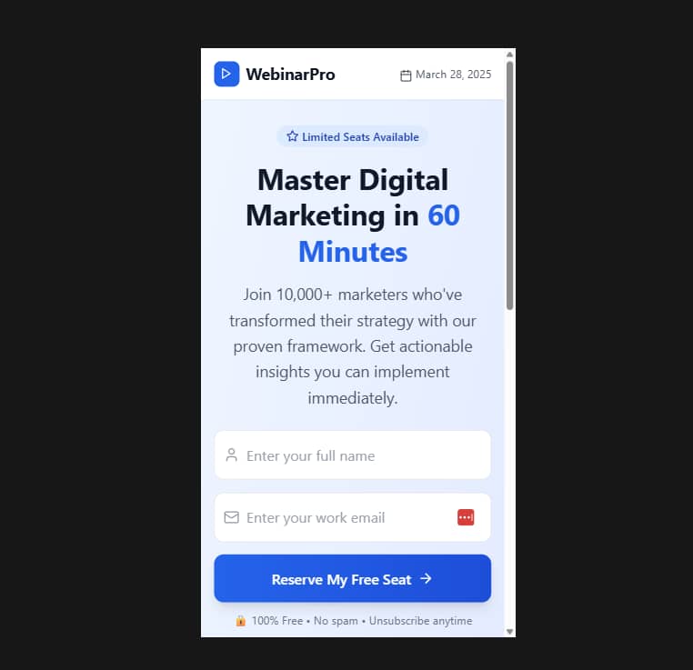
Thrive Leads and Thrive Architect make this incredibly straightforward.
Both tools allow you to create a completely separate mobile design — different layout, different spacing, different copy — and show it only to mobile visitors. No plugins, no hacks, no duplicate pages. You choose exactly how the mobile form looks, how it loads, and how much friction it removes.
That level of control is what turns a form from “responsive enough” into “mobile-ready and conversion-focused.”
Practice #2: Design for Thumb-Friendliness
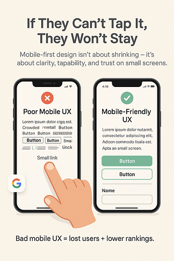
Most mobile visitors use one hand. Their thumb decides how far they scroll, what they tap, and how quickly they move on. When your opt-in form works with that natural motion, the entire experience becomes smoother and faster.
The strongest mobile forms treat the screen like a physical space shaped around human movement. The most comfortable area — the thumb zone — sits in the lower and center regions of the screen. That’s where your essential actions belong.
To create a thumb-friendly form:
Place your main CTA inside the thumb zone
Keep every interactive element in a clean vertical line
Space each tap area generously to avoid mis-taps
Use large tap targets, with 44×44 px as your baseline (Apple’s Human Interface Guideline)
When a form respects reach, pressure, and speed — the tiny ergonomics of mobile — visitors glide through it without friction. They complete the form because the design supports the way they physically hold the device, not the way a desktop layout traditionally behaves.
Thrive Leads and Thrive Architect give you full control over spacing, tap areas, and button placement across mobile breakpoints. That flexibility lets you design for the actual hand holding the phone, not the hypothetical one imagined in old responsive templates.
Practice #3: Keep Form Fields to an Absolute Minimum
Mobile visitors move quickly. They skim, decide, and act in a matter of seconds, and every extra field slows that momentum. A long form feels heavy on a small screen, and that weight shows up in your analytics as hesitation, drop-offs, and “maybe later” moments that never return.
Shorter forms perform better, especially on mobile. Reducing fields lifts completion rates because you remove the micro-decisions that interrupt progress.
The most effective mobile opt-ins usually stay within this range:
Email only for low-friction lead magnets
Name + email for slightly higher intent
Additional fields only when the offer requires them

When more detail is necessary, help users with tap-based inputs:
- Dropdowns
- Radio buttons
- Checkboxes
- Pre-filled suggestions
These interactions feel lighter on a phone and reduce the chance of typos. Open-text fields should be rare — not forbidden, but reserved for information you genuinely need to deliver value.
💡The short version: every field you remove clears the path. Mobile forms convert because they feel quick, simple, and respectful of limited attention.
Practice #4: Use the Right Form-Building Tools
Not all form builders are created equal, especially when it comes to mobile-friendliness. If you're using an outdated or inflexible form builder, your forms will likely not render properly or provide an optimal experience on smaller screens.
The best way to avoid this is by using a form-builder that embraces mobile-responsiveness and conversion-focus.
Our top recommendation? Thrive Leads.
This ultimate WordPress plugin is designed to help you effortlessly create engaging, mobile-friendly opt-in forms.
Whether you're aiming to expand your subscriber list or boost your lead generation, Thrive Leads is the tool you've been searching for. Here’s why it’s a game-changer:
Forms for All Occasions: Choose from a large variety of form templates like pop-ups, sticky ribbons, and in-line forms. Each one is fully optimized for mobile use.
Drag-and-Drop Simplicity: Our user-friendly builder allows anyone to create beautiful, custom forms quickly—no need to know HTML or CSS.
Targeted Displays: Make your forms appear to the right people at the right time with our smart targeting options, especially effective for mobile visitors.
Effortless A/B Testing: Unsure which form design is most effective? Test multiple versions easily to see which one drives the best results.
Perfect on Any Device: Every form is responsive, ensuring they look and function perfectly on any screen size.
Easy Integrations: Connect seamlessly with all the major email marketing services, streamlining your workflow and making lead management a breeze.
… and so much more!
Practice #5: Leverage 2-Step Opt-Ins for a Smoother Mobile UX
A mobile form can feel like work. A button never does. That’s why 2-step opt-ins consistently outperform traditional forms on small screens — they feel lighter, faster, and far less demanding.
The pattern is simple:
Step 1: A clear button that sparks curiosity or offers value.
Step 2: The form appears once the visitor signals interest.
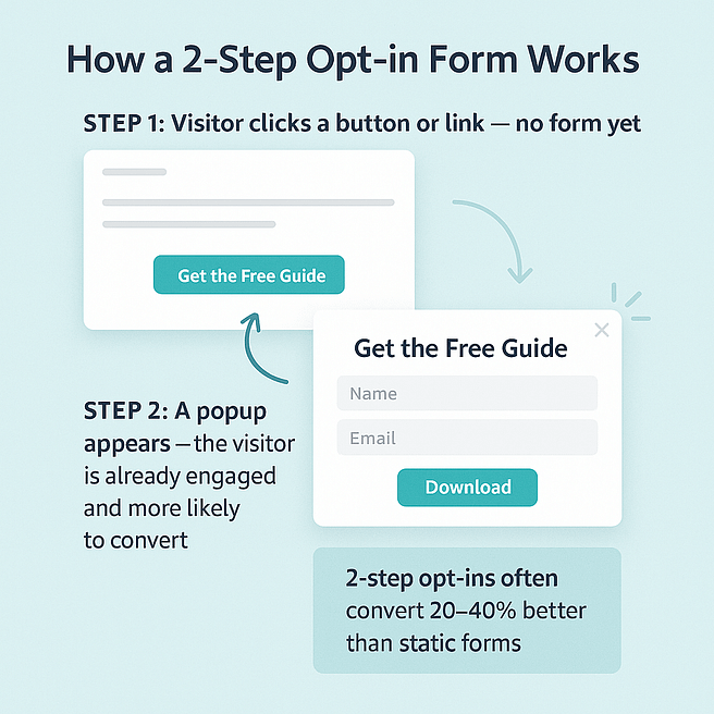
This small shift changes everything. A button removes the initial resistance a full form creates. Once someone taps it, they’ve already committed, and that momentum carries them into the second step with far more intention. The opt-in no longer feels like an interruption — it feels like a natural next action.
2-step opt-ins work beautifully for:
Lead magnets
Discount offers
Content upgrades
Resource libraries
Inline calls to action
They also soften the mobile experience. You avoid pushing a heavy form too early, which helps visitors stay engaged long enough to understand the value behind the offer.
Thrive Leads makes this approach effortless. You can turn any mobile form into a 2-step opt-in with one configuration change, pair it with clean triggers, and keep the interaction feeling smooth from the first tap to the confirmation message.
Practice #6: Use Mobile Keyboard Triggers
Nothing slows a mobile visitor down faster than the wrong keyboard. The moment someone has to search for symbols, switch between number pads, or fight autocorrect, their patience drops and the form loses another potential subscriber.
Mobile-friendly forms anticipate the keyboard a user needs before they start typing. A few smart input types and attributes take care of that instantly.
Use these to remove friction:
<input type="email" autocorrect="off" autocapitalize="off">
<input type="tel" pattern="[0-9]*">
<input type="text" autocapitalize="words">
- type="email" pulls up the email keyboard with the @ symbol.
- type="tel" brings up the number pad for phone fields.
- autocorrect="off" prevents mobile devices from “fixing” valid email addresses.
- autocapitalize="off" stops unwanted capital letters in usernames and email fields.
- autocapitalize="words" helps users enter their names quickly and correctly.
These small adjustments create a smoother, faster input experience. Users spend less time correcting mistakes and more time moving through the form with confidence.
Practice #7: Rethink Your Pop-Up Triggers for Mobile
A desktop pop-up can afford to be bold. A mobile pop-up needs to be thoughtful. When a form pushes itself onto a tiny screen too early or too aggressively, users react instantly — and not in your favor. Mobile visitors leave fast when the timing feels off.
The goal is to introduce the opt-in at a moment that feels natural, not forced. Mobile browsing has a rhythm, and your trigger should follow that rhythm instead of interrupting it.
Stronger mobile trigger strategies often include:
Scroll-based triggers (30–50% scroll works beautifully)
Time-delayed pop-ins that wait for genuine engagement
Tap-to-open 2-step pop-ups that feel lighter than full automatic pop-ups
Mobile-specific exit-intent variants where supported
Inline or ribbon-based opt-ins that blend with the page instead of blocking it
When the opt-in arrives at the right moment, visitors stay longer, feel less pressured, and convert at a higher rate. This single timing adjustment can outperform a redesign because it respects the limited space and attention mobile users have.
Practice #8: Prioritize Form Loading Speed
Mobile users reward speed. Anything that loads slowly on a small screen creates friction long before someone reaches your form fields. A delay feels heavier on mobile because people browse in motion — between tasks, in line, on trains, during tiny pockets of attention. Slow forms lose those moments immediately.
A fast-loading mobile form does three things well:
- Shows up quickly
- Focuses attention immediately
- Reduces the cognitive load of “waiting”
The biggest performance gains come from removing visual weight and unnecessary assets. Heavy images, decorative backgrounds, oversized scripts, and complex animations drain speed and steal conversions. Even a single second delays engagement.
To keep your forms fast on mobile:
- Compress any image you truly need
- Remove decorative elements that add size without adding value
- Use simple, lightweight layouts
- Keep animations subtle or skip them entirely
- Test performance on an actual phone, not just a desktop preview
When your form appears instantly, the entire interaction feels smoother. Users move through it with more confidence because nothing blocked their momentum at the start.
Next Steps: Optimize the Rest of Your Lead-Gen Funnel
Creating the right types of forms is one thing. But you also need to work on your overarching lead generation funnel to convert more of your audience into leads.
The success of your new forms also depends on ensuring you attract the right audience and guide them to see the value in your offer, convincing them to sign up.
Here are four more tutorials to help you optimize your forms for more conversions:
Mobile-Friendly WordPress Forms: Turn These Tips into Action
With these tutorial, you can rev up your lead-generation and gain more leads through your mobile opt-in and contact forms.
And Thrive Leads helps you get this done fast and with ease. Our templates were built with conversion optimization in mind so you don’t have to spend hours trying to figure out the best design principles for your forms.
Whether you’re a blogger who wants to turn more readers into subscribers, or an eCommerce store owner who’s trying to get more leads in their funnels, Thrive Leads can help.
The best part? You can get this plugin for a really great price.
But don’t just take our word for it.
Get Thrive Leads and start turning more visitors into subscribers today.


Hi Hanne,
Thank you for your tuttorials and all the good stuff Thrive Themes is creating for us. Since I started using the new Architect, everything is so easy to change for mobile users – including opt-in forms. Super time saver.
Thanks Irena!
Thank you Hanne I am just in the middle of working out how thrive leads work, and this video along with all the others, the Thrive team have produced are very helpful.
As I am a new user to the thrive leads plugin, the power of it becomes more and more evident as I learn. Once again thank you.
Stoked to hear that Stephen!
Excellent tutorial Hanne, useful information and well explained. Many thanks.
You’re welcome Helen
Hi Hanne, thank you for this video. I am relatively new but very excited about using all of the Thrive Themes plugins. Right now I’m trying to understand how to integrate Thrive Leads with Thrive Architect. In the video you started out editing in TL, but then you were editing the form in TA and I’m not sure how you got there. I thought that all the form editing had to be done in TL and then the short code is added to TA – making the form uneditable in TA? Sorry… I’m still trying to learn how these two plugins talk. I guess my question is… How do you (or
CAN you) use
Thrive Architect to edit a form that you created in Thrive Leads? Thank you!
Hi Lisa,
In the video I’m staying at all time in Thrive Leads… The Thrive Architect editor you’re seeing IS part of Thrive Leads so I understand your confusion 🙂
Also, in the video I’m not using a shortcode form but a leadgroup. This means that you will set the targeting options on lead group level.
So for example here, I’m creating a screenfiller and a ribbon that will show on all blog posts. For this, I never have to leave Thrive Leads.
If you haven’t already, I suggest you have a look at the quickstart video for Thrive Leads which will clarify some of these points.
Thank you for your informative explanation and link to the Knowledge Base. I think my confusion is when using the Thrive Architect LANDING PAGES, which already have awesome forms. I’m confused about how to integrate Thrive Leads with these pre-built forms, like the ones on the new Atomic Landing Pages. From what I currently understand (which is limited), I need to delete the form in the pre-built landing page and replace it with the short code from form I build in Thrive Leads? Is that right? Thank you for your patience as I get up to speed!
PS If you ever want to do a video showing best practices on how to integrate Thrive Leads with one of the awesome pre-built landing pages in Thrive Architect, I’d be your first thumbs up! 🙂
Ok I see 🙂
Yes that would be the way to go (I suggest you save the opt-in form from the landing page as a content template, that way you can use the same design when you start from a blank shortcode by simply loading the template 😉 )
And as a matter of fact, I’m working on a tutorial Thrive Leads and landing pages so keep an eye open for that one!
Hello Hanne,
Well explained again, thanks!
I notice that a lot of new videos are coming out right now and all of them are very usefull.
What I am really hoping, wishing for is new, or improved themes from Thrive Themes for the blog part of my website. Any Idea when you are launching new themes :):):)
Hi Daphne,
We’re starting on a new theme but I can not give you any ETA for that yet 🙂
Wanna thank you for all your tutorials. They are of great help
Happy to hear Tom!
Hi Hanne,
Because I require additional input fields for my opt-in forms, I can’t use the Thrive Leads-Active Campaign API, but must instead use pasted HTML code. Do all the mobile design innovations work equally well when the autoresponder-Thrive Leads API is not used, or are there some limitations which we should be aware of?
Hi Stan,
This should have no influence on the mobile editing features.
In my experience with both Content Builder and Thrive Leads (pre-Architect versions), my mobile designs displayed differently on not only on iOS vs Android operating systems, but also on different devices (possibly due to different screen sizes). I assume that Architect’s Responsive menu’s mobile view indicates how the page would appear with one specific screen height-width dimension. What are those height and width dimensions? Consequently, I assume that there’s no guarantee that the page would appear identically on a variety of mobile devices. If so, the prudent designer is well advised to continue to test pages on a variety of iOS and Android devices and adjust individual pages to display reasonably well on a ‘happy medium’ of devices. Is this correct?
Hello Stan,
I wrote this article explaining some of the technicalities of mobile editing. In short: it’s the width of the viewport that determines which styles are shown. The exact dimensions are in the article linked above.
When I try to put styled list or video with thrive architect, it shows Time and doesn’t save.
I use chrome and windows. Tried with other browsers but not working.
Hi,
Could you please open a support ticket on the forum if this problem persists? They will be able to help you out 🙂
how can I decrease the letter spacing in the styled list?
Hi Milaua,
You can use the “list item spacing” on the complete “styled list” element although the slider doesn’t go under zero, you can add a negative input there if necessary.
Wow, this is incredible! Thanks a lot Hanne for showing it, I had no idea Thrive Leads could do that! You guys keep improving on your awesomeness 🙂
You’re welcome Mary!
the best themes in the world, I simply love, 90% of my projects I use, they are to be congratulated!
AMAZING TEAM…
Can i give you a suggestion?
probably now it is good to integrate or make a video about the new “send to messenger” plugin of facebook… The new era is coming
Great article, very good indeed other things to be measured are the data examples in my country Venezuela, people connect on the internet in 70% by their mobile device, 3% with tablet and the remaining 27% by desktop pc and laptop, the sad thing is that the vast majority is in some of these social networks all the time Youtube, Instagram and Facebook
Thanks for sharing
Very helpful information I promise to get it a try thank
Thanks Mark
I loved this information on opt-forms and it brings up a question. How do you add extra question fields to your opt-in form? Sometimes you need more than just name and email. Thanks
Hi James, for that you would need to connect the form with an HTML form (and not through API)
Thank you for the explenation about the opt-in form.
Sadly i see the ribon, in content and lightbox appearing in my desktop and also on my mobile. Enfortunaly the ribbon, and in content doens’t show on my mobile. But the lightbox appears on my mobile.
So little bit strange. Can you give my advice? Thank you in advance
Not sure what you mean… Would you not want the lightbox to show?
Love your plugins, definitely some nice optins here.