

TL;DR: How to Increase Conversion Rates
If your website gets visitors but too few of them buy, sign up, or fill in a form, these are the eight fixes I'd make first. Every one of them comes with evidence, either from our customers, from our own A/B tests, or from published research:
- Speed up your site: a 0.1-second improvement lifted retail conversions by 8.4% in a 30-million-session study.
- Make your value obvious in 5 seconds: if visitors can't tell what you offer, nothing else on this list matters.
- Put proof next to the decision: we added two testimonials to our own sales page and measured a 25% lift.
- Use a quiz to qualify visitors: how a national mold remediation company turns readers into leads.
- Segment so your follow-up stays relevant: two customers, five audience profiles between them, better launches for both.
- Remove friction from forms and checkout: roughly one in five abandoned carts is the checkout's own fault.
- Test your offer, not just your buttons: one creator launched the same course four ways and let buyers pick the price.
- Use urgency only when the deadline is real: fake countdowns cost you more trust than they gain you sales.
If you only have time for two, start with proof and friction. Those are the fixes closest to the money.
Here's a frustrating situation I know too well: the traffic is coming. Your analytics say people are visiting, reading, even scrolling all the way down. And then they leave without buying, subscribing, or filling in a single form.
Working at Thrive Themes, I have an unusual window into this problem. We build conversion tools, so I get to see what actually works on real customer websites, and we test on our own pages too. That changes what I'm willing to put in an article like this. You won't find the recycled Expedia anecdote here, or 39 "hacks" padded out to fill a scroll bar. You'll find eight fixes, and next to each one, the evidence that earned its spot.
Let's get your visitors converting.
What Counts as a Conversion (And What's a "Good" Rate)?
Before we fix anything, we should agree on what we're measuring, because I've watched businesses chase vague goals and call it optimization.
A conversion rate is the percentage of visitors who complete a desired action on your website. The math is simple: divide your conversions by your total visitors and multiply by 100. If 1,000 people visit and 50 sign up, your conversion rate is 5%.
What's a "good" number? For most websites, somewhere between 2% and 5% is typical, but honestly, the benchmark that matters is your own current rate. A good conversion rate is one that's better than last month's. If you want to see how your numbers stack up against your industry, we compiled over 150 data points in our conversion statistics roundup.
One distinction worth keeping: a macro conversion is the primary goal that makes you money (a purchase, a booked call), while a micro conversion is a smaller step toward it (an email signup, a pricing page visit). Track both. Micro conversions are your early warning system.
How to Increase Conversion Rates: 8 Fixes With the Evidence Behind Them
Now for the fixes themselves. Each one follows the same promise: I'll tell you what to change, show you why it works, and then show you the evidence, either from a Thrive customer's real results, from our own A/B tests, or from published research I've verified at the source. Work through them in order if your whole site needs help, or jump to the one that matches your biggest leak.
1. Speed Up Your Site
The fastest way to lose a conversion is to make someone wait for the page. Speed is the first impression, and visitors read slowness as untrustworthiness before they've seen a single word of your copy.
I used to think speed advice was overblown, the kind of thing developers say to justify their invoices. Then Google and Deloitte published a study that tracked 37 brand websites across 30 million user sessions, measuring what happened when mobile load times improved by just 0.1 seconds. Not one second. One tenth of one second. Retail sites saw conversions rise by 8.4% and average order values rise by 9.2%. Travel sites saw conversions rise by 10.1%.
That's a tenth of a second buying you more than most redesigns will. Here's where those tenths hide:
If you want the full treatment, work through our site speed optimization guide, and if Google's metrics are flagging you, the Core Web Vitals fixes article will help you sort them out.
2. Make Your Value Obvious in 5 Seconds
A visitor landing on your site is asking one question: "Is this for me?" If your page doesn't answer it within about five seconds, they don't dig deeper to find out. They leave.
The test I run on every homepage I audit is brutally simple. Cover everything except the headline and subheadline. Would a stranger know what this business does, who it's for, and what to do next? You'd be surprised how many beautiful websites fail it.
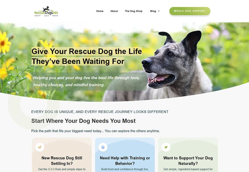
Look at how one of our customers handles this. Debi McKee's Rescue Dogs 101 tells you everything above the fold: who it's for (people adopting rescue dogs), what you get (guidance that actually works), and what to do next. No cleverness, no mystery, and that clarity is part of why her site converts readers into buyers of her courses and guides.
To pass the test yourself:
Your hero section is where this battle is won or lost, and we wrote a full guide on building a hero section that stops the scroll.
3. Put Proof Next to the Decision
People don't hesitate because they misunderstand your offer. They hesitate because they don't yet believe it. Proof, placed at the exact moment of doubt, is the strongest conversion lever I know of, and this is the one fix on this list where I can show you our own receipts.
Back in 2021, we ran an A/B test on our own Thrive Architect sales page using Thrive Optimize. The only change: we added two testimonials. Over six weeks and roughly 20,000 visitors, the version with testimonials converted at 2.75% against the control's 2.2%. That's a 25% lift in conversions, 13% more sales, and 19.6% more revenue per visitor, at a 98% confidence level. Two testimonials. That's the whole change.

The research world backs this up at scale. Northwestern University's Spiegel Research Center analyzed how reviews influence purchases and found that a product displaying just five reviews is about 270% more likely to be purchased than the same product with none. And here's my favorite detail from that study, the one I bring up whenever someone worries about a less-than-perfect rating: purchase likelihood peaks between 4.0 and 4.7 stars, then drops as ratings approach a perfect 5.0. Shoppers trust a flaw. A perfect score reads as fake.
So the play is:
If gathering this proof feels awkward, our guide on collecting and displaying testimonials makes it a process instead of a favor. Thrive Ovation exists because we got tired of doing it by hand.
4. Use a Quiz to Qualify Visitors Before You Sell
Most visitors aren't ready to buy, and treating everyone like a hot lead converts no one. A quiz flips that: it gives the visitor something genuinely useful (an answer about their own situation) while telling you exactly who they are and what they need.
I'll let a real business make this case. HomeCleanse is a mold remediation company that grew from a small New Jersey operation into a national brand, and they're a Thrive customer we've interviewed, so I'm not guessing at how they work. Interactive content is a deliberate part of how they grew. On their founder's website, they run an advanced mold quiz: you answer a series of questions about your home, and your results tell you how likely it is you have a mold problem. If the answer is "likely," you know exactly who to call. Their CMO, Scott Broschart, is blunt about what it does for the business:
"Thrive Quiz Builder is my favorite plugin. I use it on a site and it's a tremendous lead magnet for me." -- Scott Broschart, HomeCleanse

What I like about the quiz play is that it converts by being helpful. Nobody feels sold to while answering questions about their own house. A few shapes this can take for your business:
Where the leads go next matters as much as the quiz. A quiz that ends with a score and no follow-up wastes the goodwill it just earned. Connect the results to a tailored email sequence, which is exactly what the next fix is about.
HomeCleanse's whole growth story is worth reading: see the full case study.
5. Segment So Your Follow-Up Stays Relevant
Here's the quiet conversion killer almost nobody audits: sending every subscriber the same message. Relevance is what converts a lead into a customer, and you can't be relevant to someone you know nothing about.
Two of our customers prove this from different directions.
Debi McKee noticed her Rescue Dogs 101 audience wasn't one audience at all. In her words: "There's three different types of people that come to me. People who have just adopted a dog, people who are struggling with either a training issue, and people looking for ways to keep their dog healthier." So each group gets its own lead magnet and its own email sequence. Someone who's had their dog for ten years never gets the "bringing your new dog home" email. The results she reports are exactly what you'd hope: higher engagement, fewer unsubscribes, and better product launches.
Jorge de los Reyes Martínez runs En Busca Del Fuego, a business education platform, and he takes it further. A qualifying quiz sorts his audience into four profiles, and his website then shows different courses and content to each profile. Two people logging into the same site see different experiences, each built for where they actually are.
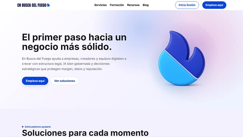
"If you want to capture leads and potential clients effectively, then you need to start using Thrive Quiz Builder." -- Jorge de los Reyes Martínez
You don't need four profiles on day one. Start the way Debi did:
Our email segmentation guide walks through the setup step by step.
Both stories go deeper than I can here: Debi's case study and Jorge's case study.
6. Remove Friction From Forms and Checkout
By the time someone reaches your checkout or your signup form, they've already decided to say yes. Every unnecessary field, surprise cost, and forced account creation is you talking them back out of it.
The research on this is sobering. The Baymard Institute, which has spent years studying nothing but e-commerce usability, puts the average cart abandonment rate at around 70%. Seven in ten carts, loaded and left. And when they ask shoppers why, roughly one in five points at the checkout itself: too long, too complicated. Baymard's testing found most checkout flows can cut 20 to 60% of their form fields without losing anything the business actually needs.
So audit your own flow with one question per field: "Do I need this to complete the transaction?" Not want. Need.
And if you want to see how far the friction-removal logic can go, I love what Stephen McCain, another Thrive customer we've profiled, did. He took his most popular lead magnet, the thing every marketer gates behind an email form, and ungated it completely.
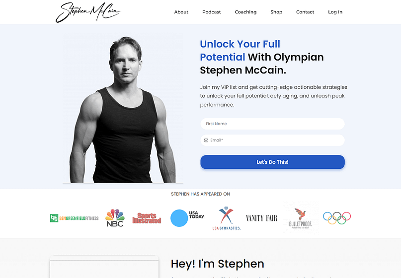
Free, no email required. It sounds like giving away the store, and instead it built the kind of trust that made his paid offers easier to sell. I'm not saying you should ungate everything. I'm saying the businesses that win this game are the ones asking "what can I remove?" while everyone else asks "what can I add?"
The full story is in Stephen's case study, and if abandoned carts are your specific leak, start with our cart abandonment guide.
7. Test Your Offer, Not Just Your Buttons
A/B testing has a reputation problem: people think it means arguing about button colors. The tests that actually move revenue are bigger than that. They test the offer itself, the price, the format, the promise.
Debi McKee's course launch is the best offer-testing story in our case study library, and I keep coming back to it. She launched her Canine Play Therapy Program four different ways in a single year: a beta version at a lower price while she was still building it, a self-paced version priced between $77 and $97, a version with added coaching, and a membership model for ongoing support. She fully expected the membership to win. It got two signups. The market picked the self-paced course at $97, and she only knows that because she let real buyers vote with real money instead of trusting her own prediction.
"I thought it was going to be a great solution. In my mind, people needed that motivation, that kind of surrounding of other people who are going through the same situation." -- Debi McKee, on the membership model that flopped
That's the mindset. For the mechanics on your own pages, this is what Thrive Optimize is for, and our 2021 testimonial test from fix #3 doubles as the worked example: one variable changed, traffic split 50/50, six weeks of patience, and a decision made at 98% confidence instead of on a hunch. If you've never run a test, our WordPress A/B testing guide takes you from zero to your first result.
One rule keeps tests honest: change one thing at a time, and let the test run until the numbers are statistically significant, usually a few weeks. Ending a test early because one version is "clearly winning" is how you ship a coin flip and call it data.
8. Use Urgency Only When the Deadline Is Real
Urgency works because deadlines force decisions. It backfires because visitors have seen ten thousand fake countdowns, and they can smell the eleventh.
My honest position is that urgency is the most dangerous tool on this list. Used truthfully (a bonus that genuinely expires, a cohort that genuinely closes, seats that genuinely run out), it converts fence-sitters who would otherwise postpone forever. Used falsely, it doesn't just fail, it contaminates every other trust signal on your page. If the countdown resets when I refresh, why would I believe your testimonials?
So the rules I'd hold you to:
This is exactly the problem Thrive Ultimatum was built to solve: it runs evergreen campaigns where each visitor gets a personal deadline that's real for them, enforced consistently, no resets, no theater. Genuine urgency at scale is possible. It just has to be genuine.
Frequently Asked Questions About Increasing Conversion Rates
Quick answers to the questions people actually search about conversion rates.
Is a 12% conversion rate good?
Yes, a 12% conversion rate is excellent for most goals. Typical website conversion rates fall between 2% and 5%, so 12% is well above average. Context matters, though: 12% would be outstanding for e-commerce sales but closer to normal for a newsletter signup page, where 10% to 20% is common.
Is a 20% conversion rate good?
A 20% conversion rate is exceptional for almost any conversion goal. Rates this high usually appear on low-friction actions like free signups or downloads, or with highly qualified traffic such as email subscribers visiting an offer page. If a cold-traffic sales page shows 20%, double-check your tracking before celebrating.
Is a 2.5% conversion rate good?
A 2.5% conversion rate is around average for most websites. E-commerce stores typically convert between 2% and 3% of visitors, so 2.5% means you're keeping pace. The better question is whether it's improving: the fixes in this article, especially adding proof and reducing checkout friction, are how you push an average rate above average.
Which factors can decrease conversion rate?
The most common conversion killers are slow page load times, unclear value propositions, missing trust signals, long or complicated checkout processes, surprise costs, forced account creation, and irrelevant follow-up emails. Traffic quality matters too: visitors from poorly targeted ads or mismatched keywords convert far below average no matter how good the page is.
What is the fastest way to increase conversion rates?
The fastest gains usually come from fixing checkout and form friction, because you're removing obstacles for people who already want to buy. Baymard Institute research shows most checkouts can cut 20 to 60% of their form fields, and roughly one in five abandoned carts is blamed on checkout length or complexity alone.
How long should I run an A/B test?
Run an A/B test until it reaches statistical significance, which typically takes two to six weeks depending on your traffic. Our own testimonial test ran six weeks across roughly 20,000 visitors before we trusted the result at 98% confidence. Ending tests early because one variant looks like it's winning is the most common way to get false results.
Where to Start
Eight fixes is a menu, not a to-do list, so let me leave you with an opinion instead of a summary. If your traffic is decent and your conversions are poor, start with fix #3 and fix #6: put proof next to your buying decisions and strip the friction out of your forms. Those two sit closest to the money, they're measurable within weeks, and both come with the strongest evidence on this page.
Then test your way through the rest. That's genuinely how we work on our own pages, and it's how the customers in this article built businesses that convert: one honest change, one real measurement, repeat.
If you want the toolkit that runs this whole playbook on WordPress (the quizzes, the testimonials, the A/B tests, the evergreen deadlines), that's Thrive Suite.
It's what HomeCleanse, Debi, Jorge, and Stephen build on, and it's what we used to run the test you saw in fix #3.


“These hacks are absolute game-changers! Thanks for sharing such valuable insights. Implementing these strategies on my website has already started to show promising results.