We’re excited to share that we’ve made a couple of key improvements to our recently released, most highly-requested feature: vertical tabs.
In last month’s release, we made a big upgrade to our Tabs element in Thrive Architect, to allow you to choose between displaying horizontal or vertical tabs.
Our goal was to give you a fresh way to:
And we were able to do just that – and we’ve loved the feedback we’ve received from you, the Thrive fam.
And today, we’re back with a couple of key improvements to make your experience with vertical tabs even better.
A Better Mobile View for Vertical Tabs
Our vertical tabs looked great on desktop screens, and tablets too. The clean, organized layout made navigation intuitive and content easily scannable. But when it came to mobile, we recognized that there was room for improvement.
So, we made the mobile view even better – with a simple fix.
When someone views your tabs on a mobile device, you can enable a toggle switch that automatically transforms the experience. This smart adaptation makes it significantly easier for visitors to navigate through your tabbed content. This is what it looks like now:
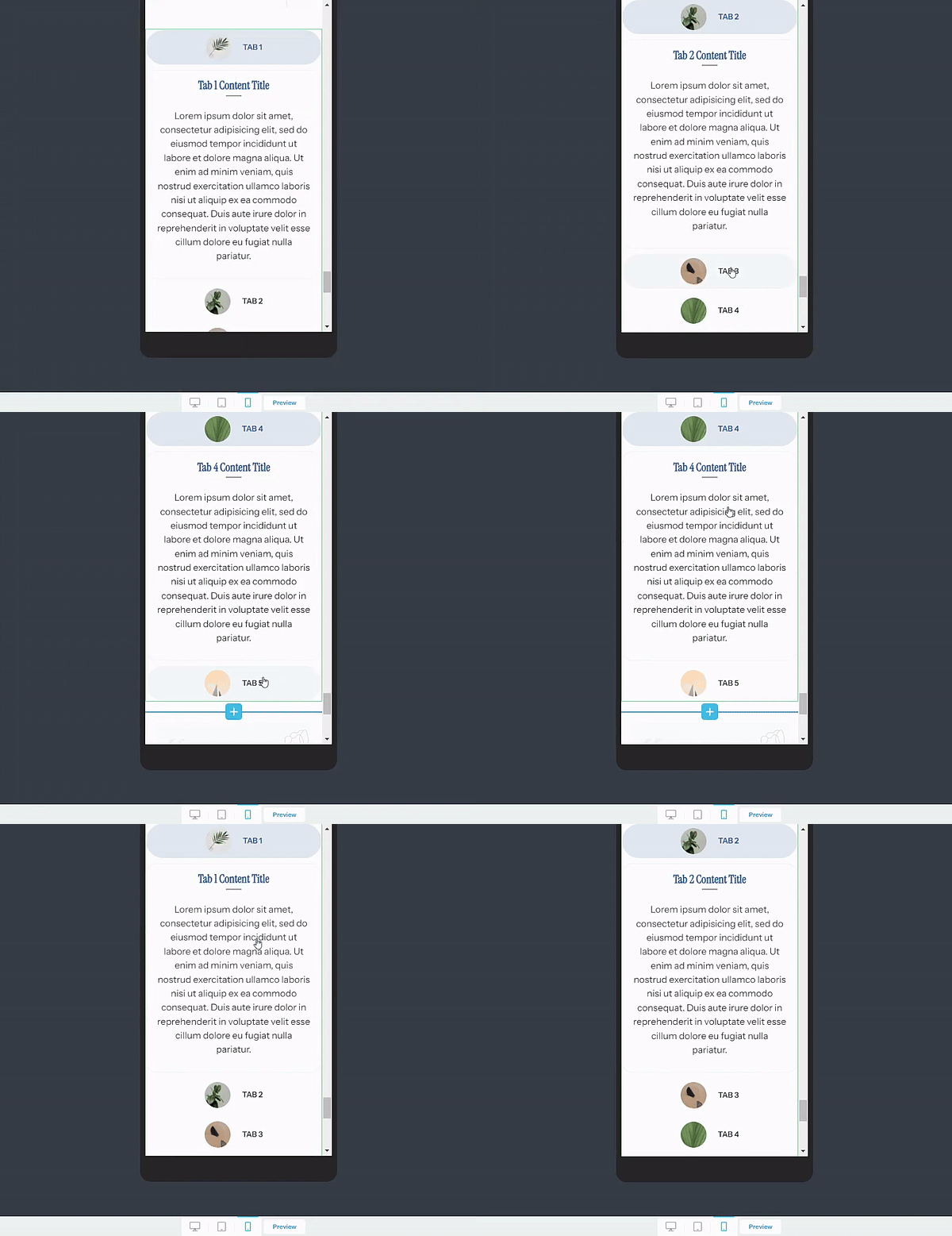
With this improvement, your tabs now have:
- Focused, tappable areas to prevent misclicks
- Clearer visual hierarchy to help users understand where they are
- Smoother transitions between tabs, which are much more natural and responsive
- Content that’s perfectly readable at any screen size
- An interface that stays clean no matter how many tabs you add
Now, navigating tabs on mobile devices will be much easier and smoother for your audience. This is super important because user experience is everything – especially on smaller devices where every pixel counts.
The stats back it up: 74% of people are more likely to return to a mobile-friendly site, and 67% are more likely to buy a product or service from such a site.
Every element plays a key role to landing conversions, and our top priority is to make sure you have the best you can work with.
New Tabs Templates in Thrive Architect: Stunning Designs Ready to Deploy
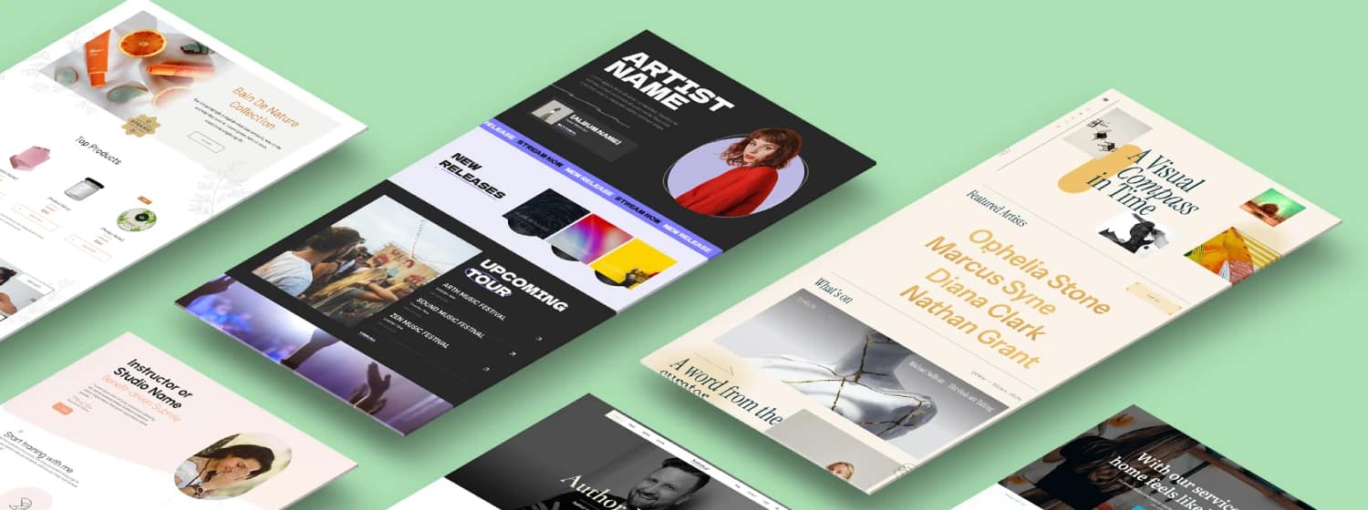
We’ve also added new templates to the Tabs element, to give you more designs to work with!
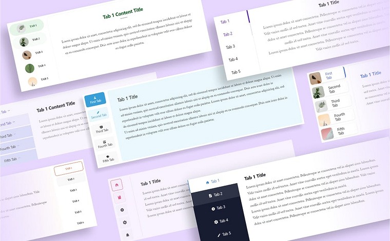
Like our original templates, they're fully customizable and mobile-responsive, so you can easily adapt them to match your brand while maintaining a great user experience across all devices.


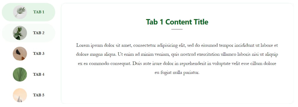
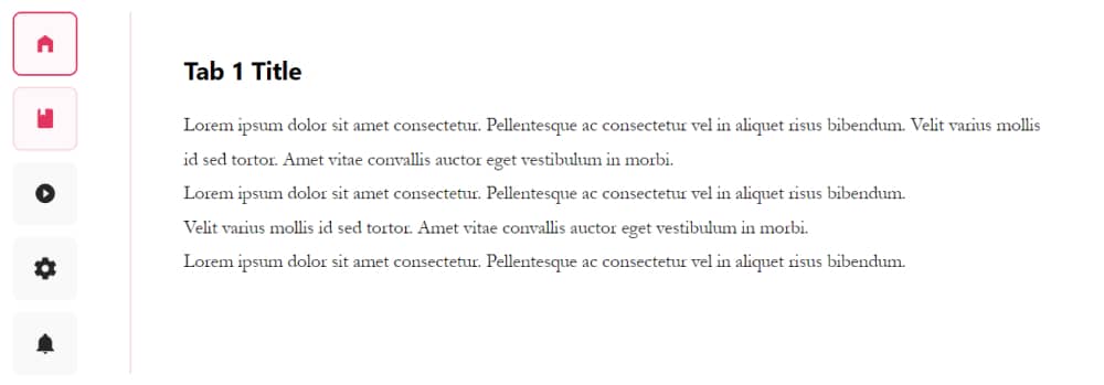
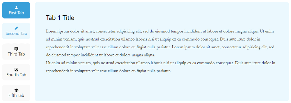

They’re already in Thrive Architect, ready for you to use, so head over there and check them out!
Smart Ways to Use Vertical Tabs on Your Website
You might be looking at this new update wondering how you can add vertical tabs to your website. Well, here are a few ways to use this neat feature:
If you want to see vertical tabs in action, then you must check out this step-by-step tutorial from Tony:
With this vertical layout, you can comfortably fit more options without cluttering your page. It's a space-efficient way to organize information, giving your visitors an easy-to-navigate experience while keeping your design clean and professional.
As with all our tools, you’re in charge here.
What Would You Like to See Next?
We're constantly working to make our Thrive products better, and your feedback plays a crucial role in that process.
We'd love to hear your thoughts on these new features and what else you'd like to see in upcoming releases. Whether it's new templates, functionality improvements, or completely new features – your insights help us build the tools you need.
Drop a comment below and let us know what would make your website building experience even better!


It looks lovely on the desktop view, but I’m still waiting for the mobile view to give me an offscreen mobile design before I implement it.