This month's feature release brings two new updates to improve your Thrive experience:
First, we've added our most highly requested feature — vertical tabs — to Thrive Architect, giving you a fresh way to organize content on your pages. Now you can choose between horizontal and vertical layouts, opening up new design possibilities for your websites.
Second, we're introducing new notifications access right inside your Thrive Themes products. No more digging through emails or checking our blog for updates. You'll get important Thrive news, license info, and product update announcements right where you work.
These new features make building websites more flexible and staying informed about Thrive easier than ever. Let's dive in and explore what's new!
1. Vertical Tabs in Thrive Architect
We're really excited about this updated feature in Thrive Architect— Vertical Tabs — for one specific reason:
This has been our single most requested feature, with more votes than any other, and we're thrilled to finally have it up and live for you to use.
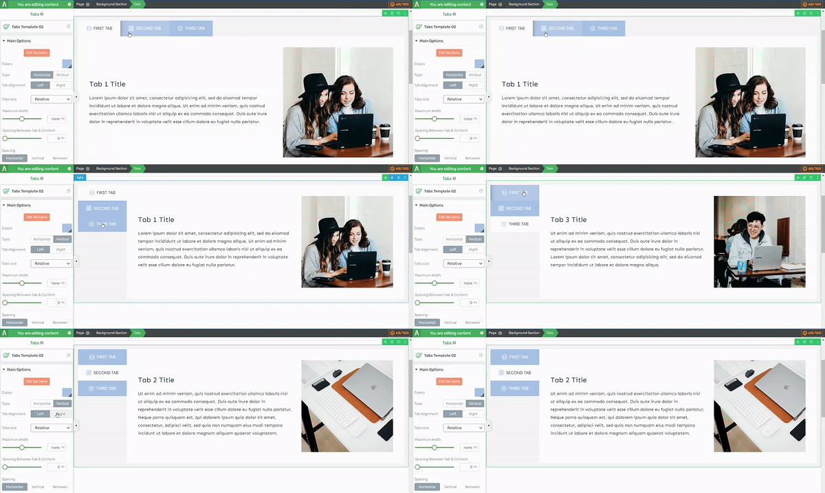
New vertical tab functionality in Thrive Architect
Our Tabs element has been a part of Thrive Architect for many years now. Tabs are a handy tool for organizing information, especially when you have a lot of content to present on your website. But up until recently, you could only present your tab content in a horizontal format, which looked something like this:
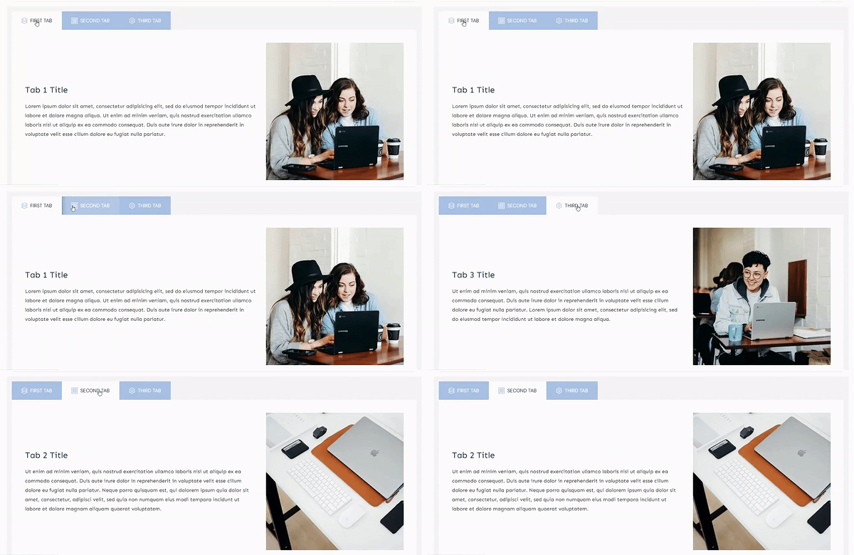
Previously, your tabs could only display in a horizontal format.
The horizontal layout worked well. It offered a functional way to display large blocks of information in a format that was easy for your visitors to understand and navigate.
But we knew it could be better. We wanted to give you more options and flexibility to turn your tabbed sections into exactly what you want.
The first big advantage you'll notice with vertical tabs is how much more convenient they feel when you need more than just a few of them.
Think about it: when you've got more than 5 tabs in a horizontal layout, things start to look crowded fast. Your content gets squeezed, and suddenly it's not so easy on the eyes.
But flip those tabs vertical? Now you can spread your information across multiple sections without breaking a sweat. And the best part? It looks fantastic.
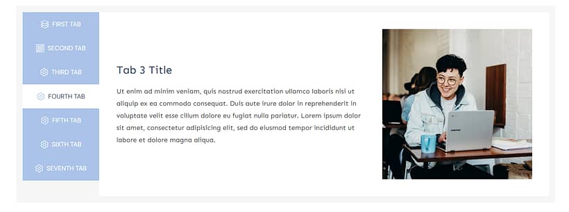
Vertical tabs allow for a better use of space with more tabs.
Your visitors get a cleaner, more intuitive way to navigate your info. And you? You get the flexibility to pack in all the content you need without sacrificing style.
Your Tabs, Your Way

Easily create a gap between your tabs and content
Prefer your tabs on the right side of the screen instead of the left? Consider it done! With vertical tabs selected, choose your tab alignment with a click.
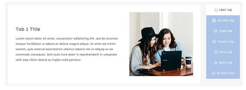
Choose which side your want your tabs, with a click!
And when it comes to customizing your tabs' look, you've got plenty of options. Start with the standard customization tools in Thrive Architect's left sidebar:
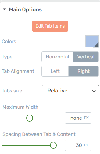
Try out different settings to find what works for you
Here, you can tweak tab colors, adjust spacing and width, set alignment, size, and more. It's your basic toolkit for quick style changes.
But for those who want to dive deeper, click the orange 'Edit Tab Items' button:
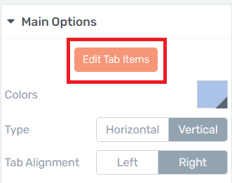
Click the "Edit Tab Items" button to access more advanced editing features for your tabs.
This is where things get interesting. Swap out tab icons, play with colors, fine-tune your text, adjust positioning - you've got a whole playground of options here.
Every element is editable – which means you have total control over your tabbed content’s look. And you get to decide how far the customization goes.
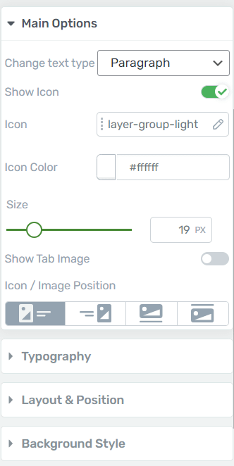
The 'Edit Tab Element' section give you a deeper set of customization options.
If you just want to make a couple of changes to your tabs for readability or spacing reasons, you can do just that.
Or perhaps you're feeling inspired and want to channel your inner designer to give your tabs a total makeover. Go for it – the sky's the limit.
Our tools are built to match your style, whether you're a design novice or a pro. Whatever your experience level or needs, we've got you covered.
And, of course, if you want to change your tabbed content template, you have a variety to pick from:
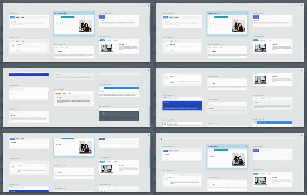
Choose from a selection of customizable, pre-designed templates
Your tabs will automatically adapt to your website’s color scheme (if you built your site with Thrive Theme Builder) – making it much easier for you to hop in and start editing this element.
NOTE:
When you add a Tabs template to your page, it will be in the default horizontal format. Just use the toggle in the left sidebar, in Thrive Architect, to switch to vertical tabs. Easy!
Our goal here with vertical tabs was to give you a fresh way to:
- Reimagine how you use space on your pages
- Create layouts that fit your content, not the other way around
- Give your visitors a cleaner, more intuitive navigation experience
Vertical tabs are easy to set up, even easier to customize, and they’ll look great on all your landing pages.
And don't forget: you can drop in any design element from Thrive Architect's left sidebar into your tabbed content. Images, videos, countdown timers - you name it, you can add it.
When you add a Tabs template to your page, it will be in the default horizontal format. Just use the toggle in the left sidebar, in Thrive Architect, to switch to vertical tabs.
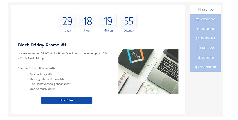
You can add a variety of design elements to turn your tabs into conversion-focused spaces to generate leads and sales
With this ability, you can use tabs to create all kinds of designs.
5 Smart Ways to Use Vertical Tabs on Your Website
You might be looking at this new update like, “This is great, Brad. But I’m not sure how to get started with this feature.” Well, let's explore how you can put this sleek vertical tab layout to work:
Product Catalog: List your main product categories in the tabs. Each tab opens to show subcategories, featured items, or best sellers. Perfect for e-commerce sites with diverse product lines.
Service Showcase: Dedicate each tab to a different service you offer. When clicked, display a detailed description, pricing, and an eye-catching image of that service in action.
Team Member Profiles: Use tabs for each team member's name. The content area can reveal their bio, expertise, and a professional photo.
Course Curriculum on a sales page: For online learning platforms, each tab could represent a module or week of the course. The content area displays lesson summaries, objectives, and related resources.
Portfolio Gallery: Creatives can use tabs for different project types or clients. The main area becomes a canvas for showcasing work samples, project details, and client testimonials.
With this vertical layout, you can comfortably fit more options without cluttering your page. It's a space-efficient way to organize information, giving your visitors an easy-to-navigate experience while keeping your design clean and professional.
As with all our tools, you’re in the driver’s seat here.
Now, with both horizontal and vertical tabs at your fingertips, you've got even more control over your site's design.
You won't find another Tabs element in WordPress with this amount of control.
Why not take some time to play around with different layouts? See what works for you. It's all about striking the right balance - content that's well-organized and looks great, while guiding your visitors smoothly through your site.
Want to see how it all comes together? Tony's got you covered. Check out this video for a live walkthrough of setting up vertical tabs in Thrive Architect:
At the end of the day, good website design is all about creating an enjoyable and efficient user experience. With the new vertical tab options now available in Thrive Architect, you have more tools to create that experience in a way that aligns with your vision for your site.
2. Thrive Notifications in WordPress Dashboard
We've also launched a new notifications engine, to keep you informed of all important updates related to your Thrive products. This includes info on license information, product updates, and Thrive-related news.
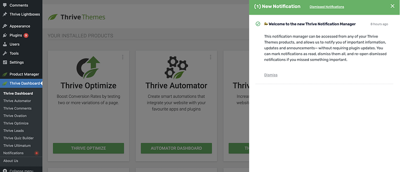
The notification drawer will open from the right when you click to view active notifications.
We'll let you know when something is worth your attention, no software update needed.
Wrapping Up
That’s a wrap for this month’s release! But don't forget, last month we also released:
- 24 new pop-up and ribbon templates for Thrive Leads
- Two new themes for Thrive Theme Builder, including our Gallery Theme and Spa Theme.
- A new Date and Time picker for the form builder in Thrive Architect
We’re working on the next round of updates already, and can’t wait to share them with you.
In the meantime, give vertical tabs a try, and let us know what you think of them. And if you have additional feature requests, drop them in the comments section (we read them all 😀).
We value your feedback and love to add your contributions to what we’re working on.
Until next month,
Happy Building!

General Manager, Thrive Themes


You mentioned that, “this has been our single most requested feature, with more votes than any other”. Where are people voting on these features? Is there a roadmap somewhere that people can add to, comment on, and vote?
We don’t have public roadmaps or public voting. We manage it all internally, so we can balance it with other behind-the-scenes priorities.
Our support team have a system for accepting and logging feature requests. If you ever want to make a request, just submit a support ticket with the category “I have a suggestion or feedback”, and we’ll log it, or add a vote if someone else has logged it first.
Guess what! I discovered the vertical tabs a couple of days ago and I thought that it has been there all the time and me, the fool, hadn’t seen it so far, LOL! That is before I read the news email and this post today! Phew, I thought I was a fool for not seeing it all this time (I’ve been using tabs since I started building my website with TT), but it was never there in the first place, only got added recently 😀
Anyway, I already implemented the (much better) vertical positioning of tabs in my website, such as a member’s profile (much more better than the horizontal), in info about my books in my sales page and there will be more to come, now that I’ve found this new feature.
Thumbs up once again, awesome TT team! You are rock stars in the WP universe!
That’s awesome! Great to know you’ve already put it to good use, and well done for having a keen eye and finding it within days of us secretly releasing it.
Thanks for your comment and your support, Dimitris!