It's that time again— when we've just rolled out a handful of killer new features into Thrive Suite that we think you're going to love. There's a little bit for everyone.
But first— it seems some of you can read the future.
A month ago, we released a massive new Assessments feature to Thrive Apprentice. It was huge! And, on the announcement video, we got this comment:

We couldn't believe it— because we were already hard at work building these exact two features— gradients for fonts and icons, and animated text highlights/ underlines!
For those with a designer's mind, we've just added them both to Thrive Architect, Thrive Theme Builder and all of our plugins that use our visual editor.
And for course creators— there are 2 new features we've added to Thrive Apprentice that will help you build a better business.
Read on and we'll share their latest features with you!
More...
1. Animated Text Highlights
Text is the backbone of good conversion-focused design. It doesn't matter how many images, icons, or sections you fill your website with— it's the words that will persuade your visitors to take action.
Every skilled copywriter will attest to being able to sell and convert with words.
But sometimes you need to draw attention to specific words. Perhaps it's a call-to-action, or words that resonate with your audience and need to jump off the page when they skim your content.
Well, in our latest update to Thrive Architect, we've added new Text Highlights that you can add to any text built with our visual editor. And what's best? You can animate them!
New Text Highlights let you call out words or key phrases in your paragraphs or any headlines on your website.
Adding them is easy. Anytime you're using our visual editor, select a piece of text, and click the highlight color picker. That'll give you the basic highlight type.
But then, open the 'Highlight Options' dropdown and you can pick from 12 different highlight types.
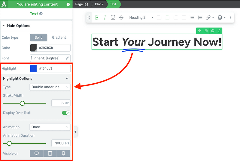
Select your text, add highlight, and choose your preferred type!
Some highlight types are static, but others are animated. Play around and see what you like!
Animated highlight types will let you set their stroke width to thicken up those lines, choose to display it over or underneath your text, and choose to animate once, loop the animation, or have it replay every time the text re-enters your browser viewport.
You can enable or disable the highlight from different screen sizes, adjust the animation speed and even adjust the time-between when it's set to loop animation.
Check out the 12 different highlight types we've included!
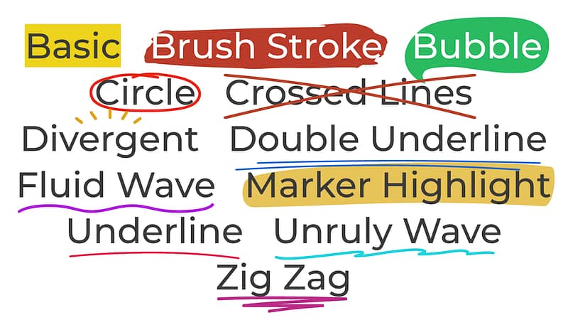
There are 12 designs to choose from, and we're taking suggestions for more.
We're excited to see how you'll use this to add some design flair to the text on your pages.
And if there are other highlight designs that you'd like to see us add, drop us a comment below! Now that we've built the foundation for this feature, it's not difficult for us to add new styles.
2. Gradients on Text, Icons, Borders and Dividers
As if text highlights wasn't enough to celebrate, we've also recently extended our gradients feature to a few of our foundation elements in Thrive Architect.
Believe it or not, adding gradients to text, icons, borders and dividers was no easy task for our developers, and to present you such an easy-to-use and design-friendly version took us a few months.
But we love the results!

Next time you add text to a page with our visual editor, you'll see that you can swap between 'Solid' and 'Gradient' for your font color options.
Selecting 'Gradient' will allow you to open the gradient color picker. You can choose between radial or linear gradients, set the angle, and place multiple nodes on the gradient color scale.
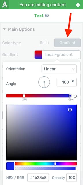
Select the Gradient picker for text.
The result is text that pops!
We've also extended gradients to our icon element too, along with content box borders and dividers.
Gradients can be applied to icons too.
Add them all together and, although it might be a little bit too much gradient for your liking, you will be able to achieve designs just like this— something you couldn't before.

Here's an example with gradients on icons, borders, text and dividers.
3. Hidden & Archived Courses
Course creators, listen up: we know that Thrive Apprentice is already throwing some big punches in the WordPress course plugin world.
Over the last few years, it's turned from a humble little plugin into a single tool that can monetize your website, letting you sell premium courses tailored to your visitors with an impressive set of features.
We're committed to keeping it top-of-the-class... especially for course creators that want more marketing power. And this latest feature helps with exactly that.
There are now 2 new statuses for course publishing: Hidden and Archive.
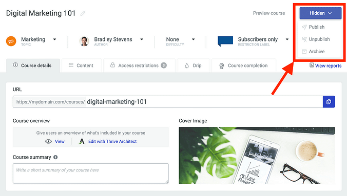
Look for the new 'Hidden' and 'Archive' statuses for course publishing.
Hidden courses are a marketers secret weapon.
When you set a course to 'Hidden', it will not show up publicly on your website... unless you have access to it.
That means it's perfect for private training programs for a select set of clients, or for courses that you're selling with an open/close course enrolment. The only people who will discover your course are those that you've granted access to, or those that you promote it to.
That means you can publish a hidden course on your website, create a sales page protected with Thrive Ultimatum, and promote it for a limited scarcity window. Anyone who buys during that window will find the course listed whenever they are logged in.
But if you don't buy it and you miss out? You won't find it anywhere.

Hidden courses will magically show up on the front-end only for users that have received access.
Then we also have the 'Archive' status. Use this when you want to remove a course from public listing with the intention to retire it, but you don't want to revoke access to it.
When you archive a course, it will take a snapshot of all users who have access to it at that time. Those students will retain access and can come back to consume it's content, but it'll be closed for business from any new students who will not be able to sign up.
4. Course Access Expiry
Another one for course creators using Thrive Apprentice, we've just rolled out 'Access Expiry' options for your online courses, which lets you automatically revoke access from students after a time period of your choosing.
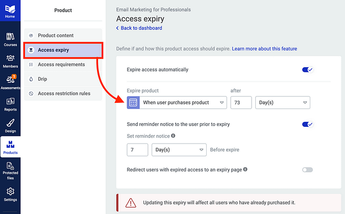
Easily set when you want course access to expire, and how to notify your students when it's approaching.
Access Expiry is set at the Thrive Apprentice product level. If you're unfamiliar, a 'product' in Thrive Apprentice is a group of content on your website that is protected under one set of restriction rules.
A product can protect a single course, or multiple, as well as membership pages, categories and posts on your website.
You can set product expiry on a specific calendar date, or a number of days after they first enrol, unique per enrolment date. When a course expiry is drawing near, you can override the course label so that returning students know that they won't have long to complete the course.
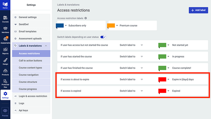
Set your access expiry labels, including the dynamic [days] text that updates to match your student's access.
We've also made sure that you can notify your students that their course access is expiring with an automatic email.
When this option is enabled, you can choose how far in advance you'd like that reminder email to be sent to your students, and you can customize the content of the email tool. Just visit Settings > Email Templates, and choose 'Product access is expiring'. Easy!
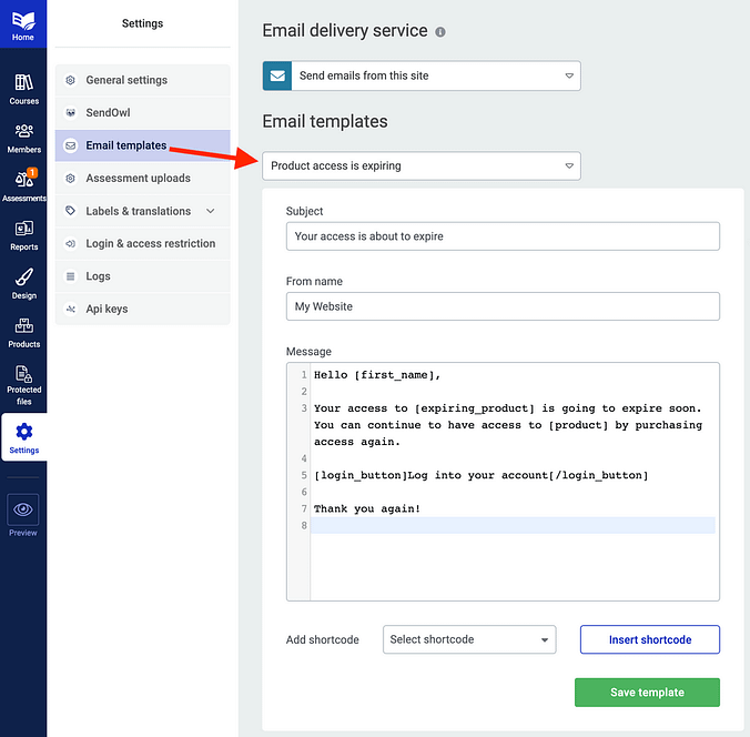
Easily send an email prior to a student losing access.
Lastly, an interview with Website Planet
A few weeks ago, I had an opportunity to sit down with Website Planet for an interview, to talk about all Thrive Themes— who we are, and what we're doing.
They've just published their article, so feel free to take a look right here:
Bradley Stevens from Thrive Themes — Interview with Website Planet.
As you can see, a lot of love has gone into this latest set of features, and we're super proud to share them with you. We've love to know what you think, and what else we can add to Thrive Suite to help you build a better business.
Bradley Stevens,
General Manager, Thrive Themes


Excited about SEVERAL of the features here. This one is BIG for marketers!
I think so too! Glad you like it, JT
Yer great I’d give you 5 stars but I can’t.
Ah, Ian— I think this is your way of requesting star-ratings for Thrive Ovation testimonials, isn’t it?
We have some strong opinions about why that’s not a good idea. When I have time, I might create some content about why. We’re not 100% opposed to it, but it’s definitely not the no-brainer that it might seem.
But I’ll take your intentions of 5-stars for the compliment that it is 😁
Epic! I love the text animations! The only thing missing now is gamification in the courses area.
Pretty neat, huh? Gamification is something we’ve discussed a few times, but we’re not ready to commit yet.
But I’d love to know, what kind of gamification features would you be looking for?
Excellent! All new features are super helpful. My favorite is the text highlight. We will use it for sure (and the other new features as well). Thanks a lot.
Happy to hear you’ll put it to good use, Martina 🙂
Hey Bradley.
The product expiry feature is great, but (IMO) not fully implemented.
For example, I have an evergreen course that starts every Friday. I want expiry to end 70 days after the course starts, not after the client purchases (and not after the client decides to start the course). I can’t specify a date for course expiry because the course is evergreen.
I really need an option for the course to expire x amount of days after a specific module is released. Pretty please?
Hey Bruce, this is a powerful use case, and it’s one we’ll discuss on the product team. Thanks for the suggestion. If I have more questions, I’ll come back here to ask.
With the animated text highlights, will that slow down our website in any way?
No, it won’t. A few years ago, we released a system inside of our visual editor where, upon hitting ‘Save’, it will only apply code to the page for the elements and objects you have added.
If you add an animated text highlight, it will add a really, really small amount of code, including the SVG (that’s the underline or circle effect) to your page— but only for the specific highlights you’ve added. It won’t add any other unnecessary code that you’re not using for that effect.
The expiry option for TA is so useful! Just one question, will it apply for students already enrolled?
If someone bought a TA product 6 months ago and I want them to have access for a year, when I activate this option will people have access for the remaining time? or for the full year? I hope my question is clear.
Yes, it applies to anyone who already has access. And when you go to enable access expiry, there will be a warning that makes that fact quite clear.
If you choose to set 1 year of access based on ‘when they first received access’, then it will back-date, and they’ll have 6 months of that year left. But if you’d prefer it to apply to all students from today, you can set a calendar date for expiry 1-year from now
Thanks! Will the option with thrive automator keep working if I decide to keep using it that way?
No, you can keep using Thrive Automator if you’d like 🙂
Nice features! Good to see that Thrive Apprentice gets better and better. I will move my courses from another LMS to Thrive Apprentice in the near future.
So the only thing that seems missing is Thrive Community. Online courses with a community are much more valuable than just an online course. Something to replace Facebook groups, Skool or Circle would be great. Any plans to release such a plugin in the near future?
It’s a request that has come up a few times, but it’s not something we’re aiming to do at this stage. We have a lot of other priorities to work through first, and to be honest— I’m a little skeptical of it. I’ve heard stories of course creators attempting to build communities and finding that engagement drops off, and that one of the best places is still Facebook because there are other reasons for students to use the platform.
When I look at my website in Edge the text animations don’t show properly. Is this something you guys are aware of, or is it me having bad luck with Edge?
Hi Ingela,
It’s not something we’re aware of with Edge, but if you reach out to our support team, they will be able to look into it for you.