Welcome to yet another round-up article where we showcase the latest features added to Thrive Suite.
In this release, there's 3 stand out improvements.
The first will give you a faster website, improving your core web vitals score while also improving your on-page clicks and visitor interactions.
The second will let you build a more intelligent website navigation experience, especially if you have a membership site or you are selling online courses.
And the third makes your online course library look like it was built by a designer... because it is!
Read on!
More...
1. Video Covers, Lazy Loading and Video Speed Improvements
Remember when we released Project Lightspeed, our code optimization project that created faster websites with a single click?
Do you also remember that we said "there's more coming" ?
Some of that 'more' is here.
Next time you add a video element to your page in the Thrive visual editor, you'll find a few new settings in the left-hand sidebar, flagged by a tooltip: Lazy loading and Video Cover/ Thumbnail.
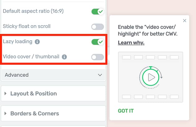
Next time you add a video element, look for the new lazy load and video cover options.
You might remember we already have a video thumbnail option that allowed you to place an image from your WordPress media library right over the top of your video.
But a 'Video Cover' is different.
If you enable it, you'll see you can select between the two. Choose 'cover' and an edit mode button will appear.
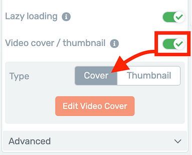
Choose 'Cover' to design it right there on the canvas!
'Edit mode'...? You know what this means.
A fully visually-editable drag-and-drop edit zone right on top of your video!
Out of the box it will come with a text element, play icon and an arrow that connects the two.
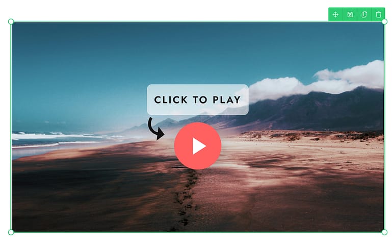
This is a video cover, meaning the text, images and icons are 100% editable right there!
These are Thrive Architect elements, meaning you can:
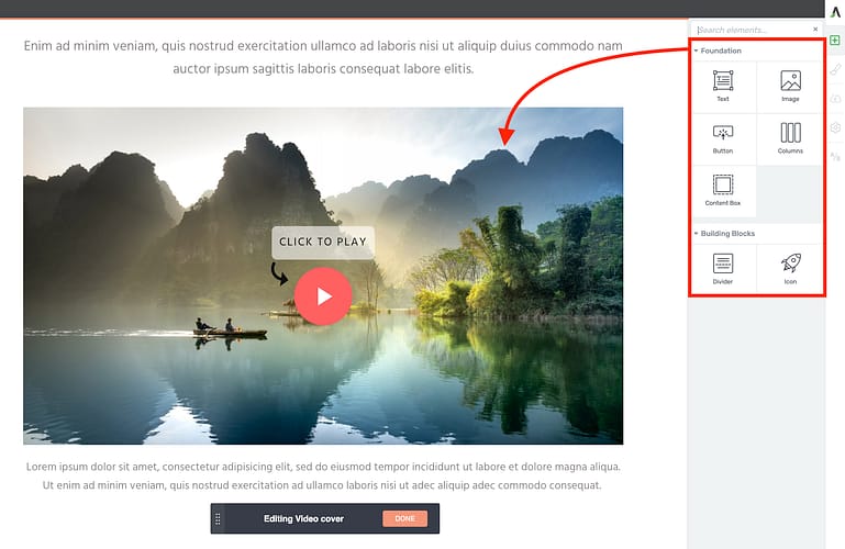
Inside edit mode, you can add elements right on top of your video.
While in edit mode, you'll have the option to add your thumbnail image that sits beneath the Thrive Architect elements, or to set it to dynamically display the featured image for that page or post.
When using Thrive Theme Builder, this is perfect for applying video covers website-wide on your video post templates, knowing that a different image will load as the video cover depending on the post that is displayed.
But there's something important about this video cover.
It isn't just there to look pretty...
It's going to speed up your website.
How The New Video Cover Will Improve Page Speed
When we took a long, hard look at how Google measures website speed for Core Web Vitals, we noticed something ironic:
YouTube (owned by Google) is notoriously slow to load, and impacts Core Web Vitals negatively.
The irony isn't lost on us.
The new Video Cover was built to be fast and to bypass speed issues that can come as a result of embedding a video on your page. And we'll prove it in our speed test results below.
How do you use this feature to speed up your site? There are 2 ways.
1. Lazy Loading Video Scripts
When you embed a video from YouTube or any other video service onto a page, then it also loads video scripts. Scripts are the code supplied by a video service that are necessary for the video player to load, and they can add substantially to page load times.
But what's the point of loading those video scripts (and slowing down your page) if your visitor hasn't even scrolled down to the video yet? Or, what if they don't even interact with the video?
That's why we've added a Lazy Load toggle for video scripts.
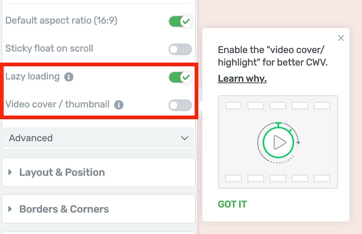
We recommend you leave Lazy Loading on.
By lazy loading your videos, the original video scripts will only load when necessary.
If you don't have a video cover: Lazy loading will only load the video scripts when the visitor scrolls the video element into the viewport, at which point it needs to fetch the thumbnail from YouTube (or other video service). That means if it's below the fold, the video scripts won't be loaded until they are needed.
If you have added a video cover: Instead of loading video scripts when the video enters the viewport, videos with a video cover or thumbnail can wait even longer. That's because the cover image and text can be loaded early, without the scripts for the video underneath being required. In this case, video scripts will be lazy loaded until the visitor hovers the cursor over the video on desktop, or they tap the video on mobile devices.
In general, we recommend leaving Lazy Load for video enabled at all times, unless you have a specific reason to switch it off. But you'll get even more speed improvements when you pair lazy loading with...
2. Preloading Video Cover Images
When you set your video cover image, you'll also see an option— 'Preload Thumbnail'.
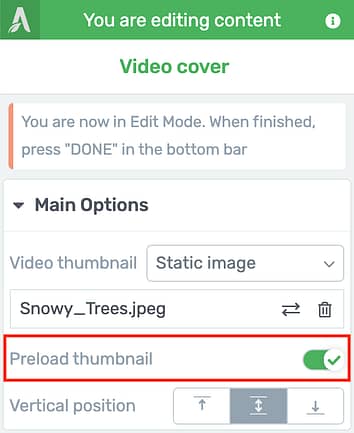
After adding an image to your video cover, you can enable 'Preload thumbnail'.
Enable 'Preload thumbnail' if your video is at the top of the page, above the fold.
What this will do is move the code for loading the image to the page head. Or in simpler terms, it means when your page loads, it will load the image file much sooner meaning it can render on the page more quickly.
The change will be visible in the code:
For the technical among us, a video cover image is not loaded as a background image with CSS— instead is uses the standard image html tag, meaning preload attributes can be applied to it. That means that you can only preload the new Video Cover, and not the standard video thumbnail that we had before.
But does it make a difference? YES!
We did a straight 1-to-1 speed test of the same page before and after the video cover image, lazy loading, and image pre-loading were enabled.
For context, this is a website on a fast host, with caching set up and Project Lightspeed enabled. Outside of those basics, no other optimizations were added— not even image optimization.
The page included a hero video— a big YouTube video right under the page headline.
Here were the results before optimizing the video element:
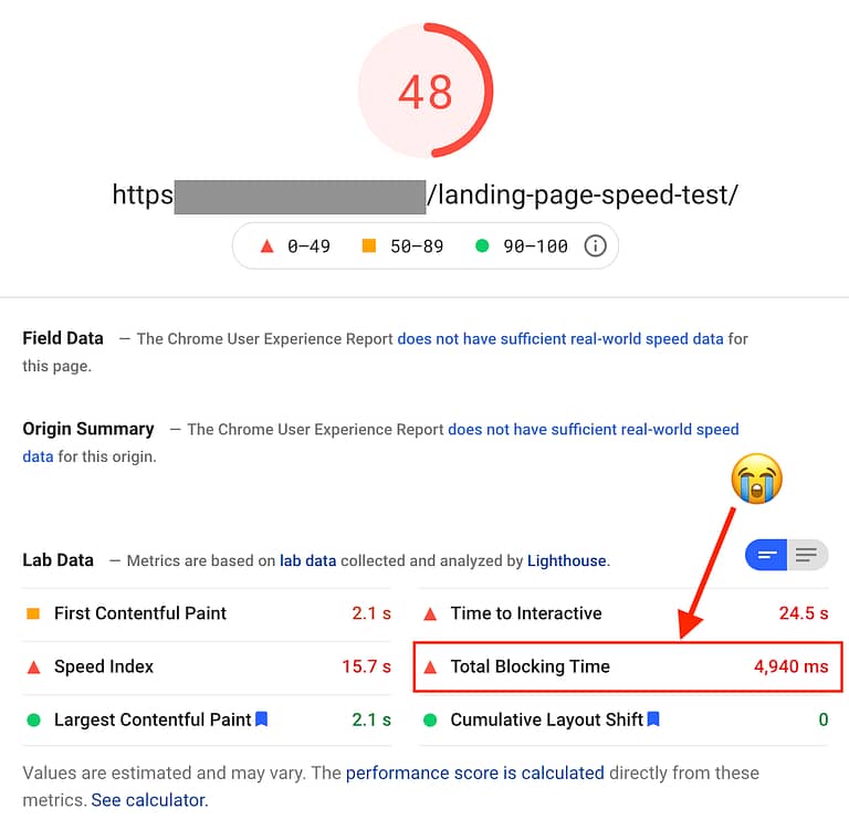
Believe it or not, but YouTube's scripts are blocking the page interactivity for nearly 5 seconds!
Take note of 'Total Blocking Time', which came in at 4,940 ms.
Total Blocking Time (TBT) directly affects one of the 3 core web vitals metrics, First Input Delay (FID).
When a website is loading and it encounters a script that needs to be loaded (like the video script from YouTube), the page will wait to download that script. During this time, a user cannot interact with the page. They feel 'blocked', hence 'Total Blocking Time'.
So, what happened after we enabled video covers, lazy loading and pre-loading the image? Have a look:
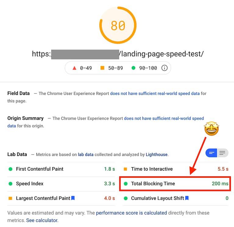
A few clicks and YouTube scripts no longer load on page load, which means better CWV scores.
That's the exact same page. Same server, same caching plugin, same settings...
But with about 3 clicks to enable this feature on the video element, Total Blocking Time dropped from 4,940 ms to only 200 ms (saving a MASSIVE 96%)— with an overall bump in speed score from 48 to 80!
2. Logged-In and Logged-Out Menus
Let's be honest here: the Custom Menu element is the backbone of your Thrive-made website.
Menus on standard WordPress themes are notoriously difficult to style. But not ours.
Our Custom Menu element can handle simple menus, mega menus, vertical menus, support for icons, images, dropdown submenu items, and more. All with visual editing of corners, borders, shadows, typography, padding, margins... everything.
But what about showing different menu items when a visitor is logged in, or logged out?
Well, we already handled this by offering logged-in/out options at the WordPress menu level and connecting your Thrive-made custom menu to the WordPress source.
But we heard from many of you that you wanted to cut out the middleman and just set logged in and logged out menu items right there in the Thrive visual editor.
Now you can.
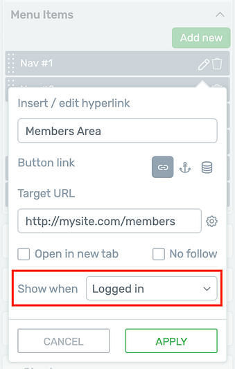
Set your menu items to show or hide depending on the visitor's logged in status.
There are two places to access the new 'Show when' settings for your menu items. The first is when you select the Custom Menu element and click the pencil icon next to each menu item, as shown above.
The second is when you select a specific menu item directly on the canvas, where you'll find the 'Show when' settings under main options, as shown below.
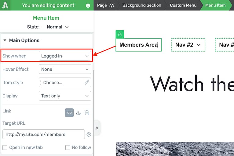
You can find the same setting when you are editing a single menu item.
There are 3 visibility states:
- 1Show Wen: Always— this is the default and behaves just as the custom menu always has.
- 2Show when: Logged In— ideal for menu items that only make sense when a user is identified, and their user account details can be displayed.
- 3Show when: Logged Out— ideal for menu items that make sense for anonymous visitors.
When you set different visibility states per menu item, you'll still see all of them in the Thrive visual editor. But by applying a few clever changes, you can create intelligent menus.
Look at this example below.

Here is an example of applying intelligent menu display logic.
In this example, the first two menu items should always be there, so they are set to 'Show always'.
The next two only make sense for a logged in user. Once they're logged in, we want to give them the option to log out. You'll also see I've combined the 'My account' menu item with a new dynamic menu image showing the logged-in user's profile image. Of course you wouldn't want that menu item shown to logged-out users because... if you don't know who the user is, you'll only be able to show a placeholder image! And that defeats the purpose.
The last two menu items only make sense for a logged out or anonymous user. There is no need to prompt a logged in user to register, because they already have. So by choosing 'Show when logged out', you'll have a menu that switches intelligently.
Let's see the front-end view of that same menu for Logged In Users:
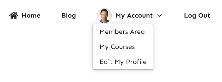
Your beautiful 'logged in' menu shows everything your members need.
And that exact same menu, as seen when a user is anonymous or logged out:

The same menu when logged out, showing everything the anonymous visitor needs.
If a menu has submenu items in it, all of those submenu items will be completely hidden when the parent is not set to show. That means in the above example, the dropdown displaying 'Members Area', 'My Courses' and 'Edit My Profile' will also be hidden if the parent 'My Account' is set to be hidden.
The new logged in + logged out menu options are available for all menu templates, both horizontal and vertical. Our current pool of menu templates is at 49!
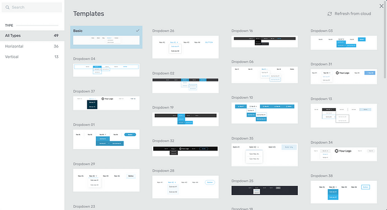
So many designer made templates to choose from— with colors and typography immediately inherited.
3. New Thrive Apprentice Online Course Templates
The new Thrive Apprentice, released in June this year, gives you the power of complete visual editing for your online school.
But we don't expect you to start from scratch.
You can follow the school design wizard and have your site set up in minutes, with your own logo, colors, fonts and templates. It's so ridiculously easy... but it also unlocks unlimited design freedom so you can customize your course templates however and whenever you want.
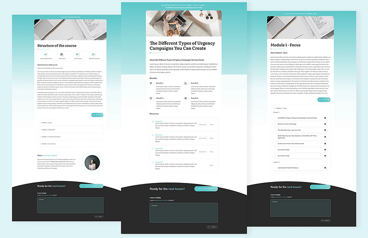
Our designers have been working hard to build 4 new sets of online course templates for Thrive Apprentice— designs that leverage this new visual-editing technology.
And they are beautiful! Take a look in Christine's latest video below or read the article about new Thrive Apprentice templates here.
There are four new design sets, which we've named:
- 1Colored Wave: Inspired by Ommi and designed to be the perfect companion
- 2Rounded: A friendly design with a splash of color
- 3Refined: Classy and layered design with squarer corners
- 4Gradient Boxed: A bold, gradient look
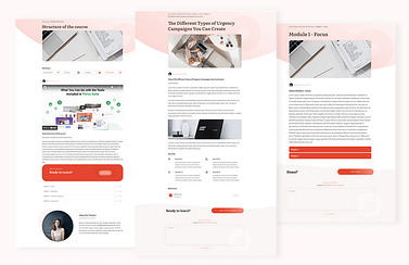
Colored Wave
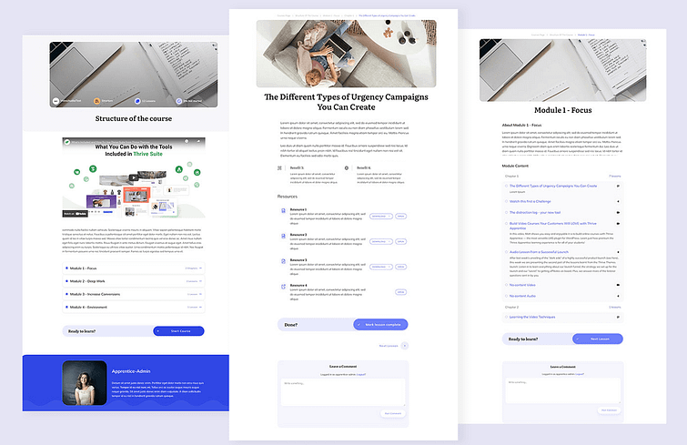
Rounded
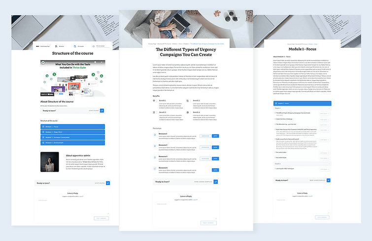
Refined
Gradient Boxed
Each of these sets come with a Course Overview, Module, Video lesson, Audio Lesson and Standard Lesson templates.
There are also 4 new course navigation sidebar designs. These can be easily mixed and matched with your preferred set of templates, so you are completely free to create the designs that suit you best.
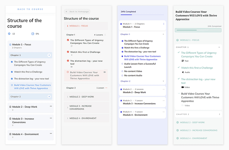
4 new navigation sidebars you can mix and match with any other Thrive Apprentice templates on your site.
The new templates include Course Homepage designs, where you list all of the courses available on your website.
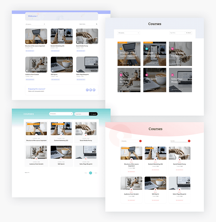
4 matching course homepages. Aren't they beautiful?
Don't forget, absolutely every pixel of these pages can be designed and styled with Thrive Apprentice. So if a design looks almost right for you, but just not quite... you have the design freedom to make it perfect.
Thrive Automator: What's Coming?
Last month, we announced the public beta of Thrive Automator, our new automation plugin for WordPress.
When we launched, we asked for your ideas and feedback and it's been fantastic to see so many interesting use cases or ideas pop up... more than we can build right now.
At the moment, our team are working on Dynamic Data sources for Thrive Automator, a public app library, new triggers and actions, improvements to how Thrive Automator processes data, some UI and UX improvements, and a new send webhook action.
You might be surprised to know that every new feature we add is roughly 9 weeks worth of work, sometimes even more. So stay tuned and we'll notify you when new features are ready.
In the meantime, if you have any more feedback, please keep it coming by filling out the feedback and suggestions form here.
P.S. Copywriter Wanted: We are Hiring!
Do you love everything Thrive? And are you an experienced copywriter with flawless word skills, an obsession for conversion rates, a marketing nerd, and can work during European business hours?
We want to hear from you. We're looking for a full-time copywriter to join our remote team. But, there's one catch: we're not just looking for 'good'— we're looking for great.
If that's you or someone you know, visit our job listing page and apply here.
And for everyone else, as always— drop a comment below! We love hearing from you.


I am experiencing Thrive Apprentice, It’s awesome. only 1 small error is Dark Template – Course Overview Error not showing Course topic icon:
https://drive.google.com/file/d/18oxwhSE79ZPBLKJh8KT5wGcdHnbNtOAG/
About Thrive Automator is also new to experience, hope to have a send webhook action soon. Currently, I can’t automate with Autonami CRM because it doesn’t have an official integration with Thrive so I can’t take full advantage of Thrive Suite.
Without looking at your website myself, it could be that you’ve set the topic color to white and are displaying on a white background. Go to Apprentice > Courses > Course Topics and check if your color is set to white.
As for Autonami, we add integrations based on number of request. But weren’t you the one asking for a FluentCRM integration, which we delivered? Have you changed your mind?
Thank you for your response.
1- For the Apprentice part, the color I have set is correct, I will send a support ticket for this part
2- I have asking for a FluentCRM integration, FluentCRM is very good for basic needs.
As for Autonami you can do a lot more with Woo and Funnel besides one feature that FluentCRM doesn’t have is Send HTTP Post (SMS) that’s why I asked to integrate Autonami it makes it much more extensible. for development.
The sidebars on the new templates left me speechless. So beautiful and user friendly! I’m migrating my courses to Thrive Apprentice and I’ve been so pleasantly surprised all along! Thank you team!
Right? I love hearing this, and so do our designers. I’ll make sure they see this comment, thanks Lucia
Great stuff team!
Thanks Jared
Thanks for another terrific update, Brad. Thrive Themes is the only business I know of whose updates are consistently so value-packed, impeccably timed and actually exciting. (And trust me, I don’t say that lightly; I’m really not into technology.) I’m increasingly grateful that I’m a member (have been since 2014). We’ll be using all of these updates.
Thank you for sticking with us for 7 years, Matthew! Wow, we’ve grown a lot since then. You’d remember the early versions of Thrive Content Builder. That seems like a lifetime ago
Thank you. I enjoy the new school designs.
And i hope that automator will get a “new incoming Webhook Trigger” very soon.
Yeah, that’ll come after sending webhooks. It’s more complex because we need to support field mapping, but our team are working on figuring it out.
Just think of what you can do with Automator once we do, though!
Absolutely love Thrive Architect, but would like to see a better option for adding custom CSS to individual elements, or maybe I am just doing something wrong.
It is so much easier to simply add custom CSS in Elementor, and that frustrates me because I would rather build sites with Thrive Architect, but the CSS feature, unless I am doing something wrong, is just not very good.
It would be nice to see some tutorials, much more in-depth, on how to add custom CSS in TA.
As far as the video thumbnails and lazy loading features – outstanding. These types features, and attention to detail, is why I love TA so much. But please address the CSS features.
Adding CSS is really quite easy. Add a class or ID in the left hand sidebar to an element(s) you want to target. Then on the right hand sidebar click settings > advanced > custom CSS. You’ll get a simple CSS overlay where you can add your code and target anything on the page.
We have a tutorial about adding custom CSS here.
What is it you’re trying to do with custom CSS that you can’t with our editor’s built in functions?
Thanks! Again, as always great update! That user log in/out menu feature – that’s what I was waiting for so long.
It should definitely make it quicker and easier to build out menus. Thanks for your comment, Martin.
Love it. You guys have really stepped up your game with the speed and CWS optimizations. This will become a key differentiator for Thrive. Excellent move. Good work. Keep doing what you’re doing. Thank you
It’s a LOT of difficult work, for sure. But we hope it’s sending a clear message that speed and CWS is something we’re taking seriously.
Wow, two new features that really help me AND the announcement of an automator “send webhook” action.
Thanks for listening to your users suggestions.
Keep up the good work,
Matthias
No problem, Matthias! What service(s) would you connect to with a webhook?
Great updates as usual. Keep up the good work!
We shall!
Great work Thrive Team!!
I have a question about Video Mute/UnMute on load. I uploaded a new vimeo video to a new page and it loads defaulted to muted. How do I change this? Thanks
When you add a video element to the page, in ‘main options’ on the left hand side, there’s a small triangle at the bottom for ‘advanced options’. Expand that section and you’ll see controls for autoplay, mute, etc. But bear in mind that browsers have rules about allowing autoplay and mute together: they’ll force mute on autoplay videos in some circumstances. We don’t have any control over that. To be fair though, browsers enforce that to defend visitors from opening a new tab and have audio blaring straight away.
Hi Bradley,
Thank you for your quick reply. Auto play is off by default but I don’t see where I can “un-mute” or “mute” the video. It wasn’t like this when I first added the video.
Love the login/ logout feature directly integrated in the visual editor menu element!
Any chance we might see a direct video player element integration for Presto Player?
At the moment we don’t have an Element API, which means 3rd parties can’t place an element in the Architect element tray. Without going into the tech of it, it’s… complex. But we are discussing how to make it possible. Until then, Presto Player can be embedded anywhere on a page with standard shortcodes or embed codes— no problem there.
Amazing updates as always you guys are the best. One suggestion I would add for the logged in/logged out menu.
Add a setting that allows us to select which roles can see or not see the menus. This will allow everyone to easily create membership sites and menus.
Hey Mark, thanks for your comment. We considered this but decided not to for a few reasons. Mainly that we have something else (better) in mind that is hopefully only a few months away.
Great update! Please consider bringing a post list carousel like you did with the image gallery. So nessesary on mobile to make use of horizontal navigation and save space like Netflix and Masterclass website.
The possibilities for Thrive Automator are very exciting. Are these blog posts the best place to keep up to date on the changes?
Yes, that’s correct. A few days after each release, we’ll share a post that explains what the new features are and why. We also send out an email, so make sure you’re on our mailing list. And if you have ideas for Thrive Automator, please submit them on the form at thrivethemes.com/automator
Looks great. I’ve put a test site into coming soon mode and now it won’t come out of it. Says updated when you uncheck the slider button but refresh and it still stays in coming soon mode.
That sounds strange, Robert. If you haven’t fixed it yet, contact our support team, they’ll help you out.