Welcome to the first major Thrive Themes release of 2023!
This one is starting us off with a bang.
We are super excited to share with you today 4 new features...
- 1One which has been highly requested for over a year,
- 2Another which we've been working towards for months (we began laying the groundwork for it over a year ago),
- 3Yet another that will make your design-life easier, and
- 4A quality-of-life improvement that sets us up for our next major release.
Come on... you didn't think we were slowing down, did you?
Read on to learn what's new for Thrive Themes users!
More...
1. Protected Files for Thrive Apprentice
In December 2021, we announced Thrive Apprentice 4.0, a major update that meant you could now protect any page, post or block of content on your website under a membership level.
That update turned Thrive Apprentice from a powerful online course platform into a mega-powerful and fully-capable membership tool.
But... we heard some comments that you wanted to protect your precious downloadable files as well. Things like PDFs, worksheets, eBooks, and more.
The concern was fair: you could embed download links on your protected pages, but once clicked, the direct link to the file hosted in your WordPress media library would be exposed, and could easily be shared online. In fact, anyone from anywhere online could just link to the file directly.
Given that worksheets, eBooks and other downloadable files are part of your intellectual property, you want to gate access to them.
Now you can. Introducing: Protected Files for Thrive Apprentice.
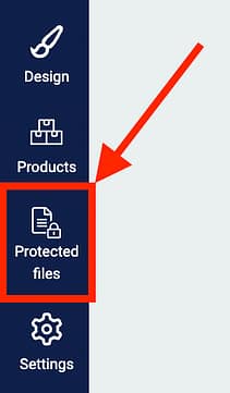
Look for the new icon in Thrive Apprentice
Next time you open Thrive Apprentice, you'll see a new tab on the left hand side. We hope it's self explanatory.
Instead of uploading protected files to your WP Media Library, where the URL will be exposed, you'll want to upload them here.
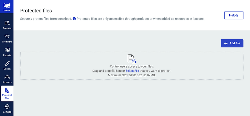
Any files added here will be safely hidden from direct linking.
Drag and drop your files, and a lightbox will pop open, letting you name the file and optionally assign it to a Thrive Apprentice Product.
Remember, a product is like an access pass. Whatever content is protected by a product— be it your courses, membership tiers, categories, pages, posts or now files— will be safely protected until a user is granted access to that product, usually by purchase, of course.
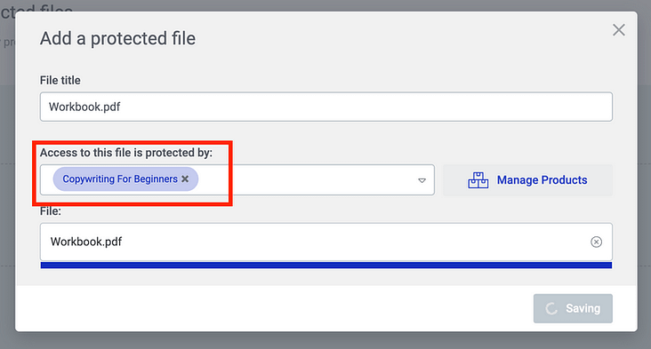
Choose a Thrive Apprentice product that will protect access to your file— it's that easy.
Once you have uploaded your file, you'll have options to edit meta data and information about how to link to it. You'll also see how many times it has been downloaded by your visitors, so you can be sure that things aren't getting out of control.
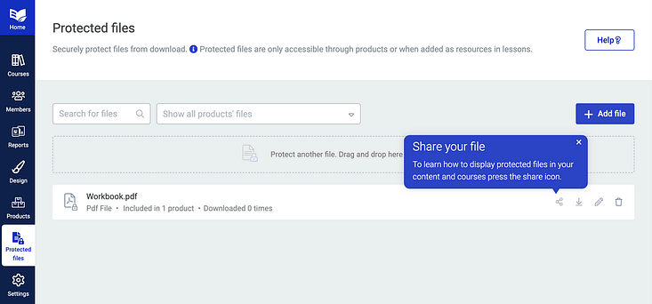
Once your file is uploaded, you'll see it listed here for easy access.
How to link to your protected file
Completed the above step? Great! Now it's time to link to the protected file.
There are 2 ways to do this.
Option 1: Adding a protected file to your online course resources list
Thrive Apprentice has a Lesson Resources feature, which makes it easy for you to provide a list of resource links available on any lesson. They can be downloadable files, links to local website pages, or other externally hosted pages.
The resources area is dynamic, meaning if you add a resource, it'll show up in a beautifully structured list on the bottom of a lesson. But if you don't, the resources list will remain hidden.
To add a resource, navigate to the content area in Thrive Apprentice, and on a specific lesson click Edit > Add Resources.
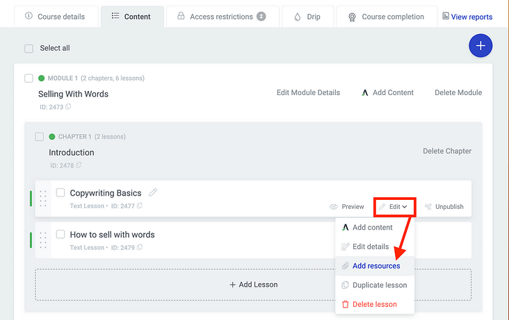
You can easily add resources to any lessons in Thrive Apprentice
Now a lightbox will open, letting you add 1 or more resources. You'll notice that 'protected file' is a new option, and will display your recently added file.
Add a bit of accompanying info, and you're done!
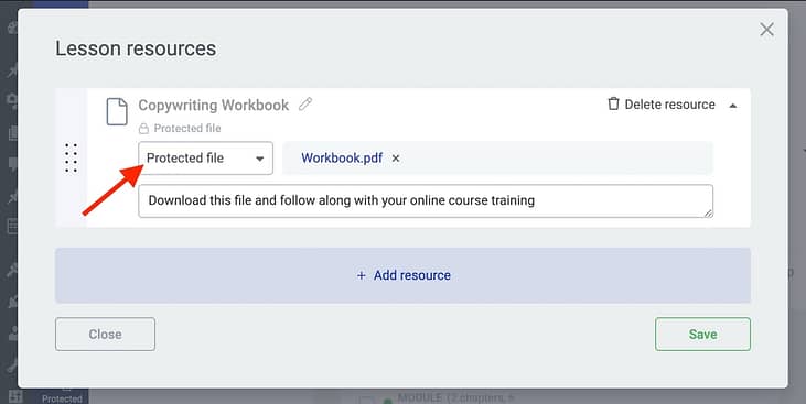
Look for the new 'Protected file' option in the Lesson Resources editor.
Now, on the front-end of your lesson, students who have access to your course will see a beautifully styled resources area with an easy-to-access download link.
This area is designer-friendly and created as part of your Thrive Apprentice course templates, so it'll inherit your fonts, colors and preferred styles.
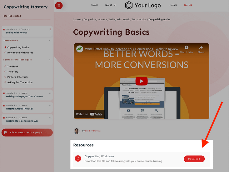
Your new protected file will appear in the Lesson Resources of your school templates.
Option 2: Adding Protected Files to pages or posts
The second way to offer your protected files is to provide a direct access link on any page or post.
Perhaps you want to create a landing page or members area on your website that is not a part of a specific course, and you want to provide clickable links that access the protected file.
Easy!
Open a page or post in Thrive Architect, create your hyperlink text, and from the typography bar, click the Insert Link icon > Dynamic link > then choose 'protected file'.
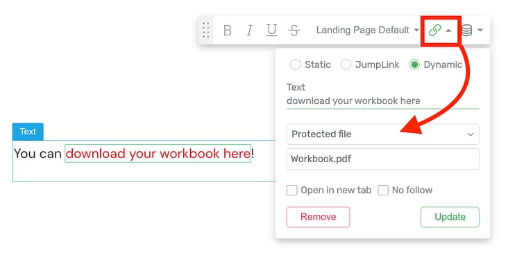
Protected Files will appear as dynamic hyperlinks.
The link will be added to your page.
What happens when the link is clicked?
This is where the magic happens. Whether your protected file is linked from the Resources area in Thrive Apprentice, or a direct link in Thrive Architect, the file URL won't be exposed.
Instead, a safe link will show. When clicked, Thrive Apprentice will check if the logged-in user has access rights. If they do, it'll immediately download from the browser window. On Google Chrome, you'll see the file show up in the downloads folder.
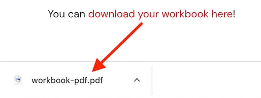
But, if a user clicks that link and they don't have permissions, they'll be redirected to your No Access template, as defined in the access settings of Thrive Apprentice.
That means you can show a default message, or redirect a user straight to the sales page where they can buy access. Of course, that no-access design is visually editable too, and in my example, I made it look just like this:

Visually edit the appearance and text of the 'no access' page your visitors see when trying to access the file without permission.
With the new Protected Files feature, you can protect anything:
PDFs, Jpegs, PNGs, xls, doc, csv, zip, mp3... the list goes on. And in case you were wondering, this feature way outdoes what other online course platforms have ever offered. Can you tell we're proud?
2. New Carousel Display Type for Both the Post List... and the Course List
You know our Post List element, right?
...the insanely-overpowered, template-driven, designer friendly way to display ANY posts, pages or custom post types on your Thrive-made website?
When you look at it, it's hard to imagine how to make it better, isn't it?
Well, we found a way.
Next time you open the Post List element, you'll see that alongside the Grid, List and Masonry display types, there's now a fourth type:
Carousel.
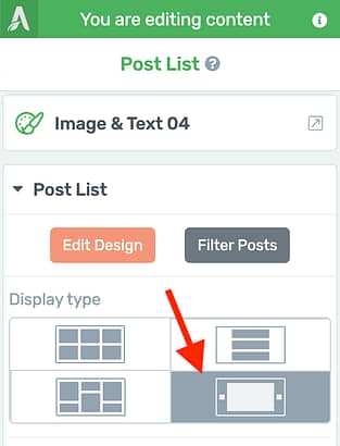
A new fourth display type!
We first introduced our Carousel technology with the Image Gallery element, allowing you to display beautiful image libraries that your visitors can scroll through.
But see, we were testing the waters. The end goal was to introduce it to the Post List and the Course List in Thrive Apprentice.
The result? An interactive, side-scrolling list of any filterable pages, posts or content from your website.
WordPress websites can get big. It's not uncommon to have hundreds of blog posts. But if you want to show those posts to your visitors, it'll take up a lot of digital real estate, won't it?
To account for this, over the years we've added pagination, smart back-end filters, and interactive front-end filters.
But a carousel takes it one step further. 20 or 30 posts can now be side-scrollable. Rather than forcing your visitors to scroll down a page length after page length, you can now give them options to scroll left and right if they want to browse your content.
Take a look at the new Carousel Options panel that appears once you've enabled it:
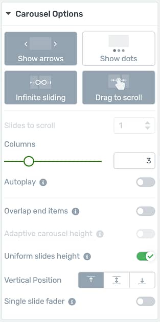
Find all your Carousel Options in their own dedicated sidebar panel.
In that option panel, you'll see you can easily add or remove arrows, navigation dots, or enable infinite sliding and drag-to-scroll.
Arrows and dots are visually editable too. Pick a new icon from the icon library, and change whatever settings you please.
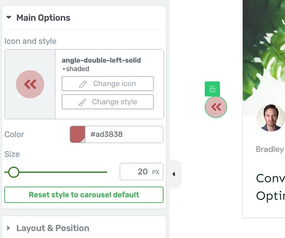
Even the arrows can be styled just to your liking!
You can enable autoplay if you want your posts to rotate on their own, and you can set your posts to uniform slide height, meaning that as your visitors navigate left and right, the size of the container won't bounce around between long and short posts.
There's even an option to make a single slide fader, with a fade transition between your posts.
Course creators, you haven't been forgotten!
The Post List technology also drives the Thrive Apprentice Course List element. Creating courses is only one half of the challenge: displaying and marketing them so your visitors want to buy them is the second half.
This element allows you to create visually editable and utterly stunning lists of the courses you are selling from you website, that can be filtered by topic, restriction labels, teacher and whether or not the student has purchased them or not.
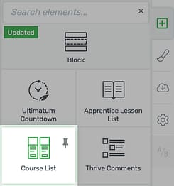
Thrive Apprentice users will be familiar with the Course List element
Choose the Carousel option for the Course List, and look at what you can create! A beautiful side-scrolling list of courses.
In this example below, I've enabled 'Overlap end items', and you'll see that a portion of the courses to the left and the right of the carousel are displayed, hinting to the visitor that there is more to see.
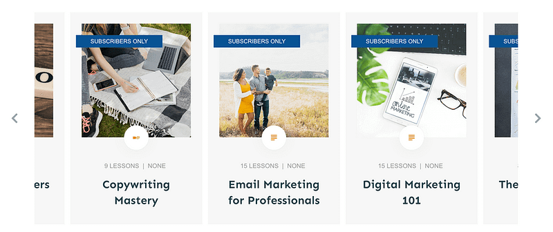
What a beautiful way to display a side-scrolling list of your courses!
One of the reasons this is such a great feature is that it's perfect for mobile visitors. Add the Course List Carousel to a full-width background section and let the courses overlap on the left and right, and mobile visitors can easily navigate with a swipe of their thumb:
3. Typography Control in Smart Landing Pages
Thrive Architect comes with nearly 100 gorgeous, marketing-focused, responsive landing page designs compatible with smart colors and page block technology. And if you have Thrive Theme Builder, you'll get access to another 86 theme-compatible pages too.
There's a lot to love.
But see, sometimes you want to mix and match, don't you?
Sometimes you want to use landing pages that look exactly like the rest of your site— borrowing their color, typography and style— whereas other times, you want to build a unique landing page, sales page or lead generation funnel that has it's own style.
Take for example these two sets below. What if you have Ommi theme installed, but you fall in love with a landing page from the Kwik Theme?
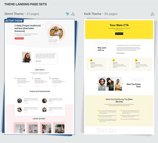
Smart landing page sets are built around a core set of shared typography.
Well, these pages are already compatible with smart colors, meaning they'll pick up your central theme color and apply it intelligently to the design component.
But so much of the look of a design is dictated by it's typography.
And given that we know you want options, we've just added a new feature to the Thrive Architect style panel, that lets you easily swap between your active Theme fonts OR uniquely inherit (and edit) the default landing page fonts.
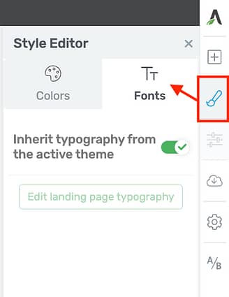
Look for the new 'Fonts' option in the Style Panel.
That means you can apply any landing page from any set, and with the click of a button, your fonts will be replaced with the main Theme typography set— a set you can configure easily in Thrive Theme Builder:
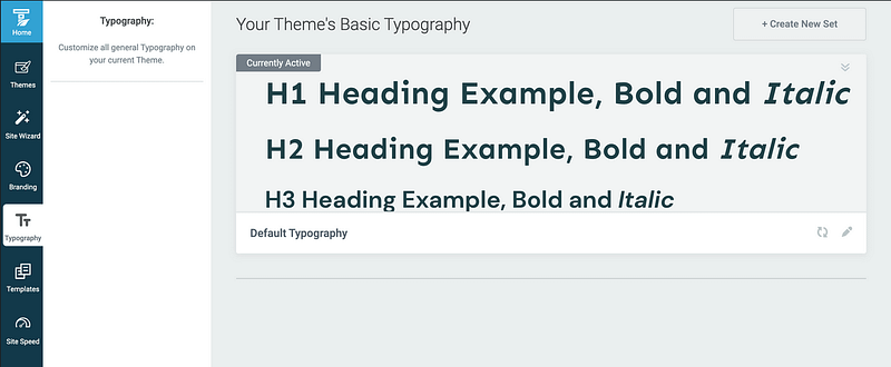
Thrive Theme Builder makes updating your global theme typography just stupidly easy
The result? Look at the two images below. The first is using a page from the Shapeshift landing page set, which has serif fonts and a more sophisticated look.
The second is inheriting Ommi theme's sans-serif fonts, for a more modern and friendly feeling.
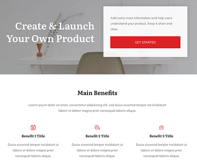
Shapeshift Landing Page with Shapeshift fonts
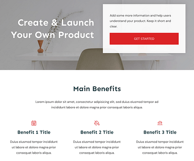
Shapeshift Landing Page... but now inheriting Ommi fonts
And all it took was one click.
4. Email Address No Longer a Required Field for a Form to be Submitted
This one might seem a little odd, until you understand the key use-case.
For many years, our Lead Generations form element— which, like everything else, is super flexible and designer friendly— had a mandatory email address field that couldn't be removed.
That makes sense because, well... how else are you adding a lead to your mailing list?
Now, we've made it possible to delete this field.
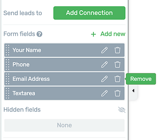
The Email Address field can be removed if you need.
"But why, Brad, that doesn't make sense?!"
Ah, but it does!
What if your customer base prefer to be contacted via phone? What if they don't want to join a mailing list, but they do want you to message them?
An example would be a car mechanic. You don't want to join a mailing list just to get your car serviced— you just want to submit a form and get a phonecall from the mechanic to book you in.
So your contact form might look more like this:
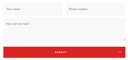
An example form without an email address field.
Then what? Well, if you add an 'email' connection, you can configure it to send an email to yourself or someone on your team whenever the form is submitted.
Note, that this isn't sending an email to the visitor— only to you, since you haven't got their email address.
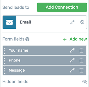
Set your form submit to send yourself an email.
With this connection type, you can configure the automated email to be sent to your inbox. Then, when it arrives, you'll have the customer's name, phone number and message in the body of the email, making it super easy for you to give them a call or shoot them a text.
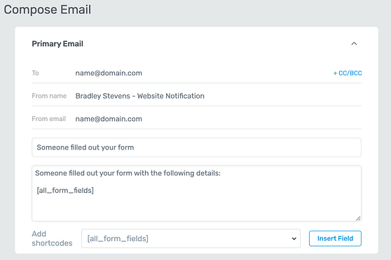
Easily edit the email sent by your website to include the form submit data.
However, if you add a mailing list as a connection, the Email Address field will be added back in to your form and will become mandatory again.
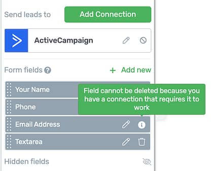
Connecting to an email list? Now you will require an email address.
The real reason we're making this change will become evident in our next major release. But in the meantime, those of you that aren't using a mailing list can make use of it right now.
But for what it's worth, why wouldn't you? Emailing marketing is still super effective.
What Else is Coming in 2023?
It's a red-hot roadmap we're working on, with no slowing down at all. We have the same product team and developers still hard at work to bring you some next-level features and software updates.
But for now, we'd love to know what you think of these latest features! Drop us a comment below.


Woo hoo, time to play with the new features!!! #excited
Enjoy!
Good stuff. Would love some additional WooCommerce abilities. A lot of our clients use WooCommerce and the ability to customize, edit, and make it all their own is hard. In some cases, we had to lobotomize Woo & Thrive to make it right. Woo feels very “templated” in Thrive. Hopefully we’ll see some major improvements in that arena.
Yeah, Woo is frustratingly difficult to work with, particularly as a visual editor. Without visual editing, it’s quite straightforward, but deepening our integration with Thrive Architect and Thrive Theme Builder is not an easy task. If it was, we would have done more of it long ago. That’s not to say we won’t, though
Fantastic! Thank you. I love all these features! You guys do know what we want and make it happen for us.
Idea. When the left side tool box is revealed, its vertical scroll bar is too thin. Can that be doubled or tripled in its thickness?
This human interface issue is frustrating.
I’m not quite sure what you’re referring to. Do you mean when you click on an element in Thrive Architect, and you have the options on the left sidebar to scroll? Some of that scrollbar width is set by your operation system and browser, not by us.
Feature 2 (Carousel for posts) is the best improvement for me personally. Keep going thrive team and please integrate some awesome form builder functions from wpforms so that thrive will stay the best and most complete wordpress page builder 🙂
Hey Timo, if you haven’t heard the news, we’re now part of the Awesome Motive family, which includes wpforms. I’ll have a chat with them and see if there’s anything we can do to deepen an integration. Very impressed with what I’ve seen of wpforms already.
My wonder is if the post slider will work on other types of content such as “lessons” and “topics?” These are out of the box post types that are part of the LearnDash LMS.
Hey Mark, I think it will. I haven’t got a test installation to try that out, but LearnDash lessons/ topics are likely just Custom Post Types, and our Post List element can display custom post types, yes. Give it a shot!
Yer great if you’re running a course website what about the rest of us!!!
Well, 3 out of 4 of these features we released aren’t for course creators. And the one that is can be used without courses too. What’s important in your business, and how can we help?
Looking forward to exploring the new features!
Question, is the “Carousel Display Type” available for Thrive Architect on sites that do not use the Thrive Themebuilder?
Hey Juergen— yes, it is. The Post List element is available in Thrive Architect, but without Thrive Theme Builder, you wouldn’t be able to override your default website blog page with it. But there’s still a lot of ways you can use it just in Thrive Architect.
Thank you once again for a great set of updates. You may not be aware but it was possible before to ‘remove’ the required email field. I had to do this for a client. You had to give it a default value and hide the field. But this solution is better!
Hah, I suppose that would technically work! But you’d be including a dummy email address in your form data every time. This will definitely be cleaner now 🙂
Does the protect files feature support S3 files or only local files?
Hey Nagui— it’s just locally hosted files. S3 would have some of it’s own file protection, though, yes? If you have a particular use case in mind, I’d be curious to know what it is.
We currently use S3Maestro to protect access to files used on our site for members only and in courses. Rather than having lots of files sourced from our server which can create a hearty load we use S3. So it would be useful if we could do the same and not need S3Maestro any more. We also use s3 Offload for all images for the same reason.
Thank you so much, I love Thrive Themes. I would like Thrive Apprentice to have a points system for evaluating students throughout the entire course. Something more suited for a school.
Gamification, essentially? We’ve had this request in the past, I’ll add a +1 with your note to it.
Add another +1 for me in the gamification.
+1 for gamification features
Excellent guys. It looks like you are moving forms to be more like ConvertBox. Do you have any plans for Community? It’s the only hole in your arsenal.
We’ve discussed Community features, but it’s a biiiiig commitment, and we’ve got a pretty extensive list of priorities to get through first. I guess by Community, you mean a way to allow course students to interact with each other, messages, etc.?
I would love to be able to have buddypress or buddyboss work with thrive theme builder and thrive apprentice.
Can’t use buddypress with TTB as it doesn’t look very good. Need to use themes designed for that plugin.
Having a community for members and groups for courses to interact would be great.
Can you integrate with Presto player and Uncanny automator please?
Regarding Uncanny Automator, what kind of integration and what are you specifically trying to do? I ask because we’ve recently joined the Awesome Motive family, of which Uncanny Automator is a part as well. So I can reach out to their team and discuss, but it would help to know what you’re trying to achieve.
I want to unlock lessons in apprentice based on video consumption in Presto Player
Super features, would it be possible to use the carousel also with WooCommerce products, categories and so on?
Is there some tooling in the pipeline to work the media files? Export and import with auto-reducing size etc.
I see, even when optimized, some pictures are still far too big. I know it’s somewhere available but just to make it easy/intuitive.
Thanks again!
Cheers Christiaan
Hey Christiaan, to answer you Woo question: sort of. The post list element can pull any custom post types on your website, including WooCommerce products. But it is different to a proper shop element, which allows you to add to cart directly from the listing. We haven’t added the carousel to the Shop element yet, and have yet to evaluate how difficult that would be. But we’ll take a look.
As for media file resizing: if you mean for the Protected Files feature, no. The content of the protected files is basically ignored. It’s just seen as a unit of data that can be downloaded, whereas when it’s added to the media library (and thus exposed to users), there are different options based on the file type.
But regarding images, if your goal is to have optimized images on your website: are you aware of our Optimole integration with Thrive Theme Builder? It’s pretty awesome!
https://help.thrivethemes.com/en/articles/4426154-how-to-use-the-site-speed-section-of-the-thrive-theme-builder-dashboard#h_ae185f3255
+1 for WooCommerce carousel feature. This is super common to see on big e-commerce websites. I would be able to redesign my home page with that option on the shop element.
Apprentice is no longer a little hot pluign in my WP installation, it’s becoming my CORE foundation in the plugin stack- I have in years searched for a solution as could do a basic Course (LMS) in WP but every time, when I nearly had it, some other stuff lacked and was missing… Every time I keept telling myself that the THRIVE (guys, shane and co.) will serve me my needs -> by time… And i’m so right, Apprentice and You Thrive guys You just understand the simple but very core fundamental of a “online business” – IS just the important stuff to control your business as a “little” cource-/content creator.. THANK you.. Cheers for the good work. the the sun shine on your all
I love all the hard work you put in ThriveSuite. Getting on board 7 years ago was one of my best business decisions.
Thank you!!
Thank you for sticking with us, Artur. More to come, too!
I’ll second that!
I love all the new updates. For years I’ve been waiting for his carousel feature. It’s my only con to Thrive Theme Builder and/or Thrive Architect. Now what I’m waiting for is for Thrive to carry this feature over for photos and or the Hero sections of the site. Either way, I’m pleased with Thrive but would like to see this feature soon. I was with Elementor before Thrive and they’ve had this feature for a while.
We’re slowly rolling out this carousel feature, so we have some more plans for it. However, having a carousel hero section of a website… well, we have some strong opinions about this. Or rather, how it gets so frequently misused in website design:
Check out this video.
It’s not that we won’t allow it, but more that we don’t consider that exact use case a high priority. That’s not to say that there aren’t clever ways to use such a feature for a high converting hero section, but that more often than not, they aren’t designed that way 🙂
I’m loving the updated carousel functionality!
Now please let us add the same side-scrolling effect to a link menu (just text, no images) and mobile design abilities will be completely leveled up!!
Ooh, that’s an interesting usecase. We’ve discussed it before, but haven’t come to a conclusion. To be clear, you mean like a horizontal strip of links that can be moved left and right? Kind of like the second light-grey menu bar here: https://www.macrumors.com/
I think we’d handle that differently to a carousel element, but we’ll see.
Hi Bradley,
I was very happy to konw that you were working to protect the files that we make available within the course area for our customers.
I see that this was a big step, as I was one of the Thrive Suite subscribers who requested measures for fair file protection from the support team.
At a certain point, I thought about hiring developers to create a plugin that could work together with Thrive Apprentice in this protection.
Well, I see that the solution you presented is incredible, but it prevents the sharing of the download link and does not make it difficult to share the file itself, that is, if there is a bad nature in sharing the link which guarantees that there will be no sharing of the file?
An additional solution would be to print some customer information into the file when it is downloaded, such as email, IP address, etc.
Honestly, I don’t know to what extent this would infringe laws such as GDPR (European Union), CCPA (California) or GDPR (Brazil), but it is one of the most efficient ways used in Brazil to contain the piracy of teaching resources available in courses.
Looking forward to further developments in advancing file protection,
Geo
Yeah, we thought about that. But watermarking personal information would be very difficult, and still not a perfect solution. The way I think about piracy for online course creators and files is this example:
>> You can’t stop someone from breaking into your car by smashing a window, but you can at least lock the car doors.
The point being— in the digital age, bad actors will find a way around most things. But you can at least make it difficult for them to exploit you. In this case, having an exposed, direct URL to your file which anyone can link to is just begging to be exploited, and our protected files feature closes that loop.
Great updates as usual. I barely have time to keep up and use all the new features being pushed out!
Now just to allow Square Brackets in Form Field Names so I can push my variables through from the Form fill to my Booking/Order page.
😉
Hey, I recognize that name! Ah yes, we spoke about this one— I got caught up with a few other things (clearly!), remind me again next week and I’ll raise this with our devs.
This is all amazing and we love it but… when are you guys adding a good-looking and clean checkout system to Apprentice? It seems like a missed opportunity, especially with how amazing the thrive architect and thrive suite eco system is. It would be great if we didn’t have to install woo-commerce to sell stuff.
I’m having a problem:
– Add description Photo: not reponsive image with Phone
– I want to add table of contents in Product Details (woocommerce)
My questions and suggestions.
Thanks!
Images are definitely responsive, even by default. It might be that you’ve set a fixed width somewhere. Reach out to our support team and they’ll take a look and figure out why your image isn’t responsive.
As for Table of Contents, I haven’t explored that use case. It may actually be possible, since a Table of Contents can pull dynamic content when applied at a template level in Thrive Theme Builder. Perhaps raise this in our facebook group, and there might be a power user who knows how to do this.
I propose: Show Price Course in Apprentice?
We’ll add it to our feature request list 🙂
I love the carousel feature. Can we please have it for testimonials next and can we please have the option to insert either videos or images in the galleries and carousels so we can display video testimonials etc? That would be awesome!
I love Thrive Apprentice. But could you guys integrate your software with Clickbank where I am selling digital products through Clickbank? It has been way too long ever since. I really hope ThriveThemes can implement it quickly and work with Clickbank so our files can be protected with members’ dashboards. Create a new account for them with a generated password whenever a customer purchases our product via the Clickbank Order form.
I hope this gets implemented asap in this year.
We’ll add your feature request, but I’ll give a heads up: we’ve had very few requests for a Clickbank integration over the years, so it’s not likely to be a high priority, I’m afraid.
A good new option. It would be nice if an email could be added, without obligation. on the right track. Regards, Marchal
Email where? And what do you mean without obligation? I need a little more context to decipher what you’re referring to
I love the new updates, especially 1 and 2. I have a question though: I’m having an audio file as an opt-in gift. So I don’t want to have that file available to just everyone without opting in first. But I’m not creating wordpress users for all my leads. They go into my CRM (FluentCRM, so wordpress based). So they won’t be “signed in” when they receive a link from me. How can I protect that audio file, but make sure that people who opted in can access it?
At the moment, Protected Files requires a WordPress account. Although there might be ways around that in future, we haven’t figured it out yet. So for your specific use-case, my recommendation would be: if they’re not paying for it, and it’s for lead generation, don’t worry about protecting it. If someone wants the audio file and all they have to do is give over their email address, it’s much less effort to just do that rather than try to circumvent the lead gen form. So you could embed the audio file on a page, de-index the page (so google won’t link to it), and then on confirmed opt-in, link them to the page.
If they end up sharing that page with someone else, the worst that will happen is someone else will be impressed by the audio file and curious about your business, even though they aren’t on the mailing list.
Any chance of the protected files feature being available for all downloadable files on a site and not just on Thrive Apprentice?
Not really, no. If you are protecting access to a file, you need a way to manage who has access to the file or not, and what should happen when they don’t. So you need an access list and the ‘no access’ logic, all which is handled perfectly by Thrive Apprentice.
Just don’t forget that you can absolutely use Thrive Apprentice for membership sites or protecting access to content without ever needing to create online courses. We use the one platform for both, but you can use it however you please.
Great work. When it comes to email, when do you think it will be possible to add a working tag (for example name or phone) in the email subject line?
Now when you collect leads for local service websites, they group as one, as there is nothing to differentiate them in the email client.
That’s valid feedback, for sure. I’ll take it to our team and see