The moment a visitor decides to buy is the most important scene in their customer journey. Success isn't accidental; it requires clear direction.
Too often, this crucial moment is unplanned. A user is interested in a product mentioned in a page or post, but there's no “buy” button in sight. They have to leave the page, find your shop, locate the product, and then add it to their cart. This creates friction and confusion, causing their excitement to buy to fizzle out.
So what’s the real cause of this common problem? It isn't bad technology. It's something much simpler: many store owners don't know they have a way to place a purchase button anywhere on their site.
This guide is that plan. It gives you the direct answers you need to create powerful “Add to Cart” buttons and place them wherever they'll be most effective.
How to Create Your Custom WooCommerce 'Add to Cart' Button
This section contains the direct, actionable answers to the most common questions people have about WooCommerce buttons. Click on any question to see the detailed answer.
Answer: There are two main ways to link your button to a WooCommerce product. We'll start with the universal method, and then show you the much easier way.
Method 1: The Universal Manual Way (The Complicated Way)
This method works for any button or link anywhere in WordPress, but it's a bit tedious and requires careful attention to detail.
- First, you need to leave your editor and go to your WordPress dashboard. Navigate to
Products. - Find the product you want to link to and hover over it to find its unique Product ID. You must copy this number exactly.
- Go back to your page editor and select your button.
- In the button's link field, you have to manually type or paste this exact URL structure, replacing
IDwith the number you copied:$https://yourdomain.com/cart/?add-to-cart=ID$
This method works, but it's prone to error. If you type the ID wrong or make a mistake in the URL structure, the link will break.
- First, you need to leave your editor and go to your WordPress dashboard. Navigate to
Method 2: The Thrive Architect Dynamic Link (The Simple & Recommended Way)

This method solves all the problems of the manual way. It's faster, easier, and you don't have to worry about errors.
- Select the button you styled in Thrive Architect.
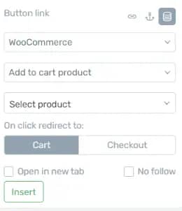
- In the left sidebar, simply click the “Dynamic Link” toggle.
- Choose “WooCommerce” as the source, then select “Add to cart product” from the next dropdown. You also have an option to link directly to the checkout page if you like.
- A search box appears. Just type the name of your product and select it from the list. No more hunting for IDs.
- Finally, choose if the button should redirect to the Cart or directly to Checkout.
- Click “Insert”. That's it. Your button is perfectly linked.
Answer: Again, the difference between the manual and dynamic methods is significant.
- The Manual Way: This gets even more complicated. You have to find both the main Product ID and the specific Variation ID. The URL you must build is much longer:
$https://yourdomain.com/cart/?add-to-cart=PRODUCT_ID&variation_id=VARIATION_ID$ - The Thrive Architect Way: It's incredibly simple. After you select the main product using the Dynamic Link feature, a new dropdown automatically appears with all its variations. Just select the one you want from the list.
Answer: Now that you're not limited to default shop pages, you can get strategic.
- In Pricing Tables: A perfect place to let users directly add their chosen plan to the cart. You can build these tables with the Thrive Architect 'Pricing Table' element.
- On Sales Pages: Create long-form sales pages and place buy buttons at key moments in your pitch.
- In Blog Posts: Did you write a review or tutorial about your own product? Add a buy button right in the content where the reader's interest is highest.
Beyond the Link: 3 Pro Tips for Buttons That Sell

Creating a working button is just the first step. Creating a button that customers want to click requires a bit of strategy. Here are three professional tips I live by when it comes to increasing your button's effectiveness.
1. Make It Visually Stand Out
A button that blends in is a button that doesn't get clicked. Use a high-contrast color that stands out from the background and surrounding elements but still fits your brand's palette. Ensure it's large enough to be easily seen and tapped on all devices, with plenty of empty space around it to breathe. A button that looks important is treated as important. Here's your cheatsheet to ensure your button gets noticed.
2. Use Clear, Action-Oriented Text
The text on your button should be simple and unambiguous. “Add to Cart” or “Buy Now” are powerful because they clearly manage expectations. The user knows exactly what will happen when they click. This clarity is critical; some case studies have shown that improving the text on a single CTA button can increase conversions by over 90% 🤯.
3. Surround It with Trust Signals
The moment a customer considers clicking “buy” is also a moment of peak anxiety. You can reduce this friction by placing trust-building elements near the button to reduce anxiety and increase confidence. Good examples include:
- A “30-Day Money-Back Guarantee” badge.
- Small icons for accepted payments (Visa, Mastercard, PayPal).
- A note about “Secure SSL Checkout.”
The Problem: Why Default Buttons Aren't Enough
So you have the technical steps and strategic tips. But why do so many stores still fail at this crucial moment?
The main problem is working without a plan. It's like trying to shoot an important scene in a movie by just making things up as you go. This leads to a strange and confusing situation where the customer is ready to buy, but there's no clear, immediate way to do so. The path for the customer becomes unclear, they lose trust, and their excitement to buy disappears.
Confusion Kills Conversions
I've worked with way too many brands who have missed out on tons of sales for this very reason. They're so busy coming up with new ideas to boost conversions and test different strategies that they needlessly complicate. A great add-to-cart button can do a lot of the heavy lifting for you.
Check out our conversion checklist to make sure you're staying on track.
The High Cost of a Poor Purchase Experience

Are your purchase buttons actually costing you sales?
An unplanned user path doesn't just feel awkward; it has serious consequences for your sales.
When the path to purchase is confusing, your customers don't stick around. They just leave. This isn't just a guess; research from Baymard Institute shows that 18% of all online shoppers will leave a site if the checkout process is too long or complicated.
Worse, your store gets a reputation for looking cheap or unprofessional. This directly affects your business. In fact, studies show that 94% of people's first impressions about a company are based on its website design, and 62% will stop engaging if a site is unattractive.
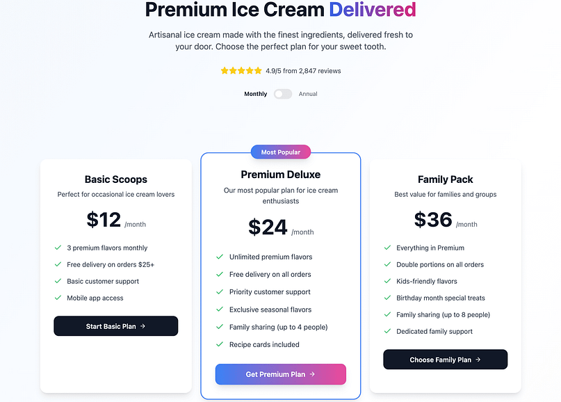
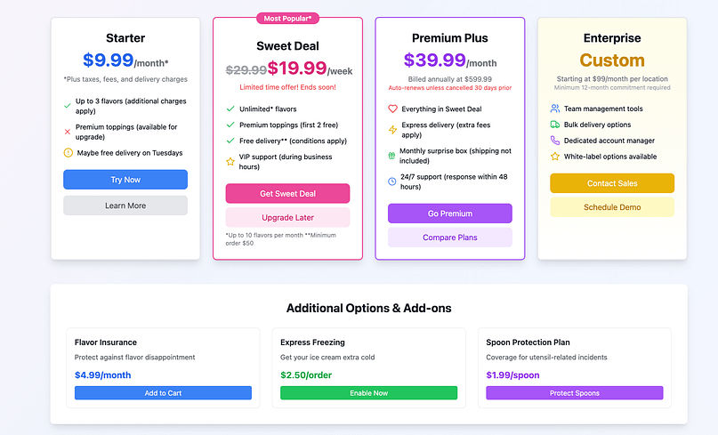
In our example above, there are some beautiful design elements, but that doesn't make up for the crazy user path.
Warning: Page Speed is Killing Your Sales
Ultimately, your sales suffer, often before a customer even sees your page. A poorly built page is a slow page, and the financial impact is devastating. Research directly from Google shows that as page load time goes from 1 second to 3 seconds, the probability of a visitor bouncing (leaving your site) increases by 32%. If your page takes 5 seconds to load, the probability of them leaving increases by 90%. If people aren't sticking around, they're not buying!
Your "Add to Cart" Button Questions, Answered (FAQ)
I'm sure you've got more questions, so here are some more in depth answers to help take your buttons to the next level.
A: Yes, both the dynamic and manual link methods work perfectly for simple subscription products.
A: The most common reasons are an incorrect Product ID, or a “caching issue.” A cache is your site's temporary memory; try clearing it in your site's settings. This is a key reason why using the Dynamic Link feature is recommended, as it avoids these manual errors.
Your Next Step: From a Perfect Button to a High-Selling Store
You now have the complete plan for crafting the perfect purchase button. You know how to direct your users to a confident 'yes' and this should help grow your sales. But to make sure you reach your goals, we've got some great WooCommerce tips for you.
Your Masterclass in WooCommerce Sales
A customer's decision to buy isn't just one big moment. Think of it like a chain made of many small links. Each link is a small 'yes' from the customer. To make a sale, every single one of those links has to be strong. The video below is a masterclass in the tips and tricks that help you do just that.
It's Your Time to Take Control
You don't have to improvise anymore. You have the plan and the right steps to follow.
The stage is set. It's time to get started, and you might well find Thrive's products have everything you need.


Thanks for your comment, David!
So, the Cart and Checkout pages can be somewhat customized with the Thrive Themes products.
I say somewhat because you cannot customize the fields or the buttons on those pages, because those are specific WooCommerce features.
BUT… You can use Thrive Architect to display elements above or below the WooCommerce content on those pages. You can also use Thrive Leads to display opt-in offers on those pages, Thrive Quiz Builder to display quizzes/surveys, Ultimatum to display countdown timers, and so on. 🙂
Is there a tutorial on Woocommerce modifications?
Is it possible to build a product page in TA? That would be great.
The product page can’t be customized with TA, unfortunately, because it is custom built by WooCommerce…
Thanks for the info, Volker 🙂
In terms of customizing, you can pretty much customize the cart and checkout pages with our products.
Now, you cannot modify the fields and the actual data on those pages, because that is specific WooCommerce content.
But, you can add other elements on those pages, with Thrive Architect, or display an opt-in form with Thrive Leads or a quiz with Thrive Quiz Builder, and so on 🙂
Thx for the answer. I doesn´t want to change woo fields or something like that. therefore a lot of plugins are available (e.g. booster).
What I meant, were styling things which I do with the AVADA theme or with CSS right now.
I am looking for the new Theme Builder in order to unique customer experience in landing pages, blog and other pages. In this context it would be cool to have the opportunity to define e.g. headlines (h1,2,3…) and woo headlines…, input fields a.s.o. from design perspective.
anyway, hopefully the new Theme Builder will go live tomorrow ;-))
Thank you so much for this, Wouter! It’s something that always bothered me about connecting Woocommerce with my pricing tables and now I know how to skip the cart for a single product purchase! You rock! 🙂
You’re very welcome, Rora 🙂
I’m really glad to hear that, James 🙂
Awesome! Thanks for the tip, Wouter 🙂
You got it! If you are in the need for any new tutorials which could also be useful for anyone else starting out, let us know 🙂
Cheers!
I haven’t really tested WooCommerce this far, but I don’t see why not.