I’ve seen it happen over and over: someone drives traffic to an affiliate link, waits for sales to roll in… and nothing happens. The problem usually isn’t the traffic — it’s the missing step in the funnel.
That missing step is what most people call an “affiliate landing page.” Inside the affiliate world, we have a sharper name for it: the bridge page. It’s not the vendor’s sales page, and it’s not just a random blog post. It’s the page you control — the one that introduces you, sets the tone, and warms people up before you hand them off to the offer.
If you’ve never built one before, don’t worry. In this guide, I’ll walk you through what bridge pages are, why they’re so powerful, and how to create high-converting ones with Thrive Architect. By the end, you’ll know exactly how to stop sending cold clicks to vendors and start sending pre-sold, ready-to-buy visitors instead.
💡 What You Should Know Before We Dive In
- Sending people straight to an affiliate link? That’s why conversions feel flat. A bridge page warms them up first.
- Keep it simple: one page, one goal, one clear call-to-action. No rabbit holes.
- Your story beats specs every time. A quick video or a real-life example builds more trust than a feature list ever will.
- And yes — the right tool makes it easy. I use Thrive Architect because I can build these pages in minutes, not days.
Affiliate Landing Page vs. Bridge Page (What’s the Difference?)
If you’re new to affiliate marketing, the terms can get confusing fast. You’ll see “affiliate landing page” everywhere, but what people actually mean isn’t always the same thing. Some are talking about pages to recruit affiliates into a program. Others mean pages affiliates use to promote a product.
That second one? That’s what matters to us. And inside the affiliate world, it has a special name: the bridge page.
Think of it like this: a landing page is any page someone arrives on after a click. A bridge page is more specific — it’s the page you create between your traffic source and the vendor’s sales page. It’s where you introduce yourself, build trust, and give people a reason to click through with confidence.
Here’s how I explain it:
Landing page is the umbrella term. It’s any page someone arrives on after clicking a link. Could be a webinar signup, a squeeze page, even a checkout.
Bridge page is the affiliate marketer’s secret weapon. It sits between your ad or email and the merchant’s sales page, giving you a chance to connect, add context, and pre-sell the offer.
If your ad is the invitation, and the vendor’s page is the party, your bridge page is you greeting guests at the door: “Come in, let me set the scene, here’s why this party is worth staying for.”
Why it matters:
- You stop being just a link-sharer. You become the trusted voice.
- You shape the way your audience sees the product (instead of leaving it all to the vendor’s copywriter).
- You stay in the good books of ad platforms that hate direct affiliate links.
So throughout this guide, whenever I say “affiliate landing page,” I’m really talking about bridge pages — the kind that earn trust and boost conversions.
The Bridge Page: Your Secret Conversion Weapon
Let me say this upfront: if you’re sending traffic straight to an affiliate link, you’re leaving money on the table. People don’t trust raw links. They trust you. And that’s exactly what a bridge page gives you — a chance to show up, share your perspective, and prime your audience before they ever see the vendor’s sales pitch.
Think of bridge page is your warm-up act. It’s where you:
- Build rapport so your audience sees you as the guide, not just a middle-person.
- Educate them on what the product actually does (without drowning them in features).
- Frame the offer in a way that connects with their problems and goals.
- Keep your campaigns compliant with ad platforms that don’t allow direct affiliate links.
The SEO Fine Print
Not all “middle pages” are created equal. A legitimate bridge page adds value — it teaches, shares, or reviews. A spammy “doorway page” just funnels people with no context, and search engines hate that. Google will happily slap a penalty on doorway pages, but a well-built bridge page? That’s seen as useful, because it actually helps visitors make better decisions.
The Psychology Behind It
Here’s the part most people miss: bridge pages work because of priming. You’re preparing your visitor’s mindset before they ever hit the offer. By the time they see the sales page, they’ve already heard your story, absorbed your framing, and are leaning in with curiosity. You’ve removed objections before they even form.
📌 My 10-Minute Formula for Bridge Pages
When I need a bridge page up fast, I don’t overcomplicate it. In Thrive Architect, I use this simple four-step flow:
- Headline that hooks — clear benefit-driven text that tells people why they should care.
- A short video or personal story — a quick clip or paragraph explaining why I recommend the product.
- Bullet-point benefits — three to five bullets focused on outcomes, not features.
- One clear CTA — a single button that links to the affiliate offer. One page = one goal.
That’s it. Ten minutes, start to finish. If you want to explore more detailed templates, stick around — the next section dives into full walkthroughs.
How to Create an Eye-Catching Affiliate Marketing Landing Page (Ultimate Guide)
This tutorial includes a step-by-step guide on how to affiliate marketing landing pages that convert.
Let’s dive in.
1. Download & Install Thrive Architect
Thrive Architect is the best landing page builder for WordPress websites.
If you’re looking for the right tool to build landing pages that stand out from other affiliate marketers in your niche – this is the plugin for you.
Thrive Architect makes web design easy – really easy. Saving you time in learning so you can focus on becoming the go-to authority in your industry.
This plugin gives you access to hundreds of customizable templates to create kickass webpages that leave your audience going “Wow. I want to learn more from this person”.
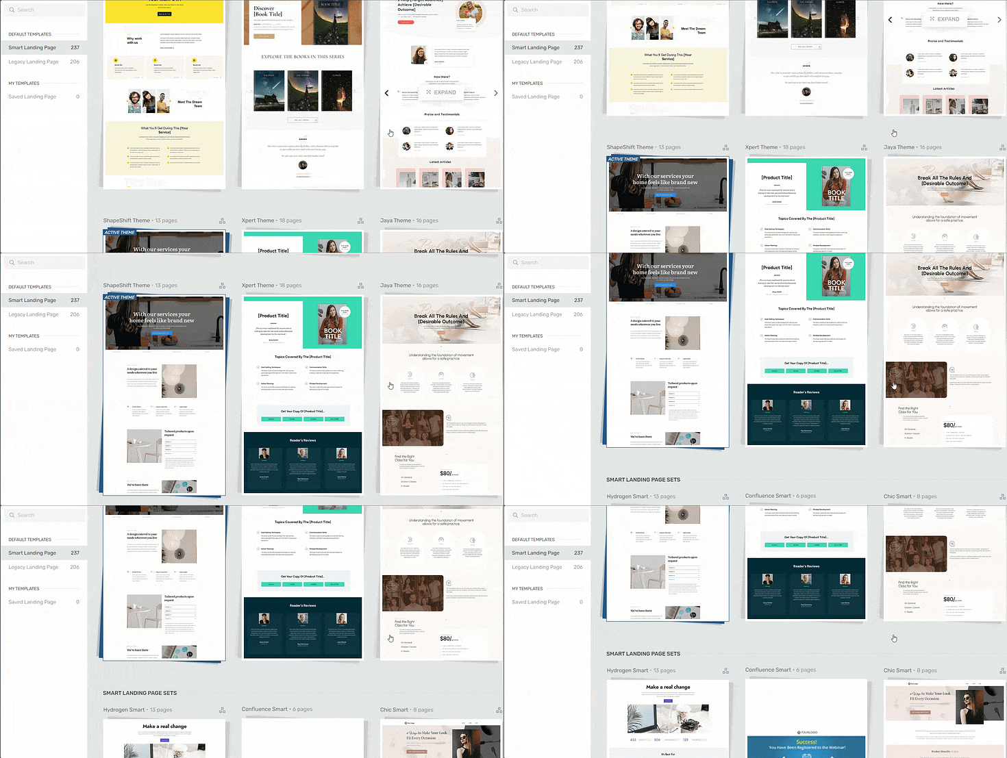
Landing page template sets in Thrive Architect
Every page template was built with conversion generation in mind, so you’ll find all the crucial elements you need to guide your site visitors to buy or sign up.
Want to make changes to a template or build a page from scratch? No problem.
Ideal for WordPress beginners, the Thrive Architect editor comes drag-and-drop functionality and a large selection of block templates and design elements you can easily add to your pages to create a custom design.

Like we said – easy building.
In terms of integrations, this plugin works seamlessly with most Google analytics plugins and the best SEO tools to help you track your metrics and optimize your content for search engines.
You can also connect your pages to your email marketing and eCommerce tools in a few clicks.
Thrive Architect doesn’t have a free version, but this pro plugin offers a 30-day money back guarantee — allowing you to give this tool a try, risk-free.
Think of it as a free landing page builder trial.
You can buy Thrive Architect as an individual product or as a part of our WordPress plugin bundle, Thrive Suite.
2. Create a New Page in WordPress
Creating a new page for your WordPress website is super straightforward.
In the WordPress Dashboard, select the "+ New" button at the top of the page and select "Page".
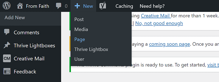
When taken to the next screen, name your page and select the bright green "Launch Thrive Architect" button.

3. Load a Landing Page Template
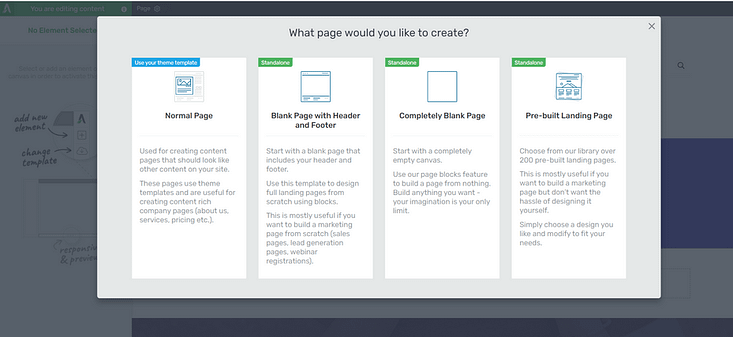
Thrive Architect will provide you with four options:
1. Normal Page
2. Blank Page with Header and Footer
3. Completely Blank Page
4. Pre-built Landing Pages
If you want to use the templates we’re showcasing in this guide, go to Legacy Landing Pages and search for “Review”. You’ll find all four-page templates in this set.
These include:
The Review Landing Page
This is a dedicated landing page for sharing reviews. Think of it more as a strategic promotional page. However, it’s geared towards conversion with clever elements and a distraction-free layout to help you get more clicks.
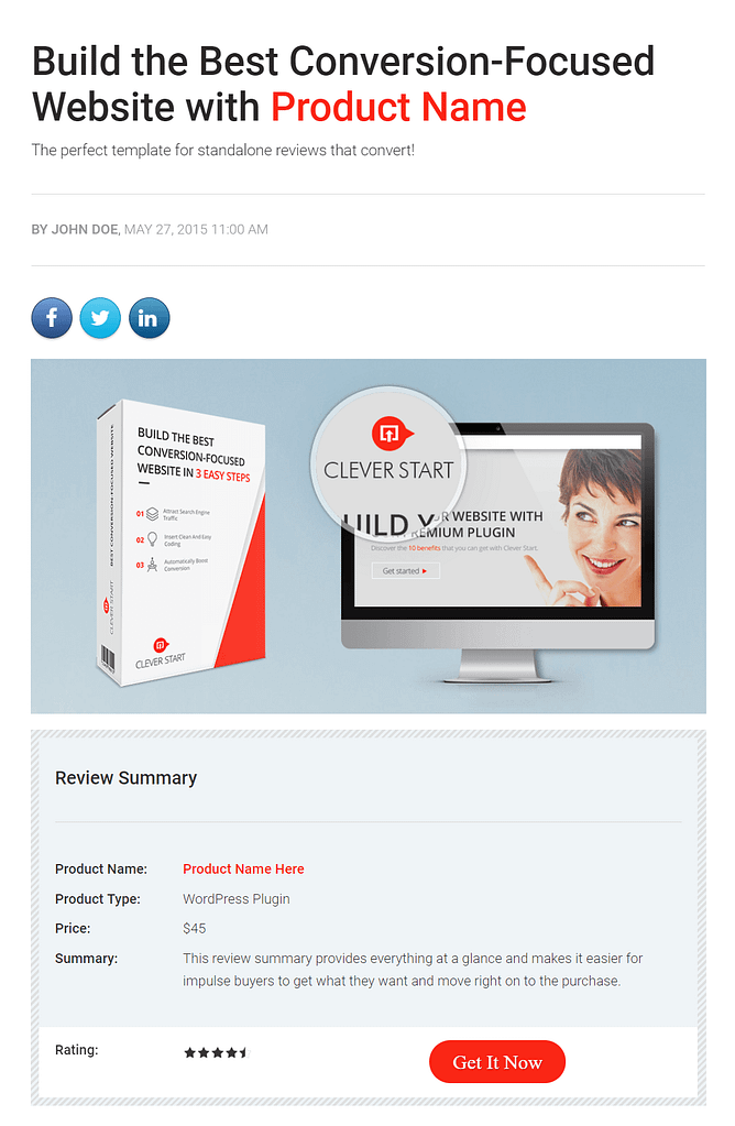
The review landing page comes with the following conversion-focused elements:
- Title: you can never go wrong with a big headline that gives the reader an instant overview about your page.
- Social sharing buttons: these help readers spread your content across different social platforms.
- First visual element: a visual highlight of what this landing page is about.
- A review summary box with product rating and a button to purchase: it’s a smart idea to include a summary box at the beginning of your affiliate landing page. Some readers read your whole article, but others just skim through it, looking for the most important information. A summary box enables them to get an instant overview of the product.
- Text layout of the template: in the body section of this template you find subheadings, images in a different alignments, and highlights. It gives you some inspiration of how to put together an article to make it visually appealing and easy to read. You can mix and match every element by using the Thrive Architect drag and drop visual editor. However, keep in mind that having at least one visual element on the screen as the reader scrolls through your article improves readability.
- Conclusion box: this is where you conclude your review and add your final words and opinion. This section includes a larger product rating element.
Next to it, you can find a pros and cons list. Even if your main purpose is to promote a product and get the most conversions, it is still a good idea to mention some negative points as well. This will give you more credibility. The best strategy is to list a lot of strong positive points and just a couple of minor negative ones. - Promotion box: this landing page finishes strong with a promotion box that clearly highlights the benefits of your promoted product. Furthermore, a large product rating element and a big CTA button encourages people to click.
The Review Comparison Page or Product Review Roundup
You can use this type of affiliate landing page when you compare multiple products. The layout and design are quite similar to the previous Review Landing Page example.
Why create a product review roundup? It’s a way to provide real value to your readers. In the last stage of the buying process, people have usually reviewed a number of products.
Now they have to decide which one to pick among all the options. With this template, you can help them through the decision-making process by providing a review comparison.
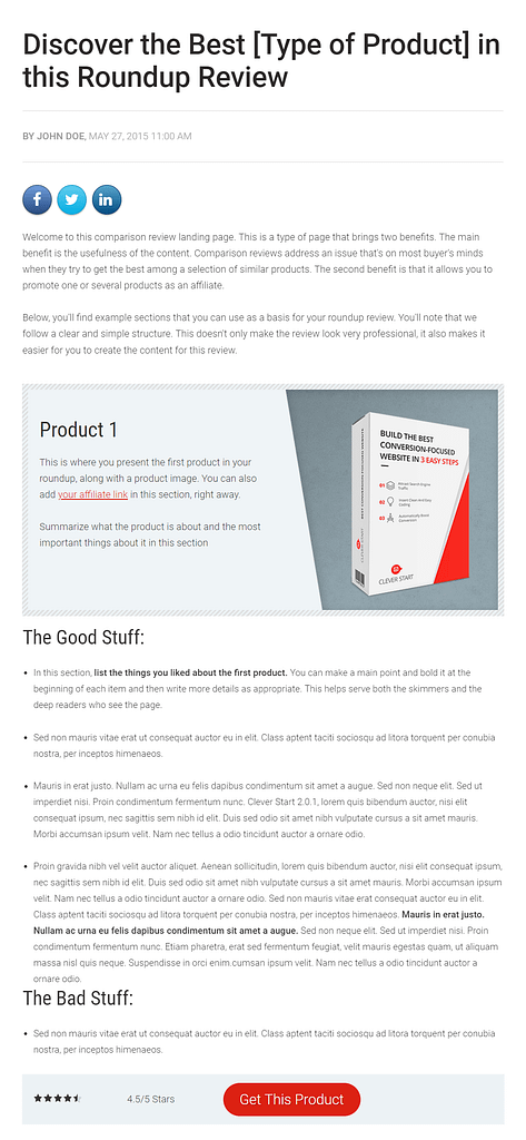
We created this template to help you write the most appealing roundup review. After the introductory paragraph, you’ll find a content pattern that repeats. You can copy this as many times as you need. It consists of:
- A product box that summarizes the product and represents it with an image
- A list of pros followed by a list of cons
- A star product rating
- A CTA button linking to the affiliate product.
A product box comes at the end of the template, which enables you to present a clear recommendation. This is the key element of the template.
After introducing all the products, you need to highlight the “winner” that has it all. Otherwise, readers might get overwhelmed after reading all the detailed information, still not knowing which one to pick.
We also recommend adding social proof like testimonials or customer success stories to solidify your review’s credibility and show potential customers that other people love the product, too.
The Review Resources Page
If you are an expert in a specific field and you have authority in your niche, your readers are surely interested in the tools and products that contribute to your success. No matter your area of expertise, it’s easy to put together a resources landing page like this.
Whether you review products, software, or websites, this page design does it all.
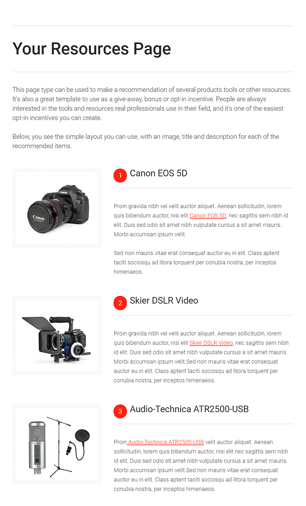
Following the title and the introductory paragraph, you’ll find a content pattern that repeats:
- A product image
- A product name
- A short paragraph that describes the product.
Depending on how long you want your resource page to be, you can simply duplicate or delete the elements in the template. Then you can use affiliate links to link through to the products.
You can take things further and add a pricing table to give your audience a clearer picture of what these products will cost them.
The Review Video Recommendation Page
If you want to promote a single product as an affiliate, it’s a good digital marketing strategy to send your target audience to your landing page first and link through to your affiliate offer from there.
This affiliate promotion strategy is a very effective way to get people to buy.
After all, your subscribers are already familiar with you and trust your opinion. They’d rather listen to you, than the opinion of an influencer they don’t know.
If you first talk to them about the benefits of a product instead of sharing a generic sales page, you have a better chance to win their purchase.
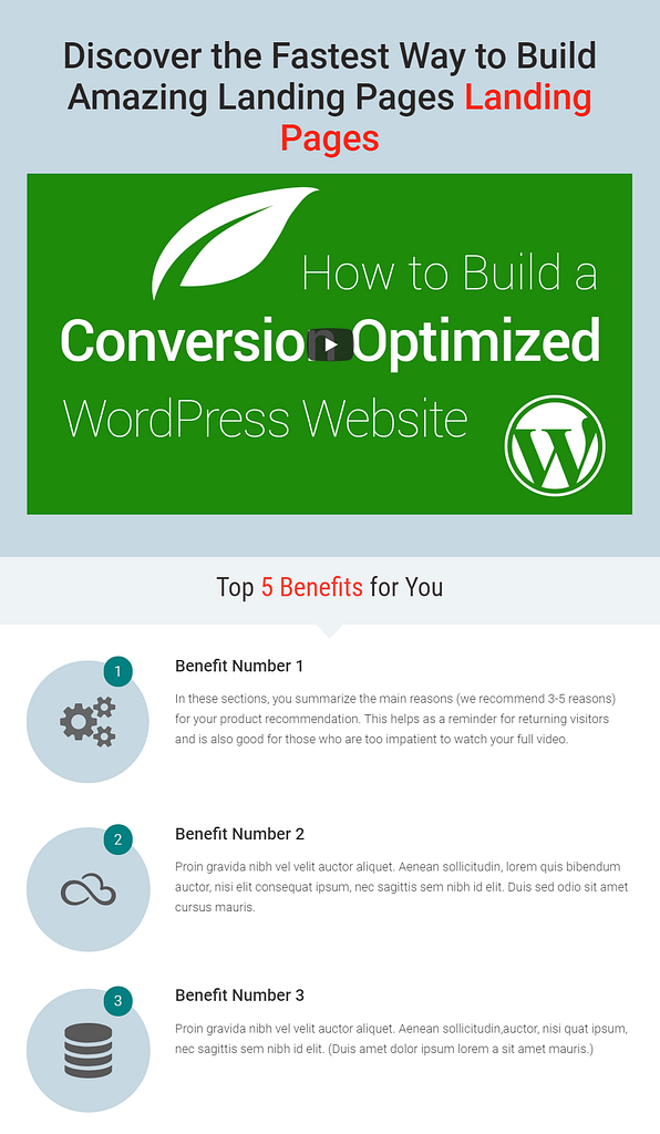
The following conversion-focused elements will help you convince your audience why to buy:
- Large headline: explains the main benefit of the product and why visitors should watch your video
- The video: you can briefly talk about why you are making your recommendation. Consider using case studies to show readers a real-life benefit, and explain how you personally benefited from using that particular item.
- A list of benefits to sum up your review: this is for readers who just skim through your content. Tie these points to real-world examples to make it more effective.
- Promo box: summarizes why you recommend the product.
4. Customize Your Affiliate Marketing Landing Page
The beauty of these templates is that you can tailor them to your liking. They’re just a starting point.
Thrive Architect equips you with all the tools you need to turn a template into unique landing pages that align with your brand.
To help jumpstart your creative mind, here are a few suggestions:
Add text highlights to your headlines to grab your audience’s attention and make your offer really stand out
Add a pre-built call-to-action section to guide your visitors to convert.
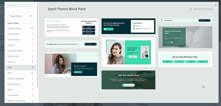
CTA section examples
Drop in an eye-grabbing hero section to introduce yourself and set a great first impression
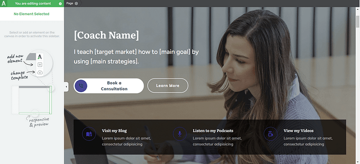
Hero section example from Xpert, our theme set for landing pages
Throw in a countdown timer to push your visitors to act faster and convert.
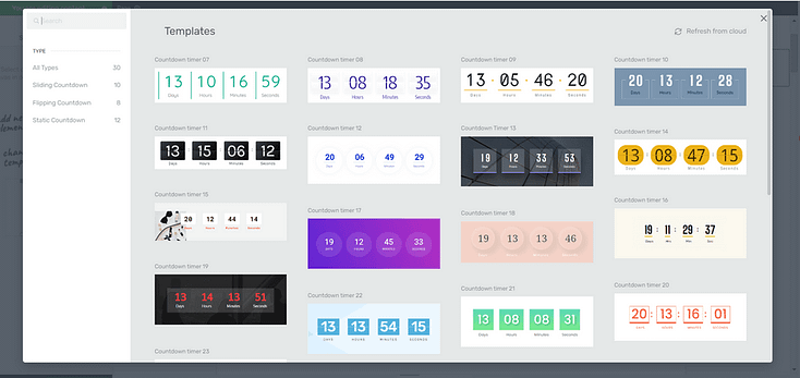
Your options are endless. Thrive Architect provides you with all the elements you need to create a successful affiliate marketing landing page.
Your Top Questions About Affiliate & Bridge Pages, Answered
Creating affiliate landing pages often brings up the same set of “wait, how do I…?” questions — and I’ve been asked them all. To save you the rabbit hole of Googling, I’ve answered the most common ones here. Each question stands on its own, so you can skim, jump around, or read straight through depending on where you’re stuck.
The purpose is simple: to persuade someone to take one action — usually clicking your affiliate link. I treat it as a pre-sell page. It’s where I warm up cold traffic, build trust, and give context before sending people to the merchant’s sales page.
A landing page is a broad term for any page a visitor lands on after a click. A bridge page is more specific — it’s the type of landing page affiliates use to connect with their audience before sending them to the offer. Think of it as the “in-between step” that builds rapport and primes your audience.
Technically, you can link directly… but it’s almost always a mistake. Many ad platforms ban direct affiliate links, and even if they didn’t, you’d be skipping your chance to earn trust and capture leads. A landing page gives you control over the message and dramatically improves conversions.
For me, it always comes down to:
A clear, benefit-driven headline
Copy that follows the AIDA flow (Attention, Interest, Desire, Action)
Engaging visuals (images, screenshots, or video)
Social proof (reviews, testimonials, or case studies)
One strong, unmissable call-to-action button
I keep it straightforward: start with a headline that matches your ad, add a short story or video about why the product matters, list a few benefits, and finish with a single call-to-action. In Thrive Architect, I can build that exact flow in about ten minutes.
Yes — as long as they add genuine value. Platforms only crack down on thin “doorway pages” that exist to trick or redirect people. A high-quality bridge page that informs, educates, or reviews a product is usually fine and often required.
A squeeze page is a type of landing page designed to capture email addresses. Affiliates often use it at the front of a funnel: offer a freebie (like a guide or checklist), collect the email, and then send people to a bridge page before the affiliate offer.
I focus on benefits, not features. I start with a strong hook, tie it to a real problem, paint the desire for a better outcome, and then present the product as the bridge to that outcome. If I can weave in a personal story, even better — authenticity sells.
Affiliate landing pages are usually private, but the same principles show up in public program pages. Think of brands like Grammarly, Shopify, or Bluehost — their pages highlight clear benefits, show social proof, and end with a single strong CTA. That’s exactly what you want to replicate as an affiliate.
If you’re on WordPress, Thrive Architect is my go-to because it’s fast and built for conversions. Other options include SeedProd, Leadpages, Instapage, or GetResponse. The key is choosing a builder that gives you full design control and integrates with your email tools.
Next Steps: Start Driving Traffic to Your Landing Pages
Once you’ve saved and launched your page, it’s time to get it in front of the right eyes.
As you share your landing page on social media, through email, and even via SEO, you need to make sure you’re targeting the right people (i.e. your ideal customer).
Here are 4 free resources/tutorials to help you drive the right traffic to your website:
- How to Create SEO-Friendly Blog Posts Users and Bots Will Love (14 Tips)
- 8 Content Marketing Hacks to Grow Your Online Business
- 7 Keyword Research Tips for the Busy Entrepreneur
- How to Get Your Business Noticed and Grow Your Audience
Wrapping Up: From Clicks to Conversions
At this point, you know the truth: affiliate success isn’t about dropping raw links and hoping for the best. It’s about building bridge pages that actually connect with people — pages that warm up cold traffic, build trust, and make clicking “buy” feel like the obvious next step.
And the best part? You don’t need to hire a designer or spend weeks learning code to pull it off. With Thrive Architect, you can spin up a professional, conversion-ready bridge page in minutes.
But if you want to go further — capture leads, add quizzes to segment your audience, even build a members-only hub for bonus content — that’s where Thrive Suite changes the game. You get Thrive Architect plus the full set of tools I use to grow and convert my own audience:
- Thrive Leads to build your email list faster.
- Thrive Quiz Builder to turn engagement into insights.
- Thrive Apprentice to package your own digital products or bonuses.
- ...and so much more
With that toolkit, you’re not just building landing pages — you’re building a real business around your affiliate promotions.
So don’t let another click go cold. Start creating bridge pages that sell for you, and let Thrive Suite give you the unfair advantage every affiliate secretly wants.
But if you want to take your online presence to the next level and boost your conversion rates, you need Thrive Suite.


