Creating remarkable content for your WordPress website has never been easier!
Keep reading to learn how the hundreds of Block templates inside Thrive Suite can help you create better content — at lightning speed!
More...
Block Element Basics
To begin, let’s discuss how the Block element gives you the flexibility to fully customize pre-designed content quickly – preventing you from having to repeat the same editing steps over and over again.
First off, make sure your Thrive Suite tools (e.g. Thrive Theme Builder, Thrive Architect, Thrive Apprentice and Thrive Quiz Builder) have all been updated with their latest versions to have access to the Block element.
Once that's done, you'll see the Block element featured prominently within your Thrive visual editor’s elements tray in the right sidebar:
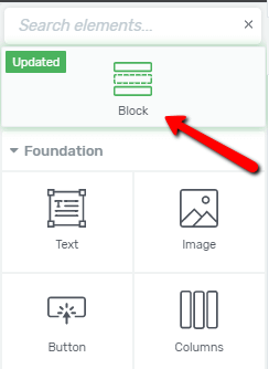
Find the Block element at the top of the right sidebar.
When you drag & drop the Block element onto the page, a template library containing hundreds of professional content designs will appear as an onscreen lightbox:
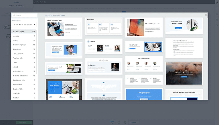
After drag & dropping a Block element on to the page, the Block template library will appear as an onscreen lightbox.
Depending on which Thrive tool you are using, the Block element then gives you access to dozens of different template categories, each containing several different designs.
Page Blocks vs. Theme Blocks vs. Content Blocks
The Block element actually offers 3 different types of content templates for you:
Page Blocks: Blocks designed to be unconstrained by landing page templates. Perfect if you’re building landing pages or full page content on a blank canvas.
Theme Blocks: Blocks designed to match your website and branding. Ideal for full width content that should look and feel like the rest of your WordPress theme.
Content Blocks: Blocks designed for content focused pages that sit within your theme templates such as blog posts or company pages.
But although the Block element can be found inside each Thrive product's visual editor, the type of templates available varies per tool.
Here’s a breakdown of the Block template types you’ll find in each of the following Thrive Themes tool scenarios:
Thrive Theme Builder template pages:
- Theme Blocks
- Content Blocks
Thrive Architect landing page templates:
- Template specific Page Blocks
- Content Blocks
Thrive Architect blog posts & landing pages using Thrive Theme Builder:
- Theme Blocks
- Content Blocks
Thrive Apprentice lesson pages:
- Theme Blocks
- Content Blocks
Thrive Quiz Builder Splash pages, Opt-in pages and Results pages:
- Theme Blocks
- Content Blocks
And to help you find the right template faster, the Block template library can be filtered in 3 different ways:
- Type a category name into the Search Bar
- Select a Block template type (Page Blocks, Content Blocks or Theme Blocks)
- And select a Block template category from the sidebar
For example, if you're trying to write a product review article for your blog, simply click on the "Product Review List" category (within the lightbox sidebar), or type the category name into the Search Bar to see the available templates:
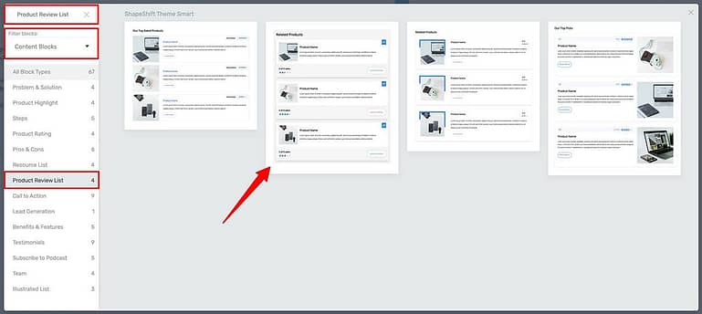
To filter Block templates, type the category name into the search bar, limit templates to Block type, or click on a category listed in the template library sidebar. Select a design by clicking on the thumbnail.
Once you find the design you’re looking for, just click its thumbnail preview to add it to your Thrive visual editor:
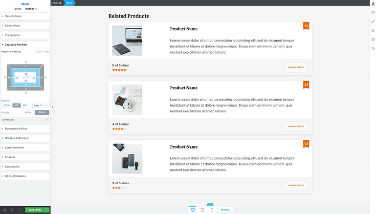
Once you click on a Block template, it will load within your Thrive visual editor.
So now that you have the Block element basics under your belt, let's take a look at ways the Block element will help you create awesome content faster.
Block Element Benefits
Not only are all the Page Block, Content Block and Theme Block templates contained within a single drag & drop Block element, but the unique benefits of each are combined as well!
Let’s take a closer look at all the rapid content creation benefits Blocks provide for you.
Available for Both Your Page and Post Content
Previously, Page Block templates were only available on “Page Block Ready” landing page templates within Thrive Architect, while the Content Block templates could be used across various kinds of WordPress content.
But now that both template types have been consolidated into the Block element, you can deploy many more designs across your posts and pages.
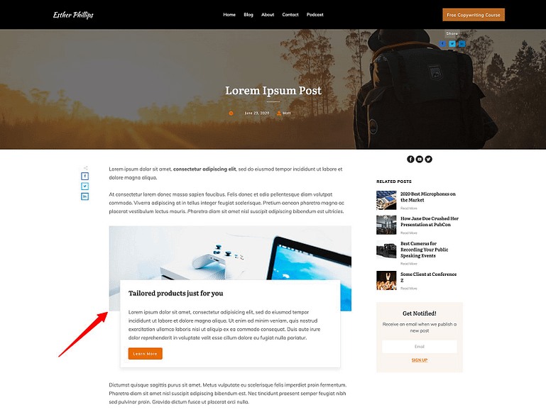
You can add Block templates to your blog post content.
So whether you’re looking for pro-designs to use inside your latest blog post, or in need of a killer Call to Action template on a landing page, the Block element — and its hundreds of templates — is your new content creation weapon of choice.
Smart Color Enabled
An awesome feature that all Block template designs share is our state-of-the-art Smart Color Technology.
Put simply, this means that — if your site is built with Thrive Theme Builder — your pre-set brand color will instantly be applied to any Block template you deploy.
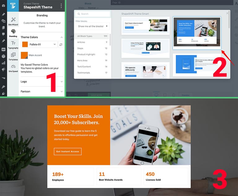
If Thrive Theme Builder is active on your site, all of the Block templates will be Smart Color enabled. That means 1) the Brand Color you set in the Thrive Theme Builder dashboard, will 3) instantly be applied to any 2) Block template design you select.
This gives you 2 great benefits when it comes to content creation:
- You can create individual post and page content that matches the look and feel of your entire website with far fewer design clicks required.
- If you ever need to change your site’s brand color, one modification in your Thrive Theme Builder dashboard will apply itself instantly across your entire site — which includes your Block designs too!
Font Matching
Another time-saving and quality-of-design boosting feature the Block element gives you is its ability to inherit your theme’s Font Styles and Typographies.
In other words, wherever you add a Block template, the design will automatically blend in to match the surrounding content.
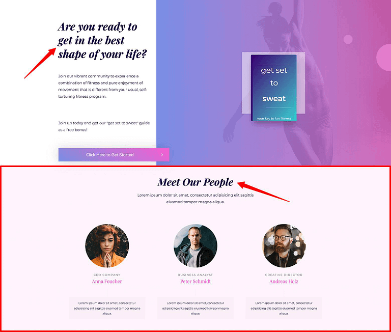
The Block element's intelligent font matching feature saves you tons of tedious clicks matching your template designs to the parent landing page or blog post. In this example, a "Team" category Block template was dropped onto the "Fitbrand Smart Homepage" template. Not only were smart colors applied to the Block template, but its font styles and typography were instantly matched as well. (Note: Bolding and Italic styling must be applied separately.)
And just like the Smart Color feature discussed above, this means that whenever you change your theme’s Typography settings, your Block designs will automatically inherit these changes as well.
Of course you can always make specific font style and typography changes to any of your Block designs where needed, just be aware that such modifications will unlink this global Font inherit feature for those specific designs.
Group Editing
Another quick-customization benefit the Block element provides you with is its intelligent group editing feature.
Because several of the Block templates include multiple variations of the same element (e.g. check out the “Articles” or “Product Highlight” template categories), group editing makes transforming those variations faster because you only need to do it once.
Take a look at one of the “Product Review List” templates as an example – changing the styling of one instance of the grouped images, fonts, buttons or highlight ribbons applies the changes to them all:

The group editing feature of the Block templates makes it easy to customize any design in just a few clicks.
We call this group editing intelligent because it knows which modifications NOT to apply to the group (like the number of stars given to a particular product or the actual in-line text changes):

The Block template group editing feature is intelligent because it doesn't apply item specific modifications like inline text changes or star rating assignments.
You also have the power to ungroup elements. This feature allows you to apply variation-specific changes that will not be applied across the entire design. This is a great way to highlight a single item within a Block template:

You can also ungroup elements within your Block templates if you want to highlight a single item of a design.
Use this ungrouping feature whenever you want to make a particular element within a Block template stand out from the crowd.
Go Full-Width on Your Blog Posts
Another useful feature the Block element applies specifically to your blog posts is the ability to make templates use the full screen width (not just the width of the blog post content area):
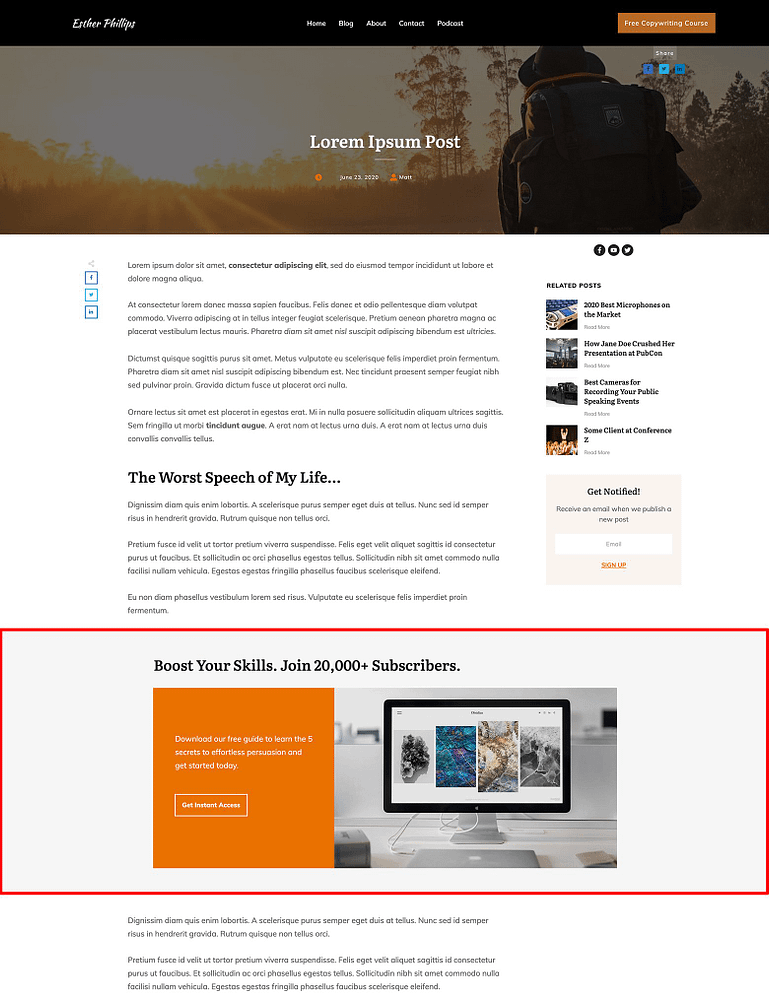
Yup, you can make Block templates take up the full-width of a screen on blog posts. Note: If you use this full-width setting, make sure it doesn't interfere with your sidebar!
This new feature comes in handy whenever your Block design just doesn’t fit within the width boundaries of a blog post’s content area (determined by your WordPress theme settings).
To activate this feature for a given Block element, just highlight its breadcrumb in the Thrive visual editor, select the Main Options tab in the left sidebar and toggle the “Stretch to fit screen width” button:
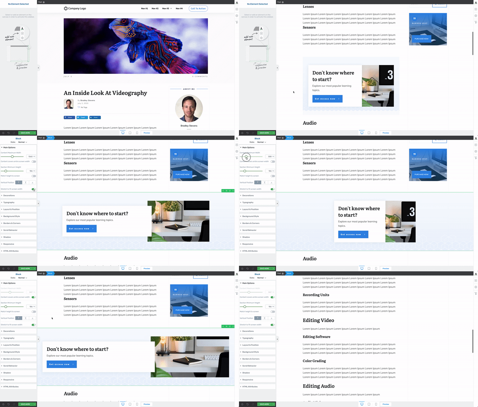
Want to make your Block templates stretch to full-width in a narrow blog post content area? Here's how.
Does Your Blog Use a Sidebar?
Please be aware that if your blog posts display a sidebar, the "Stretch to fit screen" Block element option will overlay it.
Make sure to preview the placement of any full-width Block design on a blog post so this sidebar interference doesn't occur.
Fully Responsive and Mobile Optimized
Of course, no content design is really complete unless it’s been optimized for the screen-size trifecta: desktop, tablet and mobile:

The Block template designs are fully responsive and mobile optimized — straight out of the cloud!
Rest assured that each Block element template you drag & drop into your WordPress content will look great — straight out of the cloud — no matter what sized device your readers are using!
Rapid Content Creation Examples Using Block Templates
It should now be clear just how beneficial the Block element is. In fact there’s really no limit to the types of content you can rapidly create using the templates this new element offers.
So to help get your content creation fire stoked, here are some real world examples of how the Block templates can level up your site's overall design as well as speed up your content creation timeline.
Build a "Recommended Resources" Page
Got a personal brand online business?
Then I bet there's some books, products or tools you often recommend to your followers.
Creating a “Recommended Resources” page is a great way to put all those endorsements in one place. Here's a before and after look at a website that used nothing but Block element templates to rapid-fire update its Recommended Resources page.
Thrive Tools Used
You can achieve this example’s results using the Thrive Architect page builder plugin by itself or in combination with Thrive Theme Builder.
Before Using Block Templates
Here’s the original Recommended Resources page that was built from scratch without any Thrive Architect content templates just a few years ago:
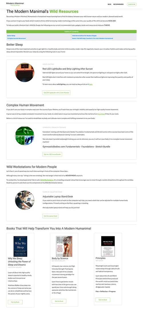
An old Recommended Resources Page built from scratch with Thrive Architect back in 2017. Because every margin, padding and column size of this page was created from scratch, it took waaay too much time to build. Because the content creator was not a pro-designer, the page did little to impress.
At the time of this page's creation, the author spent hours creating a basic looking design that did little to impress. The time it took just to tweak individual Column sizes, change Content Box border colors and Button design behaviors really added up!
After Using Block Templates
It took less than 30 minutes of dragging, dropping and making a few quick copy-paste customizations to some “Hero Area”, “Resource List” and “Lead Generation” Block templates on a Blank Thrive Architect landing page template to make the following upgrade:
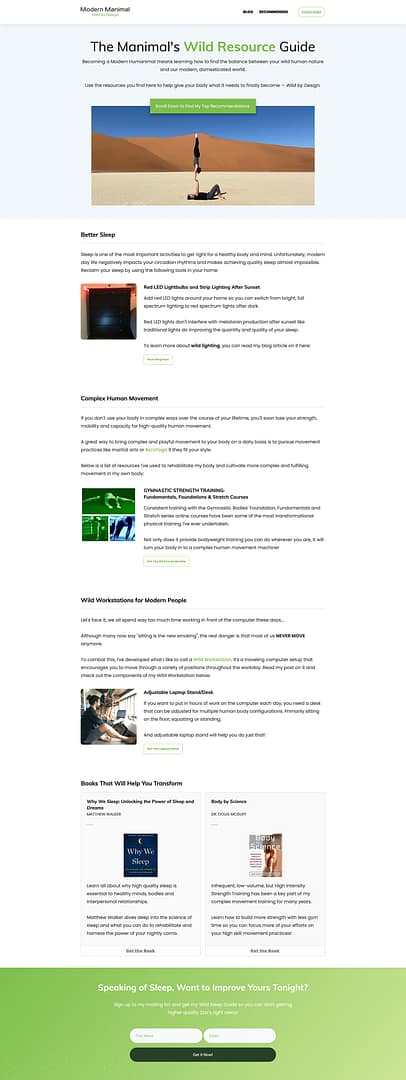
After less than 30 minutes of minor customizations to a few different Block template designs on a Blank Thrive Architect landing page template, this upgraded Recommended Resources page was completed by the exact same non-designer content creator.
By using nothing but Block templates, you can now focus on the content of your pages rather than tearing your hair out trying to tweak all those margins, paddings and borders only a pro designer knows how to make look good.
Create Blog Posts You're Actually PROUD to Share
How many blog posts have you come across that just looked like a 4-year old high on grape juice designed?
Even if the content was good, you didn’t even consider giving it a share because — you’ve got a reputation to uphold… 😉
The truth is that well-designed content feels more authoritative and Block templates help you achieve that look fast.
Let's now take a look at how quickly you can spice up an old blog post using a few more Block templates.
Thrive Tools Used
The only tool you need for this 10-minute magic trick is Thrive Architect.
Before Using Block Templates
Remember the non-designer content creator from the previous example?
Here's an old blog post said amateur built with 2 (built-from-scratch) attempts at in-content designs:
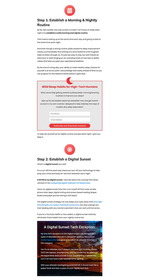
An old blog post attemting to showcase some built-from-scratch in-content designs.
After Using Block Templates
And dere's that very same blog post after a 10-minute plug-and-play, Block template design upgrade:
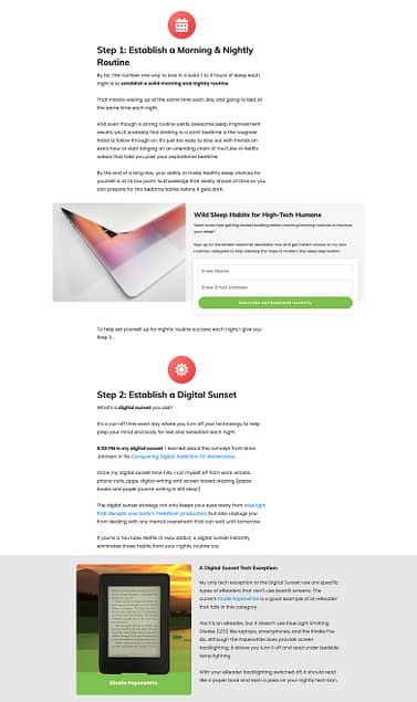
Here's the same blog post using 2 Block template designs instead. Total time invested in the update? 10 minutes.
Create an About Page that STANDS OUT
At this point, I should probably come clean with you.
The poor schmuck without any design talent running around upgrading their old content with Block templates for this post is... well... me. ¯\_(ツ)_/¯
And thanks to the new Block designs, you too can update your old About Page so it's not moping around your website like an online afterthought.
At the risk of severely embarrassing myself here, let me show you what I mean...
Thrive Tools Used
Thrive Architect with or without Thrive Theme Builder makes this transformation a synch!
Before Using Block Templates
I'm definitely NOT proud of it, but here's how my About Page appeared for a looong time. Look familiar much?
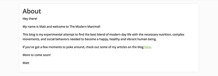
I'm not proud of it, but here's how my About Page looked like berfore Block elements came along.
After Using Block Templates
2 Block templates and few minor modifications later and you've finally got yourself a respectable looking About Page:
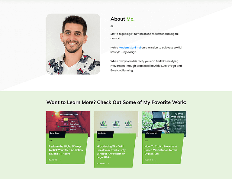
2 Block templates plus a few minutes of customization and a respectable About Page is released into the wild!
Your Turn To Craft Better Content Faster
So there you have it...
… yet another way to create content on your WordPress site faster with the combined power of Page Blocks, Content Blocks, Smart Color Technology and professionally designed content templates — all rolled up into a single drag & drop Thrive visual editor element.
If you haven’t had the chance to check out the new Block element, scroll through its many predesigned templates now to find some great designs that will transform your content.
And if you'd like to learn more nitty-gritty details about how to use the Block element across your website, check out this Thrive Knowledge Base article.
Finally, leave a comment below sharing your Block template use case ideas so our design team can get busy creating them for you in the fast growing template library!


This is great. This is extending the TTB blocks to TA pages? That’s fantastic! I’m excited to use this functionality in my next big SEO Spring friendly article… One question: your article suggests that only the block will carry the same font as the TTB theme. Why doesn’t TTB font choices carry over to everything: every landing page, for instance? If I have a H2 header with a specific font assigned in TTB, is it possible for me to make all my old landing pages’ H2 headers use that font, too? Or am I getting confused about how this all works?
Hi Daniel, the Block templates will inherit page specific font settings.
So if you’re placing a Block template on a post or page controlled by TTB, the templates will use your TTB font settings.
However, if you place a Block template within a Thrive Architect landing page template, the Block designs will inherit that landing page’s font settings (remember that Thrive Architect landing page templates work by overriding your WordPress theme settings — even if you’re using TTB as your theme).
Hi Matt,
Thank you for replying — that makes sense. I see why we would normally want TA landing pages to overwrite the site’s style. But what if I want to do an overall style refresh: change the header fonts, site-wide, for instance? I can do it instantly in my regular WP post writing — but not my TA pages? What’s the quickest way to make the changes across the site?
Hi Daniel, if your pages are using the default page template you setup in Thrive Theme Builder, then modifying the font style of the page template will instantly apply to all the pages using it (including the Block templates deployed on them).
However, if you’ve created pages using any of the Thrive Architect landing page templates, you’ll have to change the font settings for each of those landing pages one-by-one. You can do this by clicking on the cog icon in the right sidebar of the Thrive visual editor, clicking on the “Global” tab that appears, and clicking on the pencil icon under “Fonts”.
In the font settings lightbox that appears, you can then change all the font settings for that landing page. The Block templates on that landing page will inherit those new font settings as well.
Okay! I had better get working (I have a lot of pages). Although I may wait until Thrive Apprentice gets access to the custom font plugin so I can do the whole site at once.
Who knew a Geologist could write and communicate so well? 😉
One thing Geology has taught me is that anything is possible given enough time…
Wow, that is some awesome stuff guys! Looking forward to trying out the new blocks 🙂
Can’t wait to see what you build Michiel!
I’d love to some nice Portfolio Block Templates similar to what Adobe Portfolio has.
Thanks for the suggestion! I’ll pass it along to our design team for future Block template designs.
I love the block elements. I use them all the time and i feel so happy each time I do it.
Thanks Alba!
Wow, Matt. You know I’ve been waiting for this one. You came through. Thank you. Thank you. Thank you.
I’m in the process of creating a pet related website and looking for a reusable ‘blog post content pattern’ that I can create once, save it and then adapt it for all other blog posts.
These could be used to present ‘comparison’ content patterns for different makes/models of cars, aircraft, motorbikes and boats to showcase their individual specifications, characteristics and performance ratings etc. (I know that we could use custom fields for that purpose but they aren’t very customisable and they are ugly).
If you are old enough to remember the old ‘Top Trumps’ playing cards, then you will understand what I mean by ‘comparison’ content patterns.
I would love to see your designers get specific with user case templates related to pets and animals, particularly cats.
A video tutorial to accompany your blog posts would also be extremely beneficial.
Thanks for your comment Jonah!
The ‘Top Trumps’ playing card Block template idea is a cool one. Sounds like a modified variation of a “Product Highlight” template as well.
I will definitely pass it on to the designers and suggest the use case of animals for it.
And you can expect more video tutorial blog content coming your way soon!
Thanks Matt. I would like to see a deeper dive into using these elements with more ‘how to use’ video tutorials that demonstrate more of the ‘versatility and design capabilities’ when using the ‘Content Box’ & ‘Content Blocks’ & the ‘Block Templates’….specifically for when creating/designing reusable ‘blog post content pattern templates’.
Having a library of ready-made templates/elements is great but knowing how to tweak those templates/elements and seeing what is possible with them whilst also incorporating other elements, such as accordions, tabs, tables etc would be helpful.
Love the new blocks! Super easy to create very professional looking sites in way less time.
One thing I noticed with the new TTB, my auto-correct no longer works when editing text anywhere inside the website! I rely on it fairly heavily to keep my copy looking professional, so if this could be fixed, I would be happy! I’m using Windows 10, and Chrome browser.
Cheers Eric! And we’ve been working recently to speed up the Thrive visual editor responsiveness so I just confirmed with one of the devs that the auto-correct was disabled for that purpose. I think the plan is to add it back in as a toggle on/off feature in the next release.
Hi Matt,
Here I am again…your friendly Thrive “fan-pest” with a (l-o-n-g) question about BLOCKS… ???? LoL!
I’ve been creating a lot of content recently (Shane’s Audience course) & these blocks are awesome… Very quick to create beautifully-formatted posts & pages, as you have demonstrated! ????
Problem is, they seem to do some weird and unexpected things on mobile versions… I’ve had 2 people (friends, fortunately!) sending me screenshots from their own mobile devices where things are NOT looking like I expected…
Generally, the problem is the ‘box’ elements that comprise the “blocks” run into each other on mobile… In one case, it looked weird in portrait, but looked fine in landscape… In most of the other cases, it looked terrible regardless of the screen orientation.
It’s very possible I’m doing something “wrong” in my process… The problem happens whether it’s a page or a post (using TTB as well). BTW… I did check the reference post in the KB you linked to, but didn’t see anything there that would explain the unexpected results. I’m not using sidebars on any of my content either. I also had read Shane’s post (from last year?) where he demonstrates the “outside – in” mobile adjustment concept…
If it helps, I’m using an iPhone 8+ with chrome browser, another person is using an iPhone (not sure which screen size) and the other example is Chrome on Android phone.
I’m wondering if there is a reference you could refer me to, or a “best practices” for using blocks! I love them, but don’t want to fall out of favor with Google, since I know the importance they give to mobile-responsive…
Thanks for listening…and reading, and being so responsive (no pun intended ????) to all of our requests and questions!
Karen
I noticed something weird happening on my android mobile too. Going to Matts ‘about page’ at Modern Manimal – https://modernmanimal.com/about/ – the 3 recent posts are not stacked (they are inline and taper off for miles down the screen) and once a post is opened it doesn’t shrink to the screen size on my Android. Perhaps this is an issue my end?
Hey Jonah, I just checked this out myself and when I went into the mobile editor, the post list was stacked (the correct default behavior for mobile screens on this design). Then I tested by loading the page on my iPhone 6+ — it showed as stacked on that device as well. Sounds like it tried to open as the tablet version on your phone… not sure why.
Hi Matt. Just an update on this. Must have been a ‘glitch’ or ‘caching ?’ with my Android mobile (Xiaomi), as I haven’t changed any settings on it but it is now displaying your about page correctly (with the recent posts stacked etc and responsive).
Thanks for checking on Android, Jonah! 🙂
Makes me think I just didn’t do something weird at my end! 😮
Hopefully Thrive devs will be able to replicate those mobile issues! Fingers crossed! 😉
Hi Karen, glad to hear you’re getting so much mileage out of the Block templates!
As for the mobile load issues, I will bring this up with the devs and designers to see if they can replicate what you’re experiencing.
In the meantime, one way you can double check how your mobile designs are loading across several different tablet and mobile screen sizes is by using Google Chrome’s “Inspect” feature:
On the preview page of your design, right click inside the page and select “Inspect” from the dropdown menu that appears. In the inspect dashboard that appears as either a sidebar or bottom-bar, look for a “Toggle device toolbar” mobile icon and click on it. From there, look for a dropdown menu item (above your page but below the Google Chrome header) that says “Responsive” and click on that. The dropdown that appears will show you a range of mobil and tablet device screen sizes. Click on each one to see how your design looks simulated on different devices. There’s even a “Rotate” button to check how designs look between portrait and landscape modes. It’s a bit of an extra mobile device QC step, but it may help you to address some of the issues you’re having.
We’ll QC the templates on our end in the meantime to see if we can replicate these mobile display issues as well.
Hi Matt,
Thank for letting your Architect devs know! Hopefully it’s not just an isolated case with one particular Android config…
Thanks for the QC procedure you’ve provided… I’m familiar with Chrome’s “inspect” feature, but didn’t know about several of the additional features you listed! I’ll definitely give those a try & see if I can avoid these layout issues in future content! <3
I adore ThriveThemes and revamped my website with this new tool. I am not a designer but my website looks like it is done by a professional. Really grateful.
That’s exactly what we like to hear Jeannette!
This rocks, so very much!
Thanks Joanne!
Thanks, tried today, it really helped to the content design. Took about 15 minutes, but difference is huge. Thanks!
Awesome to hear Martin!
Love the blocks!
Just trying to find out how to add a section to Group Styling?
So imagine I use a 3 section image with description alongside, but I need 4 sections, so I copy one & place it below the 3rd.
But the new section with text in content box and column plus an image in another content box and column are not linked with the previous 3 sections (the Block).
How would i tie this new/separately made 4th section – in with the Group Styled 3 section block?
Thank you
After days of frustration, I realised that the process described from 05:40 no longer works as shown in the video.
The ‘Content Blocks’ element no longer exists. It has been changed to the ‘Blocks’ element…….which cannot be dropped into a ‘Content Box’ as shown in the video.
Thrive Support have suggested that I do the following as a work around, which is long winded:-
https://share.getcloudapp.com/ApuLrnwy
1. Click on the ‘+’ Icon in the right hand menu
2. Find and drag/drop the updated ‘Block’ element onto the page (no need to drop it into the ‘post content box’.
3. The ‘Block Library’ will open
4. Scroll through the menu to find the type of ‘Content Blocks’ required and insert them onto the page
5. Then click on the ‘+’ Icon in the right hand menu
6. Find and drag/drop the ‘Background Section’ element onto the page
7. Now drag/drop your individual ‘Content Blocks’ into the ‘Background Section’
8. Then click on the ‘+’ Icon in the right hand menu
9. Find and drag/drop the ‘Content Box’ onto the page
10. Then drag/drop all the individual content from the ‘Background Section’ into the ‘Content Box’
11. Then save the ‘content box’ or ‘background section’ as a template and add it to future pages
Is this now the best way of creating a content pattern and saving it as a template? If so, then can you please update this tutorial.
Hi Jonah,
Sorry about the confusion. We did indeed update the element from content block to “blocks” in order to make them available not only on blog posts but also on pages.
What our support forum suggested will work.
Another way of saving multiple content blocks as a template for using in blog posts or pages is to add the content blocks in a blog post (no need to add them into content boxes or background sections) and then save the whole blog post as a template by going to the settings cog in the right sidebar and then click on the “save as template” https://share.getcloudapp.com/Jrugbgd0 this will save everything you have inside the blog post as a template.
This template will then be available under “symbols and templates” and you can now use it in any blog post or page you like.
Matt, any chance you could add some of the Use Case and Case Study templates available in Thrive Theme Builder to this library for Thrive Architect. We can’t migrate to Thrive Theme Builder yet but are desperate to start building our use cases using those templates.
Each time I look at thrive suites features, I shout halleluyah… The free lessons I get here is better than most courses I paid over $5,000 for.
Meanwhile, is there a way to remove the embedded YouTube video title and logo?
I use YouTube to host most of my videos. I want to remove YouTube branding from the video.
Any solution or recommendation will be highly appreciated?
Agree completely with your comments about Thrive features & the tutorials & case studies! Invaluable! <3
As far as YouTube, branding is crucial for them…as well as “keeping eyeballs on their platform” (just like other social networks)… There are ways to prevent showing “related videos” (one of their Paid plans) but as far as I know you can’t remove their branding…
Other video alternatives are Wistia & Vimeo — both of which Shane recommends using for premium courses — but these are both considerably more costly…and they still have their logos showing, but your videos are completely protected from non-paying customers viewing…
For free video, you simply won’t get this…
BTW… just an afterthought about platform branding:
I’d guess that removing branding such as logos id likely against their TOS, written someplace…that we (users) have implicitly agreed to by using the service… I’m no attorney, but their legal teams are very smart…and thorough!
Excellent Post. Everything you need to know to build a website in no time. I always watch your tutorials. You rock
Thanks so much for the kind words Tom… glad to hear the videos and posts are helpful!
I love the blocks feature but it is awful that you cannot use it with your theme builder. You have to choose between
A. Using your theme builder but with normal content blocks that are not these true blocks you introduced
OR
B. Standalone with awesome block builder, but with no theme except header and footer…. a header and footer that you’d have to edit page by page if you wanted to change it later on.
Can you update the software to run together? In this day in age where everything is built with blocks, I don’t understand why there is this severe limitation.
Hi Mike,
Seems like you might have missed a little trick here 🙂 When you insert a block you can choose between a “theme blocks” or “content blocks” https://share.getcloudapp.com/bLuxkRy0 so you can take full advantage of the blocks while using Thrive Theme Builder!
I use them all the time in TTB… As Hanne has indicated you can select which blocks you want to use. And you can combine them on the same page/post…
The blocks are awesome & a huge time-saver! 🙂